
Slide Button
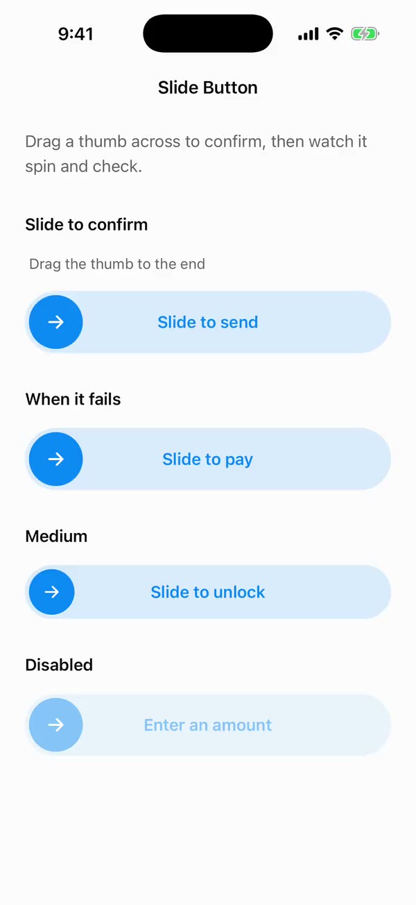
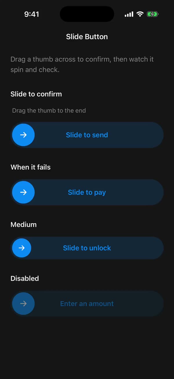
React NativeDrag a thumb across to confirm, then watch it spin and check.
Preview
Install
Source on GitHubIt works in Expo and in bare React Native. New to beUI Native? Set up your app first.
Copies the component and the shared files it needs into src/, adds the theme tokens if they're missing, and installs its libraries. Files you've changed are kept.
Keep the folder layout, since the component imports the shared files by relative path.
1Install the libraries
npx expo install react-native-gesture-handler react-native-reanimated react-native-svg react-native-worklets
npm install uniwind tailwindcss
Wrap your app in GestureHandlerRootView if it isn't already.
2Add the theme tokens
Once per app. Import it from the CSS file Uniwind reads, after Tailwind and Uniwind, and change the values to match your brand.
/* Matches the default beUI palette in ui-components/lib/themes.ts.
   Native surface maps to card; muted maps to muted-foreground. */
@layer theme {
  :root {
    @variant light {
      --color-background: oklch(99% 0 0);
      --color-surface: oklch(97% 0 0);
      --color-foreground: oklch(15% 0 0);
      --color-muted: oklch(50% 0 0);
      --color-border: oklch(15% 0 0 / 0.06);
      --color-border-strong: oklch(15% 0 0 / 0.16);
      --color-primary: #0285f7;
      --color-on-primary: #ffffff;
      --color-destructive: #dc2626;
      --color-success: #059669;
      --color-warning: #d97706;
    }
  }

  :root {
    @variant dark {
      --color-background: #151515;
      --color-surface: #1c1c1c;
      --color-foreground: oklch(96% 0 0);
      --color-muted: oklch(62% 0 0);
      --color-border: rgb(255 255 255 / 0.05);
      --color-border-strong: rgb(255 255 255 / 0.14);
      --color-primary: #0285f7;
      --color-on-primary: #ffffff;
      --color-destructive: #f87171;
      --color-success: #34d399;
      --color-warning: #fbbf24;
    }
  }

  /* Tailwind's default monospace stack isn't a font React Native can load. */
  :root {
    @variant ios {
      --font-mono: Menlo;
    }
  }

  :root {
    @variant android {
      --font-mono: monospace;
    }
  }
}
3Copy the shared files
export type { LoaderProps, LoaderVariant } from "./loader";
export { Loader } from "./loader";
import { useEffect, useState } from "react";
import {
  type ColorValue,
  Platform,
  StyleSheet,
  Text,
  View,
  type ViewProps,
} from "react-native";
import Animated, {
  Easing,
  type SharedValue,
  useAnimatedStyle,
} from "react-native-reanimated";
import { useResolveClassNames } from "uniwind";
import { useReducedMotionPreference } from "../../hooks/use-reduced-motion";
import { useKeyframes } from "./use-keyframes";

export type LoaderVariant =
  | "spinner"
  | "dots"
  | "bars"
  | "dot-matrix"
  | "dither"
  | "ascii"
  | "ascii-line"
  | "ascii-braille"
  | "ascii-blocks"
  | "ascii-bounce"
  | "morph"
  | "comet"
  | "scramble"
  | "metaballs"
  | "newton"
  | "helix"
  | "percent";

// Terminal-style frame sets, the loaders CLI agents cycle through.
const ASCII_SETS: Partial<Record<LoaderVariant, string[]>> = {
  ascii: ["⠋", "⠙", "⠹", "⠸", "⠼", "⠴", "⠦", "⠧", "⠇", "⠏"],
  "ascii-line": ["|", "/", "-", "\\"],
  "ascii-braille": ["⣾", "⣽", "⣻", "⢿", "⡿", "⣟", "⣯", "⣷"],
  "ascii-blocks": [
    "▁",
    "▂",
    "▃",
    "▄",
    "▅",
    "▆",
    "▇",
    "█",
    "▇",
    "▆",
    "▅",
    "▄",
    "▃",
    "▂",
  ],
  "ascii-bounce": ["⠁", "⠂", "⠄", "⡀", "⢀", "⠠", "⠐", "⠈"],
};

const MONO = Platform.select({
  ios: "Menlo",
  android: "monospace",
  default: "ui-monospace, SFMono-Regular, Menlo, monospace",
});

// Reduced motion keeps a calm opacity pulse and drops every transform.
const PULSE = [1, 0.4, 1];
const PULSE_DURATION = 1400;

export type LoaderProps = Omit<ViewProps, "children"> & {
  variant?: LoaderVariant;
  /** Base square size in points. Everything scales from this. Defaults to 32. */
  size?: number;
  /** Seconds per animation cycle. Defaults to 1. */
  speed?: number;
  /** Spoken name. Defaults to "Loading". */
  label?: string;
  /** Overrides the theme's foreground color. */
  color?: ColorValue;
  /** Color utility, such as `text-primary`. Used when `color` is not set. */
  className?: string;
  /** Uses the reduced-motion pulse regardless of the system preference. */
  disableAnimation?: boolean;
};

type PartProps = {
  size: number;
  /** Milliseconds per cycle. */
  cycle: number;
  reduce: boolean;
  color: ColorValue;
};

function Dot({
  size,
  color,
  style,
  square = false,
}: {
  size: number;
  color: ColorValue;
  style?: object;
  square?: boolean;
}) {
  return (
    <Animated.View
      style={[
        {
          width: size,
          height: size,
          borderRadius: square ? 0 : size / 2,
          backgroundColor: color,
        },
        style,
      ]}
    />
  );
}

function useOpacity(value: SharedValue<number>) {
  return useAnimatedStyle(() => ({ opacity: value.value }));
}

function Spinner({ size, cycle, reduce, color }: PartProps) {
  const stroke = Math.max(2, size * 0.09);
  const turn = useKeyframes([0, 360], {
    duration: cycle,
    easing: Easing.linear,
    enabled: !reduce,
  });
  const pulse = useKeyframes(PULSE, {
    duration: PULSE_DURATION,
    enabled: reduce,
  });
  const animatedStyle = useAnimatedStyle(() => ({
    opacity: pulse.value,
    // The top border spans 10:30 to 1:30; a 45° start puts it at 12 to 3.
    transform: [{ rotate: `${45 + turn.value}deg` }],
  }));
  const ring = {
    width: size,
    height: size,
    borderRadius: size / 2,
    borderWidth: stroke,
  };

  return (
    <Animated.View style={[{ width: size, height: size }, animatedStyle]}>
      <View style={[ring, { borderColor: color, opacity: 0.2 }]} />
      <View
        style={[
          ring,
          styles.overlay,
          { borderColor: "transparent", borderTopColor: color },
        ]}
      />
    </Animated.View>
  );
}

function BouncingDot({
  index,
  size,
  cycle,
  reduce,
  color,
}: PartProps & { index: number }) {
  const delay = index * cycle * 0.16;
  const y = useKeyframes([0, -size * 0.3, 0], {
    duration: cycle,
    delay,
    enabled: !reduce,
  });
  const opacity = useKeyframes(reduce ? [0.4, 1, 0.4] : [0.5, 1, 0.5], {
    duration: cycle,
    delay,
  });
  const animatedStyle = useAnimatedStyle(() => ({
    opacity: opacity.value,
    transform: [{ translateY: y.value }],
  }));
  return <Dot size={size * 0.24} color={color} style={animatedStyle} />;
}

function Dots(props: PartProps) {
  return (
    <View style={[styles.row, { gap: props.size * 0.14 }]}>
      {[0, 1, 2].map((index) => (
        <BouncingDot key={index} index={index} {...props} />
      ))}
    </View>
  );
}

function Bar({
  index,
  size,
  cycle,
  reduce,
  color,
}: PartProps & { index: number }) {
  const delay = index * cycle * 0.12;
  const scale = useKeyframes([0.3, 1, 0.3], {
    duration: cycle,
    delay,
    enabled: !reduce,
  });
  const opacity = useKeyframes([0.4, 1, 0.4], {
    duration: cycle,
    delay,
    enabled: reduce,
  });
  const animatedStyle = useAnimatedStyle(() => ({
    opacity: reduce ? opacity.value : 1,
    transform: [{ scaleY: reduce ? 1 : scale.value }],
  }));
  const width = size * 0.16;
  return (
    <Animated.View
      style={[
        {
          width,
          height: size,
          borderRadius: width / 2,
          backgroundColor: color,
          transformOrigin: "bottom",
        },
        animatedStyle,
      ]}
    />
  );
}

function Bars(props: PartProps) {
  return (
    <View style={[styles.row, { gap: props.size * 0.1, height: props.size }]}>
      {[0, 1, 2, 3].map((index) => (
        <Bar key={index} index={index} {...props} />
      ))}
    </View>
  );
}

function MatrixCell({
  delay,
  dot,
  cycle,
  reduce,
  color,
}: Omit<PartProps, "size"> & { delay: number; dot: number }) {
  const opacity = useKeyframes(reduce ? [0.3, 1, 0.3] : [0.2, 1, 0.2], {
    duration: cycle,
    delay,
  });
  const scale = useKeyframes([0.7, 1, 0.7], {
    duration: cycle,
    delay,
    enabled: !reduce,
  });
  const animatedStyle = useAnimatedStyle(() => ({
    opacity: opacity.value,
    transform: [{ scale: reduce ? 1 : scale.value }],
  }));
  return <Dot size={dot} color={color} style={animatedStyle} />;
}

function DotMatrix(props: PartProps) {
  const n = 3;
  const gap = props.size * 0.14;
  const dot = (props.size - gap * (n - 1)) / n;
  return (
    <View style={[styles.grid, { width: props.size, gap }]}>
      {Array.from({ length: n * n }, (_, index) => {
        const x = index % n;
        const y = Math.floor(index / n);
        // A diagonal wave: cells light by their distance from the corner.
        const delay = ((x + y) / (2 * (n - 1))) * props.cycle;
        return (
          <MatrixCell
            key={`${x}-${y}`}
            delay={delay}
            dot={dot}
            cycle={props.cycle}
            reduce={props.reduce}
            color={props.color}
          />
        );
      })}
    </View>
  );
}

// The ordered 4×4 Bayer matrix: cells light in this order, like a dissolving halftone.
const BAYER = [0, 8, 2, 10, 12, 4, 14, 6, 3, 11, 1, 9, 15, 7, 13, 5];

function DitherCell({
  order,
  cell,
  cycle,
  reduce,
  color,
}: Omit<PartProps, "size"> & { order: number; cell: number }) {
  const opacity = useKeyframes(reduce ? [0.3, 1, 0.3] : [0.1, 1, 0.1], {
    duration: cycle,
    delay: (order / BAYER.length) * cycle,
  });
  return <Dot size={cell} color={color} square style={useOpacity(opacity)} />;
}

function Dither(props: PartProps) {
  const n = 4;
  const gap = Math.max(1, props.size * 0.05);
  const cell = (props.size - gap * (n - 1)) / n;
  return (
    <View style={[styles.grid, { width: props.size, gap }]}>
      {BAYER.map((order) => (
        <DitherCell
          key={order}
          order={order}
          cell={cell}
          cycle={props.cycle}
          reduce={props.reduce}
          color={props.color}
        />
      ))}
    </View>
  );
}

function Ascii({
  frames,
  size,
  cycle,
  reduce,
  color,
}: PartProps & { frames: string[] }) {
  const [frame, setFrame] = useState(0);

  useEffect(() => {
    // Reduced motion slows the cycle instead of stopping it: it swaps glyphs
    // rather than moving anything on screen.
    const step = (reduce ? cycle * 2.5 : cycle) / frames.length;
    const timer = setInterval(
      () => setFrame((current) => (current + 1) % frames.length),
      step,
    );
    return () => clearInterval(timer);
  }, [cycle, frames.length, reduce]);

  return (
    <Text
      allowFontScaling={false}
      style={{
        fontFamily: MONO,
        fontSize: size,
        lineHeight: size * 1.15,
        color,
        fontVariant: ["tabular-nums"],
      }}
    >
      {frames[frame % frames.length]}
    </Text>
  );
}

// Each shape fully forms and holds before the next, so keyframes alternate
// hold and change. A square turned 45° is the diamond; corner radius makes
// the circle and squircle.
const MORPH_RADIUS = [0.5, 0.5, 0.1, 0.1, 0.1, 0.1, 0.3, 0.3, 0.5];
const MORPH_ROTATE = [0, 0, 90, 90, 225, 225, 270, 270, 360];
const MORPH_SCALE = [1, 1, 0.88, 0.88, 0.74, 0.74, 0.92, 0.92, 1];

function Morph({ size, cycle, reduce, color }: PartProps) {
  const side = size * 0.92;
  const options = { duration: cycle * 4, enabled: !reduce };
  const radius = useKeyframes(MORPH_RADIUS, options);
  const rotate = useKeyframes(MORPH_ROTATE, options);
  const scale = useKeyframes(MORPH_SCALE, options);
  const pulse = useKeyframes(PULSE, {
    duration: PULSE_DURATION,
    enabled: reduce,
  });
  const animatedStyle = useAnimatedStyle(() => ({
    opacity: pulse.value,
    borderRadius: radius.value * side,
    transform: [{ rotate: `${rotate.value}deg` }, { scale: scale.value }],
  }));
  return (
    <View style={[styles.center, { width: size, height: size }]}>
      <Animated.View
        style={[
          { width: side, height: side, backgroundColor: color },
          animatedStyle,
        ]}
      />
    </View>
  );
}

const COMET_TRAIL = [0, 1, 2, 3, 4, 5];

function Comet({ size, cycle, reduce, color }: PartProps) {
  const head = size * 0.2;
  const radius = size / 2 - head / 2;
  const turn = useKeyframes([0, 360], {
    duration: cycle,
    easing: Easing.linear,
    enabled: !reduce,
  });
  const pulse = useKeyframes(PULSE, {
    duration: PULSE_DURATION,
    enabled: reduce,
  });
  const animatedStyle = useAnimatedStyle(() => ({
    opacity: pulse.value,
    transform: [{ rotate: `${turn.value}deg` }],
  }));

  return (
    <Animated.View style={[{ width: size, height: size }, animatedStyle]}>
      {COMET_TRAIL.map((index) => {
        const dot = head * (1 - index * 0.13);
        // Each trailing dot sits 15° further back along the orbit.
        const angle = (-index * 15 * Math.PI) / 180;
        return (
          <Dot
            key={index}
            size={dot}
            color={color}
            style={{
              position: "absolute",
              left: size / 2 + Math.sin(angle) * radius - dot / 2,
              top: size / 2 - Math.cos(angle) * radius - dot / 2,
              opacity: 1 - index * 0.16,
            }}
          />
        );
      })}
    </Animated.View>
  );
}

const SCRAMBLE_TARGET = "LOADING";
const SCRAMBLE_GLYPHS = "ABCDEFGHIJKLMNOPQRSTUVWXYZ0123456789<>/*#@";

function Scramble({ size, cycle, reduce, color }: PartProps) {
  const [text, setText] = useState(SCRAMBLE_TARGET);

  useEffect(() => {
    if (reduce) {
      setText(SCRAMBLE_TARGET);
      return;
    }
    let tick = 0;
    const total = SCRAMBLE_TARGET.length + 4;
    const timer = setInterval(
      () => {
        const reveal = tick % total;
        setText(
          Array.from(SCRAMBLE_TARGET, (char, index) =>
            index < reveal
              ? char
              : SCRAMBLE_GLYPHS[
                  Math.floor(Math.random() * SCRAMBLE_GLYPHS.length)
                ],
          ).join(""),
        );
        tick += 1;
      },
      (cycle / SCRAMBLE_TARGET.length) * 0.55,
    );
    return () => clearInterval(timer);
  }, [cycle, reduce]);

  const fontSize = size * 0.42;
  return (
    <Text
      allowFontScaling={false}
      style={{
        fontFamily: MONO,
        fontSize,
        fontWeight: "500",
        letterSpacing: fontSize * 0.2,
        color,
      }}
    >
      {text}
    </Text>
  );
}

function Metaballs({ size, cycle, reduce, color }: PartProps) {
  const ball = size * 0.3;
  const travel = size * 0.2;
  const duration = cycle * 1.6;
  const swap = useKeyframes([-1, 1, -1], { duration, enabled: !reduce });
  // They meet in the middle twice per cycle; a blob swells there to join them.
  const merge = useKeyframes([0, 1, 0, 1, 0], { duration, enabled: !reduce });
  const pulse = useKeyframes([0.4, 1, 0.4], { duration, enabled: reduce });

  const left = useAnimatedStyle(() => ({
    opacity: reduce ? pulse.value : 1,
    transform: [{ translateX: reduce ? -travel * 0.5 : swap.value * travel }],
  }));
  const right = useAnimatedStyle(() => ({
    opacity: reduce ? pulse.value : 1,
    transform: [{ translateX: reduce ? travel * 0.5 : -swap.value * travel }],
  }));
  const blob = useAnimatedStyle(() => ({
    opacity: reduce ? 0 : 1,
    transform: [{ scaleX: 1 + merge.value * 0.6 }, { scaleY: merge.value }],
  }));

  return (
    <View style={[styles.center, { width: size, height: size }]}>
      <Dot size={ball} color={color} style={[styles.layer, left]} />
      <Dot size={ball} color={color} style={[styles.layer, right]} />
      <Dot size={ball * 0.8} color={color} style={[styles.layer, blob]} />
    </View>
  );
}

function NewtonBall({
  index,
  size,
  cycle,
  reduce,
  color,
}: PartProps & { index: number }) {
  const ball = size * 0.2;
  const out = ball * 1.1;
  // Only the end balls move: the left slides out and back, then the right,
  // so the impact seems to pass through the three still balls between them.
  const path =
    index === 0
      ? { x: [0, -out, 0, 0], times: [0, 0.28, 0.5, 1] }
      : index === 4
        ? { x: [0, 0, out, 0], times: [0, 0.5, 0.78, 1] }
        : null;
  const x = useKeyframes(path?.x ?? [0], {
    duration: cycle * 1.5,
    times: path?.times,
    enabled: !reduce && path !== null,
  });
  const animatedStyle = useAnimatedStyle(() => ({
    transform: [{ translateX: x.value }],
  }));
  return <Dot size={ball} color={color} style={animatedStyle} />;
}

function Newton(props: PartProps) {
  return (
    <View style={[styles.row, { height: props.size * 0.2 }]}>
      {[0, 1, 2, 3, 4].map((index) => (
        <NewtonBall key={index} index={index} {...props} />
      ))}
    </View>
  );
}

function HelixDot({
  top,
  delay,
  front,
  size,
  cycle,
  reduce,
  color,
}: PartProps & { top: number; delay: number; front: boolean }) {
  const dot = size * 0.14;
  const amp = size * 0.32;
  const options = { duration: cycle, delay, enabled: !reduce };
  const x = useKeyframes(front ? [amp, -amp, amp] : [-amp, amp, -amp], options);
  const scale = useKeyframes(front ? [1, 0.5, 1] : [0.5, 1, 0.5], options);
  const opacity = useKeyframes(
    reduce ? [0.4, 1, 0.4] : front ? [1, 0.45, 1] : [0.45, 1, 0.45],
    { duration: cycle, delay },
  );
  const animatedStyle = useAnimatedStyle(() => ({
    opacity: opacity.value,
    transform: [{ translateX: x.value }, { scale: scale.value }],
  }));
  return (
    <Dot
      size={dot}
      color={color}
      style={[
        { position: "absolute", left: size / 2 - dot / 2, top },
        animatedStyle,
      ]}
    />
  );
}

function Helix(props: PartProps) {
  const rows = 7;
  const dot = props.size * 0.14;
  return (
    <View style={{ width: props.size, height: props.size }}>
      {Array.from({ length: rows }, (_, row) => {
        const top = (row / (rows - 1)) * (props.size - dot);
        const delay = (row / rows) * props.cycle;
        return [true, false].map((front) => (
          <HelixDot
            key={`${row}-${front}`}
            top={top}
            delay={delay}
            front={front}
            {...props}
          />
        ));
      })}
    </View>
  );
}

function Percent({ size, cycle, reduce, color }: PartProps) {
  const [percent, setPercent] = useState(0);

  useEffect(() => {
    const total = reduce ? cycle * 2 : cycle;
    const step = 40;
    let elapsed = 0;
    const timer = setInterval(() => {
      elapsed += step;
      const next = Math.min(100, Math.round((elapsed / total) * 100));
      setPercent(next);
      if (next >= 100) elapsed = 0;
    }, step);
    return () => clearInterval(timer);
  }, [cycle, reduce]);

  const track = Math.max(3, size * 0.1);
  return (
    <View style={[styles.column, { gap: size * 0.14, width: size * 1.4 }]}>
      <Text
        allowFontScaling={false}
        style={{
          fontFamily: MONO,
          fontSize: size * 0.42,
          lineHeight: size * 0.42,
          fontWeight: "500",
          fontVariant: ["tabular-nums"],
          color,
        }}
      >
        {percent}%
      </Text>
      <View style={[styles.track, { height: track, borderRadius: track / 2 }]}>
        <View
          style={[styles.overlay, { backgroundColor: color, opacity: 0.15 }]}
        />
        <View
          style={{
            width: `${percent}%`,
            height: track,
            borderRadius: track / 2,
            backgroundColor: color,
          }}
        />
      </View>
    </View>
  );
}

/** Seventeen loading indicators that all scale from one `size`. */
export function Loader({
  variant = "spinner",
  size = 32,
  speed = 1,
  label = "Loading",
  color: colorProp,
  className = "",
  disableAnimation = false,
  accessibilityLabel,
  ...props
}: LoaderProps) {
  const reducedMotion = useReducedMotionPreference();
  const { color: custom } = useResolveClassNames(className);
  const { color: foreground } = useResolveClassNames("text-foreground");
  const color = colorProp ?? custom ?? foreground ?? "black";
  const part: PartProps = {
    size,
    cycle: speed * 1000,
    reduce: reducedMotion || disableAnimation,
    color,
  };
  const frames = ASCII_SETS[variant];

  return (
    <View
      {...props}
      accessible
      accessibilityRole="progressbar"
      accessibilityLabel={accessibilityLabel ?? label}
      accessibilityState={{ busy: true }}
      style={[styles.root, props.style]}
    >
      {variant === "spinner" && <Spinner {...part} />}
      {variant === "dots" && <Dots {...part} />}
      {variant === "bars" && <Bars {...part} />}
      {variant === "dot-matrix" && <DotMatrix {...part} />}
      {variant === "dither" && <Dither {...part} />}
      {frames && <Ascii key={variant} frames={frames} {...part} />}
      {variant === "morph" && <Morph {...part} />}
      {variant === "comet" && <Comet {...part} />}
      {variant === "scramble" && <Scramble {...part} />}
      {variant === "metaballs" && <Metaballs {...part} />}
      {variant === "newton" && <Newton {...part} />}
      {variant === "helix" && <Helix {...part} />}
      {variant === "percent" && <Percent {...part} />}
    </View>
  );
}

const styles = StyleSheet.create({
  root: {
    alignItems: "center",
    justifyContent: "center",
    alignSelf: "flex-start",
  },
  row: { flexDirection: "row", alignItems: "center" },
  column: { alignItems: "center" },
  grid: { flexDirection: "row", flexWrap: "wrap" },
  center: { alignItems: "center", justifyContent: "center" },
  overlay: { ...StyleSheet.absoluteFill },
  layer: { position: "absolute" },
  track: { width: "100%", overflow: "hidden" },
});
import { useEffect } from "react";
import {
  cancelAnimation,
  type EasingFunction,
  type EasingFunctionFactory,
  ReduceMotion,
  useSharedValue,
  withDelay,
  withRepeat,
  withSequence,
  withTiming,
} from "react-native-reanimated";
import { EASE_IN_OUT } from "../../styles/motion";

type KeyframeOptions = {
  /** One full pass through the keyframes, in milliseconds. */
  duration: number;
  /** Delay before the first pass only, like Motion's `delay` with `repeat`. */
  delay?: number;
  /** Offsets from 0 to 1 for each keyframe. Defaults to even spacing. */
  times?: number[];
  easing?: EasingFunction | EasingFunctionFactory;
  /** When false, the value rests on its first keyframe. */
  enabled?: boolean;
};

/**
 * Loops a shared value through `values` forever, like a Motion keyframe array
 * with `repeat: Infinity`. Loaders handle reduced motion themselves, so the
 * system preference never cuts these short.
 */
export function useKeyframes(
  values: number[],
  {
    duration,
    delay = 0,
    times,
    easing = EASE_IN_OUT,
    enabled = true,
  }: KeyframeOptions,
) {
  const first = values[0] ?? 0;
  const value = useSharedValue(first);
  // Arrays are rebuilt every render, so depend on their contents.
  const valuesKey = values.join();
  const timesKey = times?.join() ?? "";

  // values and times are tracked by their keys.
  useEffect(() => {
    if (!enabled || values.length < 2) {
      cancelAnimation(value);
      value.value = first;
      return;
    }
    const offsets =
      times ?? values.map((_, index) => index / (values.length - 1));
    const segments = values.slice(1).map((target, index) =>
      withTiming(target, {
        duration:
          ((offsets[index + 1] ?? 1) - (offsets[index] ?? 0)) * duration,
        easing,
        reduceMotion: ReduceMotion.Never,
      }),
    );
    value.value = first;
    value.value = withDelay(
      delay,
      withRepeat(withSequence(...segments), -1),
      ReduceMotion.Never,
    );
    return () => cancelAnimation(value);
  }, [delay, duration, easing, enabled, first, timesKey, value, valuesKey]);

  return value;
}
import { useEffect, useState } from "react";
import { AccessibilityInfo } from "react-native";
import { useReducedMotion } from "react-native-reanimated";

/** Reanimated supplies a synchronous initial value; native events keep it current. */
export function useReducedMotionPreference() {
  const initialValue = useReducedMotion();
  const [reducedMotion, setReducedMotion] = useState(initialValue);

  useEffect(() => {
    let active = true;
    let receivedEvent = false;
    const subscription = AccessibilityInfo.addEventListener(
      "reduceMotionChanged",
      (value) => {
        receivedEvent = true;
        setReducedMotion(value);
      },
    );
    void AccessibilityInfo.isReduceMotionEnabled().then((value) => {
      if (active && !receivedEvent) setReducedMotion(value);
    });
    return () => {
      active = false;
      subscription.remove();
    };
  }, []);

  return reducedMotion;
}
import { type ColorValue, StyleSheet, View } from "react-native";
import Animated, {
  interpolate,
  type SharedValue,
  useAnimatedStyle,
} from "react-native-reanimated";

/** A straight line in a square viewBox: [x1, y1, x2, y2]. */
export type PathSegment = [x1: number, y1: number, x2: number, y2: number];

export type DrawnPathProps = {
  /** Straight segments drawn in order, like an SVG polyline. */
  segments: PathSegment[];
  /** Rendered width and height in points. */
  size: number;
  /** Stroke width in viewBox units. */
  strokeWidth: number;
  /** Side of the square viewBox the segments are written in. Defaults to 24. */
  viewBox?: number;
  color: ColorValue | undefined;
  /** 0 draws nothing and 1 draws every segment, like SVG `pathLength`. */
  progress: SharedValue<number>;
};

function length([x1, y1, x2, y2]: PathSegment) {
  return Math.hypot(x2 - x1, y2 - y1);
}

/**
 * Draws a polyline on with rotated Views, so shared components need no SVG
 * library. Round caps extend half a stroke past each end, like SVG's linecap.
 */
export function DrawnPath({
  segments,
  size,
  strokeWidth,
  viewBox = 24,
  color,
  progress,
}: DrawnPathProps) {
  const unit = size / viewBox;
  const stroke = strokeWidth * unit;
  const total = segments.reduce((sum, segment) => sum + length(segment), 0);
  let start = 0;

  return (
    <View style={{ width: size, height: size }}>
      {segments.map((segment) => {
        const from = start / total;
        start += length(segment);
        return (
          <Stroke
            key={segment.join()}
            segment={segment}
            unit={unit}
            stroke={stroke}
            from={from}
            to={start / total}
            progress={progress}
            color={color}
          />
        );
      })}
    </View>
  );
}

function Stroke({
  segment,
  unit,
  stroke,
  from,
  to,
  progress,
  color,
}: {
  segment: PathSegment;
  unit: number;
  stroke: number;
  from: number;
  to: number;
  progress: SharedValue<number>;
  color: ColorValue | undefined;
}) {
  const [x1, y1, x2, y2] = segment;
  const full = length(segment) * unit;
  const angle = Math.atan2(y2 - y1, x2 - x1);

  const animatedStyle = useAnimatedStyle(() => {
    const drawn = interpolate(progress.value, [from, to], [0, 1], "clamp");
    return { opacity: drawn > 0 ? 1 : 0, width: stroke + full * drawn };
  });

  return (
    <Animated.View
      style={[
        styles.stroke,
        {
          left: x1 * unit - stroke / 2,
          top: y1 * unit - stroke / 2,
          height: stroke,
          borderRadius: stroke / 2,
          backgroundColor: color,
          // Rotate around the start point so the stroke grows from it.
          transformOrigin: [stroke / 2, stroke / 2, 0],
          transform: [{ rotate: `${angle}rad` }],
        },
        animatedStyle,
      ]}
    />
  );
}

const styles = StyleSheet.create({
  stroke: { position: "absolute" },
});
import {
  type ComponentType,
  createElement,
  isValidElement,
  type ReactNode,
} from "react";
import type { ColorValue } from "react-native";

export type IconProps = { size: number; color: ColorValue | undefined };
/** A component receiving `{ size, color }` (such as a lucide icon), or a prebuilt node. */
export type IconSource = ComponentType<IconProps> | ReactNode;

export function renderIcon(icon: IconSource, props: IconProps) {
  if (typeof icon === "function") return createElement(icon, props);
  // forwardRef and memo components (lucide-react-native, for example) are objects.
  if (
    icon != null &&
    typeof icon === "object" &&
    !isValidElement(icon) &&
    "$$typeof" in icon
  ) {
    return createElement(icon as unknown as ComponentType<IconProps>, props);
  }
  return icon;
}
import { Easing, ReduceMotion } from "react-native-reanimated";

// Mirrors beUI's lib/ease.ts so native motion matches the web library.

export const EASE_OUT = Easing.bezier(0.16, 1, 0.3, 1);
export const EASE_IN_OUT = Easing.bezier(0.77, 0, 0.175, 1);

/** Press feedback on buttons and other tappable surfaces. */
export const SPRING_PRESS = {
  stiffness: 500,
  damping: 30,
  mass: 0.6,
  reduceMotion: ReduceMotion.System,
} as const;

/** Content swaps: label and icon slots trading places inside a control. */
export const SPRING_SWAP = {
  stiffness: 460,
  damping: 30,
  mass: 0.55,
  reduceMotion: ReduceMotion.System,
} as const;

/** Shared-layout glides: pills, indicators and panels moving between positions. */
export const SPRING_LAYOUT = {
  stiffness: 360,
  damping: 32,
  mass: 0.6,
  reduceMotion: ReduceMotion.System,
} as const;

/** Dragged handles and fills; critically damped so values never rebound off an end. */
export const SPRING_GLIDE = {
  stiffness: 700,
  damping: 50,
  mass: 0.5,
  reduceMotion: ReduceMotion.System,
} as const;

export const motion = {
  press: SPRING_PRESS,
  swap: SPRING_SWAP,
  layout: SPRING_LAYOUT,
  glide: SPRING_GLIDE,
  exit: { duration: 160, easing: EASE_OUT, reduceMotion: ReduceMotion.System },
  fade: { duration: 150, reduceMotion: ReduceMotion.System },
} as const;
4Copy the component
export type {
  SlideButtonProps,
  SlideButtonSize,
  SlideButtonState,
} from "./slide-button";
export { SlideButton } from "./slide-button";
import { type Ref, useEffect, useRef, useState } from "react";
import {
  I18nManager,
  StyleSheet,
  Text,
  View,
  type ViewInstance,
  type ViewProps,
} from "react-native";
import { GestureDetector, usePanGesture } from "react-native-gesture-handler";
import Animated, {
  useAnimatedStyle,
  useSharedValue,
  withTiming,
} from "react-native-reanimated";
import Svg, { Path } from "react-native-svg";
import { scheduleOnRN } from "react-native-worklets";
import { useResolveClassNames } from "uniwind";
import { useReducedMotionPreference } from "../../hooks/use-reduced-motion";
import { DrawnPath } from "../../primitives/drawn-path";
import { type IconSource, renderIcon } from "../../primitives/render-icon";
import { EASE_OUT } from "../../styles/motion";
import { Loader } from "../loader";

export type SlideButtonState = "idle" | "loading" | "success" | "error";
export type SlideButtonSize = "md" | "lg";

const SIZES = {
  md: { track: 52, icon: 20 },
  lg: { track: 60, icon: 22 },
} as const;
const PAD = 4;
const SETTLE = { duration: 260, easing: EASE_OUT };
const CHECK = { duration: 360, easing: EASE_OUT };

export type SlideButtonProps = Omit<ViewProps, "children"> & {
  /** Shown on the track while idle, such as "Slide to send". */
  label: string;
  /** Read by screen readers while loading. Defaults to `label`. */
  loadingLabel?: string;
  /** Read by screen readers after success. Defaults to `label`. */
  successLabel?: string;
  /**
   * Controlled state. `loading` spins in the thumb, `success` draws a check,
   * and `idle` or `error` glide the thumb back to the start.
   */
  state?: SlideButtonState;
  /** Runs once the thumb passes `threshold` and is let go. */
  onSlideComplete: () => void;
  /** Runs each time the thumb crosses `threshold`, for a haptic tick. */
  onThresholdChange?: (past: boolean) => void;
  /** Share of the track that commits. Defaults to 0.85. */
  threshold?: number;
  size?: SlideButtonSize;
  /** The thumb's idle icon, given `{ size, color }`. Defaults to an arrow. */
  icon?: IconSource;
  /** Replaces the drawn check on success. */
  successIcon?: IconSource;
  disabled?: boolean;
  disableAnimation?: boolean;
  className?: string;
  ref?: Ref<ViewInstance>;
};

function Arrow({ size, color }: { size: number; color: unknown }) {
  return (
    <Svg width={size} height={size} viewBox="0 0 24 24" fill="none">
      <Path
        d="M5 12h14M13 6l6 6-6 6"
        stroke={String(color)}
        strokeWidth={2.2}
        strokeLinecap="round"
        strokeLinejoin="round"
      />
    </Svg>
  );
}

/**
 * A track you drag a thumb across to confirm. The fill grows behind the
 * thumb and the label fades as it goes. Let go early and it eases back;
 * past the threshold it eases to the end and calls `onSlideComplete`. Drive
 * `state` to spin while working and draw a check when done. Screen readers
 * get a plain activate action instead of the drag.
 */
export function SlideButton({
  label,
  loadingLabel,
  successLabel,
  state = "idle",
  onSlideComplete,
  onThresholdChange,
  threshold = 0.85,
  size = "lg",
  icon,
  successIcon,
  disabled = false,
  disableAnimation = false,
  className = "",
  style,
  ref,
  ...props
}: SlideButtonProps) {
  const reduce = useReducedMotionPreference() || disableAnimation;
  const { color: onPrimary } = useResolveClassNames("text-on-primary");
  const dims = SIZES[size];
  const thumbSize = dims.track - PAD * 2;
  const direction = I18nManager.isRTL ? -1 : 1;

  const [width, setWidth] = useState(0);
  const span = Math.max(width - thumbSize - PAD * 2, 0);
  const x = useSharedValue(0);
  const past = useSharedValue(false);
  const check = useSharedValue(state === "success" ? 1 : 0);
  const locked = state === "loading" || state === "success";
  const thresholdChange = useRef(onThresholdChange);
  thresholdChange.current = onThresholdChange;

  useEffect(() => {
    if (state === "idle" || state === "error") {
      x.value = reduce ? 0 : withTiming(0, SETTLE);
      // The thumb returns to the start, so report it is no longer past.
      if (past.value) {
        past.value = false;
        thresholdChange.current?.(false);
      }
    } else if (span) {
      x.value = reduce ? span : withTiming(span, SETTLE);
    }
    check.value = state === "success" ? (reduce ? 1 : withTiming(1, CHECK)) : 0;
  }, [state, span, reduce, x, past, check]);

  const crossed = (value: boolean) => onThresholdChange?.(value);
  const gesture = usePanGesture({
    enabled: width > 0 && !locked && !disabled,
    activeOffsetX: [-4, 4],
    failOffsetY: [-12, 12],
    onUpdate: (e) => {
      x.value = Math.min(Math.max(e.translationX * direction, 0), span);
      const now = x.value >= span * threshold;
      if (now !== past.value) {
        past.value = now;
        scheduleOnRN(crossed, now);
      }
    },
    onDeactivate: () => {
      if (x.value >= span * threshold) {
        x.value = reduce ? span : withTiming(span, SETTLE);
        scheduleOnRN(onSlideComplete);
      } else {
        x.value = reduce ? 0 : withTiming(0, SETTLE);
        past.value = false;
      }
    },
  });

  const thumb = useAnimatedStyle(() => ({
    transform: [{ translateX: x.value * direction }],
  }));
  const fill = useAnimatedStyle(() => ({ width: x.value + thumbSize }));
  const text = useAnimatedStyle(() => ({
    opacity: span ? Math.max(1 - (x.value / span) * 1.6, 0) : 1,
  }));

  const spoken =
    state === "loading"
      ? (loadingLabel ?? label)
      : state === "success"
        ? (successLabel ?? label)
        : label;

  return (
    <View
      {...props}
      ref={ref}
      onLayout={(e) => {
        setWidth(e.nativeEvent.layout.width);
        props.onLayout?.(e);
      }}
      accessible
      accessibilityRole="button"
      accessibilityLabel={spoken}
      accessibilityState={{
        disabled: disabled || locked,
        busy: state === "loading",
      }}
      accessibilityActions={[{ name: "activate" }]}
      onAccessibilityAction={() => {
        if (!locked && !disabled) onSlideComplete();
      }}
      style={[
        { height: dims.track, padding: PAD, opacity: disabled ? 0.5 : 1 },
        style,
      ]}
      className={`justify-center overflow-hidden rounded-full bg-primary/15 ${className}`}
    >
      <Animated.View
        style={[fill, { height: thumbSize, start: PAD }]}
        className="absolute rounded-full bg-primary/25"
      />
      <Animated.View
        style={[StyleSheet.absoluteFill, styles.center, text]}
        pointerEvents="none"
      >
        <Text
          numberOfLines={1}
          className="px-16 text-base font-semibold text-primary"
        >
          {label}
        </Text>
      </Animated.View>
      <GestureDetector gesture={gesture}>
        <Animated.View
          style={[
            thumb,
            styles.center,
            { width: thumbSize, height: thumbSize },
          ]}
          className="rounded-full bg-primary"
        >
          {state === "loading" ? (
            // Loader aligns itself to the start; centre it in the thumb.
            <Loader
              variant="spinner"
              size={dims.icon}
              color={onPrimary}
              style={styles.self}
            />
          ) : state === "success" ? (
            successIcon ? (
              renderIcon(successIcon, { size: dims.icon, color: onPrimary })
            ) : (
              <DrawnPath
                segments={[
                  [6, 12.5, 10, 16.5],
                  [10, 16.5, 18, 8],
                ]}
                size={dims.icon}
                strokeWidth={2.6}
                color={onPrimary}
                progress={check}
              />
            )
          ) : icon ? (
            renderIcon(icon, { size: dims.icon, color: onPrimary })
          ) : (
            <View style={{ transform: [{ scaleX: direction }] }}>
              <Arrow size={dims.icon} color={onPrimary} />
            </View>
          )}
        </Animated.View>
      </GestureDetector>
    </View>
  );
}

const styles = StyleSheet.create({
  center: { alignItems: "center", justifyContent: "center" },
  self: { alignSelf: "center" },
});
Documentation
A track you drag a thumb across to confirm something you shouldn't do by accident, like sending money or deleting an account. The fill grows behind the thumb and the label fades as it goes. Let go early and it eases back; past the threshold it eases to the end and confirms. Drive state and the thumb spins while you work, then draws a check.
import { SlideButton, type SlideButtonState } from "./src";

const [state, setState] = useState<SlideButtonState>("idle");

<SlideButton
  label="Slide to send"
  loadingLabel="Sending"
  successLabel="Sent"
  state={state}
  onSlideComplete={async () => {
    setState("loading");
    try {
      await send();
      setState("success");
    } catch {
      setState("error");
    }
  }}
  onThresholdChange={(past) => past && Haptics.selectionAsync()}
/>
Props
label: the text on the track.loadingLabelandsuccessLabelare what screen readers hear in those states.state:idle,loading,successorerror.loadingandsuccesshold the thumb at the end;idleanderrorglide it back to the start. The component doesn't changestateitself, so you decide when it resets.onSlideComplete(): runs once the thumb is let go pastthreshold.onThresholdChange(past): runs each time the thumb crosses the threshold, for a haptic tick.threshold: the share of the track that commits. Defaults to 0.85.size:md(52-point track) orlg(60, the default).icon,successIcon: replace the arrow and the drawn check. Each is a component given{ size, color }, such as a lucide icon, or a prebuilt element.disabled,disableAnimation,className, and View props.
Motion
- Drag: the thumb follows the finger and the fill grows behind it. The label fades out by about 60% of the way.
- Release: short of the threshold, the thumb eases back over 260 ms with ease-out. Past it, it eases to the end over the same curve.
- Loading: the library's spinner turns in the thumb, centered.
- Success: a check draws in over 360 ms.
- Error or reset: the thumb glides back to the start, mirroring the way it went.
- RTL: the thumb starts at the leading edge and slides toward the trailing one, and the arrow flips.
- With reduced motion, or
disableAnimation, the thumb jumps instead of gliding and the check appears drawn.
Accessibility
The track is one button named by label, or by loadingLabel and successLabel in those states. It reports busy while loading and disabled while locked. VoiceOver and TalkBack confirm with a double tap through the activate action, so nobody has to drag. Horizontal drags own the thumb and vertical ones go on to scroll the page.
Copy this directory, the Loader component, primitives/drawn-path.tsx, primitives/render-icon.tsx, hooks/use-reduced-motion.ts, styles/motion.ts, and the semantic tokens in styles/theme.css. The arrow needs react-native-svg.