
Message Bubble
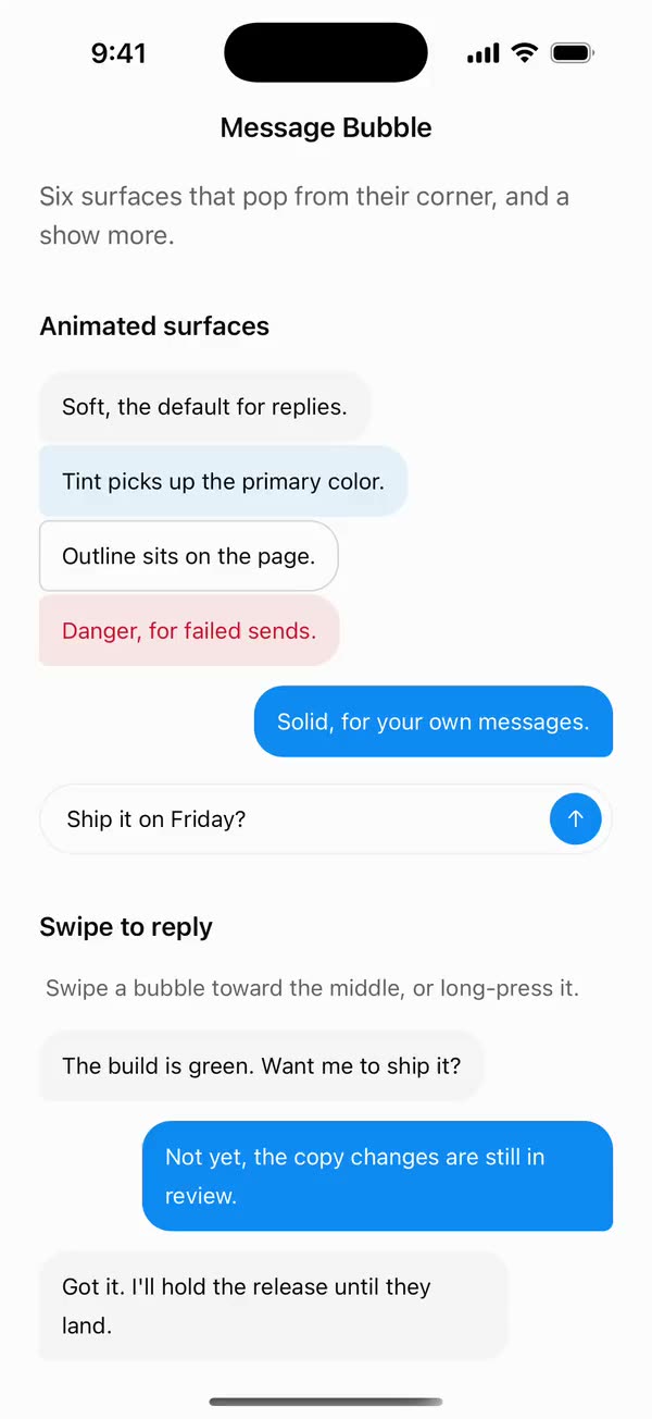
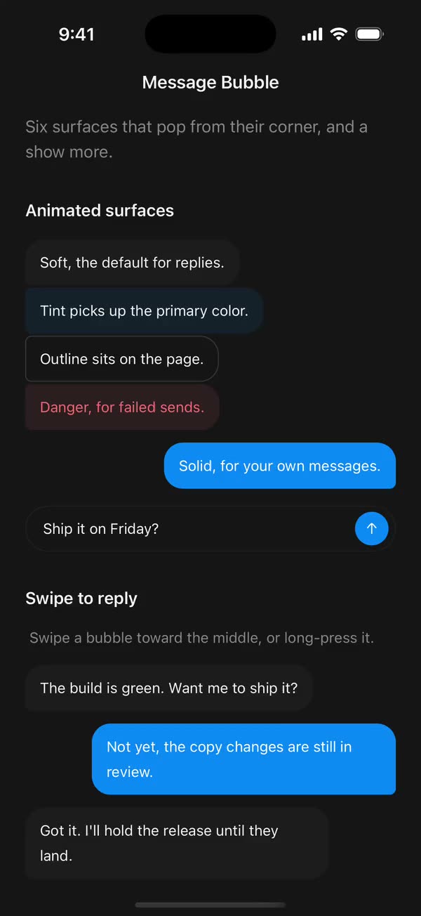
React NativeSix surfaces that pop from their corner, and a show more.
Preview
Install
Source on GitHubIt works in Expo and in bare React Native. New to beUI Native? Set up your app first.
Copies the component and the shared files it needs into src/, adds the theme tokens if they're missing, and installs its libraries. Files you've changed are kept.
Keep the folder layout, since the component imports the shared files by relative path.
1Install the libraries
npx expo install react-native-gesture-handler react-native-reanimated react-native-svg react-native-worklets
npm install uniwind tailwindcss
Wrap your app in GestureHandlerRootView if it isn't already.
2Add the theme tokens
Once per app. Import it from the CSS file Uniwind reads, after Tailwind and Uniwind, and change the values to match your brand.
/* Matches the default beUI palette in ui-components/lib/themes.ts.
   Native surface maps to card; muted maps to muted-foreground. */
@layer theme {
  :root {
    @variant light {
      --color-background: oklch(99% 0 0);
      --color-surface: oklch(97% 0 0);
      --color-foreground: oklch(15% 0 0);
      --color-muted: oklch(50% 0 0);
      --color-border: oklch(15% 0 0 / 0.06);
      --color-border-strong: oklch(15% 0 0 / 0.16);
      --color-primary: #0285f7;
      --color-on-primary: #ffffff;
      --color-destructive: #dc2626;
      --color-success: #059669;
      --color-warning: #d97706;
    }
  }

  :root {
    @variant dark {
      --color-background: #151515;
      --color-surface: #1c1c1c;
      --color-foreground: oklch(96% 0 0);
      --color-muted: oklch(62% 0 0);
      --color-border: rgb(255 255 255 / 0.05);
      --color-border-strong: rgb(255 255 255 / 0.14);
      --color-primary: #0285f7;
      --color-on-primary: #ffffff;
      --color-destructive: #f87171;
      --color-success: #34d399;
      --color-warning: #fbbf24;
    }
  }

  /* Tailwind's default monospace stack isn't a font React Native can load. */
  :root {
    @variant ios {
      --font-mono: Menlo;
    }
  }

  :root {
    @variant android {
      --font-mono: monospace;
    }
  }
}
3Copy the shared files
import { useEffect, useState } from "react";
import { AccessibilityInfo } from "react-native";
import { useReducedMotion } from "react-native-reanimated";

/** Reanimated supplies a synchronous initial value; native events keep it current. */
export function useReducedMotionPreference() {
  const initialValue = useReducedMotion();
  const [reducedMotion, setReducedMotion] = useState(initialValue);

  useEffect(() => {
    let active = true;
    let receivedEvent = false;
    const subscription = AccessibilityInfo.addEventListener(
      "reduceMotionChanged",
      (value) => {
        receivedEvent = true;
        setReducedMotion(value);
      },
    );
    void AccessibilityInfo.isReduceMotionEnabled().then((value) => {
      if (active && !receivedEvent) setReducedMotion(value);
    });
    return () => {
      active = false;
      subscription.remove();
    };
  }, []);

  return reducedMotion;
}
import type { ReactNode } from "react";
import type { ColorValue } from "react-native";
import Svg, { Circle, Path, Rect } from "react-native-svg";

type GlyphProps = { size?: number; color?: ColorValue; strokeWidth?: number };

function Glyph({
  size = 16,
  color = "currentColor",
  strokeWidth = 2,
  children,
}: GlyphProps & { children: ReactNode }) {
  return (
    <Svg
      width={size}
      height={size}
      viewBox="0 0 24 24"
      fill="none"
      stroke={color}
      strokeWidth={strokeWidth}
      strokeLinecap="round"
      strokeLinejoin="round"
    >
      {children}
    </Svg>
  );
}

// Simple 24-unit stroke glyphs shared by the agent components.

export function ChevronDownGlyph(props: GlyphProps) {
  return (
    <Glyph {...props}>
      <Path d="M6 9l6 6 6-6" />
    </Glyph>
  );
}

export function ArrowUpGlyph(props: GlyphProps) {
  return (
    <Glyph {...props}>
      <Path d="M12 19V5M5.5 11.5L12 5l6.5 6.5" />
    </Glyph>
  );
}

export function PlusGlyph(props: GlyphProps) {
  return (
    <Glyph {...props}>
      <Path d="M12 5v14M5 12h14" />
    </Glyph>
  );
}

export function StopGlyph({ size = 12, color }: GlyphProps) {
  return (
    <Svg width={size} height={size} viewBox="0 0 12 12">
      <Rect x={1} y={1} width={10} height={10} rx={2.5} fill={color} />
    </Svg>
  );
}

export function CheckGlyph(props: GlyphProps) {
  return (
    <Glyph {...props}>
      <Path d="M5 12.5l4.5 4.5L19 7" />
    </Glyph>
  );
}

export function CopyGlyph(props: GlyphProps) {
  return (
    <Glyph {...props}>
      <Rect x={8.5} y={8.5} width={12} height={12} rx={2.5} />
      <Path d="M15.5 5.5v-.5A2 2 0 0 0 13.5 3h-8.5A2 2 0 0 0 3 5v8.5a2 2 0 0 0 2 2h.5" />
    </Glyph>
  );
}

export function RetryGlyph(props: GlyphProps) {
  return (
    <Glyph {...props}>
      <Path d="M3.5 12a8.5 8.5 0 1 0 2.6-6.1L3.5 8.5" />
      <Path d="M3.5 3.5v5h5" />
    </Glyph>
  );
}

export function ThumbGlyph({
  down = false,
  ...props
}: GlyphProps & { down?: boolean }) {
  return (
    <Glyph {...props}>
      <Path
        d="M7.5 10.5v10M7.5 10.5L11 3.5a2.5 2.5 0 0 1 2.5 2.5v3.5h5a2 2 0 0 1 2 2.3l-1.2 7A2 2 0 0 1 17.3 20.5H4.5a1 1 0 0 1-1-1v-8a1 1 0 0 1 1-1z"
        transform={down ? "rotate(180 12 12)" : undefined}
      />
    </Glyph>
  );
}

export function SearchGlyph(props: GlyphProps) {
  return (
    <Glyph {...props}>
      <Circle cx={11} cy={11} r={6.5} />
      <Path d="M16 16l4 4" />
    </Glyph>
  );
}

export function GlobeGlyph(props: GlyphProps) {
  return (
    <Glyph {...props}>
      <Circle cx={12} cy={12} r={8.5} />
      <Path d="M3.5 12h17M12 3.5c2.4 2.5 3.5 5.3 3.5 8.5s-1.1 6-3.5 8.5c-2.4-2.5-3.5-5.3-3.5-8.5s1.1-6 3.5-8.5z" />
    </Glyph>
  );
}

export function FileGlyph(props: GlyphProps) {
  return (
    <Glyph {...props}>
      <Path d="M14 3.5H7.5a2 2 0 0 0-2 2v13a2 2 0 0 0 2 2h9a2 2 0 0 0 2-2V8z" />
      <Path d="M14 3.5V8h4.5M9 13h6M9 16.5h4" />
    </Glyph>
  );
}

export function PencilGlyph(props: GlyphProps) {
  return (
    <Glyph {...props}>
      <Path d="M4 20h4L19 9a2.1 2.1 0 0 0-4-4L4 16z" />
      <Path d="M13.5 6.5l4 4M14 20h6" />
    </Glyph>
  );
}

export function TerminalGlyph(props: GlyphProps) {
  return (
    <Glyph {...props}>
      <Rect x={3.5} y={4.5} width={17} height={15} rx={2.5} />
      <Path d="M7.5 10l2.5 2-2.5 2M12.5 15h4" />
    </Glyph>
  );
}

export function WrenchGlyph(props: GlyphProps) {
  return (
    <Glyph {...props}>
      <Path d="M14.5 6.5a4 4 0 0 0 5 5l-8.8 8.8a2.1 2.1 0 0 1-3-3l8.8-8.8a4 4 0 0 1-2-2z" />
    </Glyph>
  );
}

export function SparkleGlyph(props: GlyphProps) {
  return (
    <Glyph {...props}>
      <Path d="M12 4l1.8 4.6L18.5 10.5l-4.7 1.9L12 17l-1.8-4.6-4.7-1.9 4.7-1.9z" />
      <Path d="M18.5 16.5v3M17 18h3" />
    </Glyph>
  );
}

export function MessageGlyph(props: GlyphProps) {
  return (
    <Glyph {...props}>
      <Path d="M20 14.5a2 2 0 0 1-2 2H8.5L4 20V6a2 2 0 0 1 2-2h12a2 2 0 0 1 2 2z" />
    </Glyph>
  );
}

export function ImageGlyph(props: GlyphProps) {
  return (
    <Glyph {...props}>
      <Rect x={3.5} y={4.5} width={17} height={15} rx={2.5} />
      <Circle cx={9} cy={10} r={1.5} />
      <Path d="M20.5 15.5l-4.5-4.5-9 8.5" />
    </Glyph>
  );
}

export function ShieldGlyph(props: GlyphProps) {
  return (
    <Glyph {...props}>
      <Path d="M12 3.5l7 2.5v5.5c0 4.4-3 7.7-7 9-4-1.3-7-4.6-7-9V6z" />
      <Path d="M9 12l2 2 4-4" />
    </Glyph>
  );
}

export function AlertGlyph(props: GlyphProps) {
  return (
    <Glyph {...props}>
      <Circle cx={12} cy={12} r={8.5} />
      <Path d="M12 8v4.5M12 16h.01" />
    </Glyph>
  );
}

export function CrossGlyph(props: GlyphProps) {
  return (
    <Glyph {...props}>
      <Path d="M6.5 6.5l11 11M17.5 6.5l-11 11" />
    </Glyph>
  );
}

export function HelpGlyph(props: GlyphProps) {
  return (
    <Glyph {...props}>
      <Circle cx={12} cy={12} r={8.5} />
      <Path d="M9.6 9.5a2.5 2.5 0 0 1 4.8 1c0 1.7-2.4 2.2-2.4 3.5M12 16.8h.01" />
    </Glyph>
  );
}

export function ArrowGlyph({
  back = false,
  ...props
}: GlyphProps & { back?: boolean }) {
  return (
    <Glyph {...props}>
      <Path
        d="M5 12h14M13 6l6 6-6 6"
        transform={back ? "rotate(180 12 12)" : undefined}
      />
    </Glyph>
  );
}

export function BracesGlyph(props: GlyphProps) {
  return (
    <Glyph {...props}>
      <Path d="M8.5 4H8a2 2 0 0 0-2 2v3.5A2.5 2.5 0 0 1 3.5 12 2.5 2.5 0 0 1 6 14.5V18a2 2 0 0 0 2 2h.5M15.5 4h.5a2 2 0 0 1 2 2v3.5a2.5 2.5 0 0 0 2.5 2.5 2.5 2.5 0 0 0-2.5 2.5V18a2 2 0 0 1-2 2h-.5" />
    </Glyph>
  );
}

export function BanGlyph(props: GlyphProps) {
  return (
    <Glyph {...props}>
      <Circle cx={12} cy={12} r={8.5} />
      <Path d="M6 6l12 12" />
    </Glyph>
  );
}

export function CircleCheckGlyph(props: GlyphProps) {
  return (
    <Glyph {...props}>
      <Circle cx={12} cy={12} r={8.5} />
      <Path d="M8.5 12.2l2.4 2.4 4.6-4.8" />
    </Glyph>
  );
}

export function CircleCrossGlyph(props: GlyphProps) {
  return (
    <Glyph {...props}>
      <Circle cx={12} cy={12} r={8.5} />
      <Path d="M9.5 9.5l5 5M14.5 9.5l-5 5" />
    </Glyph>
  );
}

export function ListGlyph(props: GlyphProps) {
  return (
    <Glyph {...props}>
      <Path d="M4 6.5l1.5 1.5L8 5.5M4 13l1.5 1.5L8 12M11.5 7h8.5M11.5 13.5h8.5M11.5 19h8.5M4.5 19h2" />
    </Glyph>
  );
}

/** An open ring, spun by SpinGlyph. */
export function RingGlyph(props: GlyphProps) {
  return (
    <Glyph {...props}>
      <Path d="M20.5 12a8.5 8.5 0 1 1-6-8.1" />
    </Glyph>
  );
}

export function ReplyGlyph(props: GlyphProps) {
  return (
    <Glyph {...props}>
      <Path d="M9.5 7L4.5 12l5 5M4.5 12h10a5 5 0 0 1 5 5v1" />
    </Glyph>
  );
}

export function WrapGlyph(props: GlyphProps) {
  return (
    <Glyph {...props}>
      <Path d="M4 6.5h16M4 12h12.5a3.25 3.25 0 0 1 0 6.5H12M4 18.5h4.5M14 16.5l-2 2 2 2" />
    </Glyph>
  );
}

export function BookGlyph(props: GlyphProps) {
  return (
    <Glyph {...props}>
      <Path d="M12 6.5c-1.6-1.3-4-2-7.5-2v13c3.5 0 5.9.7 7.5 2 1.6-1.3 4-2 7.5-2v-13c-3.5 0-5.9.7-7.5 2zM12 6.5v13" />
    </Glyph>
  );
}

export function ExternalGlyph(props: GlyphProps) {
  return (
    <Glyph {...props}>
      <Path d="M14 4.5h5.5V10M19.5 4.5L11 13M17 14v4a2 2 0 0 1-2 2H6a2 2 0 0 1-2-2V9a2 2 0 0 1 2-2h4" />
    </Glyph>
  );
}

export function DoubleCheckGlyph(props: GlyphProps) {
  return (
    <Glyph {...props}>
      <Path d="M2.5 12.5l4.5 4.5 9-9.5M12 16.5l.5.5 9-9.5" />
    </Glyph>
  );
}

export function ClockGlyph(props: GlyphProps) {
  return (
    <Glyph {...props}>
      <Circle cx={12} cy={12} r={8.5} />
      <Path d="M12 7.5V12l3 2" />
    </Glyph>
  );
}

export function MicGlyph(props: GlyphProps) {
  return (
    <Glyph {...props}>
      <Rect x={9} y={3.5} width={6} height={11} rx={3} />
      <Path d="M5.5 11a6.5 6.5 0 0 0 13 0M12 17.5v3" />
    </Glyph>
  );
}
import {
  type ColorValue,
  StyleSheet,
  View,
  type ViewStyle,
} from "react-native";

const BANDS = 8;

export type FadeEdgeProps = {
  /** The surface color the content fades into. */
  color: ColorValue | undefined;
  /** Which edge is solid. Defaults to "bottom". */
  edge?: "top" | "bottom";
  /** Height of the fade in points. */
  height: number;
  style?: ViewStyle;
};

/**
 * A soft edge over clipped content, built from stacked bands so shared
 * components need no gradient library. Ignores touches.
 */
export function FadeEdge({
  color,
  edge = "bottom",
  height,
  style,
}: FadeEdgeProps) {
  return (
    <View
      pointerEvents="none"
      style={[
        styles.edge,
        edge === "bottom" ? styles.bottom : styles.top,
        { height },
        style,
      ]}
    >
      {Array.from({ length: BANDS }, (_, index) => {
        const t = (index + 1) / BANDS;
        return (
          <View
            key={index}
            style={{
              flex: 1,
              backgroundColor: color,
              // Ease the ramp so the fade has no visible first step.
              opacity: edge === "bottom" ? t * t : (1 - t + 1 / BANDS) ** 2,
            }}
          />
        );
      })}
    </View>
  );
}

const styles = StyleSheet.create({
  edge: { position: "absolute", left: 0, right: 0 },
  bottom: { bottom: 0 },
  top: { top: 0 },
});
import { Easing, ReduceMotion } from "react-native-reanimated";

// Mirrors beUI's lib/ease.ts so native motion matches the web library.

export const EASE_OUT = Easing.bezier(0.16, 1, 0.3, 1);
export const EASE_IN_OUT = Easing.bezier(0.77, 0, 0.175, 1);

/** Press feedback on buttons and other tappable surfaces. */
export const SPRING_PRESS = {
  stiffness: 500,
  damping: 30,
  mass: 0.6,
  reduceMotion: ReduceMotion.System,
} as const;

/** Content swaps: label and icon slots trading places inside a control. */
export const SPRING_SWAP = {
  stiffness: 460,
  damping: 30,
  mass: 0.55,
  reduceMotion: ReduceMotion.System,
} as const;

/** Shared-layout glides: pills, indicators and panels moving between positions. */
export const SPRING_LAYOUT = {
  stiffness: 360,
  damping: 32,
  mass: 0.6,
  reduceMotion: ReduceMotion.System,
} as const;

/** Dragged handles and fills; critically damped so values never rebound off an end. */
export const SPRING_GLIDE = {
  stiffness: 700,
  damping: 50,
  mass: 0.5,
  reduceMotion: ReduceMotion.System,
} as const;

export const motion = {
  press: SPRING_PRESS,
  swap: SPRING_SWAP,
  layout: SPRING_LAYOUT,
  glide: SPRING_GLIDE,
  exit: { duration: 160, easing: EASE_OUT, reduceMotion: ReduceMotion.System },
  fade: { duration: 150, reduceMotion: ReduceMotion.System },
} as const;
4Copy the component
export type {
  MessageBubbleAlign,
  MessageBubbleCollapsibleProps,
  MessageBubbleGroupProps,
  MessageBubblePosition,
  MessageBubbleProps,
  MessageBubbleTextProps,
  MessageBubbleVariant,
} from "./message-bubble";
export {
  MessageBubble,
  MessageBubbleCollapsible,
  MessageBubbleGroup,
  MessageBubbleText,
  MessageSideContext,
} from "./message-bubble";
import {
  Children,
  createContext,
  isValidElement,
  type ReactNode,
  type Ref,
  useContext,
  useEffect,
  useState,
} from "react";
import {
  Pressable,
  type PressableProps,
  StyleSheet,
  Text,
  type TextProps,
  View,
  type ViewProps,
} from "react-native";
import { Gesture, GestureDetector } from "react-native-gesture-handler";
import Animated, {
  ReduceMotion,
  useAnimatedStyle,
  useSharedValue,
  withDelay,
  withSequence,
  withSpring,
  withTiming,
} from "react-native-reanimated";
import { scheduleOnRN } from "react-native-worklets";
import { useResolveClassNames } from "uniwind";
import { useReducedMotionPreference } from "../../hooks/use-reduced-motion";
import { ChevronDownGlyph, ReplyGlyph } from "../../primitives/agent-icons";
import { FadeEdge } from "../../primitives/fade-edge";
import {
  EASE_OUT,
  SPRING_LAYOUT,
  SPRING_PRESS,
  SPRING_SWAP,
} from "../../styles/motion";

export type MessageBubbleVariant =
  | "solid"
  | "soft"
  | "tint"
  | "outline"
  | "ghost"
  | "danger";
export type MessageBubbleAlign = "start" | "end";
/** Where a bubble falls in a run of bubbles from one side. */
export type MessageBubblePosition = "single" | "first" | "middle" | "last";

const ROUND = 18;
const TIGHT = 6;

/**
 * Chat corners: the bottom corner on the sender's side tightens into a tail
 * hint, and bubbles after the first in a run tighten their top corner too, so
 * a run reads as one voice.
 */
function corners(align: MessageBubbleAlign, position: MessageBubblePosition) {
  const top = position === "middle" || position === "last" ? TIGHT : ROUND;
  return align === "end"
    ? {
        borderTopLeftRadius: ROUND,
        borderBottomLeftRadius: ROUND,
        borderTopRightRadius: top,
        borderBottomRightRadius: TIGHT,
      }
    : {
        borderTopRightRadius: ROUND,
        borderBottomRightRadius: ROUND,
        borderTopLeftRadius: top,
        borderBottomLeftRadius: TIGHT,
      };
}

const PositionContext = createContext<MessageBubblePosition | undefined>(
  undefined,
);

/** Which side a message sits on. Message provides it; bubbles default to it. */
export const MessageSideContext = createContext<MessageBubbleAlign | undefined>(
  undefined,
);

type BubbleContextValue = { variant: MessageBubbleVariant };
const BubbleContext = createContext<BubbleContextValue>({ variant: "soft" });

// Full class strings, so Uniwind can see every token at build time.
const SURFACE_CLASS: Record<MessageBubbleVariant, string> = {
  solid: "bg-primary",
  soft: "bg-surface",
  tint: "bg-primary/10",
  outline: "border border-border-strong bg-background",
  ghost: "",
  danger: "bg-destructive/10",
};
const TEXT_CLASS: Record<MessageBubbleVariant, string> = {
  solid: "text-on-primary",
  soft: "text-foreground",
  tint: "text-foreground",
  outline: "text-foreground",
  ghost: "text-foreground",
  danger: "text-destructive",
};

// One restrained overshoot as the surface pops out of its corner.
const BUBBLE_POP = {
  stiffness: 520,
  damping: 27,
  mass: 0.52,
  reduceMotion: ReduceMotion.System,
};
const POP_FADE = { duration: 120, easing: EASE_OUT };
const CONTENT_DELAY = 40;
const LINE_HEIGHT = 24;
// How far to drag before letting go replies.
const REPLY_AT = 56;

export type MessageBubbleTextProps = TextProps & { className?: string };

/** Body text in the bubble's color. Plain strings are wrapped in it for you. */
export function MessageBubbleText({
  className = "",
  ...props
}: MessageBubbleTextProps) {
  const { variant } = useContext(BubbleContext);
  return (
    <Text
      className={`text-sm leading-6 ${TEXT_CLASS[variant]} ${className}`}
      {...props}
    />
  );
}

function wrapText(children: ReactNode) {
  return Children.map(children, (child) =>
    typeof child === "string" || typeof child === "number" ? (
      <MessageBubbleText>{child}</MessageBubbleText>
    ) : (
      child
    ),
  );
}

export type MessageBubbleProps = Omit<ViewProps, "children"> & {
  /** Defaults to "soft". */
  variant?: MessageBubbleVariant;
  /** Defaults to the surrounding Message's side, then "start". */
  align?: MessageBubbleAlign;
  /** Pops the surface out of its corner once, on mount. Defaults to false. */
  animateIn?: boolean;
  /** Its place in a run, for the corners. MessageBubbleGroup sets it for you. */
  position?: MessageBubblePosition;
  /** Makes the whole bubble tappable, with press feedback. */
  onPress?: PressableProps["onPress"];
  /** Lifts the bubble before firing, like a context menu opening. */
  onLongPress?: PressableProps["onLongPress"];
  /**
   * Swipe the bubble toward the middle of the screen to reply. A reply arrow
   * grows as you drag; letting go past it calls this.
   */
  onReply?: () => void;
  /** Classes for the bubble itself, such as padding or a max width. */
  contentClassName?: string;
  /** Pops in without motion, independently of the system preference. */
  disableAnimation?: boolean;
  className?: string;
  children?: ReactNode;
  ref?: Ref<View>;
};

/**
 * A chat bubble in one of six surfaces. Its surface pops out of the corner on
 * its side, and plain text inside takes the bubble's color.
 */
export function MessageBubble({
  variant = "soft",
  align: alignProp,
  animateIn = false,
  position: positionProp,
  onPress,
  onLongPress,
  onReply,
  contentClassName = "",
  disableAnimation = false,
  className = "",
  children,
  accessibilityLabel,
  accessibilityHint,
  ref,
  ...props
}: MessageBubbleProps) {
  const side = useContext(MessageSideContext);
  const align = alignProp ?? side ?? "start";
  const groupPosition = useContext(PositionContext);
  const radii = corners(align, positionProp ?? groupPosition ?? "single");
  const reducedMotion = useReducedMotionPreference();
  const reduce = reducedMotion || disableAnimation;
  const pop = animateIn && !reduce;
  const scale = useSharedValue(pop ? 0.92 : 1);
  const surfaceOpacity = useSharedValue(pop ? 0 : 1);
  const contentOpacity = useSharedValue(pop ? 0 : 1);
  const pressed = useSharedValue(1);
  const drag = useSharedValue(0);
  const armed = useSharedValue(0);
  const ghost = variant === "ghost";
  // Toward the middle of the screen: right for start bubbles, left for end.
  const direction = align === "end" ? -1 : 1;
  const { color: muted } = useResolveClassNames("text-muted");
  const interactive = Boolean(onPress || onLongPress);

  // Plays once, on mount.
  useEffect(() => {
    if (!pop) return;
    scale.value = withSpring(1, BUBBLE_POP);
    surfaceOpacity.value = withTiming(1, POP_FADE);
    contentOpacity.value = withDelay(CONTENT_DELAY, withTiming(1, POP_FADE));
  }, []);

  const surfaceStyle = useAnimatedStyle(() => ({
    opacity: surfaceOpacity.value,
    transform: [{ scale: scale.value * pressed.value }],
  }));
  const contentStyle = useAnimatedStyle(() => ({
    opacity: contentOpacity.value,
    transform: [{ scale: pressed.value }],
  }));

  const reply = () => onReply?.();
  const swipe = Gesture.Pan()
    .enabled(Boolean(onReply))
    .activeOffsetX(direction > 0 ? [-999, 12] : [-12, 999])
    .failOffsetY([-10, 10])
    .onUpdate((event) => {
      const pull = Math.max(0, event.translationX * direction);
      // Follows the finger up to the threshold, then resists.
      const travel =
        pull < REPLY_AT ? pull : REPLY_AT + (pull - REPLY_AT) * 0.25;
      drag.value = travel * direction;
      const nowArmed = pull >= REPLY_AT ? 1 : 0;
      if (nowArmed !== armed.value) {
        armed.value = nowArmed;
      }
    })
    .onEnd(() => {
      if (armed.value === 1) scheduleOnRN(reply);
      armed.value = 0;
      drag.value = withSpring(0, SPRING_SWAP);
    });

  const dragStyle = useAnimatedStyle(() => ({
    transform: [{ translateX: drag.value }],
  }));
  const arrowStyle = useAnimatedStyle(() => {
    const progress = Math.min(1, Math.abs(drag.value) / REPLY_AT);
    return {
      opacity: progress,
      transform: [
        {
          scale: withSpring(
            armed.value ? 1.15 : 0.6 + progress * 0.4,
            SPRING_SWAP,
          ),
        },
      ],
    };
  });

  const bubble = (
    <View
      style={[
        ghost ? styles.ghost : [styles.bubble, radii],
        align === "end" ? styles.end : styles.start,
      ]}
      className={ghost ? contentClassName : `px-3.5 py-2.5 ${contentClassName}`}
    >
      {ghost ? null : (
        <Animated.View
          pointerEvents="none"
          style={[
            StyleSheet.absoluteFill,
            radii,
            { transformOrigin: [align === "end" ? "100%" : "0%", "100%", 0] },
            surfaceStyle,
          ]}
          className={SURFACE_CLASS[variant]}
        />
      )}
      <Animated.View style={contentStyle}>{wrapText(children)}</Animated.View>
    </View>
  );

  return (
    <BubbleContext.Provider value={{ variant }}>
      <View
        ref={ref}
        style={[
          styles.row,
          { alignItems: align === "end" ? "flex-end" : "flex-start" },
        ]}
        className={className}
        accessibilityActions={
          onReply ? [{ name: "reply", label: "Reply" }] : undefined
        }
        onAccessibilityAction={(event) => {
          if (event.nativeEvent.actionName === "reply") onReply?.();
        }}
        {...props}
      >
        {onReply ? (
          <Animated.View
            pointerEvents="none"
            style={[
              styles.arrow,
              align === "end" ? styles.arrowEnd : styles.arrowStart,
              arrowStyle,
            ]}
          >
            <ReplyGlyph size={18} color={muted} />
          </Animated.View>
        ) : null}
        <GestureDetector gesture={swipe}>
          <Animated.View
            style={[
              ghost ? styles.ghost : styles.swipe,
              align === "end" ? styles.end : styles.start,
              dragStyle,
            ]}
          >
            {interactive ? (
              <Pressable
                accessibilityRole="button"
                accessibilityLabel={accessibilityLabel}
                accessibilityHint={accessibilityHint}
                onPress={onPress}
                onLongPress={
                  onLongPress
                    ? (event) => {
                        if (!reduce) {
                          pressed.value = withSequence(
                            withSpring(1.04, SPRING_PRESS),
                            withSpring(1, SPRING_PRESS),
                          );
                        }
                        onLongPress(event);
                      }
                    : undefined
                }
                onPressIn={() => {
                  if (!reduce) pressed.value = withSpring(0.98, SPRING_PRESS);
                }}
                onPressOut={() => {
                  pressed.value = withSpring(1, SPRING_PRESS);
                }}
                style={[
                  styles.pressable,
                  align === "end" ? styles.end : styles.start,
                ]}
              >
                {bubble}
              </Pressable>
            ) : (
              bubble
            )}
          </Animated.View>
        </GestureDetector>
      </View>
    </BubbleContext.Provider>
  );
}

export type MessageBubbleGroupProps = ViewProps & {
  /** Space between runs from different sides: 6 (compact) or 12 points. Defaults to "compact". */
  spacing?: "compact" | "default";
  className?: string;
};

const RUN_GAP = 2;

/**
 * Stacks bubbles and joins consecutive ones from the same side into runs:
 * they sit 2 points apart with tightened corners, and runs sit further apart.
 */
export function MessageBubbleGroup({
  spacing = "compact",
  className = "",
  children,
  ...props
}: MessageBubbleGroupProps) {
  const side = useContext(MessageSideContext);
  const items = Children.toArray(children);
  const alignOf = (child: ReactNode) =>
    (isValidElement<{ align?: MessageBubbleAlign }>(child)
      ? child.props.align
      : undefined) ??
    side ??
    "start";
  const gap = spacing === "compact" ? 6 : 12;
  return (
    <View className={`w-full ${className}`} {...props}>
      {items.map((child, index) => {
        const align = alignOf(child);
        const joinsPrevious = index > 0 && alignOf(items[index - 1]) === align;
        const joinsNext =
          index < items.length - 1 && alignOf(items[index + 1]) === align;
        const position: MessageBubblePosition = joinsPrevious
          ? joinsNext
            ? "middle"
            : "last"
          : joinsNext
            ? "first"
            : "single";
        return (
          <PositionContext.Provider
            key={isValidElement(child) && child.key != null ? child.key : index}
            value={position}
          >
            <View
              style={index > 0 && { marginTop: joinsPrevious ? RUN_GAP : gap }}
            >
              {child}
            </View>
          </PositionContext.Provider>
        );
      })}
    </View>
  );
}

export type MessageBubbleCollapsibleProps = {
  open?: boolean;
  /** Defaults to false. */
  defaultOpen?: boolean;
  onOpenChange?: (open: boolean) => void;
  /** Lines shown while collapsed, at the bubble's 24 point line height. Defaults to 4. */
  collapsedLines?: number;
  /** Defaults to "Show more". */
  moreLabel?: string;
  /** Defaults to "Show less". */
  lessLabel?: string;
  /** Pops open without motion, independently of the system preference. */
  disableAnimation?: boolean;
  children: ReactNode;
};

/**
 * Clamps a long bubble to a few lines with a soft edge, and springs it open
 * to its full height. The toggle only appears when the content overflows.
 */
export function MessageBubbleCollapsible({
  open: controlledOpen,
  defaultOpen = false,
  onOpenChange,
  collapsedLines = 4,
  moreLabel = "Show more",
  lessLabel = "Show less",
  disableAnimation = false,
  children,
}: MessageBubbleCollapsibleProps) {
  const { variant } = useContext(BubbleContext);
  const reducedMotion = useReducedMotionPreference();
  const reduce = reducedMotion || disableAnimation;
  const [internalOpen, setInternalOpen] = useState(defaultOpen);
  const open = controlledOpen ?? internalOpen;
  const [full, setFull] = useState(0);
  const collapsed = collapsedLines * LINE_HEIGHT;
  const overflows = full > collapsed + 1;
  const height = useSharedValue(collapsed);
  const turn = useSharedValue(open ? 1 : 0);
  const measured = full > 0;
  const surface = useResolveClassNames(
    SURFACE_CLASS[variant] || "bg-background",
  );
  const { color: tone } = useResolveClassNames(TEXT_CLASS[variant]);

  useEffect(() => {
    if (!measured) return;
    const target = open || !overflows ? full : collapsed;
    height.value = reduce ? target : withSpring(target, SPRING_LAYOUT);
    turn.value = reduce
      ? open
        ? 1
        : 0
      : withSpring(open ? 1 : 0, SPRING_SWAP);
  }, [collapsed, full, height, measured, open, overflows, reduce, turn]);

  const clipStyle = useAnimatedStyle(() => ({ height: height.value }));
  const fadeStyle = useAnimatedStyle(() => ({
    opacity: Math.min(1, Math.max(0, (full - height.value) / LINE_HEIGHT)),
  }));
  const chevronStyle = useAnimatedStyle(() => ({
    transform: [{ rotate: `${turn.value * 180}deg` }],
  }));

  const toggle = () => {
    const next = !open;
    if (controlledOpen === undefined) setInternalOpen(next);
    onOpenChange?.(next);
  };

  return (
    <View>
      <Animated.View style={[styles.clip, measured && clipStyle]}>
        {/* Keeps its full height inside the clip, so the clamp knows how far to open. */}
        <View
          style={styles.measure}
          onLayout={({ nativeEvent }) => setFull(nativeEvent.layout.height)}
        >
          {wrapText(children)}
        </View>
        {overflows ? (
          <Animated.View
            pointerEvents="none"
            style={[StyleSheet.absoluteFill, fadeStyle]}
          >
            <FadeEdge
              color={surface.backgroundColor}
              height={LINE_HEIGHT * 1.5}
            />
          </Animated.View>
        ) : null}
      </Animated.View>
      {overflows ? (
        <Pressable
          accessibilityRole="button"
          accessibilityState={{ expanded: open }}
          onPress={toggle}
          hitSlop={8}
          style={styles.toggle}
        >
          <Text
            className={`text-xs font-medium ${TEXT_CLASS[variant]} opacity-70`}
          >
            {open ? lessLabel : moreLabel}
          </Text>
          <Animated.View style={chevronStyle}>
            <ChevronDownGlyph size={12} color={tone} />
          </Animated.View>
        </Pressable>
      ) : null}
    </View>
  );
}

const styles = StyleSheet.create({
  row: { width: "100%" },
  bubble: { minWidth: 36 },
  ghost: { width: "100%" },
  pressable: { maxWidth: "100%" },
  swipe: { maxWidth: "82%" },
  arrow: { position: "absolute", top: 0, bottom: 0, justifyContent: "center" },
  arrowStart: { left: 4 },
  arrowEnd: { right: 4 },
  start: { alignSelf: "flex-start" },
  end: { alignSelf: "flex-end" },
  clip: { overflow: "hidden" },
  measure: { flexShrink: 0 },
  toggle: {
    flexDirection: "row",
    alignItems: "center",
    gap: 4,
    marginTop: 6,
    minHeight: 24,
    alignSelf: "flex-start",
  },
});
Documentation
Native port of beUI Message Bubble: chat bubbles in six surfaces.
import { MessageBubble, MessageBubbleCollapsible, MessageBubbleGroup } from "./src";

<MessageBubbleGroup spacing="default">
  <MessageBubble variant="solid" align="end" animateIn>
    Ship it on Friday?
  </MessageBubble>
  <MessageBubble>
    <MessageBubbleCollapsible collapsedLines={4}>{longReply}</MessageBubbleCollapsible>
  </MessageBubble>
</MessageBubbleGroup>
Surfaces
variant is soft (the default), solid, tint, outline, ghost or danger. A bubble is at most 82% of the row wide and sits on its align side, which defaults to the side of the surrounding Message. Plain strings take the bubble's text color; use MessageBubbleText for styled runs. ghost drops the surface and padding, for long assistant replies.
Corners and runs
Bubbles have chat corners: the bottom corner on the sender's side tightens into a tail hint. Inside MessageBubbleGroup, consecutive bubbles from the same side form a run. They sit 2 points apart, and every bubble after the first tightens its top corner on that side too, so the run reads as one voice. Runs from different sides sit 6 points apart, or 12 with spacing="default". The group works out each bubble's place for you; set position (single, first, middle or last) to choose it yourself.
Motion
animateInpops the surface out of the bottom corner on the bubble's side once, on mount: it scales from 0.92 on a spring with one small overshoot (stiffness 520, damping 27, mass 0.52) and fades in over 120 ms, and the text follows 40 ms later.onPressoronLongPressmakes the bubble a button that presses to 0.98.MessageBubbleCollapsibleclamps its content tocollapsedLineslines with a soft edge, and springs to its full height when opened. The toggle only appears when the content is taller than the clamp.
Better on a phone
onReplylets you swipe a bubble toward the middle of the screen to reply, as in Messages and WhatsApp. The bubble follows your finger and a reply arrow fades in; past 56 points the arrow pops and the drag resists, and letting go replies. The bubble springs back either way. Screen readers get a "Reply" action instead.onLongPresslifts the bubble with a small overshoot before it fires, so a context menu opens from a bubble that responded.
Accessibility
- A tappable bubble is a button; give it an
accessibilityLabelwhen its text alone doesn't say what tapping does. - The show more toggle reports its expanded state.
- Reduced motion, or
disableAnimation, shows bubbles without the pop and opens the clamp instantly.
Copy this directory, hooks/use-reduced-motion.ts, primitives/agent-icons.tsx, primitives/fade-edge.tsx, styles/motion.ts, and the semantic tokens in styles/theme.css. It uses react-native-svg for its icons and Gesture Handler for swipe to reply.