Toast
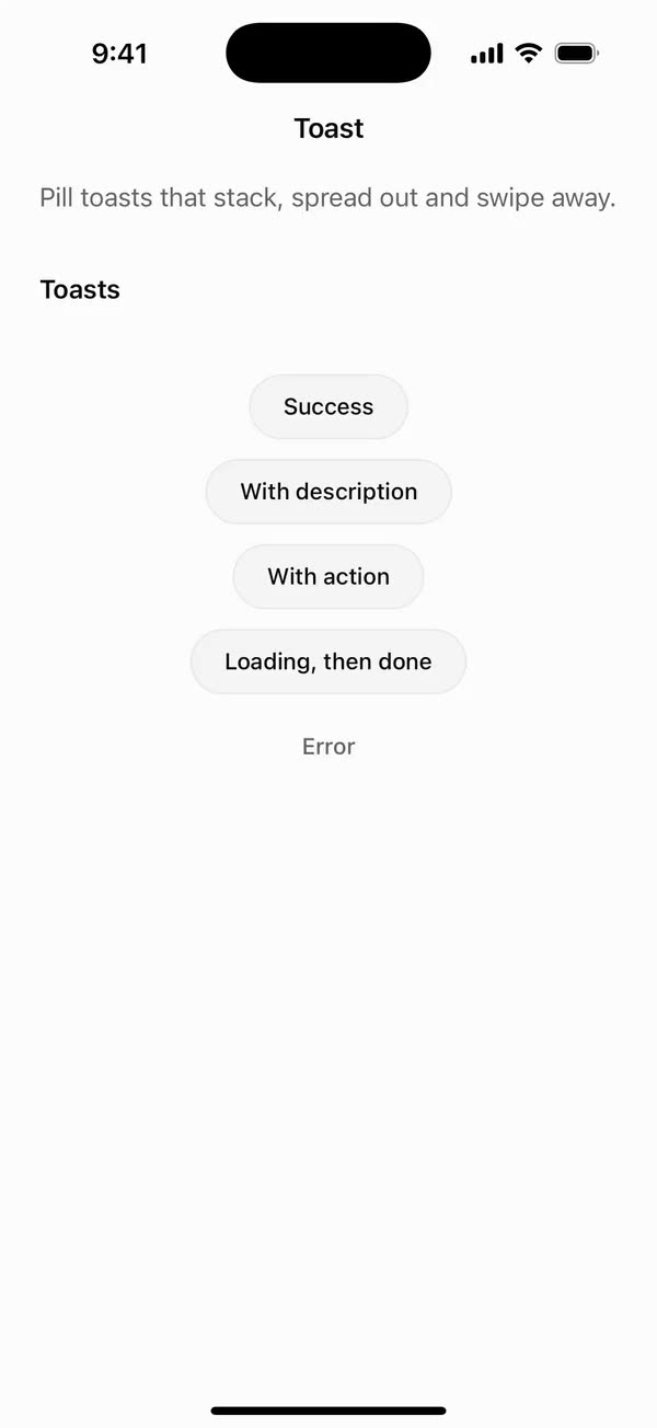
React NativePill toasts that stack, spread out and swipe away.
Preview
Install
Source on GitHubIt works in Expo and in bare React Native. New to beUI Native? Set up your app first.
Copies the component and the shared files it needs into src/, adds the theme tokens if they're missing, and installs its libraries. Files you've changed are kept.
Keep the folder layout, since the component imports the shared files by relative path.
1Install the libraries
npx expo install react-native-gesture-handler react-native-reanimated react-native-screens react-native-svg react-native-worklets
npm install uniwind tailwindcss
Wrap your app in GestureHandlerRootView if it isn't already.
2Add the theme tokens
Once per app. Import it from the CSS file Uniwind reads, after Tailwind and Uniwind, and change the values to match your brand.
/* Matches the default beUI palette in ui-components/lib/themes.ts.
   Native surface maps to card; muted maps to muted-foreground. */
@layer theme {
  :root {
    @variant light {
      --color-background: oklch(99% 0 0);
      --color-surface: oklch(97% 0 0);
      --color-foreground: oklch(15% 0 0);
      --color-muted: oklch(50% 0 0);
      --color-border: oklch(15% 0 0 / 0.06);
      --color-border-strong: oklch(15% 0 0 / 0.16);
      --color-primary: #0285f7;
      --color-on-primary: #ffffff;
      --color-destructive: #dc2626;
      --color-success: #059669;
      --color-warning: #d97706;
    }
  }

  :root {
    @variant dark {
      --color-background: #151515;
      --color-surface: #1c1c1c;
      --color-foreground: oklch(96% 0 0);
      --color-muted: oklch(62% 0 0);
      --color-border: rgb(255 255 255 / 0.05);
      --color-border-strong: rgb(255 255 255 / 0.14);
      --color-primary: #0285f7;
      --color-on-primary: #ffffff;
      --color-destructive: #f87171;
      --color-success: #34d399;
      --color-warning: #fbbf24;
    }
  }

  /* Tailwind's default monospace stack isn't a font React Native can load. */
  :root {
    @variant ios {
      --font-mono: Menlo;
    }
  }

  :root {
    @variant android {
      --font-mono: monospace;
    }
  }
}
3Copy the shared files
import { useEffect, useRef, useState } from "react";

export type PresenceItem<T> = {
  key: string;
  value: T;
  /** False for the item present on first render, so it does not animate in. */
  appear: boolean;
  exiting: boolean;
};

/**
 * Keeps replaced items mounted while they animate out, like AnimatePresence.
 * A key that returns while exiting is revived in place.
 */
export function usePresence<T>(
  key: string | null,
  value: T,
  exitDuration: (value: T) => number,
) {
  const [items, setItems] = useState<PresenceItem<T>[]>(() =>
    key === null ? [] : [{ key, value, appear: false, exiting: false }],
  );
  const [currentKey, setCurrentKey] = useState(key);
  const exitDurationRef = useRef(exitDuration);
  exitDurationRef.current = exitDuration;

  // Adjust during render so the new item and the exits start in the same frame.
  if (key !== currentKey) {
    setCurrentKey(key);
    setItems((previous) => {
      const next = previous.map((item) =>
        item.key === key
          ? { ...item, value, exiting: false }
          : { ...item, exiting: true },
      );
      if (key !== null && !previous.some((item) => item.key === key)) {
        next.push({ key, value, appear: true, exiting: false });
      }
      return next;
    });
  }

  const exitingKeys = items
    .filter((item) => item.exiting)
    .map((item) => item.key)
    .join("\n");

  useEffect(() => {
    if (!exitingKeys) return;
    const timers = items
      .filter((item) => item.exiting)
      .map((item) =>
        setTimeout(() => {
          setItems((previous) =>
            previous.filter(
              (candidate) => !(candidate.key === item.key && candidate.exiting),
            ),
          );
        }, exitDurationRef.current(item.value)),
      );
    return () => {
      for (const timer of timers) clearTimeout(timer);
    };
    // Restart removal timers only when the set of exiting items changes.
  }, [exitingKeys]);

  return items;
}
import { useEffect, useState } from "react";
import { AccessibilityInfo } from "react-native";
import { useReducedMotion } from "react-native-reanimated";

/** Reanimated supplies a synchronous initial value; native events keep it current. */
export function useReducedMotionPreference() {
  const initialValue = useReducedMotion();
  const [reducedMotion, setReducedMotion] = useState(initialValue);

  useEffect(() => {
    let active = true;
    let receivedEvent = false;
    const subscription = AccessibilityInfo.addEventListener(
      "reduceMotionChanged",
      (value) => {
        receivedEvent = true;
        setReducedMotion(value);
      },
    );
    void AccessibilityInfo.isReduceMotionEnabled().then((value) => {
      if (active && !receivedEvent) setReducedMotion(value);
    });
    return () => {
      active = false;
      subscription.remove();
    };
  }, []);

  return reducedMotion;
}
import type { ReactNode } from "react";
import type { ColorValue } from "react-native";
import Svg, { Circle, Path, Rect } from "react-native-svg";

type GlyphProps = { size?: number; color?: ColorValue; strokeWidth?: number };

function Glyph({
  size = 16,
  color = "currentColor",
  strokeWidth = 2,
  children,
}: GlyphProps & { children: ReactNode }) {
  return (
    <Svg
      width={size}
      height={size}
      viewBox="0 0 24 24"
      fill="none"
      stroke={color}
      strokeWidth={strokeWidth}
      strokeLinecap="round"
      strokeLinejoin="round"
    >
      {children}
    </Svg>
  );
}

// Simple 24-unit stroke glyphs shared by the agent components.

export function ChevronDownGlyph(props: GlyphProps) {
  return (
    <Glyph {...props}>
      <Path d="M6 9l6 6 6-6" />
    </Glyph>
  );
}

export function ArrowUpGlyph(props: GlyphProps) {
  return (
    <Glyph {...props}>
      <Path d="M12 19V5M5.5 11.5L12 5l6.5 6.5" />
    </Glyph>
  );
}

export function PlusGlyph(props: GlyphProps) {
  return (
    <Glyph {...props}>
      <Path d="M12 5v14M5 12h14" />
    </Glyph>
  );
}

export function StopGlyph({ size = 12, color }: GlyphProps) {
  return (
    <Svg width={size} height={size} viewBox="0 0 12 12">
      <Rect x={1} y={1} width={10} height={10} rx={2.5} fill={color} />
    </Svg>
  );
}

export function CheckGlyph(props: GlyphProps) {
  return (
    <Glyph {...props}>
      <Path d="M5 12.5l4.5 4.5L19 7" />
    </Glyph>
  );
}

export function CopyGlyph(props: GlyphProps) {
  return (
    <Glyph {...props}>
      <Rect x={8.5} y={8.5} width={12} height={12} rx={2.5} />
      <Path d="M15.5 5.5v-.5A2 2 0 0 0 13.5 3h-8.5A2 2 0 0 0 3 5v8.5a2 2 0 0 0 2 2h.5" />
    </Glyph>
  );
}

export function RetryGlyph(props: GlyphProps) {
  return (
    <Glyph {...props}>
      <Path d="M3.5 12a8.5 8.5 0 1 0 2.6-6.1L3.5 8.5" />
      <Path d="M3.5 3.5v5h5" />
    </Glyph>
  );
}

export function ThumbGlyph({
  down = false,
  ...props
}: GlyphProps & { down?: boolean }) {
  return (
    <Glyph {...props}>
      <Path
        d="M7.5 10.5v10M7.5 10.5L11 3.5a2.5 2.5 0 0 1 2.5 2.5v3.5h5a2 2 0 0 1 2 2.3l-1.2 7A2 2 0 0 1 17.3 20.5H4.5a1 1 0 0 1-1-1v-8a1 1 0 0 1 1-1z"
        transform={down ? "rotate(180 12 12)" : undefined}
      />
    </Glyph>
  );
}

export function SearchGlyph(props: GlyphProps) {
  return (
    <Glyph {...props}>
      <Circle cx={11} cy={11} r={6.5} />
      <Path d="M16 16l4 4" />
    </Glyph>
  );
}

export function GlobeGlyph(props: GlyphProps) {
  return (
    <Glyph {...props}>
      <Circle cx={12} cy={12} r={8.5} />
      <Path d="M3.5 12h17M12 3.5c2.4 2.5 3.5 5.3 3.5 8.5s-1.1 6-3.5 8.5c-2.4-2.5-3.5-5.3-3.5-8.5s1.1-6 3.5-8.5z" />
    </Glyph>
  );
}

export function FileGlyph(props: GlyphProps) {
  return (
    <Glyph {...props}>
      <Path d="M14 3.5H7.5a2 2 0 0 0-2 2v13a2 2 0 0 0 2 2h9a2 2 0 0 0 2-2V8z" />
      <Path d="M14 3.5V8h4.5M9 13h6M9 16.5h4" />
    </Glyph>
  );
}

export function PencilGlyph(props: GlyphProps) {
  return (
    <Glyph {...props}>
      <Path d="M4 20h4L19 9a2.1 2.1 0 0 0-4-4L4 16z" />
      <Path d="M13.5 6.5l4 4M14 20h6" />
    </Glyph>
  );
}

export function TerminalGlyph(props: GlyphProps) {
  return (
    <Glyph {...props}>
      <Rect x={3.5} y={4.5} width={17} height={15} rx={2.5} />
      <Path d="M7.5 10l2.5 2-2.5 2M12.5 15h4" />
    </Glyph>
  );
}

export function WrenchGlyph(props: GlyphProps) {
  return (
    <Glyph {...props}>
      <Path d="M14.5 6.5a4 4 0 0 0 5 5l-8.8 8.8a2.1 2.1 0 0 1-3-3l8.8-8.8a4 4 0 0 1-2-2z" />
    </Glyph>
  );
}

export function SparkleGlyph(props: GlyphProps) {
  return (
    <Glyph {...props}>
      <Path d="M12 4l1.8 4.6L18.5 10.5l-4.7 1.9L12 17l-1.8-4.6-4.7-1.9 4.7-1.9z" />
      <Path d="M18.5 16.5v3M17 18h3" />
    </Glyph>
  );
}

export function MessageGlyph(props: GlyphProps) {
  return (
    <Glyph {...props}>
      <Path d="M20 14.5a2 2 0 0 1-2 2H8.5L4 20V6a2 2 0 0 1 2-2h12a2 2 0 0 1 2 2z" />
    </Glyph>
  );
}

export function ImageGlyph(props: GlyphProps) {
  return (
    <Glyph {...props}>
      <Rect x={3.5} y={4.5} width={17} height={15} rx={2.5} />
      <Circle cx={9} cy={10} r={1.5} />
      <Path d="M20.5 15.5l-4.5-4.5-9 8.5" />
    </Glyph>
  );
}

export function ShieldGlyph(props: GlyphProps) {
  return (
    <Glyph {...props}>
      <Path d="M12 3.5l7 2.5v5.5c0 4.4-3 7.7-7 9-4-1.3-7-4.6-7-9V6z" />
      <Path d="M9 12l2 2 4-4" />
    </Glyph>
  );
}

export function AlertGlyph(props: GlyphProps) {
  return (
    <Glyph {...props}>
      <Circle cx={12} cy={12} r={8.5} />
      <Path d="M12 8v4.5M12 16h.01" />
    </Glyph>
  );
}

/** An exclamation mark alone, for a filled badge. */
export function ExclaimGlyph(props: GlyphProps) {
  return (
    <Glyph {...props}>
      <Path d="M12 6.5v7M12 17.5h.01" />
    </Glyph>
  );
}

/** An "i" alone, for a filled badge. */
export function InfoGlyph(props: GlyphProps) {
  return (
    <Glyph {...props}>
      <Path d="M12 11v6.5M12 6.5h.01" />
    </Glyph>
  );
}

export function CrossGlyph(props: GlyphProps) {
  return (
    <Glyph {...props}>
      <Path d="M6.5 6.5l11 11M17.5 6.5l-11 11" />
    </Glyph>
  );
}

export function HelpGlyph(props: GlyphProps) {
  return (
    <Glyph {...props}>
      <Circle cx={12} cy={12} r={8.5} />
      <Path d="M9.6 9.5a2.5 2.5 0 0 1 4.8 1c0 1.7-2.4 2.2-2.4 3.5M12 16.8h.01" />
    </Glyph>
  );
}

export function ArrowGlyph({
  back = false,
  ...props
}: GlyphProps & { back?: boolean }) {
  return (
    <Glyph {...props}>
      <Path
        d="M5 12h14M13 6l6 6-6 6"
        transform={back ? "rotate(180 12 12)" : undefined}
      />
    </Glyph>
  );
}

export function BracesGlyph(props: GlyphProps) {
  return (
    <Glyph {...props}>
      <Path d="M8.5 4H8a2 2 0 0 0-2 2v3.5A2.5 2.5 0 0 1 3.5 12 2.5 2.5 0 0 1 6 14.5V18a2 2 0 0 0 2 2h.5M15.5 4h.5a2 2 0 0 1 2 2v3.5a2.5 2.5 0 0 0 2.5 2.5 2.5 2.5 0 0 0-2.5 2.5V18a2 2 0 0 1-2 2h-.5" />
    </Glyph>
  );
}

export function BanGlyph(props: GlyphProps) {
  return (
    <Glyph {...props}>
      <Circle cx={12} cy={12} r={8.5} />
      <Path d="M6 6l12 12" />
    </Glyph>
  );
}

export function CircleCheckGlyph(props: GlyphProps) {
  return (
    <Glyph {...props}>
      <Circle cx={12} cy={12} r={8.5} />
      <Path d="M8.5 12.2l2.4 2.4 4.6-4.8" />
    </Glyph>
  );
}

export function CircleCrossGlyph(props: GlyphProps) {
  return (
    <Glyph {...props}>
      <Circle cx={12} cy={12} r={8.5} />
      <Path d="M9.5 9.5l5 5M14.5 9.5l-5 5" />
    </Glyph>
  );
}

export function ListGlyph(props: GlyphProps) {
  return (
    <Glyph {...props}>
      <Path d="M4 6.5l1.5 1.5L8 5.5M4 13l1.5 1.5L8 12M11.5 7h8.5M11.5 13.5h8.5M11.5 19h8.5M4.5 19h2" />
    </Glyph>
  );
}

/** An open ring, spun by SpinGlyph. */
export function RingGlyph(props: GlyphProps) {
  return (
    <Glyph {...props}>
      <Path d="M20.5 12a8.5 8.5 0 1 1-6-8.1" />
    </Glyph>
  );
}

export function ReplyGlyph(props: GlyphProps) {
  return (
    <Glyph {...props}>
      <Path d="M9.5 7L4.5 12l5 5M4.5 12h10a5 5 0 0 1 5 5v1" />
    </Glyph>
  );
}

export function WrapGlyph(props: GlyphProps) {
  return (
    <Glyph {...props}>
      <Path d="M4 6.5h16M4 12h12.5a3.25 3.25 0 0 1 0 6.5H12M4 18.5h4.5M14 16.5l-2 2 2 2" />
    </Glyph>
  );
}

export function BookGlyph(props: GlyphProps) {
  return (
    <Glyph {...props}>
      <Path d="M12 6.5c-1.6-1.3-4-2-7.5-2v13c3.5 0 5.9.7 7.5 2 1.6-1.3 4-2 7.5-2v-13c-3.5 0-5.9.7-7.5 2zM12 6.5v13" />
    </Glyph>
  );
}

export function ExternalGlyph(props: GlyphProps) {
  return (
    <Glyph {...props}>
      <Path d="M14 4.5h5.5V10M19.5 4.5L11 13M17 14v4a2 2 0 0 1-2 2H6a2 2 0 0 1-2-2V9a2 2 0 0 1 2-2h4" />
    </Glyph>
  );
}

export function DoubleCheckGlyph(props: GlyphProps) {
  return (
    <Glyph {...props}>
      <Path d="M2.5 12.5l4.5 4.5 9-9.5M12 16.5l.5.5 9-9.5" />
    </Glyph>
  );
}

export function ClockGlyph(props: GlyphProps) {
  return (
    <Glyph {...props}>
      <Circle cx={12} cy={12} r={8.5} />
      <Path d="M12 7.5V12l3 2" />
    </Glyph>
  );
}

export function MicGlyph(props: GlyphProps) {
  return (
    <Glyph {...props}>
      <Rect x={9} y={3.5} width={6} height={11} rx={3} />
      <Path d="M5.5 11a6.5 6.5 0 0 0 13 0M12 17.5v3" />
    </Glyph>
  );
}
import { useEffect, useState } from "react";
import { StyleSheet, Text, View } from "react-native";
import Animated, {
  useAnimatedStyle,
  useSharedValue,
  withSpring,
  withTiming,
} from "react-native-reanimated";
import { usePresence } from "../hooks/use-presence";
import { EASE_OUT, SPRING_SWAP } from "../styles/motion";

const EXIT = { duration: 140, easing: EASE_OUT };
const TRAVEL = 0.9;

/** Progress runs 0 (below) → 1 (resting) → 2 (rolled away above). */
function Layer({
  text,
  appear,
  exiting,
  reduce,
  height,
  className,
  lines,
}: {
  text: string;
  appear: boolean;
  exiting: boolean;
  reduce: boolean;
  height: number;
  className: string;
  lines?: number;
}) {
  const progress = useSharedValue(appear && !reduce ? 0 : 1);

  useEffect(() => {
    if (reduce) {
      progress.value = exiting ? 2 : 1;
      return;
    }
    progress.value = exiting ? withTiming(2, EXIT) : withSpring(1, SPRING_SWAP);
  }, [exiting, progress, reduce]);

  const style = useAnimatedStyle(() => {
    const p = progress.value;
    return {
      opacity: Math.max(0, Math.min(1, p <= 1 ? p : 2 - p)),
      transform: [{ translateY: (1 - p) * height * TRAVEL }],
    };
  }, [height]);

  return (
    <Animated.View style={[styles.layer, style]}>
      <Text numberOfLines={lines} className={className}>
        {text}
      </Text>
    </Animated.View>
  );
}

export type RollTextProps = {
  /** Changing the value rolls the new text in; defaults to the text itself. */
  value?: string;
  text: string;
  className: string;
  reduce: boolean;
  /** Lines before truncating. Defaults to 1; pass 0 to wrap freely. */
  numberOfLines?: number;
};

/**
 * Text that rolls up when it changes: the new line rises in from below as the
 * old one rolls up and away. Clipped to its own lines, so only the text moves.
 */
export function RollText({
  value,
  text,
  className,
  reduce,
  numberOfLines = 1,
}: RollTextProps) {
  const lines = numberOfLines === 0 ? undefined : numberOfLines;
  const [height, setHeight] = useState(16);
  const items = usePresence(value ?? text, text, () =>
    reduce ? 0 : EXIT.duration + 40,
  );

  return (
    <View style={styles.slot}>
      {/* Sizes the slot to the current text. */}
      <Text
        numberOfLines={lines}
        className={className}
        style={styles.sizer}
        onLayout={({ nativeEvent }) => setHeight(nativeEvent.layout.height)}
      >
        {text}
      </Text>
      {items.map((item) => (
        <Layer
          key={item.key}
          text={item.value}
          appear={item.appear}
          exiting={item.exiting}
          reduce={reduce}
          height={height}
          className={className}
          lines={lines}
        />
      ))}
    </View>
  );
}

const styles = StyleSheet.create({
  slot: { overflow: "hidden", flexShrink: 1, minWidth: 0 },
  sizer: { opacity: 0 },
  layer: { position: "absolute", left: 0, right: 0, top: 0 },
});
import { useEffect } from "react";
import type { ColorValue } from "react-native";
import Animated, {
  cancelAnimation,
  Easing,
  ReduceMotion,
  useAnimatedStyle,
  useSharedValue,
  withRepeat,
  withTiming,
} from "react-native-reanimated";
import { RingGlyph } from "./agent-icons";

/**
 * A spinning ring for busy states. Reduced motion holds it still; the ring
 * still reads as "in progress".
 */
export function SpinGlyph({
  size = 16,
  color,
  reduce,
}: {
  size?: number;
  color?: ColorValue;
  reduce: boolean;
}) {
  const turn = useSharedValue(0);

  useEffect(() => {
    if (reduce) {
      cancelAnimation(turn);
      turn.value = 0;
      return;
    }
    turn.value = 0;
    turn.value = withRepeat(
      withTiming(1, {
        duration: 900,
        easing: Easing.linear,
        reduceMotion: ReduceMotion.Never,
      }),
      -1,
      false,
    );
    return () => cancelAnimation(turn);
  }, [reduce, turn]);

  const style = useAnimatedStyle(() => ({
    transform: [{ rotate: `${turn.value * 360}deg` }],
  }));

  return (
    <Animated.View style={style}>
      <RingGlyph size={size} color={color} />
    </Animated.View>
  );
}
import { Easing, ReduceMotion } from "react-native-reanimated";

// Mirrors beUI's lib/ease.ts so native motion matches the web library.

export const EASE_OUT = Easing.bezier(0.16, 1, 0.3, 1);
export const EASE_IN_OUT = Easing.bezier(0.77, 0, 0.175, 1);

/** Press feedback on buttons and other tappable surfaces. */
export const SPRING_PRESS = {
  stiffness: 500,
  damping: 30,
  mass: 0.6,
  reduceMotion: ReduceMotion.System,
} as const;

/** Content swaps: label and icon slots trading places inside a control. */
export const SPRING_SWAP = {
  stiffness: 460,
  damping: 30,
  mass: 0.55,
  reduceMotion: ReduceMotion.System,
} as const;

/** Shared-layout glides: pills, indicators and panels moving between positions. */
export const SPRING_LAYOUT = {
  stiffness: 360,
  damping: 32,
  mass: 0.6,
  reduceMotion: ReduceMotion.System,
} as const;

/** Dragged handles and fills; critically damped so values never rebound off an end. */
export const SPRING_GLIDE = {
  stiffness: 700,
  damping: 50,
  mass: 0.5,
  reduceMotion: ReduceMotion.System,
} as const;

export const motion = {
  press: SPRING_PRESS,
  swap: SPRING_SWAP,
  layout: SPRING_LAYOUT,
  glide: SPRING_GLIDE,
  exit: { duration: 160, easing: EASE_OUT, reduceMotion: ReduceMotion.System },
  fade: { duration: 150, reduceMotion: ReduceMotion.System },
} as const;
4Copy the component
export {
  type ToastAction,
  type ToastItem,
  type ToastOptions,
  type ToastStatus,
  toast,
} from "./toast-store";
export { Toaster, type ToasterProps } from "./toaster";
export type ToastStatus = "neutral" | "info" | "loading" | "success" | "error";

export type ToastAction = {
  label: string;
  onPress: () => void;
};

export type ToastOptions = {
  id?: string;
  description?: string;
  status?: ToastStatus;
  action?: ToastAction;
  /** Milliseconds before it leaves; 0 keeps it up. Loading toasts stay up. */
  duration?: number;
  /** Whether a swipe can dismiss it. Defaults to true. */
  dismissible?: boolean;
};

export type ToastItem = {
  id: string;
  title: string;
  description?: string;
  status: ToastStatus;
  action?: ToastAction;
  duration: number;
  dismissible: boolean;
  /** Set when it starts leaving; the Toaster removes it after its exit. */
  dismissed: boolean;
};

const DEFAULT_DURATION = 4000;

type Timer = {
  handle: ReturnType<typeof setTimeout> | null;
  remaining: number;
  startedAt: number;
};

let items: ToastItem[] = [];
let paused = false;
let seed = 0;
const timers = new Map<string, Timer>();
const listeners = new Set<() => void>();

function emit() {
  for (const listener of listeners) listener();
}

function lifetime(item: ToastItem) {
  return item.status === "loading" ? 0 : item.duration;
}

function startTimer(id: string, ms: number) {
  stopTimer(id);
  if (ms <= 0) return;
  const timer: Timer = { handle: null, remaining: ms, startedAt: Date.now() };
  if (!paused) timer.handle = setTimeout(() => dismiss(id), ms);
  timers.set(id, timer);
}

function stopTimer(id: string) {
  const timer = timers.get(id);
  if (timer?.handle) clearTimeout(timer.handle);
  timers.delete(id);
}

function show(title: string, options: ToastOptions = {}) {
  const id = options.id ?? `toast-${Date.now()}-${seed++}`;
  if (items.some((item) => item.id === id)) {
    update(id, { ...options, title });
    return id;
  }
  const item: ToastItem = {
    id,
    title,
    description: options.description,
    status: options.status ?? "neutral",
    action: options.action,
    duration: options.duration ?? DEFAULT_DURATION,
    dismissible: options.dismissible ?? true,
    dismissed: false,
  };
  items = [...items, item];
  startTimer(id, lifetime(item));
  emit();
  return id;
}

function update(id: string, patch: ToastOptions & { title?: string }) {
  let changed: ToastItem | undefined;
  items = items.map((item) => {
    if (item.id !== id) return item;
    changed = {
      ...item,
      ...patch,
      id,
      duration: patch.duration ?? item.duration,
      status: patch.status ?? item.status,
    };
    return changed;
  });
  // A new status or duration restarts the clock.
  if (changed && (patch.status || patch.duration !== undefined))
    startTimer(id, lifetime(changed));
  emit();
}

function dismiss(id?: string) {
  const ids = id ? [id] : items.map((item) => item.id);
  for (const each of ids) stopTimer(each);
  items = items.map((item) =>
    ids.includes(item.id) ? { ...item, dismissed: true } : item,
  );
  emit();
}

function promise<T>(
  task: Promise<T>,
  messages: {
    loading: string;
    success: string | ((value: T) => string);
    error: string | ((error: unknown) => string);
  },
  options: Omit<ToastOptions, "status"> = {},
) {
  const id = show(messages.loading, { ...options, status: "loading" });
  task.then(
    (value) =>
      update(id, {
        status: "success",
        title:
          typeof messages.success === "function"
            ? messages.success(value)
            : messages.success,
      }),
    (error: unknown) =>
      update(id, {
        status: "error",
        title:
          typeof messages.error === "function"
            ? messages.error(error)
            : messages.error,
      }),
  );
  return task;
}

type Show = (title: string, options?: Omit<ToastOptions, "status">) => string;
const withStatus =
  (status: ToastStatus): Show =>
  (title, options) =>
    show(title, { ...options, status });

/**
 * Shows a toast from anywhere. Mount one `<Toaster />` near the app root to
 * display them.
 */
export const toast = Object.assign(
  (title: string, options?: ToastOptions) => show(title, options),
  {
    success: withStatus("success"),
    error: withStatus("error"),
    info: withStatus("info"),
    loading: withStatus("loading"),
    update,
    dismiss,
    promise,
  },
);

/** Internal: the Toaster's view of the store. */
export const toastStore = {
  subscribe(listener: () => void) {
    listeners.add(listener);
    return () => {
      listeners.delete(listener);
    };
  },
  getSnapshot: () => items,
  /** Drops a toast once its exit has played. */
  remove(id: string) {
    stopTimer(id);
    items = items.filter((item) => item.id !== id);
    emit();
  },
  /** Holds every timer while a finger is down or the stack is open. */
  pause() {
    if (paused) return;
    paused = true;
    const now = Date.now();
    for (const timer of timers.values()) {
      if (timer.handle) clearTimeout(timer.handle);
      timer.handle = null;
      timer.remaining = Math.max(0, timer.remaining - (now - timer.startedAt));
    }
  },
  resume() {
    if (!paused) return;
    paused = false;
    for (const [id, timer] of timers) {
      timer.startedAt = Date.now();
      timer.handle = setTimeout(() => dismiss(id), timer.remaining);
    }
  },
};
import {
  type ReactNode,
  useCallback,
  useEffect,
  useRef,
  useState,
  useSyncExternalStore,
} from "react";
import {
  AccessibilityInfo,
  Platform,
  Pressable,
  StyleSheet,
  Text,
  useWindowDimensions,
  View,
} from "react-native";
import {
  Gesture,
  GestureDetector,
  GestureHandlerRootView,
} from "react-native-gesture-handler";
import Animated, {
  Easing,
  useAnimatedStyle,
  useDerivedValue,
  useSharedValue,
  withTiming,
} from "react-native-reanimated";
import { FullWindowOverlay } from "react-native-screens";
import { scheduleOnRN } from "react-native-worklets";
import { useResolveClassNames } from "uniwind";
import { useReducedMotionPreference } from "../../hooks/use-reduced-motion";
import {
  CheckGlyph,
  ExclaimGlyph,
  InfoGlyph,
} from "../../primitives/agent-icons";
import { RollText } from "../../primitives/roll-text";
import { SpinGlyph } from "../../primitives/spin-glyph";
import { EASE_OUT } from "../../styles/motion";
import {
  type ToastItem,
  type ToastStatus,
  toast,
  toastStore,
} from "./toast-store";

// Arriving runs linearly; each phase eases on its own slice of it, so
// later phases are not crushed into the first frames of one ease-out.
const ENTER = { duration: 560, easing: Easing.linear } as const;
const EXIT = { duration: 420, easing: Easing.linear } as const;

/** Ease-out over one phase's slice of a linear progress, clamped to 0..1. */
function phase(progress: number, from: number, to: number) {
  "worklet";
  const t = Math.max(0, Math.min(1, (progress - from) / (to - from)));
  return 1 - (1 - t) ** 3;
}
/** The smallest the shell starts from: a circle around the status. */
const MORPH_START = 44;
/** The pill's corner radius, and the width of each rounded cap. */
const CAP = 22;
/** A soft lift with the border, so the pill reads on any screen. */
const SHADOW = "0 4px 16px rgba(0, 0, 0, 0.08), 0 1px 3px rgba(0, 0, 0, 0.06)";
/** The drop covers the first half, from this far past the edge. */
const DROP_FROM = 24;
const REFLOW = { duration: 220, easing: EASE_OUT } as const;
const FADE = { duration: 160 } as const;
/** How far each toast behind the front one peeks out, and how much smaller it is. */
const PEEK = 8;
const SHRINK = 0.06;
const GAP = 8;
const EDGE = 16;
const FLING_X = 90;
const FLING_Y = 28;

type Position = "top" | "bottom";
type Target = { y: number; scale: number; opacity: number };
type Size = { width: number; height: number };

export type ToasterProps = {
  /** Where toasts come from. Defaults to "top". */
  position?: Position;
  /** Space above, such as the top safe-area inset. Defaults to 0. */
  topInset?: number;
  /** Space below, such as the bottom safe-area inset. Defaults to 0. */
  bottomInset?: number;
  /** How many toasts show at once. Defaults to 3. */
  visibleToasts?: number;
  /** Called when a toast appears or changes status, such as for haptics. */
  onShow?: (toast: ToastItem) => void;
  /** Moves without motion, independently of the system preference. */
  disableAnimation?: boolean;
};

/**
 * Shows the toasts from `toast()`. Mount it once, after your navigator, so it
 * sits above your screens. Toasts stack like notifications: tap the stack to
 * spread it out, swipe one away to dismiss it.
 */
export function Toaster({
  position = "top",
  topInset = 0,
  bottomInset = 0,
  visibleToasts = 3,
  onShow,
  disableAnimation = false,
}: ToasterProps) {
  const reducedMotion = useReducedMotionPreference();
  const reduce = reducedMotion || disableAnimation;
  const items = useSyncExternalStore(
    toastStore.subscribe,
    toastStore.getSnapshot,
  );
  const [sizes, setSizes] = useState<Record<string, Size>>({});
  const [expanded, setExpanded] = useState(false);
  const [overlayReady, setOverlayReady] = useState(false);
  if (!overlayReady && items.length > 0) setOverlayReady(true);
  // Timers hold while the stack is open or a finger is down. Both live in
  // refs, so a gesture ending and a toggle land in either order.
  const touching = useRef(false);
  const open = useRef(false);
  const syncTimers = useCallback(() => {
    if (touching.current || open.current) toastStore.pause();
    else toastStore.resume();
  }, []);

  // Newest first, and only the ones not leaving.
  const live = items.filter((item) => !item.dismissed).reverse();
  if (expanded && live.length <= 1) setExpanded(false);

  useEffect(() => {
    open.current = expanded;
    syncTimers();
  }, [expanded, syncTimers]);
  const onTouch = useCallback(
    (down: boolean) => {
      touching.current = down;
      syncTimers();
    },
    [syncTimers],
  );

  // Haptics and screen readers hear about new toasts and status changes.
  const seen = useRef(new Map<string, ToastStatus>());
  const onShowRef = useRef(onShow);
  onShowRef.current = onShow;
  useEffect(() => {
    for (const item of items) {
      if (item.dismissed || seen.current.get(item.id) === item.status) continue;
      seen.current.set(item.id, item.status);
      onShowRef.current?.(item);
      if (Platform.OS === "ios")
        AccessibilityInfo.announceForAccessibility(
          item.description ? `${item.title}. ${item.description}` : item.title,
        );
    }
    for (const id of seen.current.keys())
      if (!items.some((item) => item.id === id)) seen.current.delete(id);
  }, [items]);

  const onMeasure = useCallback((id: string, size: Size) => {
    setSizes((previous) => {
      const old = previous[id];
      return old && old.width === size.width && old.height === size.height
        ? previous
        : { ...previous, [id]: size };
    });
  }, []);
  const onDismiss = useCallback((id: string) => toast.dismiss(id), []);
  const onRemove = useCallback((id: string) => {
    toastStore.remove(id);
    setSizes(({ [id]: _, ...rest }) => rest);
  }, []);
  const onToggle = useCallback(() => {
    if (live.length <= 1) return;
    open.current = !open.current;
    syncTimers();
    setExpanded(open.current);
  }, [live.length, syncTimers]);

  const sign = position === "top" ? 1 : -1;
  const front = sizes[live[0]?.id ?? ""] ?? { width: 0, height: 44 };
  const targets = new Map<string, Target & { depth: number }>();
  let offset = 0;
  live.forEach((item, depth) => {
    const height = sizes[item.id]?.height ?? 44;
    const hidden = depth >= visibleToasts;
    if (expanded) {
      targets.set(item.id, {
        depth,
        y: sign * offset,
        scale: 1,
        opacity: hidden ? 0 : 1,
      });
      offset += height + GAP;
    } else {
      // Toasts differ in size, so collapsed ones wait unseen behind the
      // front one, and solid peeks of the front's shape stand in for them.
      targets.set(item.id, {
        depth,
        y: 0,
        scale: 1 - depth * SHRINK,
        opacity: depth === 0 ? 1 : 0,
      });
    }
  });
  const peeks = Math.min(live.length, visibleToasts) - 1;

  const layer = (
    <View
      pointerEvents="box-none"
      style={[
        StyleSheet.absoluteFill,
        styles.layer,
        position === "top"
          ? { paddingTop: topInset + 8 }
          : { paddingBottom: bottomInset + 8 },
      ]}
    >
      <View
        pointerEvents="box-none"
        style={position === "top" ? styles.anchorTop : styles.anchorBottom}
      >
        {Array.from({ length: Math.max(0, visibleToasts - 1) }, (_, i) => (
          <Peek
            key={`peek-${i + 1}`}
            depth={i + 1}
            size={front}
            shown={!expanded && i < peeks}
            position={position}
            reduce={reduce}
          />
        ))}
        {items.map((item) => {
          const target = targets.get(item.id);
          return (
            <ToastView
              key={item.id}
              item={item}
              target={target}
              zIndex={target ? 100 - target.depth : 0}
              // Collapsed toasts wait unseen behind the front one, so only
              // the front one takes touches until the stack spreads out.
              interactive={!!target && (expanded || target.depth === 0)}
              position={position}
              reduce={reduce}
              onMeasure={onMeasure}
              onDismiss={onDismiss}
              onRemove={onRemove}
              onToggle={onToggle}
              onTouch={onTouch}
            />
          );
        })}
      </View>
    </View>
  );

  // On iOS native tabs and modals draw above React Native views, so toasts
  // get their own layer on the window. Touches outside a toast pass through.
  // It mounts with the first toast, once the app's window is up, and then
  // stays: a remounted overlay stops showing its content.
  if (Platform.OS === "ios") {
    if (!overlayReady) return null;
    return (
      <FullWindowOverlay>
        <GestureHandlerRootView
          pointerEvents="box-none"
          style={StyleSheet.absoluteFill}
        >
          {layer}
        </GestureHandlerRootView>
      </FullWindowOverlay>
    );
  }
  return layer;
}

function ToastView({
  item,
  target,
  zIndex,
  interactive,
  position,
  reduce,
  onMeasure,
  onDismiss,
  onRemove,
  onToggle,
  onTouch,
}: {
  item: ToastItem;
  target?: Target;
  zIndex: number;
  interactive: boolean;
  position: Position;
  reduce: boolean;
  onMeasure: (id: string, size: Size) => void;
  onDismiss: (id: string) => void;
  onRemove: (id: string) => void;
  onToggle: () => void;
  onTouch: (down: boolean) => void;
}) {
  const window = useWindowDimensions();
  const sign = position === "top" ? 1 : -1;
  const enter = useSharedValue(0);
  const y = useSharedValue(target?.y ?? 0);
  const scale = useSharedValue(target?.scale ?? 1);
  const opacity = useSharedValue(target?.opacity ?? 1);
  const dragX = useSharedValue(0);
  const dragY = useSharedValue(0);
  const height = useSharedValue(44);
  const flung = useSharedValue(0);
  // The laid-out width, and the width the pill shows at rest, which glides
  // to a new layout when the status or title changes.
  const layoutWidth = useSharedValue(0);
  const restWidth = useSharedValue(0);
  const measured = useRef(false);

  useEffect(() => {
    if (!target) return;
    const config = reduce ? { duration: 0 } : REFLOW;
    y.value = withTiming(target.y, config);
    scale.value = withTiming(target.scale, config);
    opacity.value = withTiming(target.opacity, reduce ? FADE : REFLOW);
  }, [opacity, reduce, scale, target, y]);

  // Leaving mirrors arriving. A swipe already carried it away.
  useEffect(() => {
    if (!item.dismissed || flung.value) return;
    const id = item.id;
    enter.value = withTiming(0, reduce ? FADE : EXIT, (done) => {
      if (done) scheduleOnRN(onRemove, id);
    });
  }, [enter, flung, item.dismissed, item.id, onRemove, reduce]);

  // Gesture callbacks run as worklets, so they hand the id to plain functions
  // from the Toaster; capturing the `toast` object itself crashes worklets.
  const id = item.id;

  const pan = Gesture.Pan()
    .enabled(item.dismissible && !item.dismissed)
    .activeOffsetX([-12, 12])
    .activeOffsetY([-10, 10])
    .onBegin(() => {
      scheduleOnRN(onTouch, true);
    })
    .onUpdate((event) => {
      dragX.value = event.translationX;
      // Away from the edge resists; toward it follows the finger.
      const out = event.translationY * sign < 0;
      dragY.value = out ? event.translationY : event.translationY * 0.15;
    })
    .onEnd((event) => {
      const sideways =
        Math.abs(event.translationX) > FLING_X ||
        Math.abs(event.velocityX) > 800;
      const outward =
        event.translationY * sign < -FLING_Y || event.velocityY * sign < -500;
      if (!sideways && !outward) {
        dragX.value = withTiming(0, REFLOW);
        dragY.value = withTiming(0, REFLOW);
        return;
      }
      flung.value = 1;
      scheduleOnRN(onDismiss, id);
      const done = (finished?: boolean) => {
        "worklet";
        if (finished) scheduleOnRN(onRemove, id);
      };
      if (sideways) {
        const direction = Math.sign(event.translationX || event.velocityX);
        dragX.value = withTiming(direction * window.width, EXIT, done);
      } else {
        dragY.value = withTiming(-sign * (height.value + 80), EXIT, done);
      }
    })
    .onFinalize(() => {
      scheduleOnRN(onTouch, false);
    });

  // The stack's position and depth, plus a quick fade so the morph starts
  // from the edge. It drops in as a small circle, tucked up by the screen's
  // edge, and lands in place over the first half of the motion; leaving
  // plays the same path back.
  const style = useAnimatedStyle(() => {
    const e = enter.value;
    const drop = reduce ? 1 : phase(e, 0, 0.5);
    const travel = (1 - drop) * -sign * (height.value + DROP_FROM);
    return {
      opacity: (reduce ? e : phase(e, 0, 0.18)) * opacity.value,
      transform: [
        { translateX: dragX.value },
        { translateY: y.value + dragY.value + travel },
        { scale: scale.value * (0.6 + 0.4 * drop) },
      ],
    };
  });

  // As it lands, the pill widens from a circle around the status, out from
  // the center. Only transforms move: two rounded caps slide apart and the
  // straight middle stretches between them, so the corners never distort.
  const shape = useDerivedValue(() => {
    const full = layoutWidth.value;
    const rest = restWidth.value;
    const start = Math.min(rest, Math.max(MORPH_START, height.value));
    // Widening starts as the drop slows, so the two read as one motion.
    const grow = reduce ? 1 : phase(enter.value, 0.2, 0.85);
    const width = start + (rest - start) * grow;
    const middle = full - CAP * 2;
    return {
      stretch: middle > 0 ? Math.max(0, width - CAP * 2) / middle : 1,
      shift: (full - width) / 2,
    };
  });
  const middleStyle = useAnimatedStyle(() => ({
    transform: [{ scaleX: shape.value.stretch }],
  }));
  // Squeezing also squeezes the middle's shadow into a dark sliver, so its
  // shadow fades in with its width.
  const middleShadowStyle = useAnimatedStyle(() => ({
    opacity: Math.min(1, shape.value.stretch * 3),
    transform: [{ scaleX: shape.value.stretch }],
  }));
  const leftCapStyle = useAnimatedStyle(() => ({
    transform: [{ translateX: shape.value.shift }],
  }));
  const rightCapStyle = useAnimatedStyle(() => ({
    transform: [{ translateX: -shape.value.shift }],
  }));
  // The status rides the left cap, so it stays centered in the circle.
  const rowStyle = useAnimatedStyle(() => ({
    transform: [{ translateX: shape.value.shift }],
  }));
  // The words come in once the pill has room, and fade out first on the way back.
  const textStyle = useAnimatedStyle(() => ({
    opacity: reduce ? 1 : phase(enter.value, 0.55, 0.95),
  }));

  const onLayout = ({
    nativeEvent,
  }: {
    nativeEvent: { layout: { width: number; height: number } };
  }) => {
    const { width, height: tall } = nativeEvent.layout;
    height.value = tall;
    layoutWidth.value = width;
    onMeasure(item.id, { width, height: tall });
    if (!measured.current) {
      // The morph waits for the first layout, so it knows its full width.
      measured.current = true;
      restWidth.value = width;
      enter.value = withTiming(1, reduce ? FADE : ENTER);
      return;
    }
    // A new status or title glides the pill to its new width.
    restWidth.value = reduce ? width : withTiming(width, REFLOW);
  };

  return (
    <Animated.View
      pointerEvents={!item.dismissed && interactive ? "box-none" : "none"}
      style={[
        position === "top" ? styles.slotTop : styles.slotBottom,
        { zIndex },
        style,
      ]}
    >
      <GestureDetector gesture={pan}>
        <Pressable
          onPress={onToggle}
          onLayout={onLayout}
          accessibilityRole={item.status === "error" ? "alert" : "text"}
          accessibilityLiveRegion={
            item.status === "error" ? "assertive" : "polite"
          }
          accessibilityHint={item.dismissible ? "Swipe to dismiss" : undefined}
          style={{ maxWidth: window.width - EDGE * 2 }}
        >
          {/* Every piece's shadow goes down before any fill, so the joins
              disappear and the shadows add up to the whole pill's. */}
          <PillPieces
            shadow
            middle={middleShadowStyle}
            left={leftCapStyle}
            right={rightCapStyle}
          />
          <PillPieces
            middle={middleStyle}
            left={leftCapStyle}
            right={rightCapStyle}
          />
          <Animated.View style={rowStyle}>
            <ToastContent item={item} reduce={reduce} textStyle={textStyle} />
          </Animated.View>
        </Pressable>
      </GestureDetector>
    </Animated.View>
  );
}

type PieceStyle = ReturnType<typeof useAnimatedStyle>;

/** The pill as two rounded caps and a straight middle that stretches. */
function PillPieces({
  shadow = false,
  middle,
  left,
  right,
}: {
  shadow?: boolean;
  middle: PieceStyle;
  left: PieceStyle;
  right: PieceStyle;
}) {
  // The shadow pieces only cast; the fills on top carry the border.
  const look = shadow ? styles.shadow : undefined;
  const edge = (sides: string) =>
    shadow ? "bg-background" : `${sides} border-border bg-background`;
  return (
    <>
      <Animated.View
        pointerEvents="none"
        style={[styles.middle, look, middle]}
        className={edge("border-y")}
      />
      <Animated.View
        pointerEvents="none"
        style={[styles.capLeft, look, left]}
        className={edge("border-y border-l")}
      />
      <Animated.View
        pointerEvents="none"
        style={[styles.capRight, look, right]}
        className={edge("border-y border-r")}
      />
    </>
  );
}

/** The row inside a toast: status, words and an optional action. */
function ToastContent({
  item,
  reduce,
  textStyle,
}: {
  item: ToastItem;
  reduce: boolean;
  textStyle?: ReturnType<typeof useAnimatedStyle>;
}) {
  return (
    <View className="flex-row items-center gap-2.5 py-2.5 pl-2.5 pr-4">
      <StatusBadge status={item.status} reduce={reduce} />
      <Animated.View
        style={textStyle}
        className="shrink flex-row items-center gap-2.5"
      >
        <View className="shrink">
          <RollText
            text={item.title}
            className="text-sm font-medium text-foreground"
            reduce={reduce}
            numberOfLines={2}
          />
          {item.description ? (
            <Text numberOfLines={3} className="text-xs text-muted">
              {item.description}
            </Text>
          ) : null}
        </View>
        {item.action ? (
          <Pressable
            accessibilityRole="button"
            hitSlop={8}
            onPress={() => {
              item.action?.onPress();
              toast.dismiss(item.id);
            }}
            className="ml-1 h-7 items-center justify-center rounded-full bg-primary px-3 active:opacity-80"
          >
            <Text className="text-xs font-medium text-on-primary">
              {item.action.label}
            </Text>
          </Pressable>
        ) : null}
      </Animated.View>
    </View>
  );
}

/**
 * A solid edge of the front toast's shape, peeking out behind it to show
 * more toasts are waiting. It follows the front toast's size.
 */
function Peek({
  depth,
  size,
  shown,
  position,
  reduce,
}: {
  depth: number;
  size: Size;
  shown: boolean;
  position: Position;
  reduce: boolean;
}) {
  const sign = position === "top" ? 1 : -1;
  const width = useSharedValue(size.width);
  const height = useSharedValue(size.height);
  const visible = useSharedValue(shown ? 1 : 0);

  useEffect(() => {
    const config = reduce ? { duration: 0 } : REFLOW;
    width.value = withTiming(size.width, config);
    height.value = withTiming(size.height, config);
  }, [height, reduce, size.height, size.width, width]);
  useEffect(() => {
    visible.value = withTiming(shown ? 1 : 0, reduce ? FADE : REFLOW);
  }, [reduce, shown, visible]);

  const style = useAnimatedStyle(() => ({
    width: width.value,
    height: height.value,
    opacity: visible.value,
    transform: [
      { translateY: sign * depth * PEEK * visible.value },
      { scale: 1 - depth * SHRINK },
    ],
  }));

  return (
    <View
      pointerEvents="none"
      style={[
        position === "top" ? styles.slotTop : styles.slotBottom,
        { zIndex: 100 - depth },
      ]}
    >
      <Animated.View
        style={[
          styles.pill,
          { transformOrigin: position === "top" ? "50% 100%" : "50% 0%" },
          style,
        ]}
        className="border border-border bg-background"
      />
    </View>
  );
}

const BADGE: Record<
  Exclude<ToastStatus, "neutral" | "loading">,
  { className: string; glyph: (color: string) => ReactNode }
> = {
  success: {
    className: "bg-primary",
    glyph: (color) => <CheckGlyph size={14} color={color} strokeWidth={2.8} />,
  },
  info: {
    className: "bg-primary",
    glyph: (color) => <InfoGlyph size={14} color={color} strokeWidth={2.8} />,
  },
  error: {
    className: "bg-destructive",
    glyph: (color) => (
      <ExclaimGlyph size={14} color={color} strokeWidth={2.8} />
    ),
  },
};

/** The status in a filled circle; it crossfades when the status changes. */
function StatusBadge({
  status,
  reduce,
}: {
  status: ToastStatus;
  reduce: boolean;
}) {
  const { color: onPrimary } = useResolveClassNames("text-on-primary");
  const { color: primary } = useResolveClassNames("text-primary");
  const shown = useSharedValue(1);
  const [current, setCurrent] = useState(status);

  // Fade the old mark out, swap, fade the new one in.
  useEffect(() => {
    if (status === current) return;
    if (reduce) {
      setCurrent(status);
      return;
    }
    shown.value = withTiming(0, { duration: 90 }, (done) => {
      if (done) scheduleOnRN(setCurrent, status);
    });
  }, [current, reduce, shown, status]);
  useEffect(() => {
    shown.value = withTiming(1, { duration: 160, easing: EASE_OUT });
  }, [current, shown]);

  const style = useAnimatedStyle(() => ({
    opacity: shown.value,
    transform: [{ scale: 0.7 + 0.3 * shown.value }],
  }));

  if (current === "neutral" && status === "neutral") return null;

  return (
    <Animated.View
      style={[styles.badge, style]}
      className={
        current === "loading" || current === "neutral"
          ? "bg-primary/10"
          : BADGE[current].className
      }
    >
      {current === "loading" ? (
        <SpinGlyph size={14} color={primary as string} reduce={reduce} />
      ) : current === "neutral" ? null : (
        BADGE[current].glyph(onPrimary as string)
      )}
    </Animated.View>
  );
}

const styles = StyleSheet.create({
  layer: { zIndex: 1000, elevation: 1000 },
  anchorTop: { flex: 1 },
  anchorBottom: { flex: 1, justifyContent: "flex-end" },
  slotTop: {
    position: "absolute",
    top: 0,
    left: EDGE,
    right: EDGE,
    alignItems: "center",
  },
  slotBottom: {
    position: "absolute",
    bottom: 0,
    left: EDGE,
    right: EDGE,
    alignItems: "center",
  },
  pill: { borderRadius: CAP, minHeight: 44, boxShadow: SHADOW },
  shadow: { boxShadow: SHADOW },
  middle: { position: "absolute", top: 0, bottom: 0, left: CAP, right: CAP },
  capLeft: {
    position: "absolute",
    top: 0,
    bottom: 0,
    left: 0,
    width: CAP,
    borderTopLeftRadius: CAP,
    borderBottomLeftRadius: CAP,
  },
  capRight: {
    position: "absolute",
    top: 0,
    bottom: 0,
    right: 0,
    width: CAP,
    borderTopRightRadius: CAP,
    borderBottomRightRadius: CAP,
  },
  badge: {
    width: 24,
    height: 24,
    borderRadius: 12,
    alignItems: "center",
    justifyContent: "center",
  },
});
Documentation
Native port of beUI Animated Toast Stack: small pill toasts that stack like notifications, spread out on tap and swipe away.
import { Toaster, toast } from "./src";

// Once, after your navigator.
<Toaster topInset={initialWindowMetrics?.insets.top ?? 0} />

toast.success("Changes published");
toast.info("New version available", { description: "Restart to update." });
toast("Message archived", { action: { label: "Undo", onPress: undo } });
toast.promise(upload(), {
  loading: "Uploading photo",
  success: "Photo uploaded",
  error: "Upload failed",
});
API
toast(title, options)shows a toast and returns its id.toast.success,toast.error,toast.infoandtoast.loadingset the status.- Options:
description,action({ label, onPress }),durationin milliseconds (0 keeps it up; loading toasts stay up until updated),dismissible, andidto replace an existing toast. toast.update(id, patch)changes a toast in place; a new status restarts its timer.toast.dismiss(id)removes one, andtoast.dismiss()removes them all.toast.promise(task, { loading, success, error })shows one toast that turns from loading into success or error.<Toaster>takesposition("top"or"bottom"),topInsetandbottomInset,visibleToasts(3),onShowanddisableAnimation.
Look
- A pill on the background color with a hairline border and a soft shadow, hugging its text. A description or action makes it taller; the corner radius stays, so it reads as a rounded card.
- The status sits in a filled circle: the primary color for success and info, red for errors, and a spinner for loading.
- Older toasts wait behind the newest one, shown as solid edges of its shape peeking out.
Better on a phone
- Tap the stack to spread it into a list, and tap again to fold it.
- Swipe a toast up (or down at the bottom) or sideways to dismiss it. Pulling the other way resists.
- Timers hold while a finger is down or the stack is spread out, so nothing leaves while you read it.
- On iOS toasts draw in their own layer above the window, so they sit over native tab bars and modals; touches outside a toast pass through.
onShowruns for each new toast and status change, with the toast, so you can play a haptic.
Motion
A toast drops in from the edge as a small circle around its icon, widens into the pill, then shows its text. Leaving plays the same steps in reverse. Only transforms and opacity move: two rounded caps slide apart while the middle stretches between them, so nothing is laid out again mid-motion and the corners never stretch. The stack reflows over 220 ms. A status change crossfades the icon, rolls the title and eases the pill to its new width. With reduced motion, or disableAnimation, toasts fade in place.
Accessibility
VoiceOver announces each new toast and status change. Errors are alerts; other toasts are polite live regions. A dismissible toast hints that it can be swiped.
Insets
Inside a tab screen, useSafeAreaInsets also counts the tab bar, so pass the device's insets: initialWindowMetrics?.insets from react-native-safe-area-context.
Copy this directory, hooks/use-presence.ts, hooks/use-reduced-motion.ts, primitives/agent-icons.tsx, primitives/roll-text.tsx, primitives/spin-glyph.tsx, styles/motion.ts, and the semantic tokens in styles/theme.css. It uses react-native-svg for its icons and FullWindowOverlay from react-native-screens on iOS.