
Switch
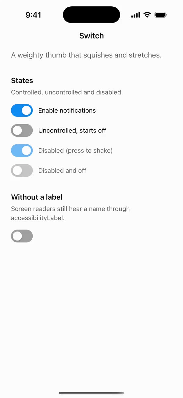
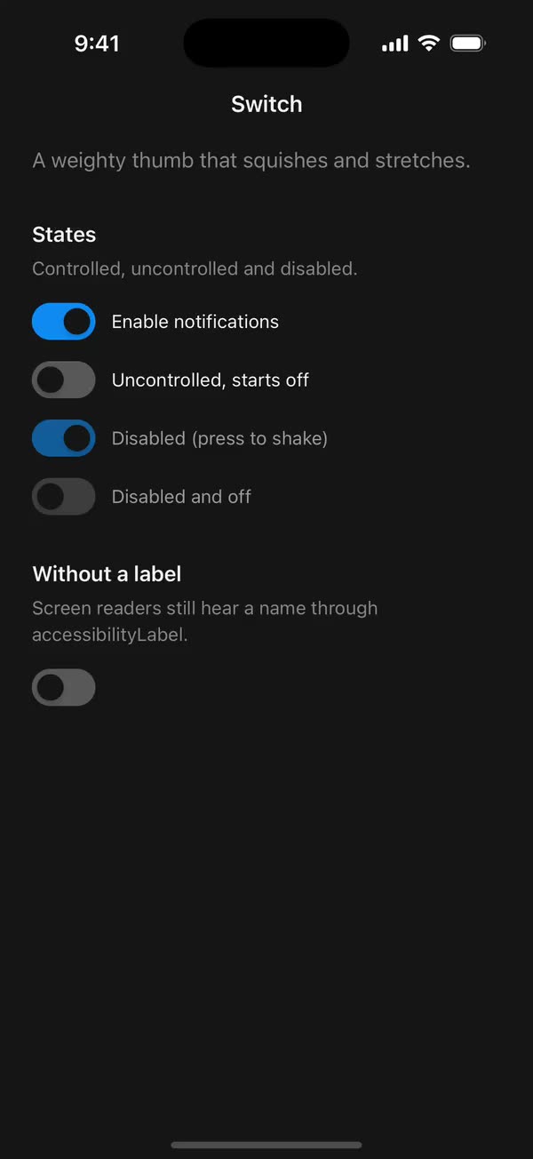
React NativeA weighty thumb that squishes and stretches.
Preview
Install
Source on GitHubIt works in Expo and in bare React Native. New to beUI Native? Set up your app first.
Copies the component and the shared files it needs into src/, adds the theme tokens if they're missing, and installs its libraries. Files you've changed are kept.
Keep the folder layout, since the component imports the shared files by relative path.
1Install the libraries
npx expo install react-native-reanimated react-native-worklets
npm install uniwind tailwindcss2Add the theme tokens
Once per app. Import it from the CSS file Uniwind reads, after Tailwind and Uniwind, and change the values to match your brand.
/* Matches the default beUI palette in ui-components/lib/themes.ts.
   Native surface maps to card; muted maps to muted-foreground. */
@layer theme {
  :root {
    @variant light {
      --color-background: oklch(99% 0 0);
      --color-surface: oklch(97% 0 0);
      --color-foreground: oklch(15% 0 0);
      --color-muted: oklch(50% 0 0);
      --color-border: oklch(15% 0 0 / 0.06);
      --color-border-strong: oklch(15% 0 0 / 0.16);
      --color-primary: #0285f7;
      --color-on-primary: #ffffff;
      --color-destructive: #dc2626;
      --color-success: #059669;
      --color-warning: #d97706;
    }
  }

  :root {
    @variant dark {
      --color-background: #151515;
      --color-surface: #1c1c1c;
      --color-foreground: oklch(96% 0 0);
      --color-muted: oklch(62% 0 0);
      --color-border: rgb(255 255 255 / 0.05);
      --color-border-strong: rgb(255 255 255 / 0.14);
      --color-primary: #0285f7;
      --color-on-primary: #ffffff;
      --color-destructive: #f87171;
      --color-success: #34d399;
      --color-warning: #fbbf24;
    }
  }
}
3Copy the shared files
import { useEffect, useState } from "react";
import { AccessibilityInfo } from "react-native";
import { useReducedMotion } from "react-native-reanimated";

/** Reanimated supplies a synchronous initial value; native events keep it current. */
export function useReducedMotionPreference() {
  const initialValue = useReducedMotion();
  const [reducedMotion, setReducedMotion] = useState(initialValue);

  useEffect(() => {
    let active = true;
    let receivedEvent = false;
    const subscription = AccessibilityInfo.addEventListener(
      "reduceMotionChanged",
      (value) => {
        receivedEvent = true;
        setReducedMotion(value);
      },
    );
    void AccessibilityInfo.isReduceMotionEnabled().then((value) => {
      if (active && !receivedEvent) setReducedMotion(value);
    });
    return () => {
      active = false;
      subscription.remove();
    };
  }, []);

  return reducedMotion;
}
4Copy the component
export type { SwitchProps } from "./switch";
export { Switch } from "./switch";
import { type Ref, useEffect, useState } from "react";
import {
  I18nManager,
  Platform,
  Pressable,
  type PressableProps,
  StyleSheet,
  Text,
  type View,
} from "react-native";
import Animated, {
  cancelAnimation,
  interpolateColor,
  ReduceMotion,
  useAnimatedStyle,
  useSharedValue,
  withDelay,
  withSequence,
  withSpring,
  withTiming,
} from "react-native-reanimated";
import { useResolveClassNames } from "uniwind";
import { useReducedMotionPreference } from "../../hooks/use-reduced-motion";

// Heavy, deliberate thumb: high mass keeps the travel weighty without wobble.
const THUMB_SPRING = {
  stiffness: 800,
  damping: 80,
  mass: 4,
  reduceMotion: ReduceMotion.System,
} as const;
const TRACK_FADE = { duration: 200, reduceMotion: ReduceMotion.System };

const TRACK_WIDTH = 48;
const TRACK_HEIGHT = 28;
const PADDING = 4;
const THUMB = 20;
const STRETCH = 4;
const TRAVEL = TRACK_WIDTH - PADDING * 2 - THUMB;
// Tops the 28-point track up to a 48-point touch area.
const HIT_SLOP = { top: 10, bottom: 10, left: 0, right: 0 };

export type SwitchProps = Omit<
  PressableProps,
  "children" | "style" | "onPress" | "disabled"
> & {
  /** Controlled state. Omit it and use `defaultChecked` for uncontrolled use. */
  checked?: boolean;
  defaultChecked?: boolean;
  onCheckedChange?: (checked: boolean) => void;
  disabled?: boolean;
  /** Visible label beside the switch. Pressing it toggles too. */
  label?: string;
  /** Disables thumb motion independently of the system preference. */
  disableAnimation?: boolean;
  className?: string;
  ref?: Ref<View>;
};

export function Switch({
  checked: checkedProp,
  defaultChecked = false,
  onCheckedChange,
  disabled = false,
  label,
  disableAnimation = false,
  className = "",
  accessibilityLabel,
  accessibilityState,
  hitSlop,
  onPressIn,
  onPressOut,
  ref,
  ...props
}: SwitchProps) {
  const [uncontrolled, setUncontrolled] = useState(defaultChecked);
  const checked = checkedProp ?? uncontrolled;
  const reducedMotion = useReducedMotionPreference();
  const animate = !reducedMotion && !disableAnimation;
  const direction = I18nManager.isRTL ? -1 : 1;

  const { backgroundColor: onColor } = useResolveClassNames("bg-primary");
  const { backgroundColor: offColor } = useResolveClassNames("bg-muted/60");

  const position = useSharedValue(checked ? 1 : 0);
  const track = useSharedValue(checked ? 1 : 0);
  const press = useSharedValue(0);
  const shake = useSharedValue(0);

  useEffect(() => {
    const target = checked ? 1 : 0;
    position.value = animate ? withSpring(target, THUMB_SPRING) : target;
    track.value = animate ? withTiming(target, TRACK_FADE) : target;
  }, [animate, checked, position, track]);

  useEffect(() => {
    if (!animate || disabled) {
      cancelAnimation(press);
      press.value = 0;
    }
  }, [animate, disabled, press]);

  const trackStyle = useAnimatedStyle(() => ({
    backgroundColor: interpolateColor(
      track.value,
      [0, 1],
      [String(offColor ?? "gray"), String(onColor ?? "blue")],
    ),
  }));

  const thumbStyle = useAnimatedStyle(() => {
    const stretch = STRETCH * press.value;
    // Grow toward the destination: leftward from the "on" end, rightward from "off".
    const lead = checked ? -stretch : 0;
    return {
      width: THUMB + stretch,
      transform: [
        {
          translateX:
            direction * (position.value * TRAVEL + lead) + shake.value,
        },
        { scale: 1 - 0.1 * press.value },
      ],
    };
  }, [checked, direction]);

  function toggle() {
    const next = !checked;
    if (checkedProp === undefined) setUncontrolled(next);
    onCheckedChange?.(next);
  }

  return (
    <Pressable
      {...props}
      ref={ref}
      accessible
      accessibilityRole="switch"
      accessibilityLabel={accessibilityLabel ?? label}
      accessibilityState={{ ...accessibilityState, checked, disabled }}
      aria-checked={checked}
      aria-disabled={disabled}
      // Native keeps presses alive while disabled so the thumb can shake; web needs the
      // real prop because react-native-web derives aria-disabled from it.
      disabled={Platform.OS === "web" && disabled}
      hitSlop={hitSlop ?? HIT_SLOP}
      className={`self-start flex-row items-center gap-3 ${disabled ? "opacity-60" : ""} ${className}`}
      onPress={() => {
        if (!disabled) toggle();
      }}
      onPressIn={(event) => {
        if (disabled) {
          if (animate) {
            shake.value = withDelay(
              200,
              withSequence(
                withTiming(-2, { duration: 150 }),
                withTiming(2, { duration: 150 }),
                withTiming(-1, { duration: 150 }),
                withTiming(0, { duration: 150 }),
              ),
            );
          }
        } else if (animate) {
          press.value = withSpring(1, THUMB_SPRING);
        }
        onPressIn?.(event);
      }}
      onPressOut={(event) => {
        if (animate) press.value = withSpring(0, THUMB_SPRING);
        onPressOut?.(event);
      }}
    >
      <Animated.View style={[styles.track, trackStyle]}>
        <Animated.View
          className="bg-background"
          style={[styles.thumb, thumbStyle]}
        />
      </Animated.View>
      {label ? (
        <Text className="shrink text-sm text-foreground">{label}</Text>
      ) : null}
    </Pressable>
  );
}

const styles = StyleSheet.create({
  track: {
    width: TRACK_WIDTH,
    height: TRACK_HEIGHT,
    borderRadius: TRACK_HEIGHT / 2,
    flexShrink: 0,
    justifyContent: "center",
  },
  thumb: {
    position: "absolute",
    start: PADDING,
    height: THUMB,
    borderRadius: THUMB / 2,
    boxShadow: "0 2px 4px rgba(0, 0, 0, 0.18)",
  },
});
Documentation
Native port of beUI Switch. A toggle with a heavy spring-driven thumb and press feedback.
import { Switch } from "./src";

<Switch checked={enabled} onCheckedChange={setEnabled} label="Enable notifications" />
<Switch defaultChecked label="Uncontrolled" />
<Switch accessibilityLabel="Airplane mode" />- Motion: the thumb travels on the web version's heavy spring (stiffness 800, damping 80, mass 4), so it feels weighty without wobbling. The track colour fades between
bg-muted/60andbg-primaryover 200 ms. - Press: while pressed, the thumb shrinks to 90% and stretches 4 points toward where it is going.
- Disabled: dims to 60% opacity and ignores presses. On iOS and Android, pressing a disabled switch gives the thumb a small shake. On web the shake is skipped, because react-native-web needs the real
disabledprop to report the disabled state. - State: pass
checkedwithonCheckedChangeto control it, ordefaultCheckedto let it manage itself. - Label:
labelrenders text beside the track. The track and label form one touch target, and the label becomes the spoken name. Without a label, passaccessibilityLabel. - Accessibility: reports the
switchrole with its checked and disabled states.hitSloptops the 28-point track up to a 48-point touch area. - RTL: the thumb starts and travels from the leading edge.
- Reduced motion: when the system asks for it, or
disableAnimationis set, the thumb and colour change instantly with no press squish or shake.
The web Switch only responds to taps, and so does this one. Native platform switches can also be dragged; that may come later with Gesture Handler.
Copy this directory, hooks/use-reduced-motion.ts, and the semantic tokens in styles/theme.css.