
Checkbox
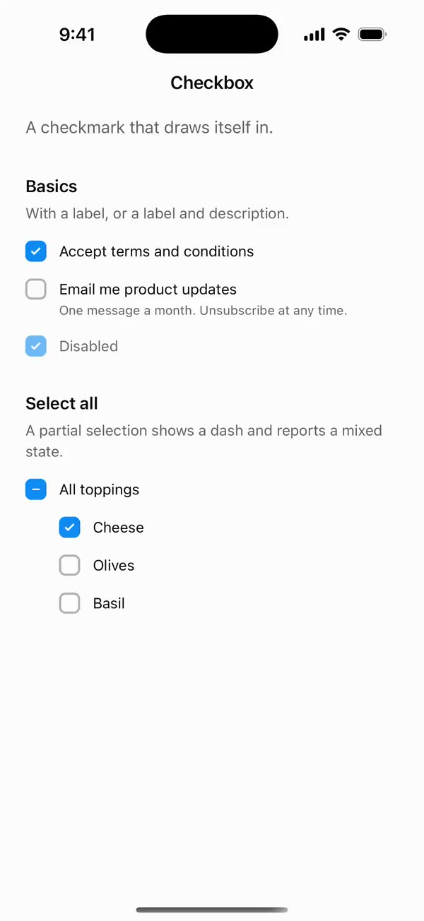
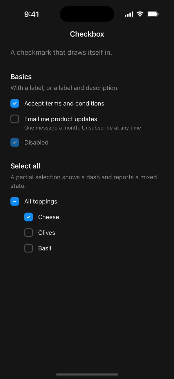
React NativeA checkmark that draws itself in.
Preview
Install
Source on GitHubIt works in Expo and in bare React Native. New to beUI Native? Set up your app first.
Copies the component and the shared files it needs into src/, adds the theme tokens if they're missing, and installs its libraries. Files you've changed are kept.
Keep the folder layout, since the component imports the shared files by relative path.
1Install the libraries
npx expo install react-native-reanimated react-native-worklets
npm install uniwind tailwindcss2Add the theme tokens
Once per app. Import it from the CSS file Uniwind reads, after Tailwind and Uniwind, and change the values to match your brand.
/* Matches the default beUI palette in ui-components/lib/themes.ts.
   Native surface maps to card; muted maps to muted-foreground. */
@layer theme {
  :root {
    @variant light {
      --color-background: oklch(99% 0 0);
      --color-surface: oklch(97% 0 0);
      --color-foreground: oklch(15% 0 0);
      --color-muted: oklch(50% 0 0);
      --color-border: oklch(15% 0 0 / 0.06);
      --color-border-strong: oklch(15% 0 0 / 0.16);
      --color-primary: #0285f7;
      --color-on-primary: #ffffff;
      --color-destructive: #dc2626;
      --color-success: #059669;
      --color-warning: #d97706;
    }
  }

  :root {
    @variant dark {
      --color-background: #151515;
      --color-surface: #1c1c1c;
      --color-foreground: oklch(96% 0 0);
      --color-muted: oklch(62% 0 0);
      --color-border: rgb(255 255 255 / 0.05);
      --color-border-strong: rgb(255 255 255 / 0.14);
      --color-primary: #0285f7;
      --color-on-primary: #ffffff;
      --color-destructive: #f87171;
      --color-success: #34d399;
      --color-warning: #fbbf24;
    }
  }
}
3Copy the shared files
import { useEffect, useRef, useState } from "react";

export type PresenceItem<T> = {
  key: string;
  value: T;
  /** False for the item present on first render, so it does not animate in. */
  appear: boolean;
  exiting: boolean;
};

/**
 * Keeps replaced items mounted while they animate out, like AnimatePresence.
 * A key that returns while exiting is revived in place.
 */
export function usePresence<T>(
  key: string | null,
  value: T,
  exitDuration: (value: T) => number,
) {
  const [items, setItems] = useState<PresenceItem<T>[]>(() =>
    key === null ? [] : [{ key, value, appear: false, exiting: false }],
  );
  const [currentKey, setCurrentKey] = useState(key);
  const exitDurationRef = useRef(exitDuration);
  exitDurationRef.current = exitDuration;

  // Adjust during render so the new item and the exits start in the same frame.
  if (key !== currentKey) {
    setCurrentKey(key);
    setItems((previous) => {
      const next = previous.map((item) =>
        item.key === key
          ? { ...item, value, exiting: false }
          : { ...item, exiting: true },
      );
      if (key !== null && !previous.some((item) => item.key === key)) {
        next.push({ key, value, appear: true, exiting: false });
      }
      return next;
    });
  }

  const exitingKeys = items
    .filter((item) => item.exiting)
    .map((item) => item.key)
    .join("\n");

  useEffect(() => {
    if (!exitingKeys) return;
    const timers = items
      .filter((item) => item.exiting)
      .map((item) =>
        setTimeout(() => {
          setItems((previous) =>
            previous.filter(
              (candidate) => !(candidate.key === item.key && candidate.exiting),
            ),
          );
        }, exitDurationRef.current(item.value)),
      );
    return () => {
      for (const timer of timers) clearTimeout(timer);
    };
    // Restart removal timers only when the set of exiting items changes.
  }, [exitingKeys]);

  return items;
}
import { useEffect, useState } from "react";
import { AccessibilityInfo } from "react-native";
import { useReducedMotion } from "react-native-reanimated";

/** Reanimated supplies a synchronous initial value; native events keep it current. */
export function useReducedMotionPreference() {
  const initialValue = useReducedMotion();
  const [reducedMotion, setReducedMotion] = useState(initialValue);

  useEffect(() => {
    let active = true;
    let receivedEvent = false;
    const subscription = AccessibilityInfo.addEventListener(
      "reduceMotionChanged",
      (value) => {
        receivedEvent = true;
        setReducedMotion(value);
      },
    );
    void AccessibilityInfo.isReduceMotionEnabled().then((value) => {
      if (active && !receivedEvent) setReducedMotion(value);
    });
    return () => {
      active = false;
      subscription.remove();
    };
  }, []);

  return reducedMotion;
}
import { type ColorValue, StyleSheet, View } from "react-native";
import Animated, {
  interpolate,
  type SharedValue,
  useAnimatedStyle,
} from "react-native-reanimated";

/** A straight line in a square viewBox: [x1, y1, x2, y2]. */
export type PathSegment = [x1: number, y1: number, x2: number, y2: number];

export type DrawnPathProps = {
  /** Straight segments drawn in order, like an SVG polyline. */
  segments: PathSegment[];
  /** Rendered width and height in points. */
  size: number;
  /** Stroke width in viewBox units. */
  strokeWidth: number;
  /** Side of the square viewBox the segments are written in. Defaults to 24. */
  viewBox?: number;
  color: ColorValue | undefined;
  /** 0 draws nothing and 1 draws every segment, like SVG `pathLength`. */
  progress: SharedValue<number>;
};

function length([x1, y1, x2, y2]: PathSegment) {
  return Math.hypot(x2 - x1, y2 - y1);
}

/**
 * Draws a polyline on with rotated Views, so shared components need no SVG
 * library. Round caps extend half a stroke past each end, like SVG's linecap.
 */
export function DrawnPath({
  segments,
  size,
  strokeWidth,
  viewBox = 24,
  color,
  progress,
}: DrawnPathProps) {
  const unit = size / viewBox;
  const stroke = strokeWidth * unit;
  const total = segments.reduce((sum, segment) => sum + length(segment), 0);
  let start = 0;

  return (
    <View style={{ width: size, height: size }}>
      {segments.map((segment) => {
        const from = start / total;
        start += length(segment);
        return (
          <Stroke
            key={segment.join()}
            segment={segment}
            unit={unit}
            stroke={stroke}
            from={from}
            to={start / total}
            progress={progress}
            color={color}
          />
        );
      })}
    </View>
  );
}

function Stroke({
  segment,
  unit,
  stroke,
  from,
  to,
  progress,
  color,
}: {
  segment: PathSegment;
  unit: number;
  stroke: number;
  from: number;
  to: number;
  progress: SharedValue<number>;
  color: ColorValue | undefined;
}) {
  const [x1, y1, x2, y2] = segment;
  const full = length(segment) * unit;
  const angle = Math.atan2(y2 - y1, x2 - x1);

  const animatedStyle = useAnimatedStyle(() => {
    const drawn = interpolate(progress.value, [from, to], [0, 1], "clamp");
    return { opacity: drawn > 0 ? 1 : 0, width: stroke + full * drawn };
  });

  return (
    <Animated.View
      style={[
        styles.stroke,
        {
          left: x1 * unit - stroke / 2,
          top: y1 * unit - stroke / 2,
          height: stroke,
          borderRadius: stroke / 2,
          backgroundColor: color,
          // Rotate around the start point so the stroke grows from it.
          transformOrigin: [stroke / 2, stroke / 2, 0],
          transform: [{ rotate: `${angle}rad` }],
        },
        animatedStyle,
      ]}
    />
  );
}

const styles = StyleSheet.create({
  stroke: { position: "absolute" },
});
import { Easing, ReduceMotion } from "react-native-reanimated";

// Mirrors beUI's lib/ease.ts so native motion matches the web library.

export const EASE_OUT = Easing.bezier(0.16, 1, 0.3, 1);
export const EASE_IN_OUT = Easing.bezier(0.77, 0, 0.175, 1);

/** Press feedback on buttons and other tappable surfaces. */
export const SPRING_PRESS = {
  stiffness: 500,
  damping: 30,
  mass: 0.6,
  reduceMotion: ReduceMotion.System,
} as const;

/** Content swaps: label and icon slots trading places inside a control. */
export const SPRING_SWAP = {
  stiffness: 460,
  damping: 30,
  mass: 0.55,
  reduceMotion: ReduceMotion.System,
} as const;

/** Shared-layout glides: pills, indicators and panels moving between positions. */
export const SPRING_LAYOUT = {
  stiffness: 360,
  damping: 32,
  mass: 0.6,
  reduceMotion: ReduceMotion.System,
} as const;

/** Dragged handles and fills; critically damped so values never rebound off an end. */
export const SPRING_GLIDE = {
  stiffness: 700,
  damping: 50,
  mass: 0.5,
  reduceMotion: ReduceMotion.System,
} as const;

export const motion = {
  press: SPRING_PRESS,
  swap: SPRING_SWAP,
  layout: SPRING_LAYOUT,
  glide: SPRING_GLIDE,
  exit: { duration: 160, easing: EASE_OUT, reduceMotion: ReduceMotion.System },
  fade: { duration: 150, reduceMotion: ReduceMotion.System },
} as const;
4Copy the component
import { type Ref, useEffect, useState } from "react";
import {
  type ColorValue,
  Pressable,
  type PressableProps,
  StyleSheet,
  Text,
  View,
} from "react-native";
import Animated, {
  cancelAnimation,
  interpolateColor,
  useAnimatedStyle,
  useSharedValue,
  withDelay,
  withSpring,
  withTiming,
} from "react-native-reanimated";
import { useResolveClassNames } from "uniwind";
import { usePresence } from "../../hooks/use-presence";
import { useReducedMotionPreference } from "../../hooks/use-reduced-motion";
import { DrawnPath, type PathSegment } from "../../primitives/drawn-path";
import { EASE_OUT, motion } from "../../styles/motion";

const BOX = 20;
// The web mark is a 24-unit SVG path drawn at 12px with a 3-unit stroke.
const MARK = 12;
const CHECK: PathSegment[] = [
  [5, 13, 9, 17],
  [9, 17, 19, 7],
];
const DASH: PathSegment[] = [[6, 12, 18, 12]];
// Tops a 20-point row up to a 48-point touch area.
const HIT_SLOP = { top: 14, bottom: 14, left: 0, right: 0 };
const COLOR_FADE = { duration: 200, reduceMotion: motion.fade.reduceMotion };

type Mark = "check" | "dash";

export type CheckboxProps = Omit<
  PressableProps,
  "children" | "style" | "onPress" | "disabled"
> & {
  /** Controlled state. Omit it and use `defaultChecked` for uncontrolled use. */
  checked?: boolean;
  defaultChecked?: boolean;
  onCheckedChange?: (checked: boolean) => void;
  /** Shows a dash and reports a mixed state, for "select all" rows. */
  indeterminate?: boolean;
  disabled?: boolean;
  label?: string;
  /** Supporting text under the label, read as the hint rather than the name. */
  description?: string;
  /** Disables press and mark motion independently of the system preference. */
  disableAnimation?: boolean;
  className?: string;
  ref?: Ref<View>;
};

function CheckMark({
  mark,
  appear,
  exiting,
  reduce,
  color,
}: {
  mark: Mark;
  appear: boolean;
  exiting: boolean;
  reduce: boolean;
  color: ColorValue | undefined;
}) {
  const segments = mark === "check" ? CHECK : DASH;
  const presence = useSharedValue(appear && !reduce ? 0 : 1);
  const draw = useSharedValue(appear && !reduce ? 0 : 1);

  useEffect(() => {
    if (reduce) {
      presence.value = exiting ? 0 : 1;
      draw.value = 1;
      return;
    }
    presence.value = withTiming(exiting ? 0 : 1, motion.exit);
    if (!exiting) {
      draw.value = withDelay(
        40,
        withTiming(1, {
          duration: mark === "check" ? 300 : 200,
          easing: EASE_OUT,
        }),
      );
    }
  }, [draw, exiting, mark, presence, reduce]);

  const markStyle = useAnimatedStyle(() => ({
    opacity: presence.value,
    transform: [{ scale: 0.5 + 0.5 * presence.value }],
  }));

  return (
    <Animated.View style={[styles.mark, markStyle]}>
      <DrawnPath
        segments={segments}
        size={MARK}
        strokeWidth={3}
        color={color}
        progress={draw}
      />
    </Animated.View>
  );
}

export function Checkbox({
  checked: checkedProp,
  defaultChecked = false,
  onCheckedChange,
  indeterminate = false,
  disabled = false,
  label,
  description,
  disableAnimation = false,
  className = "",
  accessibilityLabel,
  accessibilityHint,
  accessibilityState,
  hitSlop,
  onPressIn,
  onPressOut,
  ref,
  ...props
}: CheckboxProps) {
  const [uncontrolled, setUncontrolled] = useState(defaultChecked);
  const checked = checkedProp ?? uncontrolled;
  const showMark = checked || indeterminate;
  const reducedMotion = useReducedMotionPreference();
  const animate = !reducedMotion && !disableAnimation;

  const { backgroundColor: idleFill } = useResolveClassNames("bg-background");
  const { backgroundColor: idleBorder } = useResolveClassNames("bg-muted/50");
  const { backgroundColor: activeFill } = useResolveClassNames("bg-primary");
  const { color: markColor } = useResolveClassNames("text-on-primary");

  const active = useSharedValue(showMark ? 1 : 0);
  const scale = useSharedValue(1);
  const marks = usePresence<Mark | null>(
    showMark ? (indeterminate ? "dash" : "check") : null,
    showMark ? (indeterminate ? "dash" : "check") : null,
    () => motion.exit.duration + 40,
  );

  useEffect(() => {
    const target = showMark ? 1 : 0;
    active.value = animate ? withTiming(target, COLOR_FADE) : target;
  }, [active, animate, showMark]);

  useEffect(() => {
    if (!animate || disabled) {
      cancelAnimation(scale);
      scale.value = 1;
    }
  }, [animate, disabled, scale]);

  const boxStyle = useAnimatedStyle(() => ({
    backgroundColor: interpolateColor(
      active.value,
      [0, 1],
      [String(idleFill ?? "transparent"), String(activeFill ?? "blue")],
    ),
    borderColor: interpolateColor(
      active.value,
      [0, 1],
      [String(idleBorder ?? "gray"), String(activeFill ?? "blue")],
    ),
    transform: [{ scale: scale.value }],
  }));

  return (
    <Pressable
      {...props}
      ref={ref}
      accessible
      accessibilityRole="checkbox"
      accessibilityLabel={accessibilityLabel ?? label}
      accessibilityHint={accessibilityHint ?? description}
      accessibilityState={{
        ...accessibilityState,
        checked: indeterminate ? "mixed" : checked,
        disabled,
      }}
      aria-checked={indeterminate ? "mixed" : checked}
      aria-disabled={disabled}
      disabled={disabled}
      hitSlop={hitSlop ?? HIT_SLOP}
      className={`self-start flex-row gap-3 ${description ? "items-start" : "items-center"} ${className}`}
      onPress={() => {
        const next = !checked;
        if (checkedProp === undefined) setUncontrolled(next);
        onCheckedChange?.(next);
      }}
      onPressIn={(event) => {
        if (animate) scale.value = withSpring(0.92, motion.press);
        onPressIn?.(event);
      }}
      onPressOut={(event) => {
        if (animate) scale.value = withSpring(1, motion.press);
        onPressOut?.(event);
      }}
    >
      <Animated.View
        style={[styles.box, disabled && styles.disabled, boxStyle]}
      >
        {marks.map((item) =>
          item.value ? (
            <CheckMark
              key={item.key}
              mark={item.value}
              appear={item.appear}
              exiting={item.exiting}
              reduce={!animate}
              color={markColor}
            />
          ) : null,
        )}
      </Animated.View>
      {label || description ? (
        <View className={`shrink gap-0.5 ${disabled ? "opacity-60" : ""}`}>
          {label ? (
            <Text className="text-sm leading-5 text-foreground">{label}</Text>
          ) : null}
          {description ? (
            <Text className="text-xs text-muted">{description}</Text>
          ) : null}
        </View>
      ) : null}
    </Pressable>
  );
}

const styles = StyleSheet.create({
  box: {
    width: BOX,
    height: BOX,
    borderRadius: 6,
    borderWidth: 2,
    alignItems: "center",
    justifyContent: "center",
    flexShrink: 0,
  },
  disabled: { opacity: 0.6 },
  mark: { position: "absolute", width: MARK, height: MARK },
});
export type { CheckboxProps } from "./checkbox";
export { Checkbox } from "./checkbox";
Documentation
Native port of beUI Checkbox. A form choice with a checkmark that draws itself in, spring press feedback, and an indeterminate state.
import { Checkbox } from "./src";

<Checkbox checked={accepted} onCheckedChange={setAccepted} label="Accept terms and conditions" />
<Checkbox label="Email me updates" description="One message a month." />
<Checkbox checked={all} indeterminate={some} onCheckedChange={toggleAll} label="Select all" />- Mark: the checkmark draws itself in over 300 ms, and the indeterminate dash over 200 ms. The mark fades and scales in from 50%. When
indeterminateturns on or off, the check and the dash crossfade. - Colours: the fill and border fade between the idle and primary colours over 200 ms.
- Press: the box springs to 92% on beUI's
SPRING_PRESSspring. - State: pass
checkedwithonCheckedChangeto control it, ordefaultCheckedto let it manage itself. As on the web, pressing callsonCheckedChange(!checked); an indeterminate checkbox decides what "select all" means through that handler. - Label and description:
labelis the spoken name, anddescriptionis read as the accessibility hint. The box and text form one touch target, andhitSloptops a 20-point row up to 48 points. - Accessibility: reports the
checkboxrole. An indeterminate checkbox reports a mixed state. - Reduced motion: when the system asks for it, or
disableAnimationis set, the mark and colours change instantly with no press scale.
The mark is drawn by the shared DrawnPath primitive with rotated Views, matching the web SVG path, so the component needs no SVG library.
Copy this directory, hooks/use-presence.ts, hooks/use-reduced-motion.ts, primitives/drawn-path.tsx, styles/motion.ts, and the semantic tokens in styles/theme.css.