
Approval Card
React NativeSwipeable questions, or a review to approve.
Preview
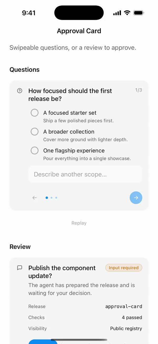
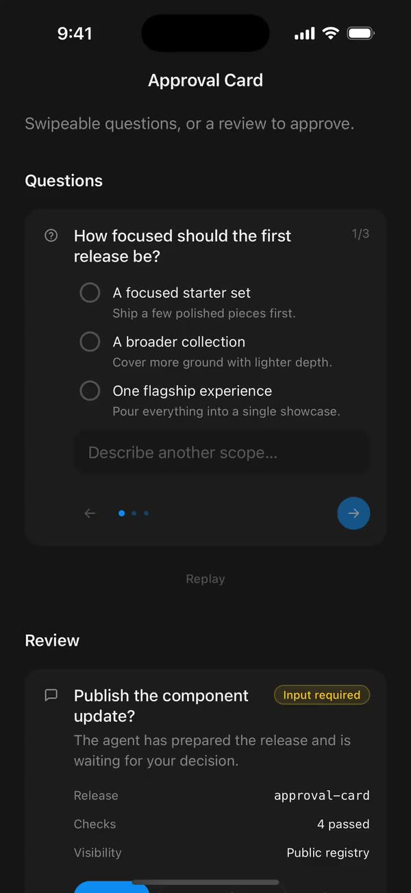
Install
Source on GitHubIt works in Expo and in bare React Native. New to beUI Native? Set up your app first.
Copies the component and the shared files it needs into src/, adds the theme tokens if they're missing, and installs its libraries. Files you've changed are kept.
Keep the folder layout, since the component imports the shared files by relative path.
1Install the libraries
npx expo install react-native-gesture-handler react-native-reanimated react-native-svg react-native-worklets
npm install uniwind tailwindcss
Wrap your app in GestureHandlerRootView if it isn't already.
2Add the theme tokens
Once per app. Import it from the CSS file Uniwind reads, after Tailwind and Uniwind, and change the values to match your brand.
/* Matches the default beUI palette in ui-components/lib/themes.ts.
   Native surface maps to card; muted maps to muted-foreground. */
@layer theme {
  :root {
    @variant light {
      --color-background: oklch(99% 0 0);
      --color-surface: oklch(97% 0 0);
      --color-foreground: oklch(15% 0 0);
      --color-muted: oklch(50% 0 0);
      --color-border: oklch(15% 0 0 / 0.06);
      --color-border-strong: oklch(15% 0 0 / 0.16);
      --color-primary: #0285f7;
      --color-on-primary: #ffffff;
      --color-destructive: #dc2626;
      --color-success: #059669;
      --color-warning: #d97706;
    }
  }

  :root {
    @variant dark {
      --color-background: #151515;
      --color-surface: #1c1c1c;
      --color-foreground: oklch(96% 0 0);
      --color-muted: oklch(62% 0 0);
      --color-border: rgb(255 255 255 / 0.05);
      --color-border-strong: rgb(255 255 255 / 0.14);
      --color-primary: #0285f7;
      --color-on-primary: #ffffff;
      --color-destructive: #f87171;
      --color-success: #34d399;
      --color-warning: #fbbf24;
    }
  }

  /* Tailwind's default monospace stack isn't a font React Native can load. */
  :root {
    @variant ios {
      --font-mono: Menlo;
    }
  }

  :root {
    @variant android {
      --font-mono: monospace;
    }
  }
}
3Copy the shared files
import type { ButtonSize, ButtonVariant } from "./button.types";

// Class strings stay literal so Uniwind can discover them.

export const variants: Record<
  ButtonVariant,
  { container: string; label: string }
> = {
  primary: { container: "bg-primary border-primary", label: "text-on-primary" },
  secondary: {
    container: "bg-surface border-border",
    label: "text-foreground",
  },
  ghost: {
    container: "bg-transparent border-transparent",
    label: "text-muted",
  },
  outline: {
    container: "bg-transparent border-border",
    label: "text-foreground",
  },
};

/**
 * Visible heights match beUI web (32, 40, 48). `hitSlop` tops the touch area up
 * to 48 points; content may grow taller for larger text.
 */
export const sizes: Record<
  ButtonSize,
  {
    container: string;
    radius: string;
    label: string;
    icon: number;
    gap: number;
    hitSlop: number;
  }
> = {
  sm: {
    container: "min-h-8 px-3 py-1 gap-1.5",
    radius: "rounded-full",
    label: "text-xs",
    icon: 14,
    gap: 6,
    hitSlop: 8,
  },
  md: {
    container: "min-h-10 px-5 py-2 gap-2",
    radius: "rounded-full",
    label: "text-sm",
    icon: 16,
    gap: 8,
    hitSlop: 4,
  },
  lg: {
    container: "min-h-12 px-6 py-2 gap-2",
    radius: "rounded-full",
    label: "text-base",
    icon: 18,
    gap: 8,
    hitSlop: 0,
  },
  icon: {
    container: "h-8 w-8",
    radius: "rounded-lg",
    label: "text-sm",
    icon: 16,
    gap: 0,
    hitSlop: 8,
  },
};
import { createContext, useContext, useEffect, useRef, useState } from "react";
import {
  type ColorValue,
  Pressable,
  StyleSheet,
  Text,
  type TextProps,
  View,
} from "react-native";
import Animated, {
  useAnimatedStyle,
  useSharedValue,
  withSpring,
  withTiming,
} from "react-native-reanimated";
import { useResolveClassNames } from "uniwind";
import { useReducedMotionPreference } from "../../hooks/use-reduced-motion";
import { renderIcon } from "../../primitives/render-icon";
import { EASE_OUT, motion } from "../../styles/motion";
import { sizes, variants } from "./button.styles";
import type {
  ButtonIcon as ButtonIconType,
  ButtonProps,
  ButtonRootProps,
  ButtonSize,
  ButtonVariant,
} from "./button.types";

const AnimatedPressable = Animated.createAnimatedComponent(Pressable);

const HOVER_SCALE = 1.02;
const RIPPLE_DURATION = 1600;

type ButtonContextValue = {
  variant: ButtonVariant;
  size: ButtonSize;
  color: ColorValue | undefined;
};

const ButtonContext = createContext<ButtonContextValue | null>(null);

/** Internal: size, variant and resolved foreground color of the enclosing button. */
export function useButtonContext() {
  const context = useContext(ButtonContext);
  if (!context) throw new Error("Button content must be rendered in a Button.");
  return context;
}

export { renderIcon as renderButtonIcon };

function ButtonLabel({ className = "", ...props }: TextProps) {
  const { variant, size } = useButtonContext();
  return (
    <Text
      {...props}
      className={`shrink text-center font-medium ${sizes[size].label} ${variants[variant].label} ${className}`}
    />
  );
}

function ButtonIcon({ icon }: { icon: ButtonIconType }) {
  const { size, color } = useButtonContext();
  return (
    <View
      accessibilityElementsHidden
      importantForAccessibility="no-hide-descendants"
      aria-hidden
      style={styles.icon}
    >
      {renderIcon(icon, { size: sizes[size].icon, color })}
    </View>
  );
}

type Ripple = { id: number; x: number; y: number; size: number };

function RippleDot({ ripple, color }: { ripple: Ripple; color: ColorValue }) {
  const progress = useSharedValue(0);

  useEffect(() => {
    progress.value = withTiming(1, {
      duration: RIPPLE_DURATION,
      easing: EASE_OUT,
    });
  }, [progress]);

  const animatedStyle = useAnimatedStyle(() => ({
    opacity: 0.3 * (1 - progress.value),
    transform: [{ scale: 0.05 + 0.95 * progress.value }],
  }));

  return (
    <Animated.View
      style={[
        styles.ripple,
        {
          left: ripple.x - ripple.size / 2,
          top: ripple.y - ripple.size / 2,
          width: ripple.size,
          height: ripple.size,
          borderRadius: ripple.size / 2,
          backgroundColor: color,
        },
        animatedStyle,
      ]}
    />
  );
}

/** Internal: the pressable surface, rendering arbitrary content. */
export function ButtonRoot({
  variant = "primary",
  size = "md",
  pressScale = 0.93,
  ripple = false,
  disableAnimation = false,
  disabled: disabledProp,
  children,
  className = "",
  style,
  hitSlop,
  accessibilityState,
  onPressIn,
  onPressOut,
  onHoverIn,
  onHoverOut,
  ref,
  ...props
}: ButtonRootProps) {
  const disabled = disabledProp ?? false;
  const reducedMotion = useReducedMotionPreference();
  const animate = !reducedMotion && !disableAnimation;
  const appearance = variants[variant];
  const dimensions = sizes[size];
  const { color } = useResolveClassNames(appearance.label);

  const scale = useSharedValue(1);
  const pressed = useSharedValue(false);
  const hovered = useSharedValue(false);
  const layout = useRef({ width: 0, height: 0 });
  const nextRippleId = useRef(0);
  const rippleTimers = useRef(new Set<ReturnType<typeof setTimeout>>());
  const [ripples, setRipples] = useState<Ripple[]>([]);

  useEffect(() => {
    const timers = rippleTimers.current;
    return () => {
      for (const timer of timers) clearTimeout(timer);
    };
  }, []);

  useEffect(() => {
    if (!animate || disabled) scale.value = 1;
  }, [animate, disabled, scale]);

  const animatedStyle = useAnimatedStyle(
    () => ({
      transform: [{ scale: scale.value }],
      // Without scale, pressing still needs visible feedback.
      opacity: disabled ? 0.5 : !animate && pressed.value ? 0.7 : 1,
    }),
    [animate, disabled],
  );

  const restScale = () => (hovered.value ? HOVER_SCALE : 1);

  return (
    <ButtonContext.Provider value={{ variant, size, color }}>
      <AnimatedPressable
        {...props}
        ref={ref}
        accessible
        accessibilityRole="button"
        accessibilityState={{ ...accessibilityState, disabled }}
        aria-disabled={disabled}
        disabled={disabled}
        hitSlop={hitSlop ?? dimensions.hitSlop}
        // Hugs its content unless the caller places it with a self-* class; on web,
        // a default self-start would otherwise win over the caller's.
        className={`${/\bself-/.test(className) ? "" : "self-start"} flex-row items-center justify-center border ${appearance.container} ${dimensions.container} ${dimensions.radius} ${className}`}
        style={[style, animatedStyle]}
        onPressIn={(event) => {
          pressed.value = true;
          if (animate) scale.value = withSpring(pressScale, motion.press);
          if (ripple && animate && color) {
            const { locationX, locationY } = event.nativeEvent;
            const { width, height } = layout.current;
            const id = nextRippleId.current++;
            setRipples((current) => [
              ...current,
              {
                id,
                x: locationX,
                y: locationY,
                size: Math.max(width, height) * 2,
              },
            ]);
            const timer = setTimeout(() => {
              rippleTimers.current.delete(timer);
              setRipples((current) => current.filter((r) => r.id !== id));
            }, RIPPLE_DURATION);
            rippleTimers.current.add(timer);
          }
          onPressIn?.(event);
        }}
        onPressOut={(event) => {
          pressed.value = false;
          if (animate) scale.value = withSpring(restScale(), motion.press);
          onPressOut?.(event);
        }}
        onHoverIn={(event) => {
          hovered.value = true;
          if (animate && !pressed.value) {
            scale.value = withSpring(HOVER_SCALE, motion.press);
          }
          onHoverIn?.(event);
        }}
        onHoverOut={(event) => {
          hovered.value = false;
          if (animate && !pressed.value) {
            scale.value = withSpring(1, motion.press);
          }
          onHoverOut?.(event);
        }}
      >
        {ripple && (
          <View
            className={`absolute inset-0 overflow-hidden ${dimensions.radius}`}
            style={styles.passThrough}
            onLayout={({ nativeEvent }) => {
              layout.current = nativeEvent.layout;
            }}
          >
            {color != null &&
              ripples.map((item) => (
                <RippleDot key={item.id} ripple={item} color={color} />
              ))}
          </View>
        )}
        {children}
      </AnimatedPressable>
    </ButtonContext.Provider>
  );
}

export function Button(props: ButtonProps) {
  if (props.size === "icon") {
    const { icon, ...rest } = props;
    return (
      <ButtonRoot {...rest}>
        <ButtonIcon icon={icon} />
      </ButtonRoot>
    );
  }
  const { startIcon, endIcon, children, ...rest } = props;
  const label = Array.isArray(children) ? children.join("") : String(children);
  return (
    <ButtonRoot {...rest}>
      {startIcon != null && <ButtonIcon icon={startIcon} />}
      <ButtonLabel>{label}</ButtonLabel>
      {endIcon != null && <ButtonIcon icon={endIcon} />}
    </ButtonRoot>
  );
}

const styles = StyleSheet.create({
  icon: { flexShrink: 0 },
  passThrough: { pointerEvents: "none" },
  ripple: { position: "absolute" },
});
import { type Ref, useEffect, useState } from "react";
import {
  type ColorValue,
  Pressable,
  type PressableProps,
  StyleSheet,
  Text,
  View,
} from "react-native";
import Animated, {
  cancelAnimation,
  interpolateColor,
  useAnimatedStyle,
  useSharedValue,
  withDelay,
  withSpring,
  withTiming,
} from "react-native-reanimated";
import { useResolveClassNames } from "uniwind";
import { usePresence } from "../../hooks/use-presence";
import { useReducedMotionPreference } from "../../hooks/use-reduced-motion";
import { DrawnPath, type PathSegment } from "../../primitives/drawn-path";
import { EASE_OUT, motion } from "../../styles/motion";

const BOX = 20;
// The web mark is a 24-unit SVG path drawn at 12px with a 3-unit stroke.
const MARK = 12;
const CHECK: PathSegment[] = [
  [5, 13, 9, 17],
  [9, 17, 19, 7],
];
const DASH: PathSegment[] = [[6, 12, 18, 12]];
// Tops a 20-point row up to a 48-point touch area.
const HIT_SLOP = { top: 14, bottom: 14, left: 0, right: 0 };
const COLOR_FADE = { duration: 200, reduceMotion: motion.fade.reduceMotion };

type Mark = "check" | "dash";

export type CheckboxProps = Omit<
  PressableProps,
  "children" | "style" | "onPress" | "disabled"
> & {
  /** Controlled state. Omit it and use `defaultChecked` for uncontrolled use. */
  checked?: boolean;
  defaultChecked?: boolean;
  onCheckedChange?: (checked: boolean) => void;
  /** Shows a dash and reports a mixed state, for "select all" rows. */
  indeterminate?: boolean;
  disabled?: boolean;
  label?: string;
  /** Supporting text under the label, read as the hint rather than the name. */
  description?: string;
  /** Disables press and mark motion independently of the system preference. */
  disableAnimation?: boolean;
  className?: string;
  ref?: Ref<View>;
};

function CheckMark({
  mark,
  appear,
  exiting,
  reduce,
  color,
}: {
  mark: Mark;
  appear: boolean;
  exiting: boolean;
  reduce: boolean;
  color: ColorValue | undefined;
}) {
  const segments = mark === "check" ? CHECK : DASH;
  const presence = useSharedValue(appear && !reduce ? 0 : 1);
  const draw = useSharedValue(appear && !reduce ? 0 : 1);

  useEffect(() => {
    if (reduce) {
      presence.value = exiting ? 0 : 1;
      draw.value = 1;
      return;
    }
    presence.value = withTiming(exiting ? 0 : 1, motion.exit);
    if (!exiting) {
      draw.value = withDelay(
        40,
        withTiming(1, {
          duration: mark === "check" ? 300 : 200,
          easing: EASE_OUT,
        }),
      );
    }
  }, [draw, exiting, mark, presence, reduce]);

  const markStyle = useAnimatedStyle(() => ({
    opacity: presence.value,
    transform: [{ scale: 0.5 + 0.5 * presence.value }],
  }));

  return (
    <Animated.View style={[styles.mark, markStyle]}>
      <DrawnPath
        segments={segments}
        size={MARK}
        strokeWidth={3}
        color={color}
        progress={draw}
      />
    </Animated.View>
  );
}

export function Checkbox({
  checked: checkedProp,
  defaultChecked = false,
  onCheckedChange,
  indeterminate = false,
  disabled = false,
  label,
  description,
  disableAnimation = false,
  className = "",
  accessibilityLabel,
  accessibilityHint,
  accessibilityState,
  hitSlop,
  onPressIn,
  onPressOut,
  ref,
  ...props
}: CheckboxProps) {
  const [uncontrolled, setUncontrolled] = useState(defaultChecked);
  const checked = checkedProp ?? uncontrolled;
  const showMark = checked || indeterminate;
  const reducedMotion = useReducedMotionPreference();
  const animate = !reducedMotion && !disableAnimation;

  const { backgroundColor: idleFill } = useResolveClassNames("bg-background");
  const { backgroundColor: idleBorder } = useResolveClassNames("bg-muted/50");
  const { backgroundColor: activeFill } = useResolveClassNames("bg-primary");
  const { color: markColor } = useResolveClassNames("text-on-primary");

  const active = useSharedValue(showMark ? 1 : 0);
  const scale = useSharedValue(1);
  const marks = usePresence<Mark | null>(
    showMark ? (indeterminate ? "dash" : "check") : null,
    showMark ? (indeterminate ? "dash" : "check") : null,
    () => motion.exit.duration + 40,
  );

  useEffect(() => {
    const target = showMark ? 1 : 0;
    active.value = animate ? withTiming(target, COLOR_FADE) : target;
  }, [active, animate, showMark]);

  useEffect(() => {
    if (!animate || disabled) {
      cancelAnimation(scale);
      scale.value = 1;
    }
  }, [animate, disabled, scale]);

  const boxStyle = useAnimatedStyle(() => ({
    backgroundColor: interpolateColor(
      active.value,
      [0, 1],
      [String(idleFill ?? "transparent"), String(activeFill ?? "blue")],
    ),
    borderColor: interpolateColor(
      active.value,
      [0, 1],
      [String(idleBorder ?? "gray"), String(activeFill ?? "blue")],
    ),
    transform: [{ scale: scale.value }],
  }));

  return (
    <Pressable
      {...props}
      ref={ref}
      accessible
      accessibilityRole="checkbox"
      accessibilityLabel={accessibilityLabel ?? label}
      accessibilityHint={accessibilityHint ?? description}
      accessibilityState={{
        ...accessibilityState,
        checked: indeterminate ? "mixed" : checked,
        disabled,
      }}
      aria-checked={indeterminate ? "mixed" : checked}
      aria-disabled={disabled}
      disabled={disabled}
      hitSlop={hitSlop ?? HIT_SLOP}
      className={`self-start flex-row gap-3 ${description ? "items-start" : "items-center"} ${className}`}
      onPress={() => {
        const next = !checked;
        if (checkedProp === undefined) setUncontrolled(next);
        onCheckedChange?.(next);
      }}
      onPressIn={(event) => {
        if (animate) scale.value = withSpring(0.92, motion.press);
        onPressIn?.(event);
      }}
      onPressOut={(event) => {
        if (animate) scale.value = withSpring(1, motion.press);
        onPressOut?.(event);
      }}
    >
      <Animated.View
        style={[styles.box, disabled && styles.disabled, boxStyle]}
      >
        {marks.map((item) =>
          item.value ? (
            <CheckMark
              key={item.key}
              mark={item.value}
              appear={item.appear}
              exiting={item.exiting}
              reduce={!animate}
              color={markColor}
            />
          ) : null,
        )}
      </Animated.View>
      {label || description ? (
        <View className={`shrink gap-0.5 ${disabled ? "opacity-60" : ""}`}>
          {label ? (
            <Text className="text-sm leading-5 text-foreground">{label}</Text>
          ) : null}
          {description ? (
            <Text className="text-xs text-muted">{description}</Text>
          ) : null}
        </View>
      ) : null}
    </Pressable>
  );
}

const styles = StyleSheet.create({
  box: {
    width: BOX,
    height: BOX,
    borderRadius: 6,
    borderWidth: 2,
    alignItems: "center",
    justifyContent: "center",
    flexShrink: 0,
  },
  disabled: { opacity: 0.6 },
  mark: { position: "absolute", width: MARK, height: MARK },
});
import { type Ref, useEffect, useRef, useState } from "react";
import {
  AccessibilityInfo,
  Platform,
  StyleSheet,
  Text,
  TextInput,
  type TextInputProps,
  View,
} from "react-native";
import Animated, {
  Easing,
  useAnimatedStyle,
  useSharedValue,
  withTiming,
} from "react-native-reanimated";
import { useResolveClassNames, useUniwind } from "uniwind";
import { usePresence } from "../../hooks/use-presence";
import { useReducedMotionPreference } from "../../hooks/use-reduced-motion";
import { useShake } from "../../hooks/use-shake";
import { DrawnPath, type PathSegment } from "../../primitives/drawn-path";
import { type IconSource, renderIcon } from "../../primitives/render-icon";
import { motion } from "../../styles/motion";

const FIELD_HEIGHT = 44;
const ICON = 16;
const CHECK: PathSegment[] = [
  [5, 12.5, 9.5, 17],
  [9.5, 17, 19, 7.5],
];
const SHAKE = [0, -6, 6, -4, 4, -2, 0];
const COLOR_FADE = { duration: 200, reduceMotion: motion.fade.reduceMotion };
const MESSAGE_FADE = { duration: 200, reduceMotion: motion.fade.reduceMotion };

export type InputClassNames = {
  root?: string;
  label?: string;
  field?: string;
  input?: string;
  errorMessage?: string;
};

export type InputProps = Omit<TextInputProps, "editable"> & {
  label?: string;
  /** A truthy error shakes the field and turns it red. A string also shows a message. */
  error?: string | boolean;
  /** Reserves one message line so validation does not shift content below. */
  reserveErrorLine?: boolean;
  /** Draws a check at the trailing edge in place of `rightIcon`. */
  success?: boolean;
  /** Decorative icon at the leading edge, given `{ size, color }`. */
  leftIcon?: IconSource;
  /** Trailing icon or control, such as a show-password button. */
  rightIcon?: IconSource;
  disabled?: boolean;
  /** Disables shake and transitions independently of the system preference. */
  disableAnimation?: boolean;
  className?: string;
  classNames?: InputClassNames;
  ref?: Ref<TextInput>;
};

function ErrorMessage({
  message,
  appear,
  exiting,
  reduce,
  className,
}: {
  message: string;
  appear: boolean;
  exiting: boolean;
  reduce: boolean;
  className: string;
}) {
  const progress = useSharedValue(appear ? 0 : 1);

  useEffect(() => {
    progress.value = withTiming(exiting ? 0 : 1, MESSAGE_FADE);
  }, [exiting, progress]);

  const animatedStyle = useAnimatedStyle(
    () => ({
      opacity: progress.value,
      transform: [{ translateY: reduce ? 0 : -4 * (1 - progress.value) }],
    }),
    [reduce],
  );

  return (
    <Animated.View
      style={[exiting && styles.exiting, animatedStyle]}
      accessibilityLiveRegion="polite"
    >
      <Text className={`px-1 text-xs text-destructive ${className}`}>
        {message}
      </Text>
    </Animated.View>
  );
}

function SuccessCheck({ reduce }: { reduce: boolean }) {
  const { color } = useResolveClassNames("text-success");
  const draw = useSharedValue(reduce ? 1 : 0);

  useEffect(() => {
    if (!reduce) {
      draw.value = withTiming(1, {
        duration: 350,
        easing: Easing.out(Easing.quad),
      });
    }
  }, [draw, reduce]);

  return (
    <View
      accessibilityElementsHidden
      importantForAccessibility="no-hide-descendants"
      aria-hidden
      style={styles.trailing}
    >
      <DrawnPath
        segments={CHECK}
        size={20}
        strokeWidth={2.5}
        color={color}
        progress={draw}
      />
    </View>
  );
}

export function Input({
  label,
  error,
  reserveErrorLine = false,
  success = false,
  leftIcon,
  rightIcon,
  disabled = false,
  disableAnimation = false,
  className = "",
  classNames,
  value: valueProp,
  defaultValue,
  onChangeText,
  onFocus,
  onBlur,
  accessibilityLabel,
  accessibilityHint,
  keyboardAppearance,
  style,
  ref,
  ...props
}: InputProps) {
  // Match the keyboard to the app's theme unless the caller chooses one.
  const { theme } = useUniwind();
  const [uncontrolled, setUncontrolled] = useState(defaultValue ?? "");
  const value = valueProp ?? uncontrolled;
  const [focused, setFocused] = useState(false);
  const inputRef = useRef<TextInput | null>(null);
  const reducedMotion = useReducedMotionPreference();
  const animate = !reducedMotion && !disableAnimation;

  const hasError = Boolean(error);
  const errorMessage = typeof error === "string" && error ? error : null;
  const state = hasError ? "error" : focused ? "focused" : "idle";

  const { color: foreground } = useResolveClassNames("text-foreground");
  const { color: muted } = useResolveClassNames("text-muted");
  const { color: placeholder } = useResolveClassNames("text-muted/60");
  const { backgroundColor: idleBorder } = useResolveClassNames("bg-border");
  const { backgroundColor: focusBorder } =
    useResolveClassNames("bg-foreground/40");
  const { backgroundColor: focusRing } =
    useResolveClassNames("bg-foreground/10");
  const { backgroundColor: errorBorder } =
    useResolveClassNames("bg-destructive");
  const { backgroundColor: errorRing } =
    useResolveClassNames("bg-destructive/25");

  const borderColor =
    state === "error"
      ? errorBorder
      : state === "focused"
        ? focusBorder
        : idleBorder;
  const ringColor = state === "error" ? errorRing : focusRing;
  const border = useSharedValue(String(borderColor ?? "transparent"));
  const ring = useSharedValue(state === "idle" ? 0 : 1);
  const { shake, style: shakeStyle } = useShake(SHAKE, 450);

  useEffect(() => {
    const next = String(borderColor ?? "transparent");
    border.value = animate ? withTiming(next, COLOR_FADE) : next;
    const target = state === "idle" ? 0 : 1;
    ring.value = animate ? withTiming(target, COLOR_FADE) : target;
  }, [animate, border, borderColor, ring, state]);

  // Shake and announce when an error appears, not while it stays.
  useEffect(() => {
    if (!hasError) return;
    if (animate) shake();
  }, [animate, hasError, shake]);

  useEffect(() => {
    if (errorMessage) AccessibilityInfo.announceForAccessibility(errorMessage);
  }, [errorMessage]);

  const messages = usePresence(
    errorMessage,
    errorMessage ?? "",
    () => MESSAGE_FADE.duration + 40,
  );

  const fieldStyle = useAnimatedStyle(() => ({ borderColor: border.value }));
  const ringStyle = useAnimatedStyle(() => ({ opacity: ring.value }));

  const trailing = success ? null : rightIcon;
  const iconProps = { size: ICON, color: muted };

  return (
    <View className={`gap-1.5 ${className} ${classNames?.root ?? ""}`}>
      {label ? (
        <Text
          // The field already carries the label for screen readers.
          accessibilityElementsHidden
          importantForAccessibility="no"
          className={`px-1 text-sm font-medium text-foreground ${classNames?.label ?? ""}`}
          onPress={() => inputRef.current?.focus()}
        >
          {label}
        </Text>
      ) : null}

      <Animated.View
        style={[styles.fieldWrap, disabled && styles.disabled, shakeStyle]}
      >
        <Animated.View
          style={[styles.ring, { borderColor: ringColor }, ringStyle]}
        />
        <Animated.View
          className={`flex-row items-center overflow-hidden rounded-full border ${classNames?.field ?? ""}`}
          style={[styles.field, fieldStyle]}
        >
          {leftIcon != null ? (
            <View
              accessibilityElementsHidden
              importantForAccessibility="no-hide-descendants"
              aria-hidden
              style={styles.leading}
            >
              {renderIcon(leftIcon, iconProps)}
            </View>
          ) : null}
          <TextInput
            {...props}
            ref={(node) => {
              inputRef.current = node;
              if (typeof ref === "function") ref(node);
              else if (ref) ref.current = node;
            }}
            value={value}
            editable={!disabled}
            accessibilityLabel={accessibilityLabel ?? label}
            accessibilityHint={accessibilityHint ?? errorMessage ?? undefined}
            aria-invalid={hasError}
            aria-disabled={disabled}
            placeholderTextColor={placeholder}
            cursorColor={foreground}
            selectionColor={foreground}
            className={`h-full flex-1 text-foreground ${leftIcon != null ? "ps-10" : "ps-3.5"} ${trailing != null || success ? "pe-10" : "pe-3.5"} ${classNames?.input ?? ""}`}
            style={[styles.input, style]}
            keyboardAppearance={keyboardAppearance ?? theme}
            onChangeText={(next) => {
              if (valueProp === undefined) setUncontrolled(next);
              onChangeText?.(next);
            }}
            onFocus={(event) => {
              setFocused(true);
              onFocus?.(event);
            }}
            onBlur={(event) => {
              setFocused(false);
              onBlur?.(event);
            }}
          />
          {success ? (
            <SuccessCheck reduce={!animate} />
          ) : trailing != null ? (
            <View style={styles.trailingControl}>
              {renderIcon(trailing, iconProps)}
            </View>
          ) : null}
        </Animated.View>
      </Animated.View>

      <View style={reserveErrorLine && styles.reserved}>
        {messages.map((item) =>
          item.value ? (
            <ErrorMessage
              key={item.key}
              message={item.value}
              appear={item.appear}
              exiting={item.exiting}
              reduce={!animate}
              className={classNames?.errorMessage ?? ""}
            />
          ) : null,
        )}
      </View>
    </View>
  );
}

const styles = StyleSheet.create({
  fieldWrap: { height: FIELD_HEIGHT },
  disabled: { opacity: 0.6 },
  // A 2-point ring around the border box, like the web's ring-2.
  ring: {
    position: "absolute",
    top: -2,
    bottom: -2,
    left: -2,
    right: -2,
    borderRadius: FIELD_HEIGHT,
    borderWidth: 2,
    pointerEvents: "none",
  },
  field: { height: FIELD_HEIGHT },
  input: {
    // A font size without a line height: a TextInput line height pushes the
    // text and placeholder off center on iOS.
    fontSize: 16,
    paddingVertical: 0,
    // Android centers text vertically only when asked, and adds font padding.
    textAlignVertical: "center",
    includeFontPadding: false,
    // Web inputs draw a focus outline; the field's border and ring replace it.
    // Chrome draws an "auto" outline whatever its width, so the style has to
    // go. React Native's types don't list "none", but React Native Web passes
    // it through.
    ...Platform.select({
      web: { outlineStyle: "none" as "solid" },
      default: {},
    }),
  },
  leading: {
    position: "absolute",
    start: 12,
    pointerEvents: "none",
  },
  trailing: {
    position: "absolute",
    end: 14,
    pointerEvents: "none",
  },
  // A 44-point square keeps trailing controls such as a password toggle tappable.
  trailingControl: {
    position: "absolute",
    end: 0,
    top: 0,
    bottom: 0,
    width: 44,
    alignItems: "center",
    justifyContent: "center",
  },
  reserved: { minHeight: 16 },
  exiting: { position: "absolute", left: 0, right: 0, top: 0 },
});
import {
  createContext,
  type ReactNode,
  type Ref,
  type RefObject,
  useCallback,
  useContext,
  useEffect,
  useMemo,
  useRef,
  useState,
} from "react";
import {
  Pressable,
  type PressableProps,
  StyleSheet,
  Text,
  View,
  type ViewProps,
} from "react-native";
import Animated, {
  cancelAnimation,
  interpolateColor,
  type SharedValue,
  useAnimatedStyle,
  useSharedValue,
  withSpring,
  withTiming,
} from "react-native-reanimated";
import { useResolveClassNames } from "uniwind";
import { useReducedMotionPreference } from "../../hooks/use-reduced-motion";
import { motion } from "../../styles/motion";

const RING = 20;
const BORDER = 2;
const DOT = 8;
const DOT_INSET = (RING - DOT) / 2;
// Tops a 20-point row up to a 48-point touch area.
const HIT_SLOP = { top: 14, bottom: 14, left: 0, right: 0 };
const COLOR_FADE = { duration: 200, reduceMotion: motion.fade.reduceMotion };

type Measure = () => void;

type RadioGroupContextValue = {
  value: string;
  select: (value: string) => void;
  animate: boolean;
  groupRef: RefObject<View | null>;
  /** Records where an item's ring sits inside the group. */
  place: (value: string, x: number, y: number) => void;
  register: (value: string, measure: Measure) => () => void;
  dotScale: SharedValue<number>;
};

const RadioGroupContext = createContext<RadioGroupContextValue | null>(null);

function useRadioGroup() {
  const context = useContext(RadioGroupContext);
  if (!context) {
    throw new Error("RadioGroupItem must be rendered inside a RadioGroup.");
  }
  return context;
}

export type RadioGroupProps = Omit<ViewProps, "children"> & {
  /** Controlled value. Omit it and use `defaultValue` for uncontrolled use. */
  value?: string;
  defaultValue?: string;
  onValueChange?: (value: string) => void;
  orientation?: "vertical" | "horizontal";
  /** Disables dot and press motion independently of the system preference. */
  disableAnimation?: boolean;
  children: ReactNode;
  className?: string;
};

export function RadioGroup({
  value: valueProp,
  defaultValue = "",
  onValueChange,
  orientation = "vertical",
  disableAnimation = false,
  children,
  className = "",
  onLayout,
  ...props
}: RadioGroupProps) {
  const [uncontrolled, setUncontrolled] = useState(defaultValue);
  const value = valueProp ?? uncontrolled;
  const reducedMotion = useReducedMotionPreference();
  const animate = !reducedMotion && !disableAnimation;
  const { backgroundColor: dotColor } = useResolveClassNames("bg-primary");

  const groupRef = useRef<View>(null);
  const positions = useRef(new Map<string, { x: number; y: number }>());
  const measures = useRef(new Map<string, Measure>());
  const valueRef = useRef(value);
  valueRef.current = value;
  const animateRef = useRef(animate);
  animateRef.current = animate;

  const x = useSharedValue(0);
  const y = useSharedValue(0);
  const visible = useSharedValue(0);
  const dotScale = useSharedValue(1);

  // Glide to the selected ring, or appear in place when nothing was shown yet.
  const moveDot = useCallback(
    (target: string) => {
      const position = positions.current.get(target);
      if (!position) {
        visible.value = 0;
        return;
      }
      const left = position.x + DOT_INSET;
      const top = position.y + DOT_INSET;
      if (visible.value === 0 || !animateRef.current) {
        x.value = left;
        y.value = top;
      } else {
        x.value = withSpring(left, motion.layout);
        y.value = withSpring(top, motion.layout);
      }
      visible.value = 1;
    },
    [visible, x, y],
  );

  useEffect(() => {
    moveDot(value);
  }, [moveDot, value]);

  // Stable so items only re-register when their own value changes.
  const place = useCallback(
    (item: string, left: number, top: number) => {
      positions.current.set(item, { x: left, y: top });
      if (item === valueRef.current) moveDot(item);
    },
    [moveDot],
  );

  const register = useCallback(
    (item: string, measure: Measure) => {
      measures.current.set(item, measure);
      return () => {
        measures.current.delete(item);
        positions.current.delete(item);
        if (item === valueRef.current) visible.value = 0;
      };
    },
    [visible],
  );

  const context = useMemo<RadioGroupContextValue>(
    () => ({
      value,
      animate,
      groupRef,
      dotScale,
      place,
      register,
      select: (next) => {
        if (valueProp === undefined) setUncontrolled(next);
        onValueChange?.(next);
      },
    }),
    [animate, dotScale, onValueChange, place, register, value, valueProp],
  );

  const dotStyle = useAnimatedStyle(() => ({
    opacity: visible.value,
    transform: [
      { translateX: x.value },
      { translateY: y.value },
      { scale: dotScale.value },
    ],
  }));

  return (
    <RadioGroupContext.Provider value={context}>
      <View
        {...props}
        ref={groupRef}
        accessibilityRole="radiogroup"
        className={`relative gap-3 ${orientation === "vertical" ? "flex-col" : "flex-row flex-wrap"} ${className}`}
        onLayout={(event) => {
          // Items can move without their own layout changing, such as on reflow.
          for (const measure of measures.current.values()) measure();
          onLayout?.(event);
        }}
      >
        {children}
        <Animated.View
          style={[styles.dot, { backgroundColor: dotColor }, dotStyle]}
        />
      </View>
    </RadioGroupContext.Provider>
  );
}

export type RadioGroupItemProps = Omit<
  PressableProps,
  "children" | "style" | "onPress" | "disabled"
> & {
  value: string;
  label?: string;
  /** Supporting text under the label, read as the hint rather than the name. */
  description?: string;
  disabled?: boolean;
  className?: string;
  ref?: Ref<View>;
};

export function RadioGroupItem({
  value,
  label,
  description,
  disabled = false,
  className = "",
  accessibilityLabel,
  accessibilityHint,
  accessibilityState,
  hitSlop,
  onPressIn,
  onPressOut,
  ref,
  ...props
}: RadioGroupItemProps) {
  const group = useRadioGroup();
  const { animate, dotScale, groupRef, place, register } = group;
  const selected = group.value === value;
  const ringRef = useRef<View>(null);

  const { backgroundColor: idleBorder } = useResolveClassNames("bg-muted/50");
  const { backgroundColor: activeBorder } = useResolveClassNames("bg-primary");

  const active = useSharedValue(selected ? 1 : 0);
  const scale = useSharedValue(1);

  const measure = useCallback(() => {
    const ring = ringRef.current;
    const groupNode = groupRef.current;
    if (!ring || !groupNode) return;
    ring.measureLayout(groupNode, (left, top) => place(value, left, top));
  }, [groupRef, place, value]);

  useEffect(() => register(value, measure), [measure, register, value]);

  useEffect(() => {
    const target = selected ? 1 : 0;
    active.value = animate ? withTiming(target, COLOR_FADE) : target;
  }, [active, animate, selected]);

  useEffect(() => {
    if (!animate || disabled) {
      cancelAnimation(scale);
      scale.value = 1;
    }
  }, [animate, disabled, scale]);

  const ringStyle = useAnimatedStyle(() => ({
    borderColor: interpolateColor(
      active.value,
      [0, 1],
      [String(idleBorder ?? "gray"), String(activeBorder ?? "blue")],
    ),
    transform: [{ scale: scale.value }],
  }));

  return (
    <Pressable
      {...props}
      ref={ref}
      accessible
      accessibilityRole="radio"
      accessibilityLabel={accessibilityLabel ?? label}
      accessibilityHint={accessibilityHint ?? description}
      accessibilityState={{
        ...accessibilityState,
        checked: selected,
        disabled,
      }}
      aria-checked={selected}
      aria-disabled={disabled}
      disabled={disabled}
      hitSlop={hitSlop ?? HIT_SLOP}
      className={`self-start flex-row gap-3 ${description ? "items-start" : "items-center"} ${className}`}
      onPress={() => {
        if (!selected) group.select(value);
      }}
      onPressIn={(event) => {
        if (animate) {
          scale.value = withSpring(0.92, motion.press);
          // The dot lives in the group, so it presses along with its ring.
          if (selected) dotScale.value = withSpring(0.92, motion.press);
        }
        onPressIn?.(event);
      }}
      onPressOut={(event) => {
        if (animate) {
          scale.value = withSpring(1, motion.press);
          dotScale.value = withSpring(1, motion.press);
        }
        onPressOut?.(event);
      }}
    >
      <Animated.View
        ref={ringRef}
        onLayout={measure}
        style={[styles.ring, disabled && styles.disabled, ringStyle]}
      />
      {label || description ? (
        <View className={`shrink gap-0.5 ${disabled ? "opacity-60" : ""}`}>
          {label ? (
            <Text className="text-sm leading-5 text-foreground">{label}</Text>
          ) : null}
          {description ? (
            <Text className="text-xs text-muted">{description}</Text>
          ) : null}
        </View>
      ) : null}
    </Pressable>
  );
}

const styles = StyleSheet.create({
  ring: {
    width: RING,
    height: RING,
    borderRadius: RING / 2,
    borderWidth: BORDER,
    flexShrink: 0,
  },
  disabled: { opacity: 0.6 },
  dot: {
    position: "absolute",
    left: 0,
    top: 0,
    width: DOT,
    height: DOT,
    borderRadius: DOT / 2,
    pointerEvents: "none",
  },
});
import { useEffect, useRef, useState } from "react";

export type PresenceItem<T> = {
  key: string;
  value: T;
  /** False for the item present on first render, so it does not animate in. */
  appear: boolean;
  exiting: boolean;
};

/**
 * Keeps replaced items mounted while they animate out, like AnimatePresence.
 * A key that returns while exiting is revived in place.
 */
export function usePresence<T>(
  key: string | null,
  value: T,
  exitDuration: (value: T) => number,
) {
  const [items, setItems] = useState<PresenceItem<T>[]>(() =>
    key === null ? [] : [{ key, value, appear: false, exiting: false }],
  );
  const [currentKey, setCurrentKey] = useState(key);
  const exitDurationRef = useRef(exitDuration);
  exitDurationRef.current = exitDuration;

  // Adjust during render so the new item and the exits start in the same frame.
  if (key !== currentKey) {
    setCurrentKey(key);
    setItems((previous) => {
      const next = previous.map((item) =>
        item.key === key
          ? { ...item, value, exiting: false }
          : { ...item, exiting: true },
      );
      if (key !== null && !previous.some((item) => item.key === key)) {
        next.push({ key, value, appear: true, exiting: false });
      }
      return next;
    });
  }

  const exitingKeys = items
    .filter((item) => item.exiting)
    .map((item) => item.key)
    .join("\n");

  useEffect(() => {
    if (!exitingKeys) return;
    const timers = items
      .filter((item) => item.exiting)
      .map((item) =>
        setTimeout(() => {
          setItems((previous) =>
            previous.filter(
              (candidate) => !(candidate.key === item.key && candidate.exiting),
            ),
          );
        }, exitDurationRef.current(item.value)),
      );
    return () => {
      for (const timer of timers) clearTimeout(timer);
    };
    // Restart removal timers only when the set of exiting items changes.
  }, [exitingKeys]);

  return items;
}
import { useEffect, useState } from "react";
import { AccessibilityInfo } from "react-native";
import { useReducedMotion } from "react-native-reanimated";

/** Reanimated supplies a synchronous initial value; native events keep it current. */
export function useReducedMotionPreference() {
  const initialValue = useReducedMotion();
  const [reducedMotion, setReducedMotion] = useState(initialValue);

  useEffect(() => {
    let active = true;
    let receivedEvent = false;
    const subscription = AccessibilityInfo.addEventListener(
      "reduceMotionChanged",
      (value) => {
        receivedEvent = true;
        setReducedMotion(value);
      },
    );
    void AccessibilityInfo.isReduceMotionEnabled().then((value) => {
      if (active && !receivedEvent) setReducedMotion(value);
    });
    return () => {
      active = false;
      subscription.remove();
    };
  }, []);

  return reducedMotion;
}
import { useCallback } from "react";
import {
  type EasingFunction,
  type EasingFunctionFactory,
  useAnimatedStyle,
  useSharedValue,
  withSequence,
  withTiming,
} from "react-native-reanimated";

/**
 * Horizontal shake through `keyframes` (in points) over `duration` ms, split
 * evenly like a Motion keyframe array. Callers skip it under reduced motion.
 */
export function useShake(
  keyframes: number[],
  duration: number,
  easing?: EasingFunction | EasingFunctionFactory,
) {
  const offset = useSharedValue(0);
  const step = duration / Math.max(1, keyframes.length - 1);

  const shake = useCallback(() => {
    const [first = 0, ...rest] = keyframes;
    offset.value = first;
    offset.value = withSequence(
      // An explicit `easing: undefined` would replace Reanimated's default.
      ...rest.map((point) =>
        withTiming(
          point,
          easing ? { duration: step, easing } : { duration: step },
        ),
      ),
    );
  }, [easing, keyframes, offset, step]);

  const style = useAnimatedStyle(() => ({
    transform: [{ translateX: offset.value }],
  }));

  return { shake, style };
}
import type { ReactNode } from "react";
import type { ColorValue } from "react-native";
import Svg, { Circle, Path, Rect } from "react-native-svg";

type GlyphProps = { size?: number; color?: ColorValue; strokeWidth?: number };

function Glyph({
  size = 16,
  color = "currentColor",
  strokeWidth = 2,
  children,
}: GlyphProps & { children: ReactNode }) {
  return (
    <Svg
      width={size}
      height={size}
      viewBox="0 0 24 24"
      fill="none"
      stroke={color}
      strokeWidth={strokeWidth}
      strokeLinecap="round"
      strokeLinejoin="round"
    >
      {children}
    </Svg>
  );
}

// Simple 24-unit stroke glyphs shared by the agent components.

export function ChevronDownGlyph(props: GlyphProps) {
  return (
    <Glyph {...props}>
      <Path d="M6 9l6 6 6-6" />
    </Glyph>
  );
}

export function ArrowUpGlyph(props: GlyphProps) {
  return (
    <Glyph {...props}>
      <Path d="M12 19V5M5.5 11.5L12 5l6.5 6.5" />
    </Glyph>
  );
}

export function PlusGlyph(props: GlyphProps) {
  return (
    <Glyph {...props}>
      <Path d="M12 5v14M5 12h14" />
    </Glyph>
  );
}

export function StopGlyph({ size = 12, color }: GlyphProps) {
  return (
    <Svg width={size} height={size} viewBox="0 0 12 12">
      <Rect x={1} y={1} width={10} height={10} rx={2.5} fill={color} />
    </Svg>
  );
}

export function CheckGlyph(props: GlyphProps) {
  return (
    <Glyph {...props}>
      <Path d="M5 12.5l4.5 4.5L19 7" />
    </Glyph>
  );
}

export function CopyGlyph(props: GlyphProps) {
  return (
    <Glyph {...props}>
      <Rect x={8.5} y={8.5} width={12} height={12} rx={2.5} />
      <Path d="M15.5 5.5v-.5A2 2 0 0 0 13.5 3h-8.5A2 2 0 0 0 3 5v8.5a2 2 0 0 0 2 2h.5" />
    </Glyph>
  );
}

export function RetryGlyph(props: GlyphProps) {
  return (
    <Glyph {...props}>
      <Path d="M3.5 12a8.5 8.5 0 1 0 2.6-6.1L3.5 8.5" />
      <Path d="M3.5 3.5v5h5" />
    </Glyph>
  );
}

export function ThumbGlyph({
  down = false,
  ...props
}: GlyphProps & { down?: boolean }) {
  return (
    <Glyph {...props}>
      <Path
        d="M7.5 10.5v10M7.5 10.5L11 3.5a2.5 2.5 0 0 1 2.5 2.5v3.5h5a2 2 0 0 1 2 2.3l-1.2 7A2 2 0 0 1 17.3 20.5H4.5a1 1 0 0 1-1-1v-8a1 1 0 0 1 1-1z"
        transform={down ? "rotate(180 12 12)" : undefined}
      />
    </Glyph>
  );
}

export function SearchGlyph(props: GlyphProps) {
  return (
    <Glyph {...props}>
      <Circle cx={11} cy={11} r={6.5} />
      <Path d="M16 16l4 4" />
    </Glyph>
  );
}

export function GlobeGlyph(props: GlyphProps) {
  return (
    <Glyph {...props}>
      <Circle cx={12} cy={12} r={8.5} />
      <Path d="M3.5 12h17M12 3.5c2.4 2.5 3.5 5.3 3.5 8.5s-1.1 6-3.5 8.5c-2.4-2.5-3.5-5.3-3.5-8.5s1.1-6 3.5-8.5z" />
    </Glyph>
  );
}

export function FileGlyph(props: GlyphProps) {
  return (
    <Glyph {...props}>
      <Path d="M14 3.5H7.5a2 2 0 0 0-2 2v13a2 2 0 0 0 2 2h9a2 2 0 0 0 2-2V8z" />
      <Path d="M14 3.5V8h4.5M9 13h6M9 16.5h4" />
    </Glyph>
  );
}

export function PencilGlyph(props: GlyphProps) {
  return (
    <Glyph {...props}>
      <Path d="M4 20h4L19 9a2.1 2.1 0 0 0-4-4L4 16z" />
      <Path d="M13.5 6.5l4 4M14 20h6" />
    </Glyph>
  );
}

export function TerminalGlyph(props: GlyphProps) {
  return (
    <Glyph {...props}>
      <Rect x={3.5} y={4.5} width={17} height={15} rx={2.5} />
      <Path d="M7.5 10l2.5 2-2.5 2M12.5 15h4" />
    </Glyph>
  );
}

export function WrenchGlyph(props: GlyphProps) {
  return (
    <Glyph {...props}>
      <Path d="M14.5 6.5a4 4 0 0 0 5 5l-8.8 8.8a2.1 2.1 0 0 1-3-3l8.8-8.8a4 4 0 0 1-2-2z" />
    </Glyph>
  );
}

export function SparkleGlyph(props: GlyphProps) {
  return (
    <Glyph {...props}>
      <Path d="M12 4l1.8 4.6L18.5 10.5l-4.7 1.9L12 17l-1.8-4.6-4.7-1.9 4.7-1.9z" />
      <Path d="M18.5 16.5v3M17 18h3" />
    </Glyph>
  );
}

export function MessageGlyph(props: GlyphProps) {
  return (
    <Glyph {...props}>
      <Path d="M20 14.5a2 2 0 0 1-2 2H8.5L4 20V6a2 2 0 0 1 2-2h12a2 2 0 0 1 2 2z" />
    </Glyph>
  );
}

export function ImageGlyph(props: GlyphProps) {
  return (
    <Glyph {...props}>
      <Rect x={3.5} y={4.5} width={17} height={15} rx={2.5} />
      <Circle cx={9} cy={10} r={1.5} />
      <Path d="M20.5 15.5l-4.5-4.5-9 8.5" />
    </Glyph>
  );
}

export function ShieldGlyph(props: GlyphProps) {
  return (
    <Glyph {...props}>
      <Path d="M12 3.5l7 2.5v5.5c0 4.4-3 7.7-7 9-4-1.3-7-4.6-7-9V6z" />
      <Path d="M9 12l2 2 4-4" />
    </Glyph>
  );
}

export function AlertGlyph(props: GlyphProps) {
  return (
    <Glyph {...props}>
      <Circle cx={12} cy={12} r={8.5} />
      <Path d="M12 8v4.5M12 16h.01" />
    </Glyph>
  );
}

export function CrossGlyph(props: GlyphProps) {
  return (
    <Glyph {...props}>
      <Path d="M6.5 6.5l11 11M17.5 6.5l-11 11" />
    </Glyph>
  );
}

export function HelpGlyph(props: GlyphProps) {
  return (
    <Glyph {...props}>
      <Circle cx={12} cy={12} r={8.5} />
      <Path d="M9.6 9.5a2.5 2.5 0 0 1 4.8 1c0 1.7-2.4 2.2-2.4 3.5M12 16.8h.01" />
    </Glyph>
  );
}

export function ArrowGlyph({
  back = false,
  ...props
}: GlyphProps & { back?: boolean }) {
  return (
    <Glyph {...props}>
      <Path
        d="M5 12h14M13 6l6 6-6 6"
        transform={back ? "rotate(180 12 12)" : undefined}
      />
    </Glyph>
  );
}

export function BracesGlyph(props: GlyphProps) {
  return (
    <Glyph {...props}>
      <Path d="M8.5 4H8a2 2 0 0 0-2 2v3.5A2.5 2.5 0 0 1 3.5 12 2.5 2.5 0 0 1 6 14.5V18a2 2 0 0 0 2 2h.5M15.5 4h.5a2 2 0 0 1 2 2v3.5a2.5 2.5 0 0 0 2.5 2.5 2.5 2.5 0 0 0-2.5 2.5V18a2 2 0 0 1-2 2h-.5" />
    </Glyph>
  );
}

export function BanGlyph(props: GlyphProps) {
  return (
    <Glyph {...props}>
      <Circle cx={12} cy={12} r={8.5} />
      <Path d="M6 6l12 12" />
    </Glyph>
  );
}

export function CircleCheckGlyph(props: GlyphProps) {
  return (
    <Glyph {...props}>
      <Circle cx={12} cy={12} r={8.5} />
      <Path d="M8.5 12.2l2.4 2.4 4.6-4.8" />
    </Glyph>
  );
}

export function CircleCrossGlyph(props: GlyphProps) {
  return (
    <Glyph {...props}>
      <Circle cx={12} cy={12} r={8.5} />
      <Path d="M9.5 9.5l5 5M14.5 9.5l-5 5" />
    </Glyph>
  );
}

export function ListGlyph(props: GlyphProps) {
  return (
    <Glyph {...props}>
      <Path d="M4 6.5l1.5 1.5L8 5.5M4 13l1.5 1.5L8 12M11.5 7h8.5M11.5 13.5h8.5M11.5 19h8.5M4.5 19h2" />
    </Glyph>
  );
}

/** An open ring, spun by SpinGlyph. */
export function RingGlyph(props: GlyphProps) {
  return (
    <Glyph {...props}>
      <Path d="M20.5 12a8.5 8.5 0 1 1-6-8.1" />
    </Glyph>
  );
}

export function ReplyGlyph(props: GlyphProps) {
  return (
    <Glyph {...props}>
      <Path d="M9.5 7L4.5 12l5 5M4.5 12h10a5 5 0 0 1 5 5v1" />
    </Glyph>
  );
}

export function WrapGlyph(props: GlyphProps) {
  return (
    <Glyph {...props}>
      <Path d="M4 6.5h16M4 12h12.5a3.25 3.25 0 0 1 0 6.5H12M4 18.5h4.5M14 16.5l-2 2 2 2" />
    </Glyph>
  );
}

export function BookGlyph(props: GlyphProps) {
  return (
    <Glyph {...props}>
      <Path d="M12 6.5c-1.6-1.3-4-2-7.5-2v13c3.5 0 5.9.7 7.5 2 1.6-1.3 4-2 7.5-2v-13c-3.5 0-5.9.7-7.5 2zM12 6.5v13" />
    </Glyph>
  );
}

export function ExternalGlyph(props: GlyphProps) {
  return (
    <Glyph {...props}>
      <Path d="M14 4.5h5.5V10M19.5 4.5L11 13M17 14v4a2 2 0 0 1-2 2H6a2 2 0 0 1-2-2V9a2 2 0 0 1 2-2h4" />
    </Glyph>
  );
}

export function DoubleCheckGlyph(props: GlyphProps) {
  return (
    <Glyph {...props}>
      <Path d="M2.5 12.5l4.5 4.5 9-9.5M12 16.5l.5.5 9-9.5" />
    </Glyph>
  );
}

export function ClockGlyph(props: GlyphProps) {
  return (
    <Glyph {...props}>
      <Circle cx={12} cy={12} r={8.5} />
      <Path d="M12 7.5V12l3 2" />
    </Glyph>
  );
}

export function MicGlyph(props: GlyphProps) {
  return (
    <Glyph {...props}>
      <Rect x={9} y={3.5} width={6} height={11} rx={3} />
      <Path d="M5.5 11a6.5 6.5 0 0 0 13 0M12 17.5v3" />
    </Glyph>
  );
}
import { type ReactNode, useEffect, useRef } from "react";
import { StyleSheet, View, type ViewStyle } from "react-native";
import Animated, {
  measure,
  useAnimatedRef,
  useAnimatedStyle,
  useSharedValue,
  withTiming,
} from "react-native-reanimated";
import { scheduleOnUI } from "react-native-worklets";
import { EASE_OUT } from "../styles/motion";

const OPEN = { duration: 220, easing: EASE_OUT };
const CLOSE = { duration: 140, easing: EASE_OUT };
const DROP = 4;
// The height while settled open: unconstrained, so growing content just flows.
const NATURAL = -1;

export type DisclosureProps = {
  open: boolean;
  /** Snaps open and closed, keeping only the fade. */
  reduce: boolean;
  /** Caps the open height; content clips beyond it. */
  maxHeight?: number;
  style?: ViewStyle;
  children: ReactNode;
};

/**
 * Collapsible content shared by the agent components: the height eases
 * between closed and the content's size while the content fades and drops 4
 * points into place. Settled open, the height is left alone, so content that
 * grows (streamed rows, new sources) is never clipped. Closed content is
 * hidden from screen readers and touches.
 */
export function Disclosure({
  open,
  reduce,
  maxHeight,
  style,
  children,
}: DisclosureProps) {
  // The content's height, kept current by layout events; measuring on demand
  // can read 0 for content inside a scroll view.
  const contentHeight = useSharedValue(0);
  const clipRef = useAnimatedRef<Animated.View>();
  const height = useSharedValue(open ? NATURAL : 0);
  const shown = useSharedValue(open ? 1 : 0);
  const mounted = useRef(false);

  useEffect(() => {
    // The first render is already in place.
    if (!mounted.current) {
      mounted.current = true;
      return;
    }
    const cap = maxHeight ?? Number.POSITIVE_INFINITY;
    scheduleOnUI(() => {
      "worklet";
      // Real sizes, read on the UI thread at the moment of the change.
      const full = Math.min(contentHeight.value, cap);
      if (open) {
        const from = height.value === NATURAL ? full : height.value;
        if (reduce) {
          height.value = NATURAL;
        } else {
          height.value = from;
          height.value = withTiming(full, OPEN, (done) => {
            if (done) height.value = NATURAL;
          });
        }
      } else {
        const clip = measure(clipRef);
        const from =
          height.value === NATURAL ? (clip?.height ?? full) : height.value;
        height.value = from;
        height.value = reduce ? 0 : withTiming(0, CLOSE);
      }
    });
    shown.value = withTiming(
      open ? 1 : 0,
      reduce ? { duration: 0 } : open ? OPEN : CLOSE,
    );
  }, [clipRef, contentHeight, height, maxHeight, open, reduce, shown]);

  const clipStyle = useAnimatedStyle(() =>
    // Settled open, the clip follows the content's measured height.
    height.value === NATURAL
      ? {
          height: Math.min(
            contentHeight.value,
            maxHeight ?? Number.POSITIVE_INFINITY,
          ),
        }
      : { height: height.value },
  );
  const contentStyle = useAnimatedStyle(
    () => ({
      opacity: shown.value,
      transform: [{ translateY: reduce ? 0 : (1 - shown.value) * -DROP }],
    }),
    [reduce],
  );

  return (
    <Animated.View
      ref={clipRef}
      pointerEvents={open ? "auto" : "none"}
      accessibilityElementsHidden={!open}
      importantForAccessibility={open ? "auto" : "no-hide-descendants"}
      style={[styles.clip, clipStyle, style]}
    >
      {/* Absolutely placed, so the content keeps its natural height while the
          clip around it is short, and can be measured at any time. */}
      <Animated.View style={[styles.content, contentStyle]}>
        <View
          style={styles.measure}
          onLayout={({ nativeEvent }) => {
            contentHeight.value = nativeEvent.layout.height;
          }}
        >
          {children}
        </View>
      </Animated.View>
    </Animated.View>
  );
}

const styles = StyleSheet.create({
  clip: { overflow: "hidden" },
  content: { position: "absolute", left: 0, right: 0, top: 0 },
  measure: { flexShrink: 0 },
});
import { type ColorValue, StyleSheet, View } from "react-native";
import Animated, {
  interpolate,
  type SharedValue,
  useAnimatedStyle,
} from "react-native-reanimated";

/** A straight line in a square viewBox: [x1, y1, x2, y2]. */
export type PathSegment = [x1: number, y1: number, x2: number, y2: number];

export type DrawnPathProps = {
  /** Straight segments drawn in order, like an SVG polyline. */
  segments: PathSegment[];
  /** Rendered width and height in points. */
  size: number;
  /** Stroke width in viewBox units. */
  strokeWidth: number;
  /** Side of the square viewBox the segments are written in. Defaults to 24. */
  viewBox?: number;
  color: ColorValue | undefined;
  /** 0 draws nothing and 1 draws every segment, like SVG `pathLength`. */
  progress: SharedValue<number>;
};

function length([x1, y1, x2, y2]: PathSegment) {
  return Math.hypot(x2 - x1, y2 - y1);
}

/**
 * Draws a polyline on with rotated Views, so shared components need no SVG
 * library. Round caps extend half a stroke past each end, like SVG's linecap.
 */
export function DrawnPath({
  segments,
  size,
  strokeWidth,
  viewBox = 24,
  color,
  progress,
}: DrawnPathProps) {
  const unit = size / viewBox;
  const stroke = strokeWidth * unit;
  const total = segments.reduce((sum, segment) => sum + length(segment), 0);
  let start = 0;

  return (
    <View style={{ width: size, height: size }}>
      {segments.map((segment) => {
        const from = start / total;
        start += length(segment);
        return (
          <Stroke
            key={segment.join()}
            segment={segment}
            unit={unit}
            stroke={stroke}
            from={from}
            to={start / total}
            progress={progress}
            color={color}
          />
        );
      })}
    </View>
  );
}

function Stroke({
  segment,
  unit,
  stroke,
  from,
  to,
  progress,
  color,
}: {
  segment: PathSegment;
  unit: number;
  stroke: number;
  from: number;
  to: number;
  progress: SharedValue<number>;
  color: ColorValue | undefined;
}) {
  const [x1, y1, x2, y2] = segment;
  const full = length(segment) * unit;
  const angle = Math.atan2(y2 - y1, x2 - x1);

  const animatedStyle = useAnimatedStyle(() => {
    const drawn = interpolate(progress.value, [from, to], [0, 1], "clamp");
    return { opacity: drawn > 0 ? 1 : 0, width: stroke + full * drawn };
  });

  return (
    <Animated.View
      style={[
        styles.stroke,
        {
          left: x1 * unit - stroke / 2,
          top: y1 * unit - stroke / 2,
          height: stroke,
          borderRadius: stroke / 2,
          backgroundColor: color,
          // Rotate around the start point so the stroke grows from it.
          transformOrigin: [stroke / 2, stroke / 2, 0],
          transform: [{ rotate: `${angle}rad` }],
        },
        animatedStyle,
      ]}
    />
  );
}

const styles = StyleSheet.create({
  stroke: { position: "absolute" },
});
import {
  type ComponentType,
  createElement,
  isValidElement,
  type ReactNode,
} from "react";
import type { ColorValue } from "react-native";

export type IconProps = { size: number; color: ColorValue | undefined };
/** A component receiving `{ size, color }` (such as a lucide icon), or a prebuilt node. */
export type IconSource = ComponentType<IconProps> | ReactNode;

export function renderIcon(icon: IconSource, props: IconProps) {
  if (typeof icon === "function") return createElement(icon, props);
  // forwardRef and memo components (lucide-react-native, for example) are objects.
  if (
    icon != null &&
    typeof icon === "object" &&
    !isValidElement(icon) &&
    "$$typeof" in icon
  ) {
    return createElement(icon as unknown as ComponentType<IconProps>, props);
  }
  return icon;
}
import { useEffect, useState } from "react";
import { StyleSheet, Text, View } from "react-native";
import Animated, {
  useAnimatedStyle,
  useSharedValue,
  withSpring,
  withTiming,
} from "react-native-reanimated";
import { usePresence } from "../hooks/use-presence";
import { EASE_OUT, SPRING_SWAP } from "../styles/motion";

const EXIT = { duration: 140, easing: EASE_OUT };
const TRAVEL = 0.9;

/** Progress runs 0 (below) → 1 (resting) → 2 (rolled away above). */
function Layer({
  text,
  appear,
  exiting,
  reduce,
  height,
  className,
  lines,
}: {
  text: string;
  appear: boolean;
  exiting: boolean;
  reduce: boolean;
  height: number;
  className: string;
  lines?: number;
}) {
  const progress = useSharedValue(appear && !reduce ? 0 : 1);

  useEffect(() => {
    if (reduce) {
      progress.value = exiting ? 2 : 1;
      return;
    }
    progress.value = exiting ? withTiming(2, EXIT) : withSpring(1, SPRING_SWAP);
  }, [exiting, progress, reduce]);

  const style = useAnimatedStyle(() => {
    const p = progress.value;
    return {
      opacity: Math.max(0, Math.min(1, p <= 1 ? p : 2 - p)),
      transform: [{ translateY: (1 - p) * height * TRAVEL }],
    };
  }, [height]);

  return (
    <Animated.View style={[styles.layer, style]}>
      <Text numberOfLines={lines} className={className}>
        {text}
      </Text>
    </Animated.View>
  );
}

export type RollTextProps = {
  /** Changing the value rolls the new text in; defaults to the text itself. */
  value?: string;
  text: string;
  className: string;
  reduce: boolean;
  /** Lines before truncating. Defaults to 1; pass 0 to wrap freely. */
  numberOfLines?: number;
};

/**
 * Text that rolls up when it changes: the new line rises in from below as the
 * old one rolls up and away. Clipped to its own lines, so only the text moves.
 */
export function RollText({
  value,
  text,
  className,
  reduce,
  numberOfLines = 1,
}: RollTextProps) {
  const lines = numberOfLines === 0 ? undefined : numberOfLines;
  const [height, setHeight] = useState(16);
  const items = usePresence(value ?? text, text, () =>
    reduce ? 0 : EXIT.duration + 40,
  );

  return (
    <View style={styles.slot}>
      {/* Sizes the slot to the current text. */}
      <Text
        numberOfLines={lines}
        className={className}
        style={styles.sizer}
        onLayout={({ nativeEvent }) => setHeight(nativeEvent.layout.height)}
      >
        {text}
      </Text>
      {items.map((item) => (
        <Layer
          key={item.key}
          text={item.value}
          appear={item.appear}
          exiting={item.exiting}
          reduce={reduce}
          height={height}
          className={className}
          lines={lines}
        />
      ))}
    </View>
  );
}

const styles = StyleSheet.create({
  slot: { overflow: "hidden", flexShrink: 1, minWidth: 0 },
  sizer: { opacity: 0 },
  layer: { position: "absolute", left: 0, right: 0, top: 0 },
});
import { useEffect } from "react";
import type { ColorValue } from "react-native";
import Animated, {
  cancelAnimation,
  Easing,
  ReduceMotion,
  useAnimatedStyle,
  useSharedValue,
  withRepeat,
  withTiming,
} from "react-native-reanimated";
import { RingGlyph } from "./agent-icons";

/**
 * A spinning ring for busy states. Reduced motion holds it still; the ring
 * still reads as "in progress".
 */
export function SpinGlyph({
  size = 16,
  color,
  reduce,
}: {
  size?: number;
  color?: ColorValue;
  reduce: boolean;
}) {
  const turn = useSharedValue(0);

  useEffect(() => {
    if (reduce) {
      cancelAnimation(turn);
      turn.value = 0;
      return;
    }
    turn.value = 0;
    turn.value = withRepeat(
      withTiming(1, {
        duration: 900,
        easing: Easing.linear,
        reduceMotion: ReduceMotion.Never,
      }),
      -1,
      false,
    );
    return () => cancelAnimation(turn);
  }, [reduce, turn]);

  const style = useAnimatedStyle(() => ({
    transform: [{ rotate: `${turn.value * 360}deg` }],
  }));

  return (
    <Animated.View style={style}>
      <RingGlyph size={size} color={color} />
    </Animated.View>
  );
}
import { Easing, ReduceMotion } from "react-native-reanimated";

// Mirrors beUI's lib/ease.ts so native motion matches the web library.

export const EASE_OUT = Easing.bezier(0.16, 1, 0.3, 1);
export const EASE_IN_OUT = Easing.bezier(0.77, 0, 0.175, 1);

/** Press feedback on buttons and other tappable surfaces. */
export const SPRING_PRESS = {
  stiffness: 500,
  damping: 30,
  mass: 0.6,
  reduceMotion: ReduceMotion.System,
} as const;

/** Content swaps: label and icon slots trading places inside a control. */
export const SPRING_SWAP = {
  stiffness: 460,
  damping: 30,
  mass: 0.55,
  reduceMotion: ReduceMotion.System,
} as const;

/** Shared-layout glides: pills, indicators and panels moving between positions. */
export const SPRING_LAYOUT = {
  stiffness: 360,
  damping: 32,
  mass: 0.6,
  reduceMotion: ReduceMotion.System,
} as const;

/** Dragged handles and fills; critically damped so values never rebound off an end. */
export const SPRING_GLIDE = {
  stiffness: 700,
  damping: 50,
  mass: 0.5,
  reduceMotion: ReduceMotion.System,
} as const;

export const motion = {
  press: SPRING_PRESS,
  swap: SPRING_SWAP,
  layout: SPRING_LAYOUT,
  glide: SPRING_GLIDE,
  exit: { duration: 160, easing: EASE_OUT, reduceMotion: ReduceMotion.System },
  fade: { duration: 150, reduceMotion: ReduceMotion.System },
} as const;
4Copy the component
import { type ReactNode, useEffect, useRef, useState } from "react";
import {
Pressable,
StyleSheet,
Text,
View,
type ViewProps,
} from "react-native";
import { Gesture, GestureDetector } from "react-native-gesture-handler";
import Animated, {
useAnimatedStyle,
useSharedValue,
withSpring,
withTiming,
} from "react-native-reanimated";
import { scheduleOnRN } from "react-native-worklets";
import { useResolveClassNames } from "uniwind";
import { usePresence } from "../../hooks/use-presence";
import { useReducedMotionPreference } from "../../hooks/use-reduced-motion";
import {
ArrowGlyph,
CheckGlyph,
CrossGlyph,
HelpGlyph,
MessageGlyph,
} from "../../primitives/agent-icons";
import { Disclosure } from "../../primitives/disclosure";
import type { IconProps } from "../../primitives/render-icon";
import { RollText } from "../../primitives/roll-text";
import { SpinGlyph } from "../../primitives/spin-glyph";
import { EASE_OUT, SPRING_SWAP } from "../../styles/motion";
import { Button } from "../button/button";
import { Checkbox } from "../checkbox/checkbox";
import { Input } from "../input/input";
import { RadioGroup, RadioGroupItem } from "../radio/radio";
export type ApprovalCardStatus =
| "pending"
| "submitting"
| "approved"
| "rejected"
| "changes-requested"
| "answered";
export type ApprovalCardOption = {
value: string;
label: string;
description?: string;
disabled?: boolean;
};
export type ApprovalCardQuestion = {
id: string;
title: string;
description?: string;
options?: ApprovalCardOption[];
/** Checkboxes instead of radios. */
multiple?: boolean;
/** Moves on after a single choice. Defaults to true for single-choice questions. */
autoAdvance?: boolean;
/** Adds a free-text answer. With no options, the question is free text only. */
allowCustom?: boolean;
customPlaceholder?: string;
};
export type ApprovalCardAnswer = { selected: string[]; custom?: string };
export type ApprovalCardAnswers = Record<string, ApprovalCardAnswer>;
const EMPTY: ApprovalCardAnswer = { selected: [], custom: "" };
const ADVANCE_AFTER = 240;
const SWAP_IN = { duration: 200, easing: EASE_OUT };
const STATUS_LABEL: Record<ApprovalCardStatus, string> = {
pending: "Input required",
submitting: "Submitting",
approved: "Approved",
rejected: "Rejected",
"changes-requested": "Changes requested",
answered: "Response submitted",
};
const TONE: Record<ApprovalCardStatus, string> = {
pending: "text-muted",
submitting: "text-muted",
approved: "text-success",
answered: "text-success",
rejected: "text-destructive",
"changes-requested": "text-warning",
};
// Full class strings, so Uniwind can see every token at build time.
const BADGE_CLASS: Record<ApprovalCardStatus, string> = {
pending: "border-warning/30 bg-warning/10",
"changes-requested": "border-warning/30 bg-warning/10",
submitting: "border-primary/30 bg-primary/10",
approved: "border-success/30 bg-success/10",
answered: "border-success/30 bg-success/10",
rejected: "border-destructive/30 bg-destructive/10",
};
const BADGE_TEXT: Record<ApprovalCardStatus, string> = {
pending: "text-warning",
"changes-requested": "text-warning",
submitting: "text-primary",
approved: "text-success",
answered: "text-success",
rejected: "text-destructive",
};
const answered = (answer: ApprovalCardAnswer) =>
answer.selected.length > 0 || Boolean(answer.custom?.trim());
function BusyIcon({ size, color }: IconProps) {
const reduce = useReducedMotionPreference();
return <SpinGlyph size={size} color={color} reduce={reduce} />;
}
function NextIcon({ size, color }: IconProps) {
return <ArrowGlyph size={size} color={color} />;
}
function BackIcon({ size, color }: IconProps) {
return <ArrowGlyph back size={size} color={color} />;
}
function Dot({
index,
current,
reduce,
}: {
index: number;
current: number;
reduce: boolean;
}) {
const scale = useSharedValue(index === current ? 1 : 0.75);
const opacity = useSharedValue(index <= current ? 1 : 0.35);
useEffect(() => {
const s = index === current ? 1 : 0.75;
const o = index <= current ? 1 : 0.35;
scale.value = reduce ? s : withSpring(s, SPRING_SWAP);
opacity.value = reduce ? o : withSpring(o, SPRING_SWAP);
}, [current, index, opacity, reduce, scale]);
const style = useAnimatedStyle(() => ({
opacity: opacity.value,
transform: [{ scale: scale.value }],
}));
return <Animated.View style={[styles.dot, style]} className="bg-primary" />;
}
const SLIDE = 24;
const SWIPE = 56;
const RESIST = 0.3;
/** Progress runs 0 (arriving) → 1 (resting) → 2 (leaving). */
function QuestionLayer({
appear,
exiting,
direction,
reduce,
children,
}: {
appear: boolean;
exiting: boolean;
direction: number;
reduce: boolean;
children: ReactNode;
}) {
const progress = useSharedValue(appear && !reduce ? 0 : 1);
useEffect(() => {
progress.value = withTiming(
exiting ? 2 : 1,
reduce ? { duration: 0 } : SWAP_IN,
);
}, [exiting, progress, reduce]);
const style = useAnimatedStyle(() => {
const p = progress.value;
return {
opacity: p <= 1 ? p : 2 - p,
// Arrives from the side you're heading toward; leaves out the other.
transform: [{ translateX: reduce ? 0 : (1 - p) * SLIDE * direction }],
};
}, [direction, reduce]);
return (
<Animated.View
pointerEvents={exiting ? "none" : "auto"}
style={[exiting && styles.leaving, style]}
>
{children}
</Animated.View>
);
}
export type ApprovalCardProps = Omit<ViewProps, "children"> & {
/** Defaults to "Approval required". Questions show their own titles. */
title?: string;
/** Review mode only. */
description?: string;
/** Review mode only: what's being approved, such as a summary of changes. */
children?: ReactNode;
/** Asks these one at a time. Without questions, the card asks for a review. */
questions?: ApprovalCardQuestion[];
/** Defaults to "pending". You move it forward after a decision. */
status?: ApprovalCardStatus;
answers?: ApprovalCardAnswers;
defaultAnswers?: ApprovalCardAnswers;
onAnswersChange?: (answers: ApprovalCardAnswers) => void;
step?: number;
/** Defaults to 0. */
defaultStep?: number;
onStepChange?: (step: number) => void;
/** Called with every answer after the last question. */
onSubmit?: (answers: ApprovalCardAnswers) => void;
onApprove?: () => void;
/** Review mode: shows "Reject". */
onReject?: () => void;
/** Review mode: shows "Request changes". */
onRequestChanges?: () => void;
/** Shows a dismiss button. */
onDismiss?: () => void;
/** Defaults to "Approve". */
approveLabel?: string;
/** Defaults to "Submit response". */
submitLabel?: string;
/** Shown once decided, in place of the status label. */
result?: string;
className?: string;
disableAnimation?: boolean;
};
/**
* Asks a person to weigh in before an agent continues: a few questions one
* at a time, or a review to approve. Once decided, it folds into the result.
*/
export function ApprovalCard({
title = "Approval required",
description,
children,
questions = [],
status = "pending",
answers: controlledAnswers,
defaultAnswers = {},
onAnswersChange,
step: controlledStep,
defaultStep = 0,
onStepChange,
onSubmit,
onApprove,
onReject,
onRequestChanges,
onDismiss,
approveLabel = "Approve",
submitLabel = "Submit response",
result,
className = "",
disableAnimation = false,
...props
}: ApprovalCardProps) {
const reducedMotion = useReducedMotionPreference();
const reduce = reducedMotion || disableAnimation;
const [internalAnswers, setInternalAnswers] = useState(defaultAnswers);
const [internalStep, setInternalStep] = useState(defaultStep);
const answers = controlledAnswers ?? internalAnswers;
const hasQuestions = questions.length > 0;
const step = Math.min(
Math.max(controlledStep ?? internalStep, 0),
Math.max(questions.length - 1, 0),
);
const question = hasQuestions ? questions[step] : undefined;
const answer = (question && answers[question.id]) || EMPTY;
const busy = status === "submitting";
const interactive = status === "pending" || busy;
const last = step === questions.length - 1;
const advanceTimer = useRef<ReturnType<typeof setTimeout> | undefined>(
undefined,
);
const { color: tone } = useResolveClassNames(TONE[status]);
const { color: muted } = useResolveClassNames("text-muted");
useEffect(() => () => clearTimeout(advanceTimer.current), []);
const direction = useRef(1);
const drag = useSharedValue(0);
const stage = usePresence(
question?.id ?? null,
question as ApprovalCardQuestion,
() => (reduce ? 0 : SWAP_IN.duration + 40),
);
const setStep = (next: number) => {
clearTimeout(advanceTimer.current);
direction.current = next >= step ? 1 : -1;
if (controlledStep === undefined) setInternalStep(next);
onStepChange?.(next);
};
const setAnswer = (next: ApprovalCardAnswer) => {
if (!question) return;
const all = { ...answers, [question.id]: next };
if (controlledAnswers === undefined) setInternalAnswers(all);
onAnswersChange?.(all);
};
const advance = () => {
if (!last) setStep(step + 1);
else onSubmit?.(answers);
};
const queueAdvance = () => {
if (
!question ||
question.multiple ||
question.autoAdvance === false ||
last ||
busy
)
return;
clearTimeout(advanceTimer.current);
advanceTimer.current = setTimeout(() => setStep(step + 1), ADVANCE_AFTER);
};
const renderQuestion = (entry: ApprovalCardQuestion) => {
const entryAnswer = answers[entry.id] ?? EMPTY;
return (
<>
{entry.description ? (
<Text className="mt-1 text-sm leading-5 text-muted">
{entry.description}
</Text>
) : null}
<View className="mt-3">
{entry.options?.length ? (
entry.multiple ? (
<View className="gap-0.5">
{entry.options.map((option) => (
<Checkbox
key={option.value}
label={option.label}
description={option.description}
disabled={busy || option.disabled}
checked={entryAnswer.selected.includes(option.value)}
onCheckedChange={(checked) =>
setAnswer({
selected: checked
? [...entryAnswer.selected, option.value]
: entryAnswer.selected.filter(
(value) => value !== option.value,
),
custom: entryAnswer.custom,
})
}
className="min-h-9 rounded-lg px-1.5 py-1"
/>
))}
</View>
) : (
<RadioGroup
value={entryAnswer.selected[0] ?? ""}
onValueChange={(value) => {
setAnswer({ selected: [value], custom: "" });
queueAdvance();
}}
className="gap-0.5"
>
{entry.options.map((option) => (
<RadioGroupItem
key={option.value}
value={option.value}
label={option.label}
description={option.description}
disabled={busy || option.disabled}
className="min-h-9 rounded-lg px-1.5 py-1"
/>
))}
</RadioGroup>
)
) : null}
{entry.allowCustom ? (
<Input
value={entryAnswer.custom ?? ""}
onChangeText={(custom) =>
setAnswer({
selected: entry.multiple ? entryAnswer.selected : [],
custom,
})
}
placeholder={entry.customPlaceholder ?? "Add another response…"}
accessibilityLabel={entry.customPlaceholder ?? "Another response"}
disabled={busy}
returnKeyType={last ? "send" : "next"}
onSubmitEditing={() => {
if (answered(answer)) advance();
}}
className={entry.options?.length ? "mt-1.5" : ""}
classNames={{
field: "h-11 rounded-xl border-0 bg-background/70",
input: "px-3 text-sm",
}}
/>
) : null}
</View>
</>
);
};
const canForward = !busy && !last && answered(answer);
const canBack = !busy && step > 0;
const goForward = () => setStep(step + 1);
const goBack = () => setStep(step - 1);
// Swipe left for the next question, right for the previous one. A swipe
// that can't go anywhere pulls with resistance and springs back.
const swipe = Gesture.Pan()
.enabled(questions.length > 1)
.activeOffsetX([-16, 16])
.failOffsetY([-12, 12])
.onUpdate((event) => {
const allowed = event.translationX < 0 ? canForward : canBack;
drag.value = event.translationX * (allowed ? 0.5 : RESIST * 0.5);
})
.onEnd((event) => {
if (event.translationX < -SWIPE && canForward) scheduleOnRN(goForward);
else if (event.translationX > SWIPE && canBack) scheduleOnRN(goBack);
drag.value = withSpring(0, SPRING_SWAP);
});
const dragStyle = useAnimatedStyle(() => ({
transform: [{ translateX: drag.value }],
}));
const statusIcon = busy ? (
<SpinGlyph size={16} color={tone} reduce={reduce} />
) : interactive ? (
hasQuestions ? (
<HelpGlyph size={16} color={tone} />
) : (
<MessageGlyph size={16} color={tone} />
)
) : status === "rejected" ? (
<CrossGlyph size={16} color={tone} />
) : (
<CheckGlyph size={16} color={tone} />
);
return (
<View
accessibilityState={{ busy }}
className={`w-full overflow-hidden rounded-2xl bg-surface p-4 ${className}`}
{...props}
>
<View style={styles.layout}>
<View style={styles.icon}>{statusIcon}</View>
<View style={styles.flex}>
<View style={styles.titleRow}>
<View style={styles.flex} accessibilityRole="header">
<RollText
value={question?.id ?? status}
text={question?.title ?? title}
className="text-base font-medium leading-5 text-foreground"
reduce={reduce}
numberOfLines={0}
/>
</View>
{hasQuestions && interactive ? (
questions.length > 1 ? (
<Text
accessibilityLabel={`Question ${step + 1} of ${questions.length}`}
className="text-xs text-muted/70"
style={styles.tabular}
>
{step + 1}/{questions.length}
</Text>
) : null
) : (
<View
accessibilityLiveRegion="polite"
className={`rounded-full border px-2 py-0.5 ${BADGE_CLASS[status]}`}
>
<Text
className={`text-[11px] font-medium ${BADGE_TEXT[status]}`}
>
{STATUS_LABEL[status]}
</Text>
</View>
)}
{onDismiss ? (
<Pressable
accessibilityRole="button"
accessibilityLabel="Dismiss"
hitSlop={12}
onPress={onDismiss}
>
<CrossGlyph size={16} color={muted} />
</Pressable>
) : null}
</View>
<Disclosure open={interactive} reduce={reduce}>
{question ? (
<View>
<GestureDetector gesture={swipe}>
<Animated.View style={dragStyle}>
{stage.map((item) => (
<QuestionLayer
key={item.key}
appear={item.appear}
exiting={item.exiting}
direction={direction.current}
reduce={reduce}
>
{renderQuestion(item.value)}
</QuestionLayer>
))}
</Animated.View>
</GestureDetector>
<View style={styles.footer} className="mt-4">
{questions.length > 1 ? (
<>
<Button
size="icon"
variant="ghost"
icon={BackIcon}
accessibilityLabel="Previous question"
disabled={step === 0 || busy}
onPress={() => setStep(step - 1)}
className="rounded-full"
/>
<View
accessible
accessibilityLabel={`Question ${step + 1} of ${questions.length}`}
style={styles.dots}
>
{questions.map((entry, index) => (
<Dot
key={entry.id}
index={index}
current={step}
reduce={reduce}
/>
))}
</View>
</>
) : null}
<View style={styles.next}>
{last ? (
<Button
size="sm"
endIcon={busy ? BusyIcon : NextIcon}
disabled={busy || !answered(answer)}
onPress={advance}
className="rounded-full"
>
{submitLabel}
</Button>
) : (
<Button
size="icon"
icon={NextIcon}
accessibilityLabel="Next question"
disabled={busy || !answered(answer)}
onPress={advance}
className="rounded-full"
/>
)}
</View>
</View>
</View>
) : (
<View>
{description ? (
<Text className="mt-1 text-sm leading-5 text-muted">
{description}
</Text>
) : null}
{children ? <View className="mt-3">{children}</View> : null}
<View style={styles.review} className="mt-4">
<Button
size="sm"
disabled={busy}
onPress={onApprove}
className="rounded-full"
>
{approveLabel}
</Button>
{onRequestChanges ? (
<Button
size="sm"
variant="secondary"
disabled={busy}
onPress={onRequestChanges}
className="rounded-full"
>
Request changes
</Button>
) : null}
{onReject ? (
<Button
size="sm"
variant="ghost"
disabled={busy}
onPress={onReject}
className="rounded-full"
>
Reject
</Button>
) : null}
</View>
</View>
)}
</Disclosure>
{!interactive ? (
<Text className="mt-1 text-sm text-muted">
{result ?? STATUS_LABEL[status]}
</Text>
) : null}
</View>
</View>
</View>
);
}
const styles = StyleSheet.create({
flex: { flex: 1, minWidth: 0 },
layout: { flexDirection: "row", alignItems: "flex-start", gap: 12 },
icon: {
width: 20,
height: 20,
alignItems: "center",
justifyContent: "center",
},
titleRow: { flexDirection: "row", alignItems: "flex-start", gap: 12 },
footer: { flexDirection: "row", alignItems: "center", gap: 12 },
dots: { flexDirection: "row", gap: 6 },
dot: { width: 6, height: 6, borderRadius: 3 },
next: { marginLeft: "auto" },
review: {
flexDirection: "row",
flexWrap: "wrap",
alignItems: "center",
gap: 8,
},
tabular: { fontVariant: ["tabular-nums"] },
leaving: { position: "absolute", left: 0, right: 0, top: 0 },
});
export type {
  ApprovalCardAnswer,
  ApprovalCardAnswers,
  ApprovalCardOption,
  ApprovalCardProps,
  ApprovalCardQuestion,
  ApprovalCardStatus,
} from "./approval-card";
export { ApprovalCard } from "./approval-card";
Documentation
Native port of beUI Approval Card: asks a person to weigh in before an agent continues.
import { ApprovalCard } from "./src";

// A few questions, one at a time
<ApprovalCard
  questions={[
    { id: "scope", title: "How focused should the release be?", options, allowCustom: true },
    { id: "checks", title: "Which checks should block publishing?", options: checks, multiple: true },
  ]}
  status={status}
  onSubmit={(answers) => send(answers)}
/>

// Or a review to approve
<ApprovalCard
  title="Publish the update?"
  status={status}
  onApprove={approve}
  onRequestChanges={requestChanges}
  onReject={reject}
>
  {summary}
</ApprovalCard>
Questions
- Single-choice questions use radios and move on 240 ms after a choice, unless
autoAdvanceis false.multiplequestions use checkboxes. allowCustomadds a text answer; with no options, the question is free text only. The keyboard's return key moves on.- Answers and the step are uncontrolled by default; control them with
answersandstep. - After the last question,
onSubmitgets every answer. Movestatustosubmittingand thenanswered.
Review
Without questions, the card shows your description and children, with Approve and, when you pass their handlers, Request changes and Reject. Move status to approved, changes-requested or rejected.
Once decided, the card folds into its status, or your result text.
Better on a phone
- Swipe left for the next question and right for the previous one. A swipe that can't go anywhere, such as past an unanswered question, pulls with resistance and springs back.
- Questions slide in from the side you're heading toward and the old one slides out the other way, so going back feels like going back.
- Long question titles wrap instead of truncating.
Accessibility
- Options are native radios and checkboxes with their labels and descriptions.
- The progress dots read as "Question 2 of 3".
- Reduced motion, or
disableAnimation, swaps questions and folds without movement.
Copy this directory, components/button/, components/checkbox/, components/input/ and components/radio/ with their files, hooks/use-presence.ts, hooks/use-reduced-motion.ts, primitives/agent-icons.tsx, primitives/disclosure.tsx, primitives/roll-text.tsx, primitives/spin-glyph.tsx, styles/motion.ts, and the semantic tokens in styles/theme.css. It uses react-native-svg and Gesture Handler.