
Card
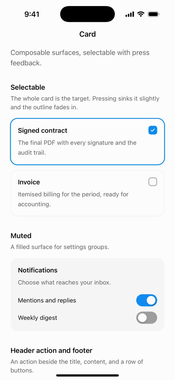
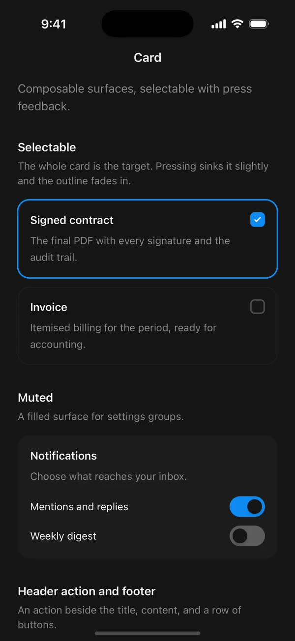
React NativeComposable surfaces, selectable with press feedback.
Preview
Install
Source on GitHubIt works in Expo and in bare React Native. New to beUI Native? Set up your app first.
Copies the component and the shared files it needs into src/, adds the theme tokens if they're missing, and installs its libraries. Files you've changed are kept.
Keep the folder layout, since the component imports the shared files by relative path.
1Install the libraries
npx expo install react-native-reanimated react-native-worklets
npm install uniwind tailwindcss2Add the theme tokens
Once per app. Import it from the CSS file Uniwind reads, after Tailwind and Uniwind, and change the values to match your brand.
/* Matches the default beUI palette in ui-components/lib/themes.ts.
   Native surface maps to card; muted maps to muted-foreground. */
@layer theme {
  :root {
    @variant light {
      --color-background: oklch(99% 0 0);
      --color-surface: oklch(97% 0 0);
      --color-foreground: oklch(15% 0 0);
      --color-muted: oklch(50% 0 0);
      --color-border: oklch(15% 0 0 / 0.06);
      --color-border-strong: oklch(15% 0 0 / 0.16);
      --color-primary: #0285f7;
      --color-on-primary: #ffffff;
      --color-destructive: #dc2626;
      --color-success: #059669;
      --color-warning: #d97706;
    }
  }

  :root {
    @variant dark {
      --color-background: #151515;
      --color-surface: #1c1c1c;
      --color-foreground: oklch(96% 0 0);
      --color-muted: oklch(62% 0 0);
      --color-border: rgb(255 255 255 / 0.05);
      --color-border-strong: rgb(255 255 255 / 0.14);
      --color-primary: #0285f7;
      --color-on-primary: #ffffff;
      --color-destructive: #f87171;
      --color-success: #34d399;
      --color-warning: #fbbf24;
    }
  }
}
3Copy the shared files
import { useEffect, useState } from "react";
import { AccessibilityInfo } from "react-native";
import { useReducedMotion } from "react-native-reanimated";

/** Reanimated supplies a synchronous initial value; native events keep it current. */
export function useReducedMotionPreference() {
  const initialValue = useReducedMotion();
  const [reducedMotion, setReducedMotion] = useState(initialValue);

  useEffect(() => {
    let active = true;
    let receivedEvent = false;
    const subscription = AccessibilityInfo.addEventListener(
      "reduceMotionChanged",
      (value) => {
        receivedEvent = true;
        setReducedMotion(value);
      },
    );
    void AccessibilityInfo.isReduceMotionEnabled().then((value) => {
      if (active && !receivedEvent) setReducedMotion(value);
    });
    return () => {
      active = false;
      subscription.remove();
    };
  }, []);

  return reducedMotion;
}
import { Easing, ReduceMotion } from "react-native-reanimated";

// Mirrors beUI's lib/ease.ts so native motion matches the web library.

export const EASE_OUT = Easing.bezier(0.16, 1, 0.3, 1);
export const EASE_IN_OUT = Easing.bezier(0.77, 0, 0.175, 1);

/** Press feedback on buttons and other tappable surfaces. */
export const SPRING_PRESS = {
  stiffness: 500,
  damping: 30,
  mass: 0.6,
  reduceMotion: ReduceMotion.System,
} as const;

/** Content swaps: label and icon slots trading places inside a control. */
export const SPRING_SWAP = {
  stiffness: 460,
  damping: 30,
  mass: 0.55,
  reduceMotion: ReduceMotion.System,
} as const;

/** Shared-layout glides: pills, indicators and panels moving between positions. */
export const SPRING_LAYOUT = {
  stiffness: 360,
  damping: 32,
  mass: 0.6,
  reduceMotion: ReduceMotion.System,
} as const;

/** Dragged handles and fills; critically damped so values never rebound off an end. */
export const SPRING_GLIDE = {
  stiffness: 700,
  damping: 50,
  mass: 0.5,
  reduceMotion: ReduceMotion.System,
} as const;

export const motion = {
  press: SPRING_PRESS,
  swap: SPRING_SWAP,
  layout: SPRING_LAYOUT,
  glide: SPRING_GLIDE,
  exit: { duration: 160, easing: EASE_OUT, reduceMotion: ReduceMotion.System },
  fade: { duration: 150, reduceMotion: ReduceMotion.System },
} as const;
4Copy the component
import {
  Children,
  createContext,
  isValidElement,
  type ReactNode,
  type Ref,
  useContext,
  useEffect,
} from "react";
import {
  Pressable,
  type PressableProps,
  StyleSheet,
  Text,
  type TextProps,
  View,
  type ViewProps,
} from "react-native";
import Animated, {
  useAnimatedStyle,
  useSharedValue,
  withSpring,
  withTiming,
} from "react-native-reanimated";
import { useResolveClassNames } from "uniwind";
import { useReducedMotionPreference } from "../../hooks/use-reduced-motion";
import { motion } from "../../styles/motion";

export type CardVariant = "outlined" | "muted";
export type CardSize = "default" | "compact";

const CardSizeContext = createContext<CardSize>("default");

const VARIANTS: Record<CardVariant, string> = {
  outlined: "border-border bg-background",
  muted: "border-transparent bg-surface",
};
// The root owns the vertical padding and the gap between parts; each part pads
// itself horizontally, so any part can be left out without others losing edges.
const ROOT_SIZES: Record<CardSize, string> = {
  default: "gap-6 py-6",
  compact: "gap-4 py-4",
};
const INSETS: Record<CardSize, string> = {
  default: "px-6",
  compact: "px-4",
};

const RADIUS = 16;
const PRESS_SCALE = 0.985;
const SELECT_FADE = { duration: 200, reduceMotion: motion.fade.reduceMotion };

export type CardProps = Omit<PressableProps, "children" | "style"> & {
  /** Defaults to "outlined". */
  variant?: CardVariant;
  /** Spacing for every part. Defaults to "default". */
  size?: CardSize;
  /**
   * Makes the whole card one touch target with press feedback. Give it an
   * accessibilityRole that says what pressing does, such as "button" or "checkbox".
   */
  onPress?: PressableProps["onPress"];
  /** Draws the chosen outline and reports the selected state. */
  selected?: boolean;
  /** Disables press motion independently of the system preference. */
  disableAnimation?: boolean;
  className?: string;
  style?: ViewProps["style"];
  children?: ReactNode;
  ref?: Ref<View>;
};

/** A surface built from parts: CardHeader, CardContent and CardFooter. */
export function Card({
  variant = "outlined",
  size = "default",
  onPress,
  selected = false,
  disableAnimation = false,
  disabled,
  className = "",
  style,
  children,
  accessibilityState,
  onPressIn,
  onPressOut,
  ref,
  ...props
}: CardProps) {
  const reducedMotion = useReducedMotionPreference();
  const animate = !reducedMotion && !disableAnimation;
  const interactive = onPress !== undefined;
  const { backgroundColor: ringColor } = useResolveClassNames("bg-primary");

  const scale = useSharedValue(1);
  const pressed = useSharedValue(0);
  const selection = useSharedValue(selected ? 1 : 0);

  useEffect(() => {
    const target = selected ? 1 : 0;
    selection.value = animate ? withTiming(target, SELECT_FADE) : target;
  }, [animate, selected, selection]);

  const pressStyle = useAnimatedStyle(
    () => ({
      transform: [{ scale: scale.value }],
      // Without scale, pressing still needs visible feedback.
      opacity: animate ? 1 : 1 - 0.15 * pressed.value,
    }),
    [animate],
  );
  const ringStyle = useAnimatedStyle(() => ({ opacity: selection.value }));

  const surface = `rounded-2xl border ${VARIANTS[variant]} ${ROOT_SIZES[size]} ${disabled ? "opacity-50" : ""} ${className}`;
  const ring = (
    <Animated.View
      style={[styles.ring, { borderColor: ringColor }, ringStyle]}
    />
  );

  if (!interactive) {
    return (
      <CardSizeContext.Provider value={size}>
        <View
          {...(props as ViewProps)}
          ref={ref}
          className={surface}
          style={style}
        >
          {children}
          {ring}
        </View>
      </CardSizeContext.Provider>
    );
  }

  return (
    <CardSizeContext.Provider value={size}>
      <Animated.View style={[styles.pressFrame, pressStyle]}>
        <Pressable
          {...props}
          ref={ref}
          accessible
          disabled={disabled}
          accessibilityState={{
            ...accessibilityState,
            selected,
            disabled: disabled ?? false,
          }}
          className={surface}
          style={style}
          onPress={onPress}
          onPressIn={(event) => {
            pressed.value = 1;
            if (animate) scale.value = withSpring(PRESS_SCALE, motion.press);
            onPressIn?.(event);
          }}
          onPressOut={(event) => {
            pressed.value = 0;
            if (animate) scale.value = withSpring(1, motion.press);
            onPressOut?.(event);
          }}
        >
          {children}
          {ring}
        </Pressable>
      </Animated.View>
    </CardSizeContext.Provider>
  );
}

/**
 * Title and description, with an optional CardAction pinned to the top
 * trailing corner.
 */
export function CardHeader({
  className = "",
  children,
  ...props
}: ViewProps & {
  className?: string;
}) {
  const size = useContext(CardSizeContext);
  const items = Children.toArray(children);
  const actions = items.filter(
    (child) => isValidElement(child) && child.type === CardAction,
  );
  const rest = items.filter((child) => !actions.includes(child));

  return (
    <View
      {...props}
      className={`flex-row items-start gap-4 ${INSETS[size]} ${className}`}
    >
      <View className="flex-1 gap-1.5">{rest}</View>
      {actions}
    </View>
  );
}

export function CardTitle({
  className = "",
  heading = false,
  ...props
}: TextProps & {
  className?: string;
  /** Reports the title as a heading, for cards that start a section. */
  heading?: boolean;
}) {
  return (
    <Text
      {...props}
      accessibilityRole={heading ? "header" : props.accessibilityRole}
      className={`text-[15px] leading-snug font-semibold text-foreground ${className}`}
    />
  );
}

export function CardDescription({
  className = "",
  ...props
}: TextProps & { className?: string }) {
  return (
    <Text
      {...props}
      className={`text-sm leading-relaxed text-muted ${className}`}
    />
  );
}

/** Sits beside the title and description inside CardHeader. */
export function CardAction({
  className = "",
  ...props
}: ViewProps & { className?: string }) {
  return <View {...props} className={`shrink-0 ${className}`} />;
}

export function CardContent({
  className = "",
  ...props
}: ViewProps & { className?: string }) {
  const size = useContext(CardSizeContext);
  return <View {...props} className={`${INSETS[size]} ${className}`} />;
}

export function CardFooter({
  className = "",
  ...props
}: ViewProps & { className?: string }) {
  const size = useContext(CardSizeContext);
  return (
    <View
      {...props}
      className={`flex-row items-center gap-2 ${INSETS[size]} ${className}`}
    />
  );
}

const styles = StyleSheet.create({
  pressFrame: { alignSelf: "stretch" },
  // The selected outline: 1 point over the card's border and 1 point outside
  // it. Offsets count from inside the 1-point border.
  ring: {
    position: "absolute",
    top: -2,
    left: -2,
    right: -2,
    bottom: -2,
    borderWidth: 2,
    borderRadius: RADIUS + 1,
    pointerEvents: "none",
  },
});
export type { CardProps, CardSize, CardVariant } from "./card";
export {
  Card,
  CardAction,
  CardContent,
  CardDescription,
  CardFooter,
  CardHeader,
  CardTitle,
} from "./card";
Documentation
Native port of beUI Card. A surface built from parts, with an optional pressable, selectable state.
import {
  Card,
  CardAction,
  CardContent,
  CardDescription,
  CardFooter,
  CardHeader,
  CardTitle,
} from "./src";

<Card>
  <CardHeader>
    <CardTitle heading>Review order</CardTitle>
    <CardDescription>Check the details before you confirm.</CardDescription>
    <CardAction>
      <Button variant="ghost" size="sm">Edit</Button>
    </CardAction>
  </CardHeader>
  <CardContent>…</CardContent>
  <CardFooter className="justify-end">
    <Button size="sm">Confirm order</Button>
  </CardFooter>
</Card>
Parts
- Card: the surface.
variantisoutlined(border on the page background, the default) ormuted(a filled surface).sizeisdefault(24-point padding and gaps) orcompact(16 points). - CardHeader: stacks a title and description, and pins any
CardActionchild to the top trailing corner. - CardTitle and CardDescription: the heading and supporting text.
headingreports the title as a heading for screen readers. - CardContent and CardFooter: the body, and a row for actions.
The card owns the vertical padding and the gap between parts. Each part pads itself horizontally, so any part can be left out, and media can run edge to edge: give the card className="overflow-hidden pt-0" and put an image first.
Pressable and selectable cards
Give Card an onPress and the whole card becomes one touch target. Pressing sinks it to 98.5% on beUI's press spring. With reduced motion, or disableAnimation, pressing dims it instead.
selected fades in a 2-point primary outline over 200 ms and reports the selected state. For a card that acts as a checkbox or radio, let the card own the state and describe it:
<Card
  selected={checked}
  onPress={() => setChecked(!checked)}
  accessibilityRole="checkbox"
  accessibilityState={{ checked }}
  accessibilityLabel="Signed contract"
>
  <CardHeader>
    <CardTitle>Signed contract</CardTitle>
    <CardAction style={{ pointerEvents: "none" }} importantForAccessibility="no-hide-descendants">
      <Checkbox checked={checked} />
    </CardAction>
  </CardHeader>
</Card>
The control inside then only shows the state, so it shouldn't respond to touches or be read separately. That replaces the web version's stretched-target class: on native, the whole card is the touch target.
Copy this directory, hooks/use-reduced-motion.ts, styles/motion.ts, and the semantic tokens in styles/theme.css.