
File Diff
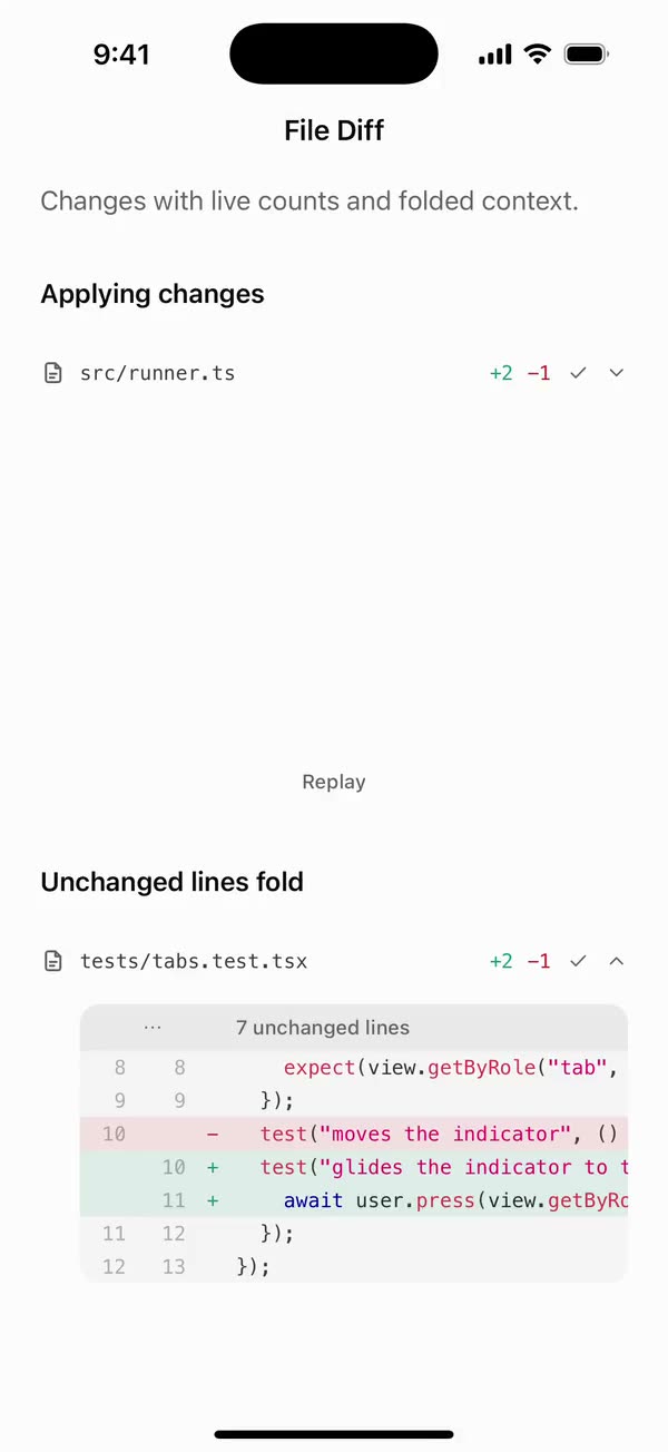
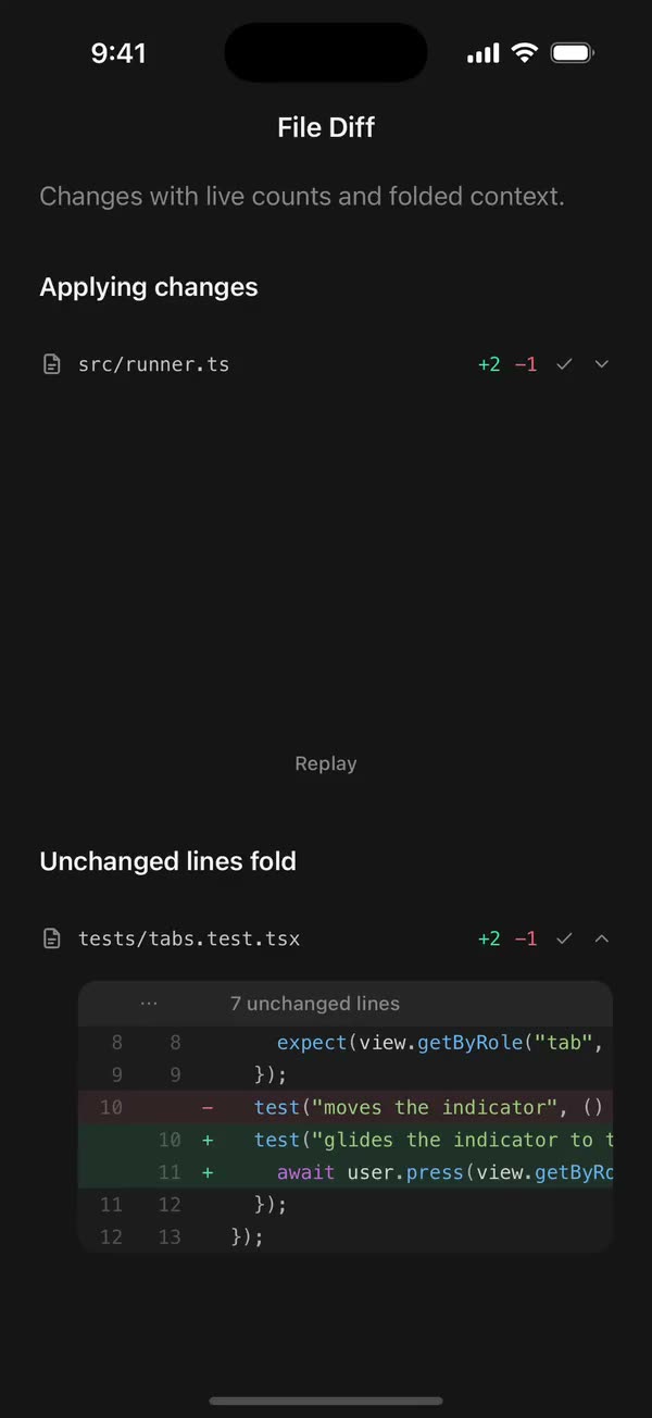
React NativeChanges with live counts and folded context.
Preview
Install
Source on GitHubIt works in Expo and in bare React Native. New to beUI Native? Set up your app first.
Copies the component and the shared files it needs into src/, adds the theme tokens if they're missing, and installs its libraries. Files you've changed are kept.
Keep the folder layout, since the component imports the shared files by relative path.
1Install the libraries
npx expo install prism-react-renderer react-native-reanimated react-native-svg react-native-worklets
npm install uniwind tailwindcss2Add the theme tokens
Once per app. Import it from the CSS file Uniwind reads, after Tailwind and Uniwind, and change the values to match your brand.
/* Matches the default beUI palette in ui-components/lib/themes.ts.
   Native surface maps to card; muted maps to muted-foreground. */
@layer theme {
  :root {
    @variant light {
      --color-background: oklch(99% 0 0);
      --color-surface: oklch(97% 0 0);
      --color-foreground: oklch(15% 0 0);
      --color-muted: oklch(50% 0 0);
      --color-border: oklch(15% 0 0 / 0.06);
      --color-border-strong: oklch(15% 0 0 / 0.16);
      --color-primary: #0285f7;
      --color-on-primary: #ffffff;
      --color-destructive: #dc2626;
      --color-success: #059669;
      --color-warning: #d97706;
    }
  }

  :root {
    @variant dark {
      --color-background: #151515;
      --color-surface: #1c1c1c;
      --color-foreground: oklch(96% 0 0);
      --color-muted: oklch(62% 0 0);
      --color-border: rgb(255 255 255 / 0.05);
      --color-border-strong: rgb(255 255 255 / 0.14);
      --color-primary: #0285f7;
      --color-on-primary: #ffffff;
      --color-destructive: #f87171;
      --color-success: #34d399;
      --color-warning: #fbbf24;
    }
  }

  /* Tailwind's default monospace stack isn't a font React Native can load. */
  :root {
    @variant ios {
      --font-mono: Menlo;
    }
  }

  :root {
    @variant android {
      --font-mono: monospace;
    }
  }
}
3Copy the shared files
import { type ReactNode, useEffect, useRef, useState } from "react";
import {
  Pressable,
  ScrollView,
  StyleSheet,
  Text,
  View,
  type ViewProps,
} from "react-native";
import Animated, {
  useAnimatedStyle,
  useSharedValue,
  withSpring,
} from "react-native-reanimated";
import { useResolveClassNames } from "uniwind";
import { useReducedMotionPreference } from "../../hooks/use-reduced-motion";
import {
  CheckGlyph,
  CopyGlyph,
  FileGlyph,
  WrapGlyph,
} from "../../primitives/agent-icons";
import {
  type CodeLanguage,
  type CodeToken,
  useCodeTokens,
} from "../../primitives/code-tokens";
import { SpinGlyph } from "../../primitives/spin-glyph";
import { SPRING_PRESS } from "../../styles/motion";

export type CodeBlockStatus = "streaming" | "complete";

const LINE = 20;
const GUTTER = 44;
const COPIED_FOR = 1600;

/** One line of tokens as nested Text, so colors stay on the line's baseline. */
export function CodeLineText({
  tokens,
  wrap,
  className = "",
}: {
  tokens: CodeToken[];
  wrap?: boolean;
  className?: string;
}) {
  return (
    <Text
      numberOfLines={wrap ? undefined : 1}
      className={`font-mono text-xs text-foreground/85 ${className}`}
      style={styles.line}
    >
      {tokens.length === 0
        ? " "
        : tokens.map((token, index) => (
            <Text
              key={index}
              style={token.color ? { color: token.color } : undefined}
            >
              {token.content}
            </Text>
          ))}
    </Text>
  );
}

function IconButton({
  label,
  selected,
  reduce,
  onPress,
  children,
}: {
  label: string;
  selected?: boolean;
  reduce: boolean;
  onPress: () => void;
  children: ReactNode;
}) {
  const scale = useSharedValue(1);
  const style = useAnimatedStyle(() => ({
    transform: [{ scale: scale.value }],
  }));
  return (
    <Pressable
      accessibilityRole="button"
      accessibilityLabel={label}
      accessibilityState={selected === undefined ? undefined : { selected }}
      hitSlop={8}
      onPress={onPress}
      onPressIn={() => {
        if (!reduce) scale.value = withSpring(0.9, SPRING_PRESS);
      }}
      onPressOut={() => {
        scale.value = withSpring(1, SPRING_PRESS);
      }}
    >
      <Animated.View style={[styles.iconButton, style]}>
        {children}
      </Animated.View>
    </Pressable>
  );
}

export type CodeBlockProps = Omit<ViewProps, "children"> & {
  code: string;
  /** Defaults to "typescript". */
  language?: CodeLanguage;
  filename?: string;
  /** Defaults to "complete". While streaming, the view follows new lines. */
  status?: CodeBlockStatus;
  /** Defaults to true. */
  showLineNumbers?: boolean;
  /** 1-based lines to tint. */
  highlightLines?: number[];
  /** Tallest the code grows before it scrolls. Defaults to 280. */
  maxHeight?: number;
  /** Starts wrapped. The header has a toggle either way. Defaults to false. */
  wrap?: boolean;
  /** Shows a copy button. Copy with your clipboard library here. */
  onCopy?: () => unknown;
  className?: string;
  disableAnimation?: boolean;
};

/**
 * Highlighted code that streams in line by line. Line numbers stay put while
 * long lines scroll sideways, and a tap wraps them instead.
 */
export function CodeBlock({
  code,
  language = "typescript",
  filename,
  status = "complete",
  showLineNumbers = true,
  highlightLines = [],
  maxHeight = 280,
  wrap: initialWrap = false,
  onCopy,
  className = "",
  disableAnimation = false,
  ...props
}: CodeBlockProps) {
  const reducedMotion = useReducedMotionPreference();
  const reduce = reducedMotion || disableAnimation;
  const streaming = status === "streaming";
  const lines = useCodeTokens(code, language);
  const [wrap, setWrap] = useState(initialWrap);
  const [copied, setCopied] = useState(false);
  const [viewport, setViewport] = useState(0);
  const copiedTimer = useRef<ReturnType<typeof setTimeout> | undefined>(
    undefined,
  );
  const scrollRef = useRef<ScrollView>(null);
  const following = useRef(true);
  const dragging = useRef(false);
  // The last lines often land with the switch to "complete", so the view
  // follows one more size change after the stream ends.
  const settling = useRef(false);
  const wasStreaming = useRef(streaming);
  if (wasStreaming.current !== streaming) {
    settling.current = !streaming;
    wasStreaming.current = streaming;
  }
  const highlighted = new Set(highlightLines);
  const { color: muted } = useResolveClassNames("text-muted");
  const { color: foreground } = useResolveClassNames("text-foreground");
  const { color: primary } = useResolveClassNames("text-primary");
  const { color: success } = useResolveClassNames("text-success");

  useEffect(() => {
    if (streaming) {
      following.current = true;
      return;
    }
    const timer = setTimeout(() => {
      settling.current = false;
    }, 500);
    return () => clearTimeout(timer);
  }, [streaming]);
  useEffect(() => () => clearTimeout(copiedTimer.current), []);

  const copy = async () => {
    await onCopy?.();
    setCopied(true);
    clearTimeout(copiedTimer.current);
    copiedTimer.current = setTimeout(() => setCopied(false), COPIED_FOR);
  };

  const tint = (index: number) =>
    highlighted.has(index + 1) ? "bg-primary/10" : "";

  const gutter = showLineNumbers ? (
    <View style={{ width: GUTTER }}>
      {lines.map((_, index) => (
        <View key={index} style={styles.gutterRow} className={tint(index)}>
          <Text
            className="font-mono text-xs text-muted/50"
            style={[styles.line, styles.tabular]}
          >
            {index + 1}
          </Text>
        </View>
      ))}
    </View>
  ) : null;

  return (
    <View
      accessibilityState={{ busy: streaming }}
      className={`w-full overflow-hidden rounded-2xl bg-surface ${className}`}
      {...props}
    >
      <View style={styles.header} className="px-3">
        <FileGlyph size={14} color={muted} />
        {filename ? (
          <Text
            numberOfLines={1}
            className="shrink font-mono text-xs text-foreground/80"
          >
            {filename}
          </Text>
        ) : null}
        <Text
          className="text-[10px] font-medium uppercase text-muted/70"
          style={styles.tracking}
        >
          {language}
        </Text>
        <View accessibilityLiveRegion="polite" style={styles.status}>
          {streaming ? (
            <SpinGlyph size={12} color={primary} reduce={reduce} />
          ) : (
            <CheckGlyph size={12} color={success} />
          )}
          <Text
            className={`text-[10px] font-medium ${streaming ? "text-primary" : "text-success"}`}
          >
            {streaming ? "Writing" : "Ready"}
          </Text>
        </View>
        <IconButton
          label="Wrap lines"
          selected={wrap}
          reduce={reduce}
          onPress={() => setWrap((value) => !value)}
        >
          <WrapGlyph size={14} color={wrap ? foreground : muted} />
        </IconButton>
        {onCopy ? (
          <IconButton
            label={copied ? "Copied" : "Copy code"}
            reduce={reduce}
            onPress={() => void copy()}
          >
            {copied ? (
              <CheckGlyph size={14} color={foreground} />
            ) : (
              <CopyGlyph size={14} color={muted} />
            )}
          </IconButton>
        ) : null}
      </View>
      {/* Padding sits outside the scroll area and its height snaps to whole
          lines, so following the stream never leaves a half line at an edge. */}
      <View className="border-t border-foreground/5 py-2">
        <ScrollView
          ref={scrollRef}
          style={{
            maxHeight: Math.max(
              LINE,
              Math.floor((maxHeight - 16) / LINE) * LINE,
            ),
          }}
          nestedScrollEnabled
          showsVerticalScrollIndicator={false}
          scrollEventThrottle={32}
          onLayout={({ nativeEvent }) => setViewport(nativeEvent.layout.width)}
          onScrollBeginDrag={() => {
            dragging.current = true;
          }}
          onMomentumScrollEnd={() => {
            dragging.current = false;
          }}
          onScrollEndDrag={({ nativeEvent }) => {
            if (!nativeEvent.velocity?.y) dragging.current = false;
          }}
          onScroll={({ nativeEvent }) => {
            if (!dragging.current) return;
            const { contentOffset, contentSize, layoutMeasurement } =
              nativeEvent;
            following.current =
              contentSize.height - contentOffset.y - layoutMeasurement.height <
              24;
          }}
          onContentSizeChange={() => {
            const follow = streaming || settling.current;
            settling.current = false;
            if (follow && following.current && !dragging.current) {
              scrollRef.current?.scrollToEnd({ animated: !reduce });
            }
          }}
        >
          <View accessibilityLiveRegion={streaming ? "polite" : "none"}>
            {wrap ? (
              // Wrapped lines vary in height, so each row carries its own number.
              lines.map((tokens, index) => (
                <View key={index} style={styles.row} className={tint(index)}>
                  {showLineNumbers ? (
                    <Text
                      className="font-mono text-xs text-muted/50"
                      style={[styles.line, styles.tabular, styles.number]}
                    >
                      {index + 1}
                    </Text>
                  ) : null}
                  <CodeLineText
                    tokens={tokens}
                    wrap
                    className={`flex-1 pr-4 ${showLineNumbers ? "pl-1" : "pl-4"}`}
                  />
                </View>
              ))
            ) : (
              <View style={styles.row}>
                {gutter}
                {/* Only the code scrolls sideways; the numbers stay in place. */}
                <ScrollView
                  horizontal
                  showsHorizontalScrollIndicator={false}
                  style={styles.flex}
                >
                  <View
                    style={{
                      minWidth: Math.max(
                        0,
                        viewport - (showLineNumbers ? GUTTER : 0),
                      ),
                    }}
                  >
                    {lines.map((tokens, index) => (
                      <View
                        key={index}
                        className={`${tint(index)} ${showLineNumbers ? "pl-1" : "pl-4"} pr-4`}
                      >
                        <CodeLineText tokens={tokens} />
                      </View>
                    ))}
                  </View>
                </ScrollView>
              </View>
            )}
          </View>
        </ScrollView>
      </View>
    </View>
  );
}

const styles = StyleSheet.create({
  flex: { flex: 1 },
  header: { flexDirection: "row", alignItems: "center", gap: 10, height: 44 },
  status: {
    flexDirection: "row",
    alignItems: "center",
    gap: 4,
    marginLeft: "auto",
  },
  iconButton: {
    width: 30,
    height: 30,
    borderRadius: 15,
    alignItems: "center",
    justifyContent: "center",
  },
  line: { lineHeight: LINE, minHeight: LINE },
  gutterRow: { height: LINE, alignItems: "flex-end", paddingRight: 12 },
  number: { width: GUTTER, textAlign: "right", paddingRight: 12 },
  row: { flexDirection: "row" },
  tabular: { fontVariant: ["tabular-nums"] },
  tracking: { letterSpacing: 0.4 },
});
import { useEffect, useState } from "react";
import { AccessibilityInfo } from "react-native";
import { useReducedMotion } from "react-native-reanimated";

/** Reanimated supplies a synchronous initial value; native events keep it current. */
export function useReducedMotionPreference() {
  const initialValue = useReducedMotion();
  const [reducedMotion, setReducedMotion] = useState(initialValue);

  useEffect(() => {
    let active = true;
    let receivedEvent = false;
    const subscription = AccessibilityInfo.addEventListener(
      "reduceMotionChanged",
      (value) => {
        receivedEvent = true;
        setReducedMotion(value);
      },
    );
    void AccessibilityInfo.isReduceMotionEnabled().then((value) => {
      if (active && !receivedEvent) setReducedMotion(value);
    });
    return () => {
      active = false;
      subscription.remove();
    };
  }, []);

  return reducedMotion;
}
import type { ReactNode } from "react";
import type { ColorValue } from "react-native";
import Svg, { Circle, Path, Rect } from "react-native-svg";

type GlyphProps = { size?: number; color?: ColorValue; strokeWidth?: number };

function Glyph({
  size = 16,
  color = "currentColor",
  strokeWidth = 2,
  children,
}: GlyphProps & { children: ReactNode }) {
  return (
    <Svg
      width={size}
      height={size}
      viewBox="0 0 24 24"
      fill="none"
      stroke={color}
      strokeWidth={strokeWidth}
      strokeLinecap="round"
      strokeLinejoin="round"
    >
      {children}
    </Svg>
  );
}

// Simple 24-unit stroke glyphs shared by the agent components.

export function ChevronDownGlyph(props: GlyphProps) {
  return (
    <Glyph {...props}>
      <Path d="M6 9l6 6 6-6" />
    </Glyph>
  );
}

export function ArrowUpGlyph(props: GlyphProps) {
  return (
    <Glyph {...props}>
      <Path d="M12 19V5M5.5 11.5L12 5l6.5 6.5" />
    </Glyph>
  );
}

export function PlusGlyph(props: GlyphProps) {
  return (
    <Glyph {...props}>
      <Path d="M12 5v14M5 12h14" />
    </Glyph>
  );
}

export function StopGlyph({ size = 12, color }: GlyphProps) {
  return (
    <Svg width={size} height={size} viewBox="0 0 12 12">
      <Rect x={1} y={1} width={10} height={10} rx={2.5} fill={color} />
    </Svg>
  );
}

export function CheckGlyph(props: GlyphProps) {
  return (
    <Glyph {...props}>
      <Path d="M5 12.5l4.5 4.5L19 7" />
    </Glyph>
  );
}

export function CopyGlyph(props: GlyphProps) {
  return (
    <Glyph {...props}>
      <Rect x={8.5} y={8.5} width={12} height={12} rx={2.5} />
      <Path d="M15.5 5.5v-.5A2 2 0 0 0 13.5 3h-8.5A2 2 0 0 0 3 5v8.5a2 2 0 0 0 2 2h.5" />
    </Glyph>
  );
}

export function RetryGlyph(props: GlyphProps) {
  return (
    <Glyph {...props}>
      <Path d="M3.5 12a8.5 8.5 0 1 0 2.6-6.1L3.5 8.5" />
      <Path d="M3.5 3.5v5h5" />
    </Glyph>
  );
}

export function ThumbGlyph({
  down = false,
  ...props
}: GlyphProps & { down?: boolean }) {
  return (
    <Glyph {...props}>
      <Path
        d="M7.5 10.5v10M7.5 10.5L11 3.5a2.5 2.5 0 0 1 2.5 2.5v3.5h5a2 2 0 0 1 2 2.3l-1.2 7A2 2 0 0 1 17.3 20.5H4.5a1 1 0 0 1-1-1v-8a1 1 0 0 1 1-1z"
        transform={down ? "rotate(180 12 12)" : undefined}
      />
    </Glyph>
  );
}

export function SearchGlyph(props: GlyphProps) {
  return (
    <Glyph {...props}>
      <Circle cx={11} cy={11} r={6.5} />
      <Path d="M16 16l4 4" />
    </Glyph>
  );
}

export function GlobeGlyph(props: GlyphProps) {
  return (
    <Glyph {...props}>
      <Circle cx={12} cy={12} r={8.5} />
      <Path d="M3.5 12h17M12 3.5c2.4 2.5 3.5 5.3 3.5 8.5s-1.1 6-3.5 8.5c-2.4-2.5-3.5-5.3-3.5-8.5s1.1-6 3.5-8.5z" />
    </Glyph>
  );
}

export function FileGlyph(props: GlyphProps) {
  return (
    <Glyph {...props}>
      <Path d="M14 3.5H7.5a2 2 0 0 0-2 2v13a2 2 0 0 0 2 2h9a2 2 0 0 0 2-2V8z" />
      <Path d="M14 3.5V8h4.5M9 13h6M9 16.5h4" />
    </Glyph>
  );
}

export function PencilGlyph(props: GlyphProps) {
  return (
    <Glyph {...props}>
      <Path d="M4 20h4L19 9a2.1 2.1 0 0 0-4-4L4 16z" />
      <Path d="M13.5 6.5l4 4M14 20h6" />
    </Glyph>
  );
}

export function TerminalGlyph(props: GlyphProps) {
  return (
    <Glyph {...props}>
      <Rect x={3.5} y={4.5} width={17} height={15} rx={2.5} />
      <Path d="M7.5 10l2.5 2-2.5 2M12.5 15h4" />
    </Glyph>
  );
}

export function WrenchGlyph(props: GlyphProps) {
  return (
    <Glyph {...props}>
      <Path d="M14.5 6.5a4 4 0 0 0 5 5l-8.8 8.8a2.1 2.1 0 0 1-3-3l8.8-8.8a4 4 0 0 1-2-2z" />
    </Glyph>
  );
}

export function SparkleGlyph(props: GlyphProps) {
  return (
    <Glyph {...props}>
      <Path d="M12 4l1.8 4.6L18.5 10.5l-4.7 1.9L12 17l-1.8-4.6-4.7-1.9 4.7-1.9z" />
      <Path d="M18.5 16.5v3M17 18h3" />
    </Glyph>
  );
}

export function MessageGlyph(props: GlyphProps) {
  return (
    <Glyph {...props}>
      <Path d="M20 14.5a2 2 0 0 1-2 2H8.5L4 20V6a2 2 0 0 1 2-2h12a2 2 0 0 1 2 2z" />
    </Glyph>
  );
}

export function ImageGlyph(props: GlyphProps) {
  return (
    <Glyph {...props}>
      <Rect x={3.5} y={4.5} width={17} height={15} rx={2.5} />
      <Circle cx={9} cy={10} r={1.5} />
      <Path d="M20.5 15.5l-4.5-4.5-9 8.5" />
    </Glyph>
  );
}

export function ShieldGlyph(props: GlyphProps) {
  return (
    <Glyph {...props}>
      <Path d="M12 3.5l7 2.5v5.5c0 4.4-3 7.7-7 9-4-1.3-7-4.6-7-9V6z" />
      <Path d="M9 12l2 2 4-4" />
    </Glyph>
  );
}

export function AlertGlyph(props: GlyphProps) {
  return (
    <Glyph {...props}>
      <Circle cx={12} cy={12} r={8.5} />
      <Path d="M12 8v4.5M12 16h.01" />
    </Glyph>
  );
}

export function CrossGlyph(props: GlyphProps) {
  return (
    <Glyph {...props}>
      <Path d="M6.5 6.5l11 11M17.5 6.5l-11 11" />
    </Glyph>
  );
}

export function HelpGlyph(props: GlyphProps) {
  return (
    <Glyph {...props}>
      <Circle cx={12} cy={12} r={8.5} />
      <Path d="M9.6 9.5a2.5 2.5 0 0 1 4.8 1c0 1.7-2.4 2.2-2.4 3.5M12 16.8h.01" />
    </Glyph>
  );
}

export function ArrowGlyph({
  back = false,
  ...props
}: GlyphProps & { back?: boolean }) {
  return (
    <Glyph {...props}>
      <Path
        d="M5 12h14M13 6l6 6-6 6"
        transform={back ? "rotate(180 12 12)" : undefined}
      />
    </Glyph>
  );
}

export function BracesGlyph(props: GlyphProps) {
  return (
    <Glyph {...props}>
      <Path d="M8.5 4H8a2 2 0 0 0-2 2v3.5A2.5 2.5 0 0 1 3.5 12 2.5 2.5 0 0 1 6 14.5V18a2 2 0 0 0 2 2h.5M15.5 4h.5a2 2 0 0 1 2 2v3.5a2.5 2.5 0 0 0 2.5 2.5 2.5 2.5 0 0 0-2.5 2.5V18a2 2 0 0 1-2 2h-.5" />
    </Glyph>
  );
}

export function BanGlyph(props: GlyphProps) {
  return (
    <Glyph {...props}>
      <Circle cx={12} cy={12} r={8.5} />
      <Path d="M6 6l12 12" />
    </Glyph>
  );
}

export function CircleCheckGlyph(props: GlyphProps) {
  return (
    <Glyph {...props}>
      <Circle cx={12} cy={12} r={8.5} />
      <Path d="M8.5 12.2l2.4 2.4 4.6-4.8" />
    </Glyph>
  );
}

export function CircleCrossGlyph(props: GlyphProps) {
  return (
    <Glyph {...props}>
      <Circle cx={12} cy={12} r={8.5} />
      <Path d="M9.5 9.5l5 5M14.5 9.5l-5 5" />
    </Glyph>
  );
}

export function ListGlyph(props: GlyphProps) {
  return (
    <Glyph {...props}>
      <Path d="M4 6.5l1.5 1.5L8 5.5M4 13l1.5 1.5L8 12M11.5 7h8.5M11.5 13.5h8.5M11.5 19h8.5M4.5 19h2" />
    </Glyph>
  );
}

/** An open ring, spun by SpinGlyph. */
export function RingGlyph(props: GlyphProps) {
  return (
    <Glyph {...props}>
      <Path d="M20.5 12a8.5 8.5 0 1 1-6-8.1" />
    </Glyph>
  );
}

export function ReplyGlyph(props: GlyphProps) {
  return (
    <Glyph {...props}>
      <Path d="M9.5 7L4.5 12l5 5M4.5 12h10a5 5 0 0 1 5 5v1" />
    </Glyph>
  );
}

export function WrapGlyph(props: GlyphProps) {
  return (
    <Glyph {...props}>
      <Path d="M4 6.5h16M4 12h12.5a3.25 3.25 0 0 1 0 6.5H12M4 18.5h4.5M14 16.5l-2 2 2 2" />
    </Glyph>
  );
}

export function BookGlyph(props: GlyphProps) {
  return (
    <Glyph {...props}>
      <Path d="M12 6.5c-1.6-1.3-4-2-7.5-2v13c3.5 0 5.9.7 7.5 2 1.6-1.3 4-2 7.5-2v-13c-3.5 0-5.9.7-7.5 2zM12 6.5v13" />
    </Glyph>
  );
}

export function ExternalGlyph(props: GlyphProps) {
  return (
    <Glyph {...props}>
      <Path d="M14 4.5h5.5V10M19.5 4.5L11 13M17 14v4a2 2 0 0 1-2 2H6a2 2 0 0 1-2-2V9a2 2 0 0 1 2-2h4" />
    </Glyph>
  );
}

export function DoubleCheckGlyph(props: GlyphProps) {
  return (
    <Glyph {...props}>
      <Path d="M2.5 12.5l4.5 4.5 9-9.5M12 16.5l.5.5 9-9.5" />
    </Glyph>
  );
}

export function ClockGlyph(props: GlyphProps) {
  return (
    <Glyph {...props}>
      <Circle cx={12} cy={12} r={8.5} />
      <Path d="M12 7.5V12l3 2" />
    </Glyph>
  );
}

export function MicGlyph(props: GlyphProps) {
  return (
    <Glyph {...props}>
      <Rect x={9} y={3.5} width={6} height={11} rx={3} />
      <Path d="M5.5 11a6.5 6.5 0 0 0 13 0M12 17.5v3" />
    </Glyph>
  );
}
import {
  normalizeTokens,
  Prism,
  type PrismTheme,
  themes,
} from "prism-react-renderer";
import { useMemo } from "react";
import { useUniwind } from "uniwind";

export type CodeLanguage =
  | "bash"
  | "css"
  | "go"
  | "javascript"
  | "json"
  | "jsx"
  | "kotlin"
  | "markdown"
  | "python"
  | "rust"
  | "sql"
  | "swift"
  | "text"
  | "tsx"
  | "typescript"
  | "yaml";

export type CodeToken = { content: string; color?: string };
export type CodeTokenLines = CodeToken[][];

// Prism's bundle has no shell grammar; this covers what agents usually run.
if (!Prism.languages.bash) {
  Prism.languages.bash = {
    comment: { pattern: /(^|\s)#.*/, lookbehind: true },
    string: { pattern: /(["'])(?:\\.|(?!\1)[^\\])*\1/, greedy: true },
    variable: /\$(?:\w+|\{[^}]+\})/,
    function: { pattern: /(^|[|;&]\s*|\$\s+)[\w./-]+/m, lookbehind: true },
    keyword:
      /\b(?:if|then|else|elif|fi|for|while|do|done|case|esac|in|function|export|return)\b/,
    property: /(^|\s)--?[\w-]+/,
    operator: /&&|\|\||[|;&<>]/,
    number: /\b\d+(?:\.\d+)?\b/,
  };
}

const LIGHT = themes.github;
const DARK = themes.oneDark;

function palette(theme: PrismTheme) {
  const colors = new Map<string, string>();
  for (const style of theme.styles) {
    const color = style.style.color;
    if (!color) continue;
    for (const type of style.types) colors.set(type, color);
  }
  return colors;
}
const PALETTES = { light: palette(LIGHT), dark: palette(DARK) };

// Small, bounded cache: streaming code re-tokenizes a growing string.
const cache = new Map<string, string[][][]>();
const CACHE_SIZE = 64;

/** Splits code into lines of tokens, each token tagged with its Prism types. */
function tokenize(code: string, language: CodeLanguage) {
  const key = `${language}\u0000${code}`;
  const hit = cache.get(key);
  if (hit) return hit;
  const grammar = language === "text" ? undefined : Prism.languages[language];
  const lines = grammar
    ? normalizeTokens(Prism.tokenize(code, grammar)).map((line) =>
        line.map((token) => [token.content, ...token.types]),
      )
    : code.split("\n").map((line) => [[line, "plain"]]);
  cache.set(key, lines);
  if (cache.size > CACHE_SIZE)
    cache.delete(cache.keys().next().value as string);
  return lines;
}

/**
 * Syntax-highlighted lines for the current light or dark theme. Tokenizing is
 * synchronous, so streamed code never flashes back to plain text.
 */
export function useCodeTokens(
  code: string,
  language: CodeLanguage,
): CodeTokenLines {
  const { theme } = useUniwind();
  const colors = theme === "dark" ? PALETTES.dark : PALETTES.light;
  return useMemo(
    () =>
      tokenize(code, language).map((line) =>
        line.map(([content = "", ...types]) => {
          let color: string | undefined;
          for (const type of types) color = colors.get(type) ?? color;
          return { content, color };
        }),
      ),
    [code, colors, language],
  );
}
import { type ReactNode, useEffect, useRef } from "react";
import { StyleSheet, View, type ViewStyle } from "react-native";
import Animated, {
  measure,
  useAnimatedRef,
  useAnimatedStyle,
  useSharedValue,
  withTiming,
} from "react-native-reanimated";
import { scheduleOnUI } from "react-native-worklets";
import { EASE_OUT } from "../styles/motion";

const OPEN = { duration: 220, easing: EASE_OUT };
const CLOSE = { duration: 140, easing: EASE_OUT };
const DROP = 4;
// The height while settled open: unconstrained, so growing content just flows.
const NATURAL = -1;

export type DisclosureProps = {
  open: boolean;
  /** Snaps open and closed, keeping only the fade. */
  reduce: boolean;
  /** Caps the open height; content clips beyond it. */
  maxHeight?: number;
  style?: ViewStyle;
  children: ReactNode;
};

/**
 * Collapsible content shared by the agent components: the height eases
 * between closed and the content's size while the content fades and drops 4
 * points into place. Settled open, the height is left alone, so content that
 * grows (streamed rows, new sources) is never clipped. Closed content is
 * hidden from screen readers and touches.
 */
export function Disclosure({
  open,
  reduce,
  maxHeight,
  style,
  children,
}: DisclosureProps) {
  // The content's height, kept current by layout events; measuring on demand
  // can read 0 for content inside a scroll view.
  const contentHeight = useSharedValue(0);
  const clipRef = useAnimatedRef<Animated.View>();
  const height = useSharedValue(open ? NATURAL : 0);
  const shown = useSharedValue(open ? 1 : 0);
  const mounted = useRef(false);

  useEffect(() => {
    // The first render is already in place.
    if (!mounted.current) {
      mounted.current = true;
      return;
    }
    const cap = maxHeight ?? Number.POSITIVE_INFINITY;
    scheduleOnUI(() => {
      "worklet";
      // Real sizes, read on the UI thread at the moment of the change.
      const full = Math.min(contentHeight.value, cap);
      if (open) {
        const from = height.value === NATURAL ? full : height.value;
        if (reduce) {
          height.value = NATURAL;
        } else {
          height.value = from;
          height.value = withTiming(full, OPEN, (done) => {
            if (done) height.value = NATURAL;
          });
        }
      } else {
        const clip = measure(clipRef);
        const from =
          height.value === NATURAL ? (clip?.height ?? full) : height.value;
        height.value = from;
        height.value = reduce ? 0 : withTiming(0, CLOSE);
      }
    });
    shown.value = withTiming(
      open ? 1 : 0,
      reduce ? { duration: 0 } : open ? OPEN : CLOSE,
    );
  }, [clipRef, contentHeight, height, maxHeight, open, reduce, shown]);

  const clipStyle = useAnimatedStyle(() =>
    // Settled open, the clip follows the content's measured height.
    height.value === NATURAL
      ? {
          height: Math.min(
            contentHeight.value,
            maxHeight ?? Number.POSITIVE_INFINITY,
          ),
        }
      : { height: height.value },
  );
  const contentStyle = useAnimatedStyle(
    () => ({
      opacity: shown.value,
      transform: [{ translateY: reduce ? 0 : (1 - shown.value) * -DROP }],
    }),
    [reduce],
  );

  return (
    <Animated.View
      ref={clipRef}
      pointerEvents={open ? "auto" : "none"}
      accessibilityElementsHidden={!open}
      importantForAccessibility={open ? "auto" : "no-hide-descendants"}
      style={[styles.clip, clipStyle, style]}
    >
      {/* Absolutely placed, so the content keeps its natural height while the
          clip around it is short, and can be measured at any time. */}
      <Animated.View style={[styles.content, contentStyle]}>
        <View
          style={styles.measure}
          onLayout={({ nativeEvent }) => {
            contentHeight.value = nativeEvent.layout.height;
          }}
        >
          {children}
        </View>
      </Animated.View>
    </Animated.View>
  );
}

const styles = StyleSheet.create({
  clip: { overflow: "hidden" },
  content: { position: "absolute", left: 0, right: 0, top: 0 },
  measure: { flexShrink: 0 },
});
import { useEffect } from "react";
import type { ColorValue } from "react-native";
import Animated, {
  cancelAnimation,
  Easing,
  ReduceMotion,
  useAnimatedStyle,
  useSharedValue,
  withRepeat,
  withTiming,
} from "react-native-reanimated";
import { RingGlyph } from "./agent-icons";

/**
 * A spinning ring for busy states. Reduced motion holds it still; the ring
 * still reads as "in progress".
 */
export function SpinGlyph({
  size = 16,
  color,
  reduce,
}: {
  size?: number;
  color?: ColorValue;
  reduce: boolean;
}) {
  const turn = useSharedValue(0);

  useEffect(() => {
    if (reduce) {
      cancelAnimation(turn);
      turn.value = 0;
      return;
    }
    turn.value = 0;
    turn.value = withRepeat(
      withTiming(1, {
        duration: 900,
        easing: Easing.linear,
        reduceMotion: ReduceMotion.Never,
      }),
      -1,
      false,
    );
    return () => cancelAnimation(turn);
  }, [reduce, turn]);

  const style = useAnimatedStyle(() => ({
    transform: [{ rotate: `${turn.value * 360}deg` }],
  }));

  return (
    <Animated.View style={style}>
      <RingGlyph size={size} color={color} />
    </Animated.View>
  );
}
import { Easing, ReduceMotion } from "react-native-reanimated";

// Mirrors beUI's lib/ease.ts so native motion matches the web library.

export const EASE_OUT = Easing.bezier(0.16, 1, 0.3, 1);
export const EASE_IN_OUT = Easing.bezier(0.77, 0, 0.175, 1);

/** Press feedback on buttons and other tappable surfaces. */
export const SPRING_PRESS = {
  stiffness: 500,
  damping: 30,
  mass: 0.6,
  reduceMotion: ReduceMotion.System,
} as const;

/** Content swaps: label and icon slots trading places inside a control. */
export const SPRING_SWAP = {
  stiffness: 460,
  damping: 30,
  mass: 0.55,
  reduceMotion: ReduceMotion.System,
} as const;

/** Shared-layout glides: pills, indicators and panels moving between positions. */
export const SPRING_LAYOUT = {
  stiffness: 360,
  damping: 32,
  mass: 0.6,
  reduceMotion: ReduceMotion.System,
} as const;

/** Dragged handles and fills; critically damped so values never rebound off an end. */
export const SPRING_GLIDE = {
  stiffness: 700,
  damping: 50,
  mass: 0.5,
  reduceMotion: ReduceMotion.System,
} as const;

export const motion = {
  press: SPRING_PRESS,
  swap: SPRING_SWAP,
  layout: SPRING_LAYOUT,
  glide: SPRING_GLIDE,
  exit: { duration: 160, easing: EASE_OUT, reduceMotion: ReduceMotion.System },
  fade: { duration: 150, reduceMotion: ReduceMotion.System },
} as const;
4Copy the component
import { useEffect, useRef, useState } from "react";
import {
  Pressable,
  ScrollView,
  StyleSheet,
  Text,
  View,
  type ViewProps,
} from "react-native";
import Animated, {
  useAnimatedStyle,
  useSharedValue,
  withSpring,
} from "react-native-reanimated";
import { useResolveClassNames } from "uniwind";
import { useReducedMotionPreference } from "../../hooks/use-reduced-motion";
import {
  CheckGlyph,
  ChevronDownGlyph,
  CopyGlyph,
  FileGlyph,
} from "../../primitives/agent-icons";
import { type CodeLanguage, useCodeTokens } from "../../primitives/code-tokens";
import { Disclosure } from "../../primitives/disclosure";
import { SpinGlyph } from "../../primitives/spin-glyph";
import { SPRING_PRESS, SPRING_SWAP } from "../../styles/motion";
import { CodeLineText } from "../code-block/code-block";

export type FileDiffStatus = "streaming" | "complete";
export type FileDiffLineType = "added" | "removed" | "context";

export type FileDiffLine = {
  id: string;
  /** Defaults to "context". */
  type?: FileDiffLineType;
  oldLine?: number;
  newLine?: number;
  content: string;
};

const LINE = 20;
const FOLD = 28;
const NUMBER = 36;
const MARK = 16;
const COPIED_FOR = 1600;

type Segment =
  | { kind: "line"; line: FileDiffLine; index: number }
  | {
      kind: "fold";
      id: string;
      lines: { line: FileDiffLine; index: number }[];
    };

/**
 * Folds runs of unchanged lines longer than `keep * 2 + 2`, keeping `keep`
 * lines of context either side of each change.
 */
function segment(
  lines: FileDiffLine[],
  keep: number,
  expanded: Set<string>,
  streaming: boolean,
) {
  const segments: Segment[] = [];
  let run: { line: FileDiffLine; index: number }[] = [];
  const flush = (atEnd: boolean) => {
    const head = segments.length === 0 ? 0 : keep;
    // A trailing run may still grow while streaming; don't fold it yet.
    const tail = atEnd ? (streaming ? run.length : 0) : keep;
    const id = run[0]?.line.id ?? "";
    if (run.length > head + tail + 2 && !expanded.has(id)) {
      for (const item of run.slice(0, head))
        segments.push({ kind: "line", ...item });
      segments.push({
        kind: "fold",
        id,
        lines: run.slice(head, run.length - tail),
      });
      for (const item of run.slice(run.length - tail))
        segments.push({ kind: "line", ...item });
    } else {
      for (const item of run) segments.push({ kind: "line", ...item });
    }
    run = [];
  };
  lines.forEach((line, index) => {
    if ((line.type ?? "context") === "context") run.push({ line, index });
    else {
      flush(false);
      segments.push({ kind: "line", line, index });
    }
  });
  flush(true);
  return segments;
}

const ROW_TINT: Record<FileDiffLineType, string> = {
  added: "bg-success/10",
  removed: "bg-destructive/10",
  context: "",
};
const MARK_CLASS: Record<FileDiffLineType, string> = {
  added: "text-success",
  removed: "text-destructive",
  context: "text-muted/50",
};

export type FileDiffProps = Omit<ViewProps, "children"> & {
  /** The file's path. */
  file: string;
  lines: FileDiffLine[];
  /** Defaults to "streaming". */
  status?: FileDiffStatus;
  open?: boolean;
  /** Defaults to true. */
  defaultOpen?: boolean;
  onOpenChange?: (open: boolean) => void;
  /** Folds the diff away once the changes are applied. Defaults to true. */
  collapseOnComplete?: boolean;
  /** Tallest the diff grows before it scrolls. Defaults to 220. */
  maxHeight?: number;
  /** Defaults to "typescript". */
  language?: CodeLanguage;
  /** Unchanged lines kept beside each change before the rest fold. Defaults to 2. */
  context?: number;
  /** Shows a copy button. Copy with your clipboard library here. */
  onCopy?: () => unknown;
  className?: string;
  disableAnimation?: boolean;
};

/**
 * A file's changes as they're applied: added and removed lines with live
 * counts. Line numbers stay put while code scrolls sideways, and long
 * unchanged stretches fold into a row you can tap open.
 */
export function FileDiff({
  file,
  lines,
  status = "streaming",
  open: controlledOpen,
  defaultOpen = true,
  onOpenChange,
  collapseOnComplete = true,
  maxHeight = 220,
  language = "typescript",
  context = 2,
  onCopy,
  className = "",
  disableAnimation = false,
  ...props
}: FileDiffProps) {
  const reducedMotion = useReducedMotionPreference();
  const reduce = reducedMotion || disableAnimation;
  const streaming = status === "streaming";
  const [internalOpen, setInternalOpen] = useState(defaultOpen);
  const open = controlledOpen ?? internalOpen;
  const [expanded, setExpanded] = useState<Set<string>>(new Set());
  const [copied, setCopied] = useState(false);
  const [viewport, setViewport] = useState(0);
  const copiedTimer = useRef<ReturnType<typeof setTimeout> | undefined>(
    undefined,
  );
  const previous = useRef(status);
  const scrollRef = useRef<ScrollView>(null);
  const following = useRef(true);
  const dragging = useRef(false);
  const turn = useSharedValue(open ? 1 : 0);
  const copyScale = useSharedValue(1);
  const tokens = useCodeTokens(
    lines.map((line) => line.content).join("\n"),
    language,
  );
  const additions = lines.filter((line) => line.type === "added").length;
  const deletions = lines.filter((line) => line.type === "removed").length;
  const segments = segment(lines, context, expanded, streaming);
  const { color: muted } = useResolveClassNames("text-muted");
  const { color: foreground } = useResolveClassNames("text-foreground");

  const setOpen = (next: boolean) => {
    if (controlledOpen === undefined) setInternalOpen(next);
    onOpenChange?.(next);
  };

  useEffect(() => {
    const was = previous.current;
    previous.current = status;
    if (was !== "streaming" && status === "streaming") {
      following.current = true;
      setOpen(true);
    } else if (
      was === "streaming" &&
      status === "complete" &&
      collapseOnComplete
    )
      setOpen(false);
  });
  useEffect(() => () => clearTimeout(copiedTimer.current), []);
  useEffect(() => {
    turn.value = reduce
      ? open
        ? 1
        : 0
      : withSpring(open ? 1 : 0, SPRING_SWAP);
  }, [open, reduce, turn]);

  const chevronStyle = useAnimatedStyle(() => ({
    transform: [{ rotate: `${turn.value * 180}deg` }],
  }));
  const copyStyle = useAnimatedStyle(() => ({
    transform: [{ scale: copyScale.value }],
  }));

  const copy = async () => {
    await onCopy?.();
    setCopied(true);
    clearTimeout(copiedTimer.current);
    copiedTimer.current = setTimeout(() => setCopied(false), COPIED_FOR);
  };
  const unfold = (id: string) =>
    setExpanded((current) => new Set(current).add(id));

  const foldLabel = (count: number) =>
    `${count} unchanged ${count === 1 ? "line" : "lines"}`;

  // The fixed side: old and new line numbers and the +/− marker.
  const gutter = segments.map((item) =>
    item.kind === "fold" ? (
      <Pressable
        key={`fold-${item.id}`}
        accessibilityElementsHidden
        importantForAccessibility="no-hide-descendants"
        onPress={() => unfold(item.id)}
        style={styles.foldGutter}
        className="bg-foreground/5"
      >
        <Text className="text-xs text-muted">⋯</Text>
      </Pressable>
    ) : (
      <View
        key={item.line.id}
        style={styles.gutterRow}
        className={ROW_TINT[item.line.type ?? "context"]}
      >
        <Text
          className="font-mono text-xs text-muted/50"
          style={[styles.number, styles.tabular]}
        >
          {item.line.oldLine ?? ""}
        </Text>
        <Text
          className="font-mono text-xs text-muted/50"
          style={[styles.number, styles.tabular]}
        >
          {item.line.newLine ?? ""}
        </Text>
        <Text
          className={`font-mono text-xs ${MARK_CLASS[item.line.type ?? "context"]}`}
          style={styles.mark}
        >
          {item.line.type === "added"
            ? "+"
            : item.line.type === "removed"
              ? "−"
              : ""}
        </Text>
      </View>
    ),
  );

  const code = segments.map((item) =>
    item.kind === "fold" ? (
      <Pressable
        key={`fold-${item.id}`}
        accessibilityRole="button"
        accessibilityLabel={`Show ${foldLabel(item.lines.length)}`}
        onPress={() => unfold(item.id)}
        style={styles.fold}
        className="bg-foreground/5 px-1.5"
      >
        <Text className="text-xs font-medium text-muted">
          {foldLabel(item.lines.length)}
        </Text>
      </Pressable>
    ) : (
      <View
        key={item.line.id}
        accessible
        accessibilityLabel={`${
          item.line.type === "added"
            ? "Added"
            : item.line.type === "removed"
              ? "Removed"
              : "Line"
        } ${item.line.newLine ?? item.line.oldLine ?? ""}: ${item.line.content}`}
        className={`${ROW_TINT[item.line.type ?? "context"]} px-1.5`}
      >
        <CodeLineText tokens={tokens[item.index] ?? []} />
      </View>
    ),
  );

  const gutterWidth = NUMBER * 2 + MARK;

  return (
    <View
      accessibilityState={{ busy: streaming }}
      className={`w-full ${className}`}
      {...props}
    >
      <Pressable
        accessibilityRole="button"
        accessibilityState={{ expanded: open }}
        accessibilityLabel={`${file}, ${additions} added, ${deletions} removed, ${
          streaming ? "applying changes" : "changes applied"
        }`}
        onPress={() => setOpen(!open)}
        style={styles.header}
        className="py-1"
      >
        <FileGlyph size={16} color={muted} />
        <Text
          numberOfLines={1}
          className="flex-1 font-mono text-xs text-foreground/80"
        >
          {file}
        </Text>
        <View style={styles.counts}>
          {additions > 0 ? (
            <Text
              className="font-mono text-xs text-success"
              style={styles.tabular}
            >
              +{additions}
            </Text>
          ) : null}
          {deletions > 0 ? (
            <Text
              className="font-mono text-xs text-destructive"
              style={styles.tabular}
            >
              −{deletions}
            </Text>
          ) : null}
        </View>
        <View style={styles.statusIcon}>
          {streaming ? (
            <SpinGlyph size={14} color={muted} reduce={reduce} />
          ) : (
            <CheckGlyph size={14} color={muted} />
          )}
        </View>
        <Animated.View style={chevronStyle}>
          <ChevronDownGlyph size={14} color={muted} />
        </Animated.View>
      </Pressable>
      <Disclosure open={open} reduce={reduce}>
        <View className="pl-6 pt-1.5">
          <View className="overflow-hidden rounded-xl bg-surface">
            <ScrollView
              ref={scrollRef}
              style={[styles.fixed, { maxHeight }]}
              nestedScrollEnabled
              showsVerticalScrollIndicator={false}
              scrollEventThrottle={32}
              onLayout={({ nativeEvent }) =>
                setViewport(nativeEvent.layout.width)
              }
              onScrollBeginDrag={() => {
                dragging.current = true;
              }}
              onMomentumScrollEnd={() => {
                dragging.current = false;
              }}
              onScrollEndDrag={({ nativeEvent }) => {
                if (!nativeEvent.velocity?.y) dragging.current = false;
              }}
              onScroll={({ nativeEvent }) => {
                if (!dragging.current) return;
                const { contentOffset, contentSize, layoutMeasurement } =
                  nativeEvent;
                following.current =
                  contentSize.height -
                    contentOffset.y -
                    layoutMeasurement.height <
                  24;
              }}
              onContentSizeChange={() => {
                if (
                  open &&
                  streaming &&
                  following.current &&
                  !dragging.current
                ) {
                  scrollRef.current?.scrollToEnd({ animated: !reduce });
                }
              }}
            >
              <View accessibilityLiveRegion="polite" style={styles.row}>
                <View style={{ width: gutterWidth }}>{gutter}</View>
                <ScrollView
                  horizontal
                  showsHorizontalScrollIndicator={false}
                  style={styles.flex}
                >
                  <View
                    style={{ minWidth: Math.max(0, viewport - gutterWidth) }}
                  >
                    {code}
                  </View>
                </ScrollView>
              </View>
            </ScrollView>
            {onCopy ? (
              <View style={styles.footer} className="px-2 pb-1.5 pt-1">
                <Pressable
                  accessibilityRole="button"
                  accessibilityLabel={copied ? "Copied" : "Copy diff"}
                  hitSlop={8}
                  onPress={() => void copy()}
                  onPressIn={() => {
                    if (!reduce)
                      copyScale.value = withSpring(0.9, SPRING_PRESS);
                  }}
                  onPressOut={() => {
                    copyScale.value = withSpring(1, SPRING_PRESS);
                  }}
                >
                  <Animated.View style={[styles.copy, copyStyle]}>
                    {copied ? (
                      <CheckGlyph size={14} color={foreground} />
                    ) : (
                      <CopyGlyph size={14} color={muted} />
                    )}
                  </Animated.View>
                </Pressable>
              </View>
            ) : null}
          </View>
        </View>
      </Disclosure>
    </View>
  );
}

const styles = StyleSheet.create({
  // Scroll views shrink to fit the space above them; inside a closing
  // disclosure that would collapse the content to nothing.
  fixed: { flexGrow: 0, flexShrink: 0 },
  flex: { flex: 1 },
  row: { flexDirection: "row" },
  header: { flexDirection: "row", alignItems: "center", gap: 8, minHeight: 40 },
  counts: { flexDirection: "row", alignItems: "center", gap: 8 },
  statusIcon: {
    width: 16,
    height: 16,
    alignItems: "center",
    justifyContent: "center",
  },
  gutterRow: { flexDirection: "row", height: LINE, alignItems: "center" },
  number: {
    width: NUMBER,
    textAlign: "right",
    paddingRight: 8,
    lineHeight: LINE,
  },
  mark: { width: MARK, textAlign: "center", lineHeight: LINE },
  fold: { height: FOLD, justifyContent: "center" },
  foldGutter: { height: FOLD, alignItems: "center", justifyContent: "center" },
  footer: { flexDirection: "row", justifyContent: "flex-end" },
  copy: {
    width: 30,
    height: 30,
    borderRadius: 8,
    alignItems: "center",
    justifyContent: "center",
  },
  tabular: { fontVariant: ["tabular-nums"] },
});
export type {
  FileDiffLine,
  FileDiffLineType,
  FileDiffProps,
  FileDiffStatus,
} from "./file-diff";
export { FileDiff } from "./file-diff";
Documentation
Native port of beUI File Diff: a file's changes as an agent applies them.
import { FileDiff } from "./src";

<FileDiff
  file="src/runner.ts"
  status={applying ? "streaming" : "complete"}
  lines={[
    { id: "1", oldLine: 18, newLine: 18, content: "export async function runTask() {" },
    { id: "2", type: "removed", oldLine: 19, content: "  return execute(task);" },
    { id: "3", type: "added", newLine: 19, content: "  return normalize(await execute(task));" },
  ]}
/>
Behavior
- Each line is
added,removedorcontext(the default), with old and new line numbers. Added and removed rows are tinted, and the header counts them as they arrive. - Code is highlighted in
language(TypeScript by default). - It opens while changes stream in, follows the newest line, and folds away once
statusiscomplete. Keep it open withcollapseOnComplete={false}, or control it withopen. - Copy appears when you pass
onCopy.
Better on a phone
- Long stretches of unchanged lines fold into a row such as "7 unchanged lines", keeping
context(2) lines beside each change, so a small screen shows the changes rather than the context. Tap the row to see the lines. A stretch at the end isn't folded while changes are still arriving. - Line numbers and +/− markers stay put while code scrolls sideways.
- Following stops while you drag up to read.
Accessibility
- The header reads as the file, the counts and whether changes are applied, and reports whether the diff is expanded.
- Each row reads as "Added 19: …", "Removed 19: …" or "Line 18: …".
- Reduced motion, or
disableAnimation, folds without movement and holds the spinner still.
Copy this directory, components/code-block/code-block.tsx, hooks/use-reduced-motion.ts, primitives/agent-icons.tsx, primitives/code-tokens.ts, primitives/disclosure.tsx, primitives/spin-glyph.tsx, styles/motion.ts, and the semantic tokens in styles/theme.css. It uses react-native-svg and prism-react-renderer.