
Image Generation
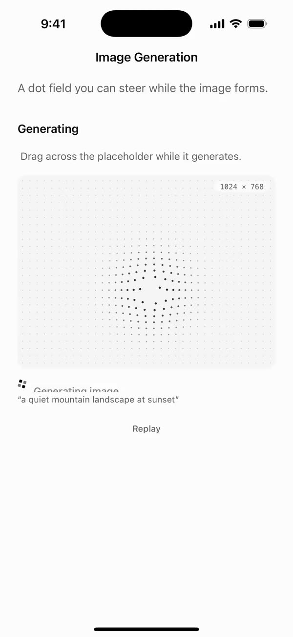
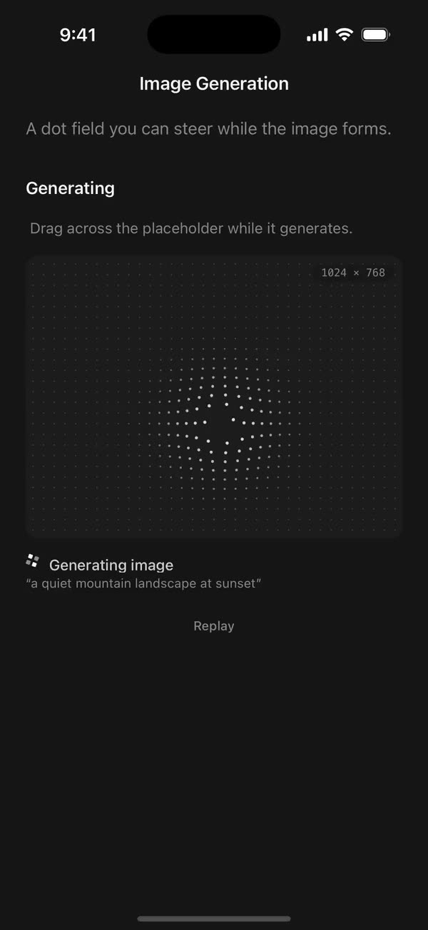
React NativeA dot field you can steer while the image forms.
Preview
Install
Source on GitHubIt works in Expo and in bare React Native. New to beUI Native? Set up your app first.
Copies the component and the shared files it needs into src/, adds the theme tokens if they're missing, and installs its libraries. Files you've changed are kept.
Keep the folder layout, since the component imports the shared files by relative path.
1Install the libraries
npx expo install @shopify/react-native-skia react-native-gesture-handler react-native-reanimated react-native-svg react-native-worklets
npm install uniwind tailwindcss
Wrap your app in GestureHandlerRootView if it isn't already.
2Add the theme tokens
Once per app. Import it from the CSS file Uniwind reads, after Tailwind and Uniwind, and change the values to match your brand.
/* Matches the default beUI palette in ui-components/lib/themes.ts.
   Native surface maps to card; muted maps to muted-foreground. */
@layer theme {
  :root {
    @variant light {
      --color-background: oklch(99% 0 0);
      --color-surface: oklch(97% 0 0);
      --color-foreground: oklch(15% 0 0);
      --color-muted: oklch(50% 0 0);
      --color-border: oklch(15% 0 0 / 0.06);
      --color-border-strong: oklch(15% 0 0 / 0.16);
      --color-primary: #0285f7;
      --color-on-primary: #ffffff;
      --color-destructive: #dc2626;
      --color-success: #059669;
      --color-warning: #d97706;
    }
  }

  :root {
    @variant dark {
      --color-background: #151515;
      --color-surface: #1c1c1c;
      --color-foreground: oklch(96% 0 0);
      --color-muted: oklch(62% 0 0);
      --color-border: rgb(255 255 255 / 0.05);
      --color-border-strong: rgb(255 255 255 / 0.14);
      --color-primary: #0285f7;
      --color-on-primary: #ffffff;
      --color-destructive: #f87171;
      --color-success: #34d399;
      --color-warning: #fbbf24;
    }
  }

  /* Tailwind's default monospace stack isn't a font React Native can load. */
  :root {
    @variant ios {
      --font-mono: Menlo;
    }
  }

  :root {
    @variant android {
      --font-mono: monospace;
    }
  }
}
3Copy the shared files
import { useEffect, useRef, useState } from "react";

export type PresenceItem<T> = {
  key: string;
  value: T;
  /** False for the item present on first render, so it does not animate in. */
  appear: boolean;
  exiting: boolean;
};

/**
 * Keeps replaced items mounted while they animate out, like AnimatePresence.
 * A key that returns while exiting is revived in place.
 */
export function usePresence<T>(
  key: string | null,
  value: T,
  exitDuration: (value: T) => number,
) {
  const [items, setItems] = useState<PresenceItem<T>[]>(() =>
    key === null ? [] : [{ key, value, appear: false, exiting: false }],
  );
  const [currentKey, setCurrentKey] = useState(key);
  const exitDurationRef = useRef(exitDuration);
  exitDurationRef.current = exitDuration;

  // Adjust during render so the new item and the exits start in the same frame.
  if (key !== currentKey) {
    setCurrentKey(key);
    setItems((previous) => {
      const next = previous.map((item) =>
        item.key === key
          ? { ...item, value, exiting: false }
          : { ...item, exiting: true },
      );
      if (key !== null && !previous.some((item) => item.key === key)) {
        next.push({ key, value, appear: true, exiting: false });
      }
      return next;
    });
  }

  const exitingKeys = items
    .filter((item) => item.exiting)
    .map((item) => item.key)
    .join("\n");

  useEffect(() => {
    if (!exitingKeys) return;
    const timers = items
      .filter((item) => item.exiting)
      .map((item) =>
        setTimeout(() => {
          setItems((previous) =>
            previous.filter(
              (candidate) => !(candidate.key === item.key && candidate.exiting),
            ),
          );
        }, exitDurationRef.current(item.value)),
      );
    return () => {
      for (const timer of timers) clearTimeout(timer);
    };
    // Restart removal timers only when the set of exiting items changes.
  }, [exitingKeys]);

  return items;
}
import { useEffect, useState } from "react";
import { AccessibilityInfo } from "react-native";
import { useReducedMotion } from "react-native-reanimated";

/** Reanimated supplies a synchronous initial value; native events keep it current. */
export function useReducedMotionPreference() {
  const initialValue = useReducedMotion();
  const [reducedMotion, setReducedMotion] = useState(initialValue);

  useEffect(() => {
    let active = true;
    let receivedEvent = false;
    const subscription = AccessibilityInfo.addEventListener(
      "reduceMotionChanged",
      (value) => {
        receivedEvent = true;
        setReducedMotion(value);
      },
    );
    void AccessibilityInfo.isReduceMotionEnabled().then((value) => {
      if (active && !receivedEvent) setReducedMotion(value);
    });
    return () => {
      active = false;
      subscription.remove();
    };
  }, []);

  return reducedMotion;
}
import type { ReactNode } from "react";
import type { ColorValue } from "react-native";
import Svg, { Circle, Path, Rect } from "react-native-svg";

type GlyphProps = { size?: number; color?: ColorValue; strokeWidth?: number };

function Glyph({
  size = 16,
  color = "currentColor",
  strokeWidth = 2,
  children,
}: GlyphProps & { children: ReactNode }) {
  return (
    <Svg
      width={size}
      height={size}
      viewBox="0 0 24 24"
      fill="none"
      stroke={color}
      strokeWidth={strokeWidth}
      strokeLinecap="round"
      strokeLinejoin="round"
    >
      {children}
    </Svg>
  );
}

// Simple 24-unit stroke glyphs shared by the agent components.

export function ChevronDownGlyph(props: GlyphProps) {
  return (
    <Glyph {...props}>
      <Path d="M6 9l6 6 6-6" />
    </Glyph>
  );
}

export function ArrowUpGlyph(props: GlyphProps) {
  return (
    <Glyph {...props}>
      <Path d="M12 19V5M5.5 11.5L12 5l6.5 6.5" />
    </Glyph>
  );
}

export function PlusGlyph(props: GlyphProps) {
  return (
    <Glyph {...props}>
      <Path d="M12 5v14M5 12h14" />
    </Glyph>
  );
}

export function StopGlyph({ size = 12, color }: GlyphProps) {
  return (
    <Svg width={size} height={size} viewBox="0 0 12 12">
      <Rect x={1} y={1} width={10} height={10} rx={2.5} fill={color} />
    </Svg>
  );
}

export function CheckGlyph(props: GlyphProps) {
  return (
    <Glyph {...props}>
      <Path d="M5 12.5l4.5 4.5L19 7" />
    </Glyph>
  );
}

export function CopyGlyph(props: GlyphProps) {
  return (
    <Glyph {...props}>
      <Rect x={8.5} y={8.5} width={12} height={12} rx={2.5} />
      <Path d="M15.5 5.5v-.5A2 2 0 0 0 13.5 3h-8.5A2 2 0 0 0 3 5v8.5a2 2 0 0 0 2 2h.5" />
    </Glyph>
  );
}

export function RetryGlyph(props: GlyphProps) {
  return (
    <Glyph {...props}>
      <Path d="M3.5 12a8.5 8.5 0 1 0 2.6-6.1L3.5 8.5" />
      <Path d="M3.5 3.5v5h5" />
    </Glyph>
  );
}

export function ThumbGlyph({
  down = false,
  ...props
}: GlyphProps & { down?: boolean }) {
  return (
    <Glyph {...props}>
      <Path
        d="M7.5 10.5v10M7.5 10.5L11 3.5a2.5 2.5 0 0 1 2.5 2.5v3.5h5a2 2 0 0 1 2 2.3l-1.2 7A2 2 0 0 1 17.3 20.5H4.5a1 1 0 0 1-1-1v-8a1 1 0 0 1 1-1z"
        transform={down ? "rotate(180 12 12)" : undefined}
      />
    </Glyph>
  );
}

export function SearchGlyph(props: GlyphProps) {
  return (
    <Glyph {...props}>
      <Circle cx={11} cy={11} r={6.5} />
      <Path d="M16 16l4 4" />
    </Glyph>
  );
}

export function GlobeGlyph(props: GlyphProps) {
  return (
    <Glyph {...props}>
      <Circle cx={12} cy={12} r={8.5} />
      <Path d="M3.5 12h17M12 3.5c2.4 2.5 3.5 5.3 3.5 8.5s-1.1 6-3.5 8.5c-2.4-2.5-3.5-5.3-3.5-8.5s1.1-6 3.5-8.5z" />
    </Glyph>
  );
}

export function FileGlyph(props: GlyphProps) {
  return (
    <Glyph {...props}>
      <Path d="M14 3.5H7.5a2 2 0 0 0-2 2v13a2 2 0 0 0 2 2h9a2 2 0 0 0 2-2V8z" />
      <Path d="M14 3.5V8h4.5M9 13h6M9 16.5h4" />
    </Glyph>
  );
}

export function PencilGlyph(props: GlyphProps) {
  return (
    <Glyph {...props}>
      <Path d="M4 20h4L19 9a2.1 2.1 0 0 0-4-4L4 16z" />
      <Path d="M13.5 6.5l4 4M14 20h6" />
    </Glyph>
  );
}

export function TerminalGlyph(props: GlyphProps) {
  return (
    <Glyph {...props}>
      <Rect x={3.5} y={4.5} width={17} height={15} rx={2.5} />
      <Path d="M7.5 10l2.5 2-2.5 2M12.5 15h4" />
    </Glyph>
  );
}

export function WrenchGlyph(props: GlyphProps) {
  return (
    <Glyph {...props}>
      <Path d="M14.5 6.5a4 4 0 0 0 5 5l-8.8 8.8a2.1 2.1 0 0 1-3-3l8.8-8.8a4 4 0 0 1-2-2z" />
    </Glyph>
  );
}

export function SparkleGlyph(props: GlyphProps) {
  return (
    <Glyph {...props}>
      <Path d="M12 4l1.8 4.6L18.5 10.5l-4.7 1.9L12 17l-1.8-4.6-4.7-1.9 4.7-1.9z" />
      <Path d="M18.5 16.5v3M17 18h3" />
    </Glyph>
  );
}

export function MessageGlyph(props: GlyphProps) {
  return (
    <Glyph {...props}>
      <Path d="M20 14.5a2 2 0 0 1-2 2H8.5L4 20V6a2 2 0 0 1 2-2h12a2 2 0 0 1 2 2z" />
    </Glyph>
  );
}

export function ImageGlyph(props: GlyphProps) {
  return (
    <Glyph {...props}>
      <Rect x={3.5} y={4.5} width={17} height={15} rx={2.5} />
      <Circle cx={9} cy={10} r={1.5} />
      <Path d="M20.5 15.5l-4.5-4.5-9 8.5" />
    </Glyph>
  );
}

export function ShieldGlyph(props: GlyphProps) {
  return (
    <Glyph {...props}>
      <Path d="M12 3.5l7 2.5v5.5c0 4.4-3 7.7-7 9-4-1.3-7-4.6-7-9V6z" />
      <Path d="M9 12l2 2 4-4" />
    </Glyph>
  );
}

export function AlertGlyph(props: GlyphProps) {
  return (
    <Glyph {...props}>
      <Circle cx={12} cy={12} r={8.5} />
      <Path d="M12 8v4.5M12 16h.01" />
    </Glyph>
  );
}

export function CrossGlyph(props: GlyphProps) {
  return (
    <Glyph {...props}>
      <Path d="M6.5 6.5l11 11M17.5 6.5l-11 11" />
    </Glyph>
  );
}

export function HelpGlyph(props: GlyphProps) {
  return (
    <Glyph {...props}>
      <Circle cx={12} cy={12} r={8.5} />
      <Path d="M9.6 9.5a2.5 2.5 0 0 1 4.8 1c0 1.7-2.4 2.2-2.4 3.5M12 16.8h.01" />
    </Glyph>
  );
}

export function ArrowGlyph({
  back = false,
  ...props
}: GlyphProps & { back?: boolean }) {
  return (
    <Glyph {...props}>
      <Path
        d="M5 12h14M13 6l6 6-6 6"
        transform={back ? "rotate(180 12 12)" : undefined}
      />
    </Glyph>
  );
}

export function BracesGlyph(props: GlyphProps) {
  return (
    <Glyph {...props}>
      <Path d="M8.5 4H8a2 2 0 0 0-2 2v3.5A2.5 2.5 0 0 1 3.5 12 2.5 2.5 0 0 1 6 14.5V18a2 2 0 0 0 2 2h.5M15.5 4h.5a2 2 0 0 1 2 2v3.5a2.5 2.5 0 0 0 2.5 2.5 2.5 2.5 0 0 0-2.5 2.5V18a2 2 0 0 1-2 2h-.5" />
    </Glyph>
  );
}

export function BanGlyph(props: GlyphProps) {
  return (
    <Glyph {...props}>
      <Circle cx={12} cy={12} r={8.5} />
      <Path d="M6 6l12 12" />
    </Glyph>
  );
}

export function CircleCheckGlyph(props: GlyphProps) {
  return (
    <Glyph {...props}>
      <Circle cx={12} cy={12} r={8.5} />
      <Path d="M8.5 12.2l2.4 2.4 4.6-4.8" />
    </Glyph>
  );
}

export function CircleCrossGlyph(props: GlyphProps) {
  return (
    <Glyph {...props}>
      <Circle cx={12} cy={12} r={8.5} />
      <Path d="M9.5 9.5l5 5M14.5 9.5l-5 5" />
    </Glyph>
  );
}

export function ListGlyph(props: GlyphProps) {
  return (
    <Glyph {...props}>
      <Path d="M4 6.5l1.5 1.5L8 5.5M4 13l1.5 1.5L8 12M11.5 7h8.5M11.5 13.5h8.5M11.5 19h8.5M4.5 19h2" />
    </Glyph>
  );
}

/** An open ring, spun by SpinGlyph. */
export function RingGlyph(props: GlyphProps) {
  return (
    <Glyph {...props}>
      <Path d="M20.5 12a8.5 8.5 0 1 1-6-8.1" />
    </Glyph>
  );
}

export function ReplyGlyph(props: GlyphProps) {
  return (
    <Glyph {...props}>
      <Path d="M9.5 7L4.5 12l5 5M4.5 12h10a5 5 0 0 1 5 5v1" />
    </Glyph>
  );
}

export function WrapGlyph(props: GlyphProps) {
  return (
    <Glyph {...props}>
      <Path d="M4 6.5h16M4 12h12.5a3.25 3.25 0 0 1 0 6.5H12M4 18.5h4.5M14 16.5l-2 2 2 2" />
    </Glyph>
  );
}

export function BookGlyph(props: GlyphProps) {
  return (
    <Glyph {...props}>
      <Path d="M12 6.5c-1.6-1.3-4-2-7.5-2v13c3.5 0 5.9.7 7.5 2 1.6-1.3 4-2 7.5-2v-13c-3.5 0-5.9.7-7.5 2zM12 6.5v13" />
    </Glyph>
  );
}

export function ExternalGlyph(props: GlyphProps) {
  return (
    <Glyph {...props}>
      <Path d="M14 4.5h5.5V10M19.5 4.5L11 13M17 14v4a2 2 0 0 1-2 2H6a2 2 0 0 1-2-2V9a2 2 0 0 1 2-2h4" />
    </Glyph>
  );
}

export function DoubleCheckGlyph(props: GlyphProps) {
  return (
    <Glyph {...props}>
      <Path d="M2.5 12.5l4.5 4.5 9-9.5M12 16.5l.5.5 9-9.5" />
    </Glyph>
  );
}

export function ClockGlyph(props: GlyphProps) {
  return (
    <Glyph {...props}>
      <Circle cx={12} cy={12} r={8.5} />
      <Path d="M12 7.5V12l3 2" />
    </Glyph>
  );
}

export function MicGlyph(props: GlyphProps) {
  return (
    <Glyph {...props}>
      <Rect x={9} y={3.5} width={6} height={11} rx={3} />
      <Path d="M5.5 11a6.5 6.5 0 0 0 13 0M12 17.5v3" />
    </Glyph>
  );
}
import { useEffect, useState } from "react";
import { StyleSheet, Text, View } from "react-native";
import Animated, {
  useAnimatedStyle,
  useSharedValue,
  withSpring,
  withTiming,
} from "react-native-reanimated";
import { usePresence } from "../hooks/use-presence";
import { EASE_OUT, SPRING_SWAP } from "../styles/motion";

const EXIT = { duration: 140, easing: EASE_OUT };
const TRAVEL = 0.9;

/** Progress runs 0 (below) → 1 (resting) → 2 (rolled away above). */
function Layer({
  text,
  appear,
  exiting,
  reduce,
  height,
  className,
  lines,
}: {
  text: string;
  appear: boolean;
  exiting: boolean;
  reduce: boolean;
  height: number;
  className: string;
  lines?: number;
}) {
  const progress = useSharedValue(appear && !reduce ? 0 : 1);

  useEffect(() => {
    if (reduce) {
      progress.value = exiting ? 2 : 1;
      return;
    }
    progress.value = exiting ? withTiming(2, EXIT) : withSpring(1, SPRING_SWAP);
  }, [exiting, progress, reduce]);

  const style = useAnimatedStyle(() => {
    const p = progress.value;
    return {
      opacity: Math.max(0, Math.min(1, p <= 1 ? p : 2 - p)),
      transform: [{ translateY: (1 - p) * height * TRAVEL }],
    };
  }, [height]);

  return (
    <Animated.View style={[styles.layer, style]}>
      <Text numberOfLines={lines} className={className}>
        {text}
      </Text>
    </Animated.View>
  );
}

export type RollTextProps = {
  /** Changing the value rolls the new text in; defaults to the text itself. */
  value?: string;
  text: string;
  className: string;
  reduce: boolean;
  /** Lines before truncating. Defaults to 1; pass 0 to wrap freely. */
  numberOfLines?: number;
};

/**
 * Text that rolls up when it changes: the new line rises in from below as the
 * old one rolls up and away. Clipped to its own lines, so only the text moves.
 */
export function RollText({
  value,
  text,
  className,
  reduce,
  numberOfLines = 1,
}: RollTextProps) {
  const lines = numberOfLines === 0 ? undefined : numberOfLines;
  const [height, setHeight] = useState(16);
  const items = usePresence(value ?? text, text, () =>
    reduce ? 0 : EXIT.duration + 40,
  );

  return (
    <View style={styles.slot}>
      {/* Sizes the slot to the current text. */}
      <Text
        numberOfLines={lines}
        className={className}
        style={styles.sizer}
        onLayout={({ nativeEvent }) => setHeight(nativeEvent.layout.height)}
      >
        {text}
      </Text>
      {items.map((item) => (
        <Layer
          key={item.key}
          text={item.value}
          appear={item.appear}
          exiting={item.exiting}
          reduce={reduce}
          height={height}
          className={className}
          lines={lines}
        />
      ))}
    </View>
  );
}

const styles = StyleSheet.create({
  slot: { overflow: "hidden", flexShrink: 1, minWidth: 0 },
  sizer: { opacity: 0 },
  layer: { position: "absolute", left: 0, right: 0, top: 0 },
});
import { Easing, ReduceMotion } from "react-native-reanimated";

// Mirrors beUI's lib/ease.ts so native motion matches the web library.

export const EASE_OUT = Easing.bezier(0.16, 1, 0.3, 1);
export const EASE_IN_OUT = Easing.bezier(0.77, 0, 0.175, 1);

/** Press feedback on buttons and other tappable surfaces. */
export const SPRING_PRESS = {
  stiffness: 500,
  damping: 30,
  mass: 0.6,
  reduceMotion: ReduceMotion.System,
} as const;

/** Content swaps: label and icon slots trading places inside a control. */
export const SPRING_SWAP = {
  stiffness: 460,
  damping: 30,
  mass: 0.55,
  reduceMotion: ReduceMotion.System,
} as const;

/** Shared-layout glides: pills, indicators and panels moving between positions. */
export const SPRING_LAYOUT = {
  stiffness: 360,
  damping: 32,
  mass: 0.6,
  reduceMotion: ReduceMotion.System,
} as const;

/** Dragged handles and fills; critically damped so values never rebound off an end. */
export const SPRING_GLIDE = {
  stiffness: 700,
  damping: 50,
  mass: 0.5,
  reduceMotion: ReduceMotion.System,
} as const;

export const motion = {
  press: SPRING_PRESS,
  swap: SPRING_SWAP,
  layout: SPRING_LAYOUT,
  glide: SPRING_GLIDE,
  exit: { duration: 160, easing: EASE_OUT, reduceMotion: ReduceMotion.System },
  fade: { duration: 150, reduceMotion: ReduceMotion.System },
} as const;
4Copy the component
import {
  Canvas,
  createPicture,
  Picture,
  Skia,
} from "@shopify/react-native-skia";
import { useState } from "react";
import { StyleSheet, View } from "react-native";
import { Gesture, GestureDetector } from "react-native-gesture-handler";
import {
  useDerivedValue,
  useFrameCallback,
  useSharedValue,
  withSpring,
} from "react-native-reanimated";
import { SPRING_SWAP } from "../../styles/motion";

const GAP = 10;
const WANDER_FOLLOW = 0.045;
const FINGER_FOLLOW = 0.16;

/**
 * A lattice of dots with a soft lens that wanders across it: dots inside the
 * lens grow, brighten and push outward. Drag a finger and the lens follows it,
 * swelling under your touch.
 */
export function DitherField({
  color,
  animate,
  interactive,
}: {
  color: string;
  animate: boolean;
  interactive: boolean;
}) {
  const [size, setSize] = useState({ width: 0, height: 0 });
  const time = useSharedValue(0);
  const x = useSharedValue(-1);
  const y = useSharedValue(-1);
  const targetX = useSharedValue(0);
  const targetY = useSharedValue(0);
  const touching = useSharedValue(false);
  const swell = useSharedValue(1);
  const width = useSharedValue(0);
  const height = useSharedValue(0);
  const dot = Skia.Color(color);

  useFrameCallback((frame) => {
    const dt = Math.min(0.05, (frame.timeSincePreviousFrame ?? 16) / 1000);
    time.value += dt * 1000;
    const w = width.value;
    const h = height.value;
    if (!touching.value) {
      targetX.value = w / 2 + Math.sin(time.value / 1700) * w * 0.12;
      targetY.value = h / 2 + Math.cos(time.value / 2100) * h * 0.1;
    }
    if (x.value < 0) {
      x.value = targetX.value;
      y.value = targetY.value;
    }
    // Frame-rate independent easing toward the target.
    const base = touching.value ? FINGER_FOLLOW : WANDER_FOLLOW;
    const follow = 1 - (1 - base) ** (dt * 60);
    x.value += (targetX.value - x.value) * follow;
    y.value += (targetY.value - y.value) * follow;
  }, animate);

  const picture = useDerivedValue(() => {
    const w = width.value;
    const h = height.value;
    const cx = x.value < 0 ? w / 2 : x.value;
    const cy = y.value < 0 ? h / 2 : y.value;
    return createPicture((canvas) => {
      const paint = Skia.Paint();
      paint.setColor(dot);
      const radius = Math.min(w, h) * 0.38 * swell.value;
      const columns = Math.ceil(w / GAP) + 1;
      const rows = Math.ceil(h / GAP) + 1;
      const offsetX = (w - (columns - 1) * GAP) / 2;
      const offsetY = (h - (rows - 1) * GAP) / 2;
      for (let row = 0; row < rows; row++) {
        for (let column = 0; column < columns; column++) {
          const anchorX = offsetX + column * GAP;
          const anchorY = offsetY + row * GAP;
          const dX = anchorX - cx;
          const dY = anchorY - cy;
          const distance = Math.hypot(dX, dY);
          const proximity = Math.max(0, 1 - distance / radius);
          const influence = proximity * proximity * (3 - 2 * proximity);
          const push = influence * influence * 9;
          const px = distance > 0 ? anchorX + (dX / distance) * push : anchorX;
          const py = distance > 0 ? anchorY + (dY / distance) * push : anchorY;
          paint.setAlphaf(0.17 + influence * 0.72);
          canvas.drawCircle(px, py, 0.65 + influence * 0.85, paint);
        }
      }
    });
  });

  const steer = Gesture.Pan()
    .enabled(interactive)
    .minDistance(0)
    .onBegin((event) => {
      touching.value = true;
      targetX.value = event.x;
      targetY.value = event.y;
      swell.value = withSpring(1.25, SPRING_SWAP);
    })
    .onUpdate((event) => {
      targetX.value = event.x;
      targetY.value = event.y;
    })
    .onFinalize(() => {
      touching.value = false;
      swell.value = withSpring(1, SPRING_SWAP);
    });

  return (
    <GestureDetector gesture={steer}>
      <View
        style={StyleSheet.absoluteFill}
        onLayout={({ nativeEvent }) => {
          const next = {
            width: nativeEvent.layout.width,
            height: nativeEvent.layout.height,
          };
          width.value = next.width;
          height.value = next.height;
          setSize(next);
        }}
      >
        {size.width > 0 ? (
          <Canvas style={StyleSheet.absoluteFill}>
            <Picture picture={picture} />
          </Canvas>
        ) : null}
      </View>
    </GestureDetector>
  );
}
import { type ReactNode, useEffect, useState } from "react";
import {
  Pressable,
  type PressableProps,
  StyleSheet,
  Text,
  View,
  type ViewProps,
} from "react-native";
import Animated, {
  cancelAnimation,
  ReduceMotion,
  useAnimatedStyle,
  useSharedValue,
  withRepeat,
  withSequence,
  withSpring,
  withTiming,
} from "react-native-reanimated";
import { scheduleOnRN } from "react-native-worklets";
import { useResolveClassNames } from "uniwind";
import { useReducedMotionPreference } from "../../hooks/use-reduced-motion";
import {
  AlertGlyph,
  CheckGlyph,
  RetryGlyph,
} from "../../primitives/agent-icons";
import { RollText } from "../../primitives/roll-text";
import { EASE_IN_OUT, EASE_OUT, SPRING_PRESS } from "../../styles/motion";
import { DitherField } from "./dither-field";

export type ImageGenerationStatus =
  | "queued"
  | "generating"
  | "refining"
  | "complete"
  | "error";

const STATUS_TEXT: Record<ImageGenerationStatus, string> = {
  queued: "Waiting to generate",
  generating: "Generating image",
  refining: "Refining details",
  complete: "Image ready",
  error: "Generation failed",
};
// The finished media shows through as the image comes into focus.
const MEDIA: Record<ImageGenerationStatus, { opacity: number; scale: number }> =
  {
    queued: { opacity: 0, scale: 1.02 },
    generating: { opacity: 0, scale: 1.015 },
    refining: { opacity: 0.62, scale: 1.005 },
    complete: { opacity: 1, scale: 1 },
    error: { opacity: 0.28, scale: 1 },
  };
const OVERLAY: Record<ImageGenerationStatus, number> = {
  queued: 1,
  generating: 1,
  refining: 0.48,
  complete: 0,
  error: 0,
};
const SETTLE = { duration: 400, easing: EASE_OUT };

/** A 2×2 glyph that turns while the image generates. */
function Mark({
  status,
  reduce,
  color,
}: {
  status: ImageGenerationStatus;
  reduce: boolean;
  color: unknown;
}) {
  const turn = useSharedValue(0);
  const active = status !== "complete" && status !== "error";
  useEffect(() => {
    if (!active || reduce) {
      cancelAnimation(turn);
      turn.value = 0;
      return;
    }
    turn.value = 0;
    turn.value = withRepeat(
      withTiming(1, {
        duration: 2400,
        easing: EASE_IN_OUT,
        reduceMotion: ReduceMotion.Never,
      }),
      -1,
      false,
    );
    return () => cancelAnimation(turn);
  }, [active, reduce, turn]);
  const style = useAnimatedStyle(() => ({
    transform: [{ rotate: `${turn.value * 360}deg` }],
  }));
  if (status === "complete")
    return <CheckGlyph size={14} color={color as string} />;
  if (status === "error")
    return <AlertGlyph size={14} color={color as string} />;
  return (
    <Animated.View style={[styles.mark, style]}>
      {[1, 0.55, 0.55, 1].map((opacity, index) => (
        <View
          // Diagonal pairs, so the turn reads at a glance.
          key={`${index}-${opacity}`}
          style={[
            styles.markCell,
            { opacity, backgroundColor: color as string },
          ]}
        />
      ))}
    </Animated.View>
  );
}

export type ImageGenerationProps = Omit<ViewProps, "children"> & {
  /** The finished media, such as an Image. It stays mounted and comes into focus. */
  children?: ReactNode;
  /** Defaults to "generating". */
  status?: ImageGenerationStatus;
  /** Spoken description. Defaults to the status and prompt. */
  label?: string;
  prompt?: string;
  /** A badge in the corner. Defaults to "1024 × 1024". */
  resolution?: string;
  /** Width over height, reserved before the media exists. Defaults to 1. */
  aspectRatio?: number;
  /** "compact" caps the width at 208 points; "fluid" fills. Defaults to "compact". */
  size?: "compact" | "fluid";
  /** Lets a finger steer the placeholder's lens. Defaults to true. */
  interactive?: boolean;
  statusText?: string;
  /** Defaults to true. */
  showStatus?: boolean;
  /** Shows "Try again" after an error. */
  onRetry?: () => void;
  /** Long-press the finished image, such as to save or share it. */
  onLongPress?: PressableProps["onLongPress"];
  className?: string;
  disableAnimation?: boolean;
};

/**
 * An image being generated: a dot lattice with a wandering lens fills the
 * frame, the finished media comes into focus through it, and the status rolls
 * along underneath. Drag across the placeholder and the lens follows.
 */
export function ImageGeneration({
  children,
  status = "generating",
  label,
  prompt,
  resolution = "1024 × 1024",
  aspectRatio = 1,
  size = "compact",
  interactive = true,
  statusText,
  showStatus = true,
  onRetry,
  onLongPress,
  className = "",
  disableAnimation = false,
  ...props
}: ImageGenerationProps) {
  const reducedMotion = useReducedMotionPreference();
  const reduce = reducedMotion || disableAnimation;
  const active =
    status === "queued" || status === "generating" || status === "refining";
  const text = statusText ?? STATUS_TEXT[status];
  const spoken = label ?? (prompt ? `${text}: ${prompt}` : text);
  const [ditherMounted, setDitherMounted] = useState(active);
  const mediaOpacity = useSharedValue(MEDIA[status].opacity);
  const mediaScale = useSharedValue(MEDIA[status].scale);
  const overlay = useSharedValue(OVERLAY[status]);
  const lift = useSharedValue(1);
  const retryScale = useSharedValue(1);
  const { color: foreground } = useResolveClassNames("text-foreground");
  const { color: destructive } = useResolveClassNames("text-destructive");

  if (active && !ditherMounted) setDitherMounted(true);
  const unmountDither = () => setDitherMounted(false);

  useEffect(() => {
    const media = MEDIA[status];
    mediaOpacity.value = withTiming(
      media.opacity,
      reduce ? { duration: 0 } : SETTLE,
    );
    mediaScale.value = reduce ? 1 : withTiming(media.scale, SETTLE);
    overlay.value = withTiming(
      OVERLAY[status],
      reduce ? { duration: 0 } : SETTLE,
      (done) => {
        if (done && OVERLAY[status] === 0) scheduleOnRN(unmountDither);
      },
    );
  }, [mediaOpacity, mediaScale, overlay, reduce, status]);

  const mediaStyle = useAnimatedStyle(() => ({
    opacity: mediaOpacity.value,
    transform: [{ scale: mediaScale.value }],
  }));
  const overlayStyle = useAnimatedStyle(() => ({ opacity: overlay.value }));
  const liftStyle = useAnimatedStyle(() => ({
    transform: [{ scale: lift.value }],
  }));
  const retryStyle = useAnimatedStyle(() => ({
    transform: [{ scale: retryScale.value }],
  }));

  return (
    <View
      accessibilityState={{ busy: active }}
      className={`w-full ${className}`}
      {...props}
    >
      <View style={size === "compact" ? styles.compact : undefined}>
        <Pressable
          accessibilityRole="image"
          accessibilityLabel={spoken}
          disabled={!onLongPress || status !== "complete"}
          onLongPress={(event) => {
            if (!reduce)
              lift.value = withSequence(
                withSpring(1.03, SPRING_PRESS),
                withSpring(1, SPRING_PRESS),
              );
            onLongPress?.(event);
          }}
        >
          <Animated.View
            style={[{ aspectRatio }, liftStyle]}
            className="w-full overflow-hidden rounded-xl bg-surface"
          >
            <Animated.View
              style={[StyleSheet.absoluteFill, mediaStyle]}
              accessibilityElementsHidden
              importantForAccessibility="no-hide-descendants"
            >
              {children}
            </Animated.View>
            {ditherMounted ? (
              <Animated.View
                style={[StyleSheet.absoluteFill, overlayStyle]}
                className="bg-surface"
              >
                <DitherField
                  color={String(foreground ?? "#000")}
                  animate={!reduce && active}
                  interactive={interactive && active && !reduce}
                />
              </Animated.View>
            ) : null}
            {resolution ? (
              <View
                pointerEvents="none"
                style={styles.badge}
                className="rounded-full bg-background/75 px-2 py-0.5"
              >
                <Text
                  className="font-mono text-[10px] text-muted"
                  style={styles.tabular}
                >
                  {resolution}
                </Text>
              </View>
            ) : null}
          </Animated.View>
        </Pressable>
        {showStatus || prompt ? (
          <View className="mt-3">
            {showStatus ? (
              <View accessibilityLiveRegion="polite" style={styles.status}>
                <Mark
                  status={status}
                  reduce={reduce}
                  color={status === "error" ? destructive : foreground}
                />
                <RollText
                  text={text}
                  className={`text-sm font-medium ${status === "error" ? "text-destructive" : "text-foreground"}`}
                  reduce={reduce}
                />
              </View>
            ) : null}
            {prompt ? (
              <Text numberOfLines={1} className="mt-0.5 text-xs text-muted">
                “{prompt}”
              </Text>
            ) : null}
          </View>
        ) : null}
        {status === "error" && onRetry ? (
          <Pressable
            accessibilityRole="button"
            onPress={onRetry}
            onPressIn={() => {
              if (!reduce) retryScale.value = withSpring(0.96, SPRING_PRESS);
            }}
            onPressOut={() => {
              retryScale.value = withSpring(1, SPRING_PRESS);
            }}
          >
            <Animated.View
              style={[styles.retry, retryStyle]}
              className="mt-3 rounded-full px-3"
            >
              <RetryGlyph size={16} color={foreground} />
              <Text className="text-sm font-medium text-foreground">
                Try again
              </Text>
            </Animated.View>
          </Pressable>
        ) : null}
      </View>
    </View>
  );
}

const styles = StyleSheet.create({
  compact: { width: "100%", maxWidth: 208, alignSelf: "center" },
  badge: { position: "absolute", top: 8, right: 8 },
  status: { flexDirection: "row", alignItems: "center", gap: 8, minHeight: 20 },
  mark: {
    width: 14,
    height: 14,
    flexDirection: "row",
    flexWrap: "wrap",
    gap: 2,
    padding: 1,
  },
  markCell: { width: 4, height: 4, borderRadius: 1 },
  retry: {
    flexDirection: "row",
    alignItems: "center",
    gap: 8,
    minHeight: 40,
    alignSelf: "flex-start",
  },
  tabular: { fontVariant: ["tabular-nums"] },
});
export type {
  ImageGenerationProps,
  ImageGenerationStatus,
} from "./image-generation";
export { ImageGeneration } from "./image-generation";
Documentation
Native port of beUI Image Generation: an image coming into being.
import { Image } from "react-native";
import { ImageGeneration } from "./src";

<ImageGeneration status={status} prompt="a quiet mountain landscape at sunset">
  <Image source={{ uri }} style={{ width: "100%", height: "100%" }} />
</ImageGeneration>
Behavior
statusmoves throughqueued,generating,refiningandcomplete, orerror. You drive it.- While active, a lattice of dots fills the frame, drawn with Skia. A soft lens wanders across it: dots inside grow, brighten and push outward.
- At
refiningthe finished media shows through at 62% under the fading dots. Atcompleteit settles into full view and the dots dissolve. The media stays mounted throughout, so nothing shifts. - The frame reserves
aspectRatio(1 by default).size="compact"caps it at 208 points wide;"fluid"fills. - The status rolls along underneath with a turning glyph, and the
promptsits under it in quotes. After an error,onRetryadds "Try again".
Better on a phone
- The web version's lens follows a mouse pointer and is switched off for touch. Here it follows your finger: drag across the placeholder and the lens tracks you, swelling under your touch, then wanders off again when you let go. Turn it off with
interactive={false}. onLongPresson the finished image lifts it slightly before firing, ready for a save or share sheet.- The lens eases at the same speed on 60 Hz and 120 Hz screens.
Accessibility
- The frame is an image named by
label, or the status and prompt. The status line is a polite live region, and the frame is marked busy while active. - Reduced motion, or
disableAnimation, draws one still frame of dots with the lens centered, and swaps statuses without movement.
Copy this directory, hooks/use-presence.ts, hooks/use-reduced-motion.ts, primitives/agent-icons.tsx, primitives/roll-text.tsx, styles/motion.ts, and the semantic tokens in styles/theme.css. It uses @shopify/react-native-skia, react-native-svg and Gesture Handler.