
Loader
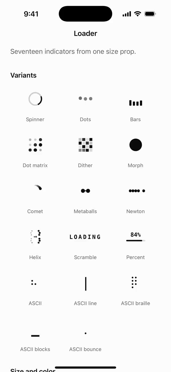
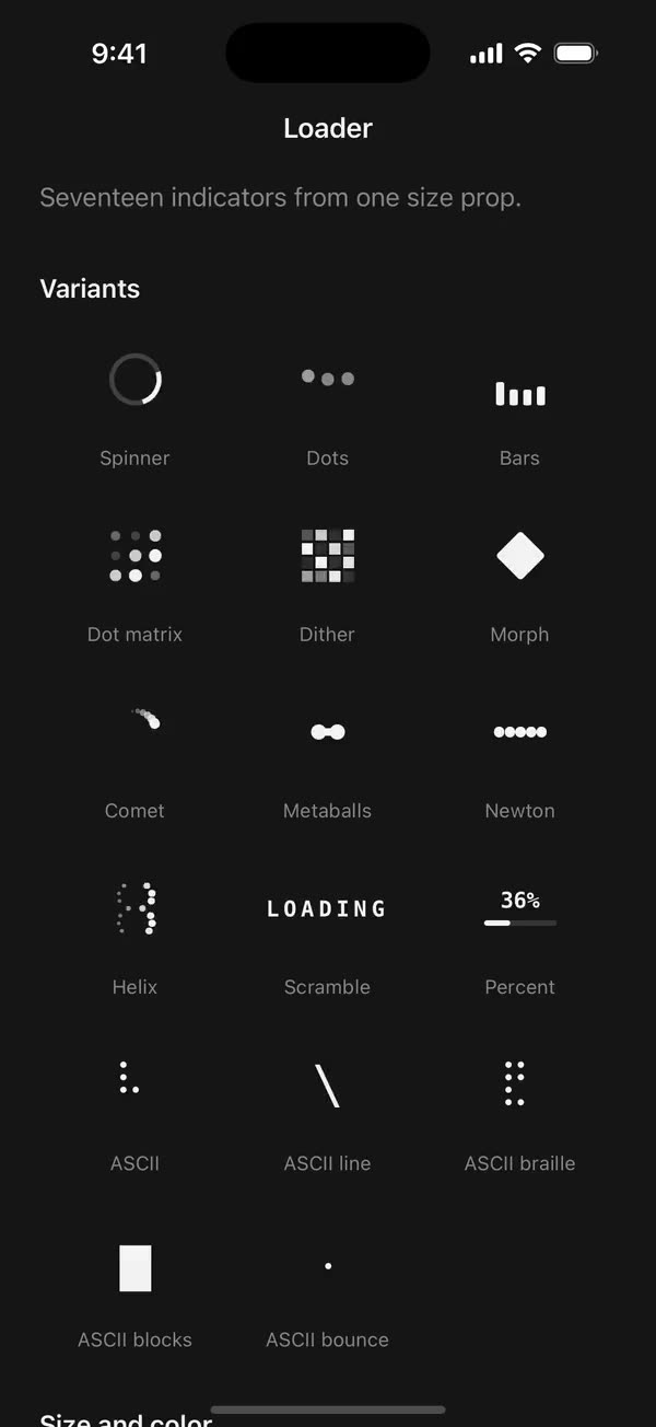
React NativeSeventeen indicators from one size prop.
Preview
Install
Source on GitHubIt works in Expo and in bare React Native. New to beUI Native? Set up your app first.
Copies the component and the shared files it needs into src/, adds the theme tokens if they're missing, and installs its libraries. Files you've changed are kept.
Keep the folder layout, since the component imports the shared files by relative path.
1Install the libraries
npx expo install react-native-reanimated react-native-worklets
npm install uniwind tailwindcss2Add the theme tokens
Once per app. Import it from the CSS file Uniwind reads, after Tailwind and Uniwind, and change the values to match your brand.
/* Matches the default beUI palette in ui-components/lib/themes.ts.
   Native surface maps to card; muted maps to muted-foreground. */
@layer theme {
  :root {
    @variant light {
      --color-background: oklch(99% 0 0);
      --color-surface: oklch(97% 0 0);
      --color-foreground: oklch(15% 0 0);
      --color-muted: oklch(50% 0 0);
      --color-border: oklch(15% 0 0 / 0.06);
      --color-border-strong: oklch(15% 0 0 / 0.16);
      --color-primary: #0285f7;
      --color-on-primary: #ffffff;
      --color-destructive: #dc2626;
      --color-success: #059669;
      --color-warning: #d97706;
    }
  }

  :root {
    @variant dark {
      --color-background: #151515;
      --color-surface: #1c1c1c;
      --color-foreground: oklch(96% 0 0);
      --color-muted: oklch(62% 0 0);
      --color-border: rgb(255 255 255 / 0.05);
      --color-border-strong: rgb(255 255 255 / 0.14);
      --color-primary: #0285f7;
      --color-on-primary: #ffffff;
      --color-destructive: #f87171;
      --color-success: #34d399;
      --color-warning: #fbbf24;
    }
  }
}
3Copy the shared files
import { useEffect, useState } from "react";
import { AccessibilityInfo } from "react-native";
import { useReducedMotion } from "react-native-reanimated";

/** Reanimated supplies a synchronous initial value; native events keep it current. */
export function useReducedMotionPreference() {
  const initialValue = useReducedMotion();
  const [reducedMotion, setReducedMotion] = useState(initialValue);

  useEffect(() => {
    let active = true;
    let receivedEvent = false;
    const subscription = AccessibilityInfo.addEventListener(
      "reduceMotionChanged",
      (value) => {
        receivedEvent = true;
        setReducedMotion(value);
      },
    );
    void AccessibilityInfo.isReduceMotionEnabled().then((value) => {
      if (active && !receivedEvent) setReducedMotion(value);
    });
    return () => {
      active = false;
      subscription.remove();
    };
  }, []);

  return reducedMotion;
}
import { Easing, ReduceMotion } from "react-native-reanimated";

// Mirrors beUI's lib/ease.ts so native motion matches the web library.

export const EASE_OUT = Easing.bezier(0.16, 1, 0.3, 1);
export const EASE_IN_OUT = Easing.bezier(0.77, 0, 0.175, 1);

/** Press feedback on buttons and other tappable surfaces. */
export const SPRING_PRESS = {
  stiffness: 500,
  damping: 30,
  mass: 0.6,
  reduceMotion: ReduceMotion.System,
} as const;

/** Content swaps: label and icon slots trading places inside a control. */
export const SPRING_SWAP = {
  stiffness: 460,
  damping: 30,
  mass: 0.55,
  reduceMotion: ReduceMotion.System,
} as const;

/** Shared-layout glides: pills, indicators and panels moving between positions. */
export const SPRING_LAYOUT = {
  stiffness: 360,
  damping: 32,
  mass: 0.6,
  reduceMotion: ReduceMotion.System,
} as const;

/** Dragged handles and fills; critically damped so values never rebound off an end. */
export const SPRING_GLIDE = {
  stiffness: 700,
  damping: 50,
  mass: 0.5,
  reduceMotion: ReduceMotion.System,
} as const;

export const motion = {
  press: SPRING_PRESS,
  swap: SPRING_SWAP,
  layout: SPRING_LAYOUT,
  glide: SPRING_GLIDE,
  exit: { duration: 160, easing: EASE_OUT, reduceMotion: ReduceMotion.System },
  fade: { duration: 150, reduceMotion: ReduceMotion.System },
} as const;
4Copy the component
export type { LoaderProps, LoaderVariant } from "./loader";
export { Loader } from "./loader";
import { useEffect, useState } from "react";
import {
  type ColorValue,
  Platform,
  StyleSheet,
  Text,
  View,
  type ViewProps,
} from "react-native";
import Animated, {
  Easing,
  type SharedValue,
  useAnimatedStyle,
} from "react-native-reanimated";
import { useResolveClassNames } from "uniwind";
import { useReducedMotionPreference } from "../../hooks/use-reduced-motion";
import { useKeyframes } from "./use-keyframes";

export type LoaderVariant =
  | "spinner"
  | "dots"
  | "bars"
  | "dot-matrix"
  | "dither"
  | "ascii"
  | "ascii-line"
  | "ascii-braille"
  | "ascii-blocks"
  | "ascii-bounce"
  | "morph"
  | "comet"
  | "scramble"
  | "metaballs"
  | "newton"
  | "helix"
  | "percent";

// Terminal-style frame sets, the loaders CLI agents cycle through.
const ASCII_SETS: Partial<Record<LoaderVariant, string[]>> = {
  ascii: ["⠋", "⠙", "⠹", "⠸", "⠼", "⠴", "⠦", "⠧", "⠇", "⠏"],
  "ascii-line": ["|", "/", "-", "\\"],
  "ascii-braille": ["⣾", "⣽", "⣻", "⢿", "⡿", "⣟", "⣯", "⣷"],
  "ascii-blocks": [
    "▁",
    "▂",
    "▃",
    "▄",
    "▅",
    "▆",
    "▇",
    "█",
    "▇",
    "▆",
    "▅",
    "▄",
    "▃",
    "▂",
  ],
  "ascii-bounce": ["⠁", "⠂", "⠄", "⡀", "⢀", "⠠", "⠐", "⠈"],
};

const MONO = Platform.select({
  ios: "Menlo",
  android: "monospace",
  default: "ui-monospace, SFMono-Regular, Menlo, monospace",
});

// Reduced motion keeps a calm opacity pulse and drops every transform.
const PULSE = [1, 0.4, 1];
const PULSE_DURATION = 1400;

export type LoaderProps = Omit<ViewProps, "children"> & {
  variant?: LoaderVariant;
  /** Base square size in points. Everything scales from this. Defaults to 32. */
  size?: number;
  /** Seconds per animation cycle. Defaults to 1. */
  speed?: number;
  /** Spoken name. Defaults to "Loading". */
  label?: string;
  /** Overrides the theme's foreground color. */
  color?: ColorValue;
  /** Color utility, such as `text-primary`. Used when `color` is not set. */
  className?: string;
  /** Uses the reduced-motion pulse regardless of the system preference. */
  disableAnimation?: boolean;
};

type PartProps = {
  size: number;
  /** Milliseconds per cycle. */
  cycle: number;
  reduce: boolean;
  color: ColorValue;
};

function Dot({
  size,
  color,
  style,
  square = false,
}: {
  size: number;
  color: ColorValue;
  style?: object;
  square?: boolean;
}) {
  return (
    <Animated.View
      style={[
        {
          width: size,
          height: size,
          borderRadius: square ? 0 : size / 2,
          backgroundColor: color,
        },
        style,
      ]}
    />
  );
}

function useOpacity(value: SharedValue<number>) {
  return useAnimatedStyle(() => ({ opacity: value.value }));
}

function Spinner({ size, cycle, reduce, color }: PartProps) {
  const stroke = Math.max(2, size * 0.09);
  const turn = useKeyframes([0, 360], {
    duration: cycle,
    easing: Easing.linear,
    enabled: !reduce,
  });
  const pulse = useKeyframes(PULSE, {
    duration: PULSE_DURATION,
    enabled: reduce,
  });
  const animatedStyle = useAnimatedStyle(() => ({
    opacity: pulse.value,
    // The top border spans 10:30 to 1:30; a 45° start puts it at 12 to 3.
    transform: [{ rotate: `${45 + turn.value}deg` }],
  }));
  const ring = {
    width: size,
    height: size,
    borderRadius: size / 2,
    borderWidth: stroke,
  };

  return (
    <Animated.View style={[{ width: size, height: size }, animatedStyle]}>
      <View style={[ring, { borderColor: color, opacity: 0.2 }]} />
      <View
        style={[
          ring,
          styles.overlay,
          { borderColor: "transparent", borderTopColor: color },
        ]}
      />
    </Animated.View>
  );
}

function BouncingDot({
  index,
  size,
  cycle,
  reduce,
  color,
}: PartProps & { index: number }) {
  const delay = index * cycle * 0.16;
  const y = useKeyframes([0, -size * 0.3, 0], {
    duration: cycle,
    delay,
    enabled: !reduce,
  });
  const opacity = useKeyframes(reduce ? [0.4, 1, 0.4] : [0.5, 1, 0.5], {
    duration: cycle,
    delay,
  });
  const animatedStyle = useAnimatedStyle(() => ({
    opacity: opacity.value,
    transform: [{ translateY: y.value }],
  }));
  return <Dot size={size * 0.24} color={color} style={animatedStyle} />;
}

function Dots(props: PartProps) {
  return (
    <View style={[styles.row, { gap: props.size * 0.14 }]}>
      {[0, 1, 2].map((index) => (
        <BouncingDot key={index} index={index} {...props} />
      ))}
    </View>
  );
}

function Bar({
  index,
  size,
  cycle,
  reduce,
  color,
}: PartProps & { index: number }) {
  const delay = index * cycle * 0.12;
  const scale = useKeyframes([0.3, 1, 0.3], {
    duration: cycle,
    delay,
    enabled: !reduce,
  });
  const opacity = useKeyframes([0.4, 1, 0.4], {
    duration: cycle,
    delay,
    enabled: reduce,
  });
  const animatedStyle = useAnimatedStyle(() => ({
    opacity: reduce ? opacity.value : 1,
    transform: [{ scaleY: reduce ? 1 : scale.value }],
  }));
  const width = size * 0.16;
  return (
    <Animated.View
      style={[
        {
          width,
          height: size,
          borderRadius: width / 2,
          backgroundColor: color,
          transformOrigin: "bottom",
        },
        animatedStyle,
      ]}
    />
  );
}

function Bars(props: PartProps) {
  return (
    <View style={[styles.row, { gap: props.size * 0.1, height: props.size }]}>
      {[0, 1, 2, 3].map((index) => (
        <Bar key={index} index={index} {...props} />
      ))}
    </View>
  );
}

function MatrixCell({
  delay,
  dot,
  cycle,
  reduce,
  color,
}: Omit<PartProps, "size"> & { delay: number; dot: number }) {
  const opacity = useKeyframes(reduce ? [0.3, 1, 0.3] : [0.2, 1, 0.2], {
    duration: cycle,
    delay,
  });
  const scale = useKeyframes([0.7, 1, 0.7], {
    duration: cycle,
    delay,
    enabled: !reduce,
  });
  const animatedStyle = useAnimatedStyle(() => ({
    opacity: opacity.value,
    transform: [{ scale: reduce ? 1 : scale.value }],
  }));
  return <Dot size={dot} color={color} style={animatedStyle} />;
}

function DotMatrix(props: PartProps) {
  const n = 3;
  const gap = props.size * 0.14;
  const dot = (props.size - gap * (n - 1)) / n;
  return (
    <View style={[styles.grid, { width: props.size, gap }]}>
      {Array.from({ length: n * n }, (_, index) => {
        const x = index % n;
        const y = Math.floor(index / n);
        // A diagonal wave: cells light by their distance from the corner.
        const delay = ((x + y) / (2 * (n - 1))) * props.cycle;
        return (
          <MatrixCell
            key={`${x}-${y}`}
            delay={delay}
            dot={dot}
            cycle={props.cycle}
            reduce={props.reduce}
            color={props.color}
          />
        );
      })}
    </View>
  );
}

// The ordered 4×4 Bayer matrix: cells light in this order, like a dissolving halftone.
const BAYER = [0, 8, 2, 10, 12, 4, 14, 6, 3, 11, 1, 9, 15, 7, 13, 5];

function DitherCell({
  order,
  cell,
  cycle,
  reduce,
  color,
}: Omit<PartProps, "size"> & { order: number; cell: number }) {
  const opacity = useKeyframes(reduce ? [0.3, 1, 0.3] : [0.1, 1, 0.1], {
    duration: cycle,
    delay: (order / BAYER.length) * cycle,
  });
  return <Dot size={cell} color={color} square style={useOpacity(opacity)} />;
}

function Dither(props: PartProps) {
  const n = 4;
  const gap = Math.max(1, props.size * 0.05);
  const cell = (props.size - gap * (n - 1)) / n;
  return (
    <View style={[styles.grid, { width: props.size, gap }]}>
      {BAYER.map((order) => (
        <DitherCell
          key={order}
          order={order}
          cell={cell}
          cycle={props.cycle}
          reduce={props.reduce}
          color={props.color}
        />
      ))}
    </View>
  );
}

function Ascii({
  frames,
  size,
  cycle,
  reduce,
  color,
}: PartProps & { frames: string[] }) {
  const [frame, setFrame] = useState(0);

  useEffect(() => {
    // Reduced motion slows the cycle instead of stopping it: it swaps glyphs
    // rather than moving anything on screen.
    const step = (reduce ? cycle * 2.5 : cycle) / frames.length;
    const timer = setInterval(
      () => setFrame((current) => (current + 1) % frames.length),
      step,
    );
    return () => clearInterval(timer);
  }, [cycle, frames.length, reduce]);

  return (
    <Text
      allowFontScaling={false}
      style={{
        fontFamily: MONO,
        fontSize: size,
        lineHeight: size * 1.15,
        color,
        fontVariant: ["tabular-nums"],
      }}
    >
      {frames[frame % frames.length]}
    </Text>
  );
}

// Each shape fully forms and holds before the next, so keyframes alternate
// hold and change. A square turned 45° is the diamond; corner radius makes
// the circle and squircle.
const MORPH_RADIUS = [0.5, 0.5, 0.1, 0.1, 0.1, 0.1, 0.3, 0.3, 0.5];
const MORPH_ROTATE = [0, 0, 90, 90, 225, 225, 270, 270, 360];
const MORPH_SCALE = [1, 1, 0.88, 0.88, 0.74, 0.74, 0.92, 0.92, 1];

function Morph({ size, cycle, reduce, color }: PartProps) {
  const side = size * 0.92;
  const options = { duration: cycle * 4, enabled: !reduce };
  const radius = useKeyframes(MORPH_RADIUS, options);
  const rotate = useKeyframes(MORPH_ROTATE, options);
  const scale = useKeyframes(MORPH_SCALE, options);
  const pulse = useKeyframes(PULSE, {
    duration: PULSE_DURATION,
    enabled: reduce,
  });
  const animatedStyle = useAnimatedStyle(() => ({
    opacity: pulse.value,
    borderRadius: radius.value * side,
    transform: [{ rotate: `${rotate.value}deg` }, { scale: scale.value }],
  }));
  return (
    <View style={[styles.center, { width: size, height: size }]}>
      <Animated.View
        style={[
          { width: side, height: side, backgroundColor: color },
          animatedStyle,
        ]}
      />
    </View>
  );
}

const COMET_TRAIL = [0, 1, 2, 3, 4, 5];

function Comet({ size, cycle, reduce, color }: PartProps) {
  const head = size * 0.2;
  const radius = size / 2 - head / 2;
  const turn = useKeyframes([0, 360], {
    duration: cycle,
    easing: Easing.linear,
    enabled: !reduce,
  });
  const pulse = useKeyframes(PULSE, {
    duration: PULSE_DURATION,
    enabled: reduce,
  });
  const animatedStyle = useAnimatedStyle(() => ({
    opacity: pulse.value,
    transform: [{ rotate: `${turn.value}deg` }],
  }));

  return (
    <Animated.View style={[{ width: size, height: size }, animatedStyle]}>
      {COMET_TRAIL.map((index) => {
        const dot = head * (1 - index * 0.13);
        // Each trailing dot sits 15° further back along the orbit.
        const angle = (-index * 15 * Math.PI) / 180;
        return (
          <Dot
            key={index}
            size={dot}
            color={color}
            style={{
              position: "absolute",
              left: size / 2 + Math.sin(angle) * radius - dot / 2,
              top: size / 2 - Math.cos(angle) * radius - dot / 2,
              opacity: 1 - index * 0.16,
            }}
          />
        );
      })}
    </Animated.View>
  );
}

const SCRAMBLE_TARGET = "LOADING";
const SCRAMBLE_GLYPHS = "ABCDEFGHIJKLMNOPQRSTUVWXYZ0123456789<>/*#@";

function Scramble({ size, cycle, reduce, color }: PartProps) {
  const [text, setText] = useState(SCRAMBLE_TARGET);

  useEffect(() => {
    if (reduce) {
      setText(SCRAMBLE_TARGET);
      return;
    }
    let tick = 0;
    const total = SCRAMBLE_TARGET.length + 4;
    const timer = setInterval(
      () => {
        const reveal = tick % total;
        setText(
          Array.from(SCRAMBLE_TARGET, (char, index) =>
            index < reveal
              ? char
              : SCRAMBLE_GLYPHS[
                  Math.floor(Math.random() * SCRAMBLE_GLYPHS.length)
                ],
          ).join(""),
        );
        tick += 1;
      },
      (cycle / SCRAMBLE_TARGET.length) * 0.55,
    );
    return () => clearInterval(timer);
  }, [cycle, reduce]);

  const fontSize = size * 0.42;
  return (
    <Text
      allowFontScaling={false}
      style={{
        fontFamily: MONO,
        fontSize,
        fontWeight: "500",
        letterSpacing: fontSize * 0.2,
        color,
      }}
    >
      {text}
    </Text>
  );
}

function Metaballs({ size, cycle, reduce, color }: PartProps) {
  const ball = size * 0.3;
  const travel = size * 0.2;
  const duration = cycle * 1.6;
  const swap = useKeyframes([-1, 1, -1], { duration, enabled: !reduce });
  // They meet in the middle twice per cycle; a blob swells there to join them.
  const merge = useKeyframes([0, 1, 0, 1, 0], { duration, enabled: !reduce });
  const pulse = useKeyframes([0.4, 1, 0.4], { duration, enabled: reduce });

  const left = useAnimatedStyle(() => ({
    opacity: reduce ? pulse.value : 1,
    transform: [{ translateX: reduce ? -travel * 0.5 : swap.value * travel }],
  }));
  const right = useAnimatedStyle(() => ({
    opacity: reduce ? pulse.value : 1,
    transform: [{ translateX: reduce ? travel * 0.5 : -swap.value * travel }],
  }));
  const blob = useAnimatedStyle(() => ({
    opacity: reduce ? 0 : 1,
    transform: [{ scaleX: 1 + merge.value * 0.6 }, { scaleY: merge.value }],
  }));

  return (
    <View style={[styles.center, { width: size, height: size }]}>
      <Dot size={ball} color={color} style={[styles.layer, left]} />
      <Dot size={ball} color={color} style={[styles.layer, right]} />
      <Dot size={ball * 0.8} color={color} style={[styles.layer, blob]} />
    </View>
  );
}

function NewtonBall({
  index,
  size,
  cycle,
  reduce,
  color,
}: PartProps & { index: number }) {
  const ball = size * 0.2;
  const out = ball * 1.1;
  // Only the end balls move: the left slides out and back, then the right,
  // so the impact seems to pass through the three still balls between them.
  const path =
    index === 0
      ? { x: [0, -out, 0, 0], times: [0, 0.28, 0.5, 1] }
      : index === 4
        ? { x: [0, 0, out, 0], times: [0, 0.5, 0.78, 1] }
        : null;
  const x = useKeyframes(path?.x ?? [0], {
    duration: cycle * 1.5,
    times: path?.times,
    enabled: !reduce && path !== null,
  });
  const animatedStyle = useAnimatedStyle(() => ({
    transform: [{ translateX: x.value }],
  }));
  return <Dot size={ball} color={color} style={animatedStyle} />;
}

function Newton(props: PartProps) {
  return (
    <View style={[styles.row, { height: props.size * 0.2 }]}>
      {[0, 1, 2, 3, 4].map((index) => (
        <NewtonBall key={index} index={index} {...props} />
      ))}
    </View>
  );
}

function HelixDot({
  top,
  delay,
  front,
  size,
  cycle,
  reduce,
  color,
}: PartProps & { top: number; delay: number; front: boolean }) {
  const dot = size * 0.14;
  const amp = size * 0.32;
  const options = { duration: cycle, delay, enabled: !reduce };
  const x = useKeyframes(front ? [amp, -amp, amp] : [-amp, amp, -amp], options);
  const scale = useKeyframes(front ? [1, 0.5, 1] : [0.5, 1, 0.5], options);
  const opacity = useKeyframes(
    reduce ? [0.4, 1, 0.4] : front ? [1, 0.45, 1] : [0.45, 1, 0.45],
    { duration: cycle, delay },
  );
  const animatedStyle = useAnimatedStyle(() => ({
    opacity: opacity.value,
    transform: [{ translateX: x.value }, { scale: scale.value }],
  }));
  return (
    <Dot
      size={dot}
      color={color}
      style={[
        { position: "absolute", left: size / 2 - dot / 2, top },
        animatedStyle,
      ]}
    />
  );
}

function Helix(props: PartProps) {
  const rows = 7;
  const dot = props.size * 0.14;
  return (
    <View style={{ width: props.size, height: props.size }}>
      {Array.from({ length: rows }, (_, row) => {
        const top = (row / (rows - 1)) * (props.size - dot);
        const delay = (row / rows) * props.cycle;
        return [true, false].map((front) => (
          <HelixDot
            key={`${row}-${front}`}
            top={top}
            delay={delay}
            front={front}
            {...props}
          />
        ));
      })}
    </View>
  );
}

function Percent({ size, cycle, reduce, color }: PartProps) {
  const [percent, setPercent] = useState(0);

  useEffect(() => {
    const total = reduce ? cycle * 2 : cycle;
    const step = 40;
    let elapsed = 0;
    const timer = setInterval(() => {
      elapsed += step;
      const next = Math.min(100, Math.round((elapsed / total) * 100));
      setPercent(next);
      if (next >= 100) elapsed = 0;
    }, step);
    return () => clearInterval(timer);
  }, [cycle, reduce]);

  const track = Math.max(3, size * 0.1);
  return (
    <View style={[styles.column, { gap: size * 0.14, width: size * 1.4 }]}>
      <Text
        allowFontScaling={false}
        style={{
          fontFamily: MONO,
          fontSize: size * 0.42,
          lineHeight: size * 0.42,
          fontWeight: "500",
          fontVariant: ["tabular-nums"],
          color,
        }}
      >
        {percent}%
      </Text>
      <View style={[styles.track, { height: track, borderRadius: track / 2 }]}>
        <View
          style={[styles.overlay, { backgroundColor: color, opacity: 0.15 }]}
        />
        <View
          style={{
            width: `${percent}%`,
            height: track,
            borderRadius: track / 2,
            backgroundColor: color,
          }}
        />
      </View>
    </View>
  );
}

/** Seventeen loading indicators that all scale from one `size`. */
export function Loader({
  variant = "spinner",
  size = 32,
  speed = 1,
  label = "Loading",
  color: colorProp,
  className = "",
  disableAnimation = false,
  accessibilityLabel,
  ...props
}: LoaderProps) {
  const reducedMotion = useReducedMotionPreference();
  const { color: custom } = useResolveClassNames(className);
  const { color: foreground } = useResolveClassNames("text-foreground");
  const color = colorProp ?? custom ?? foreground ?? "black";
  const part: PartProps = {
    size,
    cycle: speed * 1000,
    reduce: reducedMotion || disableAnimation,
    color,
  };
  const frames = ASCII_SETS[variant];

  return (
    <View
      {...props}
      accessible
      accessibilityRole="progressbar"
      accessibilityLabel={accessibilityLabel ?? label}
      accessibilityState={{ busy: true }}
      style={[styles.root, props.style]}
    >
      {variant === "spinner" && <Spinner {...part} />}
      {variant === "dots" && <Dots {...part} />}
      {variant === "bars" && <Bars {...part} />}
      {variant === "dot-matrix" && <DotMatrix {...part} />}
      {variant === "dither" && <Dither {...part} />}
      {frames && <Ascii key={variant} frames={frames} {...part} />}
      {variant === "morph" && <Morph {...part} />}
      {variant === "comet" && <Comet {...part} />}
      {variant === "scramble" && <Scramble {...part} />}
      {variant === "metaballs" && <Metaballs {...part} />}
      {variant === "newton" && <Newton {...part} />}
      {variant === "helix" && <Helix {...part} />}
      {variant === "percent" && <Percent {...part} />}
    </View>
  );
}

const styles = StyleSheet.create({
  root: {
    alignItems: "center",
    justifyContent: "center",
    alignSelf: "flex-start",
  },
  row: { flexDirection: "row", alignItems: "center" },
  column: { alignItems: "center" },
  grid: { flexDirection: "row", flexWrap: "wrap" },
  center: { alignItems: "center", justifyContent: "center" },
  overlay: { ...StyleSheet.absoluteFill },
  layer: { position: "absolute" },
  track: { width: "100%", overflow: "hidden" },
});
import { useEffect } from "react";
import {
  cancelAnimation,
  type EasingFunction,
  type EasingFunctionFactory,
  ReduceMotion,
  useSharedValue,
  withDelay,
  withRepeat,
  withSequence,
  withTiming,
} from "react-native-reanimated";
import { EASE_IN_OUT } from "../../styles/motion";

type KeyframeOptions = {
  /** One full pass through the keyframes, in milliseconds. */
  duration: number;
  /** Delay before the first pass only, like Motion's `delay` with `repeat`. */
  delay?: number;
  /** Offsets from 0 to 1 for each keyframe. Defaults to even spacing. */
  times?: number[];
  easing?: EasingFunction | EasingFunctionFactory;
  /** When false, the value rests on its first keyframe. */
  enabled?: boolean;
};

/**
 * Loops a shared value through `values` forever, like a Motion keyframe array
 * with `repeat: Infinity`. Loaders handle reduced motion themselves, so the
 * system preference never cuts these short.
 */
export function useKeyframes(
  values: number[],
  {
    duration,
    delay = 0,
    times,
    easing = EASE_IN_OUT,
    enabled = true,
  }: KeyframeOptions,
) {
  const first = values[0] ?? 0;
  const value = useSharedValue(first);
  // Arrays are rebuilt every render, so depend on their contents.
  const valuesKey = values.join();
  const timesKey = times?.join() ?? "";

  // values and times are tracked by their keys.
  useEffect(() => {
    if (!enabled || values.length < 2) {
      cancelAnimation(value);
      value.value = first;
      return;
    }
    const offsets =
      times ?? values.map((_, index) => index / (values.length - 1));
    const segments = values.slice(1).map((target, index) =>
      withTiming(target, {
        duration:
          ((offsets[index + 1] ?? 1) - (offsets[index] ?? 0)) * duration,
        easing,
        reduceMotion: ReduceMotion.Never,
      }),
    );
    value.value = first;
    value.value = withDelay(
      delay,
      withRepeat(withSequence(...segments), -1),
      ReduceMotion.Never,
    );
    return () => cancelAnimation(value);
  }, [delay, duration, easing, enabled, first, timesKey, value, valuesKey]);

  return value;
}
Documentation
Native port of beUI Loader. Seventeen loading indicators that all scale from one size.
import { Loader } from "./src";

<Loader />
<Loader variant="dots" size={24} />
<Loader variant="helix" speed={1.4} className="text-primary" />
<Loader variant="ascii-braille" label="Thinking" />
Variants: spinner, dots, bars, dot-matrix, dither, morph, comet, scramble, metaballs, newton, helix, percent, and the terminal-style ascii, ascii-line, ascii-braille, ascii-blocks and ascii-bounce.
- Size and speed:
size(32 points by default) sets the square everything scales from.speedis seconds per cycle (1 by default), matching the web prop. - Color: the theme's foreground colour by default. Pass a colour utility in
className(such astext-primary) or acolorvalue. - Motion: every variant uses the web version's timings, keyframes and stagger on beUI's in-out curve.
- Accessibility: the loader is one element with the
progressbarrole and a busy state.label("Loading" by default) is its spoken name. - Reduced motion: when the system asks for it, or
disableAnimationis set, movement is replaced by a calm opacity pulse. ASCII frames and the percent counter slow down instead of stopping, because they swap content rather than move it. Newton stays still.
The web version draws three variants with SVG. Here they're drawn with Views, so the component needs no SVG library:
- Spinner: the arc is the top border of a ring, so its ends are square rather than round.
- Morph: cycles through a circle, square, diamond and squircle using corner radius and rotation, rather than morphing SVG paths. It doesn't have the web version's triangle or hexagon.
- Metaballs: two dots cross while a blob swells where they meet, standing in for the SVG goo filter.
Copy this directory, hooks/use-reduced-motion.ts, styles/motion.ts, and the semantic tokens in styles/theme.css.