
Voice Orb
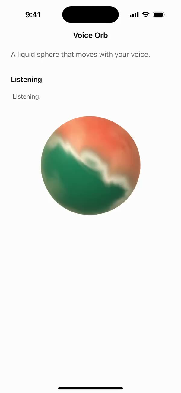
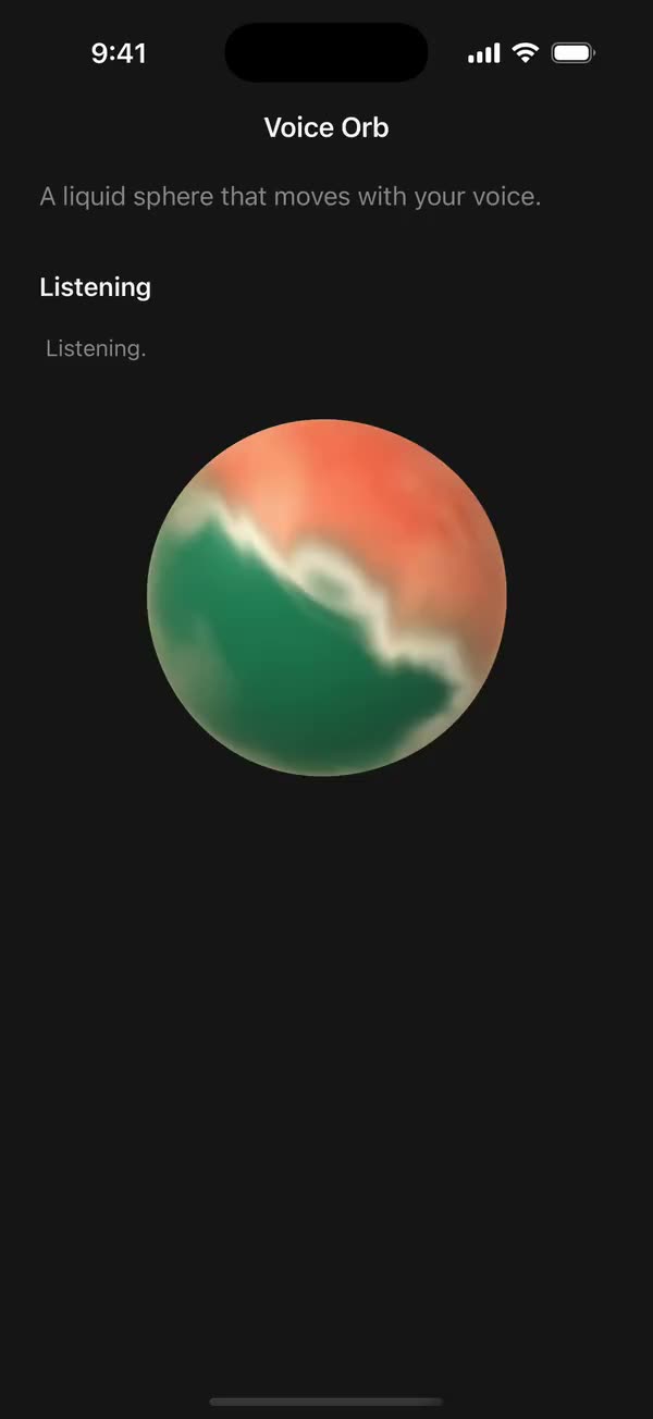
React NativeA liquid sphere that moves with your voice.
Preview
Install
Source on GitHubIt works in Expo and in bare React Native. New to beUI Native? Set up your app first.
Copies the component and the shared files it needs into src/, adds the theme tokens if they're missing, and installs its libraries. Files you've changed are kept.
Keep the folder layout, since the component imports the shared files by relative path.
1Install the libraries
npx expo install @shopify/react-native-skia react-native-reanimated react-native-worklets
npm install uniwind tailwindcss2Add the theme tokens
Once per app. Import it from the CSS file Uniwind reads, after Tailwind and Uniwind, and change the values to match your brand.
/* Matches the default beUI palette in ui-components/lib/themes.ts.
   Native surface maps to card; muted maps to muted-foreground. */
@layer theme {
  :root {
    @variant light {
      --color-background: oklch(99% 0 0);
      --color-surface: oklch(97% 0 0);
      --color-foreground: oklch(15% 0 0);
      --color-muted: oklch(50% 0 0);
      --color-border: oklch(15% 0 0 / 0.06);
      --color-border-strong: oklch(15% 0 0 / 0.16);
      --color-primary: #0285f7;
      --color-on-primary: #ffffff;
      --color-destructive: #dc2626;
      --color-success: #059669;
      --color-warning: #d97706;
    }
  }

  :root {
    @variant dark {
      --color-background: #151515;
      --color-surface: #1c1c1c;
      --color-foreground: oklch(96% 0 0);
      --color-muted: oklch(62% 0 0);
      --color-border: rgb(255 255 255 / 0.05);
      --color-border-strong: rgb(255 255 255 / 0.14);
      --color-primary: #0285f7;
      --color-on-primary: #ffffff;
      --color-destructive: #f87171;
      --color-success: #34d399;
      --color-warning: #fbbf24;
    }
  }

  /* Tailwind's default monospace stack isn't a font React Native can load. */
  :root {
    @variant ios {
      --font-mono: Menlo;
    }
  }

  :root {
    @variant android {
      --font-mono: monospace;
    }
  }
}
3Copy the shared files
import { useEffect, useState } from "react";
import { AccessibilityInfo } from "react-native";
import { useReducedMotion } from "react-native-reanimated";

/** Reanimated supplies a synchronous initial value; native events keep it current. */
export function useReducedMotionPreference() {
  const initialValue = useReducedMotion();
  const [reducedMotion, setReducedMotion] = useState(initialValue);

  useEffect(() => {
    let active = true;
    let receivedEvent = false;
    const subscription = AccessibilityInfo.addEventListener(
      "reduceMotionChanged",
      (value) => {
        receivedEvent = true;
        setReducedMotion(value);
      },
    );
    void AccessibilityInfo.isReduceMotionEnabled().then((value) => {
      if (active && !receivedEvent) setReducedMotion(value);
    });
    return () => {
      active = false;
      subscription.remove();
    };
  }, []);

  return reducedMotion;
}
import { Easing, ReduceMotion } from "react-native-reanimated";

// Mirrors beUI's lib/ease.ts so native motion matches the web library.

export const EASE_OUT = Easing.bezier(0.16, 1, 0.3, 1);
export const EASE_IN_OUT = Easing.bezier(0.77, 0, 0.175, 1);

/** Press feedback on buttons and other tappable surfaces. */
export const SPRING_PRESS = {
  stiffness: 500,
  damping: 30,
  mass: 0.6,
  reduceMotion: ReduceMotion.System,
} as const;

/** Content swaps: label and icon slots trading places inside a control. */
export const SPRING_SWAP = {
  stiffness: 460,
  damping: 30,
  mass: 0.55,
  reduceMotion: ReduceMotion.System,
} as const;

/** Shared-layout glides: pills, indicators and panels moving between positions. */
export const SPRING_LAYOUT = {
  stiffness: 360,
  damping: 32,
  mass: 0.6,
  reduceMotion: ReduceMotion.System,
} as const;

/** Dragged handles and fills; critically damped so values never rebound off an end. */
export const SPRING_GLIDE = {
  stiffness: 700,
  damping: 50,
  mass: 0.5,
  reduceMotion: ReduceMotion.System,
} as const;

export const motion = {
  press: SPRING_PRESS,
  swap: SPRING_SWAP,
  layout: SPRING_LAYOUT,
  glide: SPRING_GLIDE,
  exit: { duration: 160, easing: EASE_OUT, reduceMotion: ReduceMotion.System },
  fade: { duration: 150, reduceMotion: ReduceMotion.System },
} as const;
4Copy the component
export type { VoiceOrbProps } from "./voice-orb";
export { VoiceOrb } from "./voice-orb";
import { Canvas, Fill, Shader, Skia } from "@shopify/react-native-skia";
import { useEffect, useMemo, useState } from "react";
import {
  PixelRatio,
  Pressable,
  type PressableProps,
  StyleSheet,
  Text,
  View,
  type ViewProps,
} from "react-native";
import Animated, {
  isSharedValue,
  type SharedValue,
  useAnimatedReaction,
  useAnimatedStyle,
  useDerivedValue,
  useFrameCallback,
  useSharedValue,
  withSpring,
} from "react-native-reanimated";
import { useReducedMotionPreference } from "../../hooks/use-reduced-motion";
import { SPRING_GLIDE, SPRING_PRESS } from "../../styles/motion";

// A breathing silhouette around an advected liquid field. Voice energy opens
// the folds and ripples the rim; the grain stays fixed to the screen. Ported
// from beUI's WebGL shader: Skia's origin is top-left, so y is flipped, and
// the output is premultiplied.
const SOURCE = `
uniform float2 u_resolution;
uniform float u_scale;
uniform float u_time;
uniform float u_activity;
uniform float3 u_base;
uniform float3 u_light;
uniform float3 u_dark;

float hash(float3 p) {
  p = fract(p * 0.1031);
  p += dot(p, p.yzx + 33.33);
  return fract((p.x + p.y) * p.z);
}
float noise(float3 p) {
  float3 i = floor(p);
  float3 f = fract(p);
  f = f * f * (3.0 - 2.0 * f);
  return mix(mix(mix(hash(i), hash(i + float3(1.0, 0.0, 0.0)), f.x),
                 mix(hash(i + float3(0.0, 1.0, 0.0)), hash(i + float3(1.0, 1.0, 0.0)), f.x), f.y),
             mix(mix(hash(i + float3(0.0, 0.0, 1.0)), hash(i + float3(1.0, 0.0, 1.0)), f.x),
                 mix(hash(i + float3(0.0, 1.0, 1.0)), hash(i + float3(1.0, 1.0, 1.0)), f.x), f.y), f.z);
}
float fbm(float3 p) {
  return noise(p) * 0.57 + noise(p * 2.03 + 7.2) * 0.28 + noise(p * 4.07 + 3.1) * 0.15;
}
half4 main(float2 fragCoord) {
  float2 res = u_resolution * u_scale;
  float2 fc = float2(fragCoord.x, u_resolution.y - fragCoord.y) * u_scale;
  float2 p = (fc * 2.0 - res) / min(res.x, res.y);
  float t = u_time * 0.38;
  float angle = atan(p.y, p.x);
  float breath = sin(u_time * 1.4) * 0.008;
  float ripple = sin(angle * 3.0 + t * 2.1) * 0.55
               + sin(angle * 5.0 - t * 1.7) * 0.30
               + sin(angle * 2.0 + t) * 0.15;
  p /= 0.91 + breath + u_activity * 0.025 + ripple * (0.004 + u_activity * 0.024);
  float r2 = dot(p, p);
  float aa = 3.0 / min(res.x, res.y);
  float alpha = 1.0 - smoothstep(1.0 - aa, 1.0, r2);
  if (alpha <= 0.0) { return half4(0.0); }
  float3 normal = float3(p, sqrt(max(0.0, 1.0 - r2)));
  float3 flow = float3(normal.xy * 1.65, normal.z * 1.4);
  flow.xy += float2(sin(normal.y * 2.6 + t), cos(normal.x * 2.3 - t * 0.8)) * (0.25 + u_activity * 0.22);
  float3 warp = float3(noise(flow + float3(0.0, t, t * 0.3)),
                       noise(flow + float3(4.7, -t * 0.7, t)),
                       noise(flow + float3(t * 0.5, 9.2, -t))) - 0.5;
  float pigment = fbm(flow + warp * 1.4 + float3(t * 0.3, -t * 0.2, t * 0.4));
  float fold = normal.x * 0.50 + normal.y * 0.32 + sin(normal.y * 2.6 - t) * 0.30 + (pigment - 0.5) * 0.65;
  float shadow = smoothstep(-0.30, 0.42, fold);
  float3 color = mix(u_dark, u_base, shadow);
  color = mix(color, u_light, smoothstep(0.40, 0.82, pigment) * 0.34);
  float diffuse = max(0.0, dot(normal, normalize(float3(-0.4, 0.65, 1.0))));
  color *= 0.64 + 0.46 * diffuse;
  float shine = exp(-pow((fold + 0.06) * 8.0, 2.0)) * pow(normal.z, 0.65);
  float innerLight = exp(-pow((fold - 0.28) * 4.0, 2.0)) * normal.z;
  color = mix(color, u_light, innerLight * (0.18 + u_activity * 0.16));
  color = mix(color, mix(u_light, float3(1.0), 0.55), shine * 0.78);
  float gleam = pow(max(0.0, dot(normal, normalize(float3(-0.45, 0.55, 1.0)))), 24.0);
  color += gleam * 0.16;
  float rim = pow(1.0 - normal.z, 3.0);
  color = mix(color, u_light, rim * (0.36 + 0.25 * max(0.0, -normal.x)));
  float grain = hash(float3(fc, 1.0)) - 0.5;
  color += grain * 0.032;
  color = clamp(color, 0.0, 1.0);
  return half4(half3(color * alpha), half(alpha));
}`;

const EFFECT = Skia.RuntimeEffect.Make(SOURCE);
const DEFAULT_COLORS = ["#e8754d", "#ffe0ac", "#346b52"] as const;
// Grain and edge softness match the web at up to 2× density.
const SCALE = Math.min(PixelRatio.get(), 2);

function rgb(hex: string): [number, number, number] {
  const match = /^#([0-9a-f]{3}|[0-9a-f]{6})$/i.exec(hex);
  if (!match?.[1])
    throw new Error("VoiceOrb colors must be #RGB or #RRGGBB hex colors.");
  const value =
    match[1].length === 3 ? match[1].replace(/./g, (c) => c + c) : match[1];
  return [0, 2, 4].map(
    (i) => Number.parseInt(value.slice(i, i + 2), 16) / 255,
  ) as [number, number, number];
}

const level = (value: number) => {
  "worklet";
  return Number.isFinite(value) ? Math.max(0, Math.min(1, value)) : 0;
};

export type VoiceOrbProps = Omit<ViewProps, "children"> & {
  /**
   * Voice level from 0 to 1. Pass a shared value to drive it from audio
   * metering without re-rendering. Defaults to 0.
   */
  activity?: number | SharedValue<number>;
  /** Base, highlight and shadow, as #RGB or #RRGGBB. */
  colors?: readonly [string, string, string];
  /** Pauses the surface in place. Defaults to true. */
  active?: boolean;
  /** Defaults to 1. */
  speed?: number;
  /** Makes the orb a button, such as to start or stop listening. It squishes under your finger. */
  onPress?: PressableProps["onPress"];
  onLongPress?: PressableProps["onLongPress"];
  /** Size in points. Defaults to 256. */
  size?: number;
  disableAnimation?: boolean;
};

/**
 * A grainy liquid sphere whose surface and silhouette respond to voice. The
 * shader runs on the GPU and time only moves while it's active, so pausing
 * leaves the surface exactly where it was.
 */
export function VoiceOrb({
  activity = 0,
  colors = DEFAULT_COLORS,
  active = true,
  speed = 1,
  onPress,
  onLongPress,
  size = 256,
  disableAnimation = false,
  accessibilityLabel,
  style,
  ...props
}: VoiceOrbProps) {
  const reducedMotion = useReducedMotionPreference();
  const reduce = reducedMotion || disableAnimation;
  const animated = active && !reduce;
  const target = useSharedValue(0);
  const smooth = useSharedValue(0);
  const elapsed = useSharedValue(0);
  const pressed = useSharedValue(1);
  const [base, light, dark] = useMemo(
    () => [rgb(colors[0]), rgb(colors[1]), rgb(colors[2])] as const,
    [colors],
  );
  const shared = isSharedValue(activity)
    ? (activity as SharedValue<number>)
    : null;
  const plain = shared ? 0 : (activity as number);
  const [error] = useState(EFFECT ? null : "unavailable");

  // A number prop updates on render; a shared value is followed on the UI thread.
  useEffect(() => {
    if (!shared) target.value = animated ? level(plain) : 0;
  }, [animated, plain, shared, target]);
  useAnimatedReaction(
    () => (shared ? shared.value : null),
    (value) => {
      if (value !== null) target.value = animated ? level(value) : 0;
    },
    [shared, animated],
  );
  useAnimatedReaction(
    () => target.value,
    (value) => {
      smooth.value = animated ? withSpring(value, SPRING_GLIDE) : 0;
    },
    [animated],
  );

  useFrameCallback((frame) => {
    const dt = Math.min(0.05, (frame.timeSincePreviousFrame ?? 16) / 1000);
    elapsed.value += dt * Math.max(0, speed) * (1 + smooth.value * 0.6);
  }, animated);

  const uniforms = useDerivedValue(() => ({
    u_resolution: [size, size],
    u_scale: SCALE,
    u_time: elapsed.value,
    u_activity: smooth.value,
    u_base: base,
    u_light: light,
    u_dark: dark,
  }));

  // Lifts, widens and squashes a touch at full voice; squishes when pressed.
  const silhouette = useAnimatedStyle(() => {
    const v = smooth.value;
    return {
      transform: [
        { translateY: -v * 2 },
        { scaleX: (1 + v * 0.04) * (2 - pressed.value) },
        { scaleY: (1 - v * 0.018) * pressed.value },
      ],
    };
  });

  if (error || !EFFECT) {
    return (
      <View
        style={[
          { width: size, height: size, borderRadius: size / 2 },
          styles.fallback,
          style,
        ]}
        className="border border-border bg-surface p-8"
        {...props}
      >
        <Text className="text-center text-xs text-muted">
          Orb rendering unavailable
        </Text>
      </View>
    );
  }

  const orb = (
    <Animated.View style={[{ width: size, height: size }, silhouette]}>
      <Canvas style={StyleSheet.absoluteFill}>
        <Fill>
          <Shader source={EFFECT} uniforms={uniforms} />
        </Fill>
      </Canvas>
    </Animated.View>
  );

  return (
    <View
      accessible={Boolean(accessibilityLabel) && !onPress}
      accessibilityRole={accessibilityLabel && !onPress ? "image" : undefined}
      accessibilityLabel={onPress ? undefined : accessibilityLabel}
      importantForAccessibility={
        accessibilityLabel || onPress ? "auto" : "no-hide-descendants"
      }
      style={[{ width: size, height: size }, style]}
      {...props}
    >
      {onPress || onLongPress ? (
        <Pressable
          accessibilityRole="button"
          accessibilityLabel={accessibilityLabel}
          onPress={onPress}
          onLongPress={onLongPress}
          onPressIn={() => {
            if (!reduce) pressed.value = withSpring(0.94, SPRING_PRESS);
          }}
          onPressOut={() => {
            pressed.value = withSpring(1, SPRING_PRESS);
          }}
        >
          {orb}
        </Pressable>
      ) : (
        orb
      )}
    </View>
  );
}

const styles = StyleSheet.create({
  fallback: { alignItems: "center", justifyContent: "center" },
});
Documentation
Native port of beUI Voice Orb: a grainy liquid sphere that moves with a voice.
import { useSharedValue } from "react-native-reanimated";
import { VoiceOrb } from "./src";

const level = useSharedValue(0);
// Feed it your microphone level, 0 to 1, such as from expo-audio metering.

<VoiceOrb activity={level} accessibilityLabel="Listening" onPress={toggleListening} />
Behavior
activityis the voice level from 0 to 1, as a number or a Reanimated shared value. A shared value drives the orb from audio metering without re-rendering. It's smoothed on a fast, critically damped spring.- Voice opens the folds, ripples the rim and speeds the flow up to 1.6×. The silhouette lifts 2 points, widens 4% and squashes 1.8% at full voice.
active={false}freezes the surface exactly where it is. Time only advances while active, scaled byspeed.colorsare the base, highlight and shadow as#RGBor#RRGGBB.sizedefaults to 256 points.- The surface is the web version's shader, ported to Skia and running on the GPU. Grain and edge softness match the web at up to 2× density.
Better on a phone
The orb is often the talk button. onPress and onLongPress make it one: it squishes under your finger like something soft, then springs back.
Accessibility
- With
accessibilityLabel, it's an image, or a button when it hasonPress. Without a label it's hidden from screen readers. - Reduced motion, or
disableAnimation, draws a still surface with no voice response.
The component never asks for the microphone; your app supplies the level.
Copy this directory, hooks/use-reduced-motion.ts, styles/motion.ts, and the semantic tokens in styles/theme.css. It uses @shopify/react-native-skia.