
Message Scroller
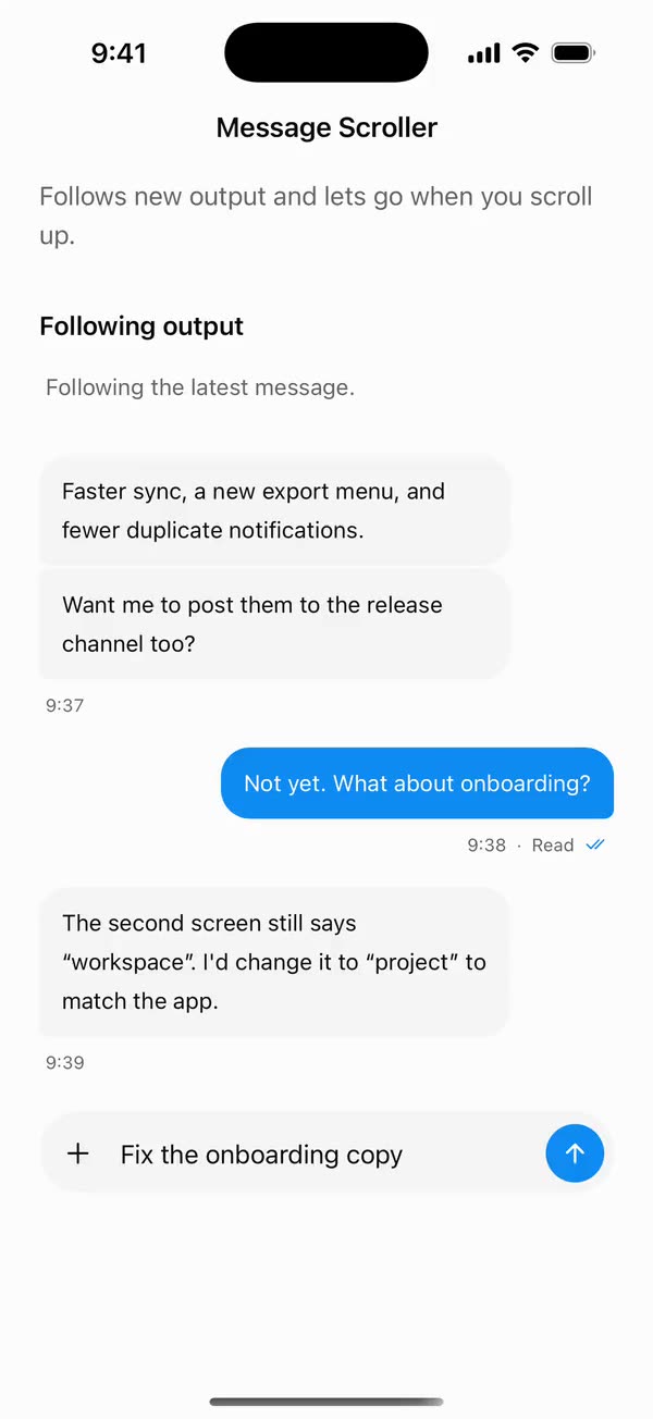
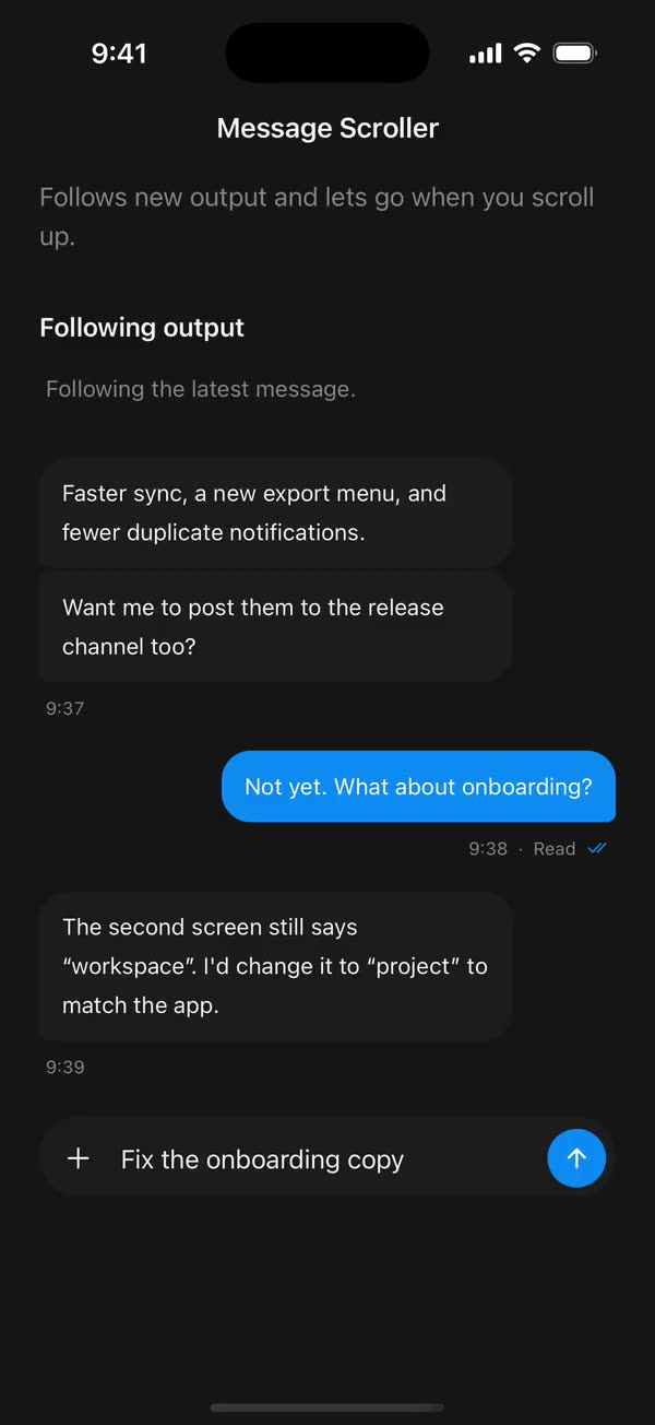
React NativeFollows new output and lets go when you scroll up.
Preview
Install
Source on GitHubIt works in Expo and in bare React Native. New to beUI Native? Set up your app first.
Copies the component and the shared files it needs into src/, adds the theme tokens if they're missing, and installs its libraries. Files you've changed are kept.
Keep the folder layout, since the component imports the shared files by relative path.
1Install the libraries
npx expo install react-native-reanimated react-native-svg react-native-worklets
npm install uniwind tailwindcss2Add the theme tokens
Once per app. Import it from the CSS file Uniwind reads, after Tailwind and Uniwind, and change the values to match your brand.
/* Matches the default beUI palette in ui-components/lib/themes.ts.
   Native surface maps to card; muted maps to muted-foreground. */
@layer theme {
  :root {
    @variant light {
      --color-background: oklch(99% 0 0);
      --color-surface: oklch(97% 0 0);
      --color-foreground: oklch(15% 0 0);
      --color-muted: oklch(50% 0 0);
      --color-border: oklch(15% 0 0 / 0.06);
      --color-border-strong: oklch(15% 0 0 / 0.16);
      --color-primary: #0285f7;
      --color-on-primary: #ffffff;
      --color-destructive: #dc2626;
      --color-success: #059669;
      --color-warning: #d97706;
    }
  }

  :root {
    @variant dark {
      --color-background: #151515;
      --color-surface: #1c1c1c;
      --color-foreground: oklch(96% 0 0);
      --color-muted: oklch(62% 0 0);
      --color-border: rgb(255 255 255 / 0.05);
      --color-border-strong: rgb(255 255 255 / 0.14);
      --color-primary: #0285f7;
      --color-on-primary: #ffffff;
      --color-destructive: #f87171;
      --color-success: #34d399;
      --color-warning: #fbbf24;
    }
  }

  /* Tailwind's default monospace stack isn't a font React Native can load. */
  :root {
    @variant ios {
      --font-mono: Menlo;
    }
  }

  :root {
    @variant android {
      --font-mono: monospace;
    }
  }
}
3Copy the shared files
import { useEffect, useRef, useState } from "react";

export type PresenceItem<T> = {
  key: string;
  value: T;
  /** False for the item present on first render, so it does not animate in. */
  appear: boolean;
  exiting: boolean;
};

/**
 * Keeps replaced items mounted while they animate out, like AnimatePresence.
 * A key that returns while exiting is revived in place.
 */
export function usePresence<T>(
  key: string | null,
  value: T,
  exitDuration: (value: T) => number,
) {
  const [items, setItems] = useState<PresenceItem<T>[]>(() =>
    key === null ? [] : [{ key, value, appear: false, exiting: false }],
  );
  const [currentKey, setCurrentKey] = useState(key);
  const exitDurationRef = useRef(exitDuration);
  exitDurationRef.current = exitDuration;

  // Adjust during render so the new item and the exits start in the same frame.
  if (key !== currentKey) {
    setCurrentKey(key);
    setItems((previous) => {
      const next = previous.map((item) =>
        item.key === key
          ? { ...item, value, exiting: false }
          : { ...item, exiting: true },
      );
      if (key !== null && !previous.some((item) => item.key === key)) {
        next.push({ key, value, appear: true, exiting: false });
      }
      return next;
    });
  }

  const exitingKeys = items
    .filter((item) => item.exiting)
    .map((item) => item.key)
    .join("\n");

  useEffect(() => {
    if (!exitingKeys) return;
    const timers = items
      .filter((item) => item.exiting)
      .map((item) =>
        setTimeout(() => {
          setItems((previous) =>
            previous.filter(
              (candidate) => !(candidate.key === item.key && candidate.exiting),
            ),
          );
        }, exitDurationRef.current(item.value)),
      );
    return () => {
      for (const timer of timers) clearTimeout(timer);
    };
    // Restart removal timers only when the set of exiting items changes.
  }, [exitingKeys]);

  return items;
}
import { useEffect, useState } from "react";
import { AccessibilityInfo } from "react-native";
import { useReducedMotion } from "react-native-reanimated";

/** Reanimated supplies a synchronous initial value; native events keep it current. */
export function useReducedMotionPreference() {
  const initialValue = useReducedMotion();
  const [reducedMotion, setReducedMotion] = useState(initialValue);

  useEffect(() => {
    let active = true;
    let receivedEvent = false;
    const subscription = AccessibilityInfo.addEventListener(
      "reduceMotionChanged",
      (value) => {
        receivedEvent = true;
        setReducedMotion(value);
      },
    );
    void AccessibilityInfo.isReduceMotionEnabled().then((value) => {
      if (active && !receivedEvent) setReducedMotion(value);
    });
    return () => {
      active = false;
      subscription.remove();
    };
  }, []);

  return reducedMotion;
}
import type { ReactNode } from "react";
import type { ColorValue } from "react-native";
import Svg, { Circle, Path, Rect } from "react-native-svg";

type GlyphProps = { size?: number; color?: ColorValue; strokeWidth?: number };

function Glyph({
  size = 16,
  color = "currentColor",
  strokeWidth = 2,
  children,
}: GlyphProps & { children: ReactNode }) {
  return (
    <Svg
      width={size}
      height={size}
      viewBox="0 0 24 24"
      fill="none"
      stroke={color}
      strokeWidth={strokeWidth}
      strokeLinecap="round"
      strokeLinejoin="round"
    >
      {children}
    </Svg>
  );
}

// Simple 24-unit stroke glyphs shared by the agent components.

export function ChevronDownGlyph(props: GlyphProps) {
  return (
    <Glyph {...props}>
      <Path d="M6 9l6 6 6-6" />
    </Glyph>
  );
}

export function ArrowUpGlyph(props: GlyphProps) {
  return (
    <Glyph {...props}>
      <Path d="M12 19V5M5.5 11.5L12 5l6.5 6.5" />
    </Glyph>
  );
}

export function PlusGlyph(props: GlyphProps) {
  return (
    <Glyph {...props}>
      <Path d="M12 5v14M5 12h14" />
    </Glyph>
  );
}

export function StopGlyph({ size = 12, color }: GlyphProps) {
  return (
    <Svg width={size} height={size} viewBox="0 0 12 12">
      <Rect x={1} y={1} width={10} height={10} rx={2.5} fill={color} />
    </Svg>
  );
}

export function CheckGlyph(props: GlyphProps) {
  return (
    <Glyph {...props}>
      <Path d="M5 12.5l4.5 4.5L19 7" />
    </Glyph>
  );
}

export function CopyGlyph(props: GlyphProps) {
  return (
    <Glyph {...props}>
      <Rect x={8.5} y={8.5} width={12} height={12} rx={2.5} />
      <Path d="M15.5 5.5v-.5A2 2 0 0 0 13.5 3h-8.5A2 2 0 0 0 3 5v8.5a2 2 0 0 0 2 2h.5" />
    </Glyph>
  );
}

export function RetryGlyph(props: GlyphProps) {
  return (
    <Glyph {...props}>
      <Path d="M3.5 12a8.5 8.5 0 1 0 2.6-6.1L3.5 8.5" />
      <Path d="M3.5 3.5v5h5" />
    </Glyph>
  );
}

export function ThumbGlyph({
  down = false,
  ...props
}: GlyphProps & { down?: boolean }) {
  return (
    <Glyph {...props}>
      <Path
        d="M7.5 10.5v10M7.5 10.5L11 3.5a2.5 2.5 0 0 1 2.5 2.5v3.5h5a2 2 0 0 1 2 2.3l-1.2 7A2 2 0 0 1 17.3 20.5H4.5a1 1 0 0 1-1-1v-8a1 1 0 0 1 1-1z"
        transform={down ? "rotate(180 12 12)" : undefined}
      />
    </Glyph>
  );
}

export function SearchGlyph(props: GlyphProps) {
  return (
    <Glyph {...props}>
      <Circle cx={11} cy={11} r={6.5} />
      <Path d="M16 16l4 4" />
    </Glyph>
  );
}

export function GlobeGlyph(props: GlyphProps) {
  return (
    <Glyph {...props}>
      <Circle cx={12} cy={12} r={8.5} />
      <Path d="M3.5 12h17M12 3.5c2.4 2.5 3.5 5.3 3.5 8.5s-1.1 6-3.5 8.5c-2.4-2.5-3.5-5.3-3.5-8.5s1.1-6 3.5-8.5z" />
    </Glyph>
  );
}

export function FileGlyph(props: GlyphProps) {
  return (
    <Glyph {...props}>
      <Path d="M14 3.5H7.5a2 2 0 0 0-2 2v13a2 2 0 0 0 2 2h9a2 2 0 0 0 2-2V8z" />
      <Path d="M14 3.5V8h4.5M9 13h6M9 16.5h4" />
    </Glyph>
  );
}

export function PencilGlyph(props: GlyphProps) {
  return (
    <Glyph {...props}>
      <Path d="M4 20h4L19 9a2.1 2.1 0 0 0-4-4L4 16z" />
      <Path d="M13.5 6.5l4 4M14 20h6" />
    </Glyph>
  );
}

export function TerminalGlyph(props: GlyphProps) {
  return (
    <Glyph {...props}>
      <Rect x={3.5} y={4.5} width={17} height={15} rx={2.5} />
      <Path d="M7.5 10l2.5 2-2.5 2M12.5 15h4" />
    </Glyph>
  );
}

export function WrenchGlyph(props: GlyphProps) {
  return (
    <Glyph {...props}>
      <Path d="M14.5 6.5a4 4 0 0 0 5 5l-8.8 8.8a2.1 2.1 0 0 1-3-3l8.8-8.8a4 4 0 0 1-2-2z" />
    </Glyph>
  );
}

export function SparkleGlyph(props: GlyphProps) {
  return (
    <Glyph {...props}>
      <Path d="M12 4l1.8 4.6L18.5 10.5l-4.7 1.9L12 17l-1.8-4.6-4.7-1.9 4.7-1.9z" />
      <Path d="M18.5 16.5v3M17 18h3" />
    </Glyph>
  );
}

export function MessageGlyph(props: GlyphProps) {
  return (
    <Glyph {...props}>
      <Path d="M20 14.5a2 2 0 0 1-2 2H8.5L4 20V6a2 2 0 0 1 2-2h12a2 2 0 0 1 2 2z" />
    </Glyph>
  );
}

export function ImageGlyph(props: GlyphProps) {
  return (
    <Glyph {...props}>
      <Rect x={3.5} y={4.5} width={17} height={15} rx={2.5} />
      <Circle cx={9} cy={10} r={1.5} />
      <Path d="M20.5 15.5l-4.5-4.5-9 8.5" />
    </Glyph>
  );
}

export function ShieldGlyph(props: GlyphProps) {
  return (
    <Glyph {...props}>
      <Path d="M12 3.5l7 2.5v5.5c0 4.4-3 7.7-7 9-4-1.3-7-4.6-7-9V6z" />
      <Path d="M9 12l2 2 4-4" />
    </Glyph>
  );
}

export function AlertGlyph(props: GlyphProps) {
  return (
    <Glyph {...props}>
      <Circle cx={12} cy={12} r={8.5} />
      <Path d="M12 8v4.5M12 16h.01" />
    </Glyph>
  );
}

export function CrossGlyph(props: GlyphProps) {
  return (
    <Glyph {...props}>
      <Path d="M6.5 6.5l11 11M17.5 6.5l-11 11" />
    </Glyph>
  );
}

export function HelpGlyph(props: GlyphProps) {
  return (
    <Glyph {...props}>
      <Circle cx={12} cy={12} r={8.5} />
      <Path d="M9.6 9.5a2.5 2.5 0 0 1 4.8 1c0 1.7-2.4 2.2-2.4 3.5M12 16.8h.01" />
    </Glyph>
  );
}

export function ArrowGlyph({
  back = false,
  ...props
}: GlyphProps & { back?: boolean }) {
  return (
    <Glyph {...props}>
      <Path
        d="M5 12h14M13 6l6 6-6 6"
        transform={back ? "rotate(180 12 12)" : undefined}
      />
    </Glyph>
  );
}

export function BracesGlyph(props: GlyphProps) {
  return (
    <Glyph {...props}>
      <Path d="M8.5 4H8a2 2 0 0 0-2 2v3.5A2.5 2.5 0 0 1 3.5 12 2.5 2.5 0 0 1 6 14.5V18a2 2 0 0 0 2 2h.5M15.5 4h.5a2 2 0 0 1 2 2v3.5a2.5 2.5 0 0 0 2.5 2.5 2.5 2.5 0 0 0-2.5 2.5V18a2 2 0 0 1-2 2h-.5" />
    </Glyph>
  );
}

export function BanGlyph(props: GlyphProps) {
  return (
    <Glyph {...props}>
      <Circle cx={12} cy={12} r={8.5} />
      <Path d="M6 6l12 12" />
    </Glyph>
  );
}

export function CircleCheckGlyph(props: GlyphProps) {
  return (
    <Glyph {...props}>
      <Circle cx={12} cy={12} r={8.5} />
      <Path d="M8.5 12.2l2.4 2.4 4.6-4.8" />
    </Glyph>
  );
}

export function CircleCrossGlyph(props: GlyphProps) {
  return (
    <Glyph {...props}>
      <Circle cx={12} cy={12} r={8.5} />
      <Path d="M9.5 9.5l5 5M14.5 9.5l-5 5" />
    </Glyph>
  );
}

export function ListGlyph(props: GlyphProps) {
  return (
    <Glyph {...props}>
      <Path d="M4 6.5l1.5 1.5L8 5.5M4 13l1.5 1.5L8 12M11.5 7h8.5M11.5 13.5h8.5M11.5 19h8.5M4.5 19h2" />
    </Glyph>
  );
}

/** An open ring, spun by SpinGlyph. */
export function RingGlyph(props: GlyphProps) {
  return (
    <Glyph {...props}>
      <Path d="M20.5 12a8.5 8.5 0 1 1-6-8.1" />
    </Glyph>
  );
}

export function ReplyGlyph(props: GlyphProps) {
  return (
    <Glyph {...props}>
      <Path d="M9.5 7L4.5 12l5 5M4.5 12h10a5 5 0 0 1 5 5v1" />
    </Glyph>
  );
}

export function WrapGlyph(props: GlyphProps) {
  return (
    <Glyph {...props}>
      <Path d="M4 6.5h16M4 12h12.5a3.25 3.25 0 0 1 0 6.5H12M4 18.5h4.5M14 16.5l-2 2 2 2" />
    </Glyph>
  );
}

export function BookGlyph(props: GlyphProps) {
  return (
    <Glyph {...props}>
      <Path d="M12 6.5c-1.6-1.3-4-2-7.5-2v13c3.5 0 5.9.7 7.5 2 1.6-1.3 4-2 7.5-2v-13c-3.5 0-5.9.7-7.5 2zM12 6.5v13" />
    </Glyph>
  );
}

export function ExternalGlyph(props: GlyphProps) {
  return (
    <Glyph {...props}>
      <Path d="M14 4.5h5.5V10M19.5 4.5L11 13M17 14v4a2 2 0 0 1-2 2H6a2 2 0 0 1-2-2V9a2 2 0 0 1 2-2h4" />
    </Glyph>
  );
}

export function DoubleCheckGlyph(props: GlyphProps) {
  return (
    <Glyph {...props}>
      <Path d="M2.5 12.5l4.5 4.5 9-9.5M12 16.5l.5.5 9-9.5" />
    </Glyph>
  );
}

export function ClockGlyph(props: GlyphProps) {
  return (
    <Glyph {...props}>
      <Circle cx={12} cy={12} r={8.5} />
      <Path d="M12 7.5V12l3 2" />
    </Glyph>
  );
}

export function MicGlyph(props: GlyphProps) {
  return (
    <Glyph {...props}>
      <Rect x={9} y={3.5} width={6} height={11} rx={3} />
      <Path d="M5.5 11a6.5 6.5 0 0 0 13 0M12 17.5v3" />
    </Glyph>
  );
}
import {
  type ColorValue,
  StyleSheet,
  View,
  type ViewStyle,
} from "react-native";

const BANDS = 8;

export type FadeEdgeProps = {
  /** The surface color the content fades into. */
  color: ColorValue | undefined;
  /** Which edge is solid. Defaults to "bottom". */
  edge?: "top" | "bottom";
  /** Height of the fade in points. */
  height: number;
  style?: ViewStyle;
};

/**
 * A soft edge over clipped content, built from stacked bands so shared
 * components need no gradient library. Ignores touches.
 */
export function FadeEdge({
  color,
  edge = "bottom",
  height,
  style,
}: FadeEdgeProps) {
  return (
    <View
      pointerEvents="none"
      style={[
        styles.edge,
        edge === "bottom" ? styles.bottom : styles.top,
        { height },
        style,
      ]}
    >
      {Array.from({ length: BANDS }, (_, index) => {
        const t = (index + 1) / BANDS;
        return (
          <View
            key={index}
            style={{
              flex: 1,
              backgroundColor: color,
              // Ease the ramp so the fade has no visible first step.
              opacity: edge === "bottom" ? t * t : (1 - t + 1 / BANDS) ** 2,
            }}
          />
        );
      })}
    </View>
  );
}

const styles = StyleSheet.create({
  edge: { position: "absolute", left: 0, right: 0 },
  bottom: { bottom: 0 },
  top: { top: 0 },
});
import { useEffect, useState } from "react";
import { StyleSheet, Text, View } from "react-native";
import Animated, {
  useAnimatedStyle,
  useSharedValue,
  withSpring,
  withTiming,
} from "react-native-reanimated";
import { usePresence } from "../hooks/use-presence";
import { EASE_OUT, SPRING_SWAP } from "../styles/motion";

const EXIT = { duration: 140, easing: EASE_OUT };
const TRAVEL = 0.9;

/** Progress runs 0 (below) → 1 (resting) → 2 (rolled away above). */
function Layer({
  text,
  appear,
  exiting,
  reduce,
  height,
  className,
  lines,
}: {
  text: string;
  appear: boolean;
  exiting: boolean;
  reduce: boolean;
  height: number;
  className: string;
  lines?: number;
}) {
  const progress = useSharedValue(appear && !reduce ? 0 : 1);

  useEffect(() => {
    if (reduce) {
      progress.value = exiting ? 2 : 1;
      return;
    }
    progress.value = exiting ? withTiming(2, EXIT) : withSpring(1, SPRING_SWAP);
  }, [exiting, progress, reduce]);

  const style = useAnimatedStyle(() => {
    const p = progress.value;
    return {
      opacity: Math.max(0, Math.min(1, p <= 1 ? p : 2 - p)),
      transform: [{ translateY: (1 - p) * height * TRAVEL }],
    };
  }, [height]);

  return (
    <Animated.View style={[styles.layer, style]}>
      <Text numberOfLines={lines} className={className}>
        {text}
      </Text>
    </Animated.View>
  );
}

export type RollTextProps = {
  /** Changing the value rolls the new text in; defaults to the text itself. */
  value?: string;
  text: string;
  className: string;
  reduce: boolean;
  /** Lines before truncating. Defaults to 1; pass 0 to wrap freely. */
  numberOfLines?: number;
};

/**
 * Text that rolls up when it changes: the new line rises in from below as the
 * old one rolls up and away. Clipped to its own lines, so only the text moves.
 */
export function RollText({
  value,
  text,
  className,
  reduce,
  numberOfLines = 1,
}: RollTextProps) {
  const lines = numberOfLines === 0 ? undefined : numberOfLines;
  const [height, setHeight] = useState(16);
  const items = usePresence(value ?? text, text, () =>
    reduce ? 0 : EXIT.duration + 40,
  );

  return (
    <View style={styles.slot}>
      {/* Sizes the slot to the current text. */}
      <Text
        numberOfLines={lines}
        className={className}
        style={styles.sizer}
        onLayout={({ nativeEvent }) => setHeight(nativeEvent.layout.height)}
      >
        {text}
      </Text>
      {items.map((item) => (
        <Layer
          key={item.key}
          text={item.value}
          appear={item.appear}
          exiting={item.exiting}
          reduce={reduce}
          height={height}
          className={className}
          lines={lines}
        />
      ))}
    </View>
  );
}

const styles = StyleSheet.create({
  slot: { overflow: "hidden", flexShrink: 1, minWidth: 0 },
  sizer: { opacity: 0 },
  layer: { position: "absolute", left: 0, right: 0, top: 0 },
});
import { Easing, ReduceMotion } from "react-native-reanimated";

// Mirrors beUI's lib/ease.ts so native motion matches the web library.

export const EASE_OUT = Easing.bezier(0.16, 1, 0.3, 1);
export const EASE_IN_OUT = Easing.bezier(0.77, 0, 0.175, 1);

/** Press feedback on buttons and other tappable surfaces. */
export const SPRING_PRESS = {
  stiffness: 500,
  damping: 30,
  mass: 0.6,
  reduceMotion: ReduceMotion.System,
} as const;

/** Content swaps: label and icon slots trading places inside a control. */
export const SPRING_SWAP = {
  stiffness: 460,
  damping: 30,
  mass: 0.55,
  reduceMotion: ReduceMotion.System,
} as const;

/** Shared-layout glides: pills, indicators and panels moving between positions. */
export const SPRING_LAYOUT = {
  stiffness: 360,
  damping: 32,
  mass: 0.6,
  reduceMotion: ReduceMotion.System,
} as const;

/** Dragged handles and fills; critically damped so values never rebound off an end. */
export const SPRING_GLIDE = {
  stiffness: 700,
  damping: 50,
  mass: 0.5,
  reduceMotion: ReduceMotion.System,
} as const;

export const motion = {
  press: SPRING_PRESS,
  swap: SPRING_SWAP,
  layout: SPRING_LAYOUT,
  glide: SPRING_GLIDE,
  exit: { duration: 160, easing: EASE_OUT, reduceMotion: ReduceMotion.System },
  fade: { duration: 150, reduceMotion: ReduceMotion.System },
} as const;
4Copy the component
export type {
  MessageScrollerHandle,
  MessageScrollerProps,
} from "./message-scroller";
export { MessageScroller } from "./message-scroller";
import {
  type ReactNode,
  type Ref,
  useCallback,
  useEffect,
  useImperativeHandle,
  useRef,
  useState,
} from "react";
import {
  type NativeScrollEvent,
  type NativeSyntheticEvent,
  Pressable,
  ScrollView,
  type ScrollViewProps,
  StyleSheet,
  View,
} from "react-native";
import Animated, {
  useAnimatedStyle,
  useSharedValue,
  withSpring,
  withTiming,
} from "react-native-reanimated";
import { useResolveClassNames } from "uniwind";
import { useReducedMotionPreference } from "../../hooks/use-reduced-motion";
import { ArrowUpGlyph } from "../../primitives/agent-icons";
import { FadeEdge } from "../../primitives/fade-edge";
import { RollText } from "../../primitives/roll-text";
import { SPRING_LAYOUT, SPRING_PRESS } from "../../styles/motion";

export type MessageScrollerHandle = {
  /** Scrolls to the newest message and resumes following. */
  scrollToEnd: (animated?: boolean) => void;
};

export type MessageScrollerProps = Omit<ScrollViewProps, "children"> & {
  /** Keeps the newest message in view as content grows. Defaults to true. */
  followOutput?: boolean;
  /** How close to the end, in points, still counts as following. Defaults to 56. */
  followThreshold?: number;
  /** Animates the follow. Defaults to true. */
  smooth?: boolean;
  onFollowChange?: (following: boolean) => void;
  /** Spoken name of the conversation. Defaults to "Conversation". */
  label?: string;
  /** Marks the conversation busy while a reply streams. */
  busy?: boolean;
  /** Shows a pill back to the newest message after you scroll up. Defaults to true. */
  showJump?: boolean;
  /**
   * Fades messages out under the top edge once you've scrolled, instead of
   * cutting them off. Set `fadeColor` to the surface behind the scroller.
   * Defaults to true.
   */
  fadeTop?: boolean;
  /** Color the top edge fades into. Defaults to the background token. */
  fadeColor?: string;
  /** Defaults to "Jump to latest". */
  jumpLabel?: string;
  /**
   * How many messages the conversation holds. When given, the pill counts
   * the ones that arrived while you were reading, such as "3 new messages".
   */
  messageCount?: number;
  /** Classes for the scroll content. */
  contentClassName?: string;
  className?: string;
  disableAnimation?: boolean;
  children: ReactNode;
  ref?: Ref<MessageScrollerHandle>;
};

/**
 * A conversation that follows new output to the bottom and lets go the moment
 * you drag up to read. A pill brings you back to the latest message.
 */
export function MessageScroller({
  followOutput = true,
  followThreshold = 56,
  smooth = true,
  onFollowChange,
  label = "Conversation",
  busy,
  showJump = true,
  fadeTop = true,
  fadeColor,
  jumpLabel = "Jump to latest",
  messageCount,
  contentClassName = "",
  className = "",
  disableAnimation = false,
  children,
  onScroll,
  onScrollBeginDrag,
  onScrollEndDrag,
  onMomentumScrollEnd,
  onContentSizeChange,
  ref,
  ...props
}: MessageScrollerProps) {
  const reducedMotion = useReducedMotionPreference();
  const reduce = reducedMotion || disableAnimation;
  const scrollRef = useRef<ScrollView>(null);
  const [following, setFollowingState] = useState(followOutput);
  const followingRef = useRef(followOutput);
  // True from the moment a finger touches until momentum settles.
  const userScrolling = useRef(false);
  const metrics = useRef({ offset: 0, content: 0, viewport: 0 });
  const jump = useSharedValue(0);
  const jumpPress = useSharedValue(1);
  const [scrolled, setScrolled] = useState(false);
  const fade = useSharedValue(0);
  const { backgroundColor: page } = useResolveClassNames("bg-background");
  useEffect(() => {
    fade.value = withTiming(scrolled ? 1 : 0, { duration: 160 });
  }, [fade, scrolled]);
  const fadeStyle = useAnimatedStyle(() => ({ opacity: fade.value }));
  const { color: foreground } = useResolveClassNames("text-foreground");

  // The message count when you last left the end.
  const [leftAt, setLeftAt] = useState(messageCount ?? 0);
  const countRef = useRef(messageCount ?? 0);
  countRef.current = messageCount ?? 0;

  const setFollowing = useCallback(
    (next: boolean) => {
      if (followingRef.current === next) return;
      if (!next) setLeftAt(countRef.current);
      followingRef.current = next;
      setFollowingState(next);
      onFollowChange?.(next);
    },
    [onFollowChange],
  );

  const scrollToEnd = useCallback(
    (animated = smooth && !reduce) => {
      setFollowing(true);
      scrollRef.current?.scrollToEnd({ animated });
    },
    [reduce, setFollowing, smooth],
  );

  useImperativeHandle(ref, () => ({ scrollToEnd }), [scrollToEnd]);

  useEffect(() => {
    if (!followOutput) setFollowing(false);
  }, [followOutput, setFollowing]);

  const overflowing = () =>
    metrics.current.content > metrics.current.viewport + 1;
  const showPill = showJump && !following && overflowing();
  const unread =
    messageCount === undefined ? 0 : Math.max(0, messageCount - leftAt);
  const pillLabel =
    unread > 0
      ? `${unread} new ${unread === 1 ? "message" : "messages"}`
      : jumpLabel;

  useEffect(() => {
    jump.value = reduce
      ? withTiming(showPill ? 1 : 0, { duration: 120 })
      : withSpring(showPill ? 1 : 0, SPRING_LAYOUT);
  }, [jump, reduce, showPill]);

  const settle = (released: boolean) => {
    const { offset, content, viewport } = metrics.current;
    const near = content - offset - viewport <= followThreshold;
    setFollowing(near);
    // Catch up on anything that arrived while the finger held the list.
    if (near && released)
      scrollRef.current?.scrollToEnd({ animated: smooth && !reduce });
  };

  const jumpStyle = useAnimatedStyle(
    () => ({
      opacity: jump.value,
      transform: [
        { translateY: reduce ? 0 : (1 - jump.value) * 12 },
        { scale: (0.9 + jump.value * 0.1) * jumpPress.value },
      ],
    }),
    [reduce],
  );

  return (
    <View style={styles.root} className={className}>
      <ScrollView
        ref={scrollRef}
        accessibilityLabel={label}
        scrollEventThrottle={16}
        keyboardShouldPersistTaps="handled"
        onLayout={({ nativeEvent }) => {
          metrics.current.viewport = nativeEvent.layout.height;
        }}
        onContentSizeChange={(width, height) => {
          const first = metrics.current.content === 0;
          metrics.current.content = height;
          // Never pull against a finger; letting go decides whether to follow.
          if (followingRef.current && !userScrolling.current) {
            scrollRef.current?.scrollToEnd({
              animated: !first && smooth && !reduce,
            });
          }
          onContentSizeChange?.(width, height);
        }}
        onScroll={(event: NativeSyntheticEvent<NativeScrollEvent>) => {
          const { contentOffset, contentSize, layoutMeasurement } =
            event.nativeEvent;
          // Only fade once there's content above the top edge.
          const away = contentOffset.y > 2;
          if (away !== scrolled) setScrolled(away);
          metrics.current = {
            offset: contentOffset.y,
            content: contentSize.height,
            viewport: layoutMeasurement.height,
          };
          // Only a finger changes whether we follow; our own scrolls don't.
          if (userScrolling.current) settle(false);
          onScroll?.(event);
        }}
        onScrollBeginDrag={(event) => {
          userScrolling.current = true;
          onScrollBeginDrag?.(event);
        }}
        onScrollEndDrag={(event) => {
          const velocity = event.nativeEvent.velocity?.y ?? 0;
          if (velocity === 0) {
            userScrolling.current = false;
            settle(true);
          }
          onScrollEndDrag?.(event);
        }}
        onMomentumScrollEnd={(event) => {
          if (userScrolling.current) {
            userScrolling.current = false;
            settle(true);
          }
          onMomentumScrollEnd?.(event);
        }}
        {...props}
      >
        <View
          accessibilityLiveRegion="polite"
          accessibilityState={{ busy }}
          className={contentClassName}
        >
          {children}
        </View>
      </ScrollView>
      {fadeTop ? (
        <Animated.View pointerEvents="none" style={[styles.fade, fadeStyle]}>
          <FadeEdge color={fadeColor ?? page} edge="top" height={FADE} />
        </Animated.View>
      ) : null}
      {showJump ? (
        <Animated.View
          pointerEvents={showPill ? "box-none" : "none"}
          style={[styles.jump, jumpStyle]}
        >
          <Pressable
            accessibilityRole="button"
            accessibilityLabel={pillLabel}
            accessibilityElementsHidden={!showPill}
            importantForAccessibility={
              showPill ? "auto" : "no-hide-descendants"
            }
            onPress={() => scrollToEnd()}
            onPressIn={() => {
              if (!reduce) jumpPress.value = withSpring(0.94, SPRING_PRESS);
            }}
            onPressOut={() => {
              jumpPress.value = withSpring(1, SPRING_PRESS);
            }}
            className="h-9 flex-row items-center gap-1.5 rounded-full border border-border bg-background px-3.5"
            style={styles.pill}
          >
            <View style={styles.down}>
              <ArrowUpGlyph size={14} color={foreground} />
            </View>
            <RollText
              text={pillLabel}
              className="text-xs font-medium text-foreground"
              reduce={reduce}
            />
          </Pressable>
        </Animated.View>
      ) : null}
    </View>
  );
}

const FADE = 28;

const styles = StyleSheet.create({
  fade: { position: "absolute", left: 0, right: 0, top: 0, height: FADE },
  root: { flex: 1, minHeight: 0 },
  jump: {
    position: "absolute",
    left: 0,
    right: 0,
    bottom: 12,
    alignItems: "center",
  },
  pill: {
    shadowColor: "#000",
    shadowOpacity: 0.08,
    shadowRadius: 12,
    shadowOffset: { width: 0, height: 4 },
    elevation: 3,
  },
  down: { transform: [{ rotate: "180deg" }] },
});
Documentation
Native port of beUI Message Scroller: a conversation that keeps the newest message in view.
import { MessageScroller } from "./src";

<MessageScroller busy={streaming} contentClassName="p-4">
  {messages}
</MessageScroller>
Behavior
- While following, new content scrolls the conversation to the bottom.
- The moment you drag up past
followThreshold(56 points), it stops following, so a streaming reply never pulls you away from what you're reading. Only your own scrolling changes this, never the component's. - A "Jump to latest" pill springs up from the bottom while you're away from the end. Tapping it scrolls down and resumes following. Turn it off with
showJump={false}. - Once you've scrolled, messages fade out under the top edge instead of being cut off. The fade uses the background token; pass
fadeColorwhen the scroller sits on another surface, or turn it off withfadeTop={false}. onFollowChangereports each change, and the ref'sscrollToEnd()jumps to the latest message from your own controls.- It's a
ScrollView, so its props pass through. Inside another vertical scroll view on Android, setnestedScrollEnabled.
The web version's preview rail depends on hover, so it isn't ported. The jump pill takes its place on touch screens.
Better on a phone
- Pass
messageCountand the pill counts what arrived while you were reading, such as "3 new messages", rolling as the count changes. - It never scrolls against your finger: new output waits while you drag, and letting go near the end catches up.
Accessibility
- The scroll view is named "Conversation". Change it with
label. - The content is a polite live region on Android and is marked busy while
busyis set. - Reduced motion, or
disableAnimation, jumps instead of scrolling smoothly and fades the pill in place.
Copy this directory, primitives/fade-edge.tsx, hooks/use-presence.ts, hooks/use-reduced-motion.ts, primitives/agent-icons.tsx, primitives/roll-text.tsx, styles/motion.ts, and the semantic tokens in styles/theme.css. It uses react-native-svg for its icon.