
Agent Loading States
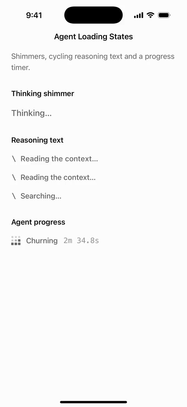
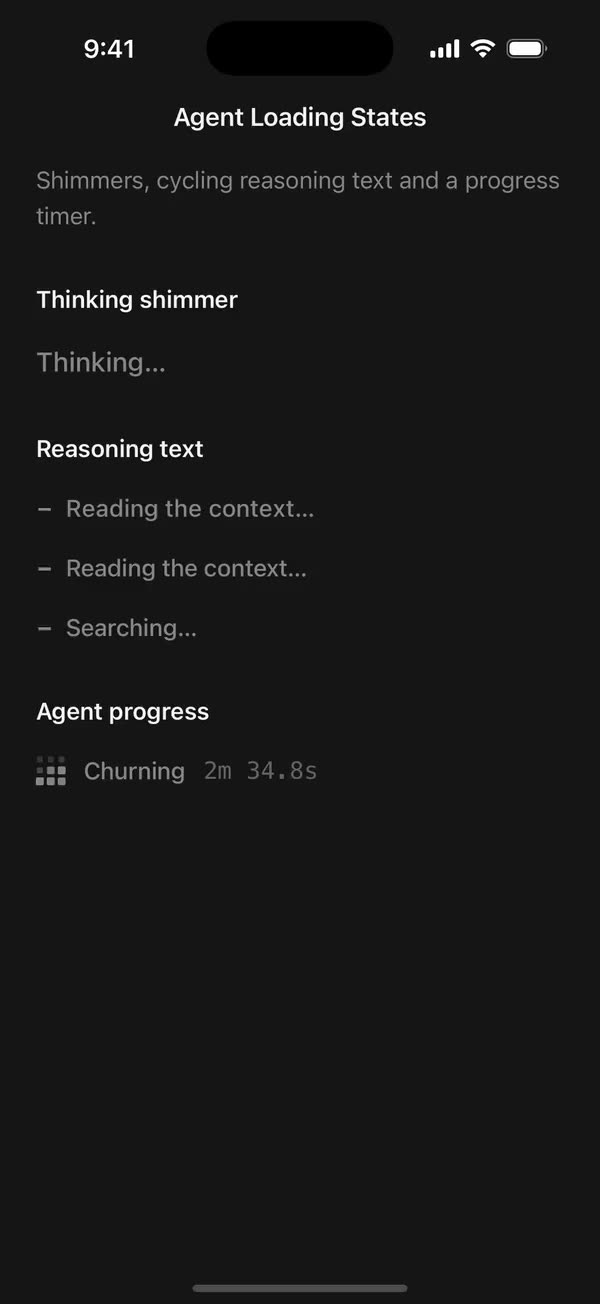
React NativeShimmers, cycling reasoning text and a progress timer.
Preview
Install
Source on GitHubIt works in Expo and in bare React Native. New to beUI Native? Set up your app first.
Copies the component and the shared files it needs into src/, adds the theme tokens if they're missing, and installs its libraries. Files you've changed are kept.
Keep the folder layout, since the component imports the shared files by relative path.
1Install the libraries
npx expo install react-native-reanimated react-native-worklets
npm install uniwind tailwindcss2Add the theme tokens
Once per app. Import it from the CSS file Uniwind reads, after Tailwind and Uniwind, and change the values to match your brand.
/* Matches the default beUI palette in ui-components/lib/themes.ts.
   Native surface maps to card; muted maps to muted-foreground. */
@layer theme {
  :root {
    @variant light {
      --color-background: oklch(99% 0 0);
      --color-surface: oklch(97% 0 0);
      --color-foreground: oklch(15% 0 0);
      --color-muted: oklch(50% 0 0);
      --color-border: oklch(15% 0 0 / 0.06);
      --color-border-strong: oklch(15% 0 0 / 0.16);
      --color-primary: #0285f7;
      --color-on-primary: #ffffff;
      --color-destructive: #dc2626;
      --color-success: #059669;
      --color-warning: #d97706;
    }
  }

  :root {
    @variant dark {
      --color-background: #151515;
      --color-surface: #1c1c1c;
      --color-foreground: oklch(96% 0 0);
      --color-muted: oklch(62% 0 0);
      --color-border: rgb(255 255 255 / 0.05);
      --color-border-strong: rgb(255 255 255 / 0.14);
      --color-primary: #0285f7;
      --color-on-primary: #ffffff;
      --color-destructive: #f87171;
      --color-success: #34d399;
      --color-warning: #fbbf24;
    }
  }

  /* Tailwind's default monospace stack isn't a font React Native can load. */
  :root {
    @variant ios {
      --font-mono: Menlo;
    }
  }

  :root {
    @variant android {
      --font-mono: monospace;
    }
  }
}
3Copy the shared files
import { useEffect, useRef, useState } from "react";
import { Text, type TextProps } from "react-native";
import { useReducedMotionPreference } from "../../hooks/use-reduced-motion";

const DEFAULT_GLYPHS = "ABCDEFGHJKLMNPQRSTUVWXYZ0123456789#%&@$?/";
// Scrambled glyphs change at most this often, in milliseconds.
const FRAME = 40;

export type TextScrambleProps = Omit<TextProps, "children"> & {
  /** Final text. Changing it scrambles toward the new value. */
  text: string;
  /** Total duration in milliseconds. Defaults to 32 ms per character, within 420–760. */
  duration?: number;
  /** Characters sampled while positions are unresolved. */
  glyphs?: string;
  /** Disables scrambling independently of the system preference. */
  disableAnimation?: boolean;
  className?: string;
};

/** Characters scramble through random glyphs and settle left to right on `text`. */
export function TextScramble({
  text,
  duration,
  glyphs = DEFAULT_GLYPHS,
  disableAnimation = false,
  className = "",
  accessibilityLabel,
  ...props
}: TextScrambleProps) {
  const reducedMotion = useReducedMotionPreference();
  const animate = !reducedMotion && !disableAnimation;
  const [display, setDisplay] = useState(text);
  const mounted = useRef(false);

  useEffect(() => {
    // The first text appears as is; later changes scramble.
    if (!mounted.current) {
      mounted.current = true;
      setDisplay(text);
      return;
    }
    if (!animate || !glyphs) {
      setDisplay(text);
      return;
    }

    const characters = Array.from(text);
    const total =
      duration ?? Math.min(760, Math.max(420, characters.length * 32));
    const startedAt = Date.now();
    let lastUpdate = 0;
    let frame = 0;

    const tick = () => {
      const now = Date.now();
      if (now - lastUpdate >= FRAME) {
        lastUpdate = now;
        const settled = Math.floor(
          Math.min((now - startedAt) / total, 1) * characters.length,
        );
        setDisplay(
          characters
            .map((character, index) =>
              index < settled || character === " "
                ? character
                : glyphs[Math.floor(Math.random() * glyphs.length)],
            )
            .join(""),
        );
      }
      if (now - startedAt < total) frame = requestAnimationFrame(tick);
      else setDisplay(text);
    };

    frame = requestAnimationFrame(tick);
    return () => cancelAnimationFrame(frame);
  }, [animate, duration, glyphs, text]);

  return (
    <Text
      {...props}
      // Screen readers get the final text, never the scrambled frames.
      accessibilityLabel={accessibilityLabel ?? text}
      className={className}
    >
      {animate ? display : text}
    </Text>
  );
}
import { useEffect } from "react";
import { View, type ViewProps } from "react-native";
import Animated, {
  cancelAnimation,
  Easing,
  interpolateColor,
  ReduceMotion,
  useSharedValue,
  withRepeat,
  withTiming,
} from "react-native-reanimated";
import { useResolveClassNames } from "uniwind";
import { useReducedMotionPreference } from "../../hooks/use-reduced-motion";
import { GlyphRow } from "../../primitives/glyph-row";

// The web gradient is twice the text's width with its highlight 40% either side
// of its middle, swept from 200% to -200% background position. In text widths
// that is a highlight 0.4 wide whose center travels from -1 to 3.
const BAND = 0.4;
const SWEEP_FROM = -1;
const SWEEP_TO = 3;

export type TextShimmerProps = Omit<ViewProps, "children"> & {
  children: string;
  /** One sweep in milliseconds. Defaults to 2500. */
  duration?: number;
  /** Text style, such as `text-xl font-semibold`. Colors come from the theme. */
  className?: string;
  /** Disables the sweep independently of the system preference. */
  disableAnimation?: boolean;
};

/** A highlight that sweeps across muted text, for loading and thinking states. */
export function TextShimmer({
  children,
  duration = 2500,
  className = "",
  disableAnimation = false,
  accessibilityLabel,
  ...props
}: TextShimmerProps) {
  const reducedMotion = useReducedMotionPreference();
  const animate = !reducedMotion && !disableAnimation;
  const { color: base } = useResolveClassNames("text-muted");
  const { color: highlight } = useResolveClassNames("text-foreground");
  const progress = useSharedValue(0);
  const baseColor = String(base ?? "gray");
  const highlightColor = String(highlight ?? "black");

  useEffect(() => {
    if (!animate) {
      cancelAnimation(progress);
      progress.value = 0;
      return;
    }
    progress.value = 0;
    progress.value = withRepeat(
      withTiming(1, {
        duration,
        easing: Easing.linear,
        reduceMotion: ReduceMotion.Never,
      }),
      -1,
    );
    return () => cancelAnimation(progress);
  }, [animate, duration, progress]);

  const colorAt = (p: number, position: number) => {
    "worklet";
    const center = SWEEP_FROM + (SWEEP_TO - SWEEP_FROM) * p;
    const lit = Math.max(0, 1 - Math.abs(position - center) / BAND);
    return {
      color: interpolateColor(lit, [0, 1], [baseColor, highlightColor]),
      opacity: 1,
    };
  };

  return (
    <View
      {...props}
      accessible
      accessibilityRole="text"
      accessibilityLabel={accessibilityLabel ?? children}
      style={[{ alignSelf: "flex-start" }, props.style]}
    >
      {animate ? (
        <GlyphRow
          text={children}
          className={className}
          progress={progress}
          colorAt={colorAt}
        />
      ) : (
        <Animated.Text className={className} style={{ color: baseColor }}>
          {children}
        </Animated.Text>
      )}
    </View>
  );
}
import { useEffect, useRef, useState } from "react";

export type PresenceItem<T> = {
  key: string;
  value: T;
  /** False for the item present on first render, so it does not animate in. */
  appear: boolean;
  exiting: boolean;
};

/**
 * Keeps replaced items mounted while they animate out, like AnimatePresence.
 * A key that returns while exiting is revived in place.
 */
export function usePresence<T>(
  key: string | null,
  value: T,
  exitDuration: (value: T) => number,
) {
  const [items, setItems] = useState<PresenceItem<T>[]>(() =>
    key === null ? [] : [{ key, value, appear: false, exiting: false }],
  );
  const [currentKey, setCurrentKey] = useState(key);
  const exitDurationRef = useRef(exitDuration);
  exitDurationRef.current = exitDuration;

  // Adjust during render so the new item and the exits start in the same frame.
  if (key !== currentKey) {
    setCurrentKey(key);
    setItems((previous) => {
      const next = previous.map((item) =>
        item.key === key
          ? { ...item, value, exiting: false }
          : { ...item, exiting: true },
      );
      if (key !== null && !previous.some((item) => item.key === key)) {
        next.push({ key, value, appear: true, exiting: false });
      }
      return next;
    });
  }

  const exitingKeys = items
    .filter((item) => item.exiting)
    .map((item) => item.key)
    .join("\n");

  useEffect(() => {
    if (!exitingKeys) return;
    const timers = items
      .filter((item) => item.exiting)
      .map((item) =>
        setTimeout(() => {
          setItems((previous) =>
            previous.filter(
              (candidate) => !(candidate.key === item.key && candidate.exiting),
            ),
          );
        }, exitDurationRef.current(item.value)),
      );
    return () => {
      for (const timer of timers) clearTimeout(timer);
    };
    // Restart removal timers only when the set of exiting items changes.
  }, [exitingKeys]);

  return items;
}
import { useEffect, useState } from "react";
import { AccessibilityInfo } from "react-native";
import { useReducedMotion } from "react-native-reanimated";

/** Reanimated supplies a synchronous initial value; native events keep it current. */
export function useReducedMotionPreference() {
  const initialValue = useReducedMotion();
  const [reducedMotion, setReducedMotion] = useState(initialValue);

  useEffect(() => {
    let active = true;
    let receivedEvent = false;
    const subscription = AccessibilityInfo.addEventListener(
      "reduceMotionChanged",
      (value) => {
        receivedEvent = true;
        setReducedMotion(value);
      },
    );
    void AccessibilityInfo.isReduceMotionEnabled().then((value) => {
      if (active && !receivedEvent) setReducedMotion(value);
    });
    return () => {
      active = false;
      subscription.remove();
    };
  }, []);

  return reducedMotion;
}
import { type ReactNode, useEffect, useState } from "react";
import { StyleSheet, Text, View } from "react-native";
import Animated, {
  useAnimatedStyle,
  useSharedValue,
  withDelay,
  withSpring,
  withTiming,
} from "react-native-reanimated";
import { usePresence } from "../hooks/use-presence";
import { motion } from "../styles/motion";

const CASCADE_STAGGER = 25;
const TEXT_DISTANCE = 14;
// Splitting into letters breaks shaping in connected and complex scripts.
// Latin plus general punctuation (dashes, quotes, the ellipsis), none of which shape.
const CASCADE_SAFE = /^[\u0020-\u007e\u00a0-\u024f\u2000-\u206f]+$/;

function letters(text: string) {
  // Whitespace-only Text can measure zero-width on Android.
  return Array.from(text.replace(/ /g, "\u00a0"));
}

function exitDuration(text: string, cascade: boolean) {
  const stagger = cascade ? (text.length - 1) * CASCADE_STAGGER * 0.5 : 0;
  return motion.exit.duration + stagger + 40;
}

/** Progress runs 0 (below) → 1 (resting) → 2 (exited above). */
function Slide({
  appear,
  exiting,
  distance,
  delay,
  reduce,
  children,
}: {
  appear: boolean;
  exiting: boolean;
  distance: number;
  delay: number;
  reduce: boolean;
  children: ReactNode;
}) {
  const progress = useSharedValue(appear ? 0 : 1);

  useEffect(() => {
    if (reduce) {
      progress.value = withTiming(exiting ? 2 : 1, motion.fade);
    } else if (exiting) {
      progress.value = withDelay(delay / 2, withTiming(2, motion.exit));
    } else {
      progress.value = withDelay(delay, withSpring(1, motion.swap));
    }
  }, [delay, exiting, progress, reduce]);

  const animatedStyle = useAnimatedStyle(() => {
    const p = progress.value;
    return {
      opacity: Math.min(1, Math.max(0, p <= 1 ? p : 2 - p)),
      transform: [{ translateY: reduce ? 0 : (1 - p) * distance }],
    };
  }, [distance, reduce]);

  return <Animated.View style={animatedStyle}>{children}</Animated.View>;
}

function Label({
  text,
  cascade,
  className,
}: {
  text: string;
  cascade: boolean;
  className: string;
}) {
  return cascade ? (
    letters(text).map((char, index) => (
      <Text key={index} className={className}>
        {char}
      </Text>
    ))
  ) : (
    <Text numberOfLines={1} className={className}>
      {text}
    </Text>
  );
}

export type CascadeTextProps = {
  /** Changing the key swaps in `text`, even when the text itself repeats. */
  textKey: string;
  text: string;
  /** Text style applied to every letter. */
  className: string;
  reduce: boolean;
};

/**
 * Letter-by-letter slot roll: old letters roll up and away as new ones spring
 * in from below, left to right, while the width springs to fit. Shared by
 * StatefulButton and TextCascade.
 */
export function CascadeText({
  textKey,
  text,
  className,
  reduce,
}: CascadeTextProps) {
  const canCascade = (value: string) => !reduce && CASCADE_SAFE.test(value);
  const items = usePresence(textKey, text, (value) =>
    reduce ? motion.fade.duration + 40 : exitDuration(value, canCascade(value)),
  );
  const [measured, setMeasured] = useState<{
    width: number;
    height: number;
  } | null>(null);
  const width = useSharedValue(0);

  const widthStyle = useAnimatedStyle(() => ({ width: width.value }));
  const labelClass = className;
  const distance = measured ? measured.height * 1.05 : 20;

  return (
    <Animated.View
      style={[
        styles.textSlot,
        measured && { height: measured.height },
        measured && widthStyle,
      ]}
    >
      {/* Measures the incoming label with the same per-letter layout it renders with. */}
      <View style={styles.measureHost}>
        <View
          style={styles.row}
          onLayout={({ nativeEvent: { layout } }) => {
            if (measured) {
              width.value = reduce
                ? layout.width
                : withSpring(layout.width, motion.swap);
            } else {
              width.value = layout.width;
            }
            setMeasured({ width: layout.width, height: layout.height });
          }}
        >
          <Label text={text} cascade={canCascade(text)} className={className} />
        </View>
      </View>

      {items.map((item) => {
        const cascade = canCascade(item.value);
        return (
          <View key={item.key} style={[styles.row, measured && styles.layer]}>
            {cascade ? (
              letters(item.value).map((char, index) => (
                <Slide
                  key={index}
                  appear={item.appear}
                  exiting={item.exiting}
                  distance={distance}
                  delay={index * CASCADE_STAGGER}
                  reduce={reduce}
                >
                  <Text className={labelClass}>{char}</Text>
                </Slide>
              ))
            ) : (
              <Slide
                appear={item.appear}
                exiting={item.exiting}
                distance={TEXT_DISTANCE}
                delay={0}
                reduce={reduce}
              >
                <Text numberOfLines={1} className={labelClass}>
                  {item.value}
                </Text>
              </Slide>
            )}
          </View>
        );
      })}
    </Animated.View>
  );
}

const styles = StyleSheet.create({
  textSlot: { overflow: "hidden", flexShrink: 0 },
  row: { flexDirection: "row", alignItems: "center" },
  layer: { position: "absolute", left: 0, top: 0 },
  measureHost: {
    position: "absolute",
    left: 0,
    top: 0,
    width: 10000,
    flexDirection: "row",
    alignItems: "flex-start",
    opacity: 0,
    pointerEvents: "none",
  },
});
import { StyleSheet, View, type ViewStyle } from "react-native";
import Animated, {
  type SharedValue,
  useAnimatedStyle,
  useSharedValue,
} from "react-native-reanimated";

/**
 * Returns a glyph's color for the current progress. `position` is the glyph's
 * center across the row, from 0 at the left edge to 1 at the right. Must be a
 * worklet.
 */
export type GlyphColor = (
  progress: number,
  position: number,
) => { color: string; opacity: number };

// Splitting into glyphs breaks shaping in connected and complex scripts.
// Latin plus general punctuation (dashes, quotes, the ellipsis), none of which shape.
const SPLIT_SAFE = /^[\u0020-\u007e\u00a0-\u024f\u2000-\u206f]+$/;

export type GlyphRowProps = {
  text: string;
  /** Text style for every glyph. Its color is replaced by `colorAt`. */
  className?: string;
  progress: SharedValue<number>;
  colorAt: GlyphColor;
  style?: ViewStyle;
};

function Glyph({
  char,
  className,
  progress,
  rowWidth,
  colorAt,
}: {
  char: string;
  className?: string;
  progress: SharedValue<number>;
  rowWidth: SharedValue<number>;
  colorAt: GlyphColor;
}) {
  const center = useSharedValue(-1);

  const animatedStyle = useAnimatedStyle(() => {
    const width = rowWidth.value;
    // Until measured, assume the middle so nothing flashes at the edges.
    const position =
      width > 0 && center.value >= 0 ? center.value / width : 0.5;
    return colorAt(progress.value, position);
  });

  return (
    <Animated.Text
      className={className}
      style={animatedStyle}
      onLayout={({ nativeEvent: { layout } }) => {
        center.value = layout.x + layout.width / 2;
      }}
    >
      {char}
    </Animated.Text>
  );
}

/**
 * Text drawn one glyph at a time so each glyph can take its own animated
 * color, standing in for web gradients clipped to text. Scripts that need
 * shaping render as a single glyph so their letters still join.
 */
export function GlyphRow({
  text,
  className,
  progress,
  colorAt,
  style,
}: GlyphRowProps) {
  const rowWidth = useSharedValue(0);
  // Whitespace-only Text can measure zero-width on Android.
  const glyphs = SPLIT_SAFE.test(text)
    ? Array.from(text.replace(/ /g, " "))
    : [text];

  return (
    <View
      style={[styles.row, style]}
      onLayout={({ nativeEvent: { layout } }) => {
        rowWidth.value = layout.width;
      }}
    >
      {glyphs.map((char, index) => (
        <Glyph
          // Position is the glyph's identity within one string.
          key={`${index}-${char}`}
          char={char}
          className={className}
          progress={progress}
          rowWidth={rowWidth}
          colorAt={colorAt}
        />
      ))}
    </View>
  );
}

const styles = StyleSheet.create({
  row: { flexDirection: "row", alignItems: "baseline" },
});
import { Easing, ReduceMotion } from "react-native-reanimated";

// Mirrors beUI's lib/ease.ts so native motion matches the web library.

export const EASE_OUT = Easing.bezier(0.16, 1, 0.3, 1);
export const EASE_IN_OUT = Easing.bezier(0.77, 0, 0.175, 1);

/** Press feedback on buttons and other tappable surfaces. */
export const SPRING_PRESS = {
  stiffness: 500,
  damping: 30,
  mass: 0.6,
  reduceMotion: ReduceMotion.System,
} as const;

/** Content swaps: label and icon slots trading places inside a control. */
export const SPRING_SWAP = {
  stiffness: 460,
  damping: 30,
  mass: 0.55,
  reduceMotion: ReduceMotion.System,
} as const;

/** Shared-layout glides: pills, indicators and panels moving between positions. */
export const SPRING_LAYOUT = {
  stiffness: 360,
  damping: 32,
  mass: 0.6,
  reduceMotion: ReduceMotion.System,
} as const;

/** Dragged handles and fills; critically damped so values never rebound off an end. */
export const SPRING_GLIDE = {
  stiffness: 700,
  damping: 50,
  mass: 0.5,
  reduceMotion: ReduceMotion.System,
} as const;

export const motion = {
  press: SPRING_PRESS,
  swap: SPRING_SWAP,
  layout: SPRING_LAYOUT,
  glide: SPRING_GLIDE,
  exit: { duration: 160, easing: EASE_OUT, reduceMotion: ReduceMotion.System },
  fade: { duration: 150, reduceMotion: ReduceMotion.System },
} as const;
4Copy the component
import { useEffect, useState } from "react";
import { StyleSheet, Text, View, type ViewProps } from "react-native";
import Animated, {
  cancelAnimation,
  Easing,
  ReduceMotion,
  useAnimatedStyle,
  useSharedValue,
  withDelay,
  withRepeat,
  withTiming,
} from "react-native-reanimated";
import { useResolveClassNames } from "uniwind";
import { useReducedMotionPreference } from "../../hooks/use-reduced-motion";

const CYCLE = 1550;
const STAGGER = 140;
const GLYPH = 20;
const GAP = 2;
const CELL = (GLYPH - GAP * 2) / 3;
const EASE = Easing.bezier(0.77, 0, 0.175, 1);

function format(seconds: number) {
  if (seconds < 60) return `${seconds.toFixed(1)}s`;
  const minutes = Math.floor(seconds / 60);
  return `${minutes}m ${(seconds - minutes * 60).toFixed(1)}s`;
}

function Cell({
  index,
  color,
  reduce,
  running,
}: {
  index: number;
  color: string;
  reduce: boolean;
  running: boolean;
}) {
  // 0 → 1 → 0 each cycle: dim and small, then full, then back.
  const pulse = useSharedValue(0);

  useEffect(() => {
    if (!running) {
      cancelAnimation(pulse);
      pulse.value = withTiming(1, { duration: 200 });
      return;
    }
    pulse.value = 0;
    pulse.value = withDelay(
      index * STAGGER,
      withRepeat(
        withTiming(1, {
          duration: CYCLE / 2,
          easing: EASE,
          reduceMotion: ReduceMotion.Never,
        }),
        -1,
        true,
      ),
    );
    return () => cancelAnimation(pulse);
  }, [index, pulse, running]);

  const style = useAnimatedStyle(() => {
    const p = pulse.value;
    return reduce
      ? { opacity: 0.35 + p * 0.45 }
      : { opacity: 0.28 + p * 0.72, transform: [{ scale: 0.72 + p * 0.28 }] };
  }, [reduce]);

  return (
    <Animated.View style={[styles.cell, { backgroundColor: color }, style]} />
  );
}

export type AgentProgressProps = Omit<ViewProps, "children"> & {
  /** Defaults to "Churning". */
  label?: string;
  /** Controlled elapsed time in seconds. Omit it to count from `initialSeconds`. */
  elapsedSeconds?: number;
  /** Where the internal timer starts. Defaults to 0. */
  initialSeconds?: number;
  /** Pauses the internal timer and the glyph. Defaults to true. */
  running?: boolean;
  /** Text size and color utilities, such as `text-base`. */
  className?: string;
  /** Holds the glyph still, independently of the system preference. */
  disableAnimation?: boolean;
};

/**
 * A pulsing 3×3 glyph, a working label and an elapsed timer, for long agent
 * runs. Screen readers hear the label once, not every tick.
 */
export function AgentProgress({
  label = "Churning",
  elapsedSeconds,
  initialSeconds = 0,
  running = true,
  className = "",
  disableAnimation = false,
  accessibilityLabel,
  ...props
}: AgentProgressProps) {
  const reducedMotion = useReducedMotionPreference();
  const reduce = reducedMotion || disableAnimation;
  const controlled = elapsedSeconds !== undefined;
  const [internal, setInternal] = useState(initialSeconds);
  const { color } = useResolveClassNames("text-muted");
  const tint = String(color ?? "gray");
  const active = controlled ? true : running;

  // Restarts only when the timer starts or stops; `internal` seeds the start.
  useEffect(() => {
    if (controlled || !running) return;
    const startedAt = Date.now() - internal * 1000;
    const timer = setInterval(
      () => setInternal((Date.now() - startedAt) / 1000),
      100,
    );
    return () => clearInterval(timer);
  }, [controlled, running]);

  return (
    <View
      accessible
      accessibilityRole="progressbar"
      accessibilityLabel={accessibilityLabel ?? `${label}, in progress`}
      style={styles.row}
      {...props}
    >
      <View
        style={styles.glyph}
        importantForAccessibility="no-hide-descendants"
      >
        {Array.from({ length: 9 }, (_, index) => (
          <Cell
            key={index}
            index={index}
            color={tint}
            reduce={reduce}
            running={active}
          />
        ))}
      </View>
      <Text className={`text-sm font-medium text-muted ${className}`}>
        {label}
      </Text>
      <Text
        className={`font-mono text-sm text-muted/70 ${className}`}
        style={styles.tabular}
      >
        {format(controlled ? elapsedSeconds : internal)}
      </Text>
    </View>
  );
}

const styles = StyleSheet.create({
  row: { flexDirection: "row", alignItems: "center", gap: 12 },
  glyph: {
    width: GLYPH,
    height: GLYPH,
    flexDirection: "row",
    flexWrap: "wrap",
    gap: GAP,
  },
  cell: { width: CELL, height: CELL, borderRadius: 1 },
  tabular: { fontVariant: ["tabular-nums"] },
});
export type { AgentProgressProps } from "./agent-progress";
export { AgentProgress } from "./agent-progress";
export type {
  ReasoningTextProps,
  ReasoningTextVariant,
} from "./reasoning-text";
export { ReasoningText } from "./reasoning-text";
export type { ThinkingShimmerProps } from "./thinking-shimmer";
export { ThinkingShimmer } from "./thinking-shimmer";
import { type ReactNode, useEffect, useState } from "react";
import { Platform, StyleSheet, Text, View, type ViewProps } from "react-native";
import Animated, {
  useAnimatedStyle,
  useSharedValue,
  withTiming,
} from "react-native-reanimated";
import { usePresence } from "../../hooks/use-presence";
import { useReducedMotionPreference } from "../../hooks/use-reduced-motion";
import { CascadeText } from "../../primitives/cascade-text";
import { EASE_OUT } from "../../styles/motion";
import { TextScramble } from "../text-animation/text-scramble";

export type ReasoningTextVariant = "cascade" | "swap" | "scramble";

const DEFAULT_PHRASES = [
  "Thinking",
  "Reading the context",
  "Connecting the details",
  "Forming a response",
];
const SWAP = { duration: 200, easing: EASE_OUT };
const SWAP_REDUCED = { duration: 120 };
const SWAP_DISTANCE = 3;

/** Progress runs 0 (below) → 1 (resting) → 2 (gone above). */
function SwapLayer({
  text,
  appear,
  exiting,
  reduce,
  className,
}: {
  text: string;
  appear: boolean;
  exiting: boolean;
  reduce: boolean;
  className: string;
}) {
  const progress = useSharedValue(appear ? 0 : 1);

  useEffect(() => {
    progress.value = withTiming(exiting ? 2 : 1, reduce ? SWAP_REDUCED : SWAP);
  }, [exiting, progress, reduce]);

  const style = useAnimatedStyle(() => {
    const p = progress.value;
    return {
      opacity: p <= 1 ? p : 2 - p,
      transform: [{ translateY: reduce ? 0 : (1 - p) * SWAP_DISTANCE }],
    };
  }, [reduce]);

  return (
    <Animated.View style={[styles.layer, style]}>
      <Text numberOfLines={1} className={className}>
        {text}
      </Text>
    </Animated.View>
  );
}

function Swap({
  text,
  index,
  reduce,
  className,
}: {
  text: string;
  index: number;
  reduce: boolean;
  className: string;
}) {
  const items = usePresence(`${index}`, text, () =>
    reduce ? SWAP_REDUCED.duration + 40 : SWAP.duration + 40,
  );
  return items.map((item) => (
    <SwapLayer
      key={item.key}
      text={item.value}
      appear={item.appear}
      exiting={item.exiting}
      reduce={reduce}
      className={className}
    />
  ));
}

const SPINNER = ["|", "/", "-", "\\"];
const SPINNER_STEP = 200;

/** A terminal line spinner set in the phrase's own type, so they share a baseline. */
function Spinner({
  className,
  reduce,
}: {
  className: string;
  reduce: boolean;
}) {
  const [frame, setFrame] = useState(0);
  useEffect(() => {
    // Reduced motion slows the swap rather than stopping it; nothing moves.
    const timer = setInterval(
      () => setFrame((current) => (current + 1) % SPINNER.length),
      reduce ? SPINNER_STEP * 2.5 : SPINNER_STEP,
    );
    return () => clearInterval(timer);
  }, [reduce]);
  return (
    <Text className={className} style={styles.spinner}>
      {SPINNER[frame]}
    </Text>
  );
}

export type ReasoningTextProps = Omit<ViewProps, "children"> & {
  /** Status phrases, cycled in order. An ellipsis is added to each. */
  phrases?: string[];
  /** How one phrase gives way to the next. Defaults to "cascade". */
  variant?: ReasoningTextVariant;
  /** Milliseconds each phrase shows. Defaults to 1800, at least 600. */
  interval?: number;
  /** Replaces the spinning ASCII indicator. Pass `null` to hide it. */
  indicator?: ReactNode;
  /** Text size utilities, such as `text-base`. */
  className?: string;
  /** Swaps phrases without motion, independently of the system preference. */
  disableAnimation?: boolean;
};

/**
 * A status line that cycles through what an agent is doing: letters roll in,
 * phrases swap, or glyphs scramble into place. The longest phrase reserves
 * the width, so nothing around it shifts.
 */
export function ReasoningText({
  phrases = DEFAULT_PHRASES,
  variant = "cascade",
  interval = 1800,
  indicator,
  className = "",
  disableAnimation = false,
  accessibilityLabel,
  ...props
}: ReasoningTextProps) {
  const reducedMotion = useReducedMotionPreference();
  const reduce = reducedMotion || disableAnimation;
  const [index, setIndex] = useState(0);
  const count = phrases.length;
  const step = Math.max(600, interval);

  useEffect(() => {
    if (count < 2) return;
    const timer = setInterval(() => setIndex((i) => (i + 1) % count), step);
    return () => clearInterval(timer);
  }, [count, step]);

  const phrase = phrases[index % Math.max(count, 1)] ?? "";
  const text = `${phrase}…`;
  const textClass = `text-sm font-medium text-muted ${className}`;

  return (
    <View
      accessible
      accessibilityLiveRegion="polite"
      accessibilityLabel={accessibilityLabel ?? phrase}
      style={styles.row}
      {...props}
    >
      {indicator === undefined ? (
        <Spinner className={textClass} reduce={reduce} />
      ) : (
        indicator
      )}
      <View style={[styles.slot, variant !== "swap" && styles.overflow]}>
        {/* Lays out every phrase, invisibly, so the slot is as wide as the widest. */}
        <View style={styles.reserve}>
          {phrases.map((candidate, position) => (
            <Text
              key={`${position}-${candidate}`}
              numberOfLines={1}
              className={textClass}
              style={position > 0 && styles.collapsed}
            >
              {`${candidate}…`}
            </Text>
          ))}
        </View>
        {variant === "cascade" ? (
          <View style={styles.layer}>
            <CascadeText
              textKey={`${index}`}
              text={text}
              className={textClass}
              reduce={reduce}
            />
          </View>
        ) : variant === "swap" ? (
          <Swap
            text={text}
            index={index}
            reduce={reduce}
            className={textClass}
          />
        ) : (
          <View style={styles.layer}>
            <TextScramble
              text={text}
              disableAnimation={reduce}
              className={textClass}
              style={styles.tabular}
            />
          </View>
        )}
      </View>
    </View>
  );
}

const styles = StyleSheet.create({
  row: { flexDirection: "row", alignItems: "center", gap: 8 },
  slot: { overflow: "hidden" },
  reserve: { opacity: 0 },
  collapsed: { height: 0 },
  // Letter-by-letter layout and scrambling glyphs can run a little wider than
  // the kerned phrase that reserves the width; let them.
  overflow: { overflow: "visible" },
  layer: {
    position: "absolute",
    left: 0,
    right: 0,
    top: 0,
    bottom: 0,
    justifyContent: "center",
  },
  tabular: { fontVariant: ["tabular-nums"] },
  spinner: {
    width: 12,
    textAlign: "center",
    fontFamily: Platform.select({ ios: "Menlo", default: "monospace" }),
  },
});
import {
  TextShimmer,
  type TextShimmerProps,
} from "../text-animation/text-shimmer";

export type ThinkingShimmerProps = Omit<TextShimmerProps, "children"> & {
  /** Defaults to "Thinking…". */
  children?: string;
};

/** A highlight sweeping across a muted status line while an agent thinks. */
export function ThinkingShimmer({
  children = "Thinking…",
  duration = 1800,
  className = "",
  ...props
}: ThinkingShimmerProps) {
  return (
    <TextShimmer
      duration={duration}
      className={`text-sm font-medium ${className}`}
      {...props}
    >
      {children}
    </TextShimmer>
  );
}
Documentation
Native port of beUI Agent Loading States: three ways to show that an agent is working.
import { AgentProgress, ReasoningText, ThinkingShimmer } from "./src";

<ThinkingShimmer>Thinking…</ThinkingShimmer>
<ReasoningText variant="cascade" />
<AgentProgress label="Churning" initialSeconds={12} />
ThinkingShimmer
A highlight sweeps across a muted status line every 1800 ms. It wraps TextShimmer, so it takes the same props.
ReasoningText
Cycles through phrases every interval ms (1800 by default, never under 600), adding an ellipsis to each. A terminal line spinner sits in front; replace it with indicator, or pass null to hide it. The longest phrase reserves the width, so nothing beside it moves.
cascade: the old letters roll up and away as the new ones spring in from below, 25 ms apart.swap: the whole phrase fades and rises 3 points over 200 ms.scramble: characters cycle through random glyphs and settle left to right.
AgentProgress
A 3×3 glyph whose cells pulse in reading order, 140 ms apart, over a 1550 ms cycle, beside a label and an elapsed timer. The timer counts up from initialSeconds every 100 ms while running, or shows elapsedSeconds when you control it. Past a minute it reads 2m 31.6s.
Accessibility
- ReasoningText is a polite live region whose label is the current phrase, without the ellipsis.
- AgentProgress is a progress bar named "Churning, in progress". The timer isn't announced on every tick.
- Reduced motion, or
disableAnimation, keeps every state readable: the shimmer stays muted, phrases swap without movement, and the glyph cells only fade.
Copy this directory, components/text-animation/text-shimmer.tsx and text-scramble.tsx, hooks/use-presence.ts, hooks/use-reduced-motion.ts, primitives/cascade-text.tsx, primitives/glyph-row.tsx, styles/motion.ts, and the semantic tokens in styles/theme.css.