
Range Slider
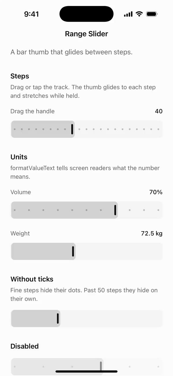
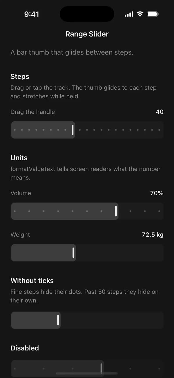
React NativeA bar thumb that glides between steps.
Preview
Install
Source on GitHubIt works in Expo and in bare React Native. New to beUI Native? Set up your app first.
Copies the component and the shared files it needs into src/, adds the theme tokens if they're missing, and installs its libraries. Files you've changed are kept.
Keep the folder layout, since the component imports the shared files by relative path.
1Install the libraries
npx expo install react-native-gesture-handler react-native-reanimated react-native-worklets
npm install uniwind tailwindcss
Wrap your app in GestureHandlerRootView if it isn't already.
2Add the theme tokens
Once per app. Import it from the CSS file Uniwind reads, after Tailwind and Uniwind, and change the values to match your brand.
/* Matches the default beUI palette in ui-components/lib/themes.ts.
   Native surface maps to card; muted maps to muted-foreground. */
@layer theme {
  :root {
    @variant light {
      --color-background: oklch(99% 0 0);
      --color-surface: oklch(97% 0 0);
      --color-foreground: oklch(15% 0 0);
      --color-muted: oklch(50% 0 0);
      --color-border: oklch(15% 0 0 / 0.06);
      --color-border-strong: oklch(15% 0 0 / 0.16);
      --color-primary: #0285f7;
      --color-on-primary: #ffffff;
      --color-destructive: #dc2626;
      --color-success: #059669;
      --color-warning: #d97706;
    }
  }

  :root {
    @variant dark {
      --color-background: #151515;
      --color-surface: #1c1c1c;
      --color-foreground: oklch(96% 0 0);
      --color-muted: oklch(62% 0 0);
      --color-border: rgb(255 255 255 / 0.05);
      --color-border-strong: rgb(255 255 255 / 0.14);
      --color-primary: #0285f7;
      --color-on-primary: #ffffff;
      --color-destructive: #f87171;
      --color-success: #34d399;
      --color-warning: #fbbf24;
    }
  }
}
3Copy the shared files
import { useEffect, useState } from "react";
import { AccessibilityInfo } from "react-native";
import { useReducedMotion } from "react-native-reanimated";

/** Reanimated supplies a synchronous initial value; native events keep it current. */
export function useReducedMotionPreference() {
  const initialValue = useReducedMotion();
  const [reducedMotion, setReducedMotion] = useState(initialValue);

  useEffect(() => {
    let active = true;
    let receivedEvent = false;
    const subscription = AccessibilityInfo.addEventListener(
      "reduceMotionChanged",
      (value) => {
        receivedEvent = true;
        setReducedMotion(value);
      },
    );
    void AccessibilityInfo.isReduceMotionEnabled().then((value) => {
      if (active && !receivedEvent) setReducedMotion(value);
    });
    return () => {
      active = false;
      subscription.remove();
    };
  }, []);

  return reducedMotion;
}
import { Easing, ReduceMotion } from "react-native-reanimated";

// Mirrors beUI's lib/ease.ts so native motion matches the web library.

export const EASE_OUT = Easing.bezier(0.16, 1, 0.3, 1);
export const EASE_IN_OUT = Easing.bezier(0.77, 0, 0.175, 1);

/** Press feedback on buttons and other tappable surfaces. */
export const SPRING_PRESS = {
  stiffness: 500,
  damping: 30,
  mass: 0.6,
  reduceMotion: ReduceMotion.System,
} as const;

/** Content swaps: label and icon slots trading places inside a control. */
export const SPRING_SWAP = {
  stiffness: 460,
  damping: 30,
  mass: 0.55,
  reduceMotion: ReduceMotion.System,
} as const;

/** Shared-layout glides: pills, indicators and panels moving between positions. */
export const SPRING_LAYOUT = {
  stiffness: 360,
  damping: 32,
  mass: 0.6,
  reduceMotion: ReduceMotion.System,
} as const;

/** Dragged handles and fills; critically damped so values never rebound off an end. */
export const SPRING_GLIDE = {
  stiffness: 700,
  damping: 50,
  mass: 0.5,
  reduceMotion: ReduceMotion.System,
} as const;

export const motion = {
  press: SPRING_PRESS,
  swap: SPRING_SWAP,
  layout: SPRING_LAYOUT,
  glide: SPRING_GLIDE,
  exit: { duration: 160, easing: EASE_OUT, reduceMotion: ReduceMotion.System },
  fade: { duration: 150, reduceMotion: ReduceMotion.System },
} as const;
4Copy the component
export type { RangeSliderProps } from "./range-slider";
export { RangeSlider, snapSliderValue } from "./range-slider";
import { type Ref, useCallback, useEffect, useState } from "react";
import {
  type AccessibilityActionEvent,
  Platform,
  StyleSheet,
  View,
  type ViewProps,
} from "react-native";
import { Gesture, GestureDetector } from "react-native-gesture-handler";
import Animated, {
  useAnimatedStyle,
  useDerivedValue,
  useSharedValue,
  withSpring,
} from "react-native-reanimated";
import { scheduleOnRN } from "react-native-worklets";
import { useReducedMotionPreference } from "../../hooks/use-reduced-motion";
import { SPRING_GLIDE } from "../../styles/motion";

// Bouncy grab feedback for the thumb's stretch only.
const SPRING_BOUNCY = { stiffness: 500, damping: 14, mass: 0.7 };
const GRAB_STRETCH = 1.35;
// The 4-point thumb starts 8 points inside the track and ends 12 points short
// of the far edge, so it always sits inside the fill's rounded end.
const THUMB_START = 8;
const THUMB_INSET = 20;
// The fill sits in a clip inset 2 points from each side.
const FILL_INSET = 2;
const MAX_TICKS = 50;

const clamp = (value: number, lo: number, hi: number) => {
  "worklet";
  return Math.min(hi, Math.max(lo, value));
};

/**
 * Nearest legal value on [min, max] for the given step. Max counts as a
 * candidate when the step doesn't divide the range, so a finger near the end
 * doesn't snap back onto the last whole step.
 */
export function snapSliderValue(
  next: number,
  min: number,
  max: number,
  step: number,
) {
  "worklet";
  if (!(max > min)) return min;
  if (!(step > 0)) return clamp(next, min, max);
  const whole = Math.floor(Number(((max - min) / step).toFixed(6)));
  const lastWhole = Number((min + whole * step).toFixed(6));
  const toGrid = clamp(
    Math.round((next - min) / step) * step + min,
    min,
    lastWhole,
  );
  const snapped =
    lastWhole < max && Math.abs(next - max) <= Math.abs(next - toGrid)
      ? max
      : toGrid;
  return Number(snapped.toFixed(6));
}

export type RangeSliderProps = Omit<ViewProps, "children"> & {
  /** Controlled value. Omit it and use `defaultValue` for uncontrolled use. */
  value?: number;
  defaultValue?: number;
  /** Called once per step while dragging, and on every other change. */
  onValueChange?: (value: number) => void;
  /** Called when a drag or tap lets go, with the final value. */
  onSlidingComplete?: (value: number) => void;
  /** Defaults to 0. */
  min?: number;
  /** Defaults to 100. */
  max?: number;
  /** Defaults to 1. */
  step?: number;
  disabled?: boolean;
  /** Draws a dot at each step, up to 50 of them. Defaults to true. */
  showTicks?: boolean;
  /**
   * Read instead of the raw number. Pass one when the value carries a unit,
   * such as "72.5 kg" or "35%".
   */
  formatValueText?: (value: number) => string;
  /** Moves without springing, independently of the system preference. */
  disableAnimation?: boolean;
  className?: string;
  ref?: Ref<View>;
};

/**
 * A stepped slider: drag or tap anywhere on the track. The bar thumb glides
 * between steps and stretches while held.
 */
export function RangeSlider({
  value,
  defaultValue = 0,
  onValueChange,
  onSlidingComplete,
  min = 0,
  max = 100,
  step = 1,
  disabled = false,
  showTicks = true,
  formatValueText,
  disableAnimation = false,
  className = "",
  style,
  accessibilityLabel,
  ref,
  ...props
}: RangeSliderProps) {
  const reducedMotion = useReducedMotionPreference();
  const reduce = reducedMotion || disableAnimation;
  const [internal, setInternal] = useState(defaultValue);
  const [width, setWidth] = useState(0);

  // Collapse inverted or empty ranges and non-positive steps, so the maths
  // below never divides by zero or walks a NaN grid.
  const lo = min;
  const hi = max > min ? max : min;
  const stride = step > 0 ? step : 1;
  const controlled = value !== undefined;
  const current = clamp(controlled ? value : internal, lo, hi);
  const percent = hi > lo ? ((current - lo) / (hi - lo)) * 100 : 0;

  const trackWidth = useSharedValue(0);
  const target = useSharedValue(percent);
  // The last value the gesture reported, so each step notifies only once.
  const reported = useSharedValue(current);
  const grabbed = useSharedValue(0);

  useEffect(() => {
    target.value = percent;
    reported.value = current;
  }, [current, percent, reported, target]);

  const commit = useCallback(
    (next: number) => {
      const clean = snapSliderValue(next, lo, hi, stride);
      if (!controlled) setInternal(clean);
      onValueChange?.(clean);
    },
    [controlled, hi, lo, onValueChange, stride],
  );
  const complete = useCallback(
    (next: number) => onSlidingComplete?.(next),
    [onSlidingComplete],
  );

  // Maps a touch to a value along the thumb's own path, so the thumb lands
  // under the finger rather than under the track's raw proportion.
  const moveTo = (x: number) => {
    "worklet";
    const span = trackWidth.value - THUMB_INSET;
    if (span <= 0) return;
    const ratio = clamp((x - THUMB_START - 2) / span, 0, 1);
    const next = snapSliderValue(lo + ratio * (hi - lo), lo, hi, stride);
    if (next === reported.value) return;
    reported.value = next;
    target.value = hi > lo ? ((next - lo) / (hi - lo)) * 100 : 0;
    scheduleOnRN(commit, next);
  };

  const pan = Gesture.Pan()
    .enabled(!disabled)
    // Horizontal drags own the slider; vertical ones go on to scroll the page.
    .activeOffsetX([-4, 4])
    .failOffsetY([-12, 12])
    .hitSlop({ vertical: 4 })
    .onStart((event) => {
      grabbed.value = 1;
      moveTo(event.x);
    })
    .onUpdate((event) => {
      moveTo(event.x);
    })
    .onFinalize((_, success) => {
      grabbed.value = 0;
      if (success) scheduleOnRN(complete, reported.value);
    });
  const tap = Gesture.Tap()
    .enabled(!disabled)
    // A finger that travels is a drag or a scroll, not a tap; failing early
    // hands a vertical swipe back to the page.
    .maxDistance(10)
    .hitSlop({ vertical: 4 })
    .onBegin(() => {
      grabbed.value = 1;
    })
    .onEnd((event) => {
      moveTo(event.x);
      scheduleOnRN(complete, reported.value);
    })
    .onFinalize(() => {
      grabbed.value = 0;
    });
  const gesture = Gesture.Race(pan, tap);

  const position = useDerivedValue(() =>
    reduce ? target.value : withSpring(target.value, SPRING_GLIDE),
  );

  const thumbStyle = useAnimatedStyle(() => {
    const span = Math.max(0, trackWidth.value - THUMB_INSET);
    return {
      transform: [
        { translateX: THUMB_START + (span * position.value) / 100 },
        {
          scaleY: reduce
            ? 1
            : withSpring(grabbed.value ? GRAB_STRETCH : 1, SPRING_BOUNCY),
        },
      ],
    };
  });
  // A full-size fill slides in from the left, so its rounded end never
  // stretches. Its edge runs a few points past the thumb at every position.
  const fillStyle = useAnimatedStyle(() => {
    const p = position.value;
    const clip = trackWidth.value - FILL_INSET * 2;
    return {
      transform: [
        {
          translateX: p >= 100 ? 0 : ((p - 100) / 100) * clip + 14 - 0.16 * p,
        },
      ],
    };
  });

  // Floor rather than round, so a range the step doesn't divide stops its dots
  // at the last whole step. toFixed first, because 0.3 / 0.1 is 2.999….
  const steps = Math.floor(Number(((hi - lo) / stride).toFixed(6)));
  const ticks =
    showTicks && steps > 0 && steps <= MAX_TICKS && width > 0
      ? Array.from({ length: steps + 1 }, (_, i) =>
          Number((lo + i * stride).toFixed(6)),
        )
      : [];

  const adjust = (event: AccessibilityActionEvent) => {
    if (disabled) return;
    const delta = event.nativeEvent.actionName === "increment" ? 1 : -1;
    commit(current + delta * stride);
  };
  // Arrow keys, Page Up and Down, Home and End on web, like the web slider.
  const webKeys =
    Platform.OS === "web" && !disabled
      ? {
          focusable: true,
          onKeyDown: (event: { key: string; preventDefault: () => void }) => {
            const map: Record<string, number> = {
              ArrowRight: current + stride,
              ArrowUp: current + stride,
              ArrowLeft: current - stride,
              ArrowDown: current - stride,
              PageUp: current + stride * 10,
              PageDown: current - stride * 10,
              Home: lo,
              End: hi,
            };
            const next = map[event.key];
            if (next !== undefined) {
              event.preventDefault();
              commit(next);
            }
          },
        }
      : {};

  return (
    <GestureDetector gesture={gesture}>
      <View
        {...props}
        {...webKeys}
        ref={ref}
        accessible
        accessibilityRole="adjustable"
        accessibilityLabel={accessibilityLabel}
        // The aria props reach every platform, including React Native Web,
        // which ignores accessibilityValue.
        aria-disabled={disabled}
        aria-valuemin={lo}
        aria-valuemax={hi}
        aria-valuenow={current}
        aria-valuetext={formatValueText?.(current)}
        accessibilityActions={[{ name: "increment" }, { name: "decrement" }]}
        onAccessibilityAction={adjust}
        onLayout={(event) => {
          const next = event.nativeEvent.layout.width;
          trackWidth.value = next;
          setWidth(next);
          props.onLayout?.(event);
        }}
        className={`h-10 w-full justify-center overflow-hidden rounded-lg bg-surface ${disabled ? "opacity-50" : ""} ${className}`}
        style={style}
      >
        <View style={styles.fillClip} className="rounded-lg">
          <Animated.View
            style={[StyleSheet.absoluteFill, fillStyle]}
            className="rounded-lg bg-foreground/15"
          />
        </View>

        {ticks.map((tick) => {
          const share = (tick - lo) / (hi - lo);
          return (
            <View
              key={tick}
              style={[
                styles.tick,
                { left: THUMB_INSET / 2 + share * (width - THUMB_INSET) - 2 },
              ]}
              className="bg-foreground/25"
            />
          );
        })}

        <Animated.View
          style={[styles.thumb, thumbStyle]}
          className="bg-foreground"
        />
      </View>
    </GestureDetector>
  );
}

const styles = StyleSheet.create({
  fillClip: {
    position: "absolute",
    top: 0,
    bottom: 0,
    left: FILL_INSET,
    right: FILL_INSET,
    overflow: "hidden",
    pointerEvents: "none",
  },
  tick: {
    position: "absolute",
    width: 4,
    height: 4,
    borderRadius: 2,
    pointerEvents: "none",
  },
  thumb: {
    position: "absolute",
    left: 0,
    width: 4,
    height: 24,
    borderRadius: 2,
    pointerEvents: "none",
  },
});
Documentation
Native port of beUI Range Slider. A stepped slider with tick dots and a bar thumb that glides between steps and stretches while held.
import { RangeSlider } from "./src";

const [value, setValue] = useState(40);

<RangeSlider
  value={value}
  onValueChange={setValue}
  step={5}
  accessibilityLabel="Value"
/>
Props
value/defaultValue/onValueChange: controlled or uncontrolled.onValueChangefires once per step while dragging, so it's the place for a selection haptic.onSlidingComplete: the final value when a drag or tap lets go.min,max,step: default to 0, 100 and 1. When the step doesn't divide the range, the end of the track still reachesmax.showTicks: a dot at each step. Defaults to true, and hides itself past 50 steps.formatValueText: what screen readers hear instead of the raw number, such as `(v) =>${v}%disabled,disableAnimation,className.
Touch
Drag or tap anywhere on the track; the thumb lands under your finger. Horizontal drags own the slider and vertical swipes go on to scroll the page, so it works inside a ScrollView.
Motion
The thumb and fill follow beUI's glide spring, critically damped so they never rebound off an end. While held, the thumb stretches to 135% on a bouncy spring. With reduced motion, or disableAnimation, both move straight to the value and the thumb doesn't stretch.
Accessibility
The track is one adjustable control (a slider on web) with its range, value and value text. VoiceOver and TalkBack swipe up and down to step it; on web, arrow keys step it, Page Up and Down move ten steps, and Home and End jump to the ends. Give it an accessibilityLabel.
Copy this directory, hooks/use-reduced-motion.ts, styles/motion.ts, and the semantic tokens in styles/theme.css.