
Alert
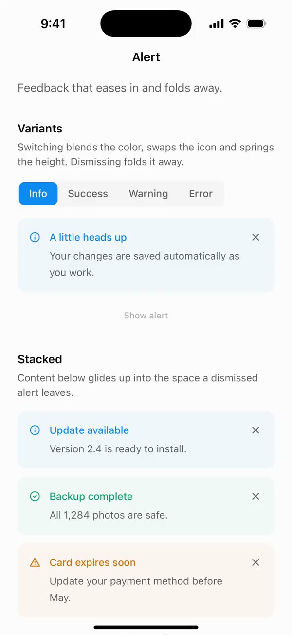
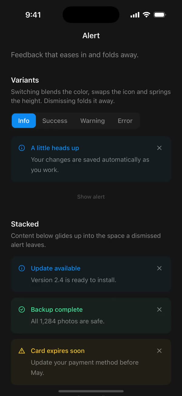
React NativeFeedback that eases in and folds away.
Preview
Install
Source on GitHubIt works in Expo and in bare React Native. New to beUI Native? Set up your app first.
Copies the component and the shared files it needs into src/, adds the theme tokens if they're missing, and installs its libraries. Files you've changed are kept.
Keep the folder layout, since the component imports the shared files by relative path.
1Install the libraries
npx expo install react-native-reanimated react-native-worklets
npm install uniwind tailwindcss2Add the theme tokens
Once per app. Import it from the CSS file Uniwind reads, after Tailwind and Uniwind, and change the values to match your brand.
/* Matches the default beUI palette in ui-components/lib/themes.ts.
   Native surface maps to card; muted maps to muted-foreground. */
@layer theme {
  :root {
    @variant light {
      --color-background: oklch(99% 0 0);
      --color-surface: oklch(97% 0 0);
      --color-foreground: oklch(15% 0 0);
      --color-muted: oklch(50% 0 0);
      --color-border: oklch(15% 0 0 / 0.06);
      --color-border-strong: oklch(15% 0 0 / 0.16);
      --color-primary: #0285f7;
      --color-on-primary: #ffffff;
      --color-destructive: #dc2626;
      --color-success: #059669;
      --color-warning: #d97706;
    }
  }

  :root {
    @variant dark {
      --color-background: #151515;
      --color-surface: #1c1c1c;
      --color-foreground: oklch(96% 0 0);
      --color-muted: oklch(62% 0 0);
      --color-border: rgb(255 255 255 / 0.05);
      --color-border-strong: rgb(255 255 255 / 0.14);
      --color-primary: #0285f7;
      --color-on-primary: #ffffff;
      --color-destructive: #f87171;
      --color-success: #34d399;
      --color-warning: #fbbf24;
    }
  }
}
3Copy the shared files
import { useEffect, useState } from "react";
import { AccessibilityInfo } from "react-native";
import { useReducedMotion } from "react-native-reanimated";

/** Reanimated supplies a synchronous initial value; native events keep it current. */
export function useReducedMotionPreference() {
  const initialValue = useReducedMotion();
  const [reducedMotion, setReducedMotion] = useState(initialValue);

  useEffect(() => {
    let active = true;
    let receivedEvent = false;
    const subscription = AccessibilityInfo.addEventListener(
      "reduceMotionChanged",
      (value) => {
        receivedEvent = true;
        setReducedMotion(value);
      },
    );
    void AccessibilityInfo.isReduceMotionEnabled().then((value) => {
      if (active && !receivedEvent) setReducedMotion(value);
    });
    return () => {
      active = false;
      subscription.remove();
    };
  }, []);

  return reducedMotion;
}
import { type ColorValue, StyleSheet, View } from "react-native";
import Animated, {
  interpolate,
  type SharedValue,
  useAnimatedStyle,
} from "react-native-reanimated";

/** A straight line in a square viewBox: [x1, y1, x2, y2]. */
export type PathSegment = [x1: number, y1: number, x2: number, y2: number];

export type DrawnPathProps = {
  /** Straight segments drawn in order, like an SVG polyline. */
  segments: PathSegment[];
  /** Rendered width and height in points. */
  size: number;
  /** Stroke width in viewBox units. */
  strokeWidth: number;
  /** Side of the square viewBox the segments are written in. Defaults to 24. */
  viewBox?: number;
  color: ColorValue | undefined;
  /** 0 draws nothing and 1 draws every segment, like SVG `pathLength`. */
  progress: SharedValue<number>;
};

function length([x1, y1, x2, y2]: PathSegment) {
  return Math.hypot(x2 - x1, y2 - y1);
}

/**
 * Draws a polyline on with rotated Views, so shared components need no SVG
 * library. Round caps extend half a stroke past each end, like SVG's linecap.
 */
export function DrawnPath({
  segments,
  size,
  strokeWidth,
  viewBox = 24,
  color,
  progress,
}: DrawnPathProps) {
  const unit = size / viewBox;
  const stroke = strokeWidth * unit;
  const total = segments.reduce((sum, segment) => sum + length(segment), 0);
  let start = 0;

  return (
    <View style={{ width: size, height: size }}>
      {segments.map((segment) => {
        const from = start / total;
        start += length(segment);
        return (
          <Stroke
            key={segment.join()}
            segment={segment}
            unit={unit}
            stroke={stroke}
            from={from}
            to={start / total}
            progress={progress}
            color={color}
          />
        );
      })}
    </View>
  );
}

function Stroke({
  segment,
  unit,
  stroke,
  from,
  to,
  progress,
  color,
}: {
  segment: PathSegment;
  unit: number;
  stroke: number;
  from: number;
  to: number;
  progress: SharedValue<number>;
  color: ColorValue | undefined;
}) {
  const [x1, y1, x2, y2] = segment;
  const full = length(segment) * unit;
  const angle = Math.atan2(y2 - y1, x2 - x1);

  const animatedStyle = useAnimatedStyle(() => {
    const drawn = interpolate(progress.value, [from, to], [0, 1], "clamp");
    return { opacity: drawn > 0 ? 1 : 0, width: stroke + full * drawn };
  });

  return (
    <Animated.View
      style={[
        styles.stroke,
        {
          left: x1 * unit - stroke / 2,
          top: y1 * unit - stroke / 2,
          height: stroke,
          borderRadius: stroke / 2,
          backgroundColor: color,
          // Rotate around the start point so the stroke grows from it.
          transformOrigin: [stroke / 2, stroke / 2, 0],
          transform: [{ rotate: `${angle}rad` }],
        },
        animatedStyle,
      ]}
    />
  );
}

const styles = StyleSheet.create({
  stroke: { position: "absolute" },
});
import { Easing, ReduceMotion } from "react-native-reanimated";

// Mirrors beUI's lib/ease.ts so native motion matches the web library.

export const EASE_OUT = Easing.bezier(0.16, 1, 0.3, 1);
export const EASE_IN_OUT = Easing.bezier(0.77, 0, 0.175, 1);

/** Press feedback on buttons and other tappable surfaces. */
export const SPRING_PRESS = {
  stiffness: 500,
  damping: 30,
  mass: 0.6,
  reduceMotion: ReduceMotion.System,
} as const;

/** Content swaps: label and icon slots trading places inside a control. */
export const SPRING_SWAP = {
  stiffness: 460,
  damping: 30,
  mass: 0.55,
  reduceMotion: ReduceMotion.System,
} as const;

/** Shared-layout glides: pills, indicators and panels moving between positions. */
export const SPRING_LAYOUT = {
  stiffness: 360,
  damping: 32,
  mass: 0.6,
  reduceMotion: ReduceMotion.System,
} as const;

/** Dragged handles and fills; critically damped so values never rebound off an end. */
export const SPRING_GLIDE = {
  stiffness: 700,
  damping: 50,
  mass: 0.5,
  reduceMotion: ReduceMotion.System,
} as const;

export const motion = {
  press: SPRING_PRESS,
  swap: SPRING_SWAP,
  layout: SPRING_LAYOUT,
  glide: SPRING_GLIDE,
  exit: { duration: 160, easing: EASE_OUT, reduceMotion: ReduceMotion.System },
  fade: { duration: 150, reduceMotion: ReduceMotion.System },
} as const;
4Copy the component
import {
  createContext,
  type ReactNode,
  type Ref,
  useCallback,
  useContext,
  useEffect,
  useMemo,
  useRef,
  useState,
} from "react";
import {
  type ColorValue,
  Pressable,
  type PressableProps,
  StyleSheet,
  Text,
  type TextProps,
  View,
  type ViewProps,
} from "react-native";
import Animated, {
  interpolateColor,
  useAnimatedStyle,
  useSharedValue,
  withSpring,
  withTiming,
} from "react-native-reanimated";
import { scheduleOnRN } from "react-native-worklets";
import { useResolveClassNames } from "uniwind";
import { useReducedMotionPreference } from "../../hooks/use-reduced-motion";
import { DrawnPath, type PathSegment } from "../../primitives/drawn-path";
import { EASE_OUT, SPRING_LAYOUT, SPRING_PRESS } from "../../styles/motion";

export type AlertVariant =
  | "default"
  | "info"
  | "success"
  | "warning"
  | "destructive";

export type AlertState = {
  open: boolean;
  variant: AlertVariant;
  setOpen: (open: boolean) => void;
  dismiss: () => void;
};

type AlertContextValue = AlertState & { reduce: boolean };

const AlertContext = createContext<AlertContextValue | null>(null);

function useAlertContext(component: string) {
  const context = useContext(AlertContext);
  if (!context) throw new Error(`${component} must be used within <Alert>`);
  return context;
}

/** Shared visibility and variant for custom alert children. */
export function useAlert(): AlertState {
  return useAlertContext("useAlert");
}

// Full class strings, so Uniwind can see every token at build time.
const SURFACE_CLASS: Record<AlertVariant, string> = {
  default: "bg-surface",
  info: "bg-primary/5",
  success: "bg-success/5",
  warning: "bg-warning/5",
  destructive: "bg-destructive/5",
};
const TONE_CLASS: Record<AlertVariant, string> = {
  default: "text-foreground",
  info: "text-primary",
  success: "text-success",
  warning: "text-warning",
  destructive: "text-destructive",
};

const ENTER_FADE = { duration: 180, easing: EASE_OUT };
const ENTER_RISE = { duration: 200, easing: EASE_OUT };
const EXIT = { duration: 120, easing: EASE_OUT };
const COLLAPSE = { duration: 220, easing: EASE_OUT };
const COLOR_FADE = { duration: 200, easing: EASE_OUT };
const ICON_IN = { duration: 180, easing: EASE_OUT };
const ICON_OUT = { duration: 100, easing: EASE_OUT };
const DROP = 6;
const ICON = 16;

export type AlertProps = Omit<ViewProps, "children"> & {
  /** Defaults to "default". */
  variant?: AlertVariant;
  /** Controlled visibility. Omit it and use `defaultOpen` for uncontrolled use. */
  open?: boolean;
  /** Defaults to true. */
  defaultOpen?: boolean;
  onOpenChange?: (open: boolean) => void;
  /** Layout classes for the inner row, separate from the animated surface. */
  contentClassName?: string;
  /** Opens and closes without moving, independently of the system preference. */
  disableAnimation?: boolean;
  className?: string;
  children?: ReactNode;
  ref?: Ref<View>;
};

/**
 * Feedback that eases in, folds away when dismissed, and blends between
 * variants. Compose AlertIcon, AlertContent (AlertTitle, AlertDescription,
 * AlertAction) and AlertClose inside.
 */
export function Alert({
  variant = "default",
  open: controlledOpen,
  defaultOpen = true,
  onOpenChange,
  contentClassName = "",
  disableAnimation = false,
  className = "",
  style,
  children,
  accessibilityRole,
  accessibilityLiveRegion,
  ref,
  ...props
}: AlertProps) {
  const reducedMotion = useReducedMotionPreference();
  const reduce = reducedMotion || disableAnimation;
  const [internalOpen, setInternalOpen] = useState(defaultOpen);
  const open = controlledOpen ?? internalOpen;
  const state = useRef({ open, controlled: false, onOpenChange });
  state.current = {
    open,
    controlled: controlledOpen !== undefined,
    onOpenChange,
  };

  const setOpen = useCallback((next: boolean) => {
    const current = state.current;
    if (next === current.open) return;
    if (!current.controlled) setInternalOpen(next);
    current.onOpenChange?.(next);
  }, []);
  const dismiss = useCallback(() => setOpen(false), [setOpen]);
  const context = useMemo(
    () => ({ open, variant, reduce, setOpen, dismiss }),
    [dismiss, open, reduce, setOpen, variant],
  );

  // Stays mounted through the exit, then unmounts.
  const [mounted, setMounted] = useState(open);
  if (open && !mounted) setMounted(true);
  // Set while opening, until a height is known to grow into. An alert open on
  // the first render lands at rest, like initial={false}.
  const appearing = useRef(false);
  const [wasOpen, setWasOpen] = useState(open);
  if (open !== wasOpen) {
    setWasOpen(open);
    appearing.current = open;
  }
  const lastHeight = useRef(0);

  const height = useSharedValue(-1);
  const opacity = useSharedValue(open ? 1 : 0);
  const rise = useSharedValue(0);

  const enter = useCallback(
    (to: number) => {
      appearing.current = false;
      opacity.value = withTiming(1, ENTER_FADE);
      if (reduce) {
        height.value = to;
        rise.value = 0;
        return;
      }
      height.value = withSpring(to, SPRING_LAYOUT);
      rise.value = withTiming(0, ENTER_RISE);
    },
    [height, opacity, reduce, rise],
  );

  useEffect(() => {
    if (open) {
      // Reopened before the exit finished: no new layout will arrive, so grow
      // back to the size already known.
      if (appearing.current && lastHeight.current > 0 && height.value > 0) {
        enter(lastHeight.current);
      } else if (appearing.current) {
        height.value = 0;
        opacity.value = 0;
        rise.value = reduce ? 0 : -DROP;
      }
      return;
    }
    const unmount = () => setMounted(false);
    if (reduce) {
      height.value = 0;
      opacity.value = withTiming(0, EXIT, (finished) => {
        if (finished) scheduleOnRN(unmount);
      });
      return;
    }
    opacity.value = withTiming(0, EXIT);
    rise.value = withTiming(-DROP, EXIT);
    // The space folds away so whatever sits below glides up into it.
    height.value = withTiming(0, COLLAPSE, (finished) => {
      if (finished) scheduleOnRN(unmount);
    });
  }, [enter, height, open, opacity, reduce, rise]);

  const measure = (next: number) => {
    lastHeight.current = next;
    if (!open) return;
    if (appearing.current) {
      enter(next);
      return;
    }
    // Content changes, such as a new variant's text, spring to the new size.
    height.value =
      height.value < 0 || reduce ? next : withSpring(next, SPRING_LAYOUT);
  };

  // The surface color blends between variants.
  const { backgroundColor } = useResolveClassNames(SURFACE_CLASS[variant]);
  const surface = String(backgroundColor ?? "transparent");
  const shown = useRef(surface);
  const blend = useSharedValue(1);
  const palette = useSharedValue({ from: surface, to: surface });
  useEffect(() => {
    if (shown.current === surface) return;
    palette.value = { from: shown.current, to: surface };
    shown.current = surface;
    blend.value = 0;
    blend.value = reduce ? 1 : withTiming(1, COLOR_FADE);
  }, [blend, palette, reduce, surface]);

  const frameStyle = useAnimatedStyle(() =>
    height.value < 0 ? {} : { height: Math.max(0, height.value) },
  );
  const surfaceStyle = useAnimatedStyle(() => ({
    opacity: opacity.value,
    transform: [{ translateY: rise.value }],
    backgroundColor: interpolateColor(
      blend.value,
      [0, 1],
      [palette.value.from, palette.value.to],
    ),
  }));

  if (!mounted) return null;

  const urgent = variant === "warning" || variant === "destructive";

  return (
    <AlertContext.Provider value={context}>
      <Animated.View style={[styles.frame, frameStyle]}>
        <Animated.View
          {...props}
          ref={ref}
          accessibilityRole={
            accessibilityRole ?? (urgent ? "alert" : undefined)
          }
          accessibilityLiveRegion={
            accessibilityLiveRegion ?? (urgent ? "assertive" : "polite")
          }
          importantForAccessibility={open ? "auto" : "no-hide-descendants"}
          accessibilityElementsHidden={!open}
          onLayout={(event) => {
            measure(event.nativeEvent.layout.height);
            props.onLayout?.(event);
          }}
          className={`rounded-xl p-4 ${className}`}
          style={[styles.surface, surfaceStyle, style]}
        >
          <View className={`flex-row items-start gap-3 ${contentClassName}`}>
            {children}
          </View>
        </Animated.View>
      </Animated.View>
    </AlertContext.Provider>
  );
}

const CIRCLE_GLYPHS: Partial<Record<AlertVariant, PathSegment[]>> = {
  default: [
    [12, 16, 12, 12],
    [12, 8, 12, 8.01],
  ],
  info: [
    [12, 16, 12, 12],
    [12, 8, 12, 8.01],
  ],
  success: [
    [8.5, 12, 11, 14.5],
    [11, 14.5, 15.5, 9.5],
  ],
  destructive: [
    [12, 8, 12, 12],
    [12, 16, 12, 16.01],
  ],
};
const WARNING_GLYPH: PathSegment[] = [
  [12, 3.5, 21.5, 20],
  [21.5, 20, 2.5, 20],
  [2.5, 20, 12, 3.5],
  [12, 9.5, 12, 13.5],
  [12, 16.8, 12, 16.81],
];

function VariantIcon({
  variant,
  color,
}: {
  variant: AlertVariant;
  color: ColorValue | undefined;
}) {
  const drawn = useSharedValue(1);
  const unit = ICON / 24;
  if (variant === "warning") {
    return (
      <DrawnPath
        segments={WARNING_GLYPH}
        size={ICON}
        strokeWidth={2}
        color={color}
        progress={drawn}
      />
    );
  }
  return (
    <View style={styles.icon}>
      <View
        style={{
          position: "absolute",
          width: 20 * unit,
          height: 20 * unit,
          borderRadius: 10 * unit,
          borderWidth: 2 * unit,
          borderColor: color,
        }}
      />
      <DrawnPath
        segments={CIRCLE_GLYPHS[variant] ?? []}
        size={ICON}
        strokeWidth={2}
        color={color}
        progress={drawn}
      />
    </View>
  );
}

type IconLayer = { variant: AlertVariant; leaving: boolean; id: number };

function IconLayerView({
  layer,
  reduce,
  appear,
  color,
  children,
  onExited,
}: {
  layer: IconLayer;
  reduce: boolean;
  appear: boolean;
  color: ColorValue | undefined;
  children?: ReactNode;
  onExited: (id: number) => void;
}) {
  const enter = appear && !reduce;
  const opacity = useSharedValue(enter ? 0 : 1);
  const lift = useSharedValue(enter ? 4 : 0);
  const scale = useSharedValue(enter ? 0.9 : 1);
  const started = useRef(false);

  useEffect(() => {
    if (layer.leaving) {
      const done = () => onExited(layer.id);
      if (reduce) {
        done();
        return;
      }
      lift.value = withTiming(-4, ICON_OUT);
      scale.value = withTiming(0.9, ICON_OUT);
      opacity.value = withTiming(0, ICON_OUT, (finished) => {
        if (finished) scheduleOnRN(done);
      });
      return;
    }
    if (started.current || !enter) return;
    started.current = true;
    opacity.value = withTiming(1, ICON_IN);
    lift.value = withTiming(0, ICON_IN);
    scale.value = withTiming(1, ICON_IN);
  }, [enter, layer, lift, onExited, opacity, reduce, scale]);

  const style = useAnimatedStyle(() => ({
    opacity: opacity.value,
    transform: [{ translateY: lift.value }, { scale: scale.value }],
  }));

  return (
    <Animated.View style={[StyleSheet.absoluteFill, styles.icon, style]}>
      {children ?? <VariantIcon variant={layer.variant} color={color} />}
    </Animated.View>
  );
}

export type AlertIconProps = Omit<ViewProps, "children"> & {
  /** Replaces the variant icon. Given no color, so pass one that fits. */
  children?: ReactNode;
  className?: string;
};

/** The variant's icon. It swaps with a small rise when the variant changes. */
export function AlertIcon({
  children,
  className = "",
  style,
  ...props
}: AlertIconProps) {
  const { variant, reduce } = useAlertContext("AlertIcon");
  const { color } = useResolveClassNames(TONE_CLASS[variant]);
  const nextId = useRef(1);
  const [layers, setLayers] = useState<IconLayer[]>([
    { variant, leaving: false, id: 0 },
  ]);
  const [shown, setShown] = useState(variant);
  const mounted = useRef(false);
  useEffect(() => {
    mounted.current = true;
  }, []);

  if (variant !== shown) {
    setShown(variant);
    const id = nextId.current++;
    setLayers((current) => [
      ...current.map((layer) => ({ ...layer, leaving: true })),
      { variant, leaving: false, id },
    ]);
  }

  const exited = useCallback((id: number) => {
    setLayers((current) => current.filter((layer) => layer.id !== id));
  }, []);

  return (
    <View
      {...props}
      accessibilityElementsHidden
      importantForAccessibility="no-hide-descendants"
      className={`mt-0.5 ${className}`}
      style={[styles.iconSlot, style]}
    >
      {layers.map((layer) => (
        <IconLayerView
          key={layer.id}
          layer={layer}
          reduce={reduce}
          appear={mounted.current && layer.id !== 0}
          color={color}
          onExited={exited}
        >
          {children}
        </IconLayerView>
      ))}
    </View>
  );
}

/** Stacks the title, description and actions, and takes the free width. */
export function AlertContent({
  className = "",
  ...props
}: ViewProps & { className?: string }) {
  return <View {...props} className={`min-w-0 flex-1 gap-1 ${className}`} />;
}

/** Takes the variant's color. */
export function AlertTitle({
  className = "",
  ...props
}: TextProps & { className?: string }) {
  const { variant } = useAlertContext("AlertTitle");
  return (
    <Text
      {...props}
      className={`text-sm leading-5 font-medium ${TONE_CLASS[variant]} ${className}`}
    />
  );
}

export function AlertDescription({
  className = "",
  ...props
}: TextProps & { className?: string }) {
  return (
    <Text
      {...props}
      className={`text-sm leading-relaxed text-muted ${className}`}
    />
  );
}

/** A row for buttons. Compose them here. */
export function AlertAction({
  className = "",
  ...props
}: ViewProps & { className?: string }) {
  return (
    <View
      {...props}
      className={`flex-row flex-wrap items-center gap-2 pt-2 ${className}`}
    />
  );
}

const CLOSE_GLYPH: PathSegment[] = [
  [18, 6, 6, 18],
  [6, 6, 18, 18],
];

export type AlertCloseProps = Omit<PressableProps, "children" | "style"> & {
  /** Replaces the X. */
  children?: ReactNode;
  className?: string;
};

/** Dismisses the alert. Your onPress runs first. */
export function AlertClose({
  children,
  className = "",
  onPress,
  onPressIn,
  onPressOut,
  accessibilityLabel = "Dismiss alert",
  ...props
}: AlertCloseProps) {
  const { dismiss, reduce } = useAlertContext("AlertClose");
  const { color } = useResolveClassNames("text-muted");
  const { backgroundColor: pressedColor } =
    useResolveClassNames("bg-foreground/5");
  const scale = useSharedValue(1);
  const pressed = useSharedValue(0);
  const drawn = useSharedValue(1);

  const style = useAnimatedStyle(() => ({
    transform: [{ scale: scale.value }],
    backgroundColor: interpolateColor(
      pressed.value,
      [0, 1],
      ["transparent", String(pressedColor ?? "transparent")],
    ),
  }));

  return (
    <Pressable
      {...props}
      accessibilityRole="button"
      accessibilityLabel={accessibilityLabel}
      hitSlop={6}
      onPress={(event) => {
        onPress?.(event);
        dismiss();
      }}
      onPressIn={(event) => {
        pressed.value = withTiming(1, { duration: 80 });
        if (!reduce) scale.value = withSpring(0.94, SPRING_PRESS);
        onPressIn?.(event);
      }}
      onPressOut={(event) => {
        pressed.value = withTiming(0, { duration: 200 });
        if (!reduce) scale.value = withSpring(1, SPRING_PRESS);
        onPressOut?.(event);
      }}
      className={`-m-1.5 ${className}`}
    >
      <Animated.View style={[styles.close, style]}>
        {children ?? (
          <DrawnPath
            segments={CLOSE_GLYPH}
            size={ICON}
            strokeWidth={2}
            color={color}
            progress={drawn}
          />
        )}
      </Animated.View>
    </Pressable>
  );
}

const styles = StyleSheet.create({
  frame: { width: "100%", overflow: "hidden" },
  // Pinned to the top so the frame can fold around it from below.
  surface: { position: "absolute", top: 0, left: 0, right: 0 },
  iconSlot: { width: ICON, height: ICON },
  icon: { alignItems: "center", justifyContent: "center" },
  close: {
    width: 32,
    height: 32,
    borderRadius: 8,
    alignItems: "center",
    justifyContent: "center",
  },
});
export type {
  AlertCloseProps,
  AlertIconProps,
  AlertProps,
  AlertState,
  AlertVariant,
} from "./alert";
export {
  Alert,
  AlertAction,
  AlertClose,
  AlertContent,
  AlertDescription,
  AlertIcon,
  AlertTitle,
  useAlert,
} from "./alert";
Documentation
Native port of beUI Animated Alert. Composable feedback that eases in, blends between variants, and folds away when dismissed.
import {
  Alert,
  AlertAction,
  AlertClose,
  AlertContent,
  AlertDescription,
  AlertIcon,
  AlertTitle,
} from "./src";

<Alert variant="destructive" open={open} onOpenChange={setOpen}>
  <AlertIcon />
  <AlertContent>
    <AlertTitle>Something went wrong</AlertTitle>
    <AlertDescription>We couldn't save your changes.</AlertDescription>
    <AlertAction>
      <Button size="sm" variant="outline" onPress={retry}>Try again</Button>
    </AlertAction>
  </AlertContent>
  <AlertClose />
</Alert>
Parts
- Alert: the surface.
variantisdefault,info,success,warningordestructive, each from the semantic tokens.open/defaultOpen/onOpenChangecontrol visibility; it starts open.contentClassNamestyles the inner row. - AlertIcon: the variant's icon. Pass children to replace it.
- AlertContent: stacks the title, description and actions, and takes the free width.
- AlertTitle: takes the variant's color. AlertDescription: muted supporting text.
- AlertAction: a row for buttons.
- AlertClose: a 32-point X button (44 with its hit slop) that dismisses the alert after running your
onPress. - useAlert():
open,variant,setOpenanddismiss, for custom parts.
Motion
Opening fades in over 180 ms and drops 6 points into place over 200 ms, both on beUI's ease-out, while the space it needs springs open. Closing fades and lifts over 120 ms as the space folds away over 220 ms, so whatever sits below glides up instead of jumping. That fold is a native addition; the web version leaves the space to its container.
Changing variant blends the surface color over 200 ms, swaps the icon with a 4-point rise and slight scale, and springs the height to fit new content.
With reduced motion, or disableAnimation, the alert fades without moving and its space opens and closes at once.
Accessibility
Warning and destructive alerts are announced as alerts and interrupt; the others are polite live regions. A closed alert is hidden from screen readers while it folds away. Override either with accessibilityRole or accessibilityLiveRegion.
Copy this directory, primitives/drawn-path.tsx, hooks/use-reduced-motion.ts, styles/motion.ts, and the semantic tokens in styles/theme.css.