
Tabs
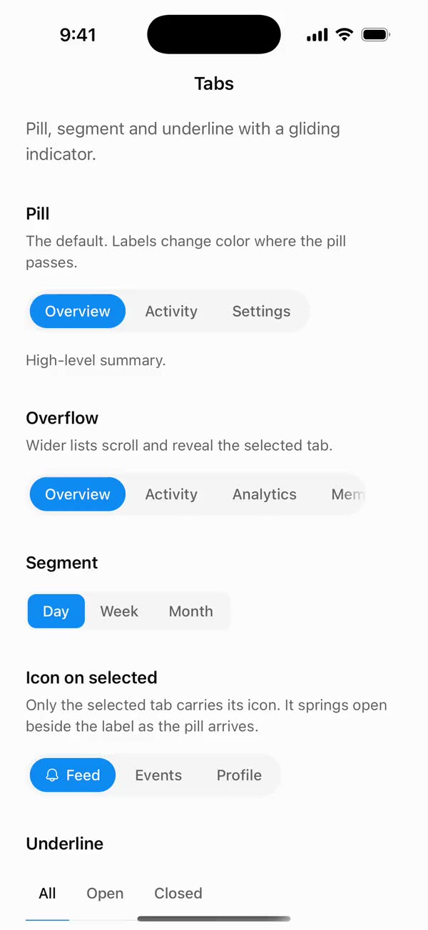
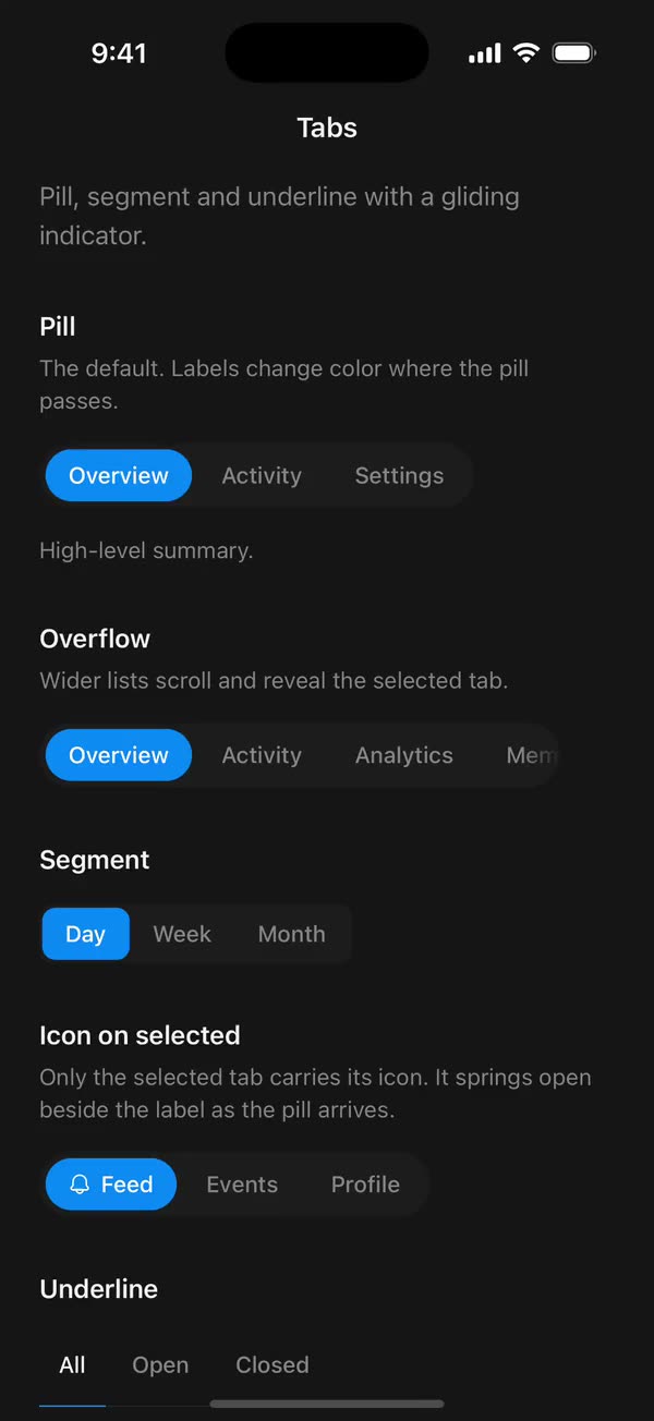
React NativePill, segment and underline with a gliding indicator.
Preview
Install
Source on GitHubIt works in Expo and in bare React Native. New to beUI Native? Set up your app first.
Copies the component and the shared files it needs into src/, adds the theme tokens if they're missing, and installs its libraries. Files you've changed are kept.
Keep the folder layout, since the component imports the shared files by relative path.
1Install the libraries
npx expo install react-native-reanimated react-native-worklets
npm install uniwind tailwindcss2Add the theme tokens
Once per app. Import it from the CSS file Uniwind reads, after Tailwind and Uniwind, and change the values to match your brand.
/* Matches the default beUI palette in ui-components/lib/themes.ts.
   Native surface maps to card; muted maps to muted-foreground. */
@layer theme {
  :root {
    @variant light {
      --color-background: oklch(99% 0 0);
      --color-surface: oklch(97% 0 0);
      --color-foreground: oklch(15% 0 0);
      --color-muted: oklch(50% 0 0);
      --color-border: oklch(15% 0 0 / 0.06);
      --color-border-strong: oklch(15% 0 0 / 0.16);
      --color-primary: #0285f7;
      --color-on-primary: #ffffff;
      --color-destructive: #dc2626;
      --color-success: #059669;
      --color-warning: #d97706;
    }
  }

  :root {
    @variant dark {
      --color-background: #151515;
      --color-surface: #1c1c1c;
      --color-foreground: oklch(96% 0 0);
      --color-muted: oklch(62% 0 0);
      --color-border: rgb(255 255 255 / 0.05);
      --color-border-strong: rgb(255 255 255 / 0.14);
      --color-primary: #0285f7;
      --color-on-primary: #ffffff;
      --color-destructive: #f87171;
      --color-success: #34d399;
      --color-warning: #fbbf24;
    }
  }
}
3Copy the shared files
import { useEffect, useState } from "react";
import { AccessibilityInfo } from "react-native";
import { useReducedMotion } from "react-native-reanimated";

/** Reanimated supplies a synchronous initial value; native events keep it current. */
export function useReducedMotionPreference() {
  const initialValue = useReducedMotion();
  const [reducedMotion, setReducedMotion] = useState(initialValue);

  useEffect(() => {
    let active = true;
    let receivedEvent = false;
    const subscription = AccessibilityInfo.addEventListener(
      "reduceMotionChanged",
      (value) => {
        receivedEvent = true;
        setReducedMotion(value);
      },
    );
    void AccessibilityInfo.isReduceMotionEnabled().then((value) => {
      if (active && !receivedEvent) setReducedMotion(value);
    });
    return () => {
      active = false;
      subscription.remove();
    };
  }, []);

  return reducedMotion;
}
import {
  type ComponentType,
  createElement,
  isValidElement,
  type ReactNode,
} from "react";
import type { ColorValue } from "react-native";

export type IconProps = { size: number; color: ColorValue | undefined };
/** A component receiving `{ size, color }` (such as a lucide icon), or a prebuilt node. */
export type IconSource = ComponentType<IconProps> | ReactNode;

export function renderIcon(icon: IconSource, props: IconProps) {
  if (typeof icon === "function") return createElement(icon, props);
  // forwardRef and memo components (lucide-react-native, for example) are objects.
  if (
    icon != null &&
    typeof icon === "object" &&
    !isValidElement(icon) &&
    "$$typeof" in icon
  ) {
    return createElement(icon as unknown as ComponentType<IconProps>, props);
  }
  return icon;
}
import { Easing, ReduceMotion } from "react-native-reanimated";

// Mirrors beUI's lib/ease.ts so native motion matches the web library.

export const EASE_OUT = Easing.bezier(0.16, 1, 0.3, 1);
export const EASE_IN_OUT = Easing.bezier(0.77, 0, 0.175, 1);

/** Press feedback on buttons and other tappable surfaces. */
export const SPRING_PRESS = {
  stiffness: 500,
  damping: 30,
  mass: 0.6,
  reduceMotion: ReduceMotion.System,
} as const;

/** Content swaps: label and icon slots trading places inside a control. */
export const SPRING_SWAP = {
  stiffness: 460,
  damping: 30,
  mass: 0.55,
  reduceMotion: ReduceMotion.System,
} as const;

/** Shared-layout glides: pills, indicators and panels moving between positions. */
export const SPRING_LAYOUT = {
  stiffness: 360,
  damping: 32,
  mass: 0.6,
  reduceMotion: ReduceMotion.System,
} as const;

/** Dragged handles and fills; critically damped so values never rebound off an end. */
export const SPRING_GLIDE = {
  stiffness: 700,
  damping: 50,
  mass: 0.5,
  reduceMotion: ReduceMotion.System,
} as const;

export const motion = {
  press: SPRING_PRESS,
  swap: SPRING_SWAP,
  layout: SPRING_LAYOUT,
  glide: SPRING_GLIDE,
  exit: { duration: 160, easing: EASE_OUT, reduceMotion: ReduceMotion.System },
  fade: { duration: 150, reduceMotion: ReduceMotion.System },
} as const;
4Copy the component
export type {
  TabsContentProps,
  TabsIcons,
  TabsListProps,
  TabsProps,
  TabsTriggerProps,
  TabsVariant,
} from "./tabs";
export { Tabs, TabsContent, TabsList, TabsTrigger } from "./tabs";
import {
  createContext,
  type ReactNode,
  useCallback,
  useContext,
  useEffect,
  useMemo,
  useRef,
  useState,
} from "react";
import {
  type LayoutRectangle,
  Platform,
  Pressable,
  type PressableProps,
  ScrollView,
  StyleSheet,
  Text,
  View,
  type ViewProps,
} from "react-native";
import Animated, {
  ReduceMotion,
  type SharedValue,
  useAnimatedStyle,
  useSharedValue,
  withSpring,
  withTiming,
} from "react-native-reanimated";
import { scheduleOnRN } from "react-native-worklets";
import { useResolveClassNames } from "uniwind";
import { useReducedMotionPreference } from "../../hooks/use-reduced-motion";
import { type IconSource, renderIcon } from "../../primitives/render-icon";
import { EASE_OUT, SPRING_SWAP } from "../../styles/motion";

export type TabsVariant = "pill" | "segment" | "underline";
/** Whether trigger icons show on every tab or only on the selected one. */
export type TabsIcons = "always" | "selected";

// Settles without overshoot, so the indicator never pokes past the list edges.
const INDICATOR_SPRING = {
  stiffness: 245,
  damping: 36,
  mass: 1.2,
  reduceMotion: ReduceMotion.System,
} as const;
const CONTENT_FADE = {
  duration: 180,
  easing: EASE_OUT,
  reduceMotion: ReduceMotion.System,
};
// Layout sizes can round below the text's real width; a little slack stops the
// overlay label from truncating while keeping it centered.
const SLACK = 1;
// Trigger icons sit before the label at the label's text size.
const ICON_SIZE = 14;
const ICON_GAP = 6;
// Width of the fade over a list edge that has more tabs past it.
const EDGE_FADE = 24;
// Space kept between a revealed tab and the edge, so it clears the fade.
const REVEAL_MARGIN = EDGE_FADE + 8;
// The color behind each variant's tabs, which the edge fades blend into.
const fadeColors: Record<TabsVariant, string> = {
  pill: "bg-surface",
  segment: "bg-surface",
  underline: "bg-background",
};

/** The same color at zero alpha, so a gradient fades without graying. */
function transparentOf(color: string) {
  const hex = color.match(/^#([0-9a-f]{6})$/i)?.[1];
  if (hex) {
    const [r, g, b] = [0, 2, 4].map((i) =>
      Number.parseInt(hex.slice(i, i + 2), 16),
    );
    return `rgba(${r}, ${g}, ${b}, 0)`;
  }
  const rgb = color.match(/^rgba?\(([^,]+),([^,]+),([^,)]+)/);
  if (rgb) return `rgba(${rgb[1]},${rgb[2]},${rgb[3]}, 0)`;
  return "transparent";
}

/** A horizontal gradient, on native through experimental_backgroundImage. */
function fadeStyle(color: string, toward: "left" | "right") {
  const gradient = `linear-gradient(to ${toward}, ${transparentOf(color)}, ${color})`;
  return Platform.OS === "web"
    ? ({ backgroundImage: gradient } as object)
    : { experimental_backgroundImage: gradient };
}

const surfaces: Record<TabsVariant, string> = {
  pill: "rounded-full bg-surface",
  segment: "rounded-lg bg-surface",
  underline: "",
};
const lists: Record<TabsVariant, string> = {
  pill: "p-1",
  segment: "p-0.5",
  // The border sits on the list so the indicator can overlap it inside the scroll view.
  underline: "border-b border-border",
};
// Space between tabs. A number rather than a class, so the indicator can work
// out where tabs will settle while their icons are still opening.
const listGaps: Record<TabsVariant, number> = {
  pill: 4,
  segment: 0,
  underline: 4,
};
const triggers: Record<TabsVariant, string> = {
  pill: "px-3.5 py-1.5 rounded-full",
  segment: "px-3.5 py-1.5 rounded-md",
  underline: "min-h-11 px-3 pt-1 pb-2.5",
};
const indicatorRadius: Record<TabsVariant, number> = {
  pill: 9999,
  segment: 8,
  underline: 0,
};

type TabsContextValue = {
  value: string;
  select: (value: string) => void;
  variant: TabsVariant;
  icons: TabsIcons;
  animate: boolean;
};

/** A tab's width with its selected-only icon folded and open. */
type TabWidths = { folded: number; open: number };

type Indicator = {
  x: SharedValue<number>;
  width: SharedValue<number>;
  visible: SharedValue<number>;
  report: (value: string, layout: LayoutRectangle, widths: TabWidths) => void;
};

const TabsContext = createContext<TabsContextValue | null>(null);
const IndicatorContext = createContext<Indicator | null>(null);

function useTabs() {
  const context = useContext(TabsContext);
  if (!context) throw new Error("Tabs parts must be rendered inside Tabs.");
  return context;
}

export type TabsProps = ViewProps & {
  /** Controlled value. Omit it and use `defaultValue` for uncontrolled use. */
  value?: string;
  defaultValue?: string;
  onValueChange?: (value: string) => void;
  variant?: TabsVariant;
  /**
   * With "selected", a trigger's icon springs open only on the selected tab
   * and folds away when another is chosen. Defaults to "always".
   */
  icons?: TabsIcons;
  /** Disables indicator and content motion independently of the system preference. */
  disableAnimation?: boolean;
  className?: string;
};

export function Tabs({
  value: valueProp,
  defaultValue = "",
  onValueChange,
  variant = "pill",
  icons = "always",
  disableAnimation = false,
  ...props
}: TabsProps) {
  const [uncontrolled, setUncontrolled] = useState(defaultValue);
  const value = valueProp ?? uncontrolled;
  const reducedMotion = useReducedMotionPreference();
  const animate = !reducedMotion && !disableAnimation;

  const context = useMemo<TabsContextValue>(
    () => ({
      value,
      variant,
      icons,
      animate,
      select: (next) => {
        if (valueProp === undefined) setUncontrolled(next);
        onValueChange?.(next);
      },
    }),
    [animate, icons, onValueChange, value, valueProp, variant],
  );

  return (
    <TabsContext.Provider value={context}>
      <View {...props} />
    </TabsContext.Provider>
  );
}

export type TabsListProps = Omit<ViewProps, "children"> & {
  /** `TabsTrigger` elements. They must be direct children so they can be measured. */
  children: ReactNode;
  className?: string;
  /** Overrides the indicator's color utility, such as `bg-foreground`. */
  indicatorClassName?: string;
};

export function TabsList({
  children,
  className = "",
  indicatorClassName,
  ...props
}: TabsListProps) {
  const { value, variant, animate } = useTabs();
  const layouts = useRef(new Map<string, LayoutRectangle>());
  const widths = useRef(new Map<string, TabWidths>());
  // The box the indicator is heading for, so repeat reports don't restart it.
  const heading = useRef<LayoutRectangle | null>(null);
  const scrollRef = useRef<ScrollView>(null);
  const scrollX = useRef(0);
  const viewportWidth = useRef(0);
  const contentWidth = useRef(0);
  const [edges, setEdges] = useState({ start: false, end: false });
  const { backgroundColor: fadeColor } = useResolveClassNames(
    fadeColors[variant],
  );
  const valueRef = useRef(value);
  valueRef.current = value;
  const animateRef = useRef(animate);
  animateRef.current = animate;

  const x = useSharedValue(0);
  const y = useSharedValue(0);
  const width = useSharedValue(0);
  const height = useSharedValue(0);
  const visible = useSharedValue(0);

  // Show a fade on each side that has tabs scrolled out of view.
  const updateEdges = useCallback(() => {
    const max = contentWidth.current - viewportWidth.current;
    const next = {
      start: scrollX.current > 1,
      end: max > 1 && scrollX.current < max - 1,
    };
    setEdges((current) =>
      current.start === next.start && current.end === next.end ? current : next,
    );
  }, []);

  // Keep the selected tab clear of the viewport edges when the list scrolls.
  const reveal = useCallback((layout: LayoutRectangle) => {
    const viewport = viewportWidth.current;
    // A list that fits has nothing to scroll; asking anyway nudges it sideways.
    if (!viewport || contentWidth.current <= viewport + 1) return;
    const start = scrollX.current;
    let target = start;
    if (layout.x < start + REVEAL_MARGIN) {
      target = layout.x - REVEAL_MARGIN;
    } else if (layout.x + layout.width > start + viewport - REVEAL_MARGIN) {
      target = layout.x + layout.width - viewport + REVEAL_MARGIN;
    }
    if (target !== start) {
      scrollRef.current?.scrollTo({
        x: Math.max(0, target),
        animated: animateRef.current,
      });
    }
  }, []);

  // Where the target tab will settle once every icon has finished opening or
  // folding. With icons="selected" tabs resize as the selection changes, and
  // their reported layouts trail the icon's spring by a frame or more. Aiming
  // at the settled box gives one glide instead of chasing late measurements.
  const settled = useCallback(
    (target: string): LayoutRectangle | null => {
      const layout = layouts.current.get(target);
      if (!layout) return null;
      const tabs = [...layouts.current.entries()].sort(
        (a, b) => a[1].x - b[1].x,
      );
      // The first tab never moves; the rest follow from the widths.
      let x = tabs[0]?.[1].x ?? 0;
      for (const [item] of tabs) {
        const size = widths.current.get(item);
        const width = size ? (item === target ? size.open : size.folded) : 0;
        if (item === target)
          return { x, y: layout.y, width, height: layout.height };
        x += width + listGaps[variant];
      }
      return null;
    },
    [variant],
  );

  const move = useCallback(
    (target: string) => {
      const box = settled(target);
      if (!box) {
        visible.value = 0;
        heading.current = null;
        return;
      }
      const last = heading.current;
      if (
        last &&
        visible.value === 1 &&
        Math.abs(last.x - box.x) < 0.5 &&
        Math.abs(last.width - box.width) < 0.5 &&
        Math.abs(last.y - box.y) < 0.5 &&
        Math.abs(last.height - box.height) < 0.5
      ) {
        return;
      }
      heading.current = box;
      // Height and vertical position never animate; only the glide does.
      y.value = box.y;
      height.value = box.height;
      if (visible.value === 0 || !animateRef.current) {
        x.value = box.x;
        width.value = box.width;
      } else {
        x.value = withSpring(box.x, INDICATOR_SPRING);
        width.value = withSpring(box.width, INDICATOR_SPRING);
      }
      visible.value = 1;
      reveal(box);
    },
    [height, reveal, settled, visible, width, x, y],
  );

  useEffect(() => {
    move(value);
  }, [move, value]);

  const report = useCallback(
    (item: string, layout: LayoutRectangle, size: TabWidths) => {
      layouts.current.set(item, layout);
      widths.current.set(item, size);
      // Any tab can move the target, such as one before it changing size.
      move(valueRef.current);
    },
    [move],
  );

  const indicator = useMemo<Indicator>(
    () => ({ x, width, visible, report }),
    [report, visible, width, x],
  );

  const indicatorStyle = useAnimatedStyle(() =>
    variant === "underline"
      ? {
          opacity: visible.value,
          width: width.value,
          transform: [{ translateX: x.value }],
        }
      : {
          opacity: visible.value,
          width: width.value,
          height: height.value,
          transform: [{ translateX: x.value }, { translateY: y.value }],
        },
  );

  return (
    <IndicatorContext.Provider value={indicator}>
      <View
        {...props}
        className={`self-start max-w-full overflow-hidden ${surfaces[variant]} ${className}`}
      >
        <ScrollView
          ref={scrollRef}
          horizontal
          showsHorizontalScrollIndicator={false}
          style={styles.scroller}
          scrollEventThrottle={16}
          onScroll={(event) => {
            scrollX.current = event.nativeEvent.contentOffset.x;
            updateEdges();
          }}
          onLayout={(event) => {
            viewportWidth.current = event.nativeEvent.layout.width;
            updateEdges();
          }}
          onContentSizeChange={(width) => {
            contentWidth.current = width;
            updateEdges();
          }}
        >
          <View
            accessibilityRole="tablist"
            className={`flex-row items-center ${lists[variant]}`}
            style={{ gap: listGaps[variant] }}
          >
            <Animated.View
              className={indicatorClassName ?? "bg-primary"}
              style={[
                variant === "underline" ? styles.underline : styles.indicator,
                { borderRadius: indicatorRadius[variant] },
                indicatorStyle,
              ]}
            />
            {children}
          </View>
        </ScrollView>
        {edges.start && fadeColor ? (
          <View
            style={[
              styles.fade,
              styles.fadeStart,
              fadeStyle(String(fadeColor), "left"),
            ]}
          />
        ) : null}
        {edges.end && fadeColor ? (
          <View
            style={[
              styles.fade,
              styles.fadeEnd,
              fadeStyle(String(fadeColor), "right"),
            ]}
          />
        ) : null}
      </View>
    </IndicatorContext.Provider>
  );
}

export type TabsTriggerProps = Omit<
  PressableProps,
  "children" | "style" | "onPress"
> & {
  value: string;
  /**
   * An icon before the label: a component given `{ size, color }`, or a
   * prebuilt node. Colored like the label in each state.
   */
  icon?: IconSource;
  /** Text children are colored for each state. Other elements render as given. */
  children: ReactNode;
  className?: string;
  onPress?: PressableProps["onPress"];
};

function TabLabel({
  children,
  className,
}: {
  children: ReactNode;
  className: string;
}) {
  return typeof children === "string" || typeof children === "number" ? (
    <Text numberOfLines={1} className={`text-sm font-medium ${className}`}>
      {children}
    </Text>
  ) : (
    children
  );
}

/** A label with an optional icon before it, in one layer's colors. */
function TabContent({
  children,
  className,
  icon,
  color,
  iconStyle,
}: {
  children: ReactNode;
  className: string;
  icon?: IconSource;
  color: string | undefined;
  iconStyle: object;
}) {
  const label = <TabLabel className={className}>{children}</TabLabel>;
  if (icon == null) return label;
  return (
    <View style={styles.content}>
      <Animated.View
        accessibilityElementsHidden
        importantForAccessibility="no-hide-descendants"
        style={[styles.icon, iconStyle]}
      >
        {renderIcon(icon, { size: ICON_SIZE, color })}
      </Animated.View>
      {label}
    </View>
  );
}

function clamp01(value: number) {
  "worklet";
  return Math.min(1, Math.max(0, value));
}

/** How much of a tab the indicator leaves uncovered on each side. */
function overlap(
  left: number,
  width: number,
  indicatorX: number,
  indicatorWidth: number,
  visible: number,
) {
  "worklet";
  const start = Math.min(width, Math.max(0, indicatorX - left));
  const end = Math.min(
    width,
    Math.max(0, left + width - (indicatorX + indicatorWidth)),
  );
  const hidden = visible === 0 || start + end >= width;
  return hidden ? { start: 0, end: 0, hidden } : { start, end, hidden };
}

export function TabsTrigger({
  value,
  icon,
  children,
  className = "",
  disabled,
  accessibilityState,
  onLayout,
  onPress,
  ...props
}: TabsTriggerProps) {
  const { value: current, select, variant, icons, animate } = useTabs();
  const indicator = useContext(IndicatorContext);
  if (!indicator) throw new Error("TabsTrigger must be rendered in TabsList.");
  const selected = current === value;
  const underline = variant === "underline";
  const labelClass = underline && selected ? "text-foreground" : "text-muted";
  const { color: labelColor } = useResolveClassNames(labelClass);
  const { color: onPrimary } = useResolveClassNames("text-on-primary");

  // One progress value opens the icon on both label layers at once, so the
  // on-indicator copy never drifts from the one beneath it.
  const shown = icons === "always" || selected;
  const reveal = useSharedValue(shown ? 1 : 0);
  // Only a selected-only icon changes the tab's width.
  const slot = icon != null && icons === "selected" ? ICON_SIZE + ICON_GAP : 0;
  const left = useSharedValue(0);
  // The folded width. The live width follows the icon's spring on the UI
  // thread, rather than layout events that arrive a frame or more late.
  const folded = useSharedValue(0);
  const sizes = useRef<TabWidths | null>(null);
  const layout = useRef<LayoutRectangle | null>(null);
  // Whether the icon is at rest. Layouts measured mid-spring are already
  // stale when they arrive, so only resting ones set the widths.
  const resting = useRef(true);
  const shownRef = useRef(shown);
  shownRef.current = shown;

  const measure = useCallback(
    (next: LayoutRectangle) => {
      const base = next.width - (shownRef.current ? slot : 0);
      sizes.current = { folded: base, open: base + slot };
      folded.value = base;
    },
    [folded, slot],
  );

  useEffect(() => {
    if (!animate) {
      reveal.value = shown ? 1 : 0;
      return;
    }
    resting.current = false;
    const rest = () => {
      resting.current = true;
      if (!layout.current) return;
      measure(layout.current);
      if (sizes.current) indicator.report(value, layout.current, sizes.current);
    };
    reveal.value = withSpring(shown ? 1 : 0, SPRING_SWAP, (finished) => {
      if (finished) scheduleOnRN(rest);
    });
  }, [animate, indicator, measure, reveal, shown, value]);
  const iconStyle = useAnimatedStyle(() => {
    // The spring overshoots a little. Below zero a width is invalid and the
    // icon snaps to its natural size, so layout uses the clamped progress.
    const open = clamp01(reveal.value);
    return {
      width: ICON_SIZE * open,
      marginRight: ICON_GAP * open,
      opacity: open,
      transform: [{ scale: 0.6 + 0.4 * reveal.value }],
    };
  });
  // The on-indicator label shows only where the indicator overlaps this tab.
  // Each style reads its shared values itself: a style only updates for the
  // values its own worklet reads, not ones read inside a helper it calls.
  const clipStyle = useAnimatedStyle(() => {
    const { start, end, hidden } = overlap(
      left.value,
      folded.value + slot * clamp01(reveal.value),
      indicator.x.value,
      indicator.width.value,
      indicator.visible.value,
    );
    return { opacity: hidden ? 0 : 1, left: start, right: end };
  });
  // The inner layer spans the whole tab by its insets, so it resizes with the
  // tab natively and its label sits exactly over the one beneath.
  const innerStyle = useAnimatedStyle(() => {
    const { start, end } = overlap(
      left.value,
      folded.value + slot * clamp01(reveal.value),
      indicator.x.value,
      indicator.width.value,
      indicator.visible.value,
    );
    return { left: -start - SLACK, right: -end - SLACK };
  });

  return (
    <Pressable
      {...props}
      accessibilityRole="tab"
      accessibilityState={{
        ...accessibilityState,
        selected,
        disabled: disabled ?? false,
      }}
      aria-selected={selected}
      disabled={disabled}
      className={`shrink-0 items-center justify-center ${triggers[variant]} ${disabled ? "opacity-50" : ""} ${className}`}
      onLayout={(event) => {
        const next = event.nativeEvent.layout;
        layout.current = next;
        left.value = next.x;
        if (resting.current || !sizes.current) measure(next);
        if (sizes.current) indicator.report(value, next, sizes.current);
        onLayout?.(event);
      }}
      onPress={(event) => {
        onPress?.(event);
        if (!event.defaultPrevented) select(value);
      }}
    >
      <TabContent
        className={labelClass}
        icon={icon}
        color={labelColor == null ? undefined : String(labelColor)}
        iconStyle={iconStyle}
      >
        {children}
      </TabContent>
      {underline ? null : (
        <Animated.View
          accessibilityElementsHidden
          importantForAccessibility="no-hide-descendants"
          aria-hidden
          style={[styles.clip, clipStyle]}
        >
          <Animated.View
            className={`items-center justify-center ${triggers[variant]}`}
            style={[styles.clipInner, innerStyle]}
          >
            <TabContent
              className="text-on-primary"
              icon={icon}
              color={onPrimary == null ? undefined : String(onPrimary)}
              iconStyle={iconStyle}
            >
              {children}
            </TabContent>
          </Animated.View>
        </Animated.View>
      )}
    </Pressable>
  );
}

export type TabsContentProps = ViewProps & {
  value: string;
  className?: string;
};

export function TabsContent({
  value,
  className = "",
  style,
  ...props
}: TabsContentProps) {
  const { value: current, animate } = useTabs();
  const active = current === value;
  const progress = useSharedValue(0);

  useEffect(() => {
    if (!active) return;
    progress.value = 0;
    progress.value = withTiming(1, CONTENT_FADE);
  }, [active, progress]);

  const animatedStyle = useAnimatedStyle(
    () => ({
      opacity: progress.value,
      transform: [{ translateY: animate ? 4 * (1 - progress.value) : 0 }],
    }),
    [animate],
  );

  if (!active) return null;
  return (
    <Animated.View
      {...props}
      className={`mt-4 ${className}`}
      style={[style, animatedStyle]}
    />
  );
}

const styles = StyleSheet.create({
  // Native ScrollViews default to flexGrow: 1 and would stretch to fill the
  // page vertically; size to the tab row instead.
  scroller: { flexGrow: 0 },
  fade: {
    position: "absolute",
    top: 0,
    bottom: 0,
    width: EDGE_FADE,
    pointerEvents: "none",
  },
  fadeStart: { left: 0 },
  fadeEnd: { right: 0 },
  indicator: { position: "absolute", left: 0, top: 0 },
  underline: { position: "absolute", left: 0, bottom: -1, height: 1 },
  clip: {
    position: "absolute",
    top: 0,
    bottom: 0,
    overflow: "hidden",
    pointerEvents: "none",
  },
  clipInner: { position: "absolute", top: 0, bottom: 0 },
  content: { flexDirection: "row", alignItems: "center" },
  icon: {
    height: ICON_SIZE,
    overflow: "hidden",
    alignItems: "center",
    justifyContent: "center",
  },
});
Documentation
Native port of beUI Tabs. Pill, segment or underline tabs with an indicator that springs between them.
import { Tabs, TabsContent, TabsList, TabsTrigger } from "./src";

<Tabs defaultValue="overview">
  <TabsList>
    <TabsTrigger value="overview">Overview</TabsTrigger>
    <TabsTrigger value="activity">Activity</TabsTrigger>
  </TabsList>
  <TabsContent value="overview">…</TabsContent>
  <TabsContent value="activity">…</TabsContent>
</Tabs>

<Tabs value={range} onValueChange={setRange} variant="segment">…</Tabs>

<Tabs defaultValue="feed" icons="selected">
  <TabsList>
    <TabsTrigger value="feed" icon={BellIcon}>Feed</TabsTrigger>
    <TabsTrigger value="profile" icon={UserIcon}>Profile</TabsTrigger>
  </TabsList>
</Tabs>- Variants:
pill(the default),segmentandunderline. - Indicator: one indicator per list springs to the selected tab. It uses the web version's spring (stiffness 245, damping 36, mass 1.2), which settles without overshooting the list edges. The first selection appears in place.
- Label colour: in the pill and segment variants, each label has a second copy in the on-primary colour, clipped to wherever the indicator overlaps it. During a glide, the colour changes exactly at the indicator's edge, matching the web version's clip-path technique.
- Icons:
TabsTriggertakes anicon, a component given{ size, color }or a prebuilt node, drawn before the label in the label's colour on both layers. Withicons="selected"onTabs, only the selected tab carries its icon: it springs open beside the label onSPRING_SWAPwhile the indicator glides over, and folds away on the tab left behind. One progress value drives both label layers, so the on-indicator copy never drifts. The default,icons="always", shows every icon. - Overflow: a list wider than its container scrolls sideways. Each edge with tabs past it fades into the list's background, and selecting a tab scrolls it 32 points clear of the edge so it sits beyond the fade. On native, swiping replaces the web version's arrow buttons. The fades use
experimental_backgroundImagegradients on iOS and Android, andbackgroundImageon web. - Content:
TabsContentrenders only the active panel, fading it in and rising 4 points over 180 ms. - State: pass
valuewithonValueChangeto control it, ordefaultValueto let it manage itself.TabsTriggeracceptsdisabled. - Accessibility: the list reports the
tablistrole, and each trigger reportstabwith its selected and disabled states. The overlay label copy is hidden from screen readers. - Reduced motion: when the system asks for it, or
disableAnimationis set onTabs, the indicator jumps to its new tab, icons appear and disappear in place, and content fades without rising.
Triggers must be direct children of TabsList, because each trigger measures its own position in the list. Text children are coloured for each state. Other elements render as given; pass icons through icon so they're coloured too.
indicatorClassName on TabsList overrides the indicator colour.
Copy this directory, hooks/use-reduced-motion.ts, primitives/render-icon.tsx, styles/motion.ts, and the semantic tokens in styles/theme.css.