
Agent Activity
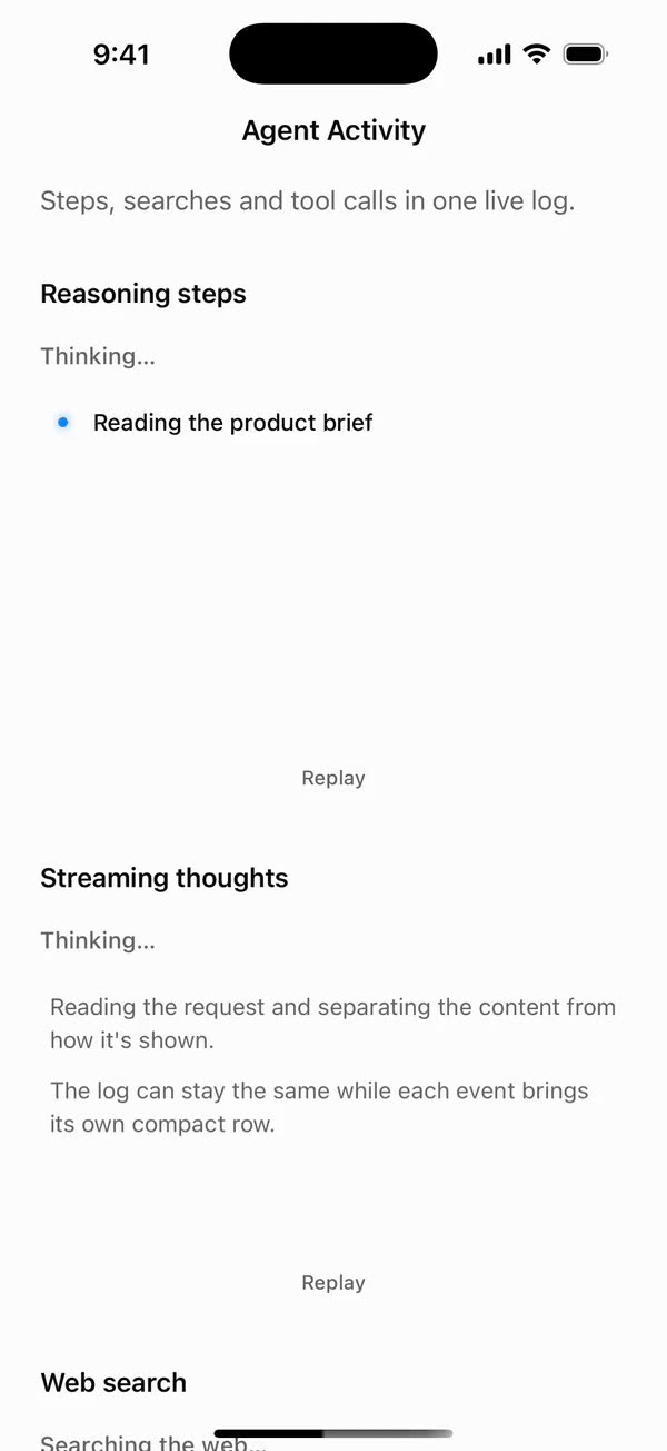
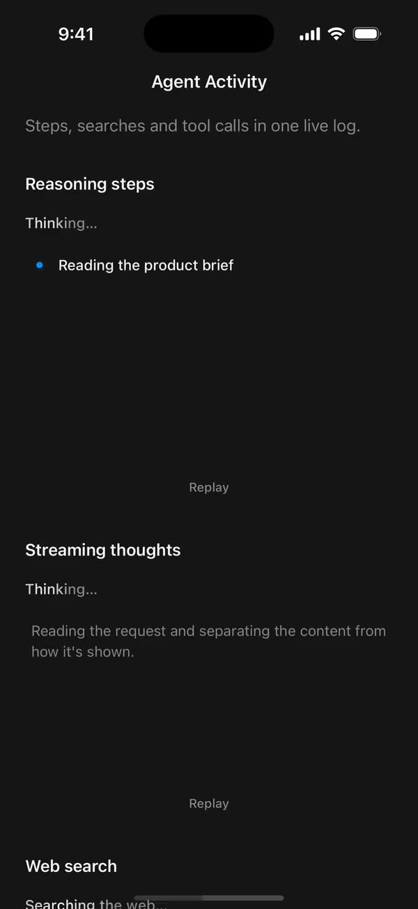
React NativeSteps, searches and tool calls in one live log.
Preview
Install
Source on GitHubIt works in Expo and in bare React Native. New to beUI Native? Set up your app first.
Copies the component and the shared files it needs into src/, adds the theme tokens if they're missing, and installs its libraries. Files you've changed are kept.
Keep the folder layout, since the component imports the shared files by relative path.
1Install the libraries
npx expo install react-native-reanimated react-native-svg react-native-worklets
npm install uniwind tailwindcss2Add the theme tokens
Once per app. Import it from the CSS file Uniwind reads, after Tailwind and Uniwind, and change the values to match your brand.
/* Matches the default beUI palette in ui-components/lib/themes.ts.
   Native surface maps to card; muted maps to muted-foreground. */
@layer theme {
  :root {
    @variant light {
      --color-background: oklch(99% 0 0);
      --color-surface: oklch(97% 0 0);
      --color-foreground: oklch(15% 0 0);
      --color-muted: oklch(50% 0 0);
      --color-border: oklch(15% 0 0 / 0.06);
      --color-border-strong: oklch(15% 0 0 / 0.16);
      --color-primary: #0285f7;
      --color-on-primary: #ffffff;
      --color-destructive: #dc2626;
      --color-success: #059669;
      --color-warning: #d97706;
    }
  }

  :root {
    @variant dark {
      --color-background: #151515;
      --color-surface: #1c1c1c;
      --color-foreground: oklch(96% 0 0);
      --color-muted: oklch(62% 0 0);
      --color-border: rgb(255 255 255 / 0.05);
      --color-border-strong: rgb(255 255 255 / 0.14);
      --color-primary: #0285f7;
      --color-on-primary: #ffffff;
      --color-destructive: #f87171;
      --color-success: #34d399;
      --color-warning: #fbbf24;
    }
  }

  /* Tailwind's default monospace stack isn't a font React Native can load. */
  :root {
    @variant ios {
      --font-mono: Menlo;
    }
  }

  :root {
    @variant android {
      --font-mono: monospace;
    }
  }
}
3Copy the shared files
import {
  TextShimmer,
  type TextShimmerProps,
} from "../text-animation/text-shimmer";

export type ThinkingShimmerProps = Omit<TextShimmerProps, "children"> & {
  /** Defaults to "Thinking…". */
  children?: string;
};

/** A highlight sweeping across a muted status line while an agent thinks. */
export function ThinkingShimmer({
  children = "Thinking…",
  duration = 1800,
  className = "",
  ...props
}: ThinkingShimmerProps) {
  return (
    <TextShimmer
      duration={duration}
      className={`text-sm font-medium ${className}`}
      {...props}
    >
      {children}
    </TextShimmer>
  );
}
import { useEffect } from "react";
import { View, type ViewProps } from "react-native";
import Animated, {
  cancelAnimation,
  Easing,
  interpolateColor,
  ReduceMotion,
  useSharedValue,
  withRepeat,
  withTiming,
} from "react-native-reanimated";
import { useResolveClassNames } from "uniwind";
import { useReducedMotionPreference } from "../../hooks/use-reduced-motion";
import { GlyphRow } from "../../primitives/glyph-row";

// The web gradient is twice the text's width with its highlight 40% either side
// of its middle, swept from 200% to -200% background position. In text widths
// that is a highlight 0.4 wide whose center travels from -1 to 3.
const BAND = 0.4;
const SWEEP_FROM = -1;
const SWEEP_TO = 3;

export type TextShimmerProps = Omit<ViewProps, "children"> & {
  children: string;
  /** One sweep in milliseconds. Defaults to 2500. */
  duration?: number;
  /** Text style, such as `text-xl font-semibold`. Colors come from the theme. */
  className?: string;
  /** Disables the sweep independently of the system preference. */
  disableAnimation?: boolean;
};

/** A highlight that sweeps across muted text, for loading and thinking states. */
export function TextShimmer({
  children,
  duration = 2500,
  className = "",
  disableAnimation = false,
  accessibilityLabel,
  ...props
}: TextShimmerProps) {
  const reducedMotion = useReducedMotionPreference();
  const animate = !reducedMotion && !disableAnimation;
  const { color: base } = useResolveClassNames("text-muted");
  const { color: highlight } = useResolveClassNames("text-foreground");
  const progress = useSharedValue(0);
  const baseColor = String(base ?? "gray");
  const highlightColor = String(highlight ?? "black");

  useEffect(() => {
    if (!animate) {
      cancelAnimation(progress);
      progress.value = 0;
      return;
    }
    progress.value = 0;
    progress.value = withRepeat(
      withTiming(1, {
        duration,
        easing: Easing.linear,
        reduceMotion: ReduceMotion.Never,
      }),
      -1,
    );
    return () => cancelAnimation(progress);
  }, [animate, duration, progress]);

  const colorAt = (p: number, position: number) => {
    "worklet";
    const center = SWEEP_FROM + (SWEEP_TO - SWEEP_FROM) * p;
    const lit = Math.max(0, 1 - Math.abs(position - center) / BAND);
    return {
      color: interpolateColor(lit, [0, 1], [baseColor, highlightColor]),
      opacity: 1,
    };
  };

  return (
    <View
      {...props}
      accessible
      accessibilityRole="text"
      accessibilityLabel={accessibilityLabel ?? children}
      style={[{ alignSelf: "flex-start" }, props.style]}
    >
      {animate ? (
        <GlyphRow
          text={children}
          className={className}
          progress={progress}
          colorAt={colorAt}
        />
      ) : (
        <Animated.Text className={className} style={{ color: baseColor }}>
          {children}
        </Animated.Text>
      )}
    </View>
  );
}
import { useEffect, useState } from "react";
import { AccessibilityInfo } from "react-native";
import { useReducedMotion } from "react-native-reanimated";

/** Reanimated supplies a synchronous initial value; native events keep it current. */
export function useReducedMotionPreference() {
  const initialValue = useReducedMotion();
  const [reducedMotion, setReducedMotion] = useState(initialValue);

  useEffect(() => {
    let active = true;
    let receivedEvent = false;
    const subscription = AccessibilityInfo.addEventListener(
      "reduceMotionChanged",
      (value) => {
        receivedEvent = true;
        setReducedMotion(value);
      },
    );
    void AccessibilityInfo.isReduceMotionEnabled().then((value) => {
      if (active && !receivedEvent) setReducedMotion(value);
    });
    return () => {
      active = false;
      subscription.remove();
    };
  }, []);

  return reducedMotion;
}
import type { ReactNode } from "react";
import type { ColorValue } from "react-native";
import Svg, { Circle, Path, Rect } from "react-native-svg";

type GlyphProps = { size?: number; color?: ColorValue; strokeWidth?: number };

function Glyph({
  size = 16,
  color = "currentColor",
  strokeWidth = 2,
  children,
}: GlyphProps & { children: ReactNode }) {
  return (
    <Svg
      width={size}
      height={size}
      viewBox="0 0 24 24"
      fill="none"
      stroke={color}
      strokeWidth={strokeWidth}
      strokeLinecap="round"
      strokeLinejoin="round"
    >
      {children}
    </Svg>
  );
}

// Simple 24-unit stroke glyphs shared by the agent components.

export function ChevronDownGlyph(props: GlyphProps) {
  return (
    <Glyph {...props}>
      <Path d="M6 9l6 6 6-6" />
    </Glyph>
  );
}

export function ArrowUpGlyph(props: GlyphProps) {
  return (
    <Glyph {...props}>
      <Path d="M12 19V5M5.5 11.5L12 5l6.5 6.5" />
    </Glyph>
  );
}

export function PlusGlyph(props: GlyphProps) {
  return (
    <Glyph {...props}>
      <Path d="M12 5v14M5 12h14" />
    </Glyph>
  );
}

export function StopGlyph({ size = 12, color }: GlyphProps) {
  return (
    <Svg width={size} height={size} viewBox="0 0 12 12">
      <Rect x={1} y={1} width={10} height={10} rx={2.5} fill={color} />
    </Svg>
  );
}

export function CheckGlyph(props: GlyphProps) {
  return (
    <Glyph {...props}>
      <Path d="M5 12.5l4.5 4.5L19 7" />
    </Glyph>
  );
}

export function CopyGlyph(props: GlyphProps) {
  return (
    <Glyph {...props}>
      <Rect x={8.5} y={8.5} width={12} height={12} rx={2.5} />
      <Path d="M15.5 5.5v-.5A2 2 0 0 0 13.5 3h-8.5A2 2 0 0 0 3 5v8.5a2 2 0 0 0 2 2h.5" />
    </Glyph>
  );
}

export function RetryGlyph(props: GlyphProps) {
  return (
    <Glyph {...props}>
      <Path d="M3.5 12a8.5 8.5 0 1 0 2.6-6.1L3.5 8.5" />
      <Path d="M3.5 3.5v5h5" />
    </Glyph>
  );
}

export function ThumbGlyph({
  down = false,
  ...props
}: GlyphProps & { down?: boolean }) {
  return (
    <Glyph {...props}>
      <Path
        d="M7.5 10.5v10M7.5 10.5L11 3.5a2.5 2.5 0 0 1 2.5 2.5v3.5h5a2 2 0 0 1 2 2.3l-1.2 7A2 2 0 0 1 17.3 20.5H4.5a1 1 0 0 1-1-1v-8a1 1 0 0 1 1-1z"
        transform={down ? "rotate(180 12 12)" : undefined}
      />
    </Glyph>
  );
}

export function SearchGlyph(props: GlyphProps) {
  return (
    <Glyph {...props}>
      <Circle cx={11} cy={11} r={6.5} />
      <Path d="M16 16l4 4" />
    </Glyph>
  );
}

export function GlobeGlyph(props: GlyphProps) {
  return (
    <Glyph {...props}>
      <Circle cx={12} cy={12} r={8.5} />
      <Path d="M3.5 12h17M12 3.5c2.4 2.5 3.5 5.3 3.5 8.5s-1.1 6-3.5 8.5c-2.4-2.5-3.5-5.3-3.5-8.5s1.1-6 3.5-8.5z" />
    </Glyph>
  );
}

export function FileGlyph(props: GlyphProps) {
  return (
    <Glyph {...props}>
      <Path d="M14 3.5H7.5a2 2 0 0 0-2 2v13a2 2 0 0 0 2 2h9a2 2 0 0 0 2-2V8z" />
      <Path d="M14 3.5V8h4.5M9 13h6M9 16.5h4" />
    </Glyph>
  );
}

export function PencilGlyph(props: GlyphProps) {
  return (
    <Glyph {...props}>
      <Path d="M4 20h4L19 9a2.1 2.1 0 0 0-4-4L4 16z" />
      <Path d="M13.5 6.5l4 4M14 20h6" />
    </Glyph>
  );
}

export function TerminalGlyph(props: GlyphProps) {
  return (
    <Glyph {...props}>
      <Rect x={3.5} y={4.5} width={17} height={15} rx={2.5} />
      <Path d="M7.5 10l2.5 2-2.5 2M12.5 15h4" />
    </Glyph>
  );
}

export function WrenchGlyph(props: GlyphProps) {
  return (
    <Glyph {...props}>
      <Path d="M14.5 6.5a4 4 0 0 0 5 5l-8.8 8.8a2.1 2.1 0 0 1-3-3l8.8-8.8a4 4 0 0 1-2-2z" />
    </Glyph>
  );
}

export function SparkleGlyph(props: GlyphProps) {
  return (
    <Glyph {...props}>
      <Path d="M12 4l1.8 4.6L18.5 10.5l-4.7 1.9L12 17l-1.8-4.6-4.7-1.9 4.7-1.9z" />
      <Path d="M18.5 16.5v3M17 18h3" />
    </Glyph>
  );
}

export function MessageGlyph(props: GlyphProps) {
  return (
    <Glyph {...props}>
      <Path d="M20 14.5a2 2 0 0 1-2 2H8.5L4 20V6a2 2 0 0 1 2-2h12a2 2 0 0 1 2 2z" />
    </Glyph>
  );
}

export function ImageGlyph(props: GlyphProps) {
  return (
    <Glyph {...props}>
      <Rect x={3.5} y={4.5} width={17} height={15} rx={2.5} />
      <Circle cx={9} cy={10} r={1.5} />
      <Path d="M20.5 15.5l-4.5-4.5-9 8.5" />
    </Glyph>
  );
}

export function ShieldGlyph(props: GlyphProps) {
  return (
    <Glyph {...props}>
      <Path d="M12 3.5l7 2.5v5.5c0 4.4-3 7.7-7 9-4-1.3-7-4.6-7-9V6z" />
      <Path d="M9 12l2 2 4-4" />
    </Glyph>
  );
}

export function AlertGlyph(props: GlyphProps) {
  return (
    <Glyph {...props}>
      <Circle cx={12} cy={12} r={8.5} />
      <Path d="M12 8v4.5M12 16h.01" />
    </Glyph>
  );
}

export function CrossGlyph(props: GlyphProps) {
  return (
    <Glyph {...props}>
      <Path d="M6.5 6.5l11 11M17.5 6.5l-11 11" />
    </Glyph>
  );
}

export function HelpGlyph(props: GlyphProps) {
  return (
    <Glyph {...props}>
      <Circle cx={12} cy={12} r={8.5} />
      <Path d="M9.6 9.5a2.5 2.5 0 0 1 4.8 1c0 1.7-2.4 2.2-2.4 3.5M12 16.8h.01" />
    </Glyph>
  );
}

export function ArrowGlyph({
  back = false,
  ...props
}: GlyphProps & { back?: boolean }) {
  return (
    <Glyph {...props}>
      <Path
        d="M5 12h14M13 6l6 6-6 6"
        transform={back ? "rotate(180 12 12)" : undefined}
      />
    </Glyph>
  );
}

export function BracesGlyph(props: GlyphProps) {
  return (
    <Glyph {...props}>
      <Path d="M8.5 4H8a2 2 0 0 0-2 2v3.5A2.5 2.5 0 0 1 3.5 12 2.5 2.5 0 0 1 6 14.5V18a2 2 0 0 0 2 2h.5M15.5 4h.5a2 2 0 0 1 2 2v3.5a2.5 2.5 0 0 0 2.5 2.5 2.5 2.5 0 0 0-2.5 2.5V18a2 2 0 0 1-2 2h-.5" />
    </Glyph>
  );
}

export function BanGlyph(props: GlyphProps) {
  return (
    <Glyph {...props}>
      <Circle cx={12} cy={12} r={8.5} />
      <Path d="M6 6l12 12" />
    </Glyph>
  );
}

export function CircleCheckGlyph(props: GlyphProps) {
  return (
    <Glyph {...props}>
      <Circle cx={12} cy={12} r={8.5} />
      <Path d="M8.5 12.2l2.4 2.4 4.6-4.8" />
    </Glyph>
  );
}

export function CircleCrossGlyph(props: GlyphProps) {
  return (
    <Glyph {...props}>
      <Circle cx={12} cy={12} r={8.5} />
      <Path d="M9.5 9.5l5 5M14.5 9.5l-5 5" />
    </Glyph>
  );
}

export function ListGlyph(props: GlyphProps) {
  return (
    <Glyph {...props}>
      <Path d="M4 6.5l1.5 1.5L8 5.5M4 13l1.5 1.5L8 12M11.5 7h8.5M11.5 13.5h8.5M11.5 19h8.5M4.5 19h2" />
    </Glyph>
  );
}

/** An open ring, spun by SpinGlyph. */
export function RingGlyph(props: GlyphProps) {
  return (
    <Glyph {...props}>
      <Path d="M20.5 12a8.5 8.5 0 1 1-6-8.1" />
    </Glyph>
  );
}

export function ReplyGlyph(props: GlyphProps) {
  return (
    <Glyph {...props}>
      <Path d="M9.5 7L4.5 12l5 5M4.5 12h10a5 5 0 0 1 5 5v1" />
    </Glyph>
  );
}

export function WrapGlyph(props: GlyphProps) {
  return (
    <Glyph {...props}>
      <Path d="M4 6.5h16M4 12h12.5a3.25 3.25 0 0 1 0 6.5H12M4 18.5h4.5M14 16.5l-2 2 2 2" />
    </Glyph>
  );
}

export function BookGlyph(props: GlyphProps) {
  return (
    <Glyph {...props}>
      <Path d="M12 6.5c-1.6-1.3-4-2-7.5-2v13c3.5 0 5.9.7 7.5 2 1.6-1.3 4-2 7.5-2v-13c-3.5 0-5.9.7-7.5 2zM12 6.5v13" />
    </Glyph>
  );
}

export function ExternalGlyph(props: GlyphProps) {
  return (
    <Glyph {...props}>
      <Path d="M14 4.5h5.5V10M19.5 4.5L11 13M17 14v4a2 2 0 0 1-2 2H6a2 2 0 0 1-2-2V9a2 2 0 0 1 2-2h4" />
    </Glyph>
  );
}

export function DoubleCheckGlyph(props: GlyphProps) {
  return (
    <Glyph {...props}>
      <Path d="M2.5 12.5l4.5 4.5 9-9.5M12 16.5l.5.5 9-9.5" />
    </Glyph>
  );
}

export function ClockGlyph(props: GlyphProps) {
  return (
    <Glyph {...props}>
      <Circle cx={12} cy={12} r={8.5} />
      <Path d="M12 7.5V12l3 2" />
    </Glyph>
  );
}

export function MicGlyph(props: GlyphProps) {
  return (
    <Glyph {...props}>
      <Rect x={9} y={3.5} width={6} height={11} rx={3} />
      <Path d="M5.5 11a6.5 6.5 0 0 0 13 0M12 17.5v3" />
    </Glyph>
  );
}
import { type ReactNode, useEffect, useRef } from "react";
import { StyleSheet, View, type ViewStyle } from "react-native";
import Animated, {
  measure,
  useAnimatedRef,
  useAnimatedStyle,
  useSharedValue,
  withTiming,
} from "react-native-reanimated";
import { scheduleOnUI } from "react-native-worklets";
import { EASE_OUT } from "../styles/motion";

const OPEN = { duration: 220, easing: EASE_OUT };
const CLOSE = { duration: 140, easing: EASE_OUT };
const DROP = 4;
// The height while settled open: unconstrained, so growing content just flows.
const NATURAL = -1;

export type DisclosureProps = {
  open: boolean;
  /** Snaps open and closed, keeping only the fade. */
  reduce: boolean;
  /** Caps the open height; content clips beyond it. */
  maxHeight?: number;
  style?: ViewStyle;
  children: ReactNode;
};

/**
 * Collapsible content shared by the agent components: the height eases
 * between closed and the content's size while the content fades and drops 4
 * points into place. Settled open, the height is left alone, so content that
 * grows (streamed rows, new sources) is never clipped. Closed content is
 * hidden from screen readers and touches.
 */
export function Disclosure({
  open,
  reduce,
  maxHeight,
  style,
  children,
}: DisclosureProps) {
  // The content's height, kept current by layout events; measuring on demand
  // can read 0 for content inside a scroll view.
  const contentHeight = useSharedValue(0);
  const clipRef = useAnimatedRef<Animated.View>();
  const height = useSharedValue(open ? NATURAL : 0);
  const shown = useSharedValue(open ? 1 : 0);
  const mounted = useRef(false);

  useEffect(() => {
    // The first render is already in place.
    if (!mounted.current) {
      mounted.current = true;
      return;
    }
    const cap = maxHeight ?? Number.POSITIVE_INFINITY;
    scheduleOnUI(() => {
      "worklet";
      // Real sizes, read on the UI thread at the moment of the change.
      const full = Math.min(contentHeight.value, cap);
      if (open) {
        const from = height.value === NATURAL ? full : height.value;
        if (reduce) {
          height.value = NATURAL;
        } else {
          height.value = from;
          height.value = withTiming(full, OPEN, (done) => {
            if (done) height.value = NATURAL;
          });
        }
      } else {
        const clip = measure(clipRef);
        const from =
          height.value === NATURAL ? (clip?.height ?? full) : height.value;
        height.value = from;
        height.value = reduce ? 0 : withTiming(0, CLOSE);
      }
    });
    shown.value = withTiming(
      open ? 1 : 0,
      reduce ? { duration: 0 } : open ? OPEN : CLOSE,
    );
  }, [clipRef, contentHeight, height, maxHeight, open, reduce, shown]);

  const clipStyle = useAnimatedStyle(() =>
    // Settled open, the clip follows the content's measured height.
    height.value === NATURAL
      ? {
          height: Math.min(
            contentHeight.value,
            maxHeight ?? Number.POSITIVE_INFINITY,
          ),
        }
      : { height: height.value },
  );
  const contentStyle = useAnimatedStyle(
    () => ({
      opacity: shown.value,
      transform: [{ translateY: reduce ? 0 : (1 - shown.value) * -DROP }],
    }),
    [reduce],
  );

  return (
    <Animated.View
      ref={clipRef}
      pointerEvents={open ? "auto" : "none"}
      accessibilityElementsHidden={!open}
      importantForAccessibility={open ? "auto" : "no-hide-descendants"}
      style={[styles.clip, clipStyle, style]}
    >
      {/* Absolutely placed, so the content keeps its natural height while the
          clip around it is short, and can be measured at any time. */}
      <Animated.View style={[styles.content, contentStyle]}>
        <View
          style={styles.measure}
          onLayout={({ nativeEvent }) => {
            contentHeight.value = nativeEvent.layout.height;
          }}
        >
          {children}
        </View>
      </Animated.View>
    </Animated.View>
  );
}

const styles = StyleSheet.create({
  clip: { overflow: "hidden" },
  content: { position: "absolute", left: 0, right: 0, top: 0 },
  measure: { flexShrink: 0 },
});
import {
  type ColorValue,
  StyleSheet,
  View,
  type ViewStyle,
} from "react-native";

const BANDS = 8;

export type FadeEdgeProps = {
  /** The surface color the content fades into. */
  color: ColorValue | undefined;
  /** Which edge is solid. Defaults to "bottom". */
  edge?: "top" | "bottom";
  /** Height of the fade in points. */
  height: number;
  style?: ViewStyle;
};

/**
 * A soft edge over clipped content, built from stacked bands so shared
 * components need no gradient library. Ignores touches.
 */
export function FadeEdge({
  color,
  edge = "bottom",
  height,
  style,
}: FadeEdgeProps) {
  return (
    <View
      pointerEvents="none"
      style={[
        styles.edge,
        edge === "bottom" ? styles.bottom : styles.top,
        { height },
        style,
      ]}
    >
      {Array.from({ length: BANDS }, (_, index) => {
        const t = (index + 1) / BANDS;
        return (
          <View
            key={index}
            style={{
              flex: 1,
              backgroundColor: color,
              // Ease the ramp so the fade has no visible first step.
              opacity: edge === "bottom" ? t * t : (1 - t + 1 / BANDS) ** 2,
            }}
          />
        );
      })}
    </View>
  );
}

const styles = StyleSheet.create({
  edge: { position: "absolute", left: 0, right: 0 },
  bottom: { bottom: 0 },
  top: { top: 0 },
});
import { StyleSheet, View, type ViewStyle } from "react-native";
import Animated, {
  type SharedValue,
  useAnimatedStyle,
  useSharedValue,
} from "react-native-reanimated";

/**
 * Returns a glyph's color for the current progress. `position` is the glyph's
 * center across the row, from 0 at the left edge to 1 at the right. Must be a
 * worklet.
 */
export type GlyphColor = (
  progress: number,
  position: number,
) => { color: string; opacity: number };

// Splitting into glyphs breaks shaping in connected and complex scripts.
// Latin plus general punctuation (dashes, quotes, the ellipsis), none of which shape.
const SPLIT_SAFE = /^[\u0020-\u007e\u00a0-\u024f\u2000-\u206f]+$/;

export type GlyphRowProps = {
  text: string;
  /** Text style for every glyph. Its color is replaced by `colorAt`. */
  className?: string;
  progress: SharedValue<number>;
  colorAt: GlyphColor;
  style?: ViewStyle;
};

function Glyph({
  char,
  className,
  progress,
  rowWidth,
  colorAt,
}: {
  char: string;
  className?: string;
  progress: SharedValue<number>;
  rowWidth: SharedValue<number>;
  colorAt: GlyphColor;
}) {
  const center = useSharedValue(-1);

  const animatedStyle = useAnimatedStyle(() => {
    const width = rowWidth.value;
    // Until measured, assume the middle so nothing flashes at the edges.
    const position =
      width > 0 && center.value >= 0 ? center.value / width : 0.5;
    return colorAt(progress.value, position);
  });

  return (
    <Animated.Text
      className={className}
      style={animatedStyle}
      onLayout={({ nativeEvent: { layout } }) => {
        center.value = layout.x + layout.width / 2;
      }}
    >
      {char}
    </Animated.Text>
  );
}

/**
 * Text drawn one glyph at a time so each glyph can take its own animated
 * color, standing in for web gradients clipped to text. Scripts that need
 * shaping render as a single glyph so their letters still join.
 */
export function GlyphRow({
  text,
  className,
  progress,
  colorAt,
  style,
}: GlyphRowProps) {
  const rowWidth = useSharedValue(0);
  // Whitespace-only Text can measure zero-width on Android.
  const glyphs = SPLIT_SAFE.test(text)
    ? Array.from(text.replace(/ /g, " "))
    : [text];

  return (
    <View
      style={[styles.row, style]}
      onLayout={({ nativeEvent: { layout } }) => {
        rowWidth.value = layout.width;
      }}
    >
      {glyphs.map((char, index) => (
        <Glyph
          // Position is the glyph's identity within one string.
          key={`${index}-${char}`}
          char={char}
          className={className}
          progress={progress}
          rowWidth={rowWidth}
          colorAt={colorAt}
        />
      ))}
    </View>
  );
}

const styles = StyleSheet.create({
  row: { flexDirection: "row", alignItems: "baseline" },
});
import { type ReactNode, useEffect } from "react";
import type { ViewProps } from "react-native";
import Animated, {
  LinearTransition,
  useAnimatedStyle,
  useSharedValue,
  withSpring,
  withTiming,
} from "react-native-reanimated";
import { EASE_OUT, SPRING_LAYOUT } from "../styles/motion";

const FADE = { duration: 180, easing: EASE_OUT };
const RISE = 6;
const EXIT_DURATION = 140;

/** Leaving rows reverse their entrance: fade and lift 3 points away. */
function riseOut() {
  "worklet";
  return {
    initialValues: { opacity: 1, transform: [{ translateY: 0 }] },
    animations: {
      opacity: withTiming(0, { duration: EXIT_DURATION, easing: EASE_OUT }),
      transform: [
        {
          translateY: withTiming(-3, {
            duration: EXIT_DURATION,
            easing: EASE_OUT,
          }),
        },
      ],
    },
  };
}

const GLIDE = LinearTransition.springify()
  .stiffness(SPRING_LAYOUT.stiffness)
  .damping(SPRING_LAYOUT.damping)
  .mass(SPRING_LAYOUT.mass);

/**
 * A row that fades and rises 6 points into place when it mounts, and lifts
 * away as it leaves, while its neighbours glide to make room. Shared by the agent activity lists.
 */
export function RiseIn({
  reduce,
  appear = true,
  children,
  style,
  ...props
}: ViewProps & { reduce: boolean; appear?: boolean; children: ReactNode }) {
  const animate = appear && !reduce;
  const opacity = useSharedValue(animate ? 0 : 1);
  const lift = useSharedValue(animate ? RISE : 0);

  // Plays once, on mount.
  useEffect(() => {
    if (!animate) return;
    opacity.value = withTiming(1, FADE);
    lift.value = withSpring(0, SPRING_LAYOUT);
  }, []);

  const rise = useAnimatedStyle(() => ({
    opacity: opacity.value,
    transform: [{ translateY: lift.value }],
  }));

  return (
    <Animated.View
      layout={reduce ? undefined : GLIDE}
      exiting={reduce ? undefined : riseOut}
      style={[rise, style]}
      {...props}
    >
      {children}
    </Animated.View>
  );
}
import { Easing, ReduceMotion } from "react-native-reanimated";

// Mirrors beUI's lib/ease.ts so native motion matches the web library.

export const EASE_OUT = Easing.bezier(0.16, 1, 0.3, 1);
export const EASE_IN_OUT = Easing.bezier(0.77, 0, 0.175, 1);

/** Press feedback on buttons and other tappable surfaces. */
export const SPRING_PRESS = {
  stiffness: 500,
  damping: 30,
  mass: 0.6,
  reduceMotion: ReduceMotion.System,
} as const;

/** Content swaps: label and icon slots trading places inside a control. */
export const SPRING_SWAP = {
  stiffness: 460,
  damping: 30,
  mass: 0.55,
  reduceMotion: ReduceMotion.System,
} as const;

/** Shared-layout glides: pills, indicators and panels moving between positions. */
export const SPRING_LAYOUT = {
  stiffness: 360,
  damping: 32,
  mass: 0.6,
  reduceMotion: ReduceMotion.System,
} as const;

/** Dragged handles and fills; critically damped so values never rebound off an end. */
export const SPRING_GLIDE = {
  stiffness: 700,
  damping: 50,
  mass: 0.5,
  reduceMotion: ReduceMotion.System,
} as const;

export const motion = {
  press: SPRING_PRESS,
  swap: SPRING_SWAP,
  layout: SPRING_LAYOUT,
  glide: SPRING_GLIDE,
  exit: { duration: 160, easing: EASE_OUT, reduceMotion: ReduceMotion.System },
  fade: { duration: 150, reduceMotion: ReduceMotion.System },
} as const;
4Copy the component
import { type ReactNode, useEffect } from "react";
import { Pressable, StyleSheet, Text, View } from "react-native";
import Animated, {
  cancelAnimation,
  ReduceMotion,
  useAnimatedStyle,
  useSharedValue,
  withRepeat,
  withTiming,
} from "react-native-reanimated";
import { useResolveClassNames } from "uniwind";
import {
  CheckGlyph,
  FileGlyph,
  GlobeGlyph,
  ImageGlyph,
  MessageGlyph,
  PencilGlyph,
  SearchGlyph,
  SparkleGlyph,
  TerminalGlyph,
  WrenchGlyph,
} from "../../primitives/agent-icons";
import { RiseIn } from "../../primitives/rise-in";
import type {
  AgentActivityItem,
  AgentActivitySearch,
  AgentActivityStep,
  AgentActivityTool,
  AgentActivityTrace,
  AgentSearchResult,
} from "./types";

/** Plain strings take the given text style; other nodes render as they are. */
export function textOf(node: ReactNode, className: string, lines?: number) {
  return typeof node === "string" || typeof node === "number" ? (
    <Text numberOfLines={lines} className={className}>
      {node}
    </Text>
  ) : (
    node
  );
}

function useMuted() {
  return useResolveClassNames("text-muted").color;
}

function Halo({ reduce }: { reduce: boolean }) {
  const pulse = useSharedValue(0);
  useEffect(() => {
    if (reduce) {
      cancelAnimation(pulse);
      pulse.value = 0.5;
      return;
    }
    pulse.value = withRepeat(
      withTiming(1, { duration: 750, reduceMotion: ReduceMotion.Never }),
      -1,
      true,
    );
    return () => cancelAnimation(pulse);
  }, [pulse, reduce]);
  const style = useAnimatedStyle(() => ({
    opacity: 0.35 + pulse.value * 0.45,
  }));
  return (
    <View style={styles.active}>
      <Animated.View
        style={[StyleSheet.absoluteFill, styles.halo, style]}
        className="bg-primary/15"
      />
      <View style={styles.dot} className="bg-primary" />
    </View>
  );
}

function StepRow({
  item,
  reduce,
  connect,
}: {
  item: AgentActivityStep;
  reduce: boolean;
  connect: boolean;
}) {
  const muted = useMuted();
  const status = item.status ?? "complete";
  return (
    <View style={styles.stepRow} className="rounded-md px-1.5 py-1">
      <View style={styles.stepIcon}>
        {status === "complete" ? (
          <CheckGlyph size={16} color={muted} strokeWidth={1.8} />
        ) : status === "active" ? (
          <Halo reduce={reduce} />
        ) : (
          <View style={styles.pending} className="border-muted" />
        )}
      </View>
      {/* Joins this step's mark to the next one, so the run reads as a sequence. */}
      {connect ? (
        <View style={styles.connector} className="bg-border-strong" />
      ) : null}
      <View style={styles.flex}>
        {textOf(
          item.label,
          `text-sm leading-5 ${status === "pending" ? "text-muted/60" : status === "active" ? "font-medium text-foreground" : "text-foreground/80"}`,
        )}
      </View>
      {item.meta ? textOf(item.meta, "text-sm leading-5 text-muted/60") : null}
    </View>
  );
}

function ResultRow({
  result,
  reduce,
  onOpenResult,
}: {
  result: AgentSearchResult;
  reduce: boolean;
  onOpenResult?: (result: AgentSearchResult) => void;
}) {
  const muted = useMuted();
  const content = (
    <>
      <View style={styles.resultIcon}>
        {result.icon ?? <GlobeGlyph size={12} color={muted} />}
      </View>
      <View style={styles.resultText}>
        {textOf(result.title, "shrink text-sm font-medium text-foreground", 1)}
        {result.domain
          ? textOf(result.domain, "shrink text-sm text-muted/60", 1)
          : null}
      </View>
    </>
  );
  return (
    <RiseIn reduce={reduce}>
      {result.url && onOpenResult ? (
        <Pressable
          accessibilityRole="link"
          onPress={() => onOpenResult(result)}
          style={styles.resultRow}
          className="rounded-md px-1.5 py-1 active:bg-surface"
        >
          {content}
        </Pressable>
      ) : (
        <View style={styles.resultRow} className="px-1.5 py-1">
          {content}
        </View>
      )}
    </RiseIn>
  );
}

function SearchRow({
  item,
  reduce,
  onOpenResult,
}: {
  item: AgentActivitySearch;
  reduce: boolean;
  onOpenResult?: (result: AgentSearchResult) => void;
}) {
  const muted = useMuted();
  return (
    <View style={styles.gap}>
      <View style={styles.queryRow} className="px-1.5 py-1">
        <SearchGlyph size={16} color={muted} strokeWidth={1.7} />
        {textOf(item.query, "shrink text-sm text-muted", 1)}
      </View>
      <View style={[styles.gap, styles.results]}>
        {item.results?.map((result) => (
          <ResultRow
            key={result.id}
            result={result}
            reduce={reduce}
            onOpenResult={onOpenResult}
          />
        ))}
        {item.moreCount ? (
          <RiseIn reduce={reduce}>
            <Text className="py-1 pl-8 text-sm text-muted/60">
              +{item.moreCount} more
            </Text>
          </RiseIn>
        ) : null}
      </View>
    </View>
  );
}

function toolIcon(action: string, color: unknown) {
  const props = { size: 16, color: color as string };
  if (action === "read") return <FileGlyph {...props} />;
  if (action === "edit" || action === "write")
    return <PencilGlyph {...props} />;
  if (action === "run") return <TerminalGlyph {...props} />;
  return <WrenchGlyph {...props} />;
}

function Chip({ children, grow }: { children: ReactNode; grow?: boolean }) {
  return (
    <View
      style={grow ? styles.flex : styles.shrink}
      className="rounded-lg bg-surface px-2.5 py-1"
    >
      {textOf(children, "font-mono text-xs text-muted", 1)}
    </View>
  );
}

function ToolRow({ item }: { item: AgentActivityTool }) {
  const muted = useMuted();
  const label = item.action.charAt(0).toUpperCase() + item.action.slice(1);
  return (
    <View style={styles.toolRow} className="px-1.5 py-0.5">
      {toolIcon(item.action, muted)}
      <Text className="text-sm font-medium leading-5 text-foreground">
        {label}
      </Text>
      <Chip grow>{item.target}</Chip>
      {item.additions !== undefined || item.deletions !== undefined ? (
        <View style={styles.counts}>
          {item.additions !== undefined ? (
            <Text
              className="font-mono text-xs text-success"
              style={styles.tabular}
            >
              +{item.additions}
            </Text>
          ) : null}
          {item.deletions !== undefined ? (
            <Text
              className="font-mono text-xs text-destructive"
              style={styles.tabular}
            >
              −{item.deletions}
            </Text>
          ) : null}
        </View>
      ) : null}
    </View>
  );
}

function traceIcon(kind: string, color: unknown) {
  const props = { size: 16, color: color as string };
  if (kind === "thinking") return <SparkleGlyph {...props} />;
  if (kind === "message") return <MessageGlyph {...props} />;
  if (kind === "write") return <PencilGlyph {...props} />;
  if (kind === "run") return <TerminalGlyph {...props} />;
  if (kind === "read") return <ImageGlyph {...props} />;
  return <WrenchGlyph {...props} />;
}

function TraceRow({ item }: { item: AgentActivityTrace }) {
  const muted = useMuted();
  return (
    <View style={styles.toolRow} className="px-1.5 py-0.5">
      {item.icon ?? traceIcon(item.kind, muted)}
      {textOf(item.label, "text-sm font-medium leading-5 text-foreground")}
      {item.detail ? <Chip>{item.detail}</Chip> : null}
    </View>
  );
}

export function ActivityRow({
  item,
  reduce,
  onOpenResult,
  connect = false,
}: {
  item: AgentActivityItem;
  reduce: boolean;
  onOpenResult?: (result: AgentSearchResult) => void;
  /** Draws a line from this step's mark to the next step's. */
  connect?: boolean;
}) {
  switch (item.type) {
    case "step":
      return <StepRow item={item} reduce={reduce} connect={connect} />;
    case "text":
      return textOf(
        item.content,
        "rounded-md px-1.5 py-1 text-sm leading-5 text-muted",
      );
    case "search":
      return (
        <SearchRow item={item} reduce={reduce} onOpenResult={onOpenResult} />
      );
    case "tool":
      return <ToolRow item={item} />;
    case "trace":
      return <TraceRow item={item} />;
  }
}

const styles = StyleSheet.create({
  flex: { flex: 1, minWidth: 0 },
  shrink: { flexShrink: 1, minWidth: 0 },
  gap: { gap: 2 },
  results: { paddingLeft: 16 },
  stepRow: {
    flexDirection: "row",
    alignItems: "flex-start",
    gap: 10,
    minHeight: 28,
  },
  stepIcon: {
    width: 16,
    height: 16,
    marginTop: 2,
    alignItems: "center",
    justifyContent: "center",
  },
  active: {
    width: 12,
    height: 12,
    alignItems: "center",
    justifyContent: "center",
  },
  halo: { borderRadius: 6 },
  dot: { width: 6, height: 6, borderRadius: 3 },
  // From under the mark, through the row's bottom padding and the gap, to the
  // top of the next mark.
  connector: {
    position: "absolute",
    left: 6 + 7.5,
    top: 4 + 2 + 16 + 2,
    bottom: -4,
    width: 1,
  },
  pending: { width: 11, height: 11, borderRadius: 6, borderWidth: 1.5 },
  queryRow: {
    flexDirection: "row",
    alignItems: "center",
    gap: 10,
    minHeight: 28,
  },
  resultRow: {
    flexDirection: "row",
    alignItems: "center",
    gap: 8,
    minHeight: 28,
  },
  resultIcon: {
    width: 20,
    height: 20,
    alignItems: "center",
    justifyContent: "center",
  },
  resultText: {
    flex: 1,
    minWidth: 0,
    flexDirection: "row",
    alignItems: "center",
    gap: 8,
  },
  toolRow: {
    flexDirection: "row",
    alignItems: "center",
    gap: 10,
    minHeight: 32,
  },
  counts: { flexDirection: "row", alignItems: "center", gap: 8 },
  tabular: { fontVariant: ["tabular-nums"] },
});
import { type ReactNode, useEffect, useRef, useState } from "react";
import {
  Pressable,
  ScrollView,
  StyleSheet,
  View,
  type ViewProps,
} from "react-native";
import Animated, {
  useAnimatedStyle,
  useSharedValue,
  withSpring,
} from "react-native-reanimated";
import { useResolveClassNames } from "uniwind";
import { useReducedMotionPreference } from "../../hooks/use-reduced-motion";
import { ChevronDownGlyph } from "../../primitives/agent-icons";
import { Disclosure } from "../../primitives/disclosure";
import { FadeEdge } from "../../primitives/fade-edge";
import { RiseIn } from "../../primitives/rise-in";
import { SPRING_LAYOUT, SPRING_SWAP } from "../../styles/motion";
import { ThinkingShimmer } from "../loading-states/thinking-shimmer";
import { ActivityRow, textOf } from "./activity-row";
import type {
  AgentActivityContentType,
  AgentActivityItem,
  AgentActivityStatus,
  AgentSearchResult,
} from "./types";

const EDGE = 12;

function formatDuration(seconds: number) {
  const total = Math.max(0, Math.round(seconds));
  if (total < 60) return `${total}s`;
  const minutes = Math.floor(total / 60);
  const rest = total % 60;
  return rest === 0 ? `${minutes}m` : `${minutes}m ${rest}s`;
}

function contentTypeOf(
  items: AgentActivityItem[],
  fallback?: AgentActivityContentType,
) {
  const first = items[0];
  if (!first) return fallback ?? "mixed";
  return items.every((item) => item.type === first.type) ? first.type : "mixed";
}

function activeLabelFor(type: AgentActivityContentType) {
  if (type === "search") return "Searching the web…";
  if (type === "tool") return "Running tools…";
  if (type === "trace") return "Working through the run…";
  if (type === "mixed") return "Working through it…";
  return "Thinking…";
}

function summaryFor(
  type: AgentActivityContentType,
  items: AgentActivityItem[],
  duration: number,
) {
  const n = items.length;
  if (type === "step" || type === "text")
    return `Thought for ${formatDuration(duration)}`;
  if (type === "search") return "Searched the web";
  if (type === "tool") return `Ran ${n} ${n === 1 ? "tool" : "tools"}`;
  if (type === "trace") {
    const messages = items.filter(
      (item) =>
        item.type === "trace" &&
        (item.kind === "thinking" || item.kind === "message"),
    ).length;
    const tools = n - messages;
    return `${tools} ${tools === 1 ? "tool call" : "tool calls"}, ${messages} ${messages === 1 ? "message" : "messages"}`;
  }
  return `Completed ${n} ${n === 1 ? "step" : "steps"}`;
}

export type AgentActivityProps = Omit<ViewProps, "children"> & {
  /** Entries in order. Append or update them as events stream in. */
  items: AgentActivityItem[];
  /** The kind of activity expected before the first item arrives. */
  contentType?: AgentActivityContentType;
  /** Defaults to "working". A working run always stays open. */
  status?: AgentActivityStatus;
  /** Elapsed seconds, for the "Thought for" summary. Defaults to 0. */
  duration?: number;
  /** Controlled open state once the run completes. */
  open?: boolean;
  /** Defaults to false. */
  defaultOpen?: boolean;
  onOpenChange?: (open: boolean) => void;
  /** Folds the log away when the run completes. Defaults to true. */
  collapseOnComplete?: boolean;
  /** Replaces the working label, which is derived from the items. */
  activeLabel?: string;
  /** Replaces the completed summary, which is derived from the items. */
  summary?: ReactNode;
  /** Tallest the log grows before it starts gliding. Defaults to 208. */
  maxHeight?: number;
  /** Called when a search result with a `url` is tapped. */
  onOpenResult?: (result: AgentSearchResult) => void;
  className?: string;
  contentClassName?: string;
  /** Shows rows and folds without motion, independently of the system preference. */
  disableAnimation?: boolean;
};

/**
 * What an agent is doing, as it does it: steps, reasoning, searches, tool
 * calls and traces in one log. While working, the newest entry stays pinned
 * to the bottom as the log glides up; once done, it folds into a summary.
 */
export function AgentActivity({
  items,
  contentType,
  status = "working",
  duration = 0,
  open: controlledOpen,
  defaultOpen = false,
  onOpenChange,
  collapseOnComplete = true,
  activeLabel,
  summary,
  maxHeight = 208,
  onOpenResult,
  className = "",
  contentClassName = "",
  disableAnimation = false,
  ...props
}: AgentActivityProps) {
  const reducedMotion = useReducedMotionPreference();
  const reduce = reducedMotion || disableAnimation;
  const working = status === "working";
  const [internalOpen, setInternalOpen] = useState(defaultOpen);
  const open = controlledOpen ?? internalOpen;
  const expanded = working || open;
  const [contentHeight, setContentHeight] = useState(0);
  const scrollRef = useRef<ScrollView>(null);
  const previousStatus = useRef(status);
  const offset = useSharedValue(0);
  const turn = useSharedValue(expanded ? 1 : 0);
  const { color: muted } = useResolveClassNames("text-muted");
  const { backgroundColor: page } = useResolveClassNames("bg-background");

  const setOpen = (next: boolean) => {
    if (controlledOpen === undefined) setInternalOpen(next);
    onOpenChange?.(next);
  };

  // Folds (or stays open) once, as the run completes.
  useEffect(() => {
    const was = previousStatus.current;
    previousStatus.current = status;
    if (was === "working" && status === "complete")
      setOpen(!collapseOnComplete);
  });

  const capped = contentHeight > maxHeight;
  const viewport = Math.min(contentHeight, maxHeight);
  const glide = working ? Math.min(0, viewport - contentHeight) : 0;

  useEffect(() => {
    offset.value = reduce ? glide : withSpring(glide, SPRING_LAYOUT);
  }, [glide, offset, reduce]);
  useEffect(() => {
    turn.value = reduce
      ? expanded
        ? 1
        : 0
      : withSpring(expanded ? 1 : 0, SPRING_SWAP);
  }, [expanded, reduce, turn]);

  const listStyle = useAnimatedStyle(() => ({
    transform: [{ translateY: offset.value }],
  }));
  const chevronStyle = useAnimatedStyle(() => ({
    transform: [{ rotate: `${turn.value * 180}deg` }],
  }));

  const type = contentTypeOf(items, contentType);
  const label = activeLabel ?? activeLabelFor(type);
  const done = summary ?? summaryFor(type, items, duration);

  return (
    <View
      accessibilityState={{ busy: working }}
      className={`w-full ${className}`}
      {...props}
    >
      {working ? (
        <View accessibilityLiveRegion="polite" style={styles.header}>
          <ThinkingShimmer>{label}</ThinkingShimmer>
        </View>
      ) : (
        <Pressable
          accessibilityRole="button"
          accessibilityState={{ expanded }}
          onPress={() => {
            const next = !open;
            setOpen(next);
            // Read a reopened log from the start.
            if (next) scrollRef.current?.scrollTo({ y: 0, animated: false });
          }}
          hitSlop={8}
          style={styles.header}
        >
          <View style={styles.summary}>
            {textOf(done, "text-sm font-medium text-muted", 1)}
          </View>
          <Animated.View style={chevronStyle}>
            <ChevronDownGlyph size={14} color={muted} />
          </Animated.View>
        </Pressable>
      )}
      <Disclosure open={expanded} reduce={reduce}>
        {/* Sizes to its content up to maxHeight, so there's no height to go stale. */}
        <View>
          <ScrollView
            ref={scrollRef}
            style={[styles.fixed, { maxHeight }]}
            scrollEnabled={!working && capped}
            showsVerticalScrollIndicator={false}
            nestedScrollEnabled
          >
            <Animated.View style={listStyle}>
              <View
                onLayout={({ nativeEvent }) =>
                  setContentHeight(nativeEvent.layout.height)
                }
                className={`gap-0.5 py-2 ${contentClassName}`}
              >
                {items.map((item, index) => (
                  <RiseIn key={item.id} reduce={reduce}>
                    <ActivityRow
                      item={item}
                      reduce={reduce}
                      onOpenResult={onOpenResult}
                      connect={
                        item.type === "step" &&
                        items[index + 1]?.type === "step"
                      }
                    />
                  </RiseIn>
                ))}
              </View>
            </Animated.View>
          </ScrollView>
          {capped ? <FadeEdge color={page} edge="top" height={EDGE} /> : null}
          {capped && !working ? <FadeEdge color={page} height={EDGE} /> : null}
        </View>
      </Disclosure>
    </View>
  );
}

const styles = StyleSheet.create({
  // Scroll views shrink to fit the space above them; inside a closing
  // disclosure that would collapse the log to nothing.
  fixed: { flexGrow: 0, flexShrink: 0 },
  header: {
    flexDirection: "row",
    alignItems: "center",
    gap: 6,
    height: 28,
    minWidth: 0,
  },
  summary: { flexShrink: 1, minWidth: 0 },
});
export type { AgentActivityProps } from "./agent-activity";
export { AgentActivity } from "./agent-activity";
export type {
  AgentActivityContentType,
  AgentActivityItem,
  AgentActivitySearch,
  AgentActivityStatus,
  AgentActivityStep,
  AgentActivityText,
  AgentActivityTool,
  AgentActivityTrace,
  AgentSearchResult,
  AgentStepStatus,
  AgentTraceKind,
} from "./types";
import type { ReactNode } from "react";

export type AgentActivityStatus = "working" | "complete";
export type AgentStepStatus = "pending" | "active" | "complete";

export type AgentActivityStep = {
  id: string;
  type: "step";
  label: ReactNode;
  /** Defaults to "complete". */
  status?: AgentStepStatus;
  meta?: ReactNode;
};

export type AgentActivityText = {
  id: string;
  type: "text";
  content: ReactNode;
};

export type AgentSearchResult = {
  id: string;
  title: ReactNode;
  domain?: ReactNode;
  /** Makes the result tappable through `onOpenResult`. */
  url?: string;
  icon?: ReactNode;
};

export type AgentActivitySearch = {
  id: string;
  type: "search";
  query: ReactNode;
  results?: AgentSearchResult[];
  moreCount?: number;
};

export type AgentActivityTool = {
  id: string;
  type: "tool";
  action: "read" | "edit" | "run" | (string & {});
  target: ReactNode;
  additions?: number;
  deletions?: number;
};

export type AgentTraceKind =
  | "thinking"
  | "message"
  | "write"
  | "run"
  | "read"
  | (string & {});

export type AgentActivityTrace = {
  id: string;
  type: "trace";
  kind: AgentTraceKind;
  label: ReactNode;
  detail?: ReactNode;
  icon?: ReactNode;
};

export type AgentActivityItem =
  | AgentActivityStep
  | AgentActivityText
  | AgentActivitySearch
  | AgentActivityTool
  | AgentActivityTrace;

export type AgentActivityContentType = AgentActivityItem["type"] | "mixed";
Documentation
Native port of beUI Agent Activity: what an agent is doing, as it does it, in one log.
import { AgentActivity } from "./src";

<AgentActivity
  status={done ? "complete" : "working"}
  duration={seconds}
  items={[
    { id: "brief", type: "step", label: "Reading the brief", status: "complete" },
    { id: "search", type: "search", query: "coffee roasters in Portland", results },
    { id: "edit", type: "tool", action: "edit", target: "launch-plan.ts", additions: 42, deletions: 8 },
  ]}
/>
Items
Append or update items as events stream in. Each has an id and a type:
step: a label with apending,activeorcompletestatus, and optionalmeta. The active step has a pulsing primary dot and a bold label, and a thin line joins each step's mark to the next, so a run of steps reads as a sequence. Labels wrap.text: freeform reasoning.search: a query withresultsthat rise in one by one, and amoreCount. Results with aurlcallonOpenResultwhen tapped.tool: aread,editorrun(or any action) on atarget, with optional line counts.trace: athinking,message,write,runorreadevent with adetail.
Behavior
- While
statusisworking, the header shimmers with a label derived from the items ("Searching the web…", "Running tools…"), or youractiveLabel. - The log grows up to
maxHeight(208 points), then glides up so the newest entry stays pinned to the bottom edge, with the older ones fading out under the top. - When the run completes, the log folds into a summary such as "Thought for 4s" or "Ran 3 tools" (or your
summary). Tap it to reopen the log, which starts from the top and scrolls on its own. Keep it open withcollapseOnComplete={false}, or control it withopen.
Better on a phone
- One scroll view serves both phases, so rows never remount or replay their entrance when the run finishes.
- The log's height eases as rows arrive instead of jumping.
- Rows that leave lift away instead of vanishing.
Accessibility
- The working label is a polite live region, and the log is marked busy while working.
- The summary is a button that reports whether the log is expanded.
- Reduced motion, or
disableAnimation, shows rows and folds without movement and holds the active step's pulse still.
Copy this directory, components/loading-states/thinking-shimmer.tsx, components/text-animation/text-shimmer.tsx, hooks/use-reduced-motion.ts, primitives/agent-icons.tsx, primitives/disclosure.tsx, primitives/fade-edge.tsx, primitives/glyph-row.tsx, primitives/rise-in.tsx, styles/motion.ts, and the semantic tokens in styles/theme.css. It uses react-native-svg for its icons.