
Streaming Response
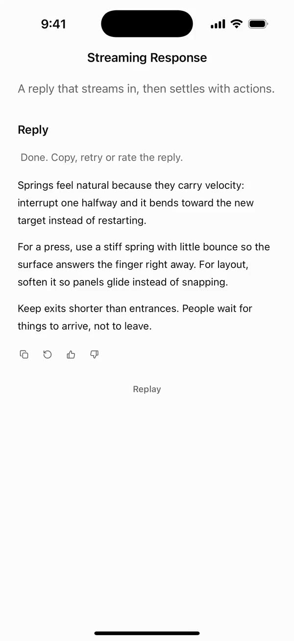
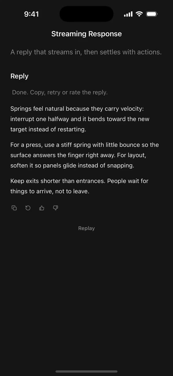
React NativeA reply that streams in, then settles with actions.
Preview
Install
Source on GitHubIt works in Expo and in bare React Native. New to beUI Native? Set up your app first.
Copies the component and the shared files it needs into src/, adds the theme tokens if they're missing, and installs its libraries. Files you've changed are kept.
Keep the folder layout, since the component imports the shared files by relative path.
1Install the libraries
npx expo install react-native-reanimated react-native-svg react-native-worklets
npm install uniwind tailwindcss2Add the theme tokens
Once per app. Import it from the CSS file Uniwind reads, after Tailwind and Uniwind, and change the values to match your brand.
/* Matches the default beUI palette in ui-components/lib/themes.ts.
   Native surface maps to card; muted maps to muted-foreground. */
@layer theme {
  :root {
    @variant light {
      --color-background: oklch(99% 0 0);
      --color-surface: oklch(97% 0 0);
      --color-foreground: oklch(15% 0 0);
      --color-muted: oklch(50% 0 0);
      --color-border: oklch(15% 0 0 / 0.06);
      --color-border-strong: oklch(15% 0 0 / 0.16);
      --color-primary: #0285f7;
      --color-on-primary: #ffffff;
      --color-destructive: #dc2626;
      --color-success: #059669;
      --color-warning: #d97706;
    }
  }

  :root {
    @variant dark {
      --color-background: #151515;
      --color-surface: #1c1c1c;
      --color-foreground: oklch(96% 0 0);
      --color-muted: oklch(62% 0 0);
      --color-border: rgb(255 255 255 / 0.05);
      --color-border-strong: rgb(255 255 255 / 0.14);
      --color-primary: #0285f7;
      --color-on-primary: #ffffff;
      --color-destructive: #f87171;
      --color-success: #34d399;
      --color-warning: #fbbf24;
    }
  }

  /* Tailwind's default monospace stack isn't a font React Native can load. */
  :root {
    @variant ios {
      --font-mono: Menlo;
    }
  }

  :root {
    @variant android {
      --font-mono: monospace;
    }
  }
}
3Copy the shared files
import { type ReactNode, useEffect, useRef, useState } from "react";
import {
  Image,
  Linking,
  Modal,
  Pressable,
  StyleSheet,
  Text,
  useWindowDimensions,
  View,
  type ViewProps,
} from "react-native";
import Animated, {
  ReduceMotion,
  useAnimatedStyle,
  useSharedValue,
  withSpring,
  withTiming,
} from "react-native-reanimated";
import { scheduleOnRN } from "react-native-worklets";
import { useResolveClassNames } from "uniwind";
import { useReducedMotionPreference } from "../../hooks/use-reduced-motion";
import {
  BookGlyph,
  ChevronDownGlyph,
  ExternalGlyph,
  GlobeGlyph,
} from "../../primitives/agent-icons";
import { Disclosure } from "../../primitives/disclosure";
import { RiseIn } from "../../primitives/rise-in";
import { EASE_OUT, SPRING_SWAP } from "../../styles/motion";

export type CitationItem = {
  id: string;
  title: string;
  domain?: string;
  /** Opens on tap, and supplies the favicon. */
  url?: string;
  /** Replaces the favicon, such as a document icon for files. */
  icon?: ReactNode;
};

const SPRING_POP = {
  stiffness: 420,
  damping: 32,
  mass: 0.6,
  reduceMotion: ReduceMotion.System,
};
const CARD_EXIT = { duration: 140, easing: EASE_OUT };
const CARD_WIDTH = 288;
const EDGE = 16;
const GAP = 8;

function faviconFor(url?: string) {
  if (!url) return null;
  try {
    return new URL("/favicon.ico", url).toString();
  } catch {
    return null;
  }
}

export type CitationFaviconProps = {
  url?: string;
  icon?: ReactNode;
  size?: number;
};

/** A source's favicon, its custom icon, or a globe when neither loads. */
export function CitationFavicon({
  url,
  icon,
  size = 16,
}: CitationFaviconProps) {
  const [failed, setFailed] = useState<string | null>(null);
  const { color: muted } = useResolveClassNames("text-muted");
  const src = faviconFor(url);
  return (
    <View
      accessibilityElementsHidden
      importantForAccessibility="no-hide-descendants"
      style={[styles.favicon, { width: size + 4, height: size + 4 }]}
    >
      {icon ? (
        icon
      ) : src && src !== failed ? (
        <Image
          source={{ uri: src }}
          onError={() => setFailed(src)}
          style={{ width: size, height: size, borderRadius: 3 }}
        />
      ) : (
        <GlobeGlyph size={size - 2} color={muted} />
      )}
    </View>
  );
}

export type CitationStackProps = { citations: CitationItem[]; limit?: number };

/** Up to `limit` (3) overlapping favicons, as a compact hint of the sources. */
export function CitationStack({ citations, limit = 3 }: CitationStackProps) {
  return (
    <View
      accessibilityElementsHidden
      importantForAccessibility="no-hide-descendants"
      style={styles.stack}
    >
      {citations.slice(0, limit).map((item, index) => (
        <View
          key={item.id}
          style={[styles.stackItem, index > 0 && styles.overlap]}
          className="border-2 border-background bg-background"
        >
          <CitationFavicon url={item.url} icon={item.icon} size={14} />
        </View>
      ))}
    </View>
  );
}

function open(item: CitationItem, onOpenSource?: (item: CitationItem) => void) {
  if (onOpenSource) onOpenSource(item);
  else if (item.url) void Linking.openURL(item.url);
}

type Anchor = { x: number; y: number; width: number; height: number };

/** The card a tapped marker springs up into. */
function SourceCard({
  item,
  index,
  anchor,
  visible,
  reduce,
  onOpenSource,
  onClose,
}: {
  item: CitationItem;
  index: number;
  anchor: Anchor | null;
  visible: boolean;
  reduce: boolean;
  onOpenSource?: (item: CitationItem) => void;
  onClose: () => void;
}) {
  const window = useWindowDimensions();
  const [present, setPresent] = useState(visible);
  const [height, setHeight] = useState(0);
  const progress = useSharedValue(0);
  if (visible && !present) setPresent(true);
  const hide = () => setPresent(false);

  useEffect(() => {
    if (!present) return;
    if (visible)
      progress.value = reduce
        ? withTiming(1, { duration: 120 })
        : withSpring(1, SPRING_POP);
    else
      progress.value = withTiming(
        0,
        reduce ? { duration: 120 } : CARD_EXIT,
        (done) => {
          if (done) scheduleOnRN(hide);
        },
      );
  }, [present, progress, reduce, visible]);

  const style = useAnimatedStyle(() => {
    const p = progress.value;
    return {
      opacity: Math.min(1, p * 1.5),
      transform: reduce ? [] : [{ scale: 0.6 + p * 0.4 }],
    };
  }, [reduce]);

  if (!present || !anchor) return null;
  const width = Math.min(CARD_WIDTH, window.width - EDGE * 2);
  const left = Math.max(
    EDGE,
    Math.min(
      anchor.x + anchor.width / 2 - width / 2,
      window.width - width - EDGE,
    ),
  );
  // Above the marker when there's room, otherwise below it.
  const above = anchor.y - GAP - height > EDGE + 40;
  const top = above ? anchor.y - GAP - height : anchor.y + anchor.height + GAP;
  const originX = anchor.x + anchor.width / 2 - left;

  return (
    <Modal
      transparent
      visible
      animationType="none"
      statusBarTranslucent
      navigationBarTranslucent
      onRequestClose={onClose}
    >
      <Pressable
        accessibilityLabel="Close source"
        style={StyleSheet.absoluteFill}
        onPress={onClose}
      />
      <Animated.View
        accessibilityViewIsModal
        onLayout={({ nativeEvent }) => setHeight(nativeEvent.layout.height)}
        style={[
          styles.card,
          {
            left,
            top,
            width,
            transformOrigin: [originX, above ? "100%" : "0%", 0],
          },
          style,
        ]}
        className="gap-3 rounded-2xl border border-border bg-background p-3"
      >
        <View style={styles.cardRow}>
          <CitationFavicon url={item.url} icon={item.icon} size={20} />
          <View style={styles.flex}>
            <Text
              numberOfLines={2}
              className="text-sm font-medium text-foreground"
            >
              {item.title}
            </Text>
            {item.domain ? (
              <Text numberOfLines={1} className="text-xs text-muted">
                {item.domain}
              </Text>
            ) : null}
          </View>
          <Text
            className="text-[10px] font-semibold text-muted"
            style={styles.tabular}
          >
            {index}
          </Text>
        </View>
        {item.url || onOpenSource ? (
          <Pressable
            accessibilityRole="link"
            onPress={() => {
              onClose();
              open(item, onOpenSource);
            }}
            style={styles.openButton}
            className="rounded-xl bg-primary active:opacity-80"
          >
            <Text className="text-sm font-medium text-on-primary">
              Open source
            </Text>
          </Pressable>
        ) : null}
      </Animated.View>
    </Modal>
  );
}

export type CitationProps = {
  item: CitationItem;
  /** The number shown, usually the source's position starting at 1. */
  index: number;
  /** Replaces opening the URL. */
  onOpenSource?: (item: CitationItem) => void;
  /** Defaults to "Citation {index}: {title}". */
  label?: string;
  disableAnimation?: boolean;
};

/**
 * An inline citation number. Tapping it springs a card up out of the marker
 * with the source and a button to open it, so you never lose your place.
 */
export function Citation({
  item,
  index,
  onOpenSource,
  label,
  disableAnimation = false,
}: CitationProps) {
  const reducedMotion = useReducedMotionPreference();
  const reduce = reducedMotion || disableAnimation;
  const ref = useRef<View>(null);
  const [anchor, setAnchor] = useState<Anchor | null>(null);
  const [visible, setVisible] = useState(false);

  return (
    // One inline view: the card's modal lives inside the marker so it adds
    // nothing to the line of text around it.
    <Pressable
      ref={ref}
      accessibilityRole="button"
      accessibilityLabel={label ?? `Citation ${index}: ${item.title}`}
      hitSlop={10}
      onPress={() =>
        ref.current?.measureInWindow((x, y, width, height) => {
          setAnchor({ x, y, width, height });
          setVisible(true);
        })
      }
      style={styles.marker}
      className="rounded-md bg-surface active:bg-border-strong"
    >
      <Text
        className="text-[10px] font-semibold text-muted"
        style={styles.tabular}
      >
        {index}
      </Text>
      <SourceCard
        item={item}
        index={index}
        anchor={anchor}
        visible={visible}
        reduce={reduce}
        onOpenSource={onOpenSource}
        onClose={() => setVisible(false)}
      />
    </Pressable>
  );
}

function CitationRow({
  item,
  index,
  reduce,
  onOpenSource,
}: {
  item: CitationItem;
  index: number;
  reduce: boolean;
  onOpenSource?: (item: CitationItem) => void;
}) {
  const { color: muted } = useResolveClassNames("text-muted");
  const tappable = Boolean(item.url || onOpenSource);
  return (
    <RiseIn reduce={reduce}>
      <Pressable
        accessibilityRole={tappable ? "link" : undefined}
        accessibilityLabel={`${index}. ${item.title}${item.domain ? `, ${item.domain}` : ""}`}
        disabled={!tappable}
        onPress={() => open(item, onOpenSource)}
        style={styles.row}
        className="rounded-lg px-1.5 py-1.5 active:bg-surface"
      >
        <CitationFavicon url={item.url} icon={item.icon} />
        <View style={styles.flex}>
          <Text
            numberOfLines={1}
            className="text-sm font-medium text-foreground/80"
          >
            {item.title}
          </Text>
          {item.domain ? (
            <Text numberOfLines={1} className="text-xs text-muted/70">
              {item.domain}
            </Text>
          ) : null}
        </View>
        <View style={styles.badge} className="rounded-md bg-foreground/5">
          <Text
            className="text-[10px] font-semibold text-muted"
            style={styles.tabular}
          >
            {index}
          </Text>
        </View>
        {tappable ? <ExternalGlyph size={14} color={muted} /> : null}
      </Pressable>
    </RiseIn>
  );
}

export type CitationListProps = {
  citations: CitationItem[];
  onOpenSource?: (item: CitationItem) => void;
  disableAnimation?: boolean;
};

/** The sources as rows that rise in as they arrive. Tap one to open it. */
export function CitationList({
  citations,
  onOpenSource,
  disableAnimation = false,
}: CitationListProps) {
  const reducedMotion = useReducedMotionPreference();
  const reduce = reducedMotion || disableAnimation;
  return (
    <View className="gap-0.5">
      {citations.map((item, index) => (
        <CitationRow
          key={item.id}
          item={item}
          index={index + 1}
          reduce={reduce}
          onOpenSource={onOpenSource}
        />
      ))}
    </View>
  );
}

export type CitationsProps = Omit<ViewProps, "children"> & {
  citations: CitationItem[];
  /** Defaults to "Sources". */
  title?: string;
  open?: boolean;
  /** Defaults to false. */
  defaultOpen?: boolean;
  onOpenChange?: (open: boolean) => void;
  onOpenSource?: (item: CitationItem) => void;
  className?: string;
  disableAnimation?: boolean;
};

/** A "Sources" toggle with a count that folds open into the source list. */
export function Citations({
  citations,
  title = "Sources",
  open: controlledOpen,
  defaultOpen = false,
  onOpenChange,
  onOpenSource,
  className = "",
  disableAnimation = false,
  ...props
}: CitationsProps) {
  const reducedMotion = useReducedMotionPreference();
  const reduce = reducedMotion || disableAnimation;
  const [internalOpen, setInternalOpen] = useState(defaultOpen);
  const isOpen = controlledOpen ?? internalOpen;
  const turn = useSharedValue(isOpen ? 1 : 0);
  const { color: muted } = useResolveClassNames("text-muted");

  useEffect(() => {
    turn.value = reduce
      ? isOpen
        ? 1
        : 0
      : withSpring(isOpen ? 1 : 0, SPRING_SWAP);
  }, [isOpen, reduce, turn]);
  const chevronStyle = useAnimatedStyle(() => ({
    transform: [{ rotate: `${turn.value * 180}deg` }],
  }));

  const toggle = () => {
    if (controlledOpen === undefined) setInternalOpen(!isOpen);
    onOpenChange?.(!isOpen);
  };

  return (
    <View className={`w-full ${className}`} {...props}>
      <Pressable
        accessibilityRole="button"
        accessibilityState={{ expanded: isOpen }}
        accessibilityLabel={`${title}, ${citations.length}`}
        onPress={toggle}
        hitSlop={6}
        style={styles.trigger}
      >
        <BookGlyph size={16} color={muted} />
        <Text className="text-sm font-medium text-muted">{title}</Text>
        <View className="rounded-full bg-surface px-1.5 py-0.5">
          <Text
            className="text-[10px] font-semibold text-muted"
            style={styles.tabular}
          >
            {citations.length}
          </Text>
        </View>
        <Animated.View style={chevronStyle}>
          <ChevronDownGlyph size={14} color={muted} />
        </Animated.View>
      </Pressable>
      <Disclosure open={isOpen} reduce={reduce}>
        <View className="mt-1">
          <CitationList
            citations={citations}
            onOpenSource={onOpenSource}
            disableAnimation={disableAnimation}
          />
        </View>
      </Disclosure>
    </View>
  );
}

const styles = StyleSheet.create({
  flex: { flex: 1, minWidth: 0 },
  favicon: { alignItems: "center", justifyContent: "center" },
  stack: { flexDirection: "row" },
  stackItem: {
    width: 24,
    height: 24,
    borderRadius: 12,
    alignItems: "center",
    justifyContent: "center",
    overflow: "hidden",
  },
  overlap: { marginLeft: -6 },
  marker: {
    minWidth: 18,
    height: 18,
    paddingHorizontal: 4,
    alignItems: "center",
    justifyContent: "center",
    transform: [{ translateY: -2 }],
  },
  card: {
    position: "absolute",
    shadowColor: "#000",
    shadowOpacity: 0.12,
    shadowRadius: 24,
    shadowOffset: { width: 0, height: 10 },
    elevation: 8,
  },
  cardRow: { flexDirection: "row", alignItems: "flex-start", gap: 10 },
  openButton: { minHeight: 40, alignItems: "center", justifyContent: "center" },
  row: { flexDirection: "row", alignItems: "center", gap: 8, minHeight: 44 },
  badge: {
    width: 20,
    height: 20,
    alignItems: "center",
    justifyContent: "center",
  },
  trigger: {
    flexDirection: "row",
    alignItems: "center",
    gap: 8,
    minHeight: 36,
    alignSelf: "flex-start",
  },
  tabular: { fontVariant: ["tabular-nums"] },
});
import { useEffect, useRef, useState } from "react";

export type PresenceItem<T> = {
  key: string;
  value: T;
  /** False for the item present on first render, so it does not animate in. */
  appear: boolean;
  exiting: boolean;
};

/**
 * Keeps replaced items mounted while they animate out, like AnimatePresence.
 * A key that returns while exiting is revived in place.
 */
export function usePresence<T>(
  key: string | null,
  value: T,
  exitDuration: (value: T) => number,
) {
  const [items, setItems] = useState<PresenceItem<T>[]>(() =>
    key === null ? [] : [{ key, value, appear: false, exiting: false }],
  );
  const [currentKey, setCurrentKey] = useState(key);
  const exitDurationRef = useRef(exitDuration);
  exitDurationRef.current = exitDuration;

  // Adjust during render so the new item and the exits start in the same frame.
  if (key !== currentKey) {
    setCurrentKey(key);
    setItems((previous) => {
      const next = previous.map((item) =>
        item.key === key
          ? { ...item, value, exiting: false }
          : { ...item, exiting: true },
      );
      if (key !== null && !previous.some((item) => item.key === key)) {
        next.push({ key, value, appear: true, exiting: false });
      }
      return next;
    });
  }

  const exitingKeys = items
    .filter((item) => item.exiting)
    .map((item) => item.key)
    .join("\n");

  useEffect(() => {
    if (!exitingKeys) return;
    const timers = items
      .filter((item) => item.exiting)
      .map((item) =>
        setTimeout(() => {
          setItems((previous) =>
            previous.filter(
              (candidate) => !(candidate.key === item.key && candidate.exiting),
            ),
          );
        }, exitDurationRef.current(item.value)),
      );
    return () => {
      for (const timer of timers) clearTimeout(timer);
    };
    // Restart removal timers only when the set of exiting items changes.
  }, [exitingKeys]);

  return items;
}
import { useEffect, useState } from "react";
import { AccessibilityInfo } from "react-native";
import { useReducedMotion } from "react-native-reanimated";

/** Reanimated supplies a synchronous initial value; native events keep it current. */
export function useReducedMotionPreference() {
  const initialValue = useReducedMotion();
  const [reducedMotion, setReducedMotion] = useState(initialValue);

  useEffect(() => {
    let active = true;
    let receivedEvent = false;
    const subscription = AccessibilityInfo.addEventListener(
      "reduceMotionChanged",
      (value) => {
        receivedEvent = true;
        setReducedMotion(value);
      },
    );
    void AccessibilityInfo.isReduceMotionEnabled().then((value) => {
      if (active && !receivedEvent) setReducedMotion(value);
    });
    return () => {
      active = false;
      subscription.remove();
    };
  }, []);

  return reducedMotion;
}
import type { ReactNode } from "react";
import type { ColorValue } from "react-native";
import Svg, { Circle, Path, Rect } from "react-native-svg";

type GlyphProps = { size?: number; color?: ColorValue; strokeWidth?: number };

function Glyph({
  size = 16,
  color = "currentColor",
  strokeWidth = 2,
  children,
}: GlyphProps & { children: ReactNode }) {
  return (
    <Svg
      width={size}
      height={size}
      viewBox="0 0 24 24"
      fill="none"
      stroke={color}
      strokeWidth={strokeWidth}
      strokeLinecap="round"
      strokeLinejoin="round"
    >
      {children}
    </Svg>
  );
}

// Simple 24-unit stroke glyphs shared by the agent components.

export function ChevronDownGlyph(props: GlyphProps) {
  return (
    <Glyph {...props}>
      <Path d="M6 9l6 6 6-6" />
    </Glyph>
  );
}

export function ArrowUpGlyph(props: GlyphProps) {
  return (
    <Glyph {...props}>
      <Path d="M12 19V5M5.5 11.5L12 5l6.5 6.5" />
    </Glyph>
  );
}

export function PlusGlyph(props: GlyphProps) {
  return (
    <Glyph {...props}>
      <Path d="M12 5v14M5 12h14" />
    </Glyph>
  );
}

export function StopGlyph({ size = 12, color }: GlyphProps) {
  return (
    <Svg width={size} height={size} viewBox="0 0 12 12">
      <Rect x={1} y={1} width={10} height={10} rx={2.5} fill={color} />
    </Svg>
  );
}

export function CheckGlyph(props: GlyphProps) {
  return (
    <Glyph {...props}>
      <Path d="M5 12.5l4.5 4.5L19 7" />
    </Glyph>
  );
}

export function CopyGlyph(props: GlyphProps) {
  return (
    <Glyph {...props}>
      <Rect x={8.5} y={8.5} width={12} height={12} rx={2.5} />
      <Path d="M15.5 5.5v-.5A2 2 0 0 0 13.5 3h-8.5A2 2 0 0 0 3 5v8.5a2 2 0 0 0 2 2h.5" />
    </Glyph>
  );
}

export function RetryGlyph(props: GlyphProps) {
  return (
    <Glyph {...props}>
      <Path d="M3.5 12a8.5 8.5 0 1 0 2.6-6.1L3.5 8.5" />
      <Path d="M3.5 3.5v5h5" />
    </Glyph>
  );
}

export function ThumbGlyph({
  down = false,
  ...props
}: GlyphProps & { down?: boolean }) {
  return (
    <Glyph {...props}>
      <Path
        d="M7.5 10.5v10M7.5 10.5L11 3.5a2.5 2.5 0 0 1 2.5 2.5v3.5h5a2 2 0 0 1 2 2.3l-1.2 7A2 2 0 0 1 17.3 20.5H4.5a1 1 0 0 1-1-1v-8a1 1 0 0 1 1-1z"
        transform={down ? "rotate(180 12 12)" : undefined}
      />
    </Glyph>
  );
}

export function SearchGlyph(props: GlyphProps) {
  return (
    <Glyph {...props}>
      <Circle cx={11} cy={11} r={6.5} />
      <Path d="M16 16l4 4" />
    </Glyph>
  );
}

export function GlobeGlyph(props: GlyphProps) {
  return (
    <Glyph {...props}>
      <Circle cx={12} cy={12} r={8.5} />
      <Path d="M3.5 12h17M12 3.5c2.4 2.5 3.5 5.3 3.5 8.5s-1.1 6-3.5 8.5c-2.4-2.5-3.5-5.3-3.5-8.5s1.1-6 3.5-8.5z" />
    </Glyph>
  );
}

export function FileGlyph(props: GlyphProps) {
  return (
    <Glyph {...props}>
      <Path d="M14 3.5H7.5a2 2 0 0 0-2 2v13a2 2 0 0 0 2 2h9a2 2 0 0 0 2-2V8z" />
      <Path d="M14 3.5V8h4.5M9 13h6M9 16.5h4" />
    </Glyph>
  );
}

export function PencilGlyph(props: GlyphProps) {
  return (
    <Glyph {...props}>
      <Path d="M4 20h4L19 9a2.1 2.1 0 0 0-4-4L4 16z" />
      <Path d="M13.5 6.5l4 4M14 20h6" />
    </Glyph>
  );
}

export function TerminalGlyph(props: GlyphProps) {
  return (
    <Glyph {...props}>
      <Rect x={3.5} y={4.5} width={17} height={15} rx={2.5} />
      <Path d="M7.5 10l2.5 2-2.5 2M12.5 15h4" />
    </Glyph>
  );
}

export function WrenchGlyph(props: GlyphProps) {
  return (
    <Glyph {...props}>
      <Path d="M14.5 6.5a4 4 0 0 0 5 5l-8.8 8.8a2.1 2.1 0 0 1-3-3l8.8-8.8a4 4 0 0 1-2-2z" />
    </Glyph>
  );
}

export function SparkleGlyph(props: GlyphProps) {
  return (
    <Glyph {...props}>
      <Path d="M12 4l1.8 4.6L18.5 10.5l-4.7 1.9L12 17l-1.8-4.6-4.7-1.9 4.7-1.9z" />
      <Path d="M18.5 16.5v3M17 18h3" />
    </Glyph>
  );
}

export function MessageGlyph(props: GlyphProps) {
  return (
    <Glyph {...props}>
      <Path d="M20 14.5a2 2 0 0 1-2 2H8.5L4 20V6a2 2 0 0 1 2-2h12a2 2 0 0 1 2 2z" />
    </Glyph>
  );
}

export function ImageGlyph(props: GlyphProps) {
  return (
    <Glyph {...props}>
      <Rect x={3.5} y={4.5} width={17} height={15} rx={2.5} />
      <Circle cx={9} cy={10} r={1.5} />
      <Path d="M20.5 15.5l-4.5-4.5-9 8.5" />
    </Glyph>
  );
}

export function ShieldGlyph(props: GlyphProps) {
  return (
    <Glyph {...props}>
      <Path d="M12 3.5l7 2.5v5.5c0 4.4-3 7.7-7 9-4-1.3-7-4.6-7-9V6z" />
      <Path d="M9 12l2 2 4-4" />
    </Glyph>
  );
}

export function AlertGlyph(props: GlyphProps) {
  return (
    <Glyph {...props}>
      <Circle cx={12} cy={12} r={8.5} />
      <Path d="M12 8v4.5M12 16h.01" />
    </Glyph>
  );
}

export function CrossGlyph(props: GlyphProps) {
  return (
    <Glyph {...props}>
      <Path d="M6.5 6.5l11 11M17.5 6.5l-11 11" />
    </Glyph>
  );
}

export function HelpGlyph(props: GlyphProps) {
  return (
    <Glyph {...props}>
      <Circle cx={12} cy={12} r={8.5} />
      <Path d="M9.6 9.5a2.5 2.5 0 0 1 4.8 1c0 1.7-2.4 2.2-2.4 3.5M12 16.8h.01" />
    </Glyph>
  );
}

export function ArrowGlyph({
  back = false,
  ...props
}: GlyphProps & { back?: boolean }) {
  return (
    <Glyph {...props}>
      <Path
        d="M5 12h14M13 6l6 6-6 6"
        transform={back ? "rotate(180 12 12)" : undefined}
      />
    </Glyph>
  );
}

export function BracesGlyph(props: GlyphProps) {
  return (
    <Glyph {...props}>
      <Path d="M8.5 4H8a2 2 0 0 0-2 2v3.5A2.5 2.5 0 0 1 3.5 12 2.5 2.5 0 0 1 6 14.5V18a2 2 0 0 0 2 2h.5M15.5 4h.5a2 2 0 0 1 2 2v3.5a2.5 2.5 0 0 0 2.5 2.5 2.5 2.5 0 0 0-2.5 2.5V18a2 2 0 0 1-2 2h-.5" />
    </Glyph>
  );
}

export function BanGlyph(props: GlyphProps) {
  return (
    <Glyph {...props}>
      <Circle cx={12} cy={12} r={8.5} />
      <Path d="M6 6l12 12" />
    </Glyph>
  );
}

export function CircleCheckGlyph(props: GlyphProps) {
  return (
    <Glyph {...props}>
      <Circle cx={12} cy={12} r={8.5} />
      <Path d="M8.5 12.2l2.4 2.4 4.6-4.8" />
    </Glyph>
  );
}

export function CircleCrossGlyph(props: GlyphProps) {
  return (
    <Glyph {...props}>
      <Circle cx={12} cy={12} r={8.5} />
      <Path d="M9.5 9.5l5 5M14.5 9.5l-5 5" />
    </Glyph>
  );
}

export function ListGlyph(props: GlyphProps) {
  return (
    <Glyph {...props}>
      <Path d="M4 6.5l1.5 1.5L8 5.5M4 13l1.5 1.5L8 12M11.5 7h8.5M11.5 13.5h8.5M11.5 19h8.5M4.5 19h2" />
    </Glyph>
  );
}

/** An open ring, spun by SpinGlyph. */
export function RingGlyph(props: GlyphProps) {
  return (
    <Glyph {...props}>
      <Path d="M20.5 12a8.5 8.5 0 1 1-6-8.1" />
    </Glyph>
  );
}

export function ReplyGlyph(props: GlyphProps) {
  return (
    <Glyph {...props}>
      <Path d="M9.5 7L4.5 12l5 5M4.5 12h10a5 5 0 0 1 5 5v1" />
    </Glyph>
  );
}

export function WrapGlyph(props: GlyphProps) {
  return (
    <Glyph {...props}>
      <Path d="M4 6.5h16M4 12h12.5a3.25 3.25 0 0 1 0 6.5H12M4 18.5h4.5M14 16.5l-2 2 2 2" />
    </Glyph>
  );
}

export function BookGlyph(props: GlyphProps) {
  return (
    <Glyph {...props}>
      <Path d="M12 6.5c-1.6-1.3-4-2-7.5-2v13c3.5 0 5.9.7 7.5 2 1.6-1.3 4-2 7.5-2v-13c-3.5 0-5.9.7-7.5 2zM12 6.5v13" />
    </Glyph>
  );
}

export function ExternalGlyph(props: GlyphProps) {
  return (
    <Glyph {...props}>
      <Path d="M14 4.5h5.5V10M19.5 4.5L11 13M17 14v4a2 2 0 0 1-2 2H6a2 2 0 0 1-2-2V9a2 2 0 0 1 2-2h4" />
    </Glyph>
  );
}

export function DoubleCheckGlyph(props: GlyphProps) {
  return (
    <Glyph {...props}>
      <Path d="M2.5 12.5l4.5 4.5 9-9.5M12 16.5l.5.5 9-9.5" />
    </Glyph>
  );
}

export function ClockGlyph(props: GlyphProps) {
  return (
    <Glyph {...props}>
      <Circle cx={12} cy={12} r={8.5} />
      <Path d="M12 7.5V12l3 2" />
    </Glyph>
  );
}

export function MicGlyph(props: GlyphProps) {
  return (
    <Glyph {...props}>
      <Rect x={9} y={3.5} width={6} height={11} rx={3} />
      <Path d="M5.5 11a6.5 6.5 0 0 0 13 0M12 17.5v3" />
    </Glyph>
  );
}
import { type ReactNode, useEffect, useRef } from "react";
import { StyleSheet, View, type ViewStyle } from "react-native";
import Animated, {
  measure,
  useAnimatedRef,
  useAnimatedStyle,
  useSharedValue,
  withTiming,
} from "react-native-reanimated";
import { scheduleOnUI } from "react-native-worklets";
import { EASE_OUT } from "../styles/motion";

const OPEN = { duration: 220, easing: EASE_OUT };
const CLOSE = { duration: 140, easing: EASE_OUT };
const DROP = 4;
// The height while settled open: unconstrained, so growing content just flows.
const NATURAL = -1;

export type DisclosureProps = {
  open: boolean;
  /** Snaps open and closed, keeping only the fade. */
  reduce: boolean;
  /** Caps the open height; content clips beyond it. */
  maxHeight?: number;
  style?: ViewStyle;
  children: ReactNode;
};

/**
 * Collapsible content shared by the agent components: the height eases
 * between closed and the content's size while the content fades and drops 4
 * points into place. Settled open, the height is left alone, so content that
 * grows (streamed rows, new sources) is never clipped. Closed content is
 * hidden from screen readers and touches.
 */
export function Disclosure({
  open,
  reduce,
  maxHeight,
  style,
  children,
}: DisclosureProps) {
  // The content's height, kept current by layout events; measuring on demand
  // can read 0 for content inside a scroll view.
  const contentHeight = useSharedValue(0);
  const clipRef = useAnimatedRef<Animated.View>();
  const height = useSharedValue(open ? NATURAL : 0);
  const shown = useSharedValue(open ? 1 : 0);
  const mounted = useRef(false);

  useEffect(() => {
    // The first render is already in place.
    if (!mounted.current) {
      mounted.current = true;
      return;
    }
    const cap = maxHeight ?? Number.POSITIVE_INFINITY;
    scheduleOnUI(() => {
      "worklet";
      // Real sizes, read on the UI thread at the moment of the change.
      const full = Math.min(contentHeight.value, cap);
      if (open) {
        const from = height.value === NATURAL ? full : height.value;
        if (reduce) {
          height.value = NATURAL;
        } else {
          height.value = from;
          height.value = withTiming(full, OPEN, (done) => {
            if (done) height.value = NATURAL;
          });
        }
      } else {
        const clip = measure(clipRef);
        const from =
          height.value === NATURAL ? (clip?.height ?? full) : height.value;
        height.value = from;
        height.value = reduce ? 0 : withTiming(0, CLOSE);
      }
    });
    shown.value = withTiming(
      open ? 1 : 0,
      reduce ? { duration: 0 } : open ? OPEN : CLOSE,
    );
  }, [clipRef, contentHeight, height, maxHeight, open, reduce, shown]);

  const clipStyle = useAnimatedStyle(() =>
    // Settled open, the clip follows the content's measured height.
    height.value === NATURAL
      ? {
          height: Math.min(
            contentHeight.value,
            maxHeight ?? Number.POSITIVE_INFINITY,
          ),
        }
      : { height: height.value },
  );
  const contentStyle = useAnimatedStyle(
    () => ({
      opacity: shown.value,
      transform: [{ translateY: reduce ? 0 : (1 - shown.value) * -DROP }],
    }),
    [reduce],
  );

  return (
    <Animated.View
      ref={clipRef}
      pointerEvents={open ? "auto" : "none"}
      accessibilityElementsHidden={!open}
      importantForAccessibility={open ? "auto" : "no-hide-descendants"}
      style={[styles.clip, clipStyle, style]}
    >
      {/* Absolutely placed, so the content keeps its natural height while the
          clip around it is short, and can be measured at any time. */}
      <Animated.View style={[styles.content, contentStyle]}>
        <View
          style={styles.measure}
          onLayout={({ nativeEvent }) => {
            contentHeight.value = nativeEvent.layout.height;
          }}
        >
          {children}
        </View>
      </Animated.View>
    </Animated.View>
  );
}

const styles = StyleSheet.create({
  clip: { overflow: "hidden" },
  content: { position: "absolute", left: 0, right: 0, top: 0 },
  measure: { flexShrink: 0 },
});
import { type ReactNode, useEffect } from "react";
import type { ViewProps } from "react-native";
import Animated, {
  LinearTransition,
  useAnimatedStyle,
  useSharedValue,
  withSpring,
  withTiming,
} from "react-native-reanimated";
import { EASE_OUT, SPRING_LAYOUT } from "../styles/motion";

const FADE = { duration: 180, easing: EASE_OUT };
const RISE = 6;
const EXIT_DURATION = 140;

/** Leaving rows reverse their entrance: fade and lift 3 points away. */
function riseOut() {
  "worklet";
  return {
    initialValues: { opacity: 1, transform: [{ translateY: 0 }] },
    animations: {
      opacity: withTiming(0, { duration: EXIT_DURATION, easing: EASE_OUT }),
      transform: [
        {
          translateY: withTiming(-3, {
            duration: EXIT_DURATION,
            easing: EASE_OUT,
          }),
        },
      ],
    },
  };
}

const GLIDE = LinearTransition.springify()
  .stiffness(SPRING_LAYOUT.stiffness)
  .damping(SPRING_LAYOUT.damping)
  .mass(SPRING_LAYOUT.mass);

/**
 * A row that fades and rises 6 points into place when it mounts, and lifts
 * away as it leaves, while its neighbours glide to make room. Shared by the agent activity lists.
 */
export function RiseIn({
  reduce,
  appear = true,
  children,
  style,
  ...props
}: ViewProps & { reduce: boolean; appear?: boolean; children: ReactNode }) {
  const animate = appear && !reduce;
  const opacity = useSharedValue(animate ? 0 : 1);
  const lift = useSharedValue(animate ? RISE : 0);

  // Plays once, on mount.
  useEffect(() => {
    if (!animate) return;
    opacity.value = withTiming(1, FADE);
    lift.value = withSpring(0, SPRING_LAYOUT);
  }, []);

  const rise = useAnimatedStyle(() => ({
    opacity: opacity.value,
    transform: [{ translateY: lift.value }],
  }));

  return (
    <Animated.View
      layout={reduce ? undefined : GLIDE}
      exiting={reduce ? undefined : riseOut}
      style={[rise, style]}
      {...props}
    >
      {children}
    </Animated.View>
  );
}
import { Easing, ReduceMotion } from "react-native-reanimated";

// Mirrors beUI's lib/ease.ts so native motion matches the web library.

export const EASE_OUT = Easing.bezier(0.16, 1, 0.3, 1);
export const EASE_IN_OUT = Easing.bezier(0.77, 0, 0.175, 1);

/** Press feedback on buttons and other tappable surfaces. */
export const SPRING_PRESS = {
  stiffness: 500,
  damping: 30,
  mass: 0.6,
  reduceMotion: ReduceMotion.System,
} as const;

/** Content swaps: label and icon slots trading places inside a control. */
export const SPRING_SWAP = {
  stiffness: 460,
  damping: 30,
  mass: 0.55,
  reduceMotion: ReduceMotion.System,
} as const;

/** Shared-layout glides: pills, indicators and panels moving between positions. */
export const SPRING_LAYOUT = {
  stiffness: 360,
  damping: 32,
  mass: 0.6,
  reduceMotion: ReduceMotion.System,
} as const;

/** Dragged handles and fills; critically damped so values never rebound off an end. */
export const SPRING_GLIDE = {
  stiffness: 700,
  damping: 50,
  mass: 0.5,
  reduceMotion: ReduceMotion.System,
} as const;

export const motion = {
  press: SPRING_PRESS,
  swap: SPRING_SWAP,
  layout: SPRING_LAYOUT,
  glide: SPRING_GLIDE,
  exit: { duration: 160, easing: EASE_OUT, reduceMotion: ReduceMotion.System },
  fade: { duration: 150, reduceMotion: ReduceMotion.System },
} as const;
4Copy the component
export type {
  StreamingResponseFeedback,
  StreamingResponseProps,
  StreamingResponseStatus,
} from "./streaming-response";
export { StreamingResponse } from "./streaming-response";
import { Children, type ReactNode, useEffect, useRef, useState } from "react";
import {
  Pressable,
  StyleSheet,
  Text,
  View,
  type ViewProps,
} from "react-native";
import Animated, {
  useAnimatedProps,
  useAnimatedStyle,
  useSharedValue,
  withDelay,
  withSpring,
  withTiming,
} from "react-native-reanimated";
import Svg, { Path } from "react-native-svg";
import { useResolveClassNames } from "uniwind";
import { usePresence } from "../../hooks/use-presence";
import { useReducedMotionPreference } from "../../hooks/use-reduced-motion";
import {
  ChevronDownGlyph,
  CopyGlyph,
  RetryGlyph,
  ThumbGlyph,
} from "../../primitives/agent-icons";
import { Disclosure } from "../../primitives/disclosure";
import { EASE_OUT, SPRING_PRESS, SPRING_SWAP } from "../../styles/motion";
import {
  type CitationItem,
  CitationList,
  CitationStack,
} from "../citations/citations";

export type StreamingResponseStatus = "streaming" | "complete" | "error";
export type StreamingResponseFeedback = "up" | "down" | null;

const BAR_IN = { duration: 220, easing: EASE_OUT };
const BAR_IN_REDUCED = { duration: 120 };
const COPIED_FOR = 1600;

function ActionButton({
  label,
  pressed,
  reduce,
  onPress,
  children,
}: {
  label: string;
  pressed?: boolean;
  reduce: boolean;
  onPress: () => void;
  children: ReactNode;
}) {
  const scale = useSharedValue(1);
  const style = useAnimatedStyle(() => ({
    transform: [{ scale: scale.value }],
  }));
  return (
    <Pressable
      accessibilityRole="button"
      accessibilityLabel={label}
      accessibilityState={
        pressed === undefined ? undefined : { selected: pressed }
      }
      hitSlop={8}
      onPress={onPress}
      onPressIn={() => {
        if (!reduce) scale.value = withSpring(0.9, SPRING_PRESS);
      }}
      onPressOut={() => {
        scale.value = withSpring(1, SPRING_PRESS);
      }}
    >
      <Animated.View
        style={[styles.action, style]}
        className={pressed ? "bg-surface" : ""}
      >
        {children}
      </Animated.View>
    </Pressable>
  );
}

/** Copy trades places with a check, which rolls in from below. */
const AnimatedPath = Animated.createAnimatedComponent(Path);
// The check from CheckGlyph, and its length for drawing it on.
const CHECK = "M5 12.5l4.5 4.5L19 7";
const CHECK_LENGTH = Math.hypot(4.5, 4.5) + Math.hypot(9.5, 10);
const ICON_OUT = { duration: 110, easing: EASE_OUT };
const DRAW = { duration: 260, easing: EASE_OUT };
const DRAW_DELAY = 60;

/**
 * A check that draws itself on, left to right. The path is redrawn each
 * frame, so it stays crisp where a scaled glyph would blur.
 */
function DrawnCheck({ color, reduce }: { color: unknown; reduce: boolean }) {
  const drawn = useSharedValue(reduce ? 1 : 0);
  // Draws once, on mount.
  useEffect(() => {
    if (!reduce) drawn.value = withDelay(DRAW_DELAY, withTiming(1, DRAW));
  }, []);
  const props = useAnimatedProps(() => ({
    strokeDashoffset: CHECK_LENGTH * (1 - drawn.value),
    // A zero-length stroke still shows its round cap as a dot.
    strokeOpacity: drawn.value > 0.02 ? 1 : 0,
  }));
  return (
    <Svg width={14} height={14} viewBox="0 0 24 24" fill="none">
      <AnimatedPath
        d={CHECK}
        stroke={color as string}
        strokeWidth={2.25}
        strokeLinecap="round"
        strokeLinejoin="round"
        strokeDasharray={`${CHECK_LENGTH} ${CHECK_LENGTH}`}
        animatedProps={props}
      />
    </Svg>
  );
}

/**
 * Copy hands off to a check: the copy icon slips down and fades, then the
 * check draws itself on. Coming back, the copy icon drops in from above.
 */
function SwapIcon({
  appear,
  exiting,
  reduce,
  children,
}: {
  appear: boolean;
  exiting: boolean;
  reduce: boolean;
  children: ReactNode;
}) {
  // 0 arriving, 1 resting, 2 gone.
  const progress = useSharedValue(appear && !reduce ? 0 : 1);
  useEffect(() => {
    if (reduce) progress.value = exiting ? 2 : 1;
    else if (exiting) progress.value = withTiming(2, ICON_OUT);
    else if (appear) progress.value = withSpring(1, SPRING_SWAP);
  }, [appear, exiting, progress, reduce]);
  // Only moves and fades: scaling a drawn glyph softens its strokes.
  const style = useAnimatedStyle(() => {
    const p = progress.value;
    return {
      opacity: p <= 1 ? Math.min(1, p) : Math.max(0, 2 - p),
      transform: reduce ? [] : [{ translateY: (p - 1) * 3 }],
    };
  }, [reduce]);
  return (
    <Animated.View style={[styles.layer, style]}>{children}</Animated.View>
  );
}

function wrapText(children: ReactNode, className: string) {
  return Children.map(children, (child) =>
    typeof child === "string" || typeof child === "number" ? (
      // Selectable, so a long press brings up the system copy and look-up menu.
      <Text selectable className={className}>
        {child}
      </Text>
    ) : (
      child
    ),
  );
}

export type StreamingResponseProps = Omit<ViewProps, "children"> & {
  /** Text, or the output of your Markdown renderer. Strings are styled for you. */
  children: ReactNode;
  /** Defaults to "streaming". Actions appear once it isn't. */
  status?: StreamingResponseStatus;
  /** Shows a copy button. Copy the text with your clipboard library here. */
  onCopy?: () => unknown;
  /** Shows a retry button. */
  onRetry?: () => void;
  feedback?: StreamingResponseFeedback;
  /** Defaults to null. */
  defaultFeedback?: StreamingResponseFeedback;
  /** Shows helpful and not helpful buttons once complete. */
  onFeedbackChange?: (feedback: StreamingResponseFeedback) => void;
  /** Sources behind the reply, shown as a stack and a count that opens the list. */
  sources?: CitationItem[];
  sourcesOpen?: boolean;
  /** Defaults to false. */
  defaultSourcesOpen?: boolean;
  onSourcesOpenChange?: (open: boolean) => void;
  /** Replaces opening a source's URL. */
  onOpenSource?: (item: CitationItem) => void;
  /** Defaults to true. */
  showActions?: boolean;
  /** Announces text as it arrives on Android. Turn off inside a live list. Defaults to true. */
  announce?: boolean;
  className?: string;
  /** Classes for the text column. */
  contentClassName?: string;
  /** Text classes applied to plain string children. */
  textClassName?: string;
  /** Shows the actions without motion, independently of the system preference. */
  disableAnimation?: boolean;
};

/**
 * An assistant reply that streams in, then settles with copy, retry and
 * feedback actions that rise in beneath it.
 */
export function StreamingResponse({
  children,
  status = "streaming",
  onCopy,
  onRetry,
  feedback: controlledFeedback,
  defaultFeedback = null,
  onFeedbackChange,
  sources = [],
  sourcesOpen: controlledSourcesOpen,
  defaultSourcesOpen = false,
  onSourcesOpenChange,
  onOpenSource,
  showActions = true,
  announce = true,
  className = "",
  contentClassName = "",
  textClassName = "text-sm leading-6 text-foreground",
  disableAnimation = false,
  ...props
}: StreamingResponseProps) {
  const reducedMotion = useReducedMotionPreference();
  const reduce = reducedMotion || disableAnimation;
  const streaming = status === "streaming";
  const complete = status === "complete";
  const [internalFeedback, setInternalFeedback] = useState(defaultFeedback);
  const feedback =
    controlledFeedback === undefined ? internalFeedback : controlledFeedback;
  const [copied, setCopied] = useState(false);
  const copiedTimer = useRef<ReturnType<typeof setTimeout> | undefined>(
    undefined,
  );
  const bar = useSharedValue(streaming ? 0 : 1);
  const { color: muted } = useResolveClassNames("text-muted");
  const { color: foreground } = useResolveClassNames("text-foreground");

  const [internalSourcesOpen, setInternalSourcesOpen] =
    useState(defaultSourcesOpen);
  const sourcesOpen = controlledSourcesOpen ?? internalSourcesOpen;
  const hasSources = sources.length > 0;
  const sourcesTurn = useSharedValue(sourcesOpen ? 1 : 0);
  useEffect(() => {
    sourcesTurn.value = reduce
      ? sourcesOpen
        ? 1
        : 0
      : withSpring(sourcesOpen ? 1 : 0, SPRING_SWAP);
  }, [reduce, sourcesOpen, sourcesTurn]);
  const sourcesChevron = useAnimatedStyle(() => ({
    transform: [{ rotate: `${sourcesTurn.value * 180}deg` }],
  }));
  const toggleSources = () => {
    if (controlledSourcesOpen === undefined)
      setInternalSourcesOpen(!sourcesOpen);
    onSourcesOpenChange?.(!sourcesOpen);
  };

  const hasActions =
    showActions &&
    !streaming &&
    Boolean(hasSources || onCopy || onRetry || (complete && onFeedbackChange));

  useEffect(() => {
    if (!hasActions) {
      bar.value = 0;
      return;
    }
    bar.value = withTiming(1, reduce ? BAR_IN_REDUCED : BAR_IN);
  }, [bar, hasActions, reduce]);

  useEffect(() => () => clearTimeout(copiedTimer.current), []);

  const barStyle = useAnimatedStyle(
    () => ({
      opacity: bar.value,
      transform: [{ translateY: reduce ? 0 : (1 - bar.value) * 4 }],
    }),
    [reduce],
  );

  const copy = async () => {
    await onCopy?.();
    setCopied(true);
    clearTimeout(copiedTimer.current);
    copiedTimer.current = setTimeout(() => setCopied(false), COPIED_FOR);
  };

  const rate = (next: Exclude<StreamingResponseFeedback, null>) => {
    const value = feedback === next ? null : next;
    if (controlledFeedback === undefined) setInternalFeedback(value);
    onFeedbackChange?.(value);
  };

  const copyIcons = usePresence(copied ? "check" : "copy", copied, () => 260);

  return (
    <View
      accessibilityState={{ busy: streaming }}
      className={className}
      {...props}
    >
      <View
        accessibilityLiveRegion={announce && streaming ? "polite" : "none"}
        className={`gap-3 ${contentClassName}`}
      >
        {wrapText(children, textClassName)}
      </View>
      {hasActions ? (
        <Animated.View style={[styles.bar, barStyle]}>
          {onCopy ? (
            <ActionButton
              label={copied ? "Copied" : "Copy"}
              reduce={reduce}
              onPress={() => void copy()}
            >
              {copyIcons.map((item) => (
                <SwapIcon
                  key={item.key}
                  appear={item.appear}
                  exiting={item.exiting}
                  reduce={reduce}
                >
                  {item.value ? (
                    <DrawnCheck color={foreground} reduce={reduce} />
                  ) : (
                    <CopyGlyph size={14} color={muted} />
                  )}
                </SwapIcon>
              ))}
            </ActionButton>
          ) : null}
          {onRetry ? (
            <ActionButton label="Retry" reduce={reduce} onPress={onRetry}>
              <RetryGlyph size={14} color={muted} />
            </ActionButton>
          ) : null}
          {complete && onFeedbackChange ? (
            <>
              <ActionButton
                label="Helpful"
                pressed={feedback === "up"}
                reduce={reduce}
                onPress={() => rate("up")}
              >
                <ThumbGlyph
                  size={14}
                  color={feedback === "up" ? foreground : muted}
                />
              </ActionButton>
              <ActionButton
                label="Not helpful"
                pressed={feedback === "down"}
                reduce={reduce}
                onPress={() => rate("down")}
              >
                <ThumbGlyph
                  down
                  size={14}
                  color={feedback === "down" ? foreground : muted}
                />
              </ActionButton>
            </>
          ) : null}
          {hasSources ? (
            <Pressable
              accessibilityRole="button"
              accessibilityState={{ expanded: sourcesOpen }}
              accessibilityLabel={`${sources.length} ${sources.length === 1 ? "source" : "sources"}`}
              onPress={toggleSources}
              hitSlop={6}
              style={styles.sources}
            >
              <CitationStack citations={sources} />
              <Text className="text-xs text-muted" style={styles.tabular}>
                {sources.length} {sources.length === 1 ? "source" : "sources"}
              </Text>
              <Animated.View style={sourcesChevron}>
                <ChevronDownGlyph size={12} color={muted} />
              </Animated.View>
            </Pressable>
          ) : null}
        </Animated.View>
      ) : null}
      {hasSources ? (
        <Disclosure open={sourcesOpen && hasActions} reduce={reduce}>
          <View className="mt-2 rounded-xl bg-surface p-2">
            <CitationList
              citations={sources}
              onOpenSource={onOpenSource}
              disableAnimation={disableAnimation}
            />
          </View>
        </Disclosure>
      ) : null}
    </View>
  );
}

const styles = StyleSheet.create({
  bar: {
    flexDirection: "row",
    alignItems: "center",
    gap: 2,
    marginTop: 12,
    marginLeft: -6,
  },
  action: {
    width: 30,
    height: 30,
    borderRadius: 8,
    alignItems: "center",
    justifyContent: "center",
  },
  layer: { position: "absolute" },
  sources: {
    flexDirection: "row",
    alignItems: "center",
    gap: 6,
    marginLeft: 8,
    minHeight: 30,
  },
  tabular: { fontVariant: ["tabular-nums"] },
});
Documentation
Native port of beUI Streaming Response: an assistant reply that streams in and then offers actions.
import * as Clipboard from "expo-clipboard";
import { StreamingResponse } from "./src";

<StreamingResponse
  status={done ? "complete" : "streaming"}
  onCopy={() => Clipboard.setStringAsync(text)}
  onRetry={retry}
  onFeedbackChange={(feedback) => rate(feedback)}
>
  {text}
</StreamingResponse>
Behavior
- Pass the text as it arrives, or your Markdown renderer's output. Plain strings, or an array of paragraphs, are styled for you; change their style with
textClassName. - Once
statusisn'tstreaming, the actions rise in beneath the reply: copy when you passonCopy, retry when you passonRetry, and helpful and not helpful oncecompletewhen you passonFeedbackChange. Tapping the chosen rating again clears it. - Copying swaps the icon to a check for 1600 ms. Copy with whatever clipboard library your app uses; the component doesn't depend on one.
- Control the rating with
feedback, or leave it uncontrolled withdefaultFeedback.
Pass sources to show a stack of favicons and a count beside the actions; tapping it folds open the source list from Citations.
Motion
The action row fades and rises 4 points over 220 ms. Buttons press to 0.9. Copying hands off cleanly: the copy icon slips down 3 points and fades in 110 ms, then the check draws itself on, left to right, over 260 ms. The two never overlap, and nothing is scaled, so the icons stay sharp throughout.
Better on a phone
Reply text is selectable, so a long press brings up the system menu to copy a sentence or look up a word, not just the whole reply.
Accessibility
- The reply is a polite live region on Android while streaming. Set
announce={false}inside a conversation that's already announced, such asMessageScroller. - It's marked busy while streaming.
- Ratings report whether they're selected.
- Reduced motion, or
disableAnimation, fades the actions in place.
Copy this directory, components/citations/, hooks/use-presence.ts, hooks/use-reduced-motion.ts, primitives/agent-icons.tsx, primitives/disclosure.tsx, primitives/rise-in.tsx, styles/motion.ts, and the semantic tokens in styles/theme.css. It uses react-native-svg for its icons.