
Tool Result
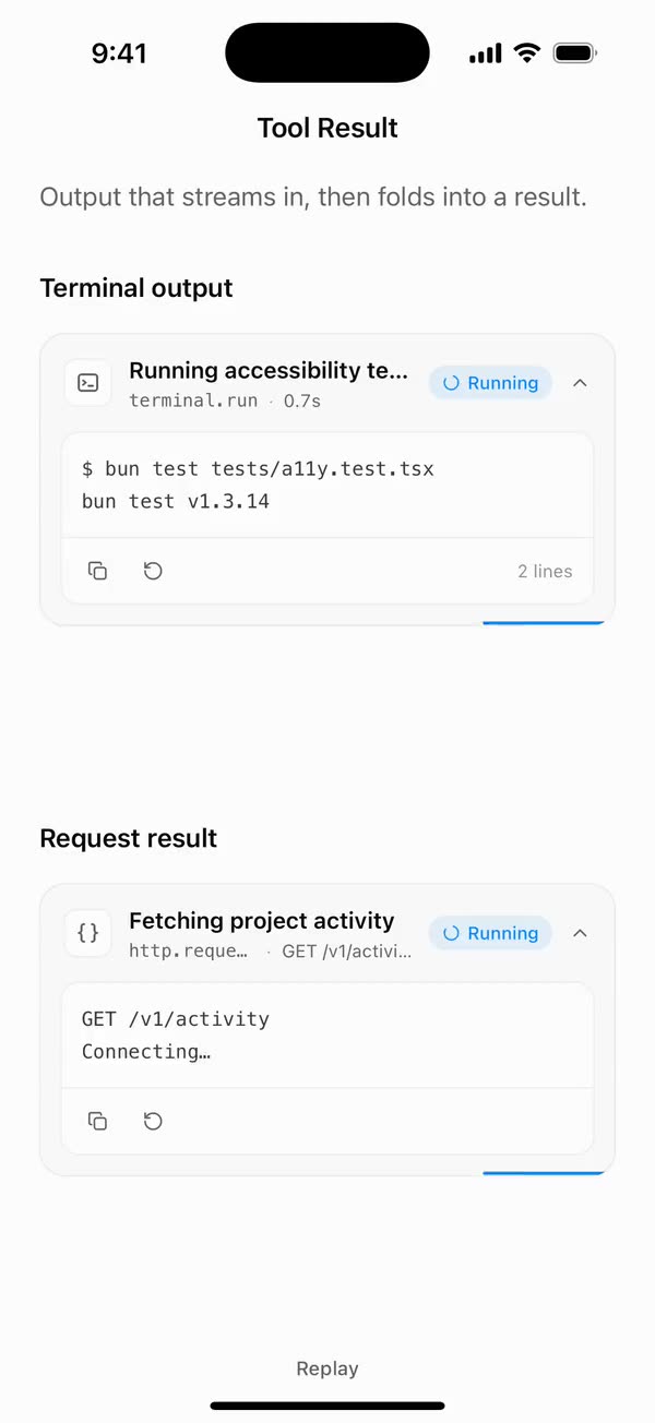
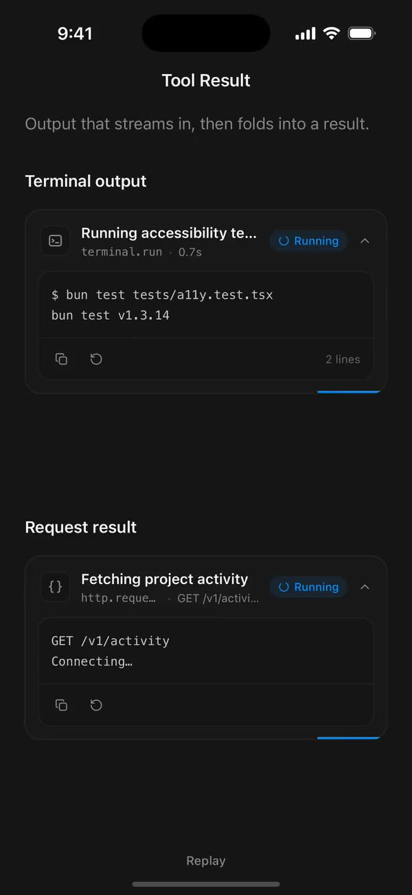
React NativeOutput that streams in, then folds into a result.
Preview
Install
Source on GitHubIt works in Expo and in bare React Native. New to beUI Native? Set up your app first.
Copies the component and the shared files it needs into src/, adds the theme tokens if they're missing, and installs its libraries. Files you've changed are kept.
Keep the folder layout, since the component imports the shared files by relative path.
1Install the libraries
npx expo install react-native-reanimated react-native-svg react-native-worklets
npm install uniwind tailwindcss2Add the theme tokens
Once per app. Import it from the CSS file Uniwind reads, after Tailwind and Uniwind, and change the values to match your brand.
/* Matches the default beUI palette in ui-components/lib/themes.ts.
   Native surface maps to card; muted maps to muted-foreground. */
@layer theme {
  :root {
    @variant light {
      --color-background: oklch(99% 0 0);
      --color-surface: oklch(97% 0 0);
      --color-foreground: oklch(15% 0 0);
      --color-muted: oklch(50% 0 0);
      --color-border: oklch(15% 0 0 / 0.06);
      --color-border-strong: oklch(15% 0 0 / 0.16);
      --color-primary: #0285f7;
      --color-on-primary: #ffffff;
      --color-destructive: #dc2626;
      --color-success: #059669;
      --color-warning: #d97706;
    }
  }

  :root {
    @variant dark {
      --color-background: #151515;
      --color-surface: #1c1c1c;
      --color-foreground: oklch(96% 0 0);
      --color-muted: oklch(62% 0 0);
      --color-border: rgb(255 255 255 / 0.05);
      --color-border-strong: rgb(255 255 255 / 0.14);
      --color-primary: #0285f7;
      --color-on-primary: #ffffff;
      --color-destructive: #f87171;
      --color-success: #34d399;
      --color-warning: #fbbf24;
    }
  }

  /* Tailwind's default monospace stack isn't a font React Native can load. */
  :root {
    @variant ios {
      --font-mono: Menlo;
    }
  }

  :root {
    @variant android {
      --font-mono: monospace;
    }
  }
}
3Copy the shared files
import { useEffect, useRef, useState } from "react";

export type PresenceItem<T> = {
  key: string;
  value: T;
  /** False for the item present on first render, so it does not animate in. */
  appear: boolean;
  exiting: boolean;
};

/**
 * Keeps replaced items mounted while they animate out, like AnimatePresence.
 * A key that returns while exiting is revived in place.
 */
export function usePresence<T>(
  key: string | null,
  value: T,
  exitDuration: (value: T) => number,
) {
  const [items, setItems] = useState<PresenceItem<T>[]>(() =>
    key === null ? [] : [{ key, value, appear: false, exiting: false }],
  );
  const [currentKey, setCurrentKey] = useState(key);
  const exitDurationRef = useRef(exitDuration);
  exitDurationRef.current = exitDuration;

  // Adjust during render so the new item and the exits start in the same frame.
  if (key !== currentKey) {
    setCurrentKey(key);
    setItems((previous) => {
      const next = previous.map((item) =>
        item.key === key
          ? { ...item, value, exiting: false }
          : { ...item, exiting: true },
      );
      if (key !== null && !previous.some((item) => item.key === key)) {
        next.push({ key, value, appear: true, exiting: false });
      }
      return next;
    });
  }

  const exitingKeys = items
    .filter((item) => item.exiting)
    .map((item) => item.key)
    .join("\n");

  useEffect(() => {
    if (!exitingKeys) return;
    const timers = items
      .filter((item) => item.exiting)
      .map((item) =>
        setTimeout(() => {
          setItems((previous) =>
            previous.filter(
              (candidate) => !(candidate.key === item.key && candidate.exiting),
            ),
          );
        }, exitDurationRef.current(item.value)),
      );
    return () => {
      for (const timer of timers) clearTimeout(timer);
    };
    // Restart removal timers only when the set of exiting items changes.
  }, [exitingKeys]);

  return items;
}
import { useEffect, useState } from "react";
import { AccessibilityInfo } from "react-native";
import { useReducedMotion } from "react-native-reanimated";

/** Reanimated supplies a synchronous initial value; native events keep it current. */
export function useReducedMotionPreference() {
  const initialValue = useReducedMotion();
  const [reducedMotion, setReducedMotion] = useState(initialValue);

  useEffect(() => {
    let active = true;
    let receivedEvent = false;
    const subscription = AccessibilityInfo.addEventListener(
      "reduceMotionChanged",
      (value) => {
        receivedEvent = true;
        setReducedMotion(value);
      },
    );
    void AccessibilityInfo.isReduceMotionEnabled().then((value) => {
      if (active && !receivedEvent) setReducedMotion(value);
    });
    return () => {
      active = false;
      subscription.remove();
    };
  }, []);

  return reducedMotion;
}
import type { ReactNode } from "react";
import type { ColorValue } from "react-native";
import Svg, { Circle, Path, Rect } from "react-native-svg";

type GlyphProps = { size?: number; color?: ColorValue; strokeWidth?: number };

function Glyph({
  size = 16,
  color = "currentColor",
  strokeWidth = 2,
  children,
}: GlyphProps & { children: ReactNode }) {
  return (
    <Svg
      width={size}
      height={size}
      viewBox="0 0 24 24"
      fill="none"
      stroke={color}
      strokeWidth={strokeWidth}
      strokeLinecap="round"
      strokeLinejoin="round"
    >
      {children}
    </Svg>
  );
}

// Simple 24-unit stroke glyphs shared by the agent components.

export function ChevronDownGlyph(props: GlyphProps) {
  return (
    <Glyph {...props}>
      <Path d="M6 9l6 6 6-6" />
    </Glyph>
  );
}

export function ArrowUpGlyph(props: GlyphProps) {
  return (
    <Glyph {...props}>
      <Path d="M12 19V5M5.5 11.5L12 5l6.5 6.5" />
    </Glyph>
  );
}

export function PlusGlyph(props: GlyphProps) {
  return (
    <Glyph {...props}>
      <Path d="M12 5v14M5 12h14" />
    </Glyph>
  );
}

export function StopGlyph({ size = 12, color }: GlyphProps) {
  return (
    <Svg width={size} height={size} viewBox="0 0 12 12">
      <Rect x={1} y={1} width={10} height={10} rx={2.5} fill={color} />
    </Svg>
  );
}

export function CheckGlyph(props: GlyphProps) {
  return (
    <Glyph {...props}>
      <Path d="M5 12.5l4.5 4.5L19 7" />
    </Glyph>
  );
}

export function CopyGlyph(props: GlyphProps) {
  return (
    <Glyph {...props}>
      <Rect x={8.5} y={8.5} width={12} height={12} rx={2.5} />
      <Path d="M15.5 5.5v-.5A2 2 0 0 0 13.5 3h-8.5A2 2 0 0 0 3 5v8.5a2 2 0 0 0 2 2h.5" />
    </Glyph>
  );
}

export function RetryGlyph(props: GlyphProps) {
  return (
    <Glyph {...props}>
      <Path d="M3.5 12a8.5 8.5 0 1 0 2.6-6.1L3.5 8.5" />
      <Path d="M3.5 3.5v5h5" />
    </Glyph>
  );
}

export function ThumbGlyph({
  down = false,
  ...props
}: GlyphProps & { down?: boolean }) {
  return (
    <Glyph {...props}>
      <Path
        d="M7.5 10.5v10M7.5 10.5L11 3.5a2.5 2.5 0 0 1 2.5 2.5v3.5h5a2 2 0 0 1 2 2.3l-1.2 7A2 2 0 0 1 17.3 20.5H4.5a1 1 0 0 1-1-1v-8a1 1 0 0 1 1-1z"
        transform={down ? "rotate(180 12 12)" : undefined}
      />
    </Glyph>
  );
}

export function SearchGlyph(props: GlyphProps) {
  return (
    <Glyph {...props}>
      <Circle cx={11} cy={11} r={6.5} />
      <Path d="M16 16l4 4" />
    </Glyph>
  );
}

export function GlobeGlyph(props: GlyphProps) {
  return (
    <Glyph {...props}>
      <Circle cx={12} cy={12} r={8.5} />
      <Path d="M3.5 12h17M12 3.5c2.4 2.5 3.5 5.3 3.5 8.5s-1.1 6-3.5 8.5c-2.4-2.5-3.5-5.3-3.5-8.5s1.1-6 3.5-8.5z" />
    </Glyph>
  );
}

export function FileGlyph(props: GlyphProps) {
  return (
    <Glyph {...props}>
      <Path d="M14 3.5H7.5a2 2 0 0 0-2 2v13a2 2 0 0 0 2 2h9a2 2 0 0 0 2-2V8z" />
      <Path d="M14 3.5V8h4.5M9 13h6M9 16.5h4" />
    </Glyph>
  );
}

export function PencilGlyph(props: GlyphProps) {
  return (
    <Glyph {...props}>
      <Path d="M4 20h4L19 9a2.1 2.1 0 0 0-4-4L4 16z" />
      <Path d="M13.5 6.5l4 4M14 20h6" />
    </Glyph>
  );
}

export function TerminalGlyph(props: GlyphProps) {
  return (
    <Glyph {...props}>
      <Rect x={3.5} y={4.5} width={17} height={15} rx={2.5} />
      <Path d="M7.5 10l2.5 2-2.5 2M12.5 15h4" />
    </Glyph>
  );
}

export function WrenchGlyph(props: GlyphProps) {
  return (
    <Glyph {...props}>
      <Path d="M14.5 6.5a4 4 0 0 0 5 5l-8.8 8.8a2.1 2.1 0 0 1-3-3l8.8-8.8a4 4 0 0 1-2-2z" />
    </Glyph>
  );
}

export function SparkleGlyph(props: GlyphProps) {
  return (
    <Glyph {...props}>
      <Path d="M12 4l1.8 4.6L18.5 10.5l-4.7 1.9L12 17l-1.8-4.6-4.7-1.9 4.7-1.9z" />
      <Path d="M18.5 16.5v3M17 18h3" />
    </Glyph>
  );
}

export function MessageGlyph(props: GlyphProps) {
  return (
    <Glyph {...props}>
      <Path d="M20 14.5a2 2 0 0 1-2 2H8.5L4 20V6a2 2 0 0 1 2-2h12a2 2 0 0 1 2 2z" />
    </Glyph>
  );
}

export function ImageGlyph(props: GlyphProps) {
  return (
    <Glyph {...props}>
      <Rect x={3.5} y={4.5} width={17} height={15} rx={2.5} />
      <Circle cx={9} cy={10} r={1.5} />
      <Path d="M20.5 15.5l-4.5-4.5-9 8.5" />
    </Glyph>
  );
}

export function ShieldGlyph(props: GlyphProps) {
  return (
    <Glyph {...props}>
      <Path d="M12 3.5l7 2.5v5.5c0 4.4-3 7.7-7 9-4-1.3-7-4.6-7-9V6z" />
      <Path d="M9 12l2 2 4-4" />
    </Glyph>
  );
}

export function AlertGlyph(props: GlyphProps) {
  return (
    <Glyph {...props}>
      <Circle cx={12} cy={12} r={8.5} />
      <Path d="M12 8v4.5M12 16h.01" />
    </Glyph>
  );
}

export function CrossGlyph(props: GlyphProps) {
  return (
    <Glyph {...props}>
      <Path d="M6.5 6.5l11 11M17.5 6.5l-11 11" />
    </Glyph>
  );
}

export function HelpGlyph(props: GlyphProps) {
  return (
    <Glyph {...props}>
      <Circle cx={12} cy={12} r={8.5} />
      <Path d="M9.6 9.5a2.5 2.5 0 0 1 4.8 1c0 1.7-2.4 2.2-2.4 3.5M12 16.8h.01" />
    </Glyph>
  );
}

export function ArrowGlyph({
  back = false,
  ...props
}: GlyphProps & { back?: boolean }) {
  return (
    <Glyph {...props}>
      <Path
        d="M5 12h14M13 6l6 6-6 6"
        transform={back ? "rotate(180 12 12)" : undefined}
      />
    </Glyph>
  );
}

export function BracesGlyph(props: GlyphProps) {
  return (
    <Glyph {...props}>
      <Path d="M8.5 4H8a2 2 0 0 0-2 2v3.5A2.5 2.5 0 0 1 3.5 12 2.5 2.5 0 0 1 6 14.5V18a2 2 0 0 0 2 2h.5M15.5 4h.5a2 2 0 0 1 2 2v3.5a2.5 2.5 0 0 0 2.5 2.5 2.5 2.5 0 0 0-2.5 2.5V18a2 2 0 0 1-2 2h-.5" />
    </Glyph>
  );
}

export function BanGlyph(props: GlyphProps) {
  return (
    <Glyph {...props}>
      <Circle cx={12} cy={12} r={8.5} />
      <Path d="M6 6l12 12" />
    </Glyph>
  );
}

export function CircleCheckGlyph(props: GlyphProps) {
  return (
    <Glyph {...props}>
      <Circle cx={12} cy={12} r={8.5} />
      <Path d="M8.5 12.2l2.4 2.4 4.6-4.8" />
    </Glyph>
  );
}

export function CircleCrossGlyph(props: GlyphProps) {
  return (
    <Glyph {...props}>
      <Circle cx={12} cy={12} r={8.5} />
      <Path d="M9.5 9.5l5 5M14.5 9.5l-5 5" />
    </Glyph>
  );
}

export function ListGlyph(props: GlyphProps) {
  return (
    <Glyph {...props}>
      <Path d="M4 6.5l1.5 1.5L8 5.5M4 13l1.5 1.5L8 12M11.5 7h8.5M11.5 13.5h8.5M11.5 19h8.5M4.5 19h2" />
    </Glyph>
  );
}

/** An open ring, spun by SpinGlyph. */
export function RingGlyph(props: GlyphProps) {
  return (
    <Glyph {...props}>
      <Path d="M20.5 12a8.5 8.5 0 1 1-6-8.1" />
    </Glyph>
  );
}

export function ReplyGlyph(props: GlyphProps) {
  return (
    <Glyph {...props}>
      <Path d="M9.5 7L4.5 12l5 5M4.5 12h10a5 5 0 0 1 5 5v1" />
    </Glyph>
  );
}

export function WrapGlyph(props: GlyphProps) {
  return (
    <Glyph {...props}>
      <Path d="M4 6.5h16M4 12h12.5a3.25 3.25 0 0 1 0 6.5H12M4 18.5h4.5M14 16.5l-2 2 2 2" />
    </Glyph>
  );
}

export function BookGlyph(props: GlyphProps) {
  return (
    <Glyph {...props}>
      <Path d="M12 6.5c-1.6-1.3-4-2-7.5-2v13c3.5 0 5.9.7 7.5 2 1.6-1.3 4-2 7.5-2v-13c-3.5 0-5.9.7-7.5 2zM12 6.5v13" />
    </Glyph>
  );
}

export function ExternalGlyph(props: GlyphProps) {
  return (
    <Glyph {...props}>
      <Path d="M14 4.5h5.5V10M19.5 4.5L11 13M17 14v4a2 2 0 0 1-2 2H6a2 2 0 0 1-2-2V9a2 2 0 0 1 2-2h4" />
    </Glyph>
  );
}

export function DoubleCheckGlyph(props: GlyphProps) {
  return (
    <Glyph {...props}>
      <Path d="M2.5 12.5l4.5 4.5 9-9.5M12 16.5l.5.5 9-9.5" />
    </Glyph>
  );
}

export function ClockGlyph(props: GlyphProps) {
  return (
    <Glyph {...props}>
      <Circle cx={12} cy={12} r={8.5} />
      <Path d="M12 7.5V12l3 2" />
    </Glyph>
  );
}

export function MicGlyph(props: GlyphProps) {
  return (
    <Glyph {...props}>
      <Rect x={9} y={3.5} width={6} height={11} rx={3} />
      <Path d="M5.5 11a6.5 6.5 0 0 0 13 0M12 17.5v3" />
    </Glyph>
  );
}
import { type ReactNode, useEffect, useRef } from "react";
import { StyleSheet, View, type ViewStyle } from "react-native";
import Animated, {
  measure,
  useAnimatedRef,
  useAnimatedStyle,
  useSharedValue,
  withTiming,
} from "react-native-reanimated";
import { scheduleOnUI } from "react-native-worklets";
import { EASE_OUT } from "../styles/motion";

const OPEN = { duration: 220, easing: EASE_OUT };
const CLOSE = { duration: 140, easing: EASE_OUT };
const DROP = 4;
// The height while settled open: unconstrained, so growing content just flows.
const NATURAL = -1;

export type DisclosureProps = {
  open: boolean;
  /** Snaps open and closed, keeping only the fade. */
  reduce: boolean;
  /** Caps the open height; content clips beyond it. */
  maxHeight?: number;
  style?: ViewStyle;
  children: ReactNode;
};

/**
 * Collapsible content shared by the agent components: the height eases
 * between closed and the content's size while the content fades and drops 4
 * points into place. Settled open, the height is left alone, so content that
 * grows (streamed rows, new sources) is never clipped. Closed content is
 * hidden from screen readers and touches.
 */
export function Disclosure({
  open,
  reduce,
  maxHeight,
  style,
  children,
}: DisclosureProps) {
  // The content's height, kept current by layout events; measuring on demand
  // can read 0 for content inside a scroll view.
  const contentHeight = useSharedValue(0);
  const clipRef = useAnimatedRef<Animated.View>();
  const height = useSharedValue(open ? NATURAL : 0);
  const shown = useSharedValue(open ? 1 : 0);
  const mounted = useRef(false);

  useEffect(() => {
    // The first render is already in place.
    if (!mounted.current) {
      mounted.current = true;
      return;
    }
    const cap = maxHeight ?? Number.POSITIVE_INFINITY;
    scheduleOnUI(() => {
      "worklet";
      // Real sizes, read on the UI thread at the moment of the change.
      const full = Math.min(contentHeight.value, cap);
      if (open) {
        const from = height.value === NATURAL ? full : height.value;
        if (reduce) {
          height.value = NATURAL;
        } else {
          height.value = from;
          height.value = withTiming(full, OPEN, (done) => {
            if (done) height.value = NATURAL;
          });
        }
      } else {
        const clip = measure(clipRef);
        const from =
          height.value === NATURAL ? (clip?.height ?? full) : height.value;
        height.value = from;
        height.value = reduce ? 0 : withTiming(0, CLOSE);
      }
    });
    shown.value = withTiming(
      open ? 1 : 0,
      reduce ? { duration: 0 } : open ? OPEN : CLOSE,
    );
  }, [clipRef, contentHeight, height, maxHeight, open, reduce, shown]);

  const clipStyle = useAnimatedStyle(() =>
    // Settled open, the clip follows the content's measured height.
    height.value === NATURAL
      ? {
          height: Math.min(
            contentHeight.value,
            maxHeight ?? Number.POSITIVE_INFINITY,
          ),
        }
      : { height: height.value },
  );
  const contentStyle = useAnimatedStyle(
    () => ({
      opacity: shown.value,
      transform: [{ translateY: reduce ? 0 : (1 - shown.value) * -DROP }],
    }),
    [reduce],
  );

  return (
    <Animated.View
      ref={clipRef}
      pointerEvents={open ? "auto" : "none"}
      accessibilityElementsHidden={!open}
      importantForAccessibility={open ? "auto" : "no-hide-descendants"}
      style={[styles.clip, clipStyle, style]}
    >
      {/* Absolutely placed, so the content keeps its natural height while the
          clip around it is short, and can be measured at any time. */}
      <Animated.View style={[styles.content, contentStyle]}>
        <View
          style={styles.measure}
          onLayout={({ nativeEvent }) => {
            contentHeight.value = nativeEvent.layout.height;
          }}
        >
          {children}
        </View>
      </Animated.View>
    </Animated.View>
  );
}

const styles = StyleSheet.create({
  clip: { overflow: "hidden" },
  content: { position: "absolute", left: 0, right: 0, top: 0 },
  measure: { flexShrink: 0 },
});
import { useEffect, useState } from "react";
import { StyleSheet, Text, View } from "react-native";
import Animated, {
  useAnimatedStyle,
  useSharedValue,
  withSpring,
  withTiming,
} from "react-native-reanimated";
import { usePresence } from "../hooks/use-presence";
import { EASE_OUT, SPRING_SWAP } from "../styles/motion";

const EXIT = { duration: 140, easing: EASE_OUT };
const TRAVEL = 0.9;

/** Progress runs 0 (below) → 1 (resting) → 2 (rolled away above). */
function Layer({
  text,
  appear,
  exiting,
  reduce,
  height,
  className,
  lines,
}: {
  text: string;
  appear: boolean;
  exiting: boolean;
  reduce: boolean;
  height: number;
  className: string;
  lines?: number;
}) {
  const progress = useSharedValue(appear && !reduce ? 0 : 1);

  useEffect(() => {
    if (reduce) {
      progress.value = exiting ? 2 : 1;
      return;
    }
    progress.value = exiting ? withTiming(2, EXIT) : withSpring(1, SPRING_SWAP);
  }, [exiting, progress, reduce]);

  const style = useAnimatedStyle(() => {
    const p = progress.value;
    return {
      opacity: Math.max(0, Math.min(1, p <= 1 ? p : 2 - p)),
      transform: [{ translateY: (1 - p) * height * TRAVEL }],
    };
  }, [height]);

  return (
    <Animated.View style={[styles.layer, style]}>
      <Text numberOfLines={lines} className={className}>
        {text}
      </Text>
    </Animated.View>
  );
}

export type RollTextProps = {
  /** Changing the value rolls the new text in; defaults to the text itself. */
  value?: string;
  text: string;
  className: string;
  reduce: boolean;
  /** Lines before truncating. Defaults to 1; pass 0 to wrap freely. */
  numberOfLines?: number;
};

/**
 * Text that rolls up when it changes: the new line rises in from below as the
 * old one rolls up and away. Clipped to its own lines, so only the text moves.
 */
export function RollText({
  value,
  text,
  className,
  reduce,
  numberOfLines = 1,
}: RollTextProps) {
  const lines = numberOfLines === 0 ? undefined : numberOfLines;
  const [height, setHeight] = useState(16);
  const items = usePresence(value ?? text, text, () =>
    reduce ? 0 : EXIT.duration + 40,
  );

  return (
    <View style={styles.slot}>
      {/* Sizes the slot to the current text. */}
      <Text
        numberOfLines={lines}
        className={className}
        style={styles.sizer}
        onLayout={({ nativeEvent }) => setHeight(nativeEvent.layout.height)}
      >
        {text}
      </Text>
      {items.map((item) => (
        <Layer
          key={item.key}
          text={item.value}
          appear={item.appear}
          exiting={item.exiting}
          reduce={reduce}
          height={height}
          className={className}
          lines={lines}
        />
      ))}
    </View>
  );
}

const styles = StyleSheet.create({
  slot: { overflow: "hidden", flexShrink: 1, minWidth: 0 },
  sizer: { opacity: 0 },
  layer: { position: "absolute", left: 0, right: 0, top: 0 },
});
import { useEffect, useState } from "react";
import { StyleSheet, View } from "react-native";
import Animated, {
  cancelAnimation,
  useAnimatedStyle,
  useSharedValue,
  withRepeat,
  withTiming,
} from "react-native-reanimated";
import { EASE_IN_OUT } from "../styles/motion";

/**
 * A thin bar that slides along a card's bottom edge while work runs. Place it
 * last inside a card with `overflow: hidden`. Reduced motion shows a still tint.
 */
export function RunningBar({ reduce }: { reduce: boolean }) {
  const [width, setWidth] = useState(0);
  const x = useSharedValue(0);
  useEffect(() => {
    if (reduce || width === 0) return;
    x.value = 0;
    x.value = withRepeat(
      withTiming(1, { duration: 1200, easing: EASE_IN_OUT }),
      -1,
      false,
    );
    return () => cancelAnimation(x);
  }, [reduce, width, x]);
  const style = useAnimatedStyle(() => ({
    transform: [{ translateX: -width * 0.35 + x.value * width * 1.35 }],
  }));
  return (
    <View
      pointerEvents="none"
      style={styles.bar}
      onLayout={({ nativeEvent }) => setWidth(nativeEvent.layout.width)}
    >
      {reduce ? (
        <View style={StyleSheet.absoluteFill} className="bg-primary/40" />
      ) : (
        <Animated.View style={[styles.fill, style]} className="bg-primary" />
      )}
    </View>
  );
}

const styles = StyleSheet.create({
  bar: {
    position: "absolute",
    left: 0,
    right: 0,
    bottom: 0,
    height: 2,
    overflow: "hidden",
  },
  fill: {
    position: "absolute",
    left: 0,
    top: 0,
    bottom: 0,
    width: "35%",
    borderRadius: 1,
  },
});
import { useEffect } from "react";
import type { ColorValue } from "react-native";
import Animated, {
  cancelAnimation,
  Easing,
  ReduceMotion,
  useAnimatedStyle,
  useSharedValue,
  withRepeat,
  withTiming,
} from "react-native-reanimated";
import { RingGlyph } from "./agent-icons";

/**
 * A spinning ring for busy states. Reduced motion holds it still; the ring
 * still reads as "in progress".
 */
export function SpinGlyph({
  size = 16,
  color,
  reduce,
}: {
  size?: number;
  color?: ColorValue;
  reduce: boolean;
}) {
  const turn = useSharedValue(0);

  useEffect(() => {
    if (reduce) {
      cancelAnimation(turn);
      turn.value = 0;
      return;
    }
    turn.value = 0;
    turn.value = withRepeat(
      withTiming(1, {
        duration: 900,
        easing: Easing.linear,
        reduceMotion: ReduceMotion.Never,
      }),
      -1,
      false,
    );
    return () => cancelAnimation(turn);
  }, [reduce, turn]);

  const style = useAnimatedStyle(() => ({
    transform: [{ rotate: `${turn.value * 360}deg` }],
  }));

  return (
    <Animated.View style={style}>
      <RingGlyph size={size} color={color} />
    </Animated.View>
  );
}
import { Easing, ReduceMotion } from "react-native-reanimated";

// Mirrors beUI's lib/ease.ts so native motion matches the web library.

export const EASE_OUT = Easing.bezier(0.16, 1, 0.3, 1);
export const EASE_IN_OUT = Easing.bezier(0.77, 0, 0.175, 1);

/** Press feedback on buttons and other tappable surfaces. */
export const SPRING_PRESS = {
  stiffness: 500,
  damping: 30,
  mass: 0.6,
  reduceMotion: ReduceMotion.System,
} as const;

/** Content swaps: label and icon slots trading places inside a control. */
export const SPRING_SWAP = {
  stiffness: 460,
  damping: 30,
  mass: 0.55,
  reduceMotion: ReduceMotion.System,
} as const;

/** Shared-layout glides: pills, indicators and panels moving between positions. */
export const SPRING_LAYOUT = {
  stiffness: 360,
  damping: 32,
  mass: 0.6,
  reduceMotion: ReduceMotion.System,
} as const;

/** Dragged handles and fills; critically damped so values never rebound off an end. */
export const SPRING_GLIDE = {
  stiffness: 700,
  damping: 50,
  mass: 0.5,
  reduceMotion: ReduceMotion.System,
} as const;

export const motion = {
  press: SPRING_PRESS,
  swap: SPRING_SWAP,
  layout: SPRING_LAYOUT,
  glide: SPRING_GLIDE,
  exit: { duration: 160, easing: EASE_OUT, reduceMotion: ReduceMotion.System },
  fade: { duration: 150, reduceMotion: ReduceMotion.System },
} as const;
4Copy the component
export type {
  ToolResultKind,
  ToolResultOutputProps,
  ToolResultProps,
  ToolResultStatus,
} from "./tool-result";
export { ToolResult, ToolResultOutput } from "./tool-result";
import { type ReactNode, useEffect, useRef, useState } from "react";
import {
  Pressable,
  ScrollView,
  StyleSheet,
  Text,
  View,
  type ViewProps,
} from "react-native";
import Animated, {
  useAnimatedStyle,
  useSharedValue,
  withSpring,
} from "react-native-reanimated";
import { useResolveClassNames } from "uniwind";
import { useReducedMotionPreference } from "../../hooks/use-reduced-motion";
import {
  BanGlyph,
  BracesGlyph,
  CheckGlyph,
  ChevronDownGlyph,
  CircleCheckGlyph,
  CircleCrossGlyph,
  CopyGlyph,
  RetryGlyph,
  TerminalGlyph,
  WrenchGlyph,
} from "../../primitives/agent-icons";
import { Disclosure } from "../../primitives/disclosure";
import { RollText } from "../../primitives/roll-text";
import { RunningBar } from "../../primitives/running-bar";
import { SpinGlyph } from "../../primitives/spin-glyph";
import { SPRING_PRESS, SPRING_SWAP } from "../../styles/motion";

export type ToolResultStatus = "running" | "success" | "error" | "cancelled";
export type ToolResultKind = "terminal" | "request" | "custom";

const STATUS_LABEL: Record<ToolResultStatus, string> = {
  running: "Running",
  success: "Completed",
  error: "Failed",
  cancelled: "Cancelled",
};
const STATUS_TEXT: Record<ToolResultStatus, string> = {
  running: "text-primary",
  success: "text-success",
  error: "text-destructive",
  cancelled: "text-muted",
};
const COPIED_FOR = 1600;

export type ToolResultOutputProps = { children: string; className?: string };

/** Tool output, such as terminal lines or a response body, in monospace. */
export function ToolResultOutput({
  children,
  className = "",
}: ToolResultOutputProps) {
  return (
    <Text
      className={`font-mono text-xs leading-5 text-foreground/80 ${className}`}
    >
      {children}
    </Text>
  );
}

function SmallAction({
  label,
  reduce,
  onPress,
  children,
}: {
  label: string;
  reduce: boolean;
  onPress: () => void;
  children: ReactNode;
}) {
  const scale = useSharedValue(1);
  const style = useAnimatedStyle(() => ({
    transform: [{ scale: scale.value }],
  }));
  return (
    <Pressable
      accessibilityRole="button"
      accessibilityLabel={label}
      hitSlop={8}
      onPress={onPress}
      onPressIn={() => {
        if (!reduce) scale.value = withSpring(0.9, SPRING_PRESS);
      }}
      onPressOut={() => {
        scale.value = withSpring(1, SPRING_PRESS);
      }}
    >
      <Animated.View style={[styles.small, style]}>{children}</Animated.View>
    </Pressable>
  );
}

export type ToolResultProps = Omit<ViewProps, "children"> & {
  /** The tool's name, such as `terminal.run`. */
  tool: string;
  title: string;
  /** The output. Strings render in monospace. */
  children: ReactNode;
  /** Defaults to "running". */
  status?: ToolResultStatus;
  /** Picks the icon. Defaults to "custom". */
  kind?: ToolResultKind;
  /** A short note beside the title, such as a duration or status code. */
  meta?: string;
  /** Replaces the kind's icon. */
  icon?: ReactNode;
  open?: boolean;
  /** Defaults to true. */
  defaultOpen?: boolean;
  onOpenChange?: (open: boolean) => void;
  /** Folds the output away when the run finishes. Defaults to true. */
  collapseOnComplete?: boolean;
  /** Tallest the output grows before it scrolls. Defaults to 220. */
  maxHeight?: number;
  /** Shows a copy button. Copy with your clipboard library here. */
  onCopy?: () => unknown;
  /** Shows a run again button. */
  onRetry?: () => void;
  className?: string;
  contentClassName?: string;
  disableAnimation?: boolean;
};

/**
 * A tool call's output that streams in while it runs, following the newest
 * line until you drag up to read, then folds into a one-line result. Title, note and status roll as
 * they change.
 */
export function ToolResult({
  tool,
  title,
  children,
  status = "running",
  kind = "custom",
  meta,
  icon,
  open: controlledOpen,
  defaultOpen = true,
  onOpenChange,
  collapseOnComplete = true,
  maxHeight = 220,
  onCopy,
  onRetry,
  className = "",
  contentClassName = "",
  disableAnimation = false,
  ...props
}: ToolResultProps) {
  const reducedMotion = useReducedMotionPreference();
  const reduce = reducedMotion || disableAnimation;
  const running = status === "running";
  const [internalOpen, setInternalOpen] = useState(defaultOpen);
  const open = controlledOpen ?? internalOpen;
  const [copied, setCopied] = useState(false);
  const copiedTimer = useRef<ReturnType<typeof setTimeout> | undefined>(
    undefined,
  );
  const previous = useRef(status);
  const scrollRef = useRef<ScrollView>(null);
  // Follows new output until you drag up to read; reaching the end again resumes.
  const following = useRef(true);
  const dragging = useRef(false);
  const turn = useSharedValue(open ? 1 : 0);
  const { color: muted } = useResolveClassNames("text-muted");
  const { color: tone } = useResolveClassNames(STATUS_TEXT[status]);
  const { color: foreground } = useResolveClassNames("text-foreground");

  const setOpen = (next: boolean) => {
    if (controlledOpen === undefined) setInternalOpen(next);
    onOpenChange?.(next);
  };

  useEffect(() => {
    const was = previous.current;
    previous.current = status;
    if (was !== "running" && status === "running") {
      following.current = true;
      setOpen(true);
    } else if (was === "running" && status !== "running" && collapseOnComplete)
      setOpen(false);
  });

  useEffect(() => () => clearTimeout(copiedTimer.current), []);

  useEffect(() => {
    turn.value = reduce
      ? open
        ? 1
        : 0
      : withSpring(open ? 1 : 0, SPRING_SWAP);
  }, [open, reduce, turn]);
  const chevronStyle = useAnimatedStyle(() => ({
    transform: [{ rotate: `${turn.value * 180}deg` }],
  }));

  const copy = async () => {
    await onCopy?.();
    setCopied(true);
    clearTimeout(copiedTimer.current);
    copiedTimer.current = setTimeout(() => setCopied(false), COPIED_FOR);
  };

  // Times the run when no note is given: ticks while running, then holds.
  const [elapsed, setElapsed] = useState<number | null>(null);
  const startedAt = useRef<number | null>(running ? Date.now() : null);
  useEffect(() => {
    if (!running) return;
    if (startedAt.current === null) startedAt.current = Date.now();
    const start = startedAt.current;
    setElapsed(Date.now() - start);
    const timer = setInterval(() => setElapsed(Date.now() - start), 100);
    return () => {
      clearInterval(timer);
      setElapsed(Date.now() - start);
      startedAt.current = null;
    };
  }, [running]);

  const kindIcon =
    icon ??
    (kind === "terminal" ? (
      <TerminalGlyph size={16} color={muted} />
    ) : kind === "request" ? (
      <BracesGlyph size={16} color={muted} />
    ) : (
      <WrenchGlyph size={16} color={muted} />
    ));
  const statusIcon = running ? (
    <SpinGlyph size={12} color={tone} reduce={reduce} />
  ) : status === "success" ? (
    <CircleCheckGlyph size={12} color={tone} />
  ) : status === "error" ? (
    <CircleCrossGlyph size={12} color={tone} />
  ) : (
    <BanGlyph size={12} color={tone} />
  );

  const lineCount =
    typeof children === "string" && children.trim()
      ? children.trimEnd().split("\n").length
      : 0;
  const shownMeta =
    meta ?? (elapsed === null ? undefined : formatElapsed(elapsed));
  const failed = status === "error";

  return (
    <View
      accessibilityState={{ busy: running }}
      className={`w-full overflow-hidden rounded-2xl border border-border bg-surface/50 ${className}`}
      {...props}
    >
      <Pressable
        accessibilityRole="button"
        accessibilityState={{ expanded: open }}
        accessibilityLabel={`${title}${shownMeta ? `, ${shownMeta}` : ""}, ${tool}, ${STATUS_LABEL[status]}`}
        onPress={() => setOpen(!open)}
        style={styles.header}
        className="px-3.5 py-3"
      >
        <View
          style={styles.tile}
          className="rounded-lg border border-border bg-background"
        >
          {kindIcon}
        </View>
        {/* Two lines, so a phone-width header never truncates everything at once. */}
        <View style={styles.texts}>
          <RollText
            text={title}
            className="text-sm font-semibold text-foreground"
            reduce={reduce}
          />
          <View style={styles.subline}>
            <Text
              numberOfLines={1}
              className="shrink font-mono text-[11px] text-muted"
            >
              {tool}
            </Text>
            {shownMeta ? (
              <>
                <Text className="text-[11px] text-muted/60">·</Text>
                {/* A live timer ticks as plain text; a given note rolls. */}
                {meta ? (
                  <RollText
                    text={meta}
                    className="text-[11px] text-muted"
                    reduce={reduce}
                  />
                ) : (
                  <Text
                    className="text-[11px] text-muted"
                    style={styles.tabular}
                  >
                    {shownMeta}
                  </Text>
                )}
              </>
            ) : null}
          </View>
        </View>
        <View
          accessibilityLiveRegion="polite"
          style={styles.status}
          className={`rounded-full px-2 py-1 ${STATUS_PILL[status]}`}
        >
          {statusIcon}
          <RollText
            text={STATUS_LABEL[status]}
            className={`text-[11px] font-medium ${STATUS_TEXT[status]}`}
            reduce={reduce}
          />
        </View>
        <Animated.View style={chevronStyle}>
          <ChevronDownGlyph size={14} color={muted} />
        </Animated.View>
      </Pressable>
      <Disclosure open={open} reduce={reduce}>
        <View
          className={`mx-3 mb-3 overflow-hidden rounded-xl border ${failed ? "border-destructive/20 bg-destructive/5" : "border-border bg-background"}`}
        >
          <ScrollView
            ref={scrollRef}
            style={[styles.fixed, { maxHeight }]}
            nestedScrollEnabled
            showsVerticalScrollIndicator={false}
            scrollEventThrottle={32}
            onScrollBeginDrag={() => {
              dragging.current = true;
            }}
            onMomentumScrollEnd={() => {
              dragging.current = false;
            }}
            onScrollEndDrag={({ nativeEvent }) => {
              if (!nativeEvent.velocity?.y) dragging.current = false;
            }}
            onScroll={({ nativeEvent }) => {
              if (!dragging.current) return;
              const { contentOffset, contentSize, layoutMeasurement } =
                nativeEvent;
              following.current =
                contentSize.height -
                  contentOffset.y -
                  layoutMeasurement.height <
                24;
            }}
            onContentSizeChange={() => {
              if (running && following.current && !dragging.current) {
                scrollRef.current?.scrollToEnd({ animated: !reduce });
              }
            }}
          >
            <View
              accessibilityLiveRegion="polite"
              className={`p-3 ${contentClassName}`}
            >
              {typeof children === "string" ? (
                <ToolResultOutput>{children}</ToolResultOutput>
              ) : (
                children
              )}
            </View>
          </ScrollView>
          {onCopy || onRetry || lineCount > 0 ? (
            <View
              style={styles.bar}
              className="border-t border-border px-1.5 py-1"
            >
              {onCopy ? (
                <SmallAction
                  label={copied ? "Copied" : "Copy result"}
                  reduce={reduce}
                  onPress={() => void copy()}
                >
                  {copied ? (
                    <CheckGlyph size={14} color={foreground} />
                  ) : (
                    <CopyGlyph size={14} color={muted} />
                  )}
                </SmallAction>
              ) : null}
              {onRetry ? (
                <SmallAction
                  label="Run again"
                  reduce={reduce}
                  onPress={onRetry}
                >
                  <RetryGlyph size={14} color={muted} />
                </SmallAction>
              ) : null}
              {lineCount > 0 ? (
                <Text
                  className="ml-auto pr-1.5 text-[11px] text-muted/70"
                  style={styles.tabular}
                >
                  {lineCount} {lineCount === 1 ? "line" : "lines"}
                </Text>
              ) : null}
            </View>
          ) : null}
        </View>
      </Disclosure>
      {running ? <RunningBar reduce={reduce} /> : null}
    </View>
  );
}

function formatElapsed(ms: number) {
  const seconds = ms / 1000;
  if (seconds < 60) return `${seconds.toFixed(1)}s`;
  const minutes = Math.floor(seconds / 60);
  return `${minutes}m ${Math.round(seconds - minutes * 60)}s`;
}

// Full class strings, so Uniwind can see every token at build time.
const STATUS_PILL: Record<ToolResultStatus, string> = {
  running: "bg-primary/10",
  success: "bg-success/10",
  error: "bg-destructive/10",
  cancelled: "bg-foreground/5",
};

const styles = StyleSheet.create({
  // Scroll views shrink to fit the space above them; inside a closing
  // disclosure that would collapse the content to nothing.
  fixed: { flexGrow: 0, flexShrink: 0 },
  header: {
    flexDirection: "row",
    alignItems: "center",
    gap: 10,
    minHeight: 56,
  },
  tile: {
    width: 30,
    height: 30,
    alignItems: "center",
    justifyContent: "center",
  },
  texts: { flex: 1, minWidth: 0, gap: 2 },
  subline: { flexDirection: "row", alignItems: "center", gap: 6 },
  status: { flexDirection: "row", alignItems: "center", gap: 4 },
  bar: { flexDirection: "row", alignItems: "center", gap: 2 },
  tabular: { fontVariant: ["tabular-nums"] },
  small: {
    width: 32,
    height: 32,
    borderRadius: 8,
    alignItems: "center",
    justifyContent: "center",
  },
});
Documentation
Native port of beUI Tool Result: a tool call's output, streamed in while it runs.
import * as Clipboard from "expo-clipboard";
import { ToolResult } from "./src";

<ToolResult
  tool="terminal.run"
  kind="terminal"
  title={running ? "Running tests" : "Tests passed"}
  status={running ? "running" : "success"}
  onCopy={() => Clipboard.setStringAsync(output)}
  onRetry={runAgain}
>
  {output}
</ToolResult>
Behavior
- String output renders in monospace; pass
ToolResultOutputor any node for more control.kindpicks the icon:terminal,requestorcustom. - It's a card: a header with the kind's icon, the title, the tool name and a note, and a status pill (Running, Completed, Failed, Cancelled) that rolls as it changes.
- Without a
metanote, the header times the run: it counts up while running and holds the final time, such as "4.1s". Passmetafor your own note, such as a status code. - The output sits in an inset box, tinted red when the run fails. Its footer holds copy and run again, and counts the lines of string output.
- A thin bar slides along the card's bottom edge while it runs.
- It opens when a run starts and folds away when it finishes. Keep it open with
collapseOnComplete={false}, or control it withopen. - Copy (when you pass
onCopy) shows a check for 1600 ms. Run again appears withonRetry.
Better on a phone
- Output follows the newest line, but stops the moment you drag up to read and picks up again when you return to the end. The web version pulls you back on every line.
- The note and tool name sit on their own line under the title, so a phone-width header never truncates everything at once.
Accessibility
- The header reads as the title, note, tool and status, and reports whether the output is expanded.
- The output is a polite live region on Android, and the result is marked busy while running.
- Reduced motion, or
disableAnimation, rolls and folds without movement and holds the spinner still.
Copy this directory, primitives/running-bar.tsx, hooks/use-presence.ts, hooks/use-reduced-motion.ts, primitives/agent-icons.tsx, primitives/disclosure.tsx, primitives/roll-text.tsx, primitives/spin-glyph.tsx, styles/motion.ts, and the semantic tokens in styles/theme.css. It uses react-native-svg for its icons.