
Button
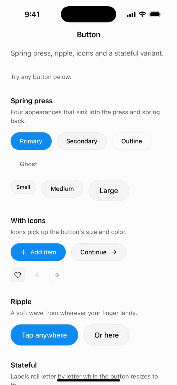
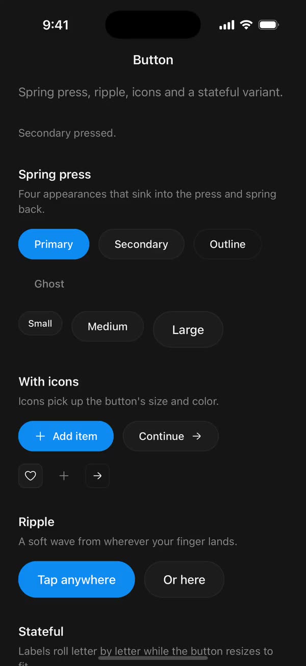
React NativeSpring press, ripple, icons and a stateful variant.
Preview
Install
Source on GitHubIt works in Expo and in bare React Native. New to beUI Native? Set up your app first.
Copies the component and the shared files it needs into src/, adds the theme tokens if they're missing, and installs its libraries. Files you've changed are kept.
Keep the folder layout, since the component imports the shared files by relative path.
1Install the libraries
npx expo install react-native-reanimated react-native-worklets
npm install uniwind tailwindcss2Add the theme tokens
Once per app. Import it from the CSS file Uniwind reads, after Tailwind and Uniwind, and change the values to match your brand.
/* Matches the default beUI palette in ui-components/lib/themes.ts.
   Native surface maps to card; muted maps to muted-foreground. */
@layer theme {
  :root {
    @variant light {
      --color-background: oklch(99% 0 0);
      --color-surface: oklch(97% 0 0);
      --color-foreground: oklch(15% 0 0);
      --color-muted: oklch(50% 0 0);
      --color-border: oklch(15% 0 0 / 0.06);
      --color-border-strong: oklch(15% 0 0 / 0.16);
      --color-primary: #0285f7;
      --color-on-primary: #ffffff;
      --color-destructive: #dc2626;
      --color-success: #059669;
      --color-warning: #d97706;
    }
  }

  :root {
    @variant dark {
      --color-background: #151515;
      --color-surface: #1c1c1c;
      --color-foreground: oklch(96% 0 0);
      --color-muted: oklch(62% 0 0);
      --color-border: rgb(255 255 255 / 0.05);
      --color-border-strong: rgb(255 255 255 / 0.14);
      --color-primary: #0285f7;
      --color-on-primary: #ffffff;
      --color-destructive: #f87171;
      --color-success: #34d399;
      --color-warning: #fbbf24;
    }
  }
}
3Copy the shared files
import { useEffect, useRef, useState } from "react";

export type PresenceItem<T> = {
  key: string;
  value: T;
  /** False for the item present on first render, so it does not animate in. */
  appear: boolean;
  exiting: boolean;
};

/**
 * Keeps replaced items mounted while they animate out, like AnimatePresence.
 * A key that returns while exiting is revived in place.
 */
export function usePresence<T>(
  key: string | null,
  value: T,
  exitDuration: (value: T) => number,
) {
  const [items, setItems] = useState<PresenceItem<T>[]>(() =>
    key === null ? [] : [{ key, value, appear: false, exiting: false }],
  );
  const [currentKey, setCurrentKey] = useState(key);
  const exitDurationRef = useRef(exitDuration);
  exitDurationRef.current = exitDuration;

  // Adjust during render so the new item and the exits start in the same frame.
  if (key !== currentKey) {
    setCurrentKey(key);
    setItems((previous) => {
      const next = previous.map((item) =>
        item.key === key
          ? { ...item, value, exiting: false }
          : { ...item, exiting: true },
      );
      if (key !== null && !previous.some((item) => item.key === key)) {
        next.push({ key, value, appear: true, exiting: false });
      }
      return next;
    });
  }

  const exitingKeys = items
    .filter((item) => item.exiting)
    .map((item) => item.key)
    .join("\n");

  useEffect(() => {
    if (!exitingKeys) return;
    const timers = items
      .filter((item) => item.exiting)
      .map((item) =>
        setTimeout(() => {
          setItems((previous) =>
            previous.filter(
              (candidate) => !(candidate.key === item.key && candidate.exiting),
            ),
          );
        }, exitDurationRef.current(item.value)),
      );
    return () => {
      for (const timer of timers) clearTimeout(timer);
    };
    // Restart removal timers only when the set of exiting items changes.
  }, [exitingKeys]);

  return items;
}
import { useEffect, useState } from "react";
import { AccessibilityInfo } from "react-native";
import { useReducedMotion } from "react-native-reanimated";

/** Reanimated supplies a synchronous initial value; native events keep it current. */
export function useReducedMotionPreference() {
  const initialValue = useReducedMotion();
  const [reducedMotion, setReducedMotion] = useState(initialValue);

  useEffect(() => {
    let active = true;
    let receivedEvent = false;
    const subscription = AccessibilityInfo.addEventListener(
      "reduceMotionChanged",
      (value) => {
        receivedEvent = true;
        setReducedMotion(value);
      },
    );
    void AccessibilityInfo.isReduceMotionEnabled().then((value) => {
      if (active && !receivedEvent) setReducedMotion(value);
    });
    return () => {
      active = false;
      subscription.remove();
    };
  }, []);

  return reducedMotion;
}
import { type ReactNode, useEffect, useState } from "react";
import { StyleSheet, Text, View } from "react-native";
import Animated, {
  useAnimatedStyle,
  useSharedValue,
  withDelay,
  withSpring,
  withTiming,
} from "react-native-reanimated";
import { usePresence } from "../hooks/use-presence";
import { motion } from "../styles/motion";

const CASCADE_STAGGER = 25;
const TEXT_DISTANCE = 14;
// Splitting into letters breaks shaping in connected and complex scripts.
const CASCADE_SAFE = /^[\u0020-\u007e\u00a0-\u024f]+$/;

function letters(text: string) {
  // Whitespace-only Text can measure zero-width on Android.
  return Array.from(text.replace(/ /g, "\u00a0"));
}

function exitDuration(text: string, cascade: boolean) {
  const stagger = cascade ? (text.length - 1) * CASCADE_STAGGER * 0.5 : 0;
  return motion.exit.duration + stagger + 40;
}

/** Progress runs 0 (below) → 1 (resting) → 2 (exited above). */
function Slide({
  appear,
  exiting,
  distance,
  delay,
  reduce,
  children,
}: {
  appear: boolean;
  exiting: boolean;
  distance: number;
  delay: number;
  reduce: boolean;
  children: ReactNode;
}) {
  const progress = useSharedValue(appear ? 0 : 1);

  useEffect(() => {
    if (reduce) {
      progress.value = withTiming(exiting ? 2 : 1, motion.fade);
    } else if (exiting) {
      progress.value = withDelay(delay / 2, withTiming(2, motion.exit));
    } else {
      progress.value = withDelay(delay, withSpring(1, motion.swap));
    }
  }, [delay, exiting, progress, reduce]);

  const animatedStyle = useAnimatedStyle(() => {
    const p = progress.value;
    return {
      opacity: Math.min(1, Math.max(0, p <= 1 ? p : 2 - p)),
      transform: [{ translateY: reduce ? 0 : (1 - p) * distance }],
    };
  }, [distance, reduce]);

  return <Animated.View style={animatedStyle}>{children}</Animated.View>;
}

function Label({
  text,
  cascade,
  className,
}: {
  text: string;
  cascade: boolean;
  className: string;
}) {
  return cascade ? (
    letters(text).map((char, index) => (
      <Text key={index} className={className}>
        {char}
      </Text>
    ))
  ) : (
    <Text numberOfLines={1} className={className}>
      {text}
    </Text>
  );
}

export type CascadeTextProps = {
  /** Changing the key swaps in `text`, even when the text itself repeats. */
  textKey: string;
  text: string;
  /** Text style applied to every letter. */
  className: string;
  reduce: boolean;
};

/**
 * Letter-by-letter slot roll: old letters roll up and away as new ones spring
 * in from below, left to right, while the width springs to fit. Shared by
 * StatefulButton and TextCascade.
 */
export function CascadeText({
  textKey,
  text,
  className,
  reduce,
}: CascadeTextProps) {
  const canCascade = (value: string) => !reduce && CASCADE_SAFE.test(value);
  const items = usePresence(textKey, text, (value) =>
    reduce ? motion.fade.duration + 40 : exitDuration(value, canCascade(value)),
  );
  const [measured, setMeasured] = useState<{
    width: number;
    height: number;
  } | null>(null);
  const width = useSharedValue(0);

  const widthStyle = useAnimatedStyle(() => ({ width: width.value }));
  const labelClass = className;
  const distance = measured ? measured.height * 1.05 : 20;

  return (
    <Animated.View
      style={[
        styles.textSlot,
        measured && { height: measured.height },
        measured && widthStyle,
      ]}
    >
      {/* Measures the incoming label with the same per-letter layout it renders with. */}
      <View style={styles.measureHost}>
        <View
          style={styles.row}
          onLayout={({ nativeEvent: { layout } }) => {
            if (measured) {
              width.value = reduce
                ? layout.width
                : withSpring(layout.width, motion.swap);
            } else {
              width.value = layout.width;
            }
            setMeasured({ width: layout.width, height: layout.height });
          }}
        >
          <Label text={text} cascade={canCascade(text)} className={className} />
        </View>
      </View>

      {items.map((item) => {
        const cascade = canCascade(item.value);
        return (
          <View key={item.key} style={[styles.row, measured && styles.layer]}>
            {cascade ? (
              letters(item.value).map((char, index) => (
                <Slide
                  key={index}
                  appear={item.appear}
                  exiting={item.exiting}
                  distance={distance}
                  delay={index * CASCADE_STAGGER}
                  reduce={reduce}
                >
                  <Text className={labelClass}>{char}</Text>
                </Slide>
              ))
            ) : (
              <Slide
                appear={item.appear}
                exiting={item.exiting}
                distance={TEXT_DISTANCE}
                delay={0}
                reduce={reduce}
              >
                <Text numberOfLines={1} className={labelClass}>
                  {item.value}
                </Text>
              </Slide>
            )}
          </View>
        );
      })}
    </Animated.View>
  );
}

const styles = StyleSheet.create({
  textSlot: { overflow: "hidden", flexShrink: 0 },
  row: { flexDirection: "row", alignItems: "center" },
  layer: { position: "absolute", left: 0, top: 0 },
  measureHost: {
    position: "absolute",
    left: 0,
    top: 0,
    width: 10000,
    flexDirection: "row",
    alignItems: "flex-start",
    opacity: 0,
    pointerEvents: "none",
  },
});
import {
  type ComponentType,
  createElement,
  isValidElement,
  type ReactNode,
} from "react";
import type { ColorValue } from "react-native";

export type IconProps = { size: number; color: ColorValue | undefined };
/** A component receiving `{ size, color }` (such as a lucide icon), or a prebuilt node. */
export type IconSource = ComponentType<IconProps> | ReactNode;

export function renderIcon(icon: IconSource, props: IconProps) {
  if (typeof icon === "function") return createElement(icon, props);
  // forwardRef and memo components (lucide-react-native, for example) are objects.
  if (
    icon != null &&
    typeof icon === "object" &&
    !isValidElement(icon) &&
    "$$typeof" in icon
  ) {
    return createElement(icon as unknown as ComponentType<IconProps>, props);
  }
  return icon;
}
import { Easing, ReduceMotion } from "react-native-reanimated";

// Mirrors beUI's lib/ease.ts so native motion matches the web library.

export const EASE_OUT = Easing.bezier(0.16, 1, 0.3, 1);
export const EASE_IN_OUT = Easing.bezier(0.77, 0, 0.175, 1);

/** Press feedback on buttons and other tappable surfaces. */
export const SPRING_PRESS = {
  stiffness: 500,
  damping: 30,
  mass: 0.6,
  reduceMotion: ReduceMotion.System,
} as const;

/** Content swaps: label and icon slots trading places inside a control. */
export const SPRING_SWAP = {
  stiffness: 460,
  damping: 30,
  mass: 0.55,
  reduceMotion: ReduceMotion.System,
} as const;

/** Shared-layout glides: pills, indicators and panels moving between positions. */
export const SPRING_LAYOUT = {
  stiffness: 360,
  damping: 32,
  mass: 0.6,
  reduceMotion: ReduceMotion.System,
} as const;

/** Dragged handles and fills; critically damped so values never rebound off an end. */
export const SPRING_GLIDE = {
  stiffness: 700,
  damping: 50,
  mass: 0.5,
  reduceMotion: ReduceMotion.System,
} as const;

export const motion = {
  press: SPRING_PRESS,
  swap: SPRING_SWAP,
  layout: SPRING_LAYOUT,
  glide: SPRING_GLIDE,
  exit: { duration: 160, easing: EASE_OUT, reduceMotion: ReduceMotion.System },
  fade: { duration: 150, reduceMotion: ReduceMotion.System },
} as const;
4Copy the component
import type { ButtonSize, ButtonVariant } from "./button.types";

// Class strings stay literal so Uniwind can discover them.

export const variants: Record<
  ButtonVariant,
  { container: string; label: string }
> = {
  primary: { container: "bg-primary border-primary", label: "text-on-primary" },
  secondary: {
    container: "bg-surface border-border",
    label: "text-foreground",
  },
  ghost: {
    container: "bg-transparent border-transparent",
    label: "text-muted",
  },
  outline: {
    container: "bg-transparent border-border",
    label: "text-foreground",
  },
};

/**
 * Visible heights match beUI web (32, 40, 48). `hitSlop` tops the touch area up
 * to 48 points; content may grow taller for larger text.
 */
export const sizes: Record<
  ButtonSize,
  {
    container: string;
    radius: string;
    label: string;
    icon: number;
    gap: number;
    hitSlop: number;
  }
> = {
  sm: {
    container: "min-h-8 px-3 py-1 gap-1.5",
    radius: "rounded-full",
    label: "text-xs",
    icon: 14,
    gap: 6,
    hitSlop: 8,
  },
  md: {
    container: "min-h-10 px-5 py-2 gap-2",
    radius: "rounded-full",
    label: "text-sm",
    icon: 16,
    gap: 8,
    hitSlop: 4,
  },
  lg: {
    container: "min-h-12 px-6 py-2 gap-2",
    radius: "rounded-full",
    label: "text-base",
    icon: 18,
    gap: 8,
    hitSlop: 0,
  },
  icon: {
    container: "h-8 w-8",
    radius: "rounded-lg",
    label: "text-sm",
    icon: 16,
    gap: 0,
    hitSlop: 8,
  },
};
import { createContext, useContext, useEffect, useRef, useState } from "react";
import {
  type ColorValue,
  Pressable,
  StyleSheet,
  Text,
  type TextProps,
  View,
} from "react-native";
import Animated, {
  useAnimatedStyle,
  useSharedValue,
  withSpring,
  withTiming,
} from "react-native-reanimated";
import { useResolveClassNames } from "uniwind";
import { useReducedMotionPreference } from "../../hooks/use-reduced-motion";
import { renderIcon } from "../../primitives/render-icon";
import { EASE_OUT, motion } from "../../styles/motion";
import { sizes, variants } from "./button.styles";
import type {
  ButtonIcon as ButtonIconType,
  ButtonProps,
  ButtonRootProps,
  ButtonSize,
  ButtonVariant,
} from "./button.types";

const AnimatedPressable = Animated.createAnimatedComponent(Pressable);

const HOVER_SCALE = 1.02;
const RIPPLE_DURATION = 1600;

type ButtonContextValue = {
  variant: ButtonVariant;
  size: ButtonSize;
  color: ColorValue | undefined;
};

const ButtonContext = createContext<ButtonContextValue | null>(null);

/** Internal: size, variant and resolved foreground color of the enclosing button. */
export function useButtonContext() {
  const context = useContext(ButtonContext);
  if (!context) throw new Error("Button content must be rendered in a Button.");
  return context;
}

export { renderIcon as renderButtonIcon };

function ButtonLabel({ className = "", ...props }: TextProps) {
  const { variant, size } = useButtonContext();
  return (
    <Text
      {...props}
      className={`shrink text-center font-medium ${sizes[size].label} ${variants[variant].label} ${className}`}
    />
  );
}

function ButtonIcon({ icon }: { icon: ButtonIconType }) {
  const { size, color } = useButtonContext();
  return (
    <View
      accessibilityElementsHidden
      importantForAccessibility="no-hide-descendants"
      aria-hidden
      style={styles.icon}
    >
      {renderIcon(icon, { size: sizes[size].icon, color })}
    </View>
  );
}

type Ripple = { id: number; x: number; y: number; size: number };

function RippleDot({ ripple, color }: { ripple: Ripple; color: ColorValue }) {
  const progress = useSharedValue(0);

  useEffect(() => {
    progress.value = withTiming(1, {
      duration: RIPPLE_DURATION,
      easing: EASE_OUT,
    });
  }, [progress]);

  const animatedStyle = useAnimatedStyle(() => ({
    opacity: 0.3 * (1 - progress.value),
    transform: [{ scale: 0.05 + 0.95 * progress.value }],
  }));

  return (
    <Animated.View
      style={[
        styles.ripple,
        {
          left: ripple.x - ripple.size / 2,
          top: ripple.y - ripple.size / 2,
          width: ripple.size,
          height: ripple.size,
          borderRadius: ripple.size / 2,
          backgroundColor: color,
        },
        animatedStyle,
      ]}
    />
  );
}

/** Internal: the pressable surface, rendering arbitrary content. */
export function ButtonRoot({
  variant = "primary",
  size = "md",
  pressScale = 0.93,
  ripple = false,
  disableAnimation = false,
  disabled: disabledProp,
  children,
  className = "",
  style,
  hitSlop,
  accessibilityState,
  onPressIn,
  onPressOut,
  onHoverIn,
  onHoverOut,
  ref,
  ...props
}: ButtonRootProps) {
  const disabled = disabledProp ?? false;
  const reducedMotion = useReducedMotionPreference();
  const animate = !reducedMotion && !disableAnimation;
  const appearance = variants[variant];
  const dimensions = sizes[size];
  const { color } = useResolveClassNames(appearance.label);

  const scale = useSharedValue(1);
  const pressed = useSharedValue(false);
  const hovered = useSharedValue(false);
  const layout = useRef({ width: 0, height: 0 });
  const nextRippleId = useRef(0);
  const rippleTimers = useRef(new Set<ReturnType<typeof setTimeout>>());
  const [ripples, setRipples] = useState<Ripple[]>([]);

  useEffect(() => {
    const timers = rippleTimers.current;
    return () => {
      for (const timer of timers) clearTimeout(timer);
    };
  }, []);

  useEffect(() => {
    if (!animate || disabled) scale.value = 1;
  }, [animate, disabled, scale]);

  const animatedStyle = useAnimatedStyle(
    () => ({
      transform: [{ scale: scale.value }],
      // Without scale, pressing still needs visible feedback.
      opacity: disabled ? 0.5 : !animate && pressed.value ? 0.7 : 1,
    }),
    [animate, disabled],
  );

  const restScale = () => (hovered.value ? HOVER_SCALE : 1);

  return (
    <ButtonContext.Provider value={{ variant, size, color }}>
      <AnimatedPressable
        {...props}
        ref={ref}
        accessible
        accessibilityRole="button"
        accessibilityState={{ ...accessibilityState, disabled }}
        aria-disabled={disabled}
        disabled={disabled}
        hitSlop={hitSlop ?? dimensions.hitSlop}
        // Hugs its content unless the caller places it with a self-* class; on web,
        // a default self-start would otherwise win over the caller's.
        className={`${/\bself-/.test(className) ? "" : "self-start"} flex-row items-center justify-center border ${appearance.container} ${dimensions.container} ${dimensions.radius} ${className}`}
        style={[style, animatedStyle]}
        onPressIn={(event) => {
          pressed.value = true;
          if (animate) scale.value = withSpring(pressScale, motion.press);
          if (ripple && animate && color) {
            const { locationX, locationY } = event.nativeEvent;
            const { width, height } = layout.current;
            const id = nextRippleId.current++;
            setRipples((current) => [
              ...current,
              {
                id,
                x: locationX,
                y: locationY,
                size: Math.max(width, height) * 2,
              },
            ]);
            const timer = setTimeout(() => {
              rippleTimers.current.delete(timer);
              setRipples((current) => current.filter((r) => r.id !== id));
            }, RIPPLE_DURATION);
            rippleTimers.current.add(timer);
          }
          onPressIn?.(event);
        }}
        onPressOut={(event) => {
          pressed.value = false;
          if (animate) scale.value = withSpring(restScale(), motion.press);
          onPressOut?.(event);
        }}
        onHoverIn={(event) => {
          hovered.value = true;
          if (animate && !pressed.value) {
            scale.value = withSpring(HOVER_SCALE, motion.press);
          }
          onHoverIn?.(event);
        }}
        onHoverOut={(event) => {
          hovered.value = false;
          if (animate && !pressed.value) {
            scale.value = withSpring(1, motion.press);
          }
          onHoverOut?.(event);
        }}
      >
        {ripple && (
          <View
            className={`absolute inset-0 overflow-hidden ${dimensions.radius}`}
            style={styles.passThrough}
            onLayout={({ nativeEvent }) => {
              layout.current = nativeEvent.layout;
            }}
          >
            {color != null &&
              ripples.map((item) => (
                <RippleDot key={item.id} ripple={item} color={color} />
              ))}
          </View>
        )}
        {children}
      </AnimatedPressable>
    </ButtonContext.Provider>
  );
}

export function Button(props: ButtonProps) {
  if (props.size === "icon") {
    const { icon, ...rest } = props;
    return (
      <ButtonRoot {...rest}>
        <ButtonIcon icon={icon} />
      </ButtonRoot>
    );
  }
  const { startIcon, endIcon, children, ...rest } = props;
  const label = Array.isArray(children) ? children.join("") : String(children);
  return (
    <ButtonRoot {...rest}>
      {startIcon != null && <ButtonIcon icon={startIcon} />}
      <ButtonLabel>{label}</ButtonLabel>
      {endIcon != null && <ButtonIcon icon={endIcon} />}
    </ButtonRoot>
  );
}

const styles = StyleSheet.create({
  icon: { flexShrink: 0 },
  passThrough: { pointerEvents: "none" },
  ripple: { position: "absolute" },
});
import type { ReactNode, Ref } from "react";
import type { PressableProps, StyleProp, View, ViewStyle } from "react-native";
import type { IconProps, IconSource } from "../../primitives/render-icon";

export type ButtonVariant = "primary" | "secondary" | "ghost" | "outline";
export type ButtonSize = "sm" | "md" | "lg" | "icon";
export type ButtonIconProps = IconProps;
/** A component receiving `{ size, color }` (such as a lucide icon), or a prebuilt node. */
export type ButtonIcon = IconSource;

export type ButtonBaseProps = Omit<PressableProps, "children" | "style"> & {
  variant?: ButtonVariant;
  /** Scale while pressed. Defaults to 0.93, matching beUI web. */
  pressScale?: number;
  /** Spawn a ripple from the press point. Off by default. */
  ripple?: boolean;
  /** Disables press motion independently of the system preference. */
  disableAnimation?: boolean;
  style?: StyleProp<ViewStyle>;
  ref?: Ref<View>;
};

/** Internal props for the shared pressable surface. */
export type ButtonRootProps = ButtonBaseProps & {
  size?: ButtonSize;
  children?: ReactNode;
};

/** Accepts interpolated JSX text such as `Save {count} items`. */
export type ButtonText = string | number | readonly (string | number)[];

export type ButtonProps = ButtonBaseProps &
  (
    | {
        size?: Exclude<ButtonSize, "icon">;
        children: ButtonText;
        startIcon?: ButtonIcon;
        endIcon?: ButtonIcon;
        icon?: never;
      }
    | {
        size: "icon";
        icon: ButtonIcon;
        /** Icon buttons have no visible text, so they need a spoken name. */
        accessibilityLabel: string;
        children?: never;
        startIcon?: never;
        endIcon?: never;
      }
  );

export type ButtonState = "idle" | "loading" | "success" | "error";

export type StatefulButtonProps = ButtonBaseProps & {
  size?: Exclude<ButtonSize, "icon">;
  state?: ButtonState;
  /** The idle label. Latin labels cascade letter by letter; other scripts slide as a whole. */
  children: string;
  loadingText?: string;
  successText?: string;
  errorText?: string;
  /** Trailing icon shown only while idle. */
  icon?: ButtonIcon;
  loadingIcon?: ButtonIcon;
  successIcon?: ButtonIcon;
  errorIcon?: ButtonIcon;
};
export { Button } from "./button";
export type {
  ButtonBaseProps,
  ButtonIcon,
  ButtonIconProps,
  ButtonProps,
  ButtonSize,
  ButtonState,
  ButtonText,
  ButtonVariant,
  StatefulButtonProps,
} from "./button.types";
export { StatefulButton } from "./stateful-button";
export { CheckIcon, CrossIcon, Spinner } from "./status-icons";
import { useEffect, useRef } from "react";
import { AccessibilityInfo, StyleSheet, View } from "react-native";
import Animated, {
  useAnimatedStyle,
  useSharedValue,
  withSpring,
  withTiming,
} from "react-native-reanimated";
import { usePresence } from "../../hooks/use-presence";
import { useReducedMotionPreference } from "../../hooks/use-reduced-motion";
import { CascadeText } from "../../primitives/cascade-text";
import { motion } from "../../styles/motion";
import { ButtonRoot, renderButtonIcon, useButtonContext } from "./button";
import { sizes, variants } from "./button.styles";
import type {
  ButtonIcon,
  ButtonState,
  StatefulButtonProps,
} from "./button.types";
import { CheckIcon, CrossIcon, Spinner } from "./status-icons";

function IconSlot({
  icon,
  appear,
  exiting,
  side,
  reduce,
}: {
  icon: ButtonIcon;
  appear: boolean;
  exiting: boolean;
  side: "start" | "end";
  reduce: boolean;
}) {
  const { size, color } = useButtonContext();
  const { icon: iconSize, gap } = sizes[size];
  const slot = iconSize + gap;
  const progress = useSharedValue(appear ? 0 : 1);

  useEffect(() => {
    progress.value = reduce
      ? withTiming(exiting ? 0 : 1, motion.fade)
      : exiting
        ? withTiming(0, motion.exit)
        : withSpring(1, motion.swap);
  }, [exiting, progress, reduce]);

  const slotStyle = useAnimatedStyle(
    () => ({
      // Width collapses with the icon so the row never pops in a single frame.
      width: reduce ? (exiting ? 0 : slot) : Math.max(0, slot * progress.value),
    }),
    [exiting, reduce, slot],
  );
  const iconStyle = useAnimatedStyle(
    () => ({
      opacity: Math.min(1, Math.max(0, progress.value)),
      transform: [{ scale: reduce ? 1 : 0.7 + 0.3 * progress.value }],
    }),
    [reduce],
  );

  return (
    <Animated.View
      style={[
        styles.iconSlot,
        side === "start" ? styles.alignStart : styles.alignEnd,
        slotStyle,
      ]}
    >
      <Animated.View style={iconStyle}>
        {renderButtonIcon(icon, { size: iconSize, color })}
      </Animated.View>
    </Animated.View>
  );
}

function StatefulContent({
  state,
  text,
  icon,
  statusIcons,
}: {
  state: ButtonState;
  text: string;
  icon: ButtonIcon | undefined;
  statusIcons: Record<Exclude<ButtonState, "idle">, ButtonIcon>;
}) {
  const reduce = useReducedMotionPreference();
  const { size, variant } = useButtonContext();
  const leading = usePresence(
    state === "idle" ? null : state,
    state,
    () => motion.exit.duration + 40,
  );
  const trailing = usePresence(
    state === "idle" && icon != null ? "idle" : null,
    icon,
    () => motion.exit.duration + 40,
  );

  return (
    <View
      accessibilityElementsHidden
      importantForAccessibility="no-hide-descendants"
      style={styles.content}
    >
      {leading.map((item) =>
        item.value === "idle" ? null : (
          <IconSlot
            key={item.key}
            icon={statusIcons[item.value]}
            appear={item.appear}
            exiting={item.exiting}
            side="start"
            reduce={reduce}
          />
        ),
      )}
      <CascadeText
        textKey={`${state}-${text}`}
        text={text}
        className={`font-medium ${sizes[size].label} ${variants[variant].label}`}
        reduce={reduce}
      />
      {trailing.map((item) => (
        <IconSlot
          key={item.key}
          icon={item.value}
          appear={item.appear}
          exiting={item.exiting}
          side="end"
          reduce={reduce}
        />
      ))}
    </View>
  );
}

export function StatefulButton({
  state = "idle",
  children,
  loadingText = "Loading",
  successText = "Done",
  errorText = "Try again",
  icon,
  loadingIcon = Spinner,
  successIcon = CheckIcon,
  errorIcon = CrossIcon,
  disabled,
  accessibilityLabel,
  accessibilityState,
  ...props
}: StatefulButtonProps) {
  const busy = state === "loading";
  const text =
    state === "loading"
      ? loadingText
      : state === "success"
        ? successText
        : state === "error"
          ? errorText
          : children;
  const previousState = useRef(state);

  // The button keeps focus while its name changes, so announce status changes explicitly.
  useEffect(() => {
    if (previousState.current === state) return;
    previousState.current = state;
    if (state !== "idle") AccessibilityInfo.announceForAccessibility(text);
  }, [state, text]);

  return (
    <ButtonRoot
      {...props}
      disabled={disabled || busy}
      accessibilityLabel={accessibilityLabel ?? text}
      accessibilityState={{ ...accessibilityState, busy }}
      aria-busy={busy}
    >
      <StatefulContent
        state={state}
        text={text}
        icon={icon}
        statusIcons={{
          loading: loadingIcon,
          success: successIcon,
          error: errorIcon,
        }}
      />
    </ButtonRoot>
  );
}

const styles = StyleSheet.create({
  content: { flexDirection: "row", alignItems: "center", flexShrink: 1 },
  iconSlot: {
    flexDirection: "row",
    alignItems: "center",
    overflow: "hidden",
    flexShrink: 0,
  },
  alignStart: { justifyContent: "flex-start" },
  alignEnd: { justifyContent: "flex-end" },
});
import { useEffect } from "react";
import { StyleSheet, View } from "react-native";
import Animated, {
  cancelAnimation,
  Easing,
  ReduceMotion,
  useAnimatedStyle,
  useSharedValue,
  withRepeat,
  withTiming,
} from "react-native-reanimated";
import type { ButtonIconProps } from "./button.types";

// Dependency-free status glyphs drawn with borders, so the button works with any icon set.

function strokeFor(size: number) {
  return Math.max(1.5, size / 9);
}

/** A three-quarter ring that keeps turning; progress is essential, so it ignores reduced motion. */
export function Spinner({ size, color }: ButtonIconProps) {
  const rotation = useSharedValue(0);

  useEffect(() => {
    rotation.value = withRepeat(
      withTiming(360, {
        duration: 800,
        easing: Easing.linear,
        reduceMotion: ReduceMotion.Never,
      }),
      -1,
      false,
    );
    return () => cancelAnimation(rotation);
  }, [rotation]);

  const animatedStyle = useAnimatedStyle(() => ({
    transform: [{ rotate: `${rotation.value}deg` }],
  }));

  const ring = size * 0.8;
  return (
    <View style={[styles.box, { width: size, height: size }]}>
      <Animated.View
        style={[
          {
            width: ring,
            height: ring,
            borderRadius: ring / 2,
            borderWidth: strokeFor(size),
            borderColor: color,
            borderTopColor: "transparent",
          },
          animatedStyle,
        ]}
      />
    </View>
  );
}

export function CheckIcon({ size, color }: ButtonIconProps) {
  const stroke = strokeFor(size);
  return (
    <View style={[styles.box, { width: size, height: size }]}>
      <View
        style={{
          width: size * 0.3,
          height: size * 0.6,
          marginTop: -size * 0.12,
          borderRightWidth: stroke,
          borderBottomWidth: stroke,
          borderColor: color,
          borderBottomRightRadius: stroke / 2,
          transform: [{ rotate: "45deg" }],
        }}
      />
    </View>
  );
}

export function CrossIcon({ size, color }: ButtonIconProps) {
  const stroke = strokeFor(size);
  const bar = {
    position: "absolute" as const,
    width: size * 0.7,
    height: stroke,
    borderRadius: stroke / 2,
    backgroundColor: color,
  };
  return (
    <View style={[styles.box, { width: size, height: size }]}>
      <View style={[bar, { transform: [{ rotate: "45deg" }] }]} />
      <View style={[bar, { transform: [{ rotate: "-45deg" }] }]} />
    </View>
  );
}

const styles = StyleSheet.create({
  box: { alignItems: "center", justifyContent: "center" },
});
Documentation
Native port of beUI Button. A spring-pressed Button plus StatefulButton, with the same variants, sizes and motion tokens as the web library.
import { Button, StatefulButton } from "./src";

<Button onPress={save}>Save changes</Button>
<Button variant="secondary" startIcon={Plus}>Create project</Button>
<Button endIcon={ArrowRight}>Continue</Button>
<Button size="icon" variant="ghost" icon={Heart} accessibilityLabel="Add to favorites" />

<StatefulButton state={state} loadingText="Saving" successText="Saved" icon={ArrowRight}>
  Save changes
</StatefulButton>
Button
- Variants:
primary,secondary,outline,ghost. - Sizes:
sm,md,lg(32, 40 and 48 points tall) andicon(32-point square). DefaulthitSloptops each up to a 48-point touch area. Native hit areas cannot extend past their parent, so leave room around compact buttons. Content can grow taller for larger text. - Press: scales to
pressScale(0.93 by default) on beUI'sSPRING_PRESSspring, and springs back on release. With a mouse or trackpad (web, iPad), hovering lifts the button to 1.02. - Ripple:
ripplesends a soft wave out from the press point. It is off by default. - Reduced motion: when the system asks for reduced motion, or
disableAnimationis set, scale and ripple turn off and pressing dims the button instead. - Disabled: dims to 50% opacity and reports the disabled state to accessibility services.
The label is the text child; interpolated text such as <Button>Save {count} items</Button> works. Icons go in startIcon and endIcon, which can be used together and follow the layout direction. size="icon" takes icon instead of a label and requires accessibilityLabel in TypeScript.
An icon can be a component that receives { size, color }, such as a lucide-react-native icon or your own SVG component, or a prebuilt element. Pass a component defined outside render. An inline arrow function is a new component type on every render, so it remounts each time. Icons receive the button's icon size and foreground color, and are hidden from accessibility services because the button owns the spoken name.
className and style style the button itself. The button forwards Pressable props, handlers and its ref. Resolve conflicting utilities through style rather than class order.
StatefulButton
state takes idle, loading, success or error. Text for each state comes from children, loadingText, successText and errorText.
- The label rolls letter by letter on
SPRING_SWAP, and the button's width springs to fit the new text. - A leading spinner, check or cross grows in beside the label. Replace them with
loadingIcon,successIconanderrorIcon. - The optional trailing
iconshows only while idle. loadingdisables the button and reports busy.- Each state change is announced to VoiceOver and TalkBack. The accessible name follows the current text unless you pass
accessibilityLabel. - Reduced motion swaps the cascade for a short crossfade, and the width changes without animating. The spinner keeps turning, because it shows that work is still in progress.
- Only Latin labels cascade. Splitting a label into letters breaks shaping in Arabic, Devanagari, Thai and other connected scripts, so those labels slide as a whole.
The web version also blurs letters as they move. Native has no cheap blur, so letters use opacity and position only.
Copying
Copy this directory, hooks/use-reduced-motion.ts, hooks/use-presence.ts, primitives/render-icon.tsx, primitives/cascade-text.tsx, styles/motion.ts, and the semantic tokens in styles/theme.css. The host app needs React Native, Uniwind and Reanimated, set up as described in the root README.
Validation
Before release, check on iOS and Android devices:
- VoiceOver and TalkBack announcements
- Large text
- RTL layouts
- Presses cancelled by scrolling
- Changing reduced motion while the app is open