
Bouncy Accordion
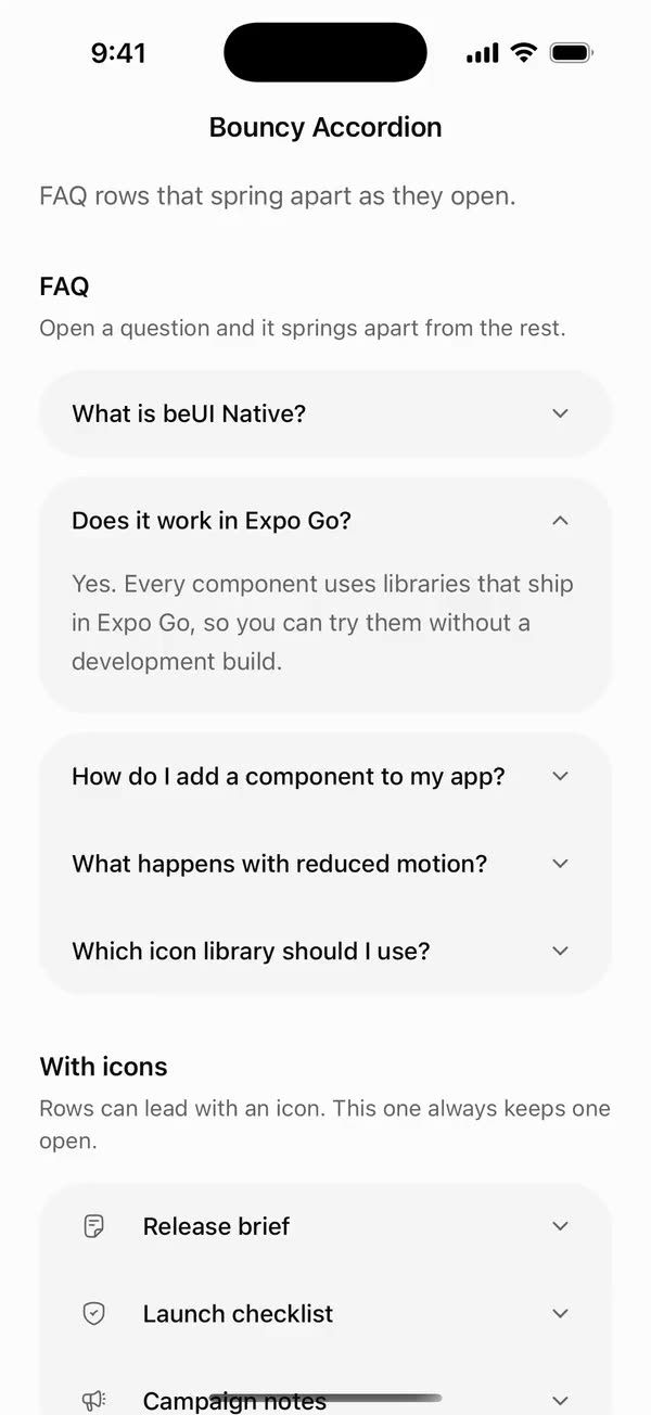
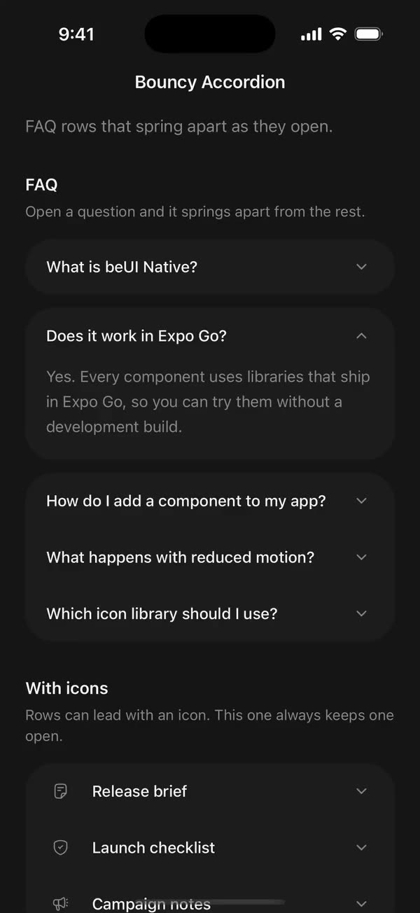
React NativeFAQ rows that spring apart as they open.
Preview
Install
Source on GitHubIt works in Expo and in bare React Native. New to beUI Native? Set up your app first.
Copies the component and the shared files it needs into src/, adds the theme tokens if they're missing, and installs its libraries. Files you've changed are kept.
Keep the folder layout, since the component imports the shared files by relative path.
1Install the libraries
npx expo install react-native-reanimated react-native-worklets
npm install uniwind tailwindcss2Add the theme tokens
Once per app. Import it from the CSS file Uniwind reads, after Tailwind and Uniwind, and change the values to match your brand.
/* Matches the default beUI palette in ui-components/lib/themes.ts.
   Native surface maps to card; muted maps to muted-foreground. */
@layer theme {
  :root {
    @variant light {
      --color-background: oklch(99% 0 0);
      --color-surface: oklch(97% 0 0);
      --color-foreground: oklch(15% 0 0);
      --color-muted: oklch(50% 0 0);
      --color-border: oklch(15% 0 0 / 0.06);
      --color-border-strong: oklch(15% 0 0 / 0.16);
      --color-primary: #0285f7;
      --color-on-primary: #ffffff;
      --color-destructive: #dc2626;
      --color-success: #059669;
      --color-warning: #d97706;
    }
  }

  :root {
    @variant dark {
      --color-background: #151515;
      --color-surface: #1c1c1c;
      --color-foreground: oklch(96% 0 0);
      --color-muted: oklch(62% 0 0);
      --color-border: rgb(255 255 255 / 0.05);
      --color-border-strong: rgb(255 255 255 / 0.14);
      --color-primary: #0285f7;
      --color-on-primary: #ffffff;
      --color-destructive: #f87171;
      --color-success: #34d399;
      --color-warning: #fbbf24;
    }
  }
}
3Copy the shared files
import { useEffect, useState } from "react";
import { AccessibilityInfo } from "react-native";
import { useReducedMotion } from "react-native-reanimated";

/** Reanimated supplies a synchronous initial value; native events keep it current. */
export function useReducedMotionPreference() {
  const initialValue = useReducedMotion();
  const [reducedMotion, setReducedMotion] = useState(initialValue);

  useEffect(() => {
    let active = true;
    let receivedEvent = false;
    const subscription = AccessibilityInfo.addEventListener(
      "reduceMotionChanged",
      (value) => {
        receivedEvent = true;
        setReducedMotion(value);
      },
    );
    void AccessibilityInfo.isReduceMotionEnabled().then((value) => {
      if (active && !receivedEvent) setReducedMotion(value);
    });
    return () => {
      active = false;
      subscription.remove();
    };
  }, []);

  return reducedMotion;
}
import { type ColorValue, StyleSheet, View } from "react-native";
import Animated, {
  interpolate,
  type SharedValue,
  useAnimatedStyle,
} from "react-native-reanimated";

/** A straight line in a square viewBox: [x1, y1, x2, y2]. */
export type PathSegment = [x1: number, y1: number, x2: number, y2: number];

export type DrawnPathProps = {
  /** Straight segments drawn in order, like an SVG polyline. */
  segments: PathSegment[];
  /** Rendered width and height in points. */
  size: number;
  /** Stroke width in viewBox units. */
  strokeWidth: number;
  /** Side of the square viewBox the segments are written in. Defaults to 24. */
  viewBox?: number;
  color: ColorValue | undefined;
  /** 0 draws nothing and 1 draws every segment, like SVG `pathLength`. */
  progress: SharedValue<number>;
};

function length([x1, y1, x2, y2]: PathSegment) {
  return Math.hypot(x2 - x1, y2 - y1);
}

/**
 * Draws a polyline on with rotated Views, so shared components need no SVG
 * library. Round caps extend half a stroke past each end, like SVG's linecap.
 */
export function DrawnPath({
  segments,
  size,
  strokeWidth,
  viewBox = 24,
  color,
  progress,
}: DrawnPathProps) {
  const unit = size / viewBox;
  const stroke = strokeWidth * unit;
  const total = segments.reduce((sum, segment) => sum + length(segment), 0);
  let start = 0;

  return (
    <View style={{ width: size, height: size }}>
      {segments.map((segment) => {
        const from = start / total;
        start += length(segment);
        return (
          <Stroke
            key={segment.join()}
            segment={segment}
            unit={unit}
            stroke={stroke}
            from={from}
            to={start / total}
            progress={progress}
            color={color}
          />
        );
      })}
    </View>
  );
}

function Stroke({
  segment,
  unit,
  stroke,
  from,
  to,
  progress,
  color,
}: {
  segment: PathSegment;
  unit: number;
  stroke: number;
  from: number;
  to: number;
  progress: SharedValue<number>;
  color: ColorValue | undefined;
}) {
  const [x1, y1, x2, y2] = segment;
  const full = length(segment) * unit;
  const angle = Math.atan2(y2 - y1, x2 - x1);

  const animatedStyle = useAnimatedStyle(() => {
    const drawn = interpolate(progress.value, [from, to], [0, 1], "clamp");
    return { opacity: drawn > 0 ? 1 : 0, width: stroke + full * drawn };
  });

  return (
    <Animated.View
      style={[
        styles.stroke,
        {
          left: x1 * unit - stroke / 2,
          top: y1 * unit - stroke / 2,
          height: stroke,
          borderRadius: stroke / 2,
          backgroundColor: color,
          // Rotate around the start point so the stroke grows from it.
          transformOrigin: [stroke / 2, stroke / 2, 0],
          transform: [{ rotate: `${angle}rad` }],
        },
        animatedStyle,
      ]}
    />
  );
}

const styles = StyleSheet.create({
  stroke: { position: "absolute" },
});
import {
  type ComponentType,
  createElement,
  isValidElement,
  type ReactNode,
} from "react";
import type { ColorValue } from "react-native";

export type IconProps = { size: number; color: ColorValue | undefined };
/** A component receiving `{ size, color }` (such as a lucide icon), or a prebuilt node. */
export type IconSource = ComponentType<IconProps> | ReactNode;

export function renderIcon(icon: IconSource, props: IconProps) {
  if (typeof icon === "function") return createElement(icon, props);
  // forwardRef and memo components (lucide-react-native, for example) are objects.
  if (
    icon != null &&
    typeof icon === "object" &&
    !isValidElement(icon) &&
    "$$typeof" in icon
  ) {
    return createElement(icon as unknown as ComponentType<IconProps>, props);
  }
  return icon;
}
import { Easing, ReduceMotion } from "react-native-reanimated";

// Mirrors beUI's lib/ease.ts so native motion matches the web library.

export const EASE_OUT = Easing.bezier(0.16, 1, 0.3, 1);
export const EASE_IN_OUT = Easing.bezier(0.77, 0, 0.175, 1);

/** Press feedback on buttons and other tappable surfaces. */
export const SPRING_PRESS = {
  stiffness: 500,
  damping: 30,
  mass: 0.6,
  reduceMotion: ReduceMotion.System,
} as const;

/** Content swaps: label and icon slots trading places inside a control. */
export const SPRING_SWAP = {
  stiffness: 460,
  damping: 30,
  mass: 0.55,
  reduceMotion: ReduceMotion.System,
} as const;

/** Shared-layout glides: pills, indicators and panels moving between positions. */
export const SPRING_LAYOUT = {
  stiffness: 360,
  damping: 32,
  mass: 0.6,
  reduceMotion: ReduceMotion.System,
} as const;

/** Dragged handles and fills; critically damped so values never rebound off an end. */
export const SPRING_GLIDE = {
  stiffness: 700,
  damping: 50,
  mass: 0.5,
  reduceMotion: ReduceMotion.System,
} as const;

export const motion = {
  press: SPRING_PRESS,
  swap: SPRING_SWAP,
  layout: SPRING_LAYOUT,
  glide: SPRING_GLIDE,
  exit: { duration: 160, easing: EASE_OUT, reduceMotion: ReduceMotion.System },
  fade: { duration: 150, reduceMotion: ReduceMotion.System },
} as const;
4Copy the component
import {
  type ReactNode,
  useCallback,
  useEffect,
  useRef,
  useState,
} from "react";
import {
  Pressable,
  StyleSheet,
  Text,
  View,
  type ViewProps,
} from "react-native";
import Animated, {
  ReduceMotion,
  useAnimatedStyle,
  useSharedValue,
  withSpring,
  withTiming,
} from "react-native-reanimated";
import { useResolveClassNames } from "uniwind";
import { useReducedMotionPreference } from "../../hooks/use-reduced-motion";
import { DrawnPath, type PathSegment } from "../../primitives/drawn-path";
import { type IconSource, renderIcon } from "../../primitives/render-icon";
import { EASE_OUT } from "../../styles/motion";

export type BouncyAccordionItem = {
  id: string;
  title: string;
  /** The answer or details. Strings get the default text style. */
  description?: ReactNode;
  /** A component given `{ size, color }`, or a prebuilt element. */
  icon?: IconSource;
  disabled?: boolean;
};

export type BouncyAccordionClassNames = {
  root?: string;
  item?: string;
  trigger?: string;
  title?: string;
  description?: string;
};

export type BouncyAccordionProps = Omit<ViewProps, "children"> & {
  items: BouncyAccordionItem[];
  /** The open item. Omit it and use `defaultValue` for uncontrolled use. */
  value?: string | null;
  defaultValue?: string | null;
  onValueChange?: (value: string | null) => void;
  /** Tapping the open item closes it. Defaults to true. */
  collapsible?: boolean;
  /** Opens and closes without springing, independently of the system preference. */
  disableAnimation?: boolean;
  className?: string;
  classNames?: BouncyAccordionClassNames;
};

// The web version's bouncy springs, as duration and damping ratio
// (damping ratio = 1 - bounce).
const ROW = {
  duration: 550,
  dampingRatio: 0.62,
  reduceMotion: ReduceMotion.System,
};
const OPEN = {
  duration: 580,
  dampingRatio: 0.68,
  reduceMotion: ReduceMotion.System,
};
// Closing is a little livelier than the web, where the bounce is mostly
// clipped once the height reaches zero.
const CLOSE = {
  duration: 520,
  dampingRatio: 0.55,
  reduceMotion: ReduceMotion.System,
};
const CHEVRON = {
  duration: 420,
  dampingRatio: 0.72,
  reduceMotion: ReduceMotion.System,
};
const FADE = { duration: 180, easing: EASE_OUT };

const GAP = 12;
// How far a closing row's overshoot may pull the rows below past rest. It
// overlaps only the closing row's empty bottom padding, in the same color.
const SETTLE_OVERLAP = 14;
const RADIUS = 28;
const ICON = 16;
const CHEVRON_PATH: PathSegment[] = [
  [6, 9, 12, 15],
  [12, 15, 18, 9],
];

function Row({
  item,
  open,
  startsGroup,
  endsGroup,
  separated,
  reduce,
  classNames,
  onToggle,
}: {
  item: BouncyAccordionItem;
  open: boolean;
  startsGroup: boolean;
  endsGroup: boolean;
  separated: boolean;
  reduce: boolean;
  classNames?: BouncyAccordionClassNames;
  onToggle: () => void;
}) {
  const { color: muted } = useResolveClassNames("text-muted");
  const { backgroundColor: pressedColor } =
    useResolveClassNames("bg-foreground/5");
  const [measured, setMeasured] = useState(0);
  // The first measurement places an initially open row without animating it.
  const firstMeasure = useRef(true);
  const hasContent = item.description != null;

  const gap = useSharedValue(separated ? GAP : 0);
  const top = useSharedValue(startsGroup ? RADIUS : 0);
  const bottom = useSharedValue(endsGroup ? RADIUS : 0);
  const height = useSharedValue(open && hasContent ? measured : 0);
  const fade = useSharedValue(open ? 1 : 0);
  const turn = useSharedValue(open ? 1 : 0);
  const pressed = useSharedValue(0);
  const drawn = useSharedValue(1);

  const to = useCallback(
    (target: number, spring: typeof ROW) =>
      reduce ? target : withSpring(target, spring),
    [reduce],
  );

  useEffect(() => {
    gap.value = to(separated ? GAP : 0, ROW);
    top.value = to(startsGroup ? RADIUS : 0, ROW);
    bottom.value = to(endsGroup ? RADIUS : 0, ROW);
  }, [bottom, endsGroup, gap, separated, startsGroup, to, top]);

  useEffect(() => {
    const target = open && hasContent ? measured : 0;
    if (firstMeasure.current && measured > 0) {
      firstMeasure.current = false;
      height.value = target;
    } else {
      height.value = to(target, open ? OPEN : CLOSE);
    }
    fade.value = reduce ? (open ? 1 : 0) : withTiming(open ? 1 : 0, FADE);
    turn.value = to(open ? 1 : 0, CHEVRON);
  }, [fade, hasContent, height, measured, open, reduce, to, turn]);

  // A height can't go below zero, so a closing spring's overshoot becomes a
  // small negative margin instead: the rows below travel slightly past rest and
  // spring back, keeping the bounce the clamp would otherwise flatten.
  const rowStyle = useAnimatedStyle(() => ({
    marginTop: Math.max(-SETTLE_OVERLAP, gap.value),
    marginBottom: Math.max(-SETTLE_OVERLAP, Math.min(0, height.value)),
    borderTopLeftRadius: Math.max(0, top.value),
    borderTopRightRadius: Math.max(0, top.value),
    borderBottomLeftRadius: Math.max(0, bottom.value),
    borderBottomRightRadius: Math.max(0, bottom.value),
  }));
  const contentStyle = useAnimatedStyle(() => ({
    height: Math.max(0, height.value),
  }));
  const fadeStyle = useAnimatedStyle(() => ({ opacity: fade.value }));
  const chevronStyle = useAnimatedStyle(() => ({
    transform: [{ rotate: `${turn.value * 180}deg` }],
  }));
  const pressStyle = useAnimatedStyle(() => ({ opacity: pressed.value }));

  return (
    <Animated.View
      className={`overflow-hidden bg-surface ${item.disabled ? "opacity-50" : ""} ${classNames?.item ?? ""}`}
      style={rowStyle}
    >
      <Pressable
        accessibilityRole="button"
        accessibilityState={{ expanded: open, disabled: item.disabled }}
        accessibilityLabel={item.title}
        disabled={item.disabled}
        onPress={onToggle}
        onPressIn={() => {
          pressed.value = withTiming(1, { duration: 80 });
        }}
        onPressOut={() => {
          pressed.value = withTiming(0, { duration: 220 });
        }}
        className={`min-h-[54px] flex-row items-center gap-4 px-5 py-3 ${classNames?.trigger ?? ""}`}
      >
        <Animated.View
          style={[
            StyleSheet.absoluteFill,
            { backgroundColor: pressedColor },
            pressStyle,
            styles.passThrough,
          ]}
        />
        {item.icon != null ? (
          <View style={styles.icon}>
            {renderIcon(item.icon, { size: ICON, color: muted })}
          </View>
        ) : null}
        <Text
          className={`flex-1 text-[15px] font-medium text-foreground ${classNames?.title ?? ""}`}
        >
          {item.title}
        </Text>
        <Animated.View style={[styles.chevron, chevronStyle]}>
          <DrawnPath
            segments={CHEVRON_PATH}
            size={ICON}
            strokeWidth={2}
            color={muted}
            progress={drawn}
          />
        </Animated.View>
      </Pressable>

      {hasContent ? (
        <Animated.View
          accessibilityElementsHidden={!open}
          importantForAccessibility={open ? "auto" : "no-hide-descendants"}
          style={[styles.content, contentStyle]}
        >
          {/* Measured at its natural height, independent of the animated frame. */}
          <Animated.View
            style={[styles.measure, fadeStyle]}
            onLayout={({ nativeEvent }) => {
              setMeasured(nativeEvent.layout.height);
            }}
          >
            {typeof item.description === "string" ? (
              <Text
                className={`text-[15px] leading-6 text-muted ${classNames?.description ?? ""}`}
              >
                {item.description}
              </Text>
            ) : (
              item.description
            )}
          </Animated.View>
        </Animated.View>
      ) : null}
    </Animated.View>
  );
}

/**
 * A single-open accordion whose open row springs apart from its neighbors,
 * rounding into its own group, while its content bounces open.
 */
export function BouncyAccordion({
  items,
  value,
  defaultValue = null,
  onValueChange,
  collapsible = true,
  disableAnimation = false,
  className = "",
  classNames,
  ...props
}: BouncyAccordionProps) {
  const [uncontrolled, setUncontrolled] = useState(defaultValue);
  const active = value === undefined ? uncontrolled : value;
  const reducedMotion = useReducedMotionPreference();
  const reduce = reducedMotion || disableAnimation;
  const activeIndex = items.findIndex((item) => item.id === active);

  const toggle = useCallback(
    (id: string) => {
      const next = active === id ? (collapsible ? null : id) : id;
      if (next === active) return;
      if (value === undefined) setUncontrolled(next);
      onValueChange?.(next);
    },
    [active, collapsible, onValueChange, value],
  );

  return (
    <View
      {...props}
      className={`w-full ${className} ${classNames?.root ?? ""}`}
    >
      {items.map((item, index) => {
        const open = item.id === active;
        const previousOpen = activeIndex === index - 1;
        const nextOpen = activeIndex === index + 1;
        return (
          <Row
            key={item.id}
            item={item}
            open={open}
            // The open row and its neighbors each round into separate groups.
            startsGroup={open || index === 0 || previousOpen}
            endsGroup={open || index === items.length - 1 || nextOpen}
            separated={index > 0 && (open || previousOpen)}
            reduce={reduce}
            classNames={classNames}
            onToggle={() => toggle(item.id)}
          />
        );
      })}
    </View>
  );
}

const styles = StyleSheet.create({
  passThrough: { pointerEvents: "none" },
  icon: {
    width: 28,
    height: 28,
    alignItems: "center",
    justifyContent: "center",
  },
  chevron: {
    width: 24,
    height: 24,
    alignItems: "center",
    justifyContent: "center",
  },
  content: { overflow: "hidden" },
  measure: {
    position: "absolute",
    top: 0,
    left: 0,
    right: 0,
    paddingHorizontal: 20,
    paddingBottom: 20,
  },
});
export type {
  BouncyAccordionClassNames,
  BouncyAccordionItem,
  BouncyAccordionProps,
} from "./bouncy-accordion";
export { BouncyAccordion } from "./bouncy-accordion";
Documentation
Native port of beUI Bouncy Accordion. A single-open accordion for FAQs and settings: rows sit together in one rounded stack, and the open row springs apart into its own group while its content bounces open.
import { BouncyAccordion } from "./src";

<BouncyAccordion
  items={[
    { id: "expo", title: "Does it work in Expo Go?", description: "Yes." },
    { id: "icons", title: "Which icons?", description: "Any library.", icon: Search },
  ]}
  defaultValue="expo"
/>- Grouping: closed rows join into one stack with 28-point outer corners. Opening a row moves it 12 points away from its neighbors, and the corners on either side of each gap spring round, so the open row becomes its own card.
- Motion: the gap, corners and content height spring with a bounce: 550 ms at damping ratio 0.62 for the row, 580 ms at 0.68 to open, and 520 ms at 0.55 to close. That's livelier than the web version on close, where the bounce is mostly clipped once the height reaches zero. The chevron flips on its own spring and the content fades in over 180 ms. A row that starts open appears in place without animating.
- Closing bounce: a height can't go below zero, so a closing row's overshoot becomes a small negative bottom margin. The rows below travel up to 14 points past rest and spring back. That overlap only covers the closing row's empty bottom padding, in the same colour as the stack it's rejoining, so nothing visibly overlaps.
- Content:
descriptioncan be a string, which gets the default muted text style, or any element. Its height is measured at its natural size, so long answers and larger text open fully. - State: pass
valuewithonValueChangeto control the open row, ordefaultValueto let it manage itself.collapsible={false}keeps one row always open. - Rows: each row is at least 54 points tall, with an optional leading
icon(a component given{ size, color }, or an element) and a soft pressed highlight.disableddims a row and ignores presses. - Accessibility: each row header is a button reporting its expanded and disabled states. Closed content is hidden from screen readers.
- Reduced motion: when the system asks for it, or
disableAnimationis set, rows open and close instantly.
classNames styles the root, rows, headers, titles and descriptions individually.
Copy this directory, hooks/use-reduced-motion.ts, primitives/drawn-path.tsx, primitives/render-icon.tsx, styles/motion.ts, and the semantic tokens in styles/theme.css.