
Number Animation
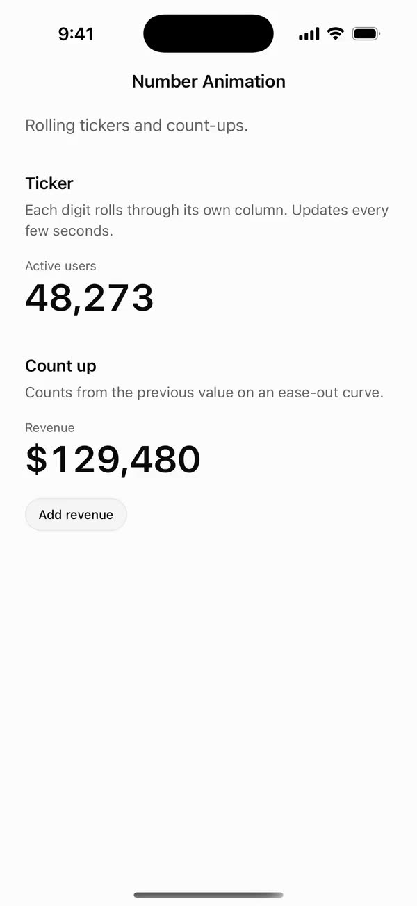
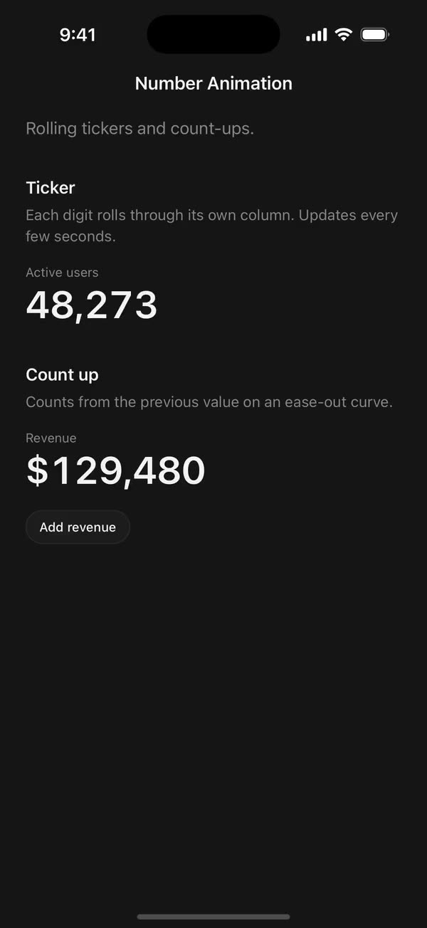
React NativeRolling tickers and count-ups.
Preview
Install
Source on GitHubIt works in Expo and in bare React Native. New to beUI Native? Set up your app first.
Copies the component and the shared files it needs into src/, adds the theme tokens if they're missing, and installs its libraries. Files you've changed are kept.
Keep the folder layout, since the component imports the shared files by relative path.
1Install the libraries
npx expo install react-native-reanimated react-native-worklets
npm install uniwind tailwindcss2Add the theme tokens
Once per app. Import it from the CSS file Uniwind reads, after Tailwind and Uniwind, and change the values to match your brand.
/* Matches the default beUI palette in ui-components/lib/themes.ts.
   Native surface maps to card; muted maps to muted-foreground. */
@layer theme {
  :root {
    @variant light {
      --color-background: oklch(99% 0 0);
      --color-surface: oklch(97% 0 0);
      --color-foreground: oklch(15% 0 0);
      --color-muted: oklch(50% 0 0);
      --color-border: oklch(15% 0 0 / 0.06);
      --color-border-strong: oklch(15% 0 0 / 0.16);
      --color-primary: #0285f7;
      --color-on-primary: #ffffff;
      --color-destructive: #dc2626;
      --color-success: #059669;
      --color-warning: #d97706;
    }
  }

  :root {
    @variant dark {
      --color-background: #151515;
      --color-surface: #1c1c1c;
      --color-foreground: oklch(96% 0 0);
      --color-muted: oklch(62% 0 0);
      --color-border: rgb(255 255 255 / 0.05);
      --color-border-strong: rgb(255 255 255 / 0.14);
      --color-primary: #0285f7;
      --color-on-primary: #ffffff;
      --color-destructive: #f87171;
      --color-success: #34d399;
      --color-warning: #fbbf24;
    }
  }
}
3Copy the shared files
import { useEffect, useState } from "react";
import { AccessibilityInfo } from "react-native";
import { useReducedMotion } from "react-native-reanimated";

/** Reanimated supplies a synchronous initial value; native events keep it current. */
export function useReducedMotionPreference() {
  const initialValue = useReducedMotion();
  const [reducedMotion, setReducedMotion] = useState(initialValue);

  useEffect(() => {
    let active = true;
    let receivedEvent = false;
    const subscription = AccessibilityInfo.addEventListener(
      "reduceMotionChanged",
      (value) => {
        receivedEvent = true;
        setReducedMotion(value);
      },
    );
    void AccessibilityInfo.isReduceMotionEnabled().then((value) => {
      if (active && !receivedEvent) setReducedMotion(value);
    });
    return () => {
      active = false;
      subscription.remove();
    };
  }, []);

  return reducedMotion;
}
import { Easing, ReduceMotion } from "react-native-reanimated";

// Mirrors beUI's lib/ease.ts so native motion matches the web library.

export const EASE_OUT = Easing.bezier(0.16, 1, 0.3, 1);
export const EASE_IN_OUT = Easing.bezier(0.77, 0, 0.175, 1);

/** Press feedback on buttons and other tappable surfaces. */
export const SPRING_PRESS = {
  stiffness: 500,
  damping: 30,
  mass: 0.6,
  reduceMotion: ReduceMotion.System,
} as const;

/** Content swaps: label and icon slots trading places inside a control. */
export const SPRING_SWAP = {
  stiffness: 460,
  damping: 30,
  mass: 0.55,
  reduceMotion: ReduceMotion.System,
} as const;

/** Shared-layout glides: pills, indicators and panels moving between positions. */
export const SPRING_LAYOUT = {
  stiffness: 360,
  damping: 32,
  mass: 0.6,
  reduceMotion: ReduceMotion.System,
} as const;

/** Dragged handles and fills; critically damped so values never rebound off an end. */
export const SPRING_GLIDE = {
  stiffness: 700,
  damping: 50,
  mass: 0.5,
  reduceMotion: ReduceMotion.System,
} as const;

export const motion = {
  press: SPRING_PRESS,
  swap: SPRING_SWAP,
  layout: SPRING_LAYOUT,
  glide: SPRING_GLIDE,
  exit: { duration: 160, easing: EASE_OUT, reduceMotion: ReduceMotion.System },
  fade: { duration: 150, reduceMotion: ReduceMotion.System },
} as const;
4Copy the component
import { useEffect, useRef, useState } from "react";
import { Text, type TextProps } from "react-native";
import { useReducedMotionPreference } from "../../hooks/use-reduced-motion";
import { EASE_OUT } from "../../styles/motion";
import { glyphStyles } from "./use-glyph-cell";

const ease = EASE_OUT.factory();

export type AnimatedNumberProps = Omit<TextProps, "children"> & {
  value: number;
  /** Count duration in milliseconds. Defaults to 1200. */
  duration?: number;
  /** Formats each frame. Defaults to a rounded, locale-grouped integer. */
  format?: (value: number) => string;
  /** Disables counting independently of the system preference. */
  disableAnimation?: boolean;
  className?: string;
};

const defaultFormat = (value: number) => Math.round(value).toLocaleString();

/** Counts from the previous value (0 at first) to `value` on beUI's ease-out curve. */
export function AnimatedNumber({
  value,
  duration = 1200,
  format = defaultFormat,
  disableAnimation = false,
  className = "",
  style,
  accessibilityLabel,
  ...props
}: AnimatedNumberProps) {
  const reducedMotion = useReducedMotionPreference();
  const animate = !reducedMotion && !disableAnimation;
  const [display, setDisplay] = useState(animate ? 0 : value);
  const current = useRef(animate ? 0 : value);

  useEffect(() => {
    if (!animate) {
      current.current = value;
      setDisplay(value);
      return;
    }
    // Continue from wherever an interrupted count stopped.
    const start = current.current;
    const startedAt = Date.now();
    let frame = 0;
    const tick = () => {
      const t = Math.min(1, (Date.now() - startedAt) / duration);
      const next = start + (value - start) * ease(t);
      current.current = next;
      setDisplay(next);
      if (t < 1) frame = requestAnimationFrame(tick);
    };
    frame = requestAnimationFrame(tick);
    return () => cancelAnimationFrame(frame);
  }, [animate, duration, value]);

  return (
    <Text
      {...props}
      // Screen readers get the final value rather than every frame.
      accessibilityLabel={accessibilityLabel ?? format(value)}
      className={className}
      style={[glyphStyles.tabular, style]}
    >
      {format(display)}
    </Text>
  );
}
export type { AnimatedNumberProps } from "./animated-number";
export { AnimatedNumber } from "./animated-number";
export type { NumberTickerProps } from "./number-ticker";
export { NumberTicker } from "./number-ticker";
import { useEffect, useMemo, useState } from "react";
import { StyleSheet, Text, View, type ViewProps } from "react-native";
import Animated, {
  useAnimatedStyle,
  useSharedValue,
  withDelay,
  withTiming,
} from "react-native-reanimated";
import { useReducedMotionPreference } from "../../hooks/use-reduced-motion";
import { EASE_OUT } from "../../styles/motion";
import { type GlyphCell, glyphStyles, useGlyphCell } from "./use-glyph-cell";

const DIGITS = Array.from({ length: 10 }, (_, digit) => digit);

export type NumberTickerProps = Omit<ViewProps, "children"> & {
  value: number;
  /** Pads with leading zeros to this many digits. */
  pad?: number;
  /** Per-digit roll duration in milliseconds. Defaults to 900. */
  duration?: number;
  /** Delay between digits on the first reveal, in milliseconds. Defaults to 40. */
  stagger?: number;
  prefix?: string;
  suffix?: string;
  /** Inserts locale group separators. */
  locale?: boolean;
  /** Custom formatter for the rounded value. */
  format?: (value: number) => string;
  /** Disables rolling independently of the system preference. */
  disableAnimation?: boolean;
  /** Text style for every glyph, such as `text-3xl font-semibold`. */
  className?: string;
  /** Extra classes for digit columns only. */
  digitClassName?: string;
};

function DigitColumn({
  digit,
  delay,
  duration,
  cell,
  className,
  reduce,
}: {
  digit: number;
  delay: number;
  duration: number;
  cell: GlyphCell;
  className: string;
  reduce: boolean;
}) {
  const offset = useSharedValue(0);

  useEffect(() => {
    const target = -digit * cell.height;
    offset.value = reduce
      ? target
      : withDelay(delay, withTiming(target, { duration, easing: EASE_OUT }));
  }, [cell.height, delay, digit, duration, offset, reduce]);

  const columnStyle = useAnimatedStyle(() => ({
    transform: [{ translateY: offset.value }],
  }));

  return (
    <View style={[styles.window, { width: cell.width, height: cell.height }]}>
      <Animated.View style={[styles.column, columnStyle]}>
        {DIGITS.map((n) => (
          <Text
            key={n}
            className={className}
            style={[glyphStyles.tabular, { height: cell.height }]}
          >
            {n}
          </Text>
        ))}
      </Animated.View>
    </View>
  );
}

/** Each digit rolls through a 0–9 column to its new value. */
export function NumberTicker({
  value,
  pad,
  duration = 900,
  stagger = 40,
  prefix,
  suffix,
  locale = false,
  format,
  disableAnimation = false,
  className = "",
  digitClassName = "",
  accessibilityLabel,
  ...props
}: NumberTickerProps) {
  const reducedMotion = useReducedMotionPreference();
  const reduce = reducedMotion || disableAnimation;
  const { cell, measurer } = useGlyphCell(className);
  const [entered, setEntered] = useState(false);

  const text = useMemo(() => {
    const rounded = Math.round(value);
    const formatted = format
      ? format(rounded)
      : locale
        ? rounded.toLocaleString()
        : String(rounded);
    return pad ? formatted.padStart(pad, "0") : formatted;
  }, [format, locale, pad, value]);

  // Key glyphs by place value from the right, so a changing digit keeps its
  // column and rolls instead of remounting, and growth adds columns on the left.
  const glyphs = Array.from(text, (char, index) => ({
    char,
    id: `place-${text.length - 1 - index}`,
  }));

  // The stagger is an entrance flourish; later updates roll every digit at once.
  useEffect(() => {
    if (!cell || entered) return;
    const timer = setTimeout(
      () => setEntered(true),
      duration + glyphs.length * stagger,
    );
    return () => clearTimeout(timer);
  }, [cell, duration, entered, glyphs.length, stagger]);

  return (
    <View
      {...props}
      accessible
      accessibilityRole="text"
      accessibilityLabel={
        accessibilityLabel ?? `${prefix ?? ""}${text}${suffix ?? ""}`
      }
      style={[styles.row, props.style]}
    >
      {measurer}
      {prefix ? <Text className={className}>{prefix}</Text> : null}
      {cell ? (
        glyphs.map(({ char, id }, index) =>
          /\d/.test(char) ? (
            <DigitColumn
              key={id}
              digit={Number(char)}
              delay={entered ? 0 : index * stagger}
              duration={duration}
              cell={cell}
              className={`${className} ${digitClassName}`}
              reduce={reduce}
            />
          ) : (
            <Text key={id} className={className}>
              {char}
            </Text>
          ),
        )
      ) : (
        // Hold the space with plain text until the digit cell is measured.
        <Text className={className} style={styles.hidden}>
          {text}
        </Text>
      )}
      {suffix ? <Text className={className}>{suffix}</Text> : null}
    </View>
  );
}

const styles = StyleSheet.create({
  row: { flexDirection: "row", alignItems: "center", alignSelf: "flex-start" },
  window: { overflow: "hidden" },
  column: { position: "absolute", left: 0, right: 0, top: 0 },
  hidden: { opacity: 0 },
});
import { useState } from "react";
import { StyleSheet, Text, View } from "react-native";

export type GlyphCell = { width: number; height: number };

/**
 * Measures one tabular "0" in the caller's text style, giving the fixed cell
 * that rolling glyphs travel through. Render `measurer` once inside the
 * component; `cell` stays null until the first layout.
 */
export function useGlyphCell(className: string) {
  const [cell, setCell] = useState<GlyphCell | null>(null);

  const measurer = (
    <View style={glyphStyles.probe}>
      <Text
        className={className}
        style={glyphStyles.tabular}
        onLayout={({ nativeEvent: { layout } }) => {
          setCell((current) =>
            current?.width === layout.width && current.height === layout.height
              ? current
              : { width: layout.width, height: layout.height },
          );
        }}
      >
        0
      </Text>
    </View>
  );

  return { cell, measurer };
}

export const glyphStyles = StyleSheet.create({
  tabular: { fontVariant: ["tabular-nums"] },
  // Wide and invisible so the probe always lays out at its natural size.
  probe: {
    position: "absolute",
    left: 0,
    top: 0,
    width: 10000,
    flexDirection: "row",
    alignItems: "flex-start",
    opacity: 0,
    pointerEvents: "none",
  },
});
Documentation
Native port of beUI Number Animation: two primitives for numbers that change.
import { AnimatedNumber, NumberTicker } from "./src";

<NumberTicker value={users} locale className="text-3xl font-semibold text-foreground" />
<AnimatedNumber value={revenue} format={(n) => `$${Math.round(n).toLocaleString()}`} />
NumberTicker
Each digit sits in a 0–9 column and rolls to its new value over 900 ms on beUI's ease-out curve. On the first appearance, digits roll up from 0 one after another, 40 ms apart. Later updates roll every changed digit at once, because a stagger on live data reads as lag. Columns belong to a place value (ones, tens, hundreds), so a growing number adds columns on the left without replaying the others. Supports pad, prefix, suffix, locale grouping and a custom format.
AnimatedNumber
Counts from the previous value (0 at first) to value over 1200 ms on the ease-out curve, formatting every frame with format. An interrupted count continues from where it is. Screen readers get the final value, never the in-between frames.
Shared behavior
classNamestyles every glyph, such astext-3xl font-semibold text-foreground. Digits are tabular, and their roll height is measured from a "0" in that style, so it follows font size and text scaling.- Each component is one accessible text element whose label is the full final value.
- Reduced motion, or
disableAnimation, shows the final value without rolling or counting. - Durations are in milliseconds. The web version's
startOnViewandbluroptions aren't ported: these start when mounted, and native has no cheap blur.
Copy this directory, hooks/use-reduced-motion.ts and styles/motion.ts.