
Radio Group
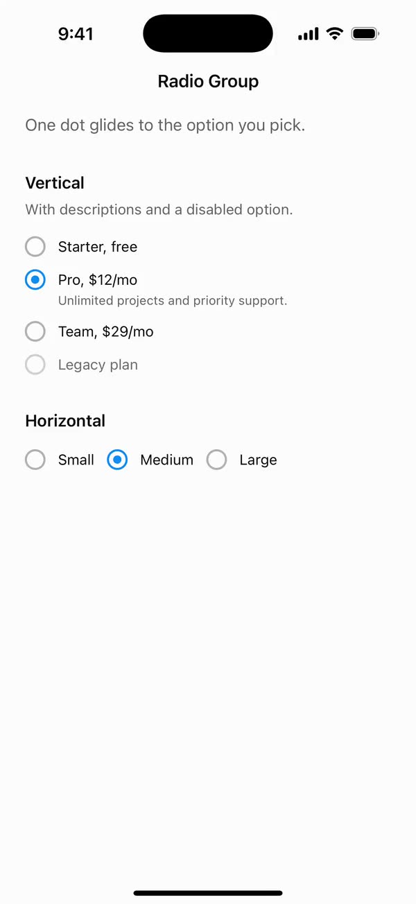
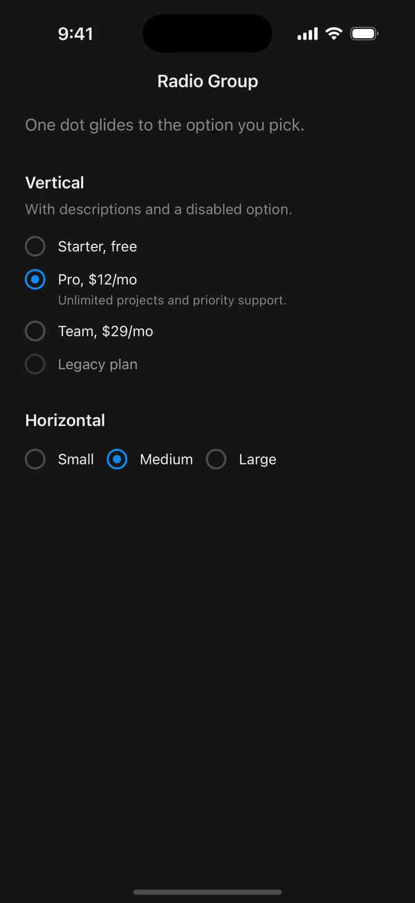
React NativeOne dot glides to the option you pick.
Preview
Install
Source on GitHubIt works in Expo and in bare React Native. New to beUI Native? Set up your app first.
Copies the component and the shared files it needs into src/, adds the theme tokens if they're missing, and installs its libraries. Files you've changed are kept.
Keep the folder layout, since the component imports the shared files by relative path.
1Install the libraries
npx expo install react-native-reanimated react-native-worklets
npm install uniwind tailwindcss2Add the theme tokens
Once per app. Import it from the CSS file Uniwind reads, after Tailwind and Uniwind, and change the values to match your brand.
/* Matches the default beUI palette in ui-components/lib/themes.ts.
   Native surface maps to card; muted maps to muted-foreground. */
@layer theme {
  :root {
    @variant light {
      --color-background: oklch(99% 0 0);
      --color-surface: oklch(97% 0 0);
      --color-foreground: oklch(15% 0 0);
      --color-muted: oklch(50% 0 0);
      --color-border: oklch(15% 0 0 / 0.06);
      --color-border-strong: oklch(15% 0 0 / 0.16);
      --color-primary: #0285f7;
      --color-on-primary: #ffffff;
      --color-destructive: #dc2626;
      --color-success: #059669;
      --color-warning: #d97706;
    }
  }

  :root {
    @variant dark {
      --color-background: #151515;
      --color-surface: #1c1c1c;
      --color-foreground: oklch(96% 0 0);
      --color-muted: oklch(62% 0 0);
      --color-border: rgb(255 255 255 / 0.05);
      --color-border-strong: rgb(255 255 255 / 0.14);
      --color-primary: #0285f7;
      --color-on-primary: #ffffff;
      --color-destructive: #f87171;
      --color-success: #34d399;
      --color-warning: #fbbf24;
    }
  }
}
3Copy the shared files
import { useEffect, useState } from "react";
import { AccessibilityInfo } from "react-native";
import { useReducedMotion } from "react-native-reanimated";

/** Reanimated supplies a synchronous initial value; native events keep it current. */
export function useReducedMotionPreference() {
  const initialValue = useReducedMotion();
  const [reducedMotion, setReducedMotion] = useState(initialValue);

  useEffect(() => {
    let active = true;
    let receivedEvent = false;
    const subscription = AccessibilityInfo.addEventListener(
      "reduceMotionChanged",
      (value) => {
        receivedEvent = true;
        setReducedMotion(value);
      },
    );
    void AccessibilityInfo.isReduceMotionEnabled().then((value) => {
      if (active && !receivedEvent) setReducedMotion(value);
    });
    return () => {
      active = false;
      subscription.remove();
    };
  }, []);

  return reducedMotion;
}
import { Easing, ReduceMotion } from "react-native-reanimated";

// Mirrors beUI's lib/ease.ts so native motion matches the web library.

export const EASE_OUT = Easing.bezier(0.16, 1, 0.3, 1);
export const EASE_IN_OUT = Easing.bezier(0.77, 0, 0.175, 1);

/** Press feedback on buttons and other tappable surfaces. */
export const SPRING_PRESS = {
  stiffness: 500,
  damping: 30,
  mass: 0.6,
  reduceMotion: ReduceMotion.System,
} as const;

/** Content swaps: label and icon slots trading places inside a control. */
export const SPRING_SWAP = {
  stiffness: 460,
  damping: 30,
  mass: 0.55,
  reduceMotion: ReduceMotion.System,
} as const;

/** Shared-layout glides: pills, indicators and panels moving between positions. */
export const SPRING_LAYOUT = {
  stiffness: 360,
  damping: 32,
  mass: 0.6,
  reduceMotion: ReduceMotion.System,
} as const;

/** Dragged handles and fills; critically damped so values never rebound off an end. */
export const SPRING_GLIDE = {
  stiffness: 700,
  damping: 50,
  mass: 0.5,
  reduceMotion: ReduceMotion.System,
} as const;

export const motion = {
  press: SPRING_PRESS,
  swap: SPRING_SWAP,
  layout: SPRING_LAYOUT,
  glide: SPRING_GLIDE,
  exit: { duration: 160, easing: EASE_OUT, reduceMotion: ReduceMotion.System },
  fade: { duration: 150, reduceMotion: ReduceMotion.System },
} as const;
4Copy the component
export type { RadioGroupItemProps, RadioGroupProps } from "./radio";
export { RadioGroup, RadioGroupItem } from "./radio";
import {
  createContext,
  type ReactNode,
  type Ref,
  type RefObject,
  useCallback,
  useContext,
  useEffect,
  useMemo,
  useRef,
  useState,
} from "react";
import {
  Pressable,
  type PressableProps,
  StyleSheet,
  Text,
  View,
  type ViewProps,
} from "react-native";
import Animated, {
  cancelAnimation,
  interpolateColor,
  type SharedValue,
  useAnimatedStyle,
  useSharedValue,
  withSpring,
  withTiming,
} from "react-native-reanimated";
import { useResolveClassNames } from "uniwind";
import { useReducedMotionPreference } from "../../hooks/use-reduced-motion";
import { motion } from "../../styles/motion";

const RING = 20;
const BORDER = 2;
const DOT = 8;
const DOT_INSET = (RING - DOT) / 2;
// Tops a 20-point row up to a 48-point touch area.
const HIT_SLOP = { top: 14, bottom: 14, left: 0, right: 0 };
const COLOR_FADE = { duration: 200, reduceMotion: motion.fade.reduceMotion };

type Measure = () => void;

type RadioGroupContextValue = {
  value: string;
  select: (value: string) => void;
  animate: boolean;
  groupRef: RefObject<View | null>;
  /** Records where an item's ring sits inside the group. */
  place: (value: string, x: number, y: number) => void;
  register: (value: string, measure: Measure) => () => void;
  dotScale: SharedValue<number>;
};

const RadioGroupContext = createContext<RadioGroupContextValue | null>(null);

function useRadioGroup() {
  const context = useContext(RadioGroupContext);
  if (!context) {
    throw new Error("RadioGroupItem must be rendered inside a RadioGroup.");
  }
  return context;
}

export type RadioGroupProps = Omit<ViewProps, "children"> & {
  /** Controlled value. Omit it and use `defaultValue` for uncontrolled use. */
  value?: string;
  defaultValue?: string;
  onValueChange?: (value: string) => void;
  orientation?: "vertical" | "horizontal";
  /** Disables dot and press motion independently of the system preference. */
  disableAnimation?: boolean;
  children: ReactNode;
  className?: string;
};

export function RadioGroup({
  value: valueProp,
  defaultValue = "",
  onValueChange,
  orientation = "vertical",
  disableAnimation = false,
  children,
  className = "",
  onLayout,
  ...props
}: RadioGroupProps) {
  const [uncontrolled, setUncontrolled] = useState(defaultValue);
  const value = valueProp ?? uncontrolled;
  const reducedMotion = useReducedMotionPreference();
  const animate = !reducedMotion && !disableAnimation;
  const { backgroundColor: dotColor } = useResolveClassNames("bg-primary");

  const groupRef = useRef<View>(null);
  const positions = useRef(new Map<string, { x: number; y: number }>());
  const measures = useRef(new Map<string, Measure>());
  const valueRef = useRef(value);
  valueRef.current = value;
  const animateRef = useRef(animate);
  animateRef.current = animate;

  const x = useSharedValue(0);
  const y = useSharedValue(0);
  const visible = useSharedValue(0);
  const dotScale = useSharedValue(1);

  // Glide to the selected ring, or appear in place when nothing was shown yet.
  const moveDot = useCallback(
    (target: string) => {
      const position = positions.current.get(target);
      if (!position) {
        visible.value = 0;
        return;
      }
      const left = position.x + DOT_INSET;
      const top = position.y + DOT_INSET;
      if (visible.value === 0 || !animateRef.current) {
        x.value = left;
        y.value = top;
      } else {
        x.value = withSpring(left, motion.layout);
        y.value = withSpring(top, motion.layout);
      }
      visible.value = 1;
    },
    [visible, x, y],
  );

  useEffect(() => {
    moveDot(value);
  }, [moveDot, value]);

  // Stable so items only re-register when their own value changes.
  const place = useCallback(
    (item: string, left: number, top: number) => {
      positions.current.set(item, { x: left, y: top });
      if (item === valueRef.current) moveDot(item);
    },
    [moveDot],
  );

  const register = useCallback(
    (item: string, measure: Measure) => {
      measures.current.set(item, measure);
      return () => {
        measures.current.delete(item);
        positions.current.delete(item);
        if (item === valueRef.current) visible.value = 0;
      };
    },
    [visible],
  );

  const context = useMemo<RadioGroupContextValue>(
    () => ({
      value,
      animate,
      groupRef,
      dotScale,
      place,
      register,
      select: (next) => {
        if (valueProp === undefined) setUncontrolled(next);
        onValueChange?.(next);
      },
    }),
    [animate, dotScale, onValueChange, place, register, value, valueProp],
  );

  const dotStyle = useAnimatedStyle(() => ({
    opacity: visible.value,
    transform: [
      { translateX: x.value },
      { translateY: y.value },
      { scale: dotScale.value },
    ],
  }));

  return (
    <RadioGroupContext.Provider value={context}>
      <View
        {...props}
        ref={groupRef}
        accessibilityRole="radiogroup"
        className={`relative gap-3 ${orientation === "vertical" ? "flex-col" : "flex-row flex-wrap"} ${className}`}
        onLayout={(event) => {
          // Items can move without their own layout changing, such as on reflow.
          for (const measure of measures.current.values()) measure();
          onLayout?.(event);
        }}
      >
        {children}
        <Animated.View
          style={[styles.dot, { backgroundColor: dotColor }, dotStyle]}
        />
      </View>
    </RadioGroupContext.Provider>
  );
}

export type RadioGroupItemProps = Omit<
  PressableProps,
  "children" | "style" | "onPress" | "disabled"
> & {
  value: string;
  label?: string;
  /** Supporting text under the label, read as the hint rather than the name. */
  description?: string;
  disabled?: boolean;
  className?: string;
  ref?: Ref<View>;
};

export function RadioGroupItem({
  value,
  label,
  description,
  disabled = false,
  className = "",
  accessibilityLabel,
  accessibilityHint,
  accessibilityState,
  hitSlop,
  onPressIn,
  onPressOut,
  ref,
  ...props
}: RadioGroupItemProps) {
  const group = useRadioGroup();
  const { animate, dotScale, groupRef, place, register } = group;
  const selected = group.value === value;
  const ringRef = useRef<View>(null);

  const { backgroundColor: idleBorder } = useResolveClassNames("bg-muted/50");
  const { backgroundColor: activeBorder } = useResolveClassNames("bg-primary");

  const active = useSharedValue(selected ? 1 : 0);
  const scale = useSharedValue(1);

  const measure = useCallback(() => {
    const ring = ringRef.current;
    const groupNode = groupRef.current;
    if (!ring || !groupNode) return;
    ring.measureLayout(groupNode, (left, top) => place(value, left, top));
  }, [groupRef, place, value]);

  useEffect(() => register(value, measure), [measure, register, value]);

  useEffect(() => {
    const target = selected ? 1 : 0;
    active.value = animate ? withTiming(target, COLOR_FADE) : target;
  }, [active, animate, selected]);

  useEffect(() => {
    if (!animate || disabled) {
      cancelAnimation(scale);
      scale.value = 1;
    }
  }, [animate, disabled, scale]);

  const ringStyle = useAnimatedStyle(() => ({
    borderColor: interpolateColor(
      active.value,
      [0, 1],
      [String(idleBorder ?? "gray"), String(activeBorder ?? "blue")],
    ),
    transform: [{ scale: scale.value }],
  }));

  return (
    <Pressable
      {...props}
      ref={ref}
      accessible
      accessibilityRole="radio"
      accessibilityLabel={accessibilityLabel ?? label}
      accessibilityHint={accessibilityHint ?? description}
      accessibilityState={{
        ...accessibilityState,
        checked: selected,
        disabled,
      }}
      aria-checked={selected}
      aria-disabled={disabled}
      disabled={disabled}
      hitSlop={hitSlop ?? HIT_SLOP}
      className={`self-start flex-row gap-3 ${description ? "items-start" : "items-center"} ${className}`}
      onPress={() => {
        if (!selected) group.select(value);
      }}
      onPressIn={(event) => {
        if (animate) {
          scale.value = withSpring(0.92, motion.press);
          // The dot lives in the group, so it presses along with its ring.
          if (selected) dotScale.value = withSpring(0.92, motion.press);
        }
        onPressIn?.(event);
      }}
      onPressOut={(event) => {
        if (animate) {
          scale.value = withSpring(1, motion.press);
          dotScale.value = withSpring(1, motion.press);
        }
        onPressOut?.(event);
      }}
    >
      <Animated.View
        ref={ringRef}
        onLayout={measure}
        style={[styles.ring, disabled && styles.disabled, ringStyle]}
      />
      {label || description ? (
        <View className={`shrink gap-0.5 ${disabled ? "opacity-60" : ""}`}>
          {label ? (
            <Text className="text-sm leading-5 text-foreground">{label}</Text>
          ) : null}
          {description ? (
            <Text className="text-xs text-muted">{description}</Text>
          ) : null}
        </View>
      ) : null}
    </Pressable>
  );
}

const styles = StyleSheet.create({
  ring: {
    width: RING,
    height: RING,
    borderRadius: RING / 2,
    borderWidth: BORDER,
    flexShrink: 0,
  },
  disabled: { opacity: 0.6 },
  dot: {
    position: "absolute",
    left: 0,
    top: 0,
    width: DOT,
    height: DOT,
    borderRadius: DOT / 2,
    pointerEvents: "none",
  },
});
Documentation
Native port of beUI Radio Group. A single-select group whose indicator dot glides to the option you pick.
import { RadioGroup, RadioGroupItem } from "./src";

<RadioGroup value={plan} onValueChange={setPlan}>
  <RadioGroupItem value="starter" label="Starter, free" />
  <RadioGroupItem value="pro" label="Pro, $12/mo" description="Unlimited projects." />
  <RadioGroupItem value="legacy" label="Legacy plan" disabled />
</RadioGroup>

<RadioGroup defaultValue="md" orientation="horizontal">…</RadioGroup>- Glide: one dot belongs to the group. It springs to the selected ring on beUI's
SPRING_LAYOUTspring, which replaces the web version's sharedlayoutId. The first selection appears in place without travelling. - Press: the ring springs to 92%. When you press the selected option, the dot presses with it.
- State: pass
valuewithonValueChangeto control it, ordefaultValueto let it manage itself.orientationstacks items vertically (the default) or wraps them in a row. - Label and description:
labelis the spoken name, anddescriptionis read as the accessibility hint. Each item's ring and text form one touch target, andhitSloptops a 20-point row up to 48 points. - Accessibility: the group reports the
radiogrouprole and each item reportsradiowith its checked and disabled states. - Reduced motion: when the system asks for it, or
disableAnimationis set on the group, the dot and colours change instantly with no press scale.
Items measure their position relative to the group, so they can sit inside your own wrapper views. Each item re-measures when its own layout or the group's layout changes. If an item moves without either of those changing, the dot can be left behind until the next layout.
Copy this directory, hooks/use-reduced-motion.ts, styles/motion.ts, and the semantic tokens in styles/theme.css.