
Swipeable List
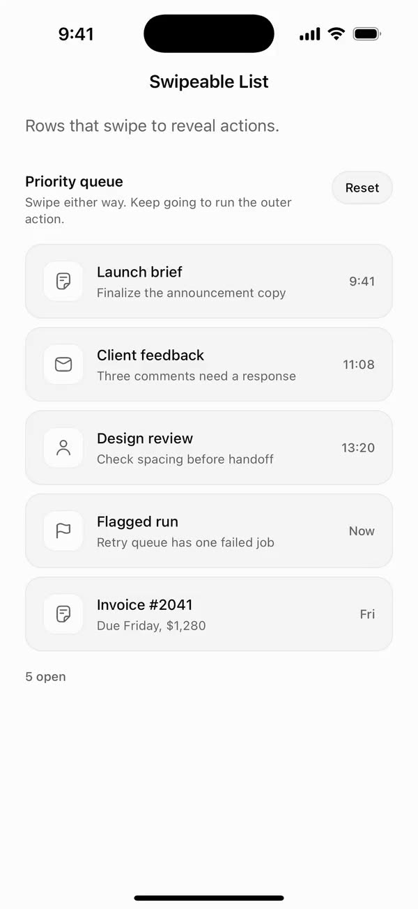
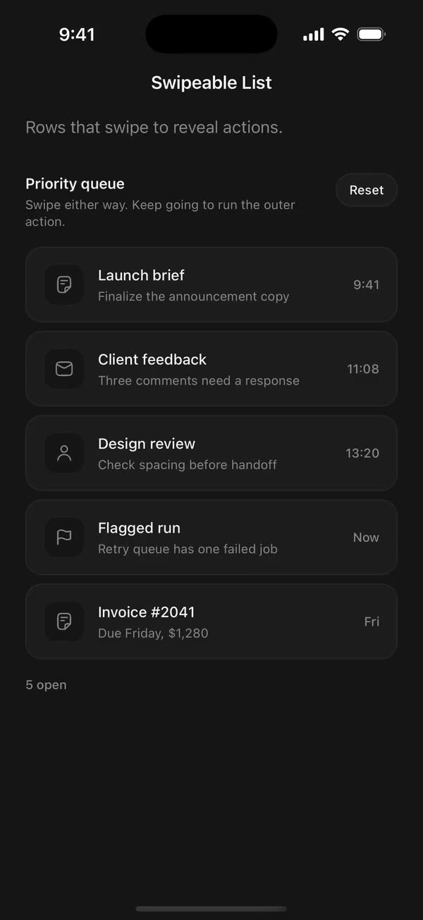
React NativeRows that swipe to reveal actions.
Preview
Install
Source on GitHubIt works in Expo and in bare React Native. New to beUI Native? Set up your app first.
Copies the component and the shared files it needs into src/, adds the theme tokens if they're missing, and installs its libraries. Files you've changed are kept.
Keep the folder layout, since the component imports the shared files by relative path.
1Install the libraries
npx expo install react-native-gesture-handler react-native-reanimated react-native-worklets
npm install uniwind tailwindcss
Wrap your app in GestureHandlerRootView if it isn't already.
2Add the theme tokens
Once per app. Import it from the CSS file Uniwind reads, after Tailwind and Uniwind, and change the values to match your brand.
/* Matches the default beUI palette in ui-components/lib/themes.ts.
   Native surface maps to card; muted maps to muted-foreground. */
@layer theme {
  :root {
    @variant light {
      --color-background: oklch(99% 0 0);
      --color-surface: oklch(97% 0 0);
      --color-foreground: oklch(15% 0 0);
      --color-muted: oklch(50% 0 0);
      --color-border: oklch(15% 0 0 / 0.06);
      --color-border-strong: oklch(15% 0 0 / 0.16);
      --color-primary: #0285f7;
      --color-on-primary: #ffffff;
      --color-destructive: #dc2626;
      --color-success: #059669;
      --color-warning: #d97706;
    }
  }

  :root {
    @variant dark {
      --color-background: #151515;
      --color-surface: #1c1c1c;
      --color-foreground: oklch(96% 0 0);
      --color-muted: oklch(62% 0 0);
      --color-border: rgb(255 255 255 / 0.05);
      --color-border-strong: rgb(255 255 255 / 0.14);
      --color-primary: #0285f7;
      --color-on-primary: #ffffff;
      --color-destructive: #f87171;
      --color-success: #34d399;
      --color-warning: #fbbf24;
    }
  }
}
3Copy the shared files
import { useEffect, useState } from "react";
import { AccessibilityInfo } from "react-native";
import { useReducedMotion } from "react-native-reanimated";

/** Reanimated supplies a synchronous initial value; native events keep it current. */
export function useReducedMotionPreference() {
  const initialValue = useReducedMotion();
  const [reducedMotion, setReducedMotion] = useState(initialValue);

  useEffect(() => {
    let active = true;
    let receivedEvent = false;
    const subscription = AccessibilityInfo.addEventListener(
      "reduceMotionChanged",
      (value) => {
        receivedEvent = true;
        setReducedMotion(value);
      },
    );
    void AccessibilityInfo.isReduceMotionEnabled().then((value) => {
      if (active && !receivedEvent) setReducedMotion(value);
    });
    return () => {
      active = false;
      subscription.remove();
    };
  }, []);

  return reducedMotion;
}
import {
  type ComponentType,
  createElement,
  isValidElement,
  type ReactNode,
} from "react";
import type { ColorValue } from "react-native";

export type IconProps = { size: number; color: ColorValue | undefined };
/** A component receiving `{ size, color }` (such as a lucide icon), or a prebuilt node. */
export type IconSource = ComponentType<IconProps> | ReactNode;

export function renderIcon(icon: IconSource, props: IconProps) {
  if (typeof icon === "function") return createElement(icon, props);
  // forwardRef and memo components (lucide-react-native, for example) are objects.
  if (
    icon != null &&
    typeof icon === "object" &&
    !isValidElement(icon) &&
    "$$typeof" in icon
  ) {
    return createElement(icon as unknown as ComponentType<IconProps>, props);
  }
  return icon;
}
import { Easing, ReduceMotion } from "react-native-reanimated";

// Mirrors beUI's lib/ease.ts so native motion matches the web library.

export const EASE_OUT = Easing.bezier(0.16, 1, 0.3, 1);
export const EASE_IN_OUT = Easing.bezier(0.77, 0, 0.175, 1);

/** Press feedback on buttons and other tappable surfaces. */
export const SPRING_PRESS = {
  stiffness: 500,
  damping: 30,
  mass: 0.6,
  reduceMotion: ReduceMotion.System,
} as const;

/** Content swaps: label and icon slots trading places inside a control. */
export const SPRING_SWAP = {
  stiffness: 460,
  damping: 30,
  mass: 0.55,
  reduceMotion: ReduceMotion.System,
} as const;

/** Shared-layout glides: pills, indicators and panels moving between positions. */
export const SPRING_LAYOUT = {
  stiffness: 360,
  damping: 32,
  mass: 0.6,
  reduceMotion: ReduceMotion.System,
} as const;

/** Dragged handles and fills; critically damped so values never rebound off an end. */
export const SPRING_GLIDE = {
  stiffness: 700,
  damping: 50,
  mass: 0.5,
  reduceMotion: ReduceMotion.System,
} as const;

export const motion = {
  press: SPRING_PRESS,
  swap: SPRING_SWAP,
  layout: SPRING_LAYOUT,
  glide: SPRING_GLIDE,
  exit: { duration: 160, easing: EASE_OUT, reduceMotion: ReduceMotion.System },
  fade: { duration: 150, reduceMotion: ReduceMotion.System },
} as const;
4Copy the component
export type {
  SwipeAction,
  SwipeActionTone,
  SwipeableListClassNames,
  SwipeableListItem,
  SwipeableListProps,
  SwipeableListValue,
  SwipeSide,
} from "./swipeable-list";
export { SwipeableList } from "./swipeable-list";
import {
  type ReactNode,
  useCallback,
  useEffect,
  useMemo,
  useRef,
  useState,
} from "react";
import {
  type AccessibilityActionEvent,
  type ColorValue,
  Pressable,
  StyleSheet,
  Text,
  View,
  type ViewProps,
} from "react-native";
import { Gesture, GestureDetector } from "react-native-gesture-handler";
import Animated, {
  cancelAnimation,
  type ExitAnimationsValues,
  FadeIn,
  interpolate,
  LayoutAnimationConfig,
  LinearTransition,
  ReduceMotion,
  type SharedValue,
  useAnimatedStyle,
  useSharedValue,
  withSpring,
  withTiming,
} from "react-native-reanimated";
import { scheduleOnRN } from "react-native-worklets";
import { useResolveClassNames } from "uniwind";
import { useReducedMotionPreference } from "../../hooks/use-reduced-motion";
import { type IconSource, renderIcon } from "../../primitives/render-icon";
import { EASE_OUT } from "../../styles/motion";

export type SwipeSide = "left" | "right";

export type SwipeableListValue = { id: string; side: SwipeSide };

export type SwipeActionTone =
  | "neutral"
  | "primary"
  | "success"
  | "warning"
  | "danger";

export type SwipeAction = {
  id: string;
  /** Shown under the icon, and the spoken name. */
  label: string;
  /** A component given `{ size, color }`, or a prebuilt element. */
  icon: IconSource;
  /** Fill color of the action. Defaults to neutral. */
  tone?: SwipeActionTone;
  disabled?: boolean;
  onPress?: (item: SwipeableListItem) => void;
};

export type SwipeableListItem = {
  id: string;
  title?: string;
  description?: string;
  meta?: string;
  leading?: ReactNode;
  /** Replaces the default title, description and meta layout. */
  content?: ReactNode;
  /** Revealed by swiping right. The first is outermost and runs on a full swipe. */
  leftActions?: SwipeAction[];
  /** Revealed by swiping left. The last is outermost and runs on a full swipe. */
  rightActions?: SwipeAction[];
  disabled?: boolean;
};

export type SwipeableListClassNames = {
  root?: string;
  item?: string;
  surface?: string;
  title?: string;
  description?: string;
  meta?: string;
};

export type SwipeableListProps = Omit<ViewProps, "children"> & {
  items: SwipeableListItem[];
  /** The open row. Omit it and use `defaultValue` for uncontrolled use. */
  value?: SwipeableListValue | null;
  defaultValue?: SwipeableListValue | null;
  onValueChange?: (value: SwipeableListValue | null) => void;
  onAction?: (payload: {
    item: SwipeableListItem;
    action: SwipeAction;
    side: SwipeSide;
    /** True when a full swipe ran the action rather than a tap. */
    fullSwipe: boolean;
  }) => void;
  /** Called when a row is tapped while closed. */
  onItemPress?: (item: SwipeableListItem) => void;
  /**
   * Called as a drag crosses the full-swipe point in either direction, the
   * moment to play a haptic. `armed` is true when releasing would run the action.
   */
  onSwipeThreshold?: (payload: {
    item: SwipeableListItem;
    side: SwipeSide;
    armed: boolean;
  }) => void;
  /** Width of each action when a row rests open, in points. Defaults to 72. */
  actionWidth?: number;
  /** Swiping far enough runs the outermost action. Defaults to true. */
  fullSwipe?: boolean;
  /** Closes the row after a tapped action runs. Defaults to true. */
  closeOnAction?: boolean;
  /** Space between rows in points. Defaults to 8. */
  gap?: number;
  /** Settles rows without springing, independently of the system preference. */
  disableAnimation?: boolean;
  className?: string;
  classNames?: SwipeableListClassNames;
  renderItem?: (item: SwipeableListItem) => ReactNode;
};

// Settles quickly with a hint of give, like the system list rows.
const SETTLE = {
  stiffness: 420,
  damping: 38,
  mass: 0.9,
  reduceMotion: ReduceMotion.System,
};
// The outermost action grows to fill and shrinks back on a livelier spring.
const ARM = {
  stiffness: 520,
  damping: 30,
  mass: 0.7,
  reduceMotion: ReduceMotion.System,
};
const COMMIT = { duration: 220, easing: EASE_OUT };
const OPEN_VELOCITY = 600;
const CLOSE_VELOCITY = 300;
const OPEN_DISTANCE_RATIO = 0.4;
const FLING_DISTANCE = 14;
// A full swipe arms once the row is this far past its resting actions, and at
// least this fraction of the row width.
const ARM_OVERSHOOT = 64;
const ARM_RATIO = 0.55;
// How long a fully swiped row waits off screen for its removal before returning.
const RETURN_DELAY = 320;
const ICON = 20;
// The row's corner radius, which action panels tuck under.
const CORNER = 16;

const FILLS: Record<SwipeActionTone, string> = {
  neutral: "bg-muted",
  primary: "bg-primary",
  success: "bg-success",
  warning: "bg-warning",
  danger: "bg-destructive",
};

/** iOS-style resistance: further pulls move less, approaching `dimension`. */
function rubberBand(overflow: number, dimension: number) {
  "worklet";
  const sign = overflow < 0 ? -1 : 1;
  const distance = Math.abs(overflow);
  return sign * ((distance * dimension * 0.55) / (dimension + 0.55 * distance));
}

function ActionPanel({
  action,
  index,
  count,
  side,
  x,
  rowWidth,
  arm,
  open,
  onPress,
}: {
  action: SwipeAction;
  index: number;
  count: number;
  side: SwipeSide;
  x: SharedValue<number>;
  rowWidth: SharedValue<number>;
  arm: SharedValue<number>;
  open: boolean;
  onPress: () => void;
}) {
  const { backgroundColor } = useResolveClassNames(
    FILLS[action.tone ?? "neutral"],
  );
  const { color } = useResolveClassNames("text-on-primary");
  // The outermost action sits at the screen edge and owns the full swipe.
  const outer = side === "left" ? 0 : count - 1;

  // The panel beside the row reaches under its rounded corners, so the corner
  // notches show the action's color rather than whatever is behind the list.
  const inner = side === "left" ? count - 1 : 0;

  const panelStyle = useAnimatedStyle(() => {
    const revealed = Math.max(0, side === "left" ? x.value : -x.value);
    const share = revealed / count;
    const a = arm.value;
    const widthOf = (i: number) =>
      i === outer ? share + (revealed - share) * a : share * (1 - a);
    let offset = 0;
    for (let i = 0; i < index; i += 1) offset += widthOf(i);
    const width = widthOf(index);
    // Grows from nothing so no color shows while the row is at rest.
    const tuck = Math.min(CORNER, revealed);
    const multi = count > 1;

    if (side === "right") {
      const edge = rowWidth.value - revealed;
      let start = edge + offset;
      if (index === inner) start -= tuck;
      // While armed, the outer action takes over the edge beside the row.
      if (index === outer && multi) start += (edge - tuck - start) * a;
      const end = edge + offset + width;
      return {
        left: start,
        width: end - start,
        zIndex: index === outer ? 1 : 0,
        paddingLeft: Math.max(0, edge - start),
        paddingRight: 0,
      };
    }

    const edge = revealed;
    const start = offset;
    let end = offset + width;
    if (index === inner) end += tuck;
    if (index === outer && multi) end += (edge + tuck - end) * a;
    return {
      left: start,
      width: end - start,
      zIndex: index === outer ? 1 : 0,
      paddingLeft: 0,
      paddingRight: Math.max(0, end - edge),
    };
  });

  const contentStyle = useAnimatedStyle(() => {
    const revealed = Math.max(0, side === "left" ? x.value : -x.value);
    const share = revealed / count;
    const width =
      index === outer
        ? share + (revealed - share) * arm.value
        : share * (1 - arm.value);
    // Content keeps its size and fades in as its panel makes room for it.
    const shown = interpolate(width, [24, 64], [0, 1], "clamp");
    return {
      opacity: shown,
      transform: [{ scale: 0.7 + 0.3 * shown }],
    };
  });

  // While armed, the outer action's content rides the row's edge.
  const alignStyle = useAnimatedStyle(() => {
    if (index !== outer) return { alignItems: "center" as const };
    return {
      alignItems:
        arm.value > 0.5
          ? side === "left"
            ? ("flex-end" as const)
            : ("flex-start" as const)
          : ("center" as const),
    };
  });

  return (
    <Animated.View
      style={[styles.panel, { backgroundColor }, panelStyle]}
      accessibilityElementsHidden={!open}
      importantForAccessibility={open ? "auto" : "no-hide-descendants"}
    >
      <Pressable
        accessibilityRole="button"
        accessibilityLabel={action.label}
        disabled={action.disabled || !open}
        onPress={onPress}
        style={[styles.press, action.disabled && styles.disabled]}
      >
        <Animated.View style={[styles.panelInner, alignStyle]}>
          <Animated.View style={[styles.actionContent, contentStyle]}>
            {renderIcon(action.icon, { size: ICON, color })}
            <Text
              numberOfLines={1}
              className="text-[11px] font-semibold text-on-primary"
            >
              {action.label}
            </Text>
          </Animated.View>
        </Animated.View>
      </Pressable>
    </Animated.View>
  );
}

function Row({
  item,
  index,
  gap,
  actionWidth,
  fullSwipe,
  openValue,
  setOpenValue,
  closeOnAction,
  onAction,
  onItemPress,
  onSwipeThreshold,
  reduce,
  pressedColor,
  classNames,
  renderItem,
}: {
  item: SwipeableListItem;
  index: number;
  gap: number;
  actionWidth: number;
  fullSwipe: boolean;
  openValue: SwipeableListValue | null;
  setOpenValue: (value: SwipeableListValue | null) => void;
  closeOnAction: boolean;
  onAction: SwipeableListProps["onAction"];
  onItemPress: SwipeableListProps["onItemPress"];
  onSwipeThreshold: SwipeableListProps["onSwipeThreshold"];
  reduce: boolean;
  pressedColor: ColorValue | undefined;
  classNames?: SwipeableListClassNames;
  renderItem?: (item: SwipeableListItem) => ReactNode;
}) {
  const leftActions = item.leftActions ?? [];
  const rightActions = item.rightActions ?? [];
  const leftWidth = leftActions.length * actionWidth;
  const rightWidth = rightActions.length * actionWidth;
  const openSide = openValue?.id === item.id ? openValue.side : null;
  const otherOpen = openValue !== null && openValue.id !== item.id;
  const restFor = useCallback(
    (side: SwipeSide | null) =>
      side === "left" ? leftWidth : side === "right" ? -rightWidth : 0,
    [leftWidth, rightWidth],
  );

  const x = useSharedValue(restFor(openSide));
  const start = useSharedValue(0);
  const rowWidth = useSharedValue(0);
  const arm = useSharedValue(0);
  const armed = useSharedValue(false);
  const pressed = useSharedValue(0);
  // The position this row last settled toward, so prop echoes don't re-animate it.
  const commanded = useRef(restFor(openSide));
  const mounted = useRef(true);
  useEffect(
    () => () => {
      mounted.current = false;
    },
    [],
  );

  const settle = useCallback(
    (target: number, velocity = 0) => {
      "worklet";
      x.value = reduce
        ? target
        : withSpring(target, { ...SETTLE, velocity: velocity * 0.6 });
    },
    [reduce, x],
  );

  const disarm = useCallback(() => {
    "worklet";
    armed.value = false;
    arm.value = reduce ? 0 : withSpring(0, ARM);
  }, [arm, armed, reduce]);

  // Follow outside changes, such as another row opening and closing this one.
  useEffect(() => {
    const target = restFor(openSide);
    if (commanded.current === target) return;
    commanded.current = target;
    settle(target);
  }, [openSide, restFor, settle]);

  const commit = useCallback(
    (side: SwipeSide | null) => {
      commanded.current = restFor(side);
      setOpenValue(side ? { id: item.id, side } : null);
    },
    [item.id, restFor, setOpenValue],
  );

  const closeOthers = useCallback(() => setOpenValue(null), [setOpenValue]);

  const runAction = useCallback(
    (action: SwipeAction, side: SwipeSide, full: boolean) => {
      if (action.disabled) return;
      action.onPress?.(item);
      onAction?.({ item, action, side, fullSwipe: full });
      if (full || closeOnAction) {
        commanded.current = 0;
        setOpenValue(null);
      }
      if (!full && closeOnAction) settle(0);
    },
    [closeOnAction, item, onAction, setOpenValue, settle],
  );

  // A full swipe leaves the row off screen; if the action removed it, its exit
  // animation collapses it from there. Otherwise it returns to rest.
  const completeFullSwipe = useCallback(
    (side: SwipeSide) => {
      const action =
        side === "left"
          ? leftActions[0]
          : rightActions[rightActions.length - 1];
      if (action) runAction(action, side, true);
      setTimeout(() => {
        if (!mounted.current) return;
        settle(0);
        disarm();
      }, RETURN_DELAY);
    },
    [disarm, leftActions, rightActions, runAction, settle],
  );

  const signalThreshold = useCallback(
    (side: SwipeSide, isArmed: boolean) =>
      onSwipeThreshold?.({ item, side, armed: isArmed }),
    [item, onSwipeThreshold],
  );

  const canFullLeft = fullSwipe && leftActions.some((a) => !a.disabled);
  const canFullRight = fullSwipe && rightActions.some((a) => !a.disabled);

  const pan = Gesture.Pan()
    .enabled(!item.disabled)
    // Horizontal intent claims the row; vertical intent leaves the scroll alone.
    .activeOffsetX([-10, 10])
    .failOffsetY([-10, 10])
    .onStart(() => {
      cancelAnimation(x);
      start.value = x.value;
      if (otherOpen) scheduleOnRN(closeOthers);
    })
    .onUpdate((event) => {
      const raw = start.value + event.translationX;
      const width = rowWidth.value || 1;
      // Full swipes travel freely to the row's edge; otherwise resistance
      // starts after the last action.
      const maxLeft = leftWidth > 0 ? (canFullLeft ? width : leftWidth) : 0;
      const maxRight = rightWidth > 0 ? (canFullRight ? width : rightWidth) : 0;
      x.value =
        raw > maxLeft
          ? maxLeft + rubberBand(raw - maxLeft, width)
          : raw < -maxRight
            ? -maxRight + rubberBand(raw + maxRight, width)
            : raw;

      const side: SwipeSide | null =
        x.value > 0 ? "left" : x.value < 0 ? "right" : null;
      const sideWidth = side === "left" ? leftWidth : rightWidth;
      const allowed = side === "left" ? canFullLeft : canFullRight;
      const threshold = Math.max(sideWidth + ARM_OVERSHOOT, width * ARM_RATIO);
      const nowArmed =
        side !== null && allowed && Math.abs(x.value) > threshold;
      if (nowArmed !== armed.value) {
        armed.value = nowArmed;
        arm.value = reduce
          ? nowArmed
            ? 1
            : 0
          : withSpring(nowArmed ? 1 : 0, ARM);
        if (side) scheduleOnRN(signalThreshold, side, nowArmed);
      }
    })
    .onEnd((event) => {
      const velocity = event.velocityX;
      const latest = x.value;
      const width = rowWidth.value || 1;

      if (armed.value) {
        const side: SwipeSide = latest > 0 ? "left" : "right";
        x.value = reduce
          ? side === "left"
            ? width
            : -width
          : withTiming(side === "left" ? width : -width, COMMIT);
        scheduleOnRN(completeFullSwipe, side);
        return;
      }

      let side: SwipeSide | null = null;
      if (openSide === "left") {
        side =
          latest < leftWidth * 0.6 || velocity < -CLOSE_VELOCITY
            ? null
            : "left";
      } else if (openSide === "right") {
        side =
          -latest < rightWidth * 0.6 || velocity > CLOSE_VELOCITY
            ? null
            : "right";
      } else if (
        leftWidth > 0 &&
        latest > 0 &&
        (latest > leftWidth * OPEN_DISTANCE_RATIO ||
          (velocity > OPEN_VELOCITY && latest > FLING_DISTANCE))
      ) {
        side = "left";
      } else if (
        rightWidth > 0 &&
        latest < 0 &&
        (-latest > rightWidth * OPEN_DISTANCE_RATIO ||
          (velocity < -OPEN_VELOCITY && latest < -FLING_DISTANCE))
      ) {
        side = "right";
      }

      settle(
        side === "left" ? leftWidth : side === "right" ? -rightWidth : 0,
        velocity,
      );
      scheduleOnRN(commit, side);
    });

  const pressItem = useCallback(() => onItemPress?.(item), [item, onItemPress]);

  // A tap closes an open row, as in native mail lists, or presses a closed one.
  const tap = Gesture.Tap()
    .enabled(!item.disabled && (openSide !== null || onItemPress !== undefined))
    .onBegin(() => {
      if (openSide === null) {
        pressed.value = withTiming(1, { duration: 80 });
      }
    })
    .onFinalize(() => {
      pressed.value = withTiming(0, { duration: 200 });
    })
    .onEnd(() => {
      if (openSide !== null) {
        settle(0);
        scheduleOnRN(commit, null);
      } else {
        scheduleOnRN(pressItem);
      }
    });

  const surfaceStyle = useAnimatedStyle(() => ({
    transform: [{ translateX: x.value }],
  }));
  const highlightStyle = useAnimatedStyle(() => ({
    opacity: pressed.value,
  }));

  const accessibilityActions = useMemo(
    () =>
      [...leftActions, ...rightActions]
        .filter((action) => !action.disabled)
        .map((action) => ({ name: action.id, label: action.label })),
    [leftActions, rightActions],
  );

  const onAccessibilityAction = (event: AccessibilityActionEvent) => {
    const name = event.nativeEvent.actionName;
    if (name === "activate") {
      onItemPress?.(item);
      return;
    }
    const left = leftActions.find((action) => action.id === name);
    const right = rightActions.find((action) => action.id === name);
    if (left) runAction(left, "left", false);
    else if (right) runAction(right, "right", false);
  };

  // Removed rows fold their height and spacing away while siblings glide up.
  const collapse = useMemo(() => {
    const margin = index > 0 ? gap : 0;
    return (values: ExitAnimationsValues) => {
      "worklet";
      const timing = { duration: 260, easing: EASE_OUT };
      return {
        initialValues: {
          height: values.currentHeight,
          marginTop: margin,
          opacity: 1,
        },
        animations: {
          height: withTiming(0, timing),
          marginTop: withTiming(0, timing),
          opacity: withTiming(0, { duration: 180 }),
        },
      };
    };
  }, [gap, index]);

  const content = renderItem ? (
    renderItem(item)
  ) : item.content !== undefined ? (
    item.content
  ) : (
    <View className="flex-row items-center gap-3">
      {item.leading ? <View className="shrink-0">{item.leading}</View> : null}
      <View className="flex-1">
        {item.title ? (
          <Text
            numberOfLines={1}
            className={`text-sm font-medium text-foreground ${classNames?.title ?? ""}`}
          >
            {item.title}
          </Text>
        ) : null}
        {item.description ? (
          <Text
            numberOfLines={1}
            className={`mt-0.5 text-xs text-muted ${classNames?.description ?? ""}`}
          >
            {item.description}
          </Text>
        ) : null}
      </View>
      {item.meta ? (
        <Text
          className={`shrink-0 text-xs font-medium text-muted ${classNames?.meta ?? ""}`}
        >
          {item.meta}
        </Text>
      ) : null}
    </View>
  );

  return (
    <Animated.View
      entering={reduce ? undefined : FadeIn.duration(220)}
      exiting={reduce ? undefined : collapse}
      layout={
        reduce
          ? undefined
          : LinearTransition.springify().stiffness(380).damping(36).mass(0.9)
      }
      onLayout={({ nativeEvent }) => {
        rowWidth.value = nativeEvent.layout.width;
      }}
      className={`overflow-hidden rounded-2xl ${item.disabled ? "opacity-60" : ""} ${classNames?.item ?? ""}`}
      style={{ marginTop: index > 0 ? gap : 0 }}
    >
      <View style={StyleSheet.absoluteFill}>
        {leftActions.map((action, i) => (
          <ActionPanel
            key={action.id}
            action={action}
            index={i}
            count={leftActions.length}
            side="left"
            x={x}
            rowWidth={rowWidth}
            arm={arm}
            open={openSide === "left"}
            onPress={() => runAction(action, "left", false)}
          />
        ))}
        {rightActions.map((action, i) => (
          <ActionPanel
            key={action.id}
            action={action}
            index={i}
            count={rightActions.length}
            side="right"
            x={x}
            rowWidth={rowWidth}
            arm={arm}
            open={openSide === "right"}
            onPress={() => runAction(action, "right", false)}
          />
        ))}
      </View>

      <GestureDetector gesture={Gesture.Exclusive(pan, tap)}>
        <Animated.View
          accessible
          accessibilityRole={onItemPress ? "button" : undefined}
          accessibilityLabel={
            [item.title, item.description, item.meta]
              .filter(Boolean)
              .join(", ") || undefined
          }
          accessibilityHint={
            accessibilityActions.length > 0
              ? "Has actions. Use the actions menu to choose one."
              : undefined
          }
          accessibilityActions={
            onItemPress
              ? [{ name: "activate" }, ...accessibilityActions]
              : accessibilityActions
          }
          onAccessibilityAction={onAccessibilityAction}
          accessibilityState={{ disabled: item.disabled ?? false }}
          className={`min-h-[72px] justify-center rounded-2xl border border-border bg-surface px-4 py-3 ${classNames?.surface ?? ""}`}
          style={[styles.surface, surfaceStyle]}
        >
          <Animated.View
            style={[
              StyleSheet.absoluteFill,
              styles.highlight,
              { backgroundColor: pressedColor },
              highlightStyle,
            ]}
          />
          {content}
        </Animated.View>
      </GestureDetector>
    </Animated.View>
  );
}

/**
 * List rows that swipe to reveal actions. Actions stretch with the drag, and a
 * full swipe runs the outermost action with the row sliding away.
 */
export function SwipeableList({
  items,
  value,
  defaultValue = null,
  onValueChange,
  onAction,
  onItemPress,
  onSwipeThreshold,
  actionWidth = 72,
  fullSwipe = true,
  closeOnAction = true,
  gap = 8,
  disableAnimation = false,
  className = "",
  classNames,
  renderItem,
  ...props
}: SwipeableListProps) {
  const [uncontrolled, setUncontrolled] = useState(defaultValue);
  const openValue = value === undefined ? uncontrolled : value;
  const reducedMotion = useReducedMotionPreference();
  const { backgroundColor: pressedColor } =
    useResolveClassNames("bg-foreground/5");

  const setOpenValue = useCallback(
    (next: SwipeableListValue | null) => {
      if (value === undefined) setUncontrolled(next);
      onValueChange?.(next);
    },
    [onValueChange, value],
  );

  return (
    <View
      {...props}
      className={`w-full ${className} ${classNames?.root ?? ""}`}
    >
      {/* Rows present on first render appear in place; later ones fade in. */}
      <LayoutAnimationConfig skipEntering>
        {items.map((item, index) => (
          <Row
            key={item.id}
            item={item}
            index={index}
            gap={gap}
            actionWidth={actionWidth}
            fullSwipe={fullSwipe}
            openValue={openValue}
            setOpenValue={setOpenValue}
            closeOnAction={closeOnAction}
            onAction={onAction}
            onItemPress={onItemPress}
            onSwipeThreshold={onSwipeThreshold}
            reduce={reducedMotion || disableAnimation}
            pressedColor={pressedColor}
            classNames={classNames}
            renderItem={renderItem}
          />
        ))}
      </LayoutAnimationConfig>
    </View>
  );
}

const styles = StyleSheet.create({
  surface: { boxShadow: "0 1px 2px rgba(0, 0, 0, 0.06)" },
  highlight: { borderRadius: 16, pointerEvents: "none" },
  panel: { position: "absolute", top: 0, bottom: 0, overflow: "hidden" },
  press: { flex: 1 },
  panelInner: { flex: 1, justifyContent: "center", paddingHorizontal: 12 },
  actionContent: { alignItems: "center", gap: 4, minWidth: 48 },
  disabled: { opacity: 0.5 },
});
Documentation
List rows that swipe left or right to reveal actions, built for touch first: actions stretch with your finger, and a full swipe runs the outermost action as the row slides away. It started as a port of beUI Swipeable List and now goes further than the web version.
import { SwipeableList } from "./src";

<SwipeableList
  items={[
    {
      id: "brief",
      title: "Launch brief",
      description: "Finalize the announcement copy",
      meta: "9:41",
      leftActions: [
        { id: "done", label: "Done", icon: Check, tone: "success" },
        { id: "pin", label: "Pin", icon: Pin, tone: "primary" },
      ],
      rightActions: [
        { id: "later", label: "Later", icon: Clock, tone: "warning" },
        { id: "trash", label: "Trash", icon: Trash, tone: "danger" },
      ],
    },
  ]}
  onAction={({ item, action }) => {
    if (action.id === "trash") remove(item.id);
  }}
  onSwipeThreshold={({ armed }) => armed && Haptics.impactAsync()}
  onItemPress={(item) => open(item)}
/>
Gestures
- Swipe: each row follows a Gesture Handler pan. A horizontal drag claims the row, and a vertical drag leaves the surrounding scroll view scrolling.
- Stretching actions: as you drag, the revealed space is shared evenly between that side's actions. Each action is a filled panel tinted by
tone(neutral,primary,success,warningordanger), and its icon and label fade and scale in once there is room for them. - Resting open: releasing past 40% of a side's actions (or flicking faster than 600 points per second) rests the row open at
actionWidthper action (72 by default). An open row closes below 60%, on a flick back, or on a tap. - Full swipe: keep dragging past the resting actions (by 64 points, and at least 55% of the row) and the outermost action springs out to fill the whole revealed space, while the others fold away. Releasing slides the row off screen and runs that action. Drag back before releasing and it springs back to normal. The outermost action is the first in
leftActionsand the last inrightActions. SetfullSwipe={false}to turn this off. - Resistance: past the furthest point a side allows, the row moves less the further you pull, like iOS rubber-banding.
- One open row: starting a swipe on another row closes the open one.
Removal
When an action removes its item from items, the row collapses its height and spacing while it fades, and the rows below glide up on a spring. After a full swipe the row is already off screen, so it simply folds away. If a fully swiped action does not remove its item, the row returns to rest. Items added later fade in; items present on first render appear in place.
Callbacks
onAction({ item, action, side, fullSwipe })runs for tapped actions, full swipes and accessibility actions.fullSwipetells them apart.onSwipeThreshold({ item, side, armed })fires as a drag crosses the full-swipe point in either direction, the moment to play a haptic. The component itself has no haptics dependency. The example app callsexpo-hapticshere.onItemPress(item)runs when a closed row is tapped, with a soft pressed highlight.
Other details
- State: pass
valuewithonValueChangeto control which row is open, ordefaultValueto let it manage itself. - Content: rows show
leading,title,descriptionandmetaby default. Usecontenton an item, orrenderItemfor the whole list, to supply your own. - Accessibility: each row is one element named by its title, description and meta. Screen readers can't swipe, so every action is also an accessibility action on the row (VoiceOver's rotor, or TalkBack's actions menu), along with "activate" when
onItemPressis set. Action buttons stay hidden until their side opens. - Reduced motion: when the system asks for it, or
disableAnimationis set, rows snap without springing and removals happen without the collapse. - Web: gestures and full swipes work. React Native Web doesn't run custom exit animations, so removed rows disappear without collapsing.
The list renders every row in a plain View, which suits inboxes and queues of tens of rows. Very long lists would need a virtualized variant built on FlatList.
Copy this directory, hooks/use-reduced-motion.ts, primitives/render-icon.tsx, styles/motion.ts, and the semantic tokens in styles/theme.css. The host app needs Gesture Handler with a GestureHandlerRootView at its root, which the example app already has.