
Menu
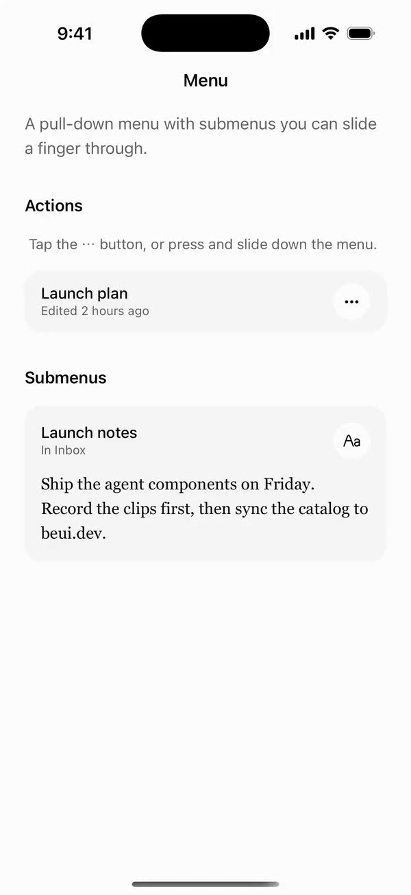
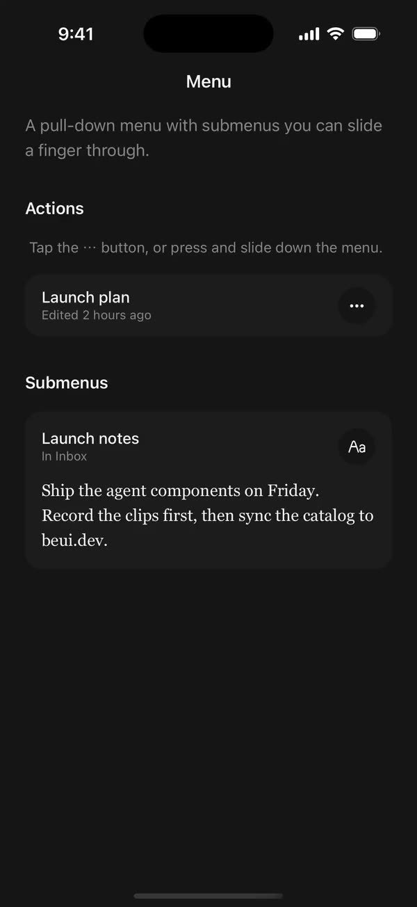
React NativeA pull-down menu with submenus you can slide a finger through.
Preview
Install
Source on GitHubIt works in Expo and in bare React Native. New to beUI Native? Set up your app first.
Copies the component and the shared files it needs into src/, adds the theme tokens if they're missing, and installs its libraries. Files you've changed are kept.
Keep the folder layout, since the component imports the shared files by relative path.
1Install the libraries
npx expo install react-native-gesture-handler react-native-reanimated react-native-svg react-native-worklets
npm install uniwind tailwindcss
Wrap your app in GestureHandlerRootView if it isn't already.
2Add the theme tokens
Once per app. Import it from the CSS file Uniwind reads, after Tailwind and Uniwind, and change the values to match your brand.
/* Matches the default beUI palette in ui-components/lib/themes.ts.
   Native surface maps to card; muted maps to muted-foreground. */
@layer theme {
  :root {
    @variant light {
      --color-background: oklch(99% 0 0);
      --color-surface: oklch(97% 0 0);
      --color-foreground: oklch(15% 0 0);
      --color-muted: oklch(50% 0 0);
      --color-border: oklch(15% 0 0 / 0.06);
      --color-border-strong: oklch(15% 0 0 / 0.16);
      --color-primary: #0285f7;
      --color-on-primary: #ffffff;
      --color-destructive: #dc2626;
      --color-success: #059669;
      --color-warning: #d97706;
    }
  }

  :root {
    @variant dark {
      --color-background: #151515;
      --color-surface: #1c1c1c;
      --color-foreground: oklch(96% 0 0);
      --color-muted: oklch(62% 0 0);
      --color-border: rgb(255 255 255 / 0.05);
      --color-border-strong: rgb(255 255 255 / 0.14);
      --color-primary: #0285f7;
      --color-on-primary: #ffffff;
      --color-destructive: #f87171;
      --color-success: #34d399;
      --color-warning: #fbbf24;
    }
  }

  /* Tailwind's default monospace stack isn't a font React Native can load. */
  :root {
    @variant ios {
      --font-mono: Menlo;
    }
  }

  :root {
    @variant android {
      --font-mono: monospace;
    }
  }
}
3Copy the shared files
import { useEffect, useState } from "react";
import { AccessibilityInfo } from "react-native";
import { useReducedMotion } from "react-native-reanimated";

/** Reanimated supplies a synchronous initial value; native events keep it current. */
export function useReducedMotionPreference() {
  const initialValue = useReducedMotion();
  const [reducedMotion, setReducedMotion] = useState(initialValue);

  useEffect(() => {
    let active = true;
    let receivedEvent = false;
    const subscription = AccessibilityInfo.addEventListener(
      "reduceMotionChanged",
      (value) => {
        receivedEvent = true;
        setReducedMotion(value);
      },
    );
    void AccessibilityInfo.isReduceMotionEnabled().then((value) => {
      if (active && !receivedEvent) setReducedMotion(value);
    });
    return () => {
      active = false;
      subscription.remove();
    };
  }, []);

  return reducedMotion;
}
import type { ReactNode } from "react";
import type { ColorValue } from "react-native";
import Svg, { Circle, Path, Rect } from "react-native-svg";

type GlyphProps = { size?: number; color?: ColorValue; strokeWidth?: number };

function Glyph({
  size = 16,
  color = "currentColor",
  strokeWidth = 2,
  children,
}: GlyphProps & { children: ReactNode }) {
  return (
    <Svg
      width={size}
      height={size}
      viewBox="0 0 24 24"
      fill="none"
      stroke={color}
      strokeWidth={strokeWidth}
      strokeLinecap="round"
      strokeLinejoin="round"
    >
      {children}
    </Svg>
  );
}

// Simple 24-unit stroke glyphs shared by the agent components.

export function ChevronDownGlyph(props: GlyphProps) {
  return (
    <Glyph {...props}>
      <Path d="M6 9l6 6 6-6" />
    </Glyph>
  );
}

export function ArrowUpGlyph(props: GlyphProps) {
  return (
    <Glyph {...props}>
      <Path d="M12 19V5M5.5 11.5L12 5l6.5 6.5" />
    </Glyph>
  );
}

export function PlusGlyph(props: GlyphProps) {
  return (
    <Glyph {...props}>
      <Path d="M12 5v14M5 12h14" />
    </Glyph>
  );
}

export function StopGlyph({ size = 12, color }: GlyphProps) {
  return (
    <Svg width={size} height={size} viewBox="0 0 12 12">
      <Rect x={1} y={1} width={10} height={10} rx={2.5} fill={color} />
    </Svg>
  );
}

export function CheckGlyph(props: GlyphProps) {
  return (
    <Glyph {...props}>
      <Path d="M5 12.5l4.5 4.5L19 7" />
    </Glyph>
  );
}

export function CopyGlyph(props: GlyphProps) {
  return (
    <Glyph {...props}>
      <Rect x={8.5} y={8.5} width={12} height={12} rx={2.5} />
      <Path d="M15.5 5.5v-.5A2 2 0 0 0 13.5 3h-8.5A2 2 0 0 0 3 5v8.5a2 2 0 0 0 2 2h.5" />
    </Glyph>
  );
}

export function RetryGlyph(props: GlyphProps) {
  return (
    <Glyph {...props}>
      <Path d="M3.5 12a8.5 8.5 0 1 0 2.6-6.1L3.5 8.5" />
      <Path d="M3.5 3.5v5h5" />
    </Glyph>
  );
}

export function ThumbGlyph({
  down = false,
  ...props
}: GlyphProps & { down?: boolean }) {
  return (
    <Glyph {...props}>
      <Path
        d="M7.5 10.5v10M7.5 10.5L11 3.5a2.5 2.5 0 0 1 2.5 2.5v3.5h5a2 2 0 0 1 2 2.3l-1.2 7A2 2 0 0 1 17.3 20.5H4.5a1 1 0 0 1-1-1v-8a1 1 0 0 1 1-1z"
        transform={down ? "rotate(180 12 12)" : undefined}
      />
    </Glyph>
  );
}

export function SearchGlyph(props: GlyphProps) {
  return (
    <Glyph {...props}>
      <Circle cx={11} cy={11} r={6.5} />
      <Path d="M16 16l4 4" />
    </Glyph>
  );
}

export function GlobeGlyph(props: GlyphProps) {
  return (
    <Glyph {...props}>
      <Circle cx={12} cy={12} r={8.5} />
      <Path d="M3.5 12h17M12 3.5c2.4 2.5 3.5 5.3 3.5 8.5s-1.1 6-3.5 8.5c-2.4-2.5-3.5-5.3-3.5-8.5s1.1-6 3.5-8.5z" />
    </Glyph>
  );
}

export function FileGlyph(props: GlyphProps) {
  return (
    <Glyph {...props}>
      <Path d="M14 3.5H7.5a2 2 0 0 0-2 2v13a2 2 0 0 0 2 2h9a2 2 0 0 0 2-2V8z" />
      <Path d="M14 3.5V8h4.5M9 13h6M9 16.5h4" />
    </Glyph>
  );
}

export function PencilGlyph(props: GlyphProps) {
  return (
    <Glyph {...props}>
      <Path d="M4 20h4L19 9a2.1 2.1 0 0 0-4-4L4 16z" />
      <Path d="M13.5 6.5l4 4M14 20h6" />
    </Glyph>
  );
}

export function TerminalGlyph(props: GlyphProps) {
  return (
    <Glyph {...props}>
      <Rect x={3.5} y={4.5} width={17} height={15} rx={2.5} />
      <Path d="M7.5 10l2.5 2-2.5 2M12.5 15h4" />
    </Glyph>
  );
}

export function WrenchGlyph(props: GlyphProps) {
  return (
    <Glyph {...props}>
      <Path d="M14.5 6.5a4 4 0 0 0 5 5l-8.8 8.8a2.1 2.1 0 0 1-3-3l8.8-8.8a4 4 0 0 1-2-2z" />
    </Glyph>
  );
}

export function SparkleGlyph(props: GlyphProps) {
  return (
    <Glyph {...props}>
      <Path d="M12 4l1.8 4.6L18.5 10.5l-4.7 1.9L12 17l-1.8-4.6-4.7-1.9 4.7-1.9z" />
      <Path d="M18.5 16.5v3M17 18h3" />
    </Glyph>
  );
}

export function MessageGlyph(props: GlyphProps) {
  return (
    <Glyph {...props}>
      <Path d="M20 14.5a2 2 0 0 1-2 2H8.5L4 20V6a2 2 0 0 1 2-2h12a2 2 0 0 1 2 2z" />
    </Glyph>
  );
}

export function ImageGlyph(props: GlyphProps) {
  return (
    <Glyph {...props}>
      <Rect x={3.5} y={4.5} width={17} height={15} rx={2.5} />
      <Circle cx={9} cy={10} r={1.5} />
      <Path d="M20.5 15.5l-4.5-4.5-9 8.5" />
    </Glyph>
  );
}

export function ShieldGlyph(props: GlyphProps) {
  return (
    <Glyph {...props}>
      <Path d="M12 3.5l7 2.5v5.5c0 4.4-3 7.7-7 9-4-1.3-7-4.6-7-9V6z" />
      <Path d="M9 12l2 2 4-4" />
    </Glyph>
  );
}

export function AlertGlyph(props: GlyphProps) {
  return (
    <Glyph {...props}>
      <Circle cx={12} cy={12} r={8.5} />
      <Path d="M12 8v4.5M12 16h.01" />
    </Glyph>
  );
}

export function CrossGlyph(props: GlyphProps) {
  return (
    <Glyph {...props}>
      <Path d="M6.5 6.5l11 11M17.5 6.5l-11 11" />
    </Glyph>
  );
}

export function HelpGlyph(props: GlyphProps) {
  return (
    <Glyph {...props}>
      <Circle cx={12} cy={12} r={8.5} />
      <Path d="M9.6 9.5a2.5 2.5 0 0 1 4.8 1c0 1.7-2.4 2.2-2.4 3.5M12 16.8h.01" />
    </Glyph>
  );
}

export function ArrowGlyph({
  back = false,
  ...props
}: GlyphProps & { back?: boolean }) {
  return (
    <Glyph {...props}>
      <Path
        d="M5 12h14M13 6l6 6-6 6"
        transform={back ? "rotate(180 12 12)" : undefined}
      />
    </Glyph>
  );
}

export function BracesGlyph(props: GlyphProps) {
  return (
    <Glyph {...props}>
      <Path d="M8.5 4H8a2 2 0 0 0-2 2v3.5A2.5 2.5 0 0 1 3.5 12 2.5 2.5 0 0 1 6 14.5V18a2 2 0 0 0 2 2h.5M15.5 4h.5a2 2 0 0 1 2 2v3.5a2.5 2.5 0 0 0 2.5 2.5 2.5 2.5 0 0 0-2.5 2.5V18a2 2 0 0 1-2 2h-.5" />
    </Glyph>
  );
}

export function BanGlyph(props: GlyphProps) {
  return (
    <Glyph {...props}>
      <Circle cx={12} cy={12} r={8.5} />
      <Path d="M6 6l12 12" />
    </Glyph>
  );
}

export function CircleCheckGlyph(props: GlyphProps) {
  return (
    <Glyph {...props}>
      <Circle cx={12} cy={12} r={8.5} />
      <Path d="M8.5 12.2l2.4 2.4 4.6-4.8" />
    </Glyph>
  );
}

export function CircleCrossGlyph(props: GlyphProps) {
  return (
    <Glyph {...props}>
      <Circle cx={12} cy={12} r={8.5} />
      <Path d="M9.5 9.5l5 5M14.5 9.5l-5 5" />
    </Glyph>
  );
}

export function ListGlyph(props: GlyphProps) {
  return (
    <Glyph {...props}>
      <Path d="M4 6.5l1.5 1.5L8 5.5M4 13l1.5 1.5L8 12M11.5 7h8.5M11.5 13.5h8.5M11.5 19h8.5M4.5 19h2" />
    </Glyph>
  );
}

/** An open ring, spun by SpinGlyph. */
export function RingGlyph(props: GlyphProps) {
  return (
    <Glyph {...props}>
      <Path d="M20.5 12a8.5 8.5 0 1 1-6-8.1" />
    </Glyph>
  );
}

export function ReplyGlyph(props: GlyphProps) {
  return (
    <Glyph {...props}>
      <Path d="M9.5 7L4.5 12l5 5M4.5 12h10a5 5 0 0 1 5 5v1" />
    </Glyph>
  );
}

export function WrapGlyph(props: GlyphProps) {
  return (
    <Glyph {...props}>
      <Path d="M4 6.5h16M4 12h12.5a3.25 3.25 0 0 1 0 6.5H12M4 18.5h4.5M14 16.5l-2 2 2 2" />
    </Glyph>
  );
}

export function BookGlyph(props: GlyphProps) {
  return (
    <Glyph {...props}>
      <Path d="M12 6.5c-1.6-1.3-4-2-7.5-2v13c3.5 0 5.9.7 7.5 2 1.6-1.3 4-2 7.5-2v-13c-3.5 0-5.9.7-7.5 2zM12 6.5v13" />
    </Glyph>
  );
}

export function ExternalGlyph(props: GlyphProps) {
  return (
    <Glyph {...props}>
      <Path d="M14 4.5h5.5V10M19.5 4.5L11 13M17 14v4a2 2 0 0 1-2 2H6a2 2 0 0 1-2-2V9a2 2 0 0 1 2-2h4" />
    </Glyph>
  );
}

export function DoubleCheckGlyph(props: GlyphProps) {
  return (
    <Glyph {...props}>
      <Path d="M2.5 12.5l4.5 4.5 9-9.5M12 16.5l.5.5 9-9.5" />
    </Glyph>
  );
}

export function ClockGlyph(props: GlyphProps) {
  return (
    <Glyph {...props}>
      <Circle cx={12} cy={12} r={8.5} />
      <Path d="M12 7.5V12l3 2" />
    </Glyph>
  );
}

export function MicGlyph(props: GlyphProps) {
  return (
    <Glyph {...props}>
      <Rect x={9} y={3.5} width={6} height={11} rx={3} />
      <Path d="M5.5 11a6.5 6.5 0 0 0 13 0M12 17.5v3" />
    </Glyph>
  );
}
import {
  type ComponentType,
  createElement,
  isValidElement,
  type ReactNode,
} from "react";
import type { ColorValue } from "react-native";

export type IconProps = { size: number; color: ColorValue | undefined };
/** A component receiving `{ size, color }` (such as a lucide icon), or a prebuilt node. */
export type IconSource = ComponentType<IconProps> | ReactNode;

export function renderIcon(icon: IconSource, props: IconProps) {
  if (typeof icon === "function") return createElement(icon, props);
  // forwardRef and memo components (lucide-react-native, for example) are objects.
  if (
    icon != null &&
    typeof icon === "object" &&
    !isValidElement(icon) &&
    "$$typeof" in icon
  ) {
    return createElement(icon as unknown as ComponentType<IconProps>, props);
  }
  return icon;
}
import { Easing, ReduceMotion } from "react-native-reanimated";

// Mirrors beUI's lib/ease.ts so native motion matches the web library.

export const EASE_OUT = Easing.bezier(0.16, 1, 0.3, 1);
export const EASE_IN_OUT = Easing.bezier(0.77, 0, 0.175, 1);

/** Press feedback on buttons and other tappable surfaces. */
export const SPRING_PRESS = {
  stiffness: 500,
  damping: 30,
  mass: 0.6,
  reduceMotion: ReduceMotion.System,
} as const;

/** Content swaps: label and icon slots trading places inside a control. */
export const SPRING_SWAP = {
  stiffness: 460,
  damping: 30,
  mass: 0.55,
  reduceMotion: ReduceMotion.System,
} as const;

/** Shared-layout glides: pills, indicators and panels moving between positions. */
export const SPRING_LAYOUT = {
  stiffness: 360,
  damping: 32,
  mass: 0.6,
  reduceMotion: ReduceMotion.System,
} as const;

/** Dragged handles and fills; critically damped so values never rebound off an end. */
export const SPRING_GLIDE = {
  stiffness: 700,
  damping: 50,
  mass: 0.5,
  reduceMotion: ReduceMotion.System,
} as const;

export const motion = {
  press: SPRING_PRESS,
  swap: SPRING_SWAP,
  layout: SPRING_LAYOUT,
  glide: SPRING_GLIDE,
  exit: { duration: 160, easing: EASE_OUT, reduceMotion: ReduceMotion.System },
  fade: { duration: 150, reduceMotion: ReduceMotion.System },
} as const;
4Copy the component
export type {
  MenuCheckboxItemProps,
  MenuContentProps,
  MenuItemProps,
  MenuProps,
  MenuRadioGroupProps,
  MenuRadioItemProps,
  MenuSubTriggerProps,
  MenuTriggerProps,
} from "./menu";
export {
  Menu,
  MenuCheckboxItem,
  MenuContent,
  MenuItem,
  MenuLabel,
  MenuRadioGroup,
  MenuRadioItem,
  MenuSeparator,
  MenuSub,
  MenuSubContent,
  MenuSubTrigger,
  MenuTrigger,
  useMenu,
} from "./menu";
import {
  createContext,
  type ReactNode,
  useCallback,
  useContext,
  useEffect,
  useId,
  useMemo,
  useRef,
  useState,
} from "react";
import {
  Modal,
  Pressable,
  type PressableProps,
  ScrollView,
  StyleSheet,
  Text,
  useWindowDimensions,
  View,
} from "react-native";
import { Gesture, GestureDetector } from "react-native-gesture-handler";
import Animated, {
  LinearTransition,
  ReduceMotion,
  type SharedValue,
  useAnimatedReaction,
  useAnimatedStyle,
  useSharedValue,
  withDelay,
  withSpring,
  withTiming,
} from "react-native-reanimated";
import { scheduleOnRN } from "react-native-worklets";
import { useResolveClassNames } from "uniwind";
import { useReducedMotionPreference } from "../../hooks/use-reduced-motion";
import { CheckGlyph, ChevronDownGlyph } from "../../primitives/agent-icons";
import { type IconSource, renderIcon } from "../../primitives/render-icon";
import { EASE_OUT, SPRING_LAYOUT, SPRING_SWAP } from "../../styles/motion";

const EDGE = 12;
const GAP = 8;
const TOP_CLEARANCE = 56;
const STAGGER = 24;
// The panel's height glides as a submenu replaces the items.
const PANEL_RESIZE = LinearTransition.springify()
  .stiffness(SPRING_LAYOUT.stiffness)
  .damping(SPRING_LAYOUT.damping)
  .mass(SPRING_LAYOUT.mass);
const SPRING_OPEN = {
  stiffness: 380,
  damping: 30,
  mass: 0.6,
  reduceMotion: ReduceMotion.System,
};
const CLOSE = { duration: 150, easing: EASE_OUT };

type Frame = { x: number; y: number; width: number; height: number };
type Slot = { top: number; height: number; disabled: boolean };
type Entry = { slot: Slot; select: () => void; closes: boolean };

type MenuContextValue = {
  open: boolean;
  setOpen: (open: boolean) => void;
  anchor: Frame | null;
  triggerRef: React.RefObject<View | null>;
  reduce: boolean;
  /** Item frames in layout order, read on the UI thread while sliding. */
  slots: SharedValue<Slot[]>;
  highlight: SharedValue<number>;
  register: (id: string, entry: Entry | null) => void;
  selectAt: (index: number) => void;
  /** Order in which items mount, for the entrance stagger. */
  order: (id: string) => number;
  /** The page on show: the root list, or a submenu's id. */
  page: string;
  /** The open submenus, outermost first. */
  stack: { id: string; label: string }[];
  /** 1 after opening a submenu, -1 after going back. */
  direction: number;
  push: (id: string, label: string) => void;
  back: () => void;
};

const ROOT = "root";
/** Which page an item belongs to. */
const PageContext = createContext(ROOT);

/** True when the item's page is the one on show. */
function useOnPage() {
  const page = useContext(PageContext);
  const context = useContext(MenuContext);
  return context ? context.page === page : false;
}

const MenuContext = createContext<MenuContextValue | null>(null);

function useMenuContext(part: string) {
  const context = useContext(MenuContext);
  if (!context) throw new Error(`${part} must be used within <Menu>`);
  return context;
}

/** Open state for custom triggers and items. */
export function useMenu() {
  const { open, setOpen } = useMenuContext("useMenu");
  return { open, setOpen, close: () => setOpen(false) };
}

export type MenuProps = {
  open?: boolean;
  /** Defaults to false. */
  defaultOpen?: boolean;
  onOpenChange?: (open: boolean) => void;
  /** Opens and closes without motion, independently of the system preference. */
  disableAnimation?: boolean;
  children: ReactNode;
};

/**
 * A pull-down menu: a trigger and the actions it reveals. Compose MenuTrigger
 * and MenuContent with MenuItem, MenuLabel, MenuSeparator, MenuRadioGroup and
 * MenuCheckboxItem inside.
 */
export function Menu({
  open: controlledOpen,
  defaultOpen = false,
  onOpenChange,
  disableAnimation = false,
  children,
}: MenuProps) {
  const reducedMotion = useReducedMotionPreference();
  const reduce = reducedMotion || disableAnimation;
  const [internalOpen, setInternalOpen] = useState(defaultOpen);
  const open = controlledOpen ?? internalOpen;
  const [anchor, setAnchor] = useState<Frame | null>(null);
  const triggerRef = useRef<View>(null);
  const slots = useSharedValue<Slot[]>([]);
  const highlight = useSharedValue(-1);
  const entries = useRef(new Map<string, Entry>());
  const sorted = useRef<Entry[]>([]);
  const mountOrder = useRef(new Map<string, number>());
  const [stack, setStack] = useState<{ id: string; label: string }[]>([]);
  const [direction, setDirection] = useState(1);
  const page = stack[stack.length - 1]?.id ?? ROOT;

  const setOpen = useCallback(
    (next: boolean) => {
      const apply = () => {
        if (controlledOpen === undefined) setInternalOpen(next);
        onOpenChange?.(next);
      };
      if (next) {
        // Measure the trigger first, so the menu opens from where it is now.
        triggerRef.current?.measureInWindow((x, y, width, height) => {
          setAnchor({ x, y, width, height });
          apply();
        });
        if (!triggerRef.current) apply();
      } else {
        apply();
      }
    },
    [controlledOpen, onOpenChange],
  );

  useEffect(() => {
    if (!open) {
      highlight.value = -1;
      mountOrder.current.clear();
      setStack([]);
    }
  }, [highlight, open]);

  const push = useCallback((id: string, label: string) => {
    mountOrder.current.clear();
    setDirection(1);
    setStack((current) => [...current, { id, label }]);
  }, []);
  const back = useCallback(() => {
    mountOrder.current.clear();
    setDirection(-1);
    setStack((current) => current.slice(0, -1));
  }, []);

  // A controlled open without a measured trigger still needs its anchor.
  useEffect(() => {
    if (!open || anchor) return;
    triggerRef.current?.measureInWindow((x, y, width, height) =>
      setAnchor({ x, y, width, height }),
    );
  }, [anchor, open]);

  const register = useCallback(
    (id: string, entry: Entry | null) => {
      if (entry) entries.current.set(id, entry);
      else entries.current.delete(id);
      sorted.current = [...entries.current.values()].sort(
        (a, b) => a.slot.top - b.slot.top,
      );
      slots.value = sorted.current.map((item) => item.slot);
    },
    [slots],
  );

  const selectAt = useCallback(
    (index: number) => {
      const entry = sorted.current[index];
      if (!entry || entry.slot.disabled) return;
      entry.select();
      if (entry.closes) setOpen(false);
    },
    [setOpen],
  );

  const order = useCallback((id: string) => {
    const map = mountOrder.current;
    if (!map.has(id)) map.set(id, map.size);
    return map.get(id) ?? 0;
  }, []);

  const value = useMemo(
    () => ({
      open,
      setOpen,
      anchor,
      triggerRef,
      reduce,
      slots,
      highlight,
      register,
      selectAt,
      order,
      page,
      stack,
      direction,
      push,
      back,
    }),
    [
      back,
      direction,
      page,
      push,
      stack,
      anchor,
      highlight,
      open,
      order,
      reduce,
      register,
      selectAt,
      setOpen,
      slots,
    ],
  );

  return <MenuContext.Provider value={value}>{children}</MenuContext.Provider>;
}

export type MenuTriggerProps = Omit<PressableProps, "onPress" | "children"> & {
  children: ReactNode;
};

/** Opens the menu. Wraps your button content; it reports whether the menu is open. */
export function MenuTrigger({
  children,
  accessibilityLabel,
  ...props
}: MenuTriggerProps) {
  const { open, setOpen, triggerRef } = useMenuContext("MenuTrigger");
  return (
    <View ref={triggerRef} collapsable={false}>
      <Pressable
        accessibilityRole="button"
        accessibilityLabel={accessibilityLabel}
        accessibilityState={{ expanded: open }}
        hitSlop={6}
        onPress={() => setOpen(!open)}
        {...props}
      >
        {children}
      </Pressable>
    </View>
  );
}

const SectionContext = createContext({
  radio: undefined as RadioContextValue | undefined,
});

/** Each row fades down into place, a beat after the one above. */
function useEntrance(index: number) {
  const { open, reduce } = useMenuContext("Menu items");
  const shown = useSharedValue(0);
  useEffect(() => {
    shown.value = open
      ? withDelay(
          reduce ? 0 : 50 + index * STAGGER,
          withTiming(1, { duration: 160, easing: EASE_OUT }),
        )
      : withTiming(0, { duration: 90 });
  }, [index, open, reduce, shown]);
  return useAnimatedStyle(() => ({
    opacity: shown.value,
    transform: [{ translateY: reduce ? 0 : (1 - shown.value) * -6 }],
  }));
}

function useSlot({
  disabled,
  select,
  closes,
}: {
  disabled: boolean;
  select: () => void;
  closes: boolean;
}) {
  const { register, slots, highlight, order } = useMenuContext("Menu items");
  const id = useId();
  const latest = useRef({ select, closes, disabled });
  latest.current = { select, closes, disabled };
  const frame = useRef<{ top: number; height: number } | null>(null);
  const index = order(id);

  const sync = useCallback(() => {
    if (!frame.current) return;
    register(id, {
      slot: { ...frame.current, disabled: latest.current.disabled },
      select: () => latest.current.select(),
      closes: latest.current.closes,
    });
  }, [id, register]);

  useEffect(() => {
    sync();
  }, [disabled, closes, sync]);
  useEffect(() => () => register(id, null), [id, register]);

  const onLayout = (event: {
    nativeEvent: { layout: { y: number; height: number } };
  }) => {
    frame.current = {
      top: event.nativeEvent.layout.y,
      height: event.nativeEvent.layout.height,
    };
    sync();
  };

  const style = useEntrance(index);

  return { onLayout, style, slots, highlight };
}

type ItemBodyProps = {
  icon?: IconSource;
  description?: string;
  destructive?: boolean;
  disabled?: boolean;
  trailing?: ReactNode;
  children: ReactNode;
};

function ItemBody({
  icon,
  description,
  destructive,
  disabled,
  trailing,
  children,
}: ItemBodyProps) {
  const { color: muted } = useResolveClassNames("text-muted");
  const { color: danger } = useResolveClassNames("text-destructive");
  return (
    <View
      style={[styles.item, disabled && styles.disabled]}
      className="px-3 py-2.5"
    >
      {icon ? (
        <View style={styles.icon}>
          {renderIcon(icon, { size: 18, color: destructive ? danger : muted })}
        </View>
      ) : null}
      <View style={styles.flex}>
        {typeof children === "string" ? (
          <Text
            numberOfLines={1}
            className={`text-[15px] ${destructive ? "text-destructive" : "text-foreground"}`}
          >
            {children}
          </Text>
        ) : (
          children
        )}
        {description ? (
          <Text numberOfLines={2} className="text-xs leading-4 text-muted">
            {description}
          </Text>
        ) : null}
      </View>
      {trailing}
    </View>
  );
}

export type MenuItemProps = Omit<ItemBodyProps, "trailing"> & {
  onSelect?: () => void;
  /** Defaults to true. */
  closeOnSelect?: boolean;
  /** Spoken name when the children aren't plain text. */
  accessibilityLabel?: string;
};

/** An action. Tap it, or slide onto it and let go. */
function MenuItemRow({
  onSelect,
  closeOnSelect = true,
  disabled = false,
  accessibilityLabel,
  ...body
}: MenuItemProps) {
  const { setOpen } = useMenuContext("MenuItem");
  const { onLayout, style } = useSlot({
    disabled,
    select: () => onSelect?.(),
    closes: closeOnSelect,
  });
  return (
    <Animated.View
      onLayout={onLayout}
      style={style}
      accessible
      accessibilityRole="menuitem"
      accessibilityLabel={
        accessibilityLabel ??
        (typeof body.children === "string" ? body.children : undefined)
      }
      accessibilityHint={body.description}
      accessibilityState={{ disabled }}
      onAccessibilityTap={() => {
        if (disabled) return;
        onSelect?.();
        if (closeOnSelect) setOpen(false);
      }}
    >
      <ItemBody disabled={disabled} {...body} />
    </Animated.View>
  );
}

/** A check that springs in when its item is chosen. */
function Check({ on, reduce }: { on: boolean; reduce: boolean }) {
  const { color: primary } = useResolveClassNames("text-primary");
  const shown = useSharedValue(on ? 1 : 0);
  useEffect(() => {
    shown.value = reduce ? (on ? 1 : 0) : withSpring(on ? 1 : 0, SPRING_SWAP);
  }, [on, reduce, shown]);
  const style = useAnimatedStyle(() => ({
    opacity: shown.value,
    transform: [{ scale: 0.4 + shown.value * 0.6 }],
  }));
  return (
    <Animated.View style={[styles.check, style]}>
      <CheckGlyph size={18} color={primary} strokeWidth={2.25} />
    </Animated.View>
  );
}

export type MenuCheckboxItemProps = Omit<ItemBodyProps, "trailing"> & {
  checked: boolean;
  onCheckedChange: (checked: boolean) => void;
  /** Defaults to false, so several can be toggled in one visit. */
  closeOnSelect?: boolean;
};

/** An option that toggles on and off, with a check that springs in. */
function MenuCheckboxItemRow({
  checked,
  onCheckedChange,
  closeOnSelect = false,
  disabled = false,
  ...body
}: MenuCheckboxItemProps) {
  const { reduce, setOpen } = useMenuContext("MenuCheckboxItem");
  const { onLayout, style } = useSlot({
    disabled,
    select: () => onCheckedChange(!checked),
    closes: closeOnSelect,
  });
  return (
    <Animated.View
      onLayout={onLayout}
      style={style}
      accessible
      accessibilityRole="checkbox"
      accessibilityLabel={
        typeof body.children === "string" ? body.children : undefined
      }
      accessibilityState={{ checked, disabled }}
      onAccessibilityTap={() => {
        if (disabled) return;
        onCheckedChange(!checked);
        if (closeOnSelect) setOpen(false);
      }}
    >
      <ItemBody
        disabled={disabled}
        trailing={<Check on={checked} reduce={reduce} />}
        {...body}
      />
    </Animated.View>
  );
}

type RadioContextValue = {
  value: string | undefined;
  select: (value: string) => void;
};

export type MenuRadioGroupProps = {
  value?: string;
  defaultValue?: string;
  onValueChange?: (value: string) => void;
  children: ReactNode;
};

/** A set of options where one is chosen. */
export function MenuRadioGroup({
  value: controlled,
  defaultValue,
  onValueChange,
  children,
}: MenuRadioGroupProps) {
  const [internal, setInternal] = useState(defaultValue);
  const value = controlled ?? internal;
  const radio = useMemo(
    () => ({
      value,
      select: (next: string) => {
        if (controlled === undefined) setInternal(next);
        onValueChange?.(next);
      },
    }),
    [controlled, onValueChange, value],
  );
  return (
    <SectionContext.Provider value={{ radio }}>
      {children}
    </SectionContext.Provider>
  );
}

export type MenuRadioItemProps = Omit<ItemBodyProps, "trailing"> & {
  value: string;
  /** Defaults to true. */
  closeOnSelect?: boolean;
};

/** One choice in a MenuRadioGroup, checked when it's the group's value. */
function MenuRadioItemRow({
  value,
  closeOnSelect = true,
  disabled = false,
  ...body
}: MenuRadioItemProps) {
  const { reduce, setOpen } = useMenuContext("MenuRadioItem");
  const { radio } = useContext(SectionContext);
  if (!radio)
    throw new Error("MenuRadioItem must be used within <MenuRadioGroup>");
  const checked = radio.value === value;
  const { onLayout, style } = useSlot({
    disabled,
    select: () => radio.select(value),
    closes: closeOnSelect,
  });
  return (
    <Animated.View
      onLayout={onLayout}
      style={style}
      accessible
      accessibilityRole="radio"
      accessibilityLabel={
        typeof body.children === "string" ? body.children : undefined
      }
      accessibilityHint={body.description}
      accessibilityState={{ checked, disabled }}
      onAccessibilityTap={() => {
        if (disabled) return;
        radio.select(value);
        if (closeOnSelect) setOpen(false);
      }}
    >
      <ItemBody
        disabled={disabled}
        trailing={<Check on={checked} reduce={reduce} />}
        {...body}
      />
    </Animated.View>
  );
}

/** An action. Tap it, or slide onto it and let go. */
export function MenuItem(props: MenuItemProps) {
  return useOnPage() ? <MenuItemRow {...props} /> : null;
}

/** An option that toggles on and off, with a check that springs in. */
export function MenuCheckboxItem(props: MenuCheckboxItemProps) {
  return useOnPage() ? <MenuCheckboxItemRow {...props} /> : null;
}

/** One choice in a MenuRadioGroup, checked when it's the group's value. */
export function MenuRadioItem(props: MenuRadioItemProps) {
  return useOnPage() ? <MenuRadioItemRow {...props} /> : null;
}

type SubContextValue = { id: string };
const SubContext = createContext<SubContextValue | null>(null);

/** A submenu: a MenuSubTrigger and the MenuSubContent it opens. */
export function MenuSub({ children }: { children: ReactNode }) {
  const id = useId();
  const value = useMemo(() => ({ id }), [id]);
  return <SubContext.Provider value={value}>{children}</SubContext.Provider>;
}

function Chevron({ back = false }: { back?: boolean }) {
  const { color: muted } = useResolveClassNames("text-muted");
  return (
    <View style={{ transform: [{ rotate: back ? "90deg" : "-90deg" }] }}>
      <ChevronDownGlyph size={16} color={muted} />
    </View>
  );
}

export type MenuSubTriggerProps = Omit<
  ItemBodyProps,
  "trailing" | "destructive"
> & {
  /** The submenu's title on its back row. Defaults to the text of the trigger. */
  title?: string;
};

function MenuSubTriggerRow({
  disabled = false,
  title,
  ...body
}: MenuSubTriggerProps) {
  const { push } = useMenuContext("MenuSubTrigger");
  const sub = useContext(SubContext);
  if (!sub) throw new Error("MenuSubTrigger must be used within <MenuSub>");
  const label =
    title ?? (typeof body.children === "string" ? body.children : "Back");
  const open = () => push(sub.id, label);
  const { onLayout, style } = useSlot({
    disabled,
    select: open,
    closes: false,
  });
  return (
    <Animated.View
      onLayout={onLayout}
      style={style}
      accessible
      accessibilityRole="menuitem"
      accessibilityLabel={label}
      accessibilityHint="Opens a submenu"
      accessibilityState={{ disabled }}
      onAccessibilityTap={() => {
        if (!disabled) open();
      }}
    >
      <ItemBody disabled={disabled} trailing={<Chevron />} {...body} />
    </Animated.View>
  );
}

/** A row that opens its submenu in place of the current items. */
export function MenuSubTrigger(props: MenuSubTriggerProps) {
  return useOnPage() ? <MenuSubTriggerRow {...props} /> : null;
}

/** The back row at the top of a submenu, titled with the submenu's name. */
function BackRow({ label }: { label: string }) {
  const { back } = useMenuContext("MenuSubContent");
  const { onLayout, style } = useSlot({
    disabled: false,
    select: back,
    closes: false,
  });
  return (
    <Animated.View
      onLayout={onLayout}
      style={style}
      accessible
      accessibilityRole="button"
      accessibilityLabel={`Back from ${label}`}
      onAccessibilityTap={back}
    >
      {/* The chevron's stroke lines up with the item text edge below. */}
      <View style={[styles.item, styles.backRow]} className="px-3 py-2.5">
        <View style={styles.backChevron}>
          <Chevron back />
        </View>
        <Text
          numberOfLines={1}
          className="flex-1 text-[15px] font-semibold text-foreground"
        >
          {label}
        </Text>
      </View>
    </Animated.View>
  );
}

/**
 * The items a MenuSubTrigger opens. They replace the current items, with a
 * back row on top; submenus can nest.
 */
export function MenuSubContent({ children }: { children: ReactNode }) {
  const sub = useContext(SubContext);
  const context = useContext(MenuContext);
  if (!sub) throw new Error("MenuSubContent must be used within <MenuSub>");
  const active = context?.page === sub.id;
  const label =
    context?.stack.find((entry) => entry.id === sub.id)?.label ?? "";
  return (
    <PageContext.Provider value={sub.id}>
      {active ? (
        <>
          <BackRow label={label} />
          <MenuSeparator />
        </>
      ) : null}
      {children}
    </PageContext.Provider>
  );
}

/** A small heading over a group of items. */
export function MenuLabel({ children }: { children: string }) {
  return useOnPage() ? <MenuLabelRow>{children}</MenuLabelRow> : null;
}

function MenuLabelRow({ children }: { children: string }) {
  const { order } = useMenuContext("MenuLabel");
  const style = useEntrance(order(useId()));
  return (
    <Animated.View style={style}>
      <Text
        accessibilityRole="header"
        className="px-3 pb-1 pt-2 text-xs font-medium text-muted"
      >
        {children}
      </Text>
    </Animated.View>
  );
}

/** A hairline between groups of items. */
export function MenuSeparator() {
  return useOnPage() ? <MenuSeparatorRow /> : null;
}

function MenuSeparatorRow() {
  const { order } = useMenuContext("MenuSeparator");
  const style = useEntrance(order(useId()));
  return (
    <Animated.View style={style}>
      <View style={styles.separator} className="mx-3 my-1 bg-border-strong" />
    </Animated.View>
  );
}

/** The pill that glides under your finger from item to item. */
function Highlight({
  slots,
  highlight,
}: {
  slots: SharedValue<Slot[]>;
  highlight: SharedValue<number>;
}) {
  const top = useSharedValue(0);
  const height = useSharedValue(0);
  const opacity = useSharedValue(0);
  useAnimatedReaction(
    () => highlight.value,
    (index) => {
      const slot = index >= 0 ? slots.value[index] : undefined;
      if (slot) {
        // The first touch places it; later moves glide on the layout spring.
        const fresh = opacity.value < 0.05;
        top.value = fresh ? slot.top : withSpring(slot.top, SPRING_LAYOUT);
        height.value = fresh
          ? slot.height
          : withSpring(slot.height, SPRING_LAYOUT);
      }
      opacity.value = withTiming(slot ? 1 : 0, { duration: slot ? 80 : 140 });
    },
  );
  const style = useAnimatedStyle(() => ({
    top: top.value,
    height: height.value,
    opacity: opacity.value,
  }));
  return (
    <Animated.View
      pointerEvents="none"
      style={[styles.highlight, style]}
      className="bg-foreground/5"
    />
  );
}

const PAGE_SLIDE = 28;

/**
 * Slides each new page in from the side it's arriving from. It stays mounted
 * across pages, so submenus keep their identity.
 */
function PageSlide({
  page,
  direction,
  reduce,
  children,
}: {
  page: string;
  direction: number;
  reduce: boolean;
  children: ReactNode;
}) {
  const progress = useSharedValue(1);
  const first = useRef(true);
  useEffect(() => {
    if (first.current) {
      first.current = false;
      return;
    }
    if (reduce) return;
    progress.value = 0;
    progress.value = withSpring(1, SPRING_LAYOUT);
  }, [page, progress, reduce]);
  const style = useAnimatedStyle(() => ({
    opacity: Math.min(1, progress.value * 1.4),
    transform: [{ translateX: (1 - progress.value) * PAGE_SLIDE * direction }],
  }));
  return <Animated.View style={style}>{children}</Animated.View>;
}

export type MenuContentProps = {
  children: ReactNode;
  /** Which edge lines up with the trigger. Defaults to "start". */
  align?: "start" | "center" | "end";
  /** "auto" opens below the trigger, or above when there isn't room. Defaults to "auto". */
  side?: "auto" | "top" | "bottom";
  /** Defaults to 260. */
  width?: number;
  className?: string;
};

/**
 * The menu panel. It springs out of the corner nearest its trigger, and its
 * rows fade in one after another. Slide a finger across it and a highlight
 * glides from item to item; let go to choose.
 */
export function MenuContent({
  children,
  align = "start",
  side = "auto",
  width: preferredWidth = 260,
  className = "",
}: MenuContentProps) {
  const {
    open,
    setOpen,
    anchor,
    reduce,
    slots,
    highlight,
    selectAt,
    page,
    direction,
    back,
    stack,
  } = useMenuContext("MenuContent");
  const window = useWindowDimensions();
  const [present, setPresent] = useState(open);
  const [contentHeight, setContentHeight] = useState(0);
  const progress = useSharedValue(0);
  if (open && !present) setPresent(true);
  const hide = useCallback(() => setPresent(false), []);

  useEffect(() => {
    if (!present) return;
    if (open)
      progress.value = reduce
        ? withTiming(1, { duration: 120 })
        : withSpring(1, SPRING_OPEN);
    else
      progress.value = withTiming(
        0,
        reduce ? { duration: 120 } : CLOSE,
        (done) => {
          if (done) scheduleOnRN(hide);
        },
      );
  }, [hide, open, present, progress, reduce]);

  const panelStyle = useAnimatedStyle(() => {
    const p = progress.value;
    return {
      opacity: Math.min(1, p * 1.8),
      transform: reduce ? [] : [{ scale: 0.55 + Math.max(0, p) * 0.45 }],
    };
  }, [reduce]);
  const scrimStyle = useAnimatedStyle(() => ({
    opacity: Math.min(1, progress.value),
  }));

  if (!present || !anchor) return null;

  const width = Math.min(preferredWidth, window.width - EDGE * 2);
  const below = window.height - (anchor.y + anchor.height) - GAP - EDGE;
  const above = anchor.y - GAP - TOP_CLEARANCE;
  const placeBelow =
    side === "bottom" ||
    (side === "auto" && (below >= contentHeight || below >= above));
  const maxHeight = Math.max(120, placeBelow ? below : above);
  const height = Math.min(contentHeight, maxHeight);
  const scrollable = contentHeight > maxHeight;
  const desired =
    align === "start"
      ? anchor.x
      : align === "end"
        ? anchor.x + anchor.width - width
        : anchor.x + anchor.width / 2 - width / 2;
  const left = Math.max(EDGE, Math.min(desired, window.width - width - EDGE));
  const top = placeBelow
    ? anchor.y + anchor.height + GAP
    : anchor.y - GAP - height;
  // Grow out of the point nearest the trigger.
  const originX = Math.max(
    0,
    Math.min(width, anchor.x + anchor.width / 2 - left),
  );

  const indexAt = (y: number) => {
    "worklet";
    const list = slots.value;
    for (let i = 0; i < list.length; i++) {
      const slot = list[i];
      if (slot && y >= slot.top && y < slot.top + slot.height)
        return slot.disabled ? -1 : i;
    }
    return -1;
  };

  const tap = Gesture.Tap()
    .maxDuration(600)
    .onBegin((event) => {
      highlight.value = indexAt(event.y);
    })
    .onEnd((event, success) => {
      const index = indexAt(event.y);
      if (success && index >= 0) scheduleOnRN(selectAt, index);
    })
    .onFinalize(() => {
      highlight.value = -1;
    });
  // Slide to choose when everything fits; a still tap falls through to the
  // tap. A scrolling menu leaves dragging to the scroll and chooses on tap.
  const choose = scrollable
    ? tap
    : Gesture.Exclusive(
        Gesture.Pan()
          .minDistance(4)
          .onBegin((event) => {
            highlight.value = indexAt(event.y);
          })
          .onUpdate((event) => {
            highlight.value = indexAt(event.y);
          })
          .onEnd((event) => {
            const index = indexAt(event.y);
            if (index >= 0) scheduleOnRN(selectAt, index);
          })
          .onFinalize(() => {
            highlight.value = -1;
          }),
        tap,
      );

  const list = (
    <GestureDetector gesture={choose}>
      <View
        collapsable={false}
        onLayout={({ nativeEvent }) =>
          setContentHeight(nativeEvent.layout.height)
        }
      >
        <Highlight slots={slots} highlight={highlight} />
        <PageSlide page={page} direction={direction} reduce={reduce}>
          {children}
        </PageSlide>
      </View>
    </GestureDetector>
  );

  return (
    <Modal
      transparent
      visible
      animationType="none"
      statusBarTranslucent
      navigationBarTranslucent
      onRequestClose={() => (stack.length > 0 ? back() : setOpen(false))}
    >
      <Animated.View
        style={[StyleSheet.absoluteFill, scrimStyle]}
        className="bg-foreground/5"
      >
        <Pressable
          accessibilityLabel="Close menu"
          style={StyleSheet.absoluteFill}
          onPress={() => setOpen(false)}
        />
      </Animated.View>
      <Animated.View
        accessibilityViewIsModal
        accessibilityRole="menu"
        layout={reduce ? undefined : PANEL_RESIZE}
        style={[
          styles.panel,
          {
            left,
            top,
            width,
            transformOrigin: [originX, placeBelow ? "0%" : "100%", 0],
          },
          panelStyle,
        ]}
        className={`rounded-2xl border border-border bg-background p-1.5 ${className}`}
      >
        {scrollable ? (
          <ScrollView
            style={{ maxHeight: maxHeight - 12 }}
            bounces={false}
            showsVerticalScrollIndicator={false}
          >
            {list}
          </ScrollView>
        ) : (
          list
        )}
      </Animated.View>
    </Modal>
  );
}

const styles = StyleSheet.create({
  flex: { flex: 1, minWidth: 0 },
  item: { flexDirection: "row", alignItems: "center", gap: 12, minHeight: 44 },
  disabled: { opacity: 0.4 },
  icon: { width: 22, alignItems: "center" },
  backRow: { gap: 4 },
  // The glyph's stroke starts 4 points into its 16 point box.
  backChevron: { marginLeft: -4 },
  check: { width: 20, alignItems: "center" },
  separator: { height: StyleSheet.hairlineWidth },
  highlight: { position: "absolute", left: 0, right: 0, borderRadius: 12 },
  panel: {
    position: "absolute",
    shadowColor: "#000",
    shadowOpacity: 0.12,
    shadowRadius: 28,
    shadowOffset: { width: 0, height: 10 },
    elevation: 10,
  },
});
Documentation
A pull-down menu: a button that reveals a short list of actions and options, built for touch.
import {
  Menu,
  MenuCheckboxItem,
  MenuContent,
  MenuItem,
  MenuLabel,
  MenuRadioGroup,
  MenuRadioItem,
  MenuSeparator,
  MenuSub,
  MenuSubContent,
  MenuSubTrigger,
  MenuTrigger,
} from "./src";

<Menu>
  <MenuTrigger accessibilityLabel="More actions">
    <MoreIcon size={20} color={color} />
  </MenuTrigger>
  <MenuContent align="end">
    <MenuItem icon={ShareIcon} onSelect={share}>Share</MenuItem>
    <MenuSub>
      <MenuSubTrigger icon={FolderIcon}>Move to</MenuSubTrigger>
      <MenuSubContent>
        <MenuItem onSelect={() => move("inbox")}>Inbox</MenuItem>
        <MenuItem onSelect={() => move("archive")}>Archive</MenuItem>
      </MenuSubContent>
    </MenuSub>
    <MenuCheckboxItem checked={pinned} onCheckedChange={setPinned}>Pin to top</MenuCheckboxItem>
    <MenuSeparator />
    <MenuLabel>Sort by</MenuLabel>
    <MenuRadioGroup value={sort} onValueChange={setSort}>
      <MenuRadioItem value="recent">Most recent</MenuRadioItem>
      <MenuRadioItem value="name">Name</MenuRadioItem>
    </MenuRadioGroup>
    <MenuSeparator />
    <MenuItem icon={TrashIcon} destructive onSelect={remove}>Delete</MenuItem>
  </MenuContent>
</Menu>
Parts
Menuholds the open state. Leave it uncontrolled, or control it withopenandonOpenChange.MenuTriggerwraps your button and toggles the menu.MenuContentis the panel.alignlines itsstart,centerorendup with the trigger;sideisauto(below, or above when there isn't room),toporbottom;widthdefaults to 260.MenuItemis an action with an optionaliconanddescription.destructiveturns it red. It closes the menu unlesscloseOnSelect={false}.MenuCheckboxItemtoggles on and off and stays open, so several can be set in one visit.MenuRadioGroupwithMenuRadioItempicks one option, and closes once you choose.MenuSubwithMenuSubTriggerandMenuSubContentmakes a submenu. The trigger shows a chevron; choosing it replaces the current items with the submenu's, with a back row on top titled with the trigger's text (or itstitle). Submenus can nest, and closing the menu returns to the top.MenuLabelheads a group, andMenuSeparatordivides groups.useMenu()gives custom parts the open state andclose().
Motion
- The panel springs out of the point nearest its trigger (stiffness 380, damping 30, mass 0.6), from 55% scale, over a faint scrim. Closing shrinks it back toward the trigger in 150 ms.
- Rows fade down into place 24 ms apart.
- Checks spring in when an option is chosen.
- Opening a submenu slides its items in from the right; going back slides the previous items in from the left. The panel's height glides to fit each page, and its rows stagger in again.
Better on a phone
Press anywhere on the menu and slide: a highlight glides under your finger from item to item, skipping disabled ones, and letting go chooses, like menus on iOS. A plain tap works too. A menu too tall for the space beside its trigger scrolls instead, and choosing is by tap there.
Submenus open in place rather than as a second panel off to the side, which wouldn't fit on a phone. Sliding works on every page, and the Android back button steps back one page before it closes the menu.
Accessibility
- The trigger is a button that reports whether the menu is expanded. Name icon-only triggers with
accessibilityLabel. - The panel is a menu. Items are menu items, checkbox items report checked, radio items report checked within their group, and labels are headings. Disabled items say so.
- Submenu triggers say they open a submenu, and the back row reads as "Back from Move to".
- The Android back button goes back a page, then closes the menu.
- Reduced motion, or
disableAnimation, opens and closes with fades only.
Copy this directory, hooks/use-reduced-motion.ts, primitives/agent-icons.tsx, primitives/render-icon.tsx, styles/motion.ts, and the semantic tokens in styles/theme.css. It uses Gesture Handler and react-native-svg.