
Color Picker
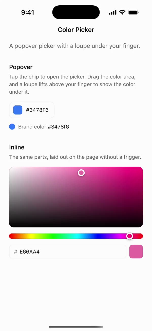
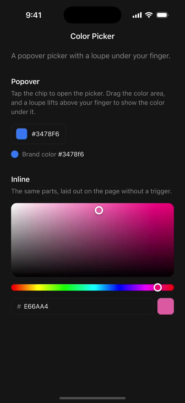
React NativeA popover picker with a loupe under your finger.
Preview
Install
Source on GitHubIt works in Expo and in bare React Native. New to beUI Native? Set up your app first.
Copies the component and the shared files it needs into src/, adds the theme tokens if they're missing, and installs its libraries. Files you've changed are kept.
Keep the folder layout, since the component imports the shared files by relative path.
1Install the libraries
npx expo install react-native-gesture-handler react-native-reanimated react-native-worklets
npm install uniwind tailwindcss
Wrap your app in GestureHandlerRootView if it isn't already.
2Add the theme tokens
Once per app. Import it from the CSS file Uniwind reads, after Tailwind and Uniwind, and change the values to match your brand.
/* Matches the default beUI palette in ui-components/lib/themes.ts.
   Native surface maps to card; muted maps to muted-foreground. */
@layer theme {
  :root {
    @variant light {
      --color-background: oklch(99% 0 0);
      --color-surface: oklch(97% 0 0);
      --color-foreground: oklch(15% 0 0);
      --color-muted: oklch(50% 0 0);
      --color-border: oklch(15% 0 0 / 0.06);
      --color-border-strong: oklch(15% 0 0 / 0.16);
      --color-primary: #0285f7;
      --color-on-primary: #ffffff;
      --color-destructive: #dc2626;
      --color-success: #059669;
      --color-warning: #d97706;
    }
  }

  :root {
    @variant dark {
      --color-background: #151515;
      --color-surface: #1c1c1c;
      --color-foreground: oklch(96% 0 0);
      --color-muted: oklch(62% 0 0);
      --color-border: rgb(255 255 255 / 0.05);
      --color-border-strong: rgb(255 255 255 / 0.14);
      --color-primary: #0285f7;
      --color-on-primary: #ffffff;
      --color-destructive: #f87171;
      --color-success: #34d399;
      --color-warning: #fbbf24;
    }
  }
}
3Copy the shared files
import { useEffect, useState } from "react";
import { AccessibilityInfo } from "react-native";
import { useReducedMotion } from "react-native-reanimated";

/** Reanimated supplies a synchronous initial value; native events keep it current. */
export function useReducedMotionPreference() {
  const initialValue = useReducedMotion();
  const [reducedMotion, setReducedMotion] = useState(initialValue);

  useEffect(() => {
    let active = true;
    let receivedEvent = false;
    const subscription = AccessibilityInfo.addEventListener(
      "reduceMotionChanged",
      (value) => {
        receivedEvent = true;
        setReducedMotion(value);
      },
    );
    void AccessibilityInfo.isReduceMotionEnabled().then((value) => {
      if (active && !receivedEvent) setReducedMotion(value);
    });
    return () => {
      active = false;
      subscription.remove();
    };
  }, []);

  return reducedMotion;
}
import { useCallback } from "react";
import {
  type EasingFunction,
  type EasingFunctionFactory,
  useAnimatedStyle,
  useSharedValue,
  withSequence,
  withTiming,
} from "react-native-reanimated";

/**
 * Horizontal shake through `keyframes` (in points) over `duration` ms, split
 * evenly like a Motion keyframe array. Callers skip it under reduced motion.
 */
export function useShake(
  keyframes: number[],
  duration: number,
  easing?: EasingFunction | EasingFunctionFactory,
) {
  const offset = useSharedValue(0);
  const step = duration / Math.max(1, keyframes.length - 1);

  const shake = useCallback(() => {
    const [first = 0, ...rest] = keyframes;
    offset.value = first;
    offset.value = withSequence(
      // An explicit `easing: undefined` would replace Reanimated's default.
      ...rest.map((point) =>
        withTiming(
          point,
          easing ? { duration: step, easing } : { duration: step },
        ),
      ),
    );
  }, [easing, keyframes, offset, step]);

  const style = useAnimatedStyle(() => ({
    transform: [{ translateX: offset.value }],
  }));

  return { shake, style };
}
import { Easing, ReduceMotion } from "react-native-reanimated";

// Mirrors beUI's lib/ease.ts so native motion matches the web library.

export const EASE_OUT = Easing.bezier(0.16, 1, 0.3, 1);
export const EASE_IN_OUT = Easing.bezier(0.77, 0, 0.175, 1);

/** Press feedback on buttons and other tappable surfaces. */
export const SPRING_PRESS = {
  stiffness: 500,
  damping: 30,
  mass: 0.6,
  reduceMotion: ReduceMotion.System,
} as const;

/** Content swaps: label and icon slots trading places inside a control. */
export const SPRING_SWAP = {
  stiffness: 460,
  damping: 30,
  mass: 0.55,
  reduceMotion: ReduceMotion.System,
} as const;

/** Shared-layout glides: pills, indicators and panels moving between positions. */
export const SPRING_LAYOUT = {
  stiffness: 360,
  damping: 32,
  mass: 0.6,
  reduceMotion: ReduceMotion.System,
} as const;

/** Dragged handles and fills; critically damped so values never rebound off an end. */
export const SPRING_GLIDE = {
  stiffness: 700,
  damping: 50,
  mass: 0.5,
  reduceMotion: ReduceMotion.System,
} as const;

export const motion = {
  press: SPRING_PRESS,
  swap: SPRING_SWAP,
  layout: SPRING_LAYOUT,
  glide: SPRING_GLIDE,
  exit: { duration: 160, easing: EASE_OUT, reduceMotion: ReduceMotion.System },
  fade: { duration: 150, reduceMotion: ReduceMotion.System },
} as const;
4Copy the component
// Color math, matching the web version.

/** Hue 0-360, saturation and value 0-100, alpha 0-1. */
export type Hsva = { h: number; s: number; v: number; a: number };
/** Channels 0-255, alpha 0-1. */
export type Rgba = { r: number; g: number; b: number; a: number };

export const clamp = (n: number, lo: number, hi: number) =>
  Math.min(hi, Math.max(lo, n));

const round = (n: number, places = 0) => {
  const f = 10 ** places;
  return Math.round(n * f) / f;
};

export function hsvaToRgba({ h, s, v, a }: Hsva): Rgba {
  const sat = s / 100;
  const val = v / 100;
  const f = (n: number) => {
    const k = (n + h / 60) % 6;
    return val - val * sat * Math.max(0, Math.min(k, 4 - k, 1));
  };
  return {
    r: Math.round(f(5) * 255),
    g: Math.round(f(3) * 255),
    b: Math.round(f(1) * 255),
    a,
  };
}

/** `previous` keeps hue for greys and saturation for black, which RGB can't carry. */
export function rgbaToHsva({ r, g, b, a }: Rgba, previous?: Hsva): Hsva {
  const rn = r / 255;
  const gn = g / 255;
  const bn = b / 255;
  const max = Math.max(rn, gn, bn);
  const d = max - Math.min(rn, gn, bn);
  let h = previous?.h ?? 0;
  if (d) {
    if (max === rn) h = ((gn - bn) / d) % 6;
    else if (max === gn) h = (bn - rn) / d + 2;
    else h = (rn - gn) / d + 4;
    h = (h * 60 + 360) % 360;
  }
  const v = max * 100;
  const s = max ? (d / max) * 100 : (previous?.s ?? 0);
  return { h, s, v, a };
}

const HEX_PATTERN = /^#?([0-9a-f]{3,4}|[0-9a-f]{6}|[0-9a-f]{8})$/i;

/** Parses #rgb, #rgba, #rrggbb and #rrggbbaa. Returns null for anything else. */
export function parseHex(input: string): Rgba | null {
  const match = HEX_PATTERN.exec(input.trim());
  const digits = match?.[1];
  if (!digits) return null;
  const hex =
    digits.length <= 4 ? [...digits].map((c) => c + c).join("") : digits;
  const n = (i: number) => Number.parseInt(hex.slice(i, i + 2), 16);
  return {
    r: n(0),
    g: n(2),
    b: n(4),
    a: hex.length === 8 ? round(n(6) / 255, 2) : 1,
  };
}

/** Lowercase #rrggbb, or #rrggbbaa when the color is translucent. */
export function formatHex({ r, g, b, a }: Rgba): string {
  const pair = (n: number) => Math.round(n).toString(16).padStart(2, "0");
  return `#${pair(r)}${pair(g)}${pair(b)}${a < 1 ? pair(a * 255) : ""}`;
}

export function hsvToHsl({ h, s, v }: Hsva) {
  const sv = s / 100;
  const vv = v / 100;
  const l = vv * (1 - sv / 2);
  const sl = l === 0 || l === 1 ? 0 : (vv - l) / Math.min(l, 1 - l);
  return { h, s: sl * 100, l: l * 100 };
}

export function hslToHsv(
  h: number,
  s: number,
  l: number,
  previous: Hsva,
  a: number,
): Hsva {
  const sl = s / 100;
  const ll = l / 100;
  const v = ll + sl * Math.min(ll, 1 - ll);
  return { h, s: v ? 2 * (1 - ll / v) * 100 : previous.s, v: v * 100, a };
}

export const BLACK: Rgba = { r: 0, g: 0, b: 0, a: 1 };

/** `rgba(…)` for a color, with an optional alpha override. */
export function rgbaString({ r, g, b, a }: Rgba, alpha = a) {
  return `rgba(${r}, ${g}, ${b}, ${alpha})`;
}

/** The fully saturated, fully bright color for a hue. */
export function hueColor(h: number) {
  return rgbaString(hsvaToRgba({ h, s: 100, v: 100, a: 1 }));
}
import {
  createContext,
  type ReactNode,
  type RefObject,
  useCallback,
  useContext,
  useMemo,
  useRef,
  useState,
} from "react";
import { View, type ViewProps } from "react-native";
import { type SharedValue, useSharedValue } from "react-native-reanimated";
import { useReducedMotionPreference } from "../../hooks/use-reduced-motion";
import {
  BLACK,
  clamp,
  formatHex,
  type Hsva,
  hsvaToRgba,
  parseHex,
  type Rgba,
  rgbaToHsva,
} from "./color";

/** A frame in window coordinates. */
export type Frame = { x: number; y: number; width: number; height: number };

export type ColorPickerContextValue = {
  hsva: Hsva;
  rgba: Rgba;
  hex: string;
  alpha: boolean;
  disabled: boolean;
  reduce: boolean;
  /** Sets the color live, clamping each channel. */
  update: (next: Hsva) => void;
  /** Reports the settled color through onValueCommit. */
  commit: () => void;
  open: boolean;
  setOpen: (open: boolean) => void;
  /** 0 closed to 1 open; drives the panel and its rows. */
  progress: SharedValue<number>;
  /** The trigger, which the panel lines up under. */
  triggerRef: RefObject<View | null>;
  triggerFrame: Frame | null;
};

const ColorPickerContext = createContext<ColorPickerContextValue | null>(null);

export function usePickerContext(component: string) {
  const context = useContext(ColorPickerContext);
  if (!context) {
    throw new Error(`${component} must be used within <ColorPicker>`);
  }
  return context;
}

/** The picker's state, for custom parts. */
export function useColorPicker() {
  const { hsva, rgba, hex, update, commit, open, setOpen } =
    usePickerContext("useColorPicker");
  return { hsva, rgba, hex, update, commit, open, setOpen };
}

export type ColorPickerProps = Omit<ViewProps, "children"> & {
  /** Controlled hex color. Omit it and use `defaultValue` for uncontrolled use. */
  value?: string;
  /** Defaults to "#3478f6". */
  defaultValue?: string;
  /** Called on every change, such as each step of a drag. */
  onValueChange?: (value: string) => void;
  /** Called when a change settles: a drag ends, a field is submitted, a preset is picked. */
  onValueCommit?: (value: string) => void;
  /** Allows translucent colors and shows the opacity slider. Defaults to true. */
  alpha?: boolean;
  disabled?: boolean;
  open?: boolean;
  defaultOpen?: boolean;
  onOpenChange?: (open: boolean) => void;
  /** Moves without springing, independently of the system preference. */
  disableAnimation?: boolean;
  className?: string;
  children: ReactNode;
};

/**
 * A color picker built from parts: ColorPickerTrigger opens ColorPickerContent,
 * which holds the area, sliders, fields and presets. The parts also work
 * inline, without a trigger.
 */
export function ColorPicker({
  value,
  defaultValue = "#3478f6",
  onValueChange,
  onValueCommit,
  alpha = true,
  disabled = false,
  open: openProp,
  defaultOpen = false,
  onOpenChange,
  disableAnimation = false,
  className = "",
  children,
  ...props
}: ColorPickerProps) {
  const reducedMotion = useReducedMotionPreference();
  const reduce = reducedMotion || disableAnimation;
  const triggerRef = useRef<View>(null);
  const [triggerFrame, setTriggerFrame] = useState<Frame | null>(null);
  const progress = useSharedValue(defaultOpen ? 1 : 0);

  const [openInternal, setOpenInternal] = useState(defaultOpen);
  const open = openProp ?? openInternal;
  const setOpen = useCallback(
    (next: boolean) => {
      if (next === open || (next && disabled)) return;
      const apply = () => {
        if (openProp === undefined) setOpenInternal(next);
        onOpenChange?.(next);
      };
      if (!next) {
        apply();
        return;
      }
      // Find the trigger on screen before the panel appears beside it.
      if (!triggerRef.current) {
        apply();
        return;
      }
      triggerRef.current.measureInWindow((x, y, width, height) => {
        setTriggerFrame({ x, y, width, height });
        apply();
      });
    },
    [disabled, onOpenChange, open, openProp],
  );

  const controlled = value !== undefined;
  const incoming = controlled ? value : defaultValue;
  const [state, setState] = useState(() => ({
    source: incoming,
    hsva: rgbaToHsva(parseHex(incoming) ?? BLACK),
  }));

  // A controlled value the picker didn't emit is read during render, so the
  // thumbs never show a stale color for a frame.
  let hsva = state.hsva;
  if (controlled && value !== state.source) {
    const parsed = parseHex(value);
    hsva = parsed ? rgbaToHsva(parsed, state.hsva) : state.hsva;
    setState({ source: value, hsva });
  }
  if (!alpha && hsva.a !== 1) hsva = { ...hsva, a: 1 };

  const rgba = hsvaToRgba(hsva);
  const hex = formatHex(rgba);
  // Handlers read the latest emitted hex, which can be ahead of the render.
  const hexRef = useRef(hex);
  hexRef.current = hex;

  const update = useCallback(
    (next: Hsva) => {
      const clean: Hsva = {
        h: clamp(next.h, 0, 360),
        s: clamp(next.s, 0, 100),
        v: clamp(next.v, 0, 100),
        a: alpha ? clamp(next.a, 0, 1) : 1,
      };
      const nextHex = formatHex(hsvaToRgba(clean));
      const changed = nextHex !== hexRef.current;
      hexRef.current = nextHex;
      setState({ source: nextHex, hsva: clean });
      if (changed) onValueChange?.(nextHex);
    },
    [alpha, onValueChange],
  );
  const commit = useCallback(
    () => onValueCommit?.(hexRef.current),
    [onValueCommit],
  );

  const context = useMemo<ColorPickerContextValue>(
    () => ({
      hsva,
      rgba,
      hex,
      alpha,
      disabled,
      reduce,
      update,
      commit,
      open,
      setOpen,
      progress,
      triggerRef,
      triggerFrame,
    }),
    [
      alpha,
      commit,
      disabled,
      hex,
      hsva,
      open,
      progress,
      reduce,
      rgba,
      setOpen,
      triggerFrame,
      update,
    ],
  );

  return (
    <ColorPickerContext.Provider value={context}>
      <View
        {...props}
        className={`${disabled ? "opacity-50" : ""} ${className}`}
      >
        {children}
      </View>
    </ColorPickerContext.Provider>
  );
}
import { useState } from "react";
import {
  Platform,
  StyleSheet,
  Text,
  TextInput,
  type TextInputProps,
  View,
} from "react-native";
import Animated from "react-native-reanimated";
import { useResolveClassNames } from "uniwind";
import { useShake } from "../../hooks/use-shake";
import { EASE_OUT } from "../../styles/motion";
import {
  clamp,
  type Hsva,
  hslToHsv,
  hsvToHsl,
  parseHex,
  type Rgba,
  rgbaToHsva,
} from "./color";
import { usePickerContext } from "./context";

const SHAKE = [0, -5, 5, -3, 3, 0];

// Web draws a focus outline; the field's border shows focus instead. React
// Native's types don't list "none", but React Native Web passes it through.
const WEB_NO_OUTLINE =
  Platform.OS === "web" ? { outlineStyle: "none" as "solid" } : null;

function useFieldColors() {
  const { color: foreground } = useResolveClassNames("text-foreground");
  const { color: muted } = useResolveClassNames("text-muted");
  return { foreground, muted };
}

export type ColorPickerHexInputProps = Omit<
  TextInputProps,
  "value" | "defaultValue" | "onChangeText"
> & { className?: string };

/**
 * The hex field. It updates the color live once six or eight digits are in,
 * and shakes and reverts if what's left on submit isn't a color.
 */
export function ColorPickerHexInput({
  className = "",
  accessibilityLabel = "Hex color",
  onBlur,
  onSubmitEditing,
  style,
  ...props
}: ColorPickerHexInputProps) {
  const { hsva, hex, update, commit, disabled, reduce } = usePickerContext(
    "ColorPickerHexInput",
  );
  const { foreground, muted } = useFieldColors();
  const [draft, setDraft] = useState<string | null>(null);
  const [focused, setFocused] = useState(false);
  const { shake, style: shakeStyle } = useShake(SHAKE, 300, EASE_OUT);

  const settle = () => {
    if (draft === null) return;
    const parsed = parseHex(draft);
    if (parsed) {
      update(rgbaToHsva(parsed, hsva));
      commit();
    } else if (!reduce) {
      shake();
    }
    setDraft(null);
  };

  return (
    <Animated.View
      style={shakeStyle}
      className={`min-w-0 flex-1 flex-row items-center rounded-lg border bg-background pl-3 ${focused ? "border-border-strong" : "border-border"} ${className}`}
    >
      <Text className="text-sm text-muted">#</Text>
      <TextInput
        {...props}
        accessibilityLabel={accessibilityLabel}
        editable={!disabled}
        autoCapitalize="characters"
        autoCorrect={false}
        spellCheck={false}
        maxLength={9}
        returnKeyType="done"
        value={draft ?? hex.slice(1).toUpperCase()}
        placeholderTextColor={muted}
        onFocus={() => setFocused(true)}
        onChangeText={(text) => {
          const next = text.replace(/^#/, "");
          setDraft(next);
          // Live only at full length, so "ABC" on the way to "ABCDEF" doesn't
          // flash a short-form color.
          if (next.length === 6 || next.length === 8) {
            const parsed = parseHex(next);
            if (parsed) update(rgbaToHsva(parsed, hsva));
          }
        }}
        onBlur={(event) => {
          setFocused(false);
          settle();
          onBlur?.(event);
        }}
        onSubmitEditing={(event) => {
          settle();
          onSubmitEditing?.(event);
        }}
        style={[styles.field, { color: foreground }, WEB_NO_OUTLINE, style]}
      />
    </Animated.View>
  );
}

type ChannelSpec = {
  key: string;
  short: string;
  name: string;
  max: number;
  value: number;
  set: (n: number) => Hsva;
};

function ChannelField({ spec }: { spec: ChannelSpec }) {
  const { update, commit, disabled } = usePickerContext("ColorPickerChannels");
  const { foreground } = useFieldColors();
  const [draft, setDraft] = useState<string | null>(null);
  const [focused, setFocused] = useState(false);
  const shown = Math.round(spec.value);

  return (
    <View className="min-w-0 flex-1 items-center gap-1">
      <View
        className={`h-9 w-full justify-center rounded-lg border bg-background ${focused ? "border-border-strong" : "border-border"}`}
      >
        <TextInput
          accessibilityLabel={spec.name}
          editable={!disabled}
          keyboardType="number-pad"
          returnKeyType="done"
          maxLength={3}
          value={draft ?? String(shown)}
          onFocus={() => setFocused(true)}
          onChangeText={(text) => {
            const next = text.replace(/[^\d]/g, "").slice(0, 3);
            setDraft(next);
            if (next !== "") update(spec.set(clamp(Number(next), 0, spec.max)));
          }}
          onBlur={() => {
            setFocused(false);
            if (draft !== null) commit();
            setDraft(null);
          }}
          style={[
            styles.field,
            styles.center,
            { color: foreground },
            WEB_NO_OUTLINE,
          ]}
        />
      </View>
      <Text
        accessibilityElementsHidden
        importantForAccessibility="no"
        className="text-[11px] font-medium text-muted"
      >
        {spec.short}
      </Text>
    </View>
  );
}

export type ColorPickerChannelsProps = {
  /** Which channels to edit. Defaults to "rgb". */
  format?: "rgb" | "hsl";
  className?: string;
};

/** Numeric RGB or HSL fields, plus opacity when the picker allows alpha. */
export function ColorPickerChannels({
  format = "rgb",
  className = "",
}: ColorPickerChannelsProps) {
  const { hsva, rgba, alpha } = usePickerContext("ColorPickerChannels");
  const fromRgb = (patch: Partial<Rgba>) =>
    rgbaToHsva({ ...rgba, ...patch }, hsva);
  let specs: ChannelSpec[];
  if (format === "hsl") {
    const hsl = hsvToHsl(hsva);
    specs = [
      {
        key: "h",
        short: "H",
        name: "Hue",
        max: 360,
        value: hsl.h,
        set: (n) => hslToHsv(n, hsl.s, hsl.l, hsva, hsva.a),
      },
      {
        key: "s",
        short: "S",
        name: "Saturation",
        max: 100,
        value: hsl.s,
        set: (n) => hslToHsv(hsl.h, n, hsl.l, hsva, hsva.a),
      },
      {
        key: "l",
        short: "L",
        name: "Lightness",
        max: 100,
        value: hsl.l,
        set: (n) => hslToHsv(hsl.h, hsl.s, n, hsva, hsva.a),
      },
    ];
  } else {
    specs = [
      {
        key: "r",
        short: "R",
        name: "Red",
        max: 255,
        value: rgba.r,
        set: (n) => fromRgb({ r: n }),
      },
      {
        key: "g",
        short: "G",
        name: "Green",
        max: 255,
        value: rgba.g,
        set: (n) => fromRgb({ g: n }),
      },
      {
        key: "b",
        short: "B",
        name: "Blue",
        max: 255,
        value: rgba.b,
        set: (n) => fromRgb({ b: n }),
      },
    ];
  }
  if (alpha) {
    specs.push({
      key: "a",
      short: "A",
      name: "Opacity percent",
      max: 100,
      value: hsva.a * 100,
      set: (n) => ({ ...hsva, a: n / 100 }),
    });
  }
  return (
    <View className={`min-w-0 flex-1 flex-row gap-1.5 ${className}`}>
      {specs.map((spec) => (
        <ChannelField key={`${format}-${spec.key}`} spec={spec} />
      ))}
    </View>
  );
}

const styles = StyleSheet.create({
  field: {
    flex: 1,
    height: 34,
    fontSize: 14,
    paddingVertical: 0,
    paddingHorizontal: 6,
    textAlignVertical: "center",
    includeFontPadding: false,
    fontVariant: ["tabular-nums"],
  },
  center: { textAlign: "center" },
});
export type { Hsva, Rgba } from "./color";
export { formatHex, hsvaToRgba, parseHex, rgbaToHsva } from "./color";
export type { ColorPickerProps } from "./context";
export { ColorPicker, useColorPicker } from "./context";
export type {
  ColorPickerChannelsProps,
  ColorPickerHexInputProps,
} from "./fields";
export { ColorPickerChannels, ColorPickerHexInput } from "./fields";
export type {
  ColorPickerContentProps,
  ColorPickerTriggerProps,
} from "./popover";
export { ColorPickerContent, ColorPickerTrigger } from "./popover";
export type {
  ColorPickerPresetProps,
  ColorPickerPresetsProps,
} from "./presets";
export { ColorPickerPreset, ColorPickerPresets } from "./presets";
export type { ColorPickerAreaProps, ColorPickerSliderProps } from "./surfaces";
export {
  ColorPickerAlpha,
  ColorPickerArea,
  ColorPickerHue,
  ColorPickerSwatch,
} from "./surfaces";
import {
  Children,
  type ReactNode,
  useCallback,
  useEffect,
  useState,
} from "react";
import {
  Keyboard,
  Modal,
  Platform,
  Pressable,
  type PressableProps,
  StyleSheet,
  Text,
  useWindowDimensions,
  View,
} from "react-native";
import { GestureHandlerRootView } from "react-native-gesture-handler";
import Animated, {
  cancelAnimation,
  Extrapolation,
  interpolate,
  type SharedValue,
  useAnimatedStyle,
  useSharedValue,
  withSpring,
  withTiming,
} from "react-native-reanimated";
import { scheduleOnRN } from "react-native-worklets";
import { EASE_OUT } from "../../styles/motion";
import { usePickerContext } from "./context";
import { Checkerboard } from "./surfaces";

// Opening springs the panel out of the trigger's corner, quick and lightly
// damped, like a native popover. Closing runs the same path back as a short
// timed fade, so it has a fixed end: the modal is gone the moment it's done,
// and the next tap lands on the page instead of an invisible overlay.
const OPEN = { stiffness: 380, damping: 30, mass: 0.8 };
const CLOSE = { duration: 160, easing: EASE_OUT };
const REDUCED = { duration: 150 };
const PANEL_WIDTH = 288;
const GUTTER = 8;
const GAP = 8;
const EDGE = 16;
const CHIP = 24;
const CHIP_RADIUS = 6;
const KEYBOARD_SHIFT = { duration: 220, easing: EASE_OUT };

/** The on-screen keyboard's height while `active`, or 0. */
function useKeyboardHeight(active: boolean) {
  const [height, setHeight] = useState(0);
  useEffect(() => {
    if (!active) return;
    const ios = Platform.OS === "ios";
    const show = Keyboard.addListener(
      ios ? "keyboardWillShow" : "keyboardDidShow",
      (event) => setHeight(event.endCoordinates.height),
    );
    const hide = Keyboard.addListener(
      ios ? "keyboardWillHide" : "keyboardDidHide",
      () => setHeight(0),
    );
    return () => {
      show.remove();
      hide.remove();
    };
  }, [active]);
  return height;
}

export type ColorPickerTriggerProps = Omit<
  PressableProps,
  "children" | "style"
> & {
  /** Replaces the hex label beside the chip. */
  children?: ReactNode;
  className?: string;
};

/** A color chip and the hex. Opens ColorPickerContent. */
export function ColorPickerTrigger({
  children,
  className = "",
  onPress,
  accessibilityLabel,
  ...props
}: ColorPickerTriggerProps) {
  const { hex, open, setOpen, disabled, triggerRef } =
    usePickerContext("ColorPickerTrigger");
  const alpha = hex.slice(7);

  return (
    <Pressable
      {...props}
      ref={triggerRef}
      collapsable={false}
      accessibilityRole="button"
      accessibilityLabel={accessibilityLabel ?? `Color, ${hex.toUpperCase()}`}
      accessibilityHint={open ? undefined : "Opens the color picker"}
      aria-expanded={open}
      aria-disabled={disabled}
      disabled={disabled}
      onPress={(event) => {
        onPress?.(event);
        if (!event.defaultPrevented) setOpen(!open);
      }}
      className={`h-11 flex-row items-center gap-2.5 self-start rounded-xl border border-border bg-background pr-3.5 pl-2.5 active:opacity-80 ${className}`}
    >
      <View style={styles.chip}>
        <Checkerboard width={CHIP} height={CHIP} />
        <View
          style={[
            StyleSheet.absoluteFill,
            styles.edge,
            { backgroundColor: hex },
          ]}
        />
      </View>
      {children ?? (
        <Text className="font-mono text-sm uppercase text-foreground tabular-nums">
          {hex.slice(0, 7)}
          {alpha ? <Text className="text-muted">{alpha}</Text> : null}
        </Text>
      )}
    </Pressable>
  );
}

/** One row of the panel, settling in just behind the one above it. */
function Row({
  index,
  progress,
  children,
}: {
  index: number;
  progress: SharedValue<number>;
  children: ReactNode;
}) {
  const style = useAnimatedStyle(() => {
    const start = index * 0.07;
    const q = interpolate(
      progress.value,
      [start, start + 0.6],
      [0, 1],
      Extrapolation.CLAMP,
    );
    return { opacity: q, transform: [{ translateY: -4 * (1 - q) }] };
  });
  return <Animated.View style={style}>{children}</Animated.View>;
}

export type ColorPickerContentProps = {
  children: ReactNode;
  /** Names the panel for screen readers. Defaults to "Color picker". */
  accessibilityLabel?: string;
  className?: string;
};

/**
 * The panel ColorPickerTrigger opens. It floats beside the trigger: below it,
 * unless there's more room above. It springs out of the trigger's corner with
 * its rows settling in behind, and folds back the same way, quicker. A tap
 * outside, or Android's back button, closes it.
 */
export function ColorPickerContent({
  children,
  accessibilityLabel = "Color picker",
  className = "",
}: ColorPickerContentProps) {
  const { open, setOpen, progress, reduce, triggerFrame } =
    usePickerContext("ColorPickerContent");
  const window = useWindowDimensions();
  const keyboard = useKeyboardHeight(open);
  const [present, setPresent] = useState(open);
  if (open && !present) setPresent(true);
  // A modal takes a moment to appear. Waiting for it, and for the panel's
  // first layout, means the opening plays where it can be seen.
  const [shown, setShown] = useState(false);
  if (!present && shown) setShown(false);
  const [panelHeight, setPanelHeight] = useState(0);
  const shift = useSharedValue(0);

  const hide = useCallback(() => setPresent(false), []);

  // onShow doesn't fire everywhere, such as on web; don't wait on it forever.
  useEffect(() => {
    if (!present || shown) return;
    const timer = setTimeout(() => setShown(true), 300);
    return () => clearTimeout(timer);
  }, [present, shown]);

  const ready = shown && panelHeight > 0;

  useEffect(() => {
    if (!present) return;
    if (open && !ready) return;
    cancelAnimation(progress);
    if (open) {
      progress.value = reduce ? withTiming(1, REDUCED) : withSpring(1, OPEN);
      return;
    }
    Keyboard.dismiss();
    progress.value = withTiming(0, reduce ? REDUCED : CLOSE, (finished) => {
      if (finished) scheduleOnRN(hide);
    });
  }, [hide, open, present, progress, ready, reduce]);

  // Side and position, from the trigger's frame.
  const width = Math.min(PANEL_WIDTH, window.width - GUTTER * 2);
  const trigger = triggerFrame ?? { x: GUTTER, y: 120, width: 0, height: 44 };
  const left = Math.min(
    Math.max(trigger.x, GUTTER),
    window.width - width - GUTTER,
  );
  const below = window.height - (trigger.y + trigger.height) - GAP - EDGE;
  const above = trigger.y - GAP - EDGE;
  const isTop = panelHeight > 0 && below < panelHeight && above > below;
  const top = isTop
    ? trigger.y - GAP - panelHeight
    : trigger.y + trigger.height + GAP;

  // When typing in a field, lift the panel clear of the keyboard.
  useEffect(() => {
    const limit = window.height - keyboard - GUTTER;
    const overflow = keyboard > 0 ? Math.max(0, top + panelHeight - limit) : 0;
    shift.value = withTiming(-overflow, KEYBOARD_SHIFT);
  }, [keyboard, panelHeight, shift, top, window.height]);

  // The panel grows from the corner nearest the trigger's chip.
  const panelStyle = useAnimatedStyle(() => {
    const p = progress.value;
    const settled = Math.min(1, Math.max(0, p));
    return {
      opacity: interpolate(p, [0, 0.5], [0, 1], Extrapolation.CLAMP),
      transform: [
        { translateY: shift.value + (isTop ? 8 : -8) * (1 - settled) },
        { scale: reduce ? 1 : 0.9 + 0.1 * p },
      ],
    };
  });

  let row = 0;
  const rows = Children.map(children, (child) => {
    const index = row;
    row += 1;
    return (
      <Row index={index} progress={progress}>
        {child}
      </Row>
    );
  });

  return (
    <Modal
      transparent
      visible={present}
      animationType="none"
      statusBarTranslucent
      navigationBarTranslucent
      onShow={() => setShown(true)}
      onRequestClose={() => setOpen(false)}
    >
      {/* Gestures inside a modal need their own root on Android. */}
      <GestureHandlerRootView style={styles.root}>
        <Pressable
          accessibilityLabel="Close"
          accessibilityRole="button"
          style={StyleSheet.absoluteFill}
          onPress={() => setOpen(false)}
        />
        <Animated.View
          accessibilityViewIsModal
          accessibilityLabel={accessibilityLabel}
          onLayout={({ nativeEvent }) =>
            setPanelHeight(nativeEvent.layout.height)
          }
          className={`gap-3 rounded-2xl border border-border bg-background p-3 ${className}`}
          style={[
            styles.panel,
            { left, top, width },
            isTop ? styles.fromBottom : styles.fromTop,
            panelStyle,
          ]}
        >
          {rows}
        </Animated.View>
      </GestureHandlerRootView>
    </Modal>
  );
}

const styles = StyleSheet.create({
  root: { flex: 1 },
  panel: {
    position: "absolute",
    boxShadow: "0 12px 32px -8px rgba(0, 0, 0, 0.25)",
  },
  // The corner nearest the trigger's chip, at the panel's left edge.
  fromTop: { transformOrigin: "24px 0px" },
  fromBottom: { transformOrigin: "24px 100%" },
  chip: {
    width: CHIP,
    height: CHIP,
    borderRadius: CHIP_RADIUS,
    overflow: "hidden",
  },
  edge: {
    borderRadius: CHIP_RADIUS,
    borderWidth: 1,
    borderColor: "rgba(0, 0, 0, 0.1)",
  },
});
import {
  createContext,
  type ReactNode,
  useCallback,
  useContext,
  useEffect,
  useRef,
  useState,
} from "react";
import { Pressable, StyleSheet, View } from "react-native";
import Animated, {
  useAnimatedStyle,
  useSharedValue,
  withSpring,
  withTiming,
} from "react-native-reanimated";
import { useResolveClassNames } from "uniwind";
import { SPRING_LAYOUT, SPRING_PRESS } from "../../styles/motion";
import { formatHex, parseHex, rgbaToHsva } from "./color";
import { usePickerContext } from "./context";
import { Checkerboard } from "./surfaces";

const SIZE = 24;
const RING_GAP = 3;
// The ring hops between swatches over a low arc, higher the further it goes.
const HOP = 0.15;

type Spot = { x: number; y: number };

const PresetsContext = createContext<{
  place: (value: string, spot: Spot) => void;
} | null>(null);

export type ColorPickerPresetsProps = {
  children: ReactNode;
  /** Names the group for screen readers, such as "Presets". */
  accessibilityLabel?: string;
  className?: string;
};

/** A row of preset swatches. A ring marks the one matching the current color. */
export function ColorPickerPresets({
  children,
  accessibilityLabel,
  className = "",
}: ColorPickerPresetsProps) {
  const { hex, reduce } = usePickerContext("ColorPickerPresets");
  // On web, borders resolve per side.
  const ringClass = useResolveClassNames("border-foreground/70");
  const ring = ringClass.borderColor ?? ringClass.borderTopColor;
  const spots = useRef(new Map<string, Spot>());
  const [version, setVersion] = useState(0);
  const place = useCallback((value: string, spot: Spot) => {
    const known = spots.current.get(value);
    if (known && known.x === spot.x && known.y === spot.y) return;
    spots.current.set(value, spot);
    setVersion((n) => n + 1);
  }, []);

  const from = useSharedValue<Spot>({ x: 0, y: 0 });
  const to = useSharedValue<Spot>({ x: 0, y: 0 });
  const travel = useSharedValue(1);
  const shown = useSharedValue(0);
  const last = useRef<Spot | null>(null);

  useEffect(() => {
    const target = spots.current.get(hex);
    if (!target) {
      shown.value = withTiming(0, { duration: 120 });
      last.current = null;
      return;
    }
    const start = last.current;
    last.current = target;
    if (!start || reduce) {
      from.value = target;
      to.value = target;
      travel.value = 1;
      shown.value = withTiming(1, { duration: 120 });
      return;
    }
    if (start.x === target.x && start.y === target.y) return;
    from.value = start;
    to.value = target;
    travel.value = 0;
    travel.value = withSpring(1, SPRING_LAYOUT);
    shown.value = 1;
  }, [from, hex, reduce, shown, to, travel, version]);

  const ringStyle = useAnimatedStyle(() => {
    const t = travel.value;
    const a = from.value;
    const b = to.value;
    const distance = Math.hypot(b.x - a.x, b.y - a.y);
    const arc =
      HOP * distance * Math.sin(Math.PI * Math.min(1, Math.max(0, t)));
    return {
      opacity: shown.value,
      transform: [
        { translateX: a.x + (b.x - a.x) * t - RING_GAP },
        { translateY: a.y + (b.y - a.y) * t - RING_GAP - arc },
      ],
    };
  });

  return (
    <PresetsContext.Provider value={{ place }}>
      <View
        accessibilityLabel={accessibilityLabel}
        className={`flex-row flex-wrap gap-2 ${className}`}
      >
        {children}
        <Animated.View
          pointerEvents="none"
          style={[styles.ring, { borderColor: ring }, ringStyle]}
        />
      </View>
    </PresetsContext.Provider>
  );
}

export type ColorPickerPresetProps = {
  /** The hex color this preset applies. */
  value: string;
  /** The color's name for screen readers. Defaults to the hex. */
  label?: string;
  onPress?: () => void;
  className?: string;
};

export function ColorPickerPreset({
  value,
  label,
  onPress,
  className = "",
}: ColorPickerPresetProps) {
  const { hsva, hex, update, commit, disabled, reduce } =
    usePickerContext("ColorPickerPreset");
  const presets = useContext(PresetsContext);
  const parsed = parseHex(value);
  const normalized = parsed ? formatHex(parsed) : value;
  const selected = normalized === hex;
  const scale = useSharedValue(1);
  const pressStyle = useAnimatedStyle(() => ({
    transform: [{ scale: scale.value }],
  }));

  return (
    <Pressable
      accessibilityRole="button"
      accessibilityLabel={label ?? normalized}
      accessibilityState={{ selected, disabled }}
      disabled={disabled}
      hitSlop={6}
      onLayout={({ nativeEvent }) =>
        presets?.place(normalized, {
          x: nativeEvent.layout.x,
          y: nativeEvent.layout.y,
        })
      }
      onPressIn={() => {
        if (!reduce) scale.value = withSpring(0.88, SPRING_PRESS);
      }}
      onPressOut={() => {
        scale.value = withSpring(1, SPRING_PRESS);
      }}
      onPress={() => {
        onPress?.();
        if (!parsed) return;
        update(rgbaToHsva(parsed, hsva));
        commit();
      }}
      className={className}
    >
      <Animated.View style={[styles.swatch, pressStyle]}>
        <Checkerboard width={SIZE} height={SIZE} />
        <View style={[styles.color, { backgroundColor: normalized }]} />
      </Animated.View>
    </Pressable>
  );
}

const styles = StyleSheet.create({
  swatch: {
    width: SIZE,
    height: SIZE,
    borderRadius: SIZE / 2,
    overflow: "hidden",
  },
  color: {
    ...StyleSheet.absoluteFill,
    borderRadius: SIZE / 2,
    borderWidth: 1,
    borderColor: "rgba(0, 0, 0, 0.1)",
  },
  ring: {
    position: "absolute",
    left: 0,
    top: 0,
    width: SIZE + RING_GAP * 2,
    height: SIZE + RING_GAP * 2,
    borderRadius: (SIZE + RING_GAP * 2) / 2,
    borderWidth: 2,
  },
});
import { memo, useEffect, useRef } from "react";
import {
  type AccessibilityActionEvent,
  Platform,
  StyleSheet,
  View,
  type ViewProps,
} from "react-native";
import { Gesture, GestureDetector } from "react-native-gesture-handler";
import Animated, {
  type SharedValue,
  useAnimatedStyle,
  useSharedValue,
  withSpring,
  withTiming,
} from "react-native-reanimated";
import { scheduleOnRN } from "react-native-worklets";
import { EASE_OUT, SPRING_GLIDE, SPRING_PRESS } from "../../styles/motion";
import { hueColor, rgbaString } from "./color";
import { usePickerContext } from "./context";

// The loupe lifts with a visible overshoot so it reads as picked up, unlike
// the critically damped glide the thumb itself rides on.
const LOUPE_LIFT = { stiffness: 520, damping: 24, mass: 0.6 };
const LOUPE_DROP = { duration: 120, easing: EASE_OUT };
// Drag speed, in track widths per second, swings the loupe like a pendulum.
const LOUPE_TILT = 16;
const LOUPE_TILT_SPEED = 4;
const THUMB = 18;
// Sliders inset the thumb's path by half a thumb, so it never leaves the track.
const RAIL_INSET = THUMB / 2;
const CHECK = 4;
const CHECK_LIGHT = "#fafafa";
const CHECK_DARK = "#d4d4d8";

/** A gradient fill, through experimental_backgroundImage on native. */
export function gradient(css: string) {
  return Platform.OS === "web"
    ? ({ backgroundImage: css } as object)
    : { experimental_backgroundImage: css };
}

/**
 * The transparency checkerboard. React Native has no conic gradient, so it's
 * drawn from small squares, once per size.
 */
export const Checkerboard = memo(function Checkerboard({
  width,
  height,
}: {
  width: number;
  height: number;
}) {
  const columns = Math.ceil(width / CHECK);
  const rows = Math.ceil(height / CHECK);
  const squares: { left: number; top: number }[] = [];
  for (let row = 0; row < rows; row++) {
    for (let column = row % 2; column < columns; column += 2) {
      squares.push({ left: column * CHECK, top: row * CHECK });
    }
  }
  return (
    <View
      pointerEvents="none"
      style={[StyleSheet.absoluteFill, { backgroundColor: CHECK_LIGHT }]}
    >
      {squares.map(({ left, top }) => (
        <View key={`${left}-${top}`} style={[styles.check, { left, top }]} />
      ))}
    </View>
  );
});

/** Where a touch lands on a track, kept on the UI thread while dragging. */
function useTrack({
  axes,
  inset,
  onPoint,
  onEnd,
  disabled,
}: {
  axes: "x" | "xy";
  inset: number;
  onPoint: (x: number, y: number) => void;
  onEnd: () => void;
  disabled: boolean;
}) {
  const width = useSharedValue(0);
  const height = useSharedValue(0);
  const x = useSharedValue(0);
  const y = useSharedValue(0);
  const dragging = useSharedValue(false);
  const lift = useSharedValue(0);
  const tilt = useSharedValue(0);

  const place = (px: number, py: number) => {
    "worklet";
    const span = Math.max(1, width.value - inset * 2);
    const nx = Math.min(1, Math.max(0, (px - inset) / span));
    const ny =
      axes === "xy"
        ? Math.min(1, Math.max(0, py / Math.max(1, height.value)))
        : 0;
    x.value = nx;
    y.value = ny;
    scheduleOnRN(onPoint, nx, ny);
  };

  // A finger down jumps the thumb there; moving drags it.
  const gesture = Gesture.Pan()
    .enabled(!disabled)
    .minDistance(0)
    .onBegin((event) => {
      dragging.value = true;
      lift.value = withSpring(1, LOUPE_LIFT);
      place(event.x, event.y);
    })
    .onUpdate((event) => {
      place(event.x, event.y);
      const speed = event.velocityX / Math.max(1, width.value);
      tilt.value = withSpring(
        Math.max(-1, Math.min(1, speed / LOUPE_TILT_SPEED)) * -LOUPE_TILT,
        SPRING_PRESS,
      );
    })
    .onFinalize(() => {
      dragging.value = false;
      lift.value = withTiming(0, LOUPE_DROP);
      tilt.value = withSpring(0, SPRING_PRESS);
      scheduleOnRN(onEnd);
    });

  return { gesture, width, height, x, y, dragging, lift, tilt };
}

/** Thumbs follow the color when it changes from elsewhere, gliding there. */
function useFollow(
  shared: SharedValue<number>,
  target: number,
  dragging: SharedValue<boolean>,
  reduce: boolean,
) {
  useEffect(() => {
    if (dragging.value) return;
    shared.value = reduce ? target : withSpring(target, SPRING_GLIDE);
  }, [dragging, reduce, shared, target]);
}

function Thumb({
  x,
  y,
  width,
  height,
  inset,
  lift,
  tilt,
  color,
  reduce,
}: {
  x: SharedValue<number>;
  y?: SharedValue<number>;
  width: SharedValue<number>;
  height: SharedValue<number>;
  inset: number;
  lift: SharedValue<number>;
  tilt: SharedValue<number>;
  color: string;
  reduce: boolean;
}) {
  const position = useAnimatedStyle(() => {
    const span = Math.max(0, width.value - inset * 2);
    return {
      transform: [
        { translateX: inset + x.value * span - THUMB / 2 },
        {
          translateY: y
            ? y.value * height.value - THUMB / 2
            : height.value / 2 - THUMB / 2,
        },
      ],
    };
  });
  // The thumb tucks in while the loupe is up, so the finger's color shows above.
  const dot = useAnimatedStyle(() => ({
    transform: [{ scale: reduce ? 1 : 1 - 0.22 * lift.value }],
  }));
  const loupe = useAnimatedStyle(() => {
    const l = reduce ? 0 : lift.value;
    return {
      opacity: Math.min(1, Math.max(0, l)),
      transform: [
        { translateY: 16 * (1 - l) },
        { rotate: `${tilt.value}deg` },
        { scale: 0.3 + 0.7 * l },
      ],
    };
  });

  return (
    <Animated.View pointerEvents="none" style={[styles.thumbSlot, position]}>
      <Animated.View style={[styles.loupe, loupe]}>
        {/* A teardrop: a square with one sharp corner, turned to point down.
            The color is the drop's own background, which follows its mixed
            corners; iOS wouldn't clip a filled child to them. */}
        <View style={[styles.drop, { backgroundColor: color }]} />
      </Animated.View>
      <Animated.View style={[styles.dot, { backgroundColor: color }, dot]} />
    </Animated.View>
  );
}

export type ColorPickerAreaProps = Omit<ViewProps, "children"> & {
  /** Accessible name. Defaults to "Saturation and brightness". */
  label?: string;
  className?: string;
};

/**
 * The saturation and brightness area. Drag anywhere; a loupe lifts above the
 * finger to show the color under it.
 */
export function ColorPickerArea({
  label = "Saturation and brightness",
  className = "",
  style,
  ...props
}: ColorPickerAreaProps) {
  const { hsva, rgba, update, commit, disabled, reduce } =
    usePickerContext("ColorPickerArea");
  const latest = useRef(hsva);
  latest.current = hsva;

  const track = useTrack({
    axes: "xy",
    inset: 0,
    onPoint: (x, y) =>
      update({ ...latest.current, s: x * 100, v: (1 - y) * 100 }),
    onEnd: commit,
    disabled,
  });
  useFollow(track.x, hsva.s / 100, track.dragging, reduce);
  useFollow(track.y, 1 - hsva.v / 100, track.dragging, reduce);

  const s = Math.round(hsva.s);
  const v = Math.round(hsva.v);
  const nudge = (event: AccessibilityActionEvent) => {
    const step = 5;
    const name = event.nativeEvent.actionName;
    const next =
      name === "increment"
        ? { ...hsva, s: hsva.s + step }
        : name === "decrement"
          ? { ...hsva, s: hsva.s - step }
          : name === "brighter"
            ? { ...hsva, v: hsva.v + step }
            : { ...hsva, v: hsva.v - step };
    update(next);
    commit();
  };

  return (
    <GestureDetector gesture={track.gesture}>
      <Animated.View
        {...props}
        accessible
        accessibilityRole="adjustable"
        accessibilityLabel={label}
        aria-valuetext={`Saturation ${s}%, brightness ${v}%`}
        accessibilityActions={[
          { name: "increment", label: "More saturated" },
          { name: "decrement", label: "Less saturated" },
          { name: "brighter", label: "Brighter" },
          { name: "darker", label: "Darker" },
        ]}
        onAccessibilityAction={nudge}
        onLayout={(event) => {
          track.width.value = event.nativeEvent.layout.width;
          track.height.value = event.nativeEvent.layout.height;
          props.onLayout?.(event);
        }}
        className={`h-40 w-full rounded-xl ${className}`}
        style={[{ backgroundColor: hueColor(hsva.h) }, style]}
      >
        <View
          pointerEvents="none"
          style={[
            styles.fill,
            styles.areaRound,
            gradient(
              "linear-gradient(to right, rgba(255, 255, 255, 1), rgba(255, 255, 255, 0))",
            ),
          ]}
        />
        <View
          pointerEvents="none"
          style={[
            styles.fill,
            styles.areaRound,
            gradient(
              "linear-gradient(to top, rgba(0, 0, 0, 1), rgba(0, 0, 0, 0))",
            ),
          ]}
        />
        <View
          pointerEvents="none"
          style={[styles.fill, styles.areaRound, styles.inset]}
        />
        <Thumb
          x={track.x}
          y={track.y}
          width={track.width}
          height={track.height}
          inset={0}
          lift={track.lift}
          tilt={track.tilt}
          color={rgbaString(rgba, 1)}
          reduce={reduce}
        />
      </Animated.View>
    </GestureDetector>
  );
}

function ChannelSlider({
  value,
  max,
  onValue,
  label,
  valueText,
  background,
  thumbColor,
  checker = false,
  className = "",
}: {
  value: number;
  max: number;
  onValue: (next: number) => void;
  label: string;
  valueText: string;
  background: string;
  thumbColor: string;
  checker?: boolean;
  className?: string;
}) {
  const { commit, disabled, reduce } = usePickerContext("ColorPicker slider");
  const track = useTrack({
    axes: "x",
    inset: RAIL_INSET,
    onPoint: (x) => onValue(x * max),
    onEnd: commit,
    disabled,
  });
  useFollow(track.x, value / max, track.dragging, reduce);
  const widthRef = useRef(0);

  return (
    <GestureDetector gesture={track.gesture}>
      <View
        accessible
        accessibilityRole="adjustable"
        accessibilityLabel={label}
        aria-valuemin={0}
        aria-valuemax={max}
        aria-valuenow={Math.round(value)}
        aria-valuetext={valueText}
        accessibilityActions={[{ name: "increment" }, { name: "decrement" }]}
        onAccessibilityAction={(event) => {
          const step = Math.max(1, Math.round(max / 36));
          onValue(
            value +
              (event.nativeEvent.actionName === "increment" ? step : -step),
          );
          commit();
        }}
        onLayout={(event) => {
          widthRef.current = event.nativeEvent.layout.width;
          track.width.value = event.nativeEvent.layout.width;
          track.height.value = event.nativeEvent.layout.height;
        }}
        // A tall touch area around a thin track.
        hitSlop={{ top: 12, bottom: 12 }}
        className={`h-3.5 w-full rounded-full ${className}`}
      >
        <View style={[styles.fill, styles.round, styles.clip]}>
          {checker ? <Checkerboard width={320} height={14} /> : null}
          <View style={[styles.fill, gradient(background)]} />
          <View style={[styles.fill, styles.round, styles.inset]} />
        </View>
        <Thumb
          x={track.x}
          width={track.width}
          height={track.height}
          inset={RAIL_INSET}
          lift={track.lift}
          tilt={track.tilt}
          color={thumbColor}
          reduce={reduce}
        />
      </View>
    </GestureDetector>
  );
}

export type ColorPickerSliderProps = { label?: string; className?: string };

export function ColorPickerHue({
  label = "Hue",
  className,
}: ColorPickerSliderProps) {
  const { hsva, update } = usePickerContext("ColorPickerHue");
  const latest = useRef(hsva);
  latest.current = hsva;
  return (
    <ChannelSlider
      value={hsva.h}
      max={360}
      onValue={(next) => update({ ...latest.current, h: next })}
      label={label}
      valueText={`${Math.round(hsva.h)} degrees`}
      background="linear-gradient(to right, #ff0000 0%, #ffff00 17%, #00ff00 33%, #00ffff 50%, #0000ff 67%, #ff00ff 83%, #ff0000 100%)"
      thumbColor={hueColor(hsva.h)}
      className={className}
    />
  );
}

/** Renders nothing when the picker has `alpha={false}`. */
export function ColorPickerAlpha({
  label = "Opacity",
  className,
}: ColorPickerSliderProps) {
  const { hsva, rgba, alpha, update } = usePickerContext("ColorPickerAlpha");
  const latest = useRef(hsva);
  latest.current = hsva;
  if (!alpha) return null;
  return (
    <ChannelSlider
      value={hsva.a * 100}
      max={100}
      onValue={(next) =>
        update({ ...latest.current, a: Math.round(next) / 100 })
      }
      label={label}
      valueText={`${Math.round(hsva.a * 100)}%`}
      background={`linear-gradient(to right, ${rgbaString(rgba, 0)}, ${rgbaString(rgba, 1)})`}
      thumbColor={rgbaString(rgba)}
      checker
      className={className}
    />
  );
}

/** The current color over a transparency checkerboard. Decorative. */
export function ColorPickerSwatch({ className = "" }: { className?: string }) {
  const { hex } = usePickerContext("ColorPickerSwatch");
  return (
    <View
      accessibilityElementsHidden
      importantForAccessibility="no-hide-descendants"
      className={`size-9 overflow-hidden rounded-lg ${className}`}
    >
      <Checkerboard width={36} height={36} />
      <View
        style={[
          styles.fill,
          styles.inset,
          styles.swatchRound,
          { backgroundColor: hex },
        ]}
      />
    </View>
  );
}

const styles = StyleSheet.create({
  fill: { ...StyleSheet.absoluteFill },
  round: { borderRadius: 999 },
  clip: { overflow: "hidden" },
  // A faint inner edge so light colors don't melt into the panel.
  inset: { borderWidth: 1, borderColor: "rgba(0, 0, 0, 0.1)" },
  areaRound: { borderRadius: 12 },
  swatchRound: { borderRadius: 8 },
  check: {
    position: "absolute",
    width: CHECK,
    height: CHECK,
    backgroundColor: CHECK_DARK,
  },
  thumbSlot: {
    position: "absolute",
    left: 0,
    top: 0,
    width: THUMB,
    height: THUMB,
  },
  dot: {
    width: THUMB,
    height: THUMB,
    borderRadius: THUMB / 2,
    borderWidth: 3,
    borderColor: "#ffffff",
    boxShadow: "0 0 0 1px rgba(0, 0, 0, 0.12), 0 2px 6px rgba(0, 0, 0, 0.25)",
  },
  loupe: {
    position: "absolute",
    left: THUMB / 2 - 20,
    bottom: THUMB + 12,
    width: 40,
    height: 40,
    transformOrigin: "50% 130%",
  },
  drop: {
    width: 40,
    height: 40,
    borderWidth: 3,
    borderColor: "#ffffff",
    borderTopLeftRadius: 20,
    borderTopRightRadius: 20,
    borderBottomRightRadius: 20,
    borderBottomLeftRadius: 0,
    transform: [{ rotate: "-45deg" }],
    boxShadow: "0 0 0 1px rgba(0, 0, 0, 0.1), 0 6px 16px rgba(0, 0, 0, 0.28)",
  },
});
Documentation
Native port of beUI Color Picker, built for touch. A trigger opens a popover with a saturation and brightness area, where a loupe lifts above your finger while you drag, plus hue and opacity sliders, hex, RGB and HSL fields, and presets.
import {
  ColorPicker,
  ColorPickerAlpha,
  ColorPickerArea,
  ColorPickerContent,
  ColorPickerHexInput,
  ColorPickerHue,
  ColorPickerPreset,
  ColorPickerPresets,
  ColorPickerSwatch,
  ColorPickerTrigger,
} from "./src";

<ColorPicker value={color} onValueChange={setColor} onValueCommit={save}>
  <ColorPickerTrigger />
  <ColorPickerContent accessibilityLabel="Brand color">
    <ColorPickerArea />
    <ColorPickerHue />
    <ColorPickerAlpha />
    <View className="flex-row gap-1.5">
      <ColorPickerHexInput />
      <ColorPickerSwatch />
    </View>
    <ColorPickerPresets accessibilityLabel="Presets">
      <ColorPickerPreset value="#3478f6" label="Blue" />
      <ColorPickerPreset value="#e55656" label="Red" />
    </ColorPickerPresets>
  </ColorPickerContent>
</ColorPicker>
Parts
- ColorPicker: owns the color.
value/defaultValue(hex, defaults to#3478f6) /onValueChange(every change, such as each step of a drag) /onValueCommit(when a change settles: a drag ends, a field is submitted, a preset is picked).alphaallows translucent colors and defaults to true.open/defaultOpen/onOpenChange,disabled,disableAnimation. - ColorPickerTrigger: a color chip and the hex.
- ColorPickerContent: the floating panel, below the trigger unless there's more room above. A tap outside, or Android's back button, closes it.
- ColorPickerArea: saturation and brightness. A finger down jumps the thumb there; dragging moves it.
- ColorPickerHue and ColorPickerAlpha: sliders with a tall touch area around the thin track. The opacity slider renders nothing when
alphais off. - ColorPickerHexInput: updates live once six or eight digits are in, and shakes and reverts if what's left on submit isn't a color.
- ColorPickerChannels: numeric
rgborhslfields, plus opacity when alpha is on. - ColorPickerSwatch: the current color over a transparency checkerboard.
- ColorPickerPresets and ColorPickerPreset: swatches; a ring marks the one matching the current color.
- useColorPicker(): the color as HSVA, RGBA and hex, with
update,commit,openandsetOpen, for custom parts. The color helpersparseHex,formatHex,hsvaToRgbaandrgbaToHsvaare exported too.
The parts also work inline, without a trigger: put the area and sliders straight inside ColorPicker.
Motion
The panel opens like a native popover: it springs out of the trigger's corner (scaling up from 90%, fading in and dropping 8 points) on a quick, lightly damped spring, and its rows settle in just behind it. Opening waits until the panel is actually on screen, since a modal takes a moment to appear. Closing runs the same path back as a 160 ms fade with a fixed end, so the modal is gone the moment it finishes and the next tap lands on the page.
While a finger is on the area or a slider, the thumb follows it directly on the UI thread and tucks in, and a teardrop loupe lifts above it with a little overshoot, showing the color under the finger and swinging with the drag's speed. It drops when the finger lifts. When the color changes from elsewhere, the thumbs glide there on beUI's glide spring. The preset ring hops between swatches over a low arc, higher for longer jumps.
While a field is focused, the panel lifts clear of the keyboard.
The web version morphs the trigger's chip into the area, blurs rows as they arrive and has an eye dropper. On a phone, the morph reads as a block of color sweeping over the panel, React Native has no cheap blur, and there's no system color sampler, so the panel opens as a popover, rows fade and drop instead, and there's no eye dropper. With reduced motion, or disableAnimation, the panel fades in place, thumbs jump, and there's no loupe.
Accessibility
The area is an adjustable control: swipe up and down to change saturation, with Brighter and Darker as extra actions, and it reads both values. The sliders are adjustable too, with their own names and values. Presets read their color's name and whether they're selected. Fields have labels. Give the trigger an accessibilityLabel that names the color's purpose.
For haptics, call your haptics library from onValueCommit, as the showcase does with expo-haptics.
Copy this directory, hooks/use-reduced-motion.ts, hooks/use-shake.ts, styles/motion.ts, and the semantic tokens in styles/theme.css.