
OTP Input
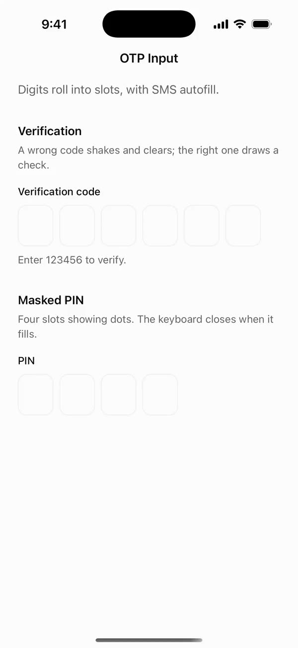
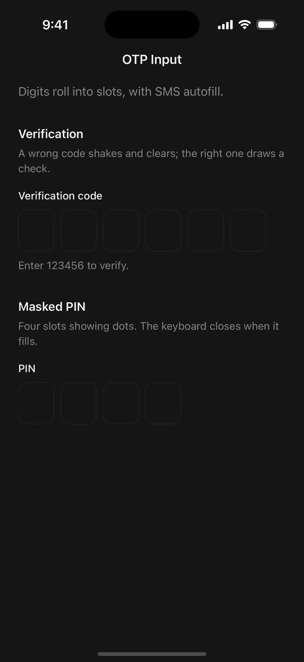
React NativeDigits roll into slots, with SMS autofill.
Preview
Install
Source on GitHubIt works in Expo and in bare React Native. New to beUI Native? Set up your app first.
Copies the component and the shared files it needs into src/, adds the theme tokens if they're missing, and installs its libraries. Files you've changed are kept.
Keep the folder layout, since the component imports the shared files by relative path.
1Install the libraries
npx expo install react-native-reanimated react-native-worklets
npm install uniwind tailwindcss2Add the theme tokens
Once per app. Import it from the CSS file Uniwind reads, after Tailwind and Uniwind, and change the values to match your brand.
/* Matches the default beUI palette in ui-components/lib/themes.ts.
   Native surface maps to card; muted maps to muted-foreground. */
@layer theme {
  :root {
    @variant light {
      --color-background: oklch(99% 0 0);
      --color-surface: oklch(97% 0 0);
      --color-foreground: oklch(15% 0 0);
      --color-muted: oklch(50% 0 0);
      --color-border: oklch(15% 0 0 / 0.06);
      --color-border-strong: oklch(15% 0 0 / 0.16);
      --color-primary: #0285f7;
      --color-on-primary: #ffffff;
      --color-destructive: #dc2626;
      --color-success: #059669;
      --color-warning: #d97706;
    }
  }

  :root {
    @variant dark {
      --color-background: #151515;
      --color-surface: #1c1c1c;
      --color-foreground: oklch(96% 0 0);
      --color-muted: oklch(62% 0 0);
      --color-border: rgb(255 255 255 / 0.05);
      --color-border-strong: rgb(255 255 255 / 0.14);
      --color-primary: #0285f7;
      --color-on-primary: #ffffff;
      --color-destructive: #f87171;
      --color-success: #34d399;
      --color-warning: #fbbf24;
    }
  }
}
3Copy the shared files
import { useEffect, useRef, useState } from "react";

export type PresenceItem<T> = {
  key: string;
  value: T;
  /** False for the item present on first render, so it does not animate in. */
  appear: boolean;
  exiting: boolean;
};

/**
 * Keeps replaced items mounted while they animate out, like AnimatePresence.
 * A key that returns while exiting is revived in place.
 */
export function usePresence<T>(
  key: string | null,
  value: T,
  exitDuration: (value: T) => number,
) {
  const [items, setItems] = useState<PresenceItem<T>[]>(() =>
    key === null ? [] : [{ key, value, appear: false, exiting: false }],
  );
  const [currentKey, setCurrentKey] = useState(key);
  const exitDurationRef = useRef(exitDuration);
  exitDurationRef.current = exitDuration;

  // Adjust during render so the new item and the exits start in the same frame.
  if (key !== currentKey) {
    setCurrentKey(key);
    setItems((previous) => {
      const next = previous.map((item) =>
        item.key === key
          ? { ...item, value, exiting: false }
          : { ...item, exiting: true },
      );
      if (key !== null && !previous.some((item) => item.key === key)) {
        next.push({ key, value, appear: true, exiting: false });
      }
      return next;
    });
  }

  const exitingKeys = items
    .filter((item) => item.exiting)
    .map((item) => item.key)
    .join("\n");

  useEffect(() => {
    if (!exitingKeys) return;
    const timers = items
      .filter((item) => item.exiting)
      .map((item) =>
        setTimeout(() => {
          setItems((previous) =>
            previous.filter(
              (candidate) => !(candidate.key === item.key && candidate.exiting),
            ),
          );
        }, exitDurationRef.current(item.value)),
      );
    return () => {
      for (const timer of timers) clearTimeout(timer);
    };
    // Restart removal timers only when the set of exiting items changes.
  }, [exitingKeys]);

  return items;
}
import { useEffect, useState } from "react";
import { AccessibilityInfo } from "react-native";
import { useReducedMotion } from "react-native-reanimated";

/** Reanimated supplies a synchronous initial value; native events keep it current. */
export function useReducedMotionPreference() {
  const initialValue = useReducedMotion();
  const [reducedMotion, setReducedMotion] = useState(initialValue);

  useEffect(() => {
    let active = true;
    let receivedEvent = false;
    const subscription = AccessibilityInfo.addEventListener(
      "reduceMotionChanged",
      (value) => {
        receivedEvent = true;
        setReducedMotion(value);
      },
    );
    void AccessibilityInfo.isReduceMotionEnabled().then((value) => {
      if (active && !receivedEvent) setReducedMotion(value);
    });
    return () => {
      active = false;
      subscription.remove();
    };
  }, []);

  return reducedMotion;
}
import { useCallback } from "react";
import {
  type EasingFunction,
  type EasingFunctionFactory,
  useAnimatedStyle,
  useSharedValue,
  withSequence,
  withTiming,
} from "react-native-reanimated";

/**
 * Horizontal shake through `keyframes` (in points) over `duration` ms, split
 * evenly like a Motion keyframe array. Callers skip it under reduced motion.
 */
export function useShake(
  keyframes: number[],
  duration: number,
  easing?: EasingFunction | EasingFunctionFactory,
) {
  const offset = useSharedValue(0);
  const step = duration / Math.max(1, keyframes.length - 1);

  const shake = useCallback(() => {
    const [first = 0, ...rest] = keyframes;
    offset.value = first;
    offset.value = withSequence(
      // An explicit `easing: undefined` would replace Reanimated's default.
      ...rest.map((point) =>
        withTiming(
          point,
          easing ? { duration: step, easing } : { duration: step },
        ),
      ),
    );
  }, [easing, keyframes, offset, step]);

  const style = useAnimatedStyle(() => ({
    transform: [{ translateX: offset.value }],
  }));

  return { shake, style };
}
import { type ColorValue, StyleSheet, View } from "react-native";
import Animated, {
  interpolate,
  type SharedValue,
  useAnimatedStyle,
} from "react-native-reanimated";

/** A straight line in a square viewBox: [x1, y1, x2, y2]. */
export type PathSegment = [x1: number, y1: number, x2: number, y2: number];

export type DrawnPathProps = {
  /** Straight segments drawn in order, like an SVG polyline. */
  segments: PathSegment[];
  /** Rendered width and height in points. */
  size: number;
  /** Stroke width in viewBox units. */
  strokeWidth: number;
  /** Side of the square viewBox the segments are written in. Defaults to 24. */
  viewBox?: number;
  color: ColorValue | undefined;
  /** 0 draws nothing and 1 draws every segment, like SVG `pathLength`. */
  progress: SharedValue<number>;
};

function length([x1, y1, x2, y2]: PathSegment) {
  return Math.hypot(x2 - x1, y2 - y1);
}

/**
 * Draws a polyline on with rotated Views, so shared components need no SVG
 * library. Round caps extend half a stroke past each end, like SVG's linecap.
 */
export function DrawnPath({
  segments,
  size,
  strokeWidth,
  viewBox = 24,
  color,
  progress,
}: DrawnPathProps) {
  const unit = size / viewBox;
  const stroke = strokeWidth * unit;
  const total = segments.reduce((sum, segment) => sum + length(segment), 0);
  let start = 0;

  return (
    <View style={{ width: size, height: size }}>
      {segments.map((segment) => {
        const from = start / total;
        start += length(segment);
        return (
          <Stroke
            key={segment.join()}
            segment={segment}
            unit={unit}
            stroke={stroke}
            from={from}
            to={start / total}
            progress={progress}
            color={color}
          />
        );
      })}
    </View>
  );
}

function Stroke({
  segment,
  unit,
  stroke,
  from,
  to,
  progress,
  color,
}: {
  segment: PathSegment;
  unit: number;
  stroke: number;
  from: number;
  to: number;
  progress: SharedValue<number>;
  color: ColorValue | undefined;
}) {
  const [x1, y1, x2, y2] = segment;
  const full = length(segment) * unit;
  const angle = Math.atan2(y2 - y1, x2 - x1);

  const animatedStyle = useAnimatedStyle(() => {
    const drawn = interpolate(progress.value, [from, to], [0, 1], "clamp");
    return { opacity: drawn > 0 ? 1 : 0, width: stroke + full * drawn };
  });

  return (
    <Animated.View
      style={[
        styles.stroke,
        {
          left: x1 * unit - stroke / 2,
          top: y1 * unit - stroke / 2,
          height: stroke,
          borderRadius: stroke / 2,
          backgroundColor: color,
          // Rotate around the start point so the stroke grows from it.
          transformOrigin: [stroke / 2, stroke / 2, 0],
          transform: [{ rotate: `${angle}rad` }],
        },
        animatedStyle,
      ]}
    />
  );
}

const styles = StyleSheet.create({
  stroke: { position: "absolute" },
});
import { Easing, ReduceMotion } from "react-native-reanimated";

// Mirrors beUI's lib/ease.ts so native motion matches the web library.

export const EASE_OUT = Easing.bezier(0.16, 1, 0.3, 1);
export const EASE_IN_OUT = Easing.bezier(0.77, 0, 0.175, 1);

/** Press feedback on buttons and other tappable surfaces. */
export const SPRING_PRESS = {
  stiffness: 500,
  damping: 30,
  mass: 0.6,
  reduceMotion: ReduceMotion.System,
} as const;

/** Content swaps: label and icon slots trading places inside a control. */
export const SPRING_SWAP = {
  stiffness: 460,
  damping: 30,
  mass: 0.55,
  reduceMotion: ReduceMotion.System,
} as const;

/** Shared-layout glides: pills, indicators and panels moving between positions. */
export const SPRING_LAYOUT = {
  stiffness: 360,
  damping: 32,
  mass: 0.6,
  reduceMotion: ReduceMotion.System,
} as const;

/** Dragged handles and fills; critically damped so values never rebound off an end. */
export const SPRING_GLIDE = {
  stiffness: 700,
  damping: 50,
  mass: 0.5,
  reduceMotion: ReduceMotion.System,
} as const;

export const motion = {
  press: SPRING_PRESS,
  swap: SPRING_SWAP,
  layout: SPRING_LAYOUT,
  glide: SPRING_GLIDE,
  exit: { duration: 160, easing: EASE_OUT, reduceMotion: ReduceMotion.System },
  fade: { duration: 150, reduceMotion: ReduceMotion.System },
} as const;
4Copy the component
export type { OTPInputProps, OTPStatus } from "./otp-input";
export { OTPInput } from "./otp-input";
import { type Ref, useEffect, useRef, useState } from "react";
import {
  AccessibilityInfo,
  Platform,
  Pressable,
  StyleSheet,
  Text,
  TextInput,
  type TextInputProps,
  View,
} from "react-native";
import Animated, {
  cancelAnimation,
  useAnimatedStyle,
  useSharedValue,
  withDelay,
  withRepeat,
  withSequence,
  withSpring,
  withTiming,
} from "react-native-reanimated";
import { useResolveClassNames, useUniwind } from "uniwind";
import { usePresence } from "../../hooks/use-presence";
import { useReducedMotionPreference } from "../../hooks/use-reduced-motion";
import { useShake } from "../../hooks/use-shake";
import { DrawnPath, type PathSegment } from "../../primitives/drawn-path";
import { EASE_OUT, motion } from "../../styles/motion";

export type OTPStatus = "idle" | "error" | "success";

const SLOT_WIDTH = 48;
const SLOT_HEIGHT = 56;
const ROLL = 14;
const DIGIT_TIMING = { duration: 220, easing: EASE_OUT };
const COLOR_FADE = { duration: 200, reduceMotion: motion.fade.reduceMotion };
const SHAKE = [0, -5, 5, -3, 3, -1, 0];
const CHECK: PathSegment[] = [
  [5, 13, 9, 17],
  [9, 17, 19, 7],
];
const CHECK_SPRING = { stiffness: 500, damping: 28 };

export type OTPInputProps = Omit<
  TextInputProps,
  | "value"
  | "defaultValue"
  | "onChangeText"
  | "maxLength"
  | "editable"
  | "keyboardType"
  | "secureTextEntry"
> & {
  /** Number of slots. Defaults to 6. */
  length?: number;
  /** Controlled code. Omit it and use `defaultValue` for uncontrolled use. */
  value?: string;
  defaultValue?: string;
  onChangeText?: (value: string) => void;
  /** Fires once every slot is filled. */
  onComplete?: (value: string) => void;
  label?: string;
  /** Helper text below the slots while idle. */
  hint?: string;
  successMessage?: string;
  errorMessage?: string;
  /** Validation feedback: "error" shakes, "success" draws a check. */
  status?: OTPStatus;
  /** Shows dots instead of the typed digits. */
  mask?: boolean;
  disabled?: boolean;
  /** Disables digit, caret and feedback motion independently of the system preference. */
  disableAnimation?: boolean;
  /** Dismisses the keyboard once the last slot fills. */
  blurOnComplete?: boolean;
  className?: string;
  ref?: Ref<TextInput>;
};

function sanitize(raw: string, length: number) {
  return raw.replace(/\D/g, "").slice(0, length);
}

/** Progress runs 0 (below) → 1 (resting) → 2 (rolled out above). */
function Digit({
  char,
  appear,
  exiting,
  reduce,
}: {
  char: string;
  appear: boolean;
  exiting: boolean;
  reduce: boolean;
}) {
  const progress = useSharedValue(appear && !reduce ? 0 : 1);

  useEffect(() => {
    const target = exiting ? 2 : 1;
    progress.value = reduce ? target : withTiming(target, DIGIT_TIMING);
  }, [exiting, progress, reduce]);

  const animatedStyle = useAnimatedStyle(() => {
    const p = progress.value;
    return {
      opacity: p <= 1 ? p : 2 - p,
      transform: [{ translateY: (1 - p) * ROLL }],
    };
  });

  return (
    <Animated.View style={[styles.digit, animatedStyle]}>
      <Text
        maxFontSizeMultiplier={1.4}
        className="text-xl font-semibold text-foreground"
        style={styles.tabular}
      >
        {char}
      </Text>
    </Animated.View>
  );
}

function Caret({ filled, reduce }: { filled: boolean; reduce: boolean }) {
  const opacity = useSharedValue(1);

  useEffect(() => {
    if (reduce) return;
    // On for half a second, off for half, like the web caret.
    opacity.value = withRepeat(
      withSequence(
        withDelay(500, withTiming(0, { duration: 0 })),
        withDelay(500, withTiming(1, { duration: 0 })),
      ),
      -1,
    );
    return () => cancelAnimation(opacity);
  }, [opacity, reduce]);

  const animatedStyle = useAnimatedStyle(() => ({ opacity: opacity.value }));

  return (
    <Animated.View
      className="bg-foreground"
      style={[styles.caret, filled ? styles.caretEnd : null, animatedStyle]}
    />
  );
}

function Slot({
  char,
  active,
  status,
  mask,
  reduce,
}: {
  char: string;
  active: boolean;
  status: OTPStatus;
  mask: boolean;
  reduce: boolean;
}) {
  const { backgroundColor: idle } = useResolveClassNames("bg-border");
  const { backgroundColor: filled } = useResolveClassNames("bg-border-strong");
  const { backgroundColor: focus } = useResolveClassNames("bg-foreground");
  const { backgroundColor: error } = useResolveClassNames("bg-destructive/60");
  const { backgroundColor: success } = useResolveClassNames("bg-success/60");

  const color =
    status === "success"
      ? success
      : status === "error"
        ? error
        : active
          ? focus
          : char
            ? filled
            : idle;
  const border = useSharedValue(String(color ?? "transparent"));

  useEffect(() => {
    const next = String(color ?? "transparent");
    border.value = reduce ? next : withTiming(next, COLOR_FADE);
  }, [border, color, reduce]);

  const digits = usePresence(
    char ? char : null,
    char,
    () => DIGIT_TIMING.duration + 40,
  );
  const borderStyle = useAnimatedStyle(() => ({ borderColor: border.value }));

  return (
    <Animated.View style={[styles.slot, borderStyle]}>
      {active && status !== "success" ? (
        <Caret filled={char !== ""} reduce={reduce} />
      ) : null}
      {digits.map((item) => (
        <Digit
          key={item.key}
          char={mask ? "•" : item.value}
          appear={item.appear}
          exiting={item.exiting}
          reduce={reduce}
        />
      ))}
    </Animated.View>
  );
}

function SuccessCheck({
  appear,
  exiting,
  reduce,
}: {
  appear: boolean;
  exiting: boolean;
  reduce: boolean;
}) {
  const { color } = useResolveClassNames("text-success");
  const presence = useSharedValue(appear && !reduce ? 0 : 1);
  const draw = useSharedValue(appear && !reduce ? 0 : 1);

  useEffect(() => {
    const target = exiting ? 0 : 1;
    if (reduce) {
      presence.value = target;
      draw.value = 1;
      return;
    }
    presence.value = withSpring(target, CHECK_SPRING);
    if (!exiting) {
      draw.value = withDelay(
        100,
        withTiming(1, { duration: 350, easing: EASE_OUT }),
      );
    }
  }, [draw, exiting, presence, reduce]);

  const animatedStyle = useAnimatedStyle(() => ({
    opacity: Math.min(1, presence.value),
    transform: [{ scale: 0.6 + 0.4 * presence.value }],
  }));

  return (
    <Animated.View style={[styles.check, animatedStyle]}>
      <DrawnPath
        segments={CHECK}
        size={20}
        strokeWidth={3}
        color={color}
        progress={draw}
      />
    </Animated.View>
  );
}

export function OTPInput({
  length = 6,
  value: valueProp,
  defaultValue = "",
  onChangeText,
  onComplete,
  label,
  hint,
  successMessage,
  errorMessage,
  status = "idle",
  mask = false,
  disabled = false,
  disableAnimation = false,
  className = "",
  accessibilityLabel,
  onFocus,
  onBlur,
  blurOnComplete = false,
  keyboardAppearance,
  ref,
  ...props
}: OTPInputProps) {
  const { theme } = useUniwind();
  const inputRef = useRef<TextInput | null>(null);
  // Blur once the filled value and caret have rendered; applying them can
  // otherwise take focus straight back.
  const pendingBlur = useRef(false);
  const [uncontrolled, setUncontrolled] = useState(() =>
    sanitize(defaultValue, length),
  );
  const code = sanitize(valueProp ?? uncontrolled, length);
  const [focused, setFocused] = useState(false);
  const reducedMotion = useReducedMotionPreference();
  const animate = !reducedMotion && !disableAnimation;
  const { shake, style: shakeStyle } = useShake(SHAKE, 450, EASE_OUT);
  const previousStatus = useRef(status);

  useEffect(() => {
    if (!pendingBlur.current || code.length < length) return;
    pendingBlur.current = false;
    inputRef.current?.blur();
  }, [code, length]);

  const active = Math.min(code.length, length - 1);
  const message =
    status === "success"
      ? successMessage
      : status === "error"
        ? errorMessage
        : hint;

  useEffect(() => {
    if (previousStatus.current === status) return;
    previousStatus.current = status;
    if (status === "error" && animate) shake();
    if (status !== "idle" && message) {
      AccessibilityInfo.announceForAccessibility(message);
    }
  }, [animate, message, shake, status]);

  const checks = usePresence(
    status === "success" ? "success" : null,
    true,
    () => 300,
  );

  return (
    <View className={`self-start gap-2 ${className}`}>
      {label ? (
        <Text
          accessibilityElementsHidden
          importantForAccessibility="no"
          className="text-sm font-medium text-foreground"
        >
          {label}
        </Text>
      ) : null}

      <Pressable
        // Focus on any tap across the slots, even one the field misses.
        accessible={false}
        disabled={disabled}
        onPress={() => inputRef.current?.focus()}
        style={disabled && styles.disabled}
      >
        <Animated.View
          className="flex-row items-center gap-2"
          style={shakeStyle}
          accessibilityElementsHidden
          importantForAccessibility="no-hide-descendants"
        >
          {Array.from({ length }, (_, index) => (
            <Slot
              // Fixed-length slot grid that never reorders.
              key={index}
              char={code[index] ?? ""}
              active={focused && index === active}
              status={status}
              mask={mask}
              reduce={!animate}
            />
          ))}
        </Animated.View>

        {checks.map((item) => (
          <SuccessCheck
            key={item.key}
            appear={item.appear}
            exiting={item.exiting}
            reduce={!animate}
          />
        ))}

        {/* A transparent field over the slots owns focus, the keyboard, paste
            and SMS autofill. The slots only draw what it holds. */}
        <TextInput
          {...props}
          ref={(node) => {
            inputRef.current = node;
            if (typeof ref === "function") ref(node);
            else if (ref) ref.current = node;
          }}
          // Match the keyboard to the app's theme unless the caller chooses one.
          keyboardAppearance={keyboardAppearance ?? theme}
          value={code}
          editable={!disabled}
          maxLength={length}
          keyboardType="number-pad"
          inputMode="numeric"
          textContentType="oneTimeCode"
          autoComplete={Platform.OS === "android" ? "sms-otp" : "one-time-code"}
          caretHidden
          // Nothing of the native field shows; the slots draw everything.
          selectionColor="transparent"
          underlineColorAndroid="transparent"
          contextMenuHidden={false}
          // Keep the native caret at the end so edits always append or delete last.
          selection={{ start: code.length, end: code.length }}
          accessibilityLabel={
            accessibilityLabel ?? label ?? "One-time passcode"
          }
          accessibilityHint={message}
          aria-invalid={status === "error"}
          aria-disabled={disabled}
          style={styles.capture}
          onChangeText={(raw) => {
            const next = sanitize(raw, length);
            if (next === code) return;
            const completed = code.length < length && next.length === length;
            // Set before notifying: a parent update can render synchronously.
            if (completed && blurOnComplete) pendingBlur.current = true;
            if (valueProp === undefined) setUncontrolled(next);
            onChangeText?.(next);
            if (completed) onComplete?.(next);
          }}
          onFocus={(event) => {
            setFocused(true);
            onFocus?.(event);
          }}
          onBlur={(event) => {
            setFocused(false);
            onBlur?.(event);
          }}
        />
      </Pressable>

      {message ? (
        <Text
          accessibilityLiveRegion="polite"
          className={`text-sm ${status === "success" ? "text-success" : status === "error" ? "text-destructive" : "text-muted"}`}
        >
          {message}
        </Text>
      ) : null}
    </View>
  );
}

const styles = StyleSheet.create({
  disabled: { opacity: 0.5 },
  slot: {
    width: SLOT_WIDTH,
    height: SLOT_HEIGHT,
    borderRadius: 12,
    borderWidth: 1,
    alignItems: "center",
    justifyContent: "center",
    overflow: "hidden",
  },
  digit: {
    ...StyleSheet.absoluteFill,
    alignItems: "center",
    justifyContent: "center",
  },
  tabular: { fontVariant: ["tabular-nums"] },
  caret: { position: "absolute", width: 1, height: 24 },
  caretEnd: { right: 12 },
  check: {
    position: "absolute",
    right: -28,
    top: (SLOT_HEIGHT - 20) / 2,
    pointerEvents: "none",
  },
  capture: {
    ...StyleSheet.absoluteFill,
    // iOS skips views below 0.01 opacity when hit-testing, so a fully
    // transparent field never receives the tap that opens the keyboard.
    opacity: 0.011,
    color: "transparent",
    backgroundColor: "transparent",
  },
});
Documentation
Native port of beUI OTP Input. A one-time-code field whose digits roll into their slots, with an error shake and a check that draws itself on success.
import { OTPInput } from "./src";

<OTPInput
  label="Verification code"
  hint="We sent a code to your phone."
  errorMessage="Wrong code, try again."
  successMessage="Verified."
  value={code}
  status={status}
  onChangeText={setCode}
  onComplete={verify}
/>- Slots:
lengthslots (6 by default), 48 by 56 points each. Each new digit rolls up into its slot over 220 ms, and a deleted digit rolls out upward.maskshows dots instead of digits. - Caret: the active slot shows a blinking caret and a stronger border. Slot borders fade between empty, filled, active, error and success colours.
- Status:
status="error"shakes the slots and turns them red.status="success"turns them green and springs in a check that draws itself beside the slots. Each status message is announced to screen readers. - Input: a transparent native
TextInputcovers the slots and owns focus, the number pad, paste and SMS autofill (oneTimeCodeon iOS,sms-otpon Android). It only accepts digits.onCompletefires when the last slot fills. - State: pass
valuewithonChangeTextto control it, ordefaultValueto let it manage itself. - Keyboard: the number pad follows the app's light or dark theme on iOS (override with
keyboardAppearance).blurOnCompletedismisses the keyboard once the last slot fills. - Accessibility: screen readers see one field named by
label(or "One-time passcode"), with the current message as its hint. The drawn slots are hidden from them. - Reduced motion: when the system asks for it, or
disableAnimationis set, digits and colours change instantly, the caret stays solid, and nothing shakes.
Unlike the web version, editing always happens at the end of the code: backspace removes the last digit and typing appends. The web version lets you place the caret in a middle slot with a mouse or the arrow keys, which touch keyboards don't offer.
Copy this directory, hooks/use-presence.ts, hooks/use-reduced-motion.ts, hooks/use-shake.ts, primitives/drawn-path.tsx, styles/motion.ts, and the semantic tokens in styles/theme.css.