
Multi Select
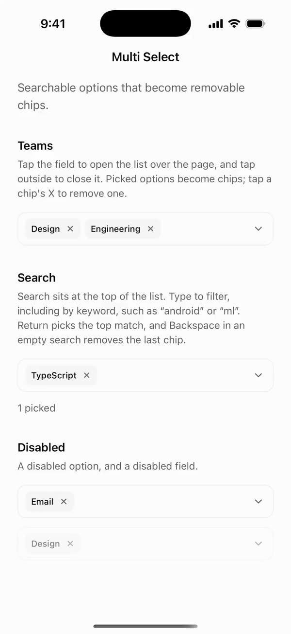
React NativeSearchable options that become removable chips.
Preview
Install
Source on GitHubIt works in Expo and in bare React Native. New to beUI Native? Set up your app first.
Copies the component and the shared files it needs into src/, adds the theme tokens if they're missing, and installs its libraries. Files you've changed are kept.
Keep the folder layout, since the component imports the shared files by relative path.
1Install the libraries
npx expo install react-native-reanimated react-native-worklets
npm install uniwind tailwindcss2Add the theme tokens
Once per app. Import it from the CSS file Uniwind reads, after Tailwind and Uniwind, and change the values to match your brand.
/* Matches the default beUI palette in ui-components/lib/themes.ts.
   Native surface maps to card; muted maps to muted-foreground. */
@layer theme {
  :root {
    @variant light {
      --color-background: oklch(99% 0 0);
      --color-surface: oklch(97% 0 0);
      --color-foreground: oklch(15% 0 0);
      --color-muted: oklch(50% 0 0);
      --color-border: oklch(15% 0 0 / 0.06);
      --color-border-strong: oklch(15% 0 0 / 0.16);
      --color-primary: #0285f7;
      --color-on-primary: #ffffff;
      --color-destructive: #dc2626;
      --color-success: #059669;
      --color-warning: #d97706;
    }
  }

  :root {
    @variant dark {
      --color-background: #151515;
      --color-surface: #1c1c1c;
      --color-foreground: oklch(96% 0 0);
      --color-muted: oklch(62% 0 0);
      --color-border: rgb(255 255 255 / 0.05);
      --color-border-strong: rgb(255 255 255 / 0.14);
      --color-primary: #0285f7;
      --color-on-primary: #ffffff;
      --color-destructive: #f87171;
      --color-success: #34d399;
      --color-warning: #fbbf24;
    }
  }
}
3Copy the shared files
import { useEffect, useState } from "react";
import { AccessibilityInfo } from "react-native";
import { useReducedMotion } from "react-native-reanimated";

/** Reanimated supplies a synchronous initial value; native events keep it current. */
export function useReducedMotionPreference() {
  const initialValue = useReducedMotion();
  const [reducedMotion, setReducedMotion] = useState(initialValue);

  useEffect(() => {
    let active = true;
    let receivedEvent = false;
    const subscription = AccessibilityInfo.addEventListener(
      "reduceMotionChanged",
      (value) => {
        receivedEvent = true;
        setReducedMotion(value);
      },
    );
    void AccessibilityInfo.isReduceMotionEnabled().then((value) => {
      if (active && !receivedEvent) setReducedMotion(value);
    });
    return () => {
      active = false;
      subscription.remove();
    };
  }, []);

  return reducedMotion;
}
import { type ColorValue, StyleSheet, View } from "react-native";
import Animated, {
  interpolate,
  type SharedValue,
  useAnimatedStyle,
} from "react-native-reanimated";

/** A straight line in a square viewBox: [x1, y1, x2, y2]. */
export type PathSegment = [x1: number, y1: number, x2: number, y2: number];

export type DrawnPathProps = {
  /** Straight segments drawn in order, like an SVG polyline. */
  segments: PathSegment[];
  /** Rendered width and height in points. */
  size: number;
  /** Stroke width in viewBox units. */
  strokeWidth: number;
  /** Side of the square viewBox the segments are written in. Defaults to 24. */
  viewBox?: number;
  color: ColorValue | undefined;
  /** 0 draws nothing and 1 draws every segment, like SVG `pathLength`. */
  progress: SharedValue<number>;
};

function length([x1, y1, x2, y2]: PathSegment) {
  return Math.hypot(x2 - x1, y2 - y1);
}

/**
 * Draws a polyline on with rotated Views, so shared components need no SVG
 * library. Round caps extend half a stroke past each end, like SVG's linecap.
 */
export function DrawnPath({
  segments,
  size,
  strokeWidth,
  viewBox = 24,
  color,
  progress,
}: DrawnPathProps) {
  const unit = size / viewBox;
  const stroke = strokeWidth * unit;
  const total = segments.reduce((sum, segment) => sum + length(segment), 0);
  let start = 0;

  return (
    <View style={{ width: size, height: size }}>
      {segments.map((segment) => {
        const from = start / total;
        start += length(segment);
        return (
          <Stroke
            key={segment.join()}
            segment={segment}
            unit={unit}
            stroke={stroke}
            from={from}
            to={start / total}
            progress={progress}
            color={color}
          />
        );
      })}
    </View>
  );
}

function Stroke({
  segment,
  unit,
  stroke,
  from,
  to,
  progress,
  color,
}: {
  segment: PathSegment;
  unit: number;
  stroke: number;
  from: number;
  to: number;
  progress: SharedValue<number>;
  color: ColorValue | undefined;
}) {
  const [x1, y1, x2, y2] = segment;
  const full = length(segment) * unit;
  const angle = Math.atan2(y2 - y1, x2 - x1);

  const animatedStyle = useAnimatedStyle(() => {
    const drawn = interpolate(progress.value, [from, to], [0, 1], "clamp");
    return { opacity: drawn > 0 ? 1 : 0, width: stroke + full * drawn };
  });

  return (
    <Animated.View
      style={[
        styles.stroke,
        {
          left: x1 * unit - stroke / 2,
          top: y1 * unit - stroke / 2,
          height: stroke,
          borderRadius: stroke / 2,
          backgroundColor: color,
          // Rotate around the start point so the stroke grows from it.
          transformOrigin: [stroke / 2, stroke / 2, 0],
          transform: [{ rotate: `${angle}rad` }],
        },
        animatedStyle,
      ]}
    />
  );
}

const styles = StyleSheet.create({
  stroke: { position: "absolute" },
});
import { Easing, ReduceMotion } from "react-native-reanimated";

// Mirrors beUI's lib/ease.ts so native motion matches the web library.

export const EASE_OUT = Easing.bezier(0.16, 1, 0.3, 1);
export const EASE_IN_OUT = Easing.bezier(0.77, 0, 0.175, 1);

/** Press feedback on buttons and other tappable surfaces. */
export const SPRING_PRESS = {
  stiffness: 500,
  damping: 30,
  mass: 0.6,
  reduceMotion: ReduceMotion.System,
} as const;

/** Content swaps: label and icon slots trading places inside a control. */
export const SPRING_SWAP = {
  stiffness: 460,
  damping: 30,
  mass: 0.55,
  reduceMotion: ReduceMotion.System,
} as const;

/** Shared-layout glides: pills, indicators and panels moving between positions. */
export const SPRING_LAYOUT = {
  stiffness: 360,
  damping: 32,
  mass: 0.6,
  reduceMotion: ReduceMotion.System,
} as const;

/** Dragged handles and fills; critically damped so values never rebound off an end. */
export const SPRING_GLIDE = {
  stiffness: 700,
  damping: 50,
  mass: 0.5,
  reduceMotion: ReduceMotion.System,
} as const;

export const motion = {
  press: SPRING_PRESS,
  swap: SPRING_SWAP,
  layout: SPRING_LAYOUT,
  glide: SPRING_GLIDE,
  exit: { duration: 160, easing: EASE_OUT, reduceMotion: ReduceMotion.System },
  fade: { duration: 150, reduceMotion: ReduceMotion.System },
} as const;
4Copy the component
import {
  createContext,
  type ReactNode,
  type RefObject,
  useCallback,
  useContext,
  useMemo,
  useRef,
  useState,
} from "react";
import { type TextInput, View, type ViewProps } from "react-native";

export type Anchor = { x: number; y: number; width: number; height: number };

import { useReducedMotionPreference } from "../../hooks/use-reduced-motion";

export type MultiSelectFilter = (
  value: string,
  query: string,
  keywords: string[],
) => boolean;

/** Matches when the query's characters appear in order, like the web version. */
const defaultFilter: MultiSelectFilter = (value, query, keywords) => {
  const needle = query.trim().toLocaleLowerCase();
  if (!needle) return true;
  const haystack = [value, ...keywords].join(" ").toLocaleLowerCase();
  let at = 0;
  for (const character of haystack) {
    if (character === needle[at]) at += 1;
    if (at === needle.length) return true;
  }
  return false;
};

export type RegisteredItem = {
  value: string;
  label: string;
  keywords: string[];
  disabled: boolean;
};

export type MultiSelectContextValue = {
  open: boolean;
  setOpen: (open: boolean) => void;
  values: string[];
  toggle: (value: string) => void;
  remove: (value: string) => void;
  query: string;
  setQuery: (query: string) => void;
  register: (item: RegisteredItem) => void;
  unregister: (value: string) => void;
  labelFor: (value: string) => string;
  isVisible: (value: string) => boolean;
  visibleCount: number;
  /** The first visible option that can be picked, for the return key. */
  firstMatch: string | null;
  disabled: boolean;
  reduce: boolean;
  inputRef: RefObject<TextInput | null>;
  triggerRef: RefObject<View | null>;
  /** The trigger's frame in the window, measured as the panel opens. */
  anchor: Anchor | null;
  /** Measures the trigger again, such as after chips change its height. */
  measure: () => void;
};

const MultiSelectContext = createContext<MultiSelectContextValue | null>(null);

/**
 * True inside the hidden copy of the options that MultiSelectContent keeps
 * mounted, so chips know every label before the panel first opens.
 */
export const RegistryContext = createContext(false);

/** Lets a group hide itself while a query leaves none of its options. */
export const MultiSelectGroupContext = createContext<
  ((value: string, visible: boolean) => void) | null
>(null);

export function useMultiSelectContext(component: string) {
  const context = useContext(MultiSelectContext);
  if (!context) {
    throw new Error(`${component} must be used within <MultiSelect>`);
  }
  return context;
}

export type MultiSelectProps = Omit<ViewProps, "children"> & {
  children: ReactNode;
  /** Controlled selection. Omit it and use `defaultValue` for uncontrolled use. */
  value?: string[];
  defaultValue?: string[];
  onValueChange?: (value: string[]) => void;
  open?: boolean;
  defaultOpen?: boolean;
  onOpenChange?: (open: boolean) => void;
  query?: string;
  defaultQuery?: string;
  onQueryChange?: (query: string) => void;
  /** Decides which options a query shows. Defaults to an in-order character match. */
  filter?: MultiSelectFilter;
  disabled?: boolean;
  /** Moves without springing, independently of the system preference. */
  disableAnimation?: boolean;
  className?: string;
};

/**
 * Picks several options from a searchable list. Compose MultiSelectTrigger
 * (with MultiSelectValue) and MultiSelectContent (with MultiSelectInput and
 * MultiSelectList) inside.
 */
export function MultiSelect({
  children,
  value: controlledValue,
  defaultValue = [],
  onValueChange,
  open: controlledOpen,
  defaultOpen = false,
  onOpenChange,
  query: controlledQuery,
  defaultQuery = "",
  onQueryChange,
  filter = defaultFilter,
  disabled = false,
  disableAnimation = false,
  className = "",
  ...props
}: MultiSelectProps) {
  const reducedMotion = useReducedMotionPreference();
  const reduce = reducedMotion || disableAnimation;
  const inputRef = useRef<TextInput>(null);
  const triggerRef = useRef<View>(null);
  const [anchor, setAnchor] = useState<Anchor | null>(null);
  const [internalValue, setInternalValue] = useState(defaultValue);
  const [internalOpen, setInternalOpen] = useState(defaultOpen);
  const [internalQuery, setInternalQuery] = useState(defaultQuery);
  const [items, setItems] = useState<Map<string, RegisteredItem>>(new Map());

  const values = controlledValue ?? internalValue;
  const open = controlledOpen ?? internalOpen;
  const query = controlledQuery ?? internalQuery;
  const valueControlled = controlledValue !== undefined;
  const openControlled = controlledOpen !== undefined;
  const queryControlled = controlledQuery !== undefined;

  const setQuery = useCallback(
    (next: string) => {
      if (!queryControlled) setInternalQuery(next);
      onQueryChange?.(next);
    },
    [onQueryChange, queryControlled],
  );

  const measure = useCallback(() => {
    triggerRef.current?.measureInWindow((x, y, width, height) => {
      setAnchor((current) =>
        current?.x === x &&
        current.y === y &&
        current.width === width &&
        current.height === height
          ? current
          : { x, y, width, height },
      );
    });
  }, []);

  const setOpen = useCallback(
    (next: boolean) => {
      if (disabled && next) return;
      if (next === open) return;
      if (next) {
        // Find the trigger on screen before the panel appears beside it.
        triggerRef.current?.measureInWindow((x, y, width, height) => {
          setAnchor({ x, y, width, height });
          if (!openControlled) setInternalOpen(true);
          onOpenChange?.(true);
        });
        return;
      }
      if (!openControlled) setInternalOpen(false);
      onOpenChange?.(false);
      setQuery("");
    },
    [disabled, onOpenChange, open, openControlled, setQuery],
  );

  const register = useCallback((item: RegisteredItem) => {
    setItems((current) => {
      const existing = current.get(item.value);
      if (
        existing?.label === item.label &&
        existing.disabled === item.disabled &&
        existing.keywords.join("\u0000") === item.keywords.join("\u0000")
      ) {
        return current;
      }
      const next = new Map(current);
      next.set(item.value, item);
      return next;
    });
  }, []);

  const unregister = useCallback((value: string) => {
    setItems((current) => {
      if (!current.has(value)) return current;
      const next = new Map(current);
      next.delete(value);
      return next;
    });
  }, []);

  // While the panel folds closed, it keeps filtering by the query it was open
  // with, so its rows don't jump back to the full list mid-fold.
  const [openQuery, setOpenQuery] = useState(query);
  if (open && openQuery !== query) setOpenQuery(query);
  const listQuery = open ? query : openQuery;

  const visible = useMemo(
    () =>
      Array.from(items.values()).filter((item) =>
        filter(item.value, listQuery, [item.label, ...item.keywords]),
      ),
    [filter, items, listQuery],
  );
  const visibleValues = useMemo(
    () => new Set(visible.map((item) => item.value)),
    [visible],
  );

  const commit = useCallback(
    (next: string[]) => {
      if (!valueControlled) setInternalValue(next);
      onValueChange?.(next);
    },
    [onValueChange, valueControlled],
  );

  const toggle = useCallback(
    (value: string) => {
      if (items.get(value)?.disabled) return;
      commit(
        values.includes(value)
          ? values.filter((item) => item !== value)
          : [...values, value],
      );
      setQuery("");
    },
    [commit, items, setQuery, values],
  );

  const remove = useCallback(
    (value: string) => {
      if (!values.includes(value)) return;
      commit(values.filter((item) => item !== value));
    },
    [commit, values],
  );

  const context = useMemo<MultiSelectContextValue>(
    () => ({
      open,
      setOpen,
      values,
      toggle,
      remove,
      query,
      setQuery,
      register,
      unregister,
      labelFor: (value) => items.get(value)?.label ?? value,
      isVisible: (value) => !listQuery.trim() || visibleValues.has(value),
      visibleCount: visible.length,
      firstMatch: visible.find((item) => !item.disabled)?.value ?? null,
      disabled,
      reduce,
      inputRef,
      triggerRef,
      anchor,
      measure,
    }),
    [
      anchor,
      disabled,
      items,
      listQuery,
      measure,
      open,
      query,
      reduce,
      register,
      remove,
      setOpen,
      setQuery,
      toggle,
      unregister,
      values,
      visible,
      visibleValues,
    ],
  );

  return (
    <MultiSelectContext.Provider value={context}>
      <View {...props} className={`w-full ${className}`}>
        {children}
      </View>
    </MultiSelectContext.Provider>
  );
}
export type { MultiSelectFilter, MultiSelectProps } from "./context";
export { MultiSelect } from "./context";
export type {
  MultiSelectContentProps,
  MultiSelectGroupProps,
  MultiSelectItemProps,
  MultiSelectListProps,
} from "./list";
export {
  MultiSelectContent,
  MultiSelectEmpty,
  MultiSelectGroup,
  MultiSelectItem,
  MultiSelectLabel,
  MultiSelectList,
  MultiSelectSeparator,
} from "./list";
export type {
  MultiSelectInputProps,
  MultiSelectTriggerProps,
  MultiSelectValueProps,
} from "./trigger";
export {
  MultiSelectInput,
  MultiSelectTrigger,
  MultiSelectValue,
} from "./trigger";
import {
  type ReactNode,
  useCallback,
  useContext,
  useEffect,
  useMemo,
  useState,
} from "react";
import {
  Keyboard,
  Modal,
  Platform,
  Pressable,
  ScrollView,
  StyleSheet,
  Text,
  useWindowDimensions,
  View,
} from "react-native";
import Animated, {
  cancelAnimation,
  ReduceMotion,
  useAnimatedStyle,
  useSharedValue,
  withSpring,
  withTiming,
} from "react-native-reanimated";
import { scheduleOnRN } from "react-native-worklets";
import { useResolveClassNames } from "uniwind";
import { DrawnPath, type PathSegment } from "../../primitives/drawn-path";
import { EASE_OUT } from "../../styles/motion";
import {
  MultiSelectGroupContext,
  RegistryContext,
  useMultiSelectContext,
} from "./context";

// The web version's morph: the panel grows out of the field and pulls away
// from it on a spring with a light bounce, then folds back quickly.
const MORPH = {
  duration: 500,
  dampingRatio: 0.78,
  reduceMotion: ReduceMotion.System,
};
const FOLD = { duration: 200, easing: EASE_OUT };
const FADE = { duration: 150 };
const CHECK_FADE = { duration: 140, easing: EASE_OUT };
// How far the open panel sits from the field.
const GAP = 6;
// Space kept from the window's bottom edge, or the keyboard, and from its top.
const EDGE = 16;
const TOP_EDGE = 56;
// With less room than this below the field, the panel opens above it if
// there's more room there.
const MIN_BELOW = 220;
const MAX_LIST = 256;
const CHECK: PathSegment[] = [
  [20, 6, 9, 17],
  [9, 17, 4, 12],
];

/** The on-screen keyboard's height while `active`, or 0. */
function useKeyboardHeight(active: boolean) {
  const [height, setHeight] = useState(0);
  useEffect(() => {
    if (!active) return;
    const ios = Platform.OS === "ios";
    const show = Keyboard.addListener(
      ios ? "keyboardWillShow" : "keyboardDidShow",
      (event) => setHeight(event.endCoordinates.height),
    );
    const hide = Keyboard.addListener(
      ios ? "keyboardWillHide" : "keyboardDidHide",
      () => setHeight(0),
    );
    // React Native Web has no keyboard metrics; it reports no keyboard.
    if (typeof Keyboard.metrics === "function") {
      setHeight(Keyboard.metrics()?.height ?? 0);
    }
    return () => {
      show.remove();
      hide.remove();
    };
  }, [active]);
  return height;
}

export type MultiSelectContentProps = {
  children: ReactNode;
  className?: string;
};

/**
 * The panel. It floats over the page beside the field: below it, unless the
 * room there, keyboard included, is tight and there's more above. A tap
 * outside, or Android's back button, closes it.
 */
export function MultiSelectContent({
  children,
  className = "",
}: MultiSelectContentProps) {
  const context = useMultiSelectContext("MultiSelectContent");
  const { open, anchor, reduce } = context;
  const window = useWindowDimensions();
  const keyboard = useKeyboardHeight(open);
  // The modal stays up while the panel folds away.
  const [present, setPresent] = useState(open);
  if (open && !present) setPresent(true);
  const [height, setHeight] = useState(0);
  const progress = useSharedValue(0);

  const hide = useCallback(() => setPresent(false), []);

  useEffect(() => {
    if (!present) return;
    cancelAnimation(progress);
    if (open) {
      progress.value = reduce ? withTiming(1, FADE) : withSpring(1, MORPH);
    } else {
      progress.value = withTiming(0, reduce ? FADE : FOLD, (done) => {
        if (done) scheduleOnRN(hide);
      });
    }
  }, [hide, open, present, progress, reduce]);

  const below = anchor
    ? window.height - keyboard - (anchor.y + anchor.height) - GAP - EDGE
    : 0;
  const above = anchor ? anchor.y - GAP - TOP_EDGE : 0;
  const isTop = below < MIN_BELOW && above > below;
  const room = Math.max(120, isTop ? above : below);

  const panelStyle = useAnimatedStyle(() => {
    const p = progress.value;
    return {
      // A spring past 1 grows the panel a little past its size: the bounce.
      height: reduce ? height : height * Math.max(0, p),
      opacity: Math.min(1, Math.max(0, p * 3)),
      transform: [
        { translateY: (isTop ? -GAP : GAP) * Math.min(1, Math.max(0, p)) },
      ],
    };
  }, [height, isTop, reduce]);

  const position =
    anchor === null
      ? null
      : isTop
        ? {
            left: anchor.x,
            width: anchor.width,
            bottom: window.height - anchor.y,
          }
        : {
            left: anchor.x,
            width: anchor.width,
            top: anchor.y + anchor.height,
          };

  return (
    <>
      {/* A hidden copy, so chips know every label before the first open. */}
      <View style={styles.registry} accessibilityElementsHidden>
        <RegistryContext.Provider value={true}>
          {children}
        </RegistryContext.Provider>
      </View>

      <Modal
        transparent
        visible={present}
        animationType="none"
        statusBarTranslucent
        navigationBarTranslucent
        onRequestClose={() => context.setOpen(false)}
      >
        <Pressable
          accessibilityLabel="Close"
          accessibilityRole="button"
          style={StyleSheet.absoluteFill}
          onPress={() => context.setOpen(false)}
        />
        {position ? (
          <Animated.View
            accessibilityViewIsModal
            className={`overflow-hidden rounded-xl border border-border bg-background ${className}`}
            style={[styles.panel, position, panelStyle]}
          >
            {/* Pinned to the edge nearest the field and measured at its own
                height, so the panel uncovers it from there. */}
            <View
              style={[
                styles.content,
                isTop ? styles.pinBottom : styles.pinTop,
                { maxHeight: room - 2 },
              ]}
              onLayout={({ nativeEvent }) =>
                // The panel's 1-point border on each side.
                setHeight(nativeEvent.layout.height + 2)
              }
            >
              {children}
            </View>
          </Animated.View>
        ) : null}
      </Modal>
    </>
  );
}

export type MultiSelectListProps = {
  children: ReactNode;
  accessibilityLabel?: string;
  className?: string;
};

/** Scrolls past 256 points, or sooner when the room beside the field is tight. */
export function MultiSelectList({
  children,
  accessibilityLabel = "Options",
  className = "",
}: MultiSelectListProps) {
  const registering = useContext(RegistryContext);
  if (registering) return <>{children}</>;
  return (
    <ScrollView
      accessibilityLabel={accessibilityLabel}
      keyboardShouldPersistTaps="handled"
      style={styles.list}
      contentContainerClassName={`p-1.5 ${className}`}
    >
      {children}
    </ScrollView>
  );
}

export type MultiSelectGroupProps = {
  children: ReactNode;
  className?: string;
};

/** Hides itself while a query leaves none of its options. */
export function MultiSelectGroup({
  children,
  className = "",
}: MultiSelectGroupProps) {
  const registering = useContext(RegistryContext);
  const [shown, setShown] = useState<Map<string, boolean>>(new Map());
  const report = useCallback((value: string, visible: boolean) => {
    setShown((current) => {
      if (current.get(value) === visible) return current;
      const next = new Map(current);
      next.set(value, visible);
      return next;
    });
  }, []);
  const empty = useMemo(
    () => shown.size > 0 && ![...shown.values()].some(Boolean),
    [shown],
  );

  if (registering) return <>{children}</>;

  return (
    <MultiSelectGroupContext.Provider value={report}>
      <View
        style={empty ? styles.hidden : null}
        className={`py-0.5 ${className}`}
      >
        {children}
      </View>
    </MultiSelectGroupContext.Provider>
  );
}

export function MultiSelectLabel({
  children,
  className = "",
}: {
  children: ReactNode;
  className?: string;
}) {
  const registering = useContext(RegistryContext);
  if (registering) return null;
  return (
    <Text
      accessibilityRole="header"
      className={`px-2 py-1.5 text-[11px] font-medium uppercase tracking-widest text-muted ${className}`}
    >
      {children}
    </Text>
  );
}

export type MultiSelectItemProps = {
  value: string;
  children: ReactNode;
  /** The label for chips, search and screen readers when children aren't a string. */
  textValue?: string;
  /** Extra words a query can match. */
  keywords?: string[];
  disabled?: boolean;
  onSelect?: (value: string) => void;
  className?: string;
};

export function MultiSelectItem(props: MultiSelectItemProps) {
  const registering = useContext(RegistryContext);
  return registering ? <RegisteredItem {...props} /> : <ItemRow {...props} />;
}

/** The hidden copy's half: tells the root about the option. */
function RegisteredItem({
  value,
  children,
  textValue,
  keywords = [],
  disabled = false,
}: MultiSelectItemProps) {
  const { register, unregister } = useMultiSelectContext("MultiSelectItem");
  const label = textValue ?? (typeof children === "string" ? children : value);
  const keywordKey = keywords.join("\u0000");
  const words = useMemo(
    () => (keywordKey ? keywordKey.split("\u0000") : []),
    [keywordKey],
  );
  useEffect(() => {
    register({ value, label, keywords: words, disabled });
  }, [disabled, label, register, value, words]);
  useEffect(() => () => unregister(value), [unregister, value]);
  return null;
}

/** The panel's half: a checkbox row. */
function ItemRow({
  value,
  children,
  textValue,
  disabled = false,
  onSelect,
  className = "",
}: MultiSelectItemProps) {
  const context = useMultiSelectContext("MultiSelectItem");
  const report = useContext(MultiSelectGroupContext);
  const { color: foreground } = useResolveClassNames("text-foreground");
  const label = textValue ?? (typeof children === "string" ? children : value);
  const selected = context.values.includes(value);
  const visible = context.isVisible(value);

  useEffect(() => {
    report?.(value, visible);
  }, [report, value, visible]);

  const mark = useSharedValue(selected ? 1 : 0);
  const drawn = useSharedValue(1);
  useEffect(() => {
    const target = selected ? 1 : 0;
    mark.value = context.reduce ? target : withTiming(target, CHECK_FADE);
  }, [context.reduce, mark, selected]);
  const markStyle = useAnimatedStyle(() => ({
    opacity: mark.value,
    transform: [{ scale: 0.82 + 0.18 * mark.value }],
  }));

  if (!visible) return null;

  return (
    <Pressable
      accessibilityRole="checkbox"
      accessibilityLabel={label}
      // The aria props reach every platform, including React Native Web,
      // which ignores accessibilityState.checked.
      aria-checked={selected}
      aria-disabled={disabled}
      disabled={disabled}
      onPress={() => {
        onSelect?.(value);
        context.toggle(value);
      }}
      className={`min-h-11 flex-row items-center gap-2 rounded-lg px-2 py-2 active:bg-surface ${disabled ? "opacity-45" : ""} ${className}`}
    >
      <View className="min-w-0 flex-1">
        {typeof children === "string" ? (
          <Text
            className={`text-sm ${selected ? "text-foreground" : "text-muted"}`}
          >
            {children}
          </Text>
        ) : (
          children
        )}
      </View>
      <Animated.View style={[styles.check, markStyle]}>
        <DrawnPath
          segments={CHECK}
          size={16}
          strokeWidth={2.2}
          color={foreground}
          progress={drawn}
        />
      </Animated.View>
    </Pressable>
  );
}

export function MultiSelectEmpty({
  children = "No options found.",
  className = "",
}: {
  children?: ReactNode;
  className?: string;
}) {
  const registering = useContext(RegistryContext);
  const context = useMultiSelectContext("MultiSelectEmpty");
  if (registering || context.visibleCount > 0) return null;
  return (
    <Text
      accessibilityLiveRegion="polite"
      className={`px-3 py-8 text-center text-sm text-muted ${className}`}
    >
      {children}
    </Text>
  );
}

export function MultiSelectSeparator({
  className = "",
}: {
  className?: string;
}) {
  const registering = useContext(RegistryContext);
  if (registering) return null;
  return (
    <View
      accessibilityElementsHidden
      importantForAccessibility="no"
      className={`-mx-1 my-1 h-px bg-border ${className}`}
    />
  );
}

const styles = StyleSheet.create({
  registry: { display: "none" },
  // Lifts the floating panel off the page it covers.
  panel: {
    position: "absolute",
    boxShadow: "0 10px 30px -8px rgba(0, 0, 0, 0.18)",
  },
  content: { position: "absolute", left: 0, right: 0 },
  pinTop: { top: 0 },
  pinBottom: { bottom: 0 },
  list: { flexGrow: 0, flexShrink: 1, maxHeight: MAX_LIST },
  hidden: { display: "none" },
  check: {
    width: 20,
    height: 20,
    alignItems: "center",
    justifyContent: "center",
  },
});
import { type ReactNode, useContext, useEffect } from "react";
import {
  Platform,
  Pressable,
  StyleSheet,
  Text,
  TextInput,
  type TextInputProps,
  View,
} from "react-native";
import Animated, {
  Keyframe,
  LayoutAnimationConfig,
  LinearTransition,
  useAnimatedStyle,
  useSharedValue,
  withSpring,
} from "react-native-reanimated";
import { useResolveClassNames } from "uniwind";
import { DrawnPath, type PathSegment } from "../../primitives/drawn-path";
import { EASE_OUT, SPRING_LAYOUT, SPRING_SWAP } from "../../styles/motion";
import { RegistryContext, useMultiSelectContext } from "./context";

const CHEVRON: PathSegment[] = [
  [6, 9, 12, 15],
  [12, 15, 18, 9],
];
const REMOVE: PathSegment[] = [
  [18, 6, 6, 18],
  [6, 6, 18, 18],
];
const SEARCH: PathSegment[] = [[16, 16, 21, 21]];

// A picked chip rises into place; a removed one shrinks away while the rest
// spring to their new spots.
const CHIP_IN = new Keyframe({
  0: { opacity: 0, transform: [{ translateY: 6 }, { scale: 0.92 }] },
  100: {
    opacity: 1,
    transform: [{ translateY: 0 }, { scale: 1 }],
    easing: EASE_OUT,
  },
}).duration(220);
const CHIP_OUT = new Keyframe({
  0: { opacity: 1, transform: [{ scale: 1 }] },
  100: { opacity: 0, transform: [{ scale: 0.86 }], easing: EASE_OUT },
}).duration(160);
const CHIP_MOVE = LinearTransition.springify()
  .stiffness(SPRING_LAYOUT.stiffness)
  .damping(SPRING_LAYOUT.damping)
  .mass(SPRING_LAYOUT.mass);

export type MultiSelectTriggerProps = {
  children: ReactNode;
  /** Names the field for screen readers, such as "Teams". */
  accessibilityLabel?: string;
  className?: string;
};

/** The field: picked chips wrap inside it. Tapping it opens the list. */
export function MultiSelectTrigger({
  children,
  accessibilityLabel,
  className = "",
}: MultiSelectTriggerProps) {
  const context = useMultiSelectContext("MultiSelectTrigger");
  const { color: muted } = useResolveClassNames("text-muted");
  const turn = useSharedValue(context.open ? 1 : 0);
  const drawn = useSharedValue(1);
  const { measure, open } = context;

  useEffect(() => {
    const target = context.open ? 1 : 0;
    turn.value = context.reduce ? target : withSpring(target, SPRING_SWAP);
  }, [context.open, context.reduce, turn]);

  const chevronStyle = useAnimatedStyle(() => ({
    transform: [{ rotate: `${turn.value * 180}deg` }],
  }));

  const summary =
    context.values.length === 0
      ? undefined
      : context.values.map((value) => context.labelFor(value)).join(", ");

  return (
    <View
      ref={context.triggerRef}
      collapsable={false}
      // Chips can change the field's height while the panel is open.
      onLayout={() => {
        if (open) measure();
      }}
      className={`min-h-11 w-full flex-row items-center gap-2 rounded-xl border bg-background py-1.5 pr-1 pl-2.5 ${context.open ? "border-border-strong" : "border-border"} ${context.disabled ? "opacity-50" : ""} ${className}`}
    >
      {/* Covers the field, so a tap anywhere but a chip's X opens the list. */}
      <Pressable
        accessibilityRole="button"
        accessibilityLabel={accessibilityLabel}
        accessibilityHint={context.open ? undefined : "Shows the options"}
        accessibilityValue={summary ? { text: summary } : undefined}
        accessibilityState={{
          expanded: context.open,
          disabled: context.disabled,
        }}
        disabled={context.disabled}
        onPress={() => context.setOpen(!context.open)}
        style={StyleSheet.absoluteFill}
      />
      <View
        pointerEvents="box-none"
        className="min-w-0 flex-1 flex-row flex-wrap items-center gap-1.5"
      >
        {children}
      </View>
      <Animated.View
        pointerEvents="none"
        style={[styles.chevron, chevronStyle]}
      >
        <DrawnPath
          segments={CHEVRON}
          size={16}
          strokeWidth={2}
          color={muted}
          progress={drawn}
        />
      </Animated.View>
    </View>
  );
}

export type MultiSelectValueProps = {
  /** Shown while nothing is picked. */
  placeholder?: string;
  /** Renders a chip's label. Defaults to the option's label. */
  children?: (value: string, label: string) => ReactNode;
  chipClassName?: string;
};

/** A removable chip for each picked option. */
export function MultiSelectValue({
  placeholder = "Select options",
  children,
  chipClassName = "",
}: MultiSelectValueProps) {
  const context = useMultiSelectContext("MultiSelectValue");
  const { color: muted } = useResolveClassNames("text-muted");
  const drawn = useSharedValue(1);

  if (context.values.length === 0) {
    return (
      <Text
        pointerEvents="none"
        numberOfLines={1}
        className="py-1 text-sm text-muted"
      >
        {placeholder}
      </Text>
    );
  }

  return (
    // Chips already picked on the first render appear without animating in.
    <LayoutAnimationConfig skipEntering>
      {context.values.map((value) => {
        const label = context.labelFor(value);
        return (
          <Animated.View
            key={value}
            // Taps on the label fall through to the field and open the list;
            // only the X is a button of its own.
            pointerEvents="box-none"
            entering={context.reduce ? undefined : CHIP_IN}
            exiting={context.reduce ? undefined : CHIP_OUT}
            layout={context.reduce ? undefined : CHIP_MOVE}
            className={`h-7 max-w-full flex-row items-center gap-1 rounded-lg bg-surface pr-1 pl-2 ${chipClassName}`}
          >
            <View pointerEvents="none" className="shrink">
              {children ? (
                children(value, label)
              ) : (
                <Text
                  numberOfLines={1}
                  className="text-xs font-medium text-foreground"
                >
                  {label}
                </Text>
              )}
            </View>
            <Pressable
              accessibilityRole="button"
              accessibilityLabel={`Remove ${label}`}
              disabled={context.disabled}
              hitSlop={8}
              onPress={() => context.remove(value)}
              className="size-5 items-center justify-center rounded-md active:bg-foreground/10"
            >
              <DrawnPath
                segments={REMOVE}
                size={12}
                strokeWidth={2.2}
                color={muted}
                progress={drawn}
              />
            </Pressable>
          </Animated.View>
        );
      })}
    </LayoutAnimationConfig>
  );
}

export type MultiSelectInputProps = Omit<
  TextInputProps,
  "value" | "defaultValue" | "onChangeText"
> & {
  onChangeText?: (text: string) => void;
};

/**
 * A search field for the top of MultiSelectContent. Typing filters the list,
 * return picks the top match, and Backspace in an empty field removes the
 * last chip.
 */
export function MultiSelectInput({
  accessibilityLabel = "Search options",
  placeholder = "Search…",
  onChangeText,
  onKeyPress,
  onSubmitEditing,
  style,
  ...props
}: MultiSelectInputProps) {
  const registering = useContext(RegistryContext);
  const context = useMultiSelectContext("MultiSelectInput");
  const { color: foreground } = useResolveClassNames("text-foreground");
  const { color: muted } = useResolveClassNames("text-muted");
  const drawn = useSharedValue(1);

  if (registering) return null;

  return (
    <View className="flex-row items-center gap-2 border-b border-border px-3">
      <View pointerEvents="none" style={styles.searchIcon}>
        <View style={[styles.lens, { borderColor: muted }]} />
        <View style={StyleSheet.absoluteFill}>
          <DrawnPath
            segments={SEARCH}
            size={14}
            strokeWidth={2.4}
            color={muted}
            progress={drawn}
          />
        </View>
      </View>
      <TextInput
        {...props}
        ref={context.inputRef}
        accessibilityLabel={accessibilityLabel}
        editable={!context.disabled}
        value={context.query}
        placeholder={placeholder}
        placeholderTextColor={muted}
        autoCapitalize="none"
        autoCorrect={false}
        returnKeyType="done"
        submitBehavior="submit"
        onChangeText={(text) => {
          context.setQuery(text);
          onChangeText?.(text);
        }}
        onKeyPress={(event) => {
          onKeyPress?.(event);
          if (
            event.nativeEvent.key === "Backspace" &&
            !context.query &&
            context.values.length > 0
          ) {
            context.remove(context.values[context.values.length - 1] ?? "");
          }
        }}
        onSubmitEditing={(event) => {
          onSubmitEditing?.(event);
          if (context.query && context.firstMatch) {
            context.toggle(context.firstMatch);
          }
        }}
        style={[styles.input, { color: foreground }, WEB_NO_OUTLINE, style]}
      />
    </View>
  );
}

// Web draws a focus outline around inputs; the panel already frames this one.
// React Native's types don't list "none", but React Native Web passes it on.
const WEB_NO_OUTLINE =
  Platform.OS === "web" ? { outlineStyle: "none" as "solid" } : null;

const styles = StyleSheet.create({
  chevron: {
    width: 32,
    height: 32,
    alignItems: "center",
    justifyContent: "center",
  },
  searchIcon: { width: 14, height: 14 },
  lens: {
    position: "absolute",
    top: 0,
    left: 0,
    width: 10,
    height: 10,
    borderRadius: 5,
    borderWidth: 1.4,
  },
  input: {
    flex: 1,
    height: 44,
    fontSize: 16,
    paddingVertical: 0,
    textAlignVertical: "center",
    includeFontPadding: false,
  },
});
Documentation
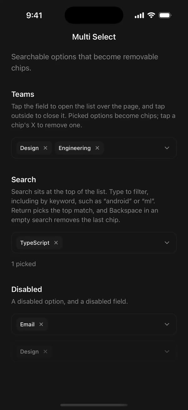
Native port of beUI Multi Select. Composable parts for picking several options from a searchable list. Picked options become removable chips that rise in, shrink away, and spring into new places.
import {
  MultiSelect,
  MultiSelectContent,
  MultiSelectEmpty,
  MultiSelectGroup,
  MultiSelectInput,
  MultiSelectItem,
  MultiSelectLabel,
  MultiSelectList,
  MultiSelectTrigger,
  MultiSelectValue,
} from "./src";

<MultiSelect value={teams} onValueChange={setTeams}>
  <MultiSelectTrigger accessibilityLabel="Teams">
    <MultiSelectValue placeholder="Choose teams" />
  </MultiSelectTrigger>
  <MultiSelectContent>
    <MultiSelectInput accessibilityLabel="Search teams" />
    <MultiSelectList accessibilityLabel="Teams">
      <MultiSelectGroup>
        <MultiSelectLabel>Product teams</MultiSelectLabel>
        <MultiSelectItem value="design">Design</MultiSelectItem>
        <MultiSelectItem value="engineering" keywords={["dev"]}>
          Engineering
        </MultiSelectItem>
      </MultiSelectGroup>
      <MultiSelectEmpty>No teams found.</MultiSelectEmpty>
    </MultiSelectList>
  </MultiSelectContent>
</MultiSelect>
Parts
- MultiSelect: owns the state.
value/defaultValue/onValueChangefor the picked options,open/defaultOpen/onOpenChangefor the list,query/defaultQuery/onQueryChangefor the search text, andfilterto replace the default in-order character match.disabled,disableAnimation. - MultiSelectTrigger: the field. Chips wrap inside it beside a chevron, and a tap anywhere but a chip's X opens or closes the list. Give it an
accessibilityLabel. - MultiSelectValue: a chip for each picked option, with a remove button.
placeholdershows while nothing is picked. Pass a function child to render chip labels yourself. - MultiSelectContent: the floating panel. A tap outside it, or Android's back button, closes it.
- MultiSelectInput: a search field for the top of the panel. It filters the list as you type, return picks the top match, and Backspace in an empty search removes the last chip.
- MultiSelectList: scrolls past 256 points, or sooner when the room beside the field is tight.
- MultiSelectGroup and MultiSelectLabel: a group hides itself while a query leaves none of its options.
- MultiSelectItem: an option, shown as a checkbox row at least 44 points tall.
textValuelabels it when its children aren't a string;keywordsadds words a query can match;disableddims it. - MultiSelectEmpty and MultiSelectSeparator.
On native
Like the web version, the panel floats over the page beside the field without moving anything. It opens below the field, or above it when the room below is tight and there's more above; the keyboard counts against that room, and the list shortens to fit whatever is left.
The search field lives at the top of the panel rather than in the field: the panel is a modal, and a modal takes focus from inputs behind it. Chip labels stay correct while the panel is closed because MultiSelectContent keeps a hidden copy of the options mounted.
Motion
The panel grows out of the field and pulls 6 points away on a spring with a light bounce (500 ms, damping ratio 0.78), then folds back over 200 ms. Chips rise 6 points and scale up from 92% as they're picked, shrink out over 160 ms as they're removed, and the rest spring into place on beUI's layout spring. Checks fade and scale in over 140 ms.
With reduced motion, or disableAnimation, the panel and chips change at once.
Accessibility
The field reads as a button with its label, the picked options as its value, and the list's expanded state; the search field reads with its own label; each option as a checkbox with its checked and disabled state, and each chip's remove button as "Remove" and the option's label. Give the input an accessibilityLabel.
Copy this directory, primitives/drawn-path.tsx, hooks/use-reduced-motion.ts, styles/motion.ts, and the semantic tokens in styles/theme.css.